![[Visual] [Guide] [Product Experience] Metrics](http://images.ctfassets.net/gwbpo1m641r7/4nXp1BbpcXKXTYnkW0A5vL/cc32a7285fe77d02808ff770e9b12e45/AdobeStock_540624504.png?w=3840&q=100&fit=fill&fm=avif)
If you’re tracking metrics like task completion, Net Promoter Score® (NPS®), number of new users, and churn rate, you’re already on track to understanding how people use your product.
But the best way to truly connect the dots between what's happening and why it happens is to analyze product experience (PX) metrics. Product experience insights reveal how individual users feel and behave while using your product. They answer questions like: what did a user see in the moments before leaving your site? What were they looking for that they didn’t find? Did they experience a UX issue?
Pay attention to qualitative PX metrics, and you’ll be sure to make product changes that benefit your customers (their experience and satisfaction with your product) and your business (retention and revenue).
8 PX metrics to help you improve the customer experience
PX metrics help you understand your user’s journey across your digital spaces—from their perspective.
To make the following list of metrics easy to understand and implement, let's use a real-world example of a task a user wants to complete: scheduling an email campaign using email marketing software.
1. Insights from customers who completed a task as you expected
What this metric indicates
Using the example above: these customers built and scheduled their email campaign in the shortest amount of time possible. They followed the steps you defined in your customer journey map—aka your ‘conversion funnel.’
Diving into these customers' sessions helps you create smooth experiences for other users, too.
How to find these customers and collect this metric
Jump into a platform that offers product experience insights, like Contentsquare. All you need to do is:
Head to the Session Replay tool, which records video-style replays of how users click, scroll and move through your site
Filter replays by users who reached the scheduled confirmation page
Sort these replays by length to find those that spent the shortest amount of time getting to the confirmation page
Watch the 5–10 shortest ones. How did these users behave on each of the pages? Were there sections they focused on more, or ignored?
By watching relevant replays, you’ll understand what successful customers did, thought, and felt as they progressed through their task.
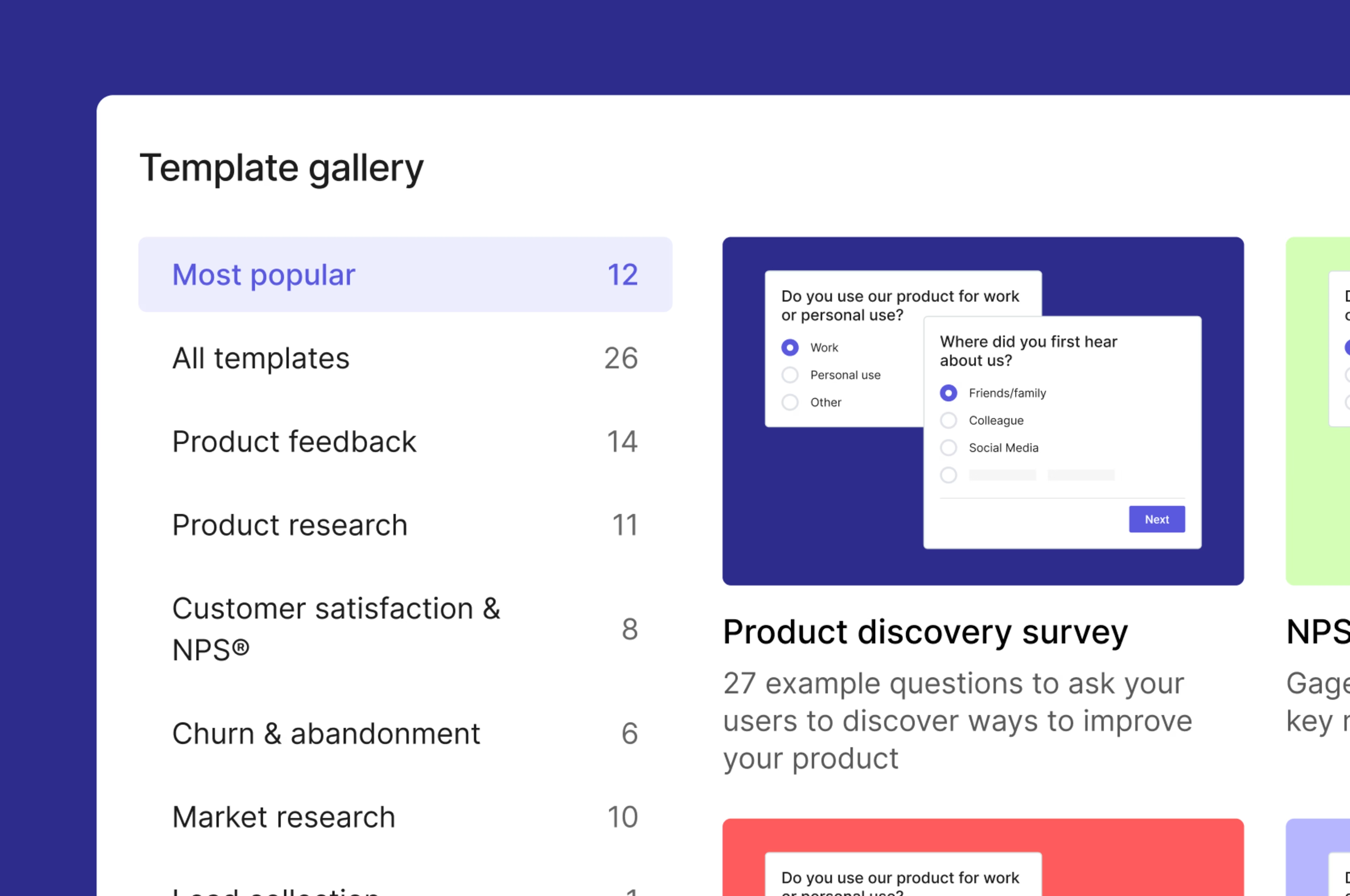
Then, use a tool like Contentsquare to launch a survey on the task completion page. Ask a combination of closed-ended and open-ended questions—for example, “On a scale from 1–5, how easy did we make it for you to [complete a task]?” followed by “What’s the main reason for your score?”—this allows you to collect feedback from successful users directly.
💡Pro tip: to set up your survey faster, base it on one from Contentsquare’s template library, or generate effective questions based on your goals with our AI question-writing tool. |
2. Insights from customers who took longer than expected to complete a task
What this metric indicates
These customers have scheduled their email campaign, but for one reason or another, it took them a while to get there. PX insights help you learn when and where your product slows users down.
How to find these customers and collect this metric
Once again, head to Contentsquare’s Session Replay tool and filter sessions by those that reached the task completion page. Sort your sessions from longest to shortest, and watch 5–10 of the longest.
Look for signs of confusion, such as repeated clicks on a page element, jumping back and forth between pages, or scrolling up and down on the same page. You could even filter sessions by frustration score.
Then, place a Customer Effort Score (CES) survey on pages with an unusually long session duration. Ask open-ended questions (like “Are you finding what you need on this page?”) so your customers can tell you why they’re stuck.
![[Visual] Customer effort score](http://images.ctfassets.net/gwbpo1m641r7/3s6MyVS6jLE2EbV0CjupJT/8a05afca09f221b4300b80b66c9d2685/px-metrics-customer-effort-score-survey.png?w=1920&q=100&fit=fill&fm=avif)
3. Insights from customers who didn’t complete a task
What this metric indicates
These customers started building their email marketing campaign but never finished. Maybe they changed their minds or got confused along the way.
The best way to help more customers achieve their goals with your product is to understand what has stopped customers in the past.
How to find these customers and collect this metric
If you’re using Contentsquare, review Journey Analysis diagrams to find the most common exit pages. Contentsquare’s Journey Analysis tool turns your customer journey data into a sunburst-shaped chart that reveals which pages users pass through whilst completing your important flows—use it to spot high-exit pages at a glance.
![[Customer Story] [Clarins] Journey Analysis](http://images.ctfassets.net/gwbpo1m641r7/4nozxbnvlcRqDnxYjbPNnm/707c4b2a2c0c36077eb336538bb1098c/Complex.svg?w=1920&q=100&fit=fill)
Set up exit-intent surveys on these high-exit pages. Ask users directly why they’re leaving, what they’re missing, and whether they need support from your team.
Then, analyze heatmaps of high-exit pages to identify patterns of user behavior—were they trying to click an unclickable element? Were they not scrolling down far enough to see an important CTA?
4. Insights from customers who experienced friction
What this metric indicates
Users who experience friction or blockers while creating their email campaigns shed light on issues with your product. Behavior like rage clicks—repeated clicking to the same spot—can reveal opportunities for product improvement you otherwise wouldn’t spot.
How to find these customers and collect this metric
For this PX insight, you need to identify which users experienced friction and drill down into why. Set up a Contentsquare dashboard to monitor your frustration score, watch how this changes over time, and identify potential factors behind any spikes.
![[Visual] [Frustration Analysis]](http://images.ctfassets.net/gwbpo1m641r7/5agv9YiPjuvi8pGaX4HiPx/3699c3bd8989b95bb4b8ace90cd8d120/Screenshot_2024-11-08_at_10.24.09.png?w=3840&q=100&fit=fill&fm=avif)
Then, filter your session replays by rage clicks. Watch back the replays with the most rage clicks, and note the pages and elements behind users’ frustration.
To dig further, run unmoderated user tests on your product with Contentsquare’s User Tests. This allows you to set users tasks to complete on your product and record how they go about them, so you can spot any moments of friction and watch them through your users’ eyes.
5. Insights from customers who took an unexpected path
What this metric indicates
These customers have successfully created an email campaign, but the path they took to get there was different from the one you built your product around.
They may have visited several pages outside of the customer journey map, or started the process from an unexpected page. Dive into these product experiences to learn why some customers go off-piste.
How to find these customers and collect this metric
If you’re using Contentsquare, you can drill into this segment using Journey Analysis. Simply configure your Journey Analysis diagram to show the journeys of all user sessions that ended with the confirmation page users see when they’ve correctly sent an email campaign. To do this, click on ‘Reverse journey’, then ‘Journeys to exit page groups’ and select that confirmation page.
Next, spot the rarely visited journeys in your data visualization. Thin segments of each circle correspond to uncommonly visited page visits in this user journey. These are the pages to analyze further.
![[Visual] [Reverse Journey]](http://images.ctfassets.net/gwbpo1m641r7/4I1RcB43owXsl2KVIjMKjj/9fc69ea55af8bc7b8822d73f0043f5a0/Screenshot_2024-10-29_at_16.36.08.png?w=3840&q=100&fit=fill&fm=avif)
Use Contentsquare to review session replays for users that moved from these pages to your ‘email campaign sent’ confirmation page. See where they hover their mouse, how they scroll, and what they click on.
Set up a survey on these outlier pages. Ask “Are you finding everything you need today?” then, with a follow-up question if they reply negatively. You could even ask them to leave their email address for a 1:1 interview about their navigation choices.
![[visual] caption Contentsquare’s Interviews lets you automate the user research process, testing hypotheses and prototypes with rea](http://images.ctfassets.net/gwbpo1m641r7/52HiOLBDtansbbMEbj2BIC/c6722b26f565d58a4ced8747f2ec0120/Video_highlight_sharing_Visual-1.avif?w=3840&q=100&fit=fill&fm=avif)
6. Feedback from customers with high NPS® scores
What this metric indicates
A high Net Promoter Score® (NPS®) reflects customers who are likely to recommend your product to others
Feedback from these customers can reveal the most valuable qualities of your product, and flag positive moments in your product experience, so you can build on your successes.
How to find these customers and collect this metric
Set up an NPS® survey on your website. Contentsquare makes this easy with our dedicated NPS® survey template. Tweak the survey’s settings so that it only appears to users on specific pages.
Set up follow-up questions for specific ratings. For example, if a customer gives you a 9 on your NPS survey, you can ask: “How does our product make your job easier?”
Analyze responses to follow-up questions from high scorers to create a list of reasons your product makes users happy. These answers may inspire new product and marketing initiatives.
![[Visual] Capabilities - Surveys - Use Cases - Track Customer Loyalty - NPS](http://images.ctfassets.net/gwbpo1m641r7/7tUftZyvBWu9t7NZliwkHV/a81660a77627a678cfbba86c5efd636e/Track_customer_loyalty_and_happiness.svg?w=1920&q=100&fit=fill)
7. Insights from customers with low CSAT scores
What this metric indicates
A CSAT or customer satisfaction survey records how satisfied users are with your product, customer service and brand.
CSAT scores are generally high, so it’s important to pay attention to dips in your overall ratings. Low CSAT scores indicate a poor experience with your product or a support representative.
How to find these customers and collect this metric
Easily launch a customer satisfaction survey on your website with Contentsquare’s CSAT survey template. Set up follow-up questions to specific ratings. For example, if a customer gives you a 3 in your CSAT survey, ask: “Sorry to hear that! What makes you unhappy with [product name]?”
Analyze responses to follow-up questions from low scorers. Generate a report with AI to compile a list of reasons your product didn’t hit the mark. Some responses will offer ideas for meaningful product improvements.
Then, filter session replays by users with low CSAT responses. When users indicate specific frustrations, watch a replay of their session to see what they experienced. This helps you understand them and prioritize the right product improvements.
![[Visual] Net promoter score](http://images.ctfassets.net/gwbpo1m641r7/5Ew6q98kfTHQSHo5TCWoE9/17c6603358412ada7e024a3fd313ae53/Group-26086302.png?w=3840&q=100&fit=fill&fm=avif)
8. Insights from churned customers
What this metric indicates
Unless you explicitly ask, you can’t know why your customer stopped using your product. Product analytics or customer support interactions may reveal some of the reasons for churn, but direct feedback from customers offers much deeper context.
How to find these customers and collect this metric
When you send users an email to confirm that they’ve unsubscribed from your product, include a link to a churn survey. Use Contentsquare to create surveys hosted on their own unique URL for free.
In our churn survey template, we suggest asking former customers to select their reason for leaving, score your product, and expand on what made them rate your product that way.
![[Visual] [Churn Survey]](http://images.ctfassets.net/gwbpo1m641r7/7GGaEULQnHjIdhCjphMwYd/d3175df008b16a5a89689d8ed4c1568f/px-metrics-churn-survey.png?w=1920&q=100&fit=fill&fm=avif)
Analyze session replays from users with negative responses and look for any frustrations they mentioned in the survey. These show you what preceded the churn, so you can focus on product updates that will turn moments of disappointment into moments of delight.
How to use these metrics to improve PX
The product improvements you make will ultimately depend on what your PX insights and product analytics metrics reveal—but here are a few suggestion product areas to focus on:
Product onboarding, including the number of steps, the length of support pages, and CTA placement
UX issues, like elements that look clickable but aren’t, or confusing information architecture
Cancellation pages to add information that recently churned users mention they missed whilst using the product
Customer support processes to help your customer care team nurture more empathy and understanding for common negative product experiences
Product roadmap initiatives, like the features your customers are missing or wish to see improved
But remember: there’s no universal product improvement handbook. For the best results, let your users tell you what they want to see by analyzing PX insights and prioritizing the changes that will improve their product experience.
FAQs about qualitative product experience metrics
Quantitative product metrics are numerical insights that show you the actions people take while using your product. For example, how many users completed a task, how long it took them on average, and how many users you acquired or lost.
Qualitative product metrics reveal the opinions, motivations, and feelings of people who use your product: non-numerical insights that help you explore why users take, or don’t take, steps inside your product.
Quantitative product metrics track data, while qualitative product metrics come from observation and feedback.
![[Visual] Contentsquare's Content Team](http://images.ctfassets.net/gwbpo1m641r7/3IVEUbRzFIoC9mf5EJ2qHY/f25ccd2131dfd63f5c63b5b92cc4ba20/Copy_of_Copy_of_BLOG-icp-8117438.jpeg?w=1920&q=100&fit=fill&fm=avif)
![[visual] The best user engagement software and tools to create a brilliant product experience that keeps your customers coming back.](http://images.ctfassets.net/gwbpo1m641r7/2YsSwdFZqFDqJL38ij8KEd/72e8bd27ab056f1ddf2377bd3497ca84/AdobeStock_379755167.jpeg?w=1920&q=100&fit=fill&fm=avif)
![[Visual] Stock - Happy user with coffee and phone](http://images.ctfassets.net/gwbpo1m641r7/5ubAy1D2BjSqaiT4Lz3sEP/2ea71cab72d252ee96b2d592f7e26ac5/AdobeStock_248831473.png?w=1920&q=100&fit=fill&fm=avif)