![[Visual] Stock desk with charts](http://images.ctfassets.net/gwbpo1m641r7/2tRESCVeZzl1oloyDmqYQs/ebd468a1f5d05d92c120d265eb448ef9/AdobeStock_747312086.png?w=3840&q=100&fit=fill&fm=avif)
Whether you're a product manager, marketer, or data analyst, trend reporting is a valuable tool that helps you make data-driven decisions about your projects.
This article gives you a comprehensive overview of trend reporting, including what it is, why it's important, and how to get started with your own reports.
What is trend reporting?
A trend report is a type of performance report that tracks changes to a project’s metrics over time. It helps you identify patterns in user or customer behavior, so you can get a complete picture of your user experience (UX) and improve it.
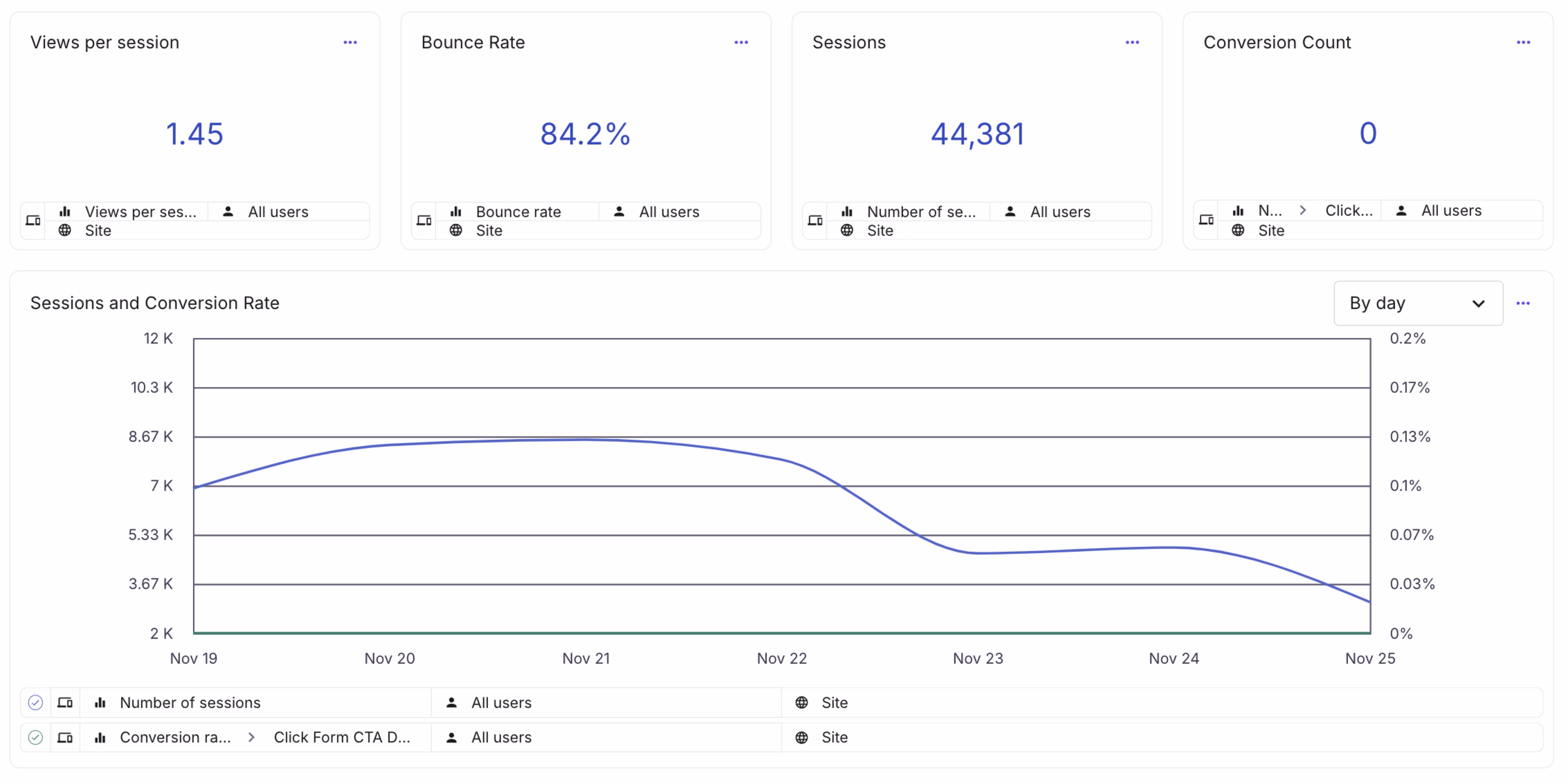
Trend reports are usually in the form of charts or graphs, letting you easily visualize any changes and compare data points against one another. You can continually create trend reports to keep track of the performance of key metrics, or use them after a change to your product, website, or strategy to see if it’s affected user behavior.
![[Visual] trend report](http://images.ctfassets.net/gwbpo1m641r7/6Qm4nh1xSo0JsOfMT4XB9d/996e65018e1d9ab62368ba8b681318a7/trend-report-visual.png?w=1920&q=100&fit=fill&fm=avif)
Trend reports make it easy to see how specific metrics are performing over time
For example, imagine you’re a product marketer leading a content and email campaign to increase the adoption of a feature. A trend report showing the active users of that feature in the 6 months following the campaign launch would let you see if feature usage is trending upward or downward, or if it remains roughly the same.
If the data shows your campaign is a success, you can replicate that content strategy for other product features and feel more confident in the outcome.
4 benefits of trend reporting
Let's look at a few ways trend reports help you stay focused, improve your product or service, and better understand your customers.
1. Catch changes in user behavior early on
Because trend reports make it easy to spot significant patterns, you can take early action when problems arise.
For example, say you’re tracking rage clicks on your sign-up page. With a trend report, you’ll pick up on any increases in rage clicks, and when they happened. Then, your team can dig into the data and find out what caused the change.
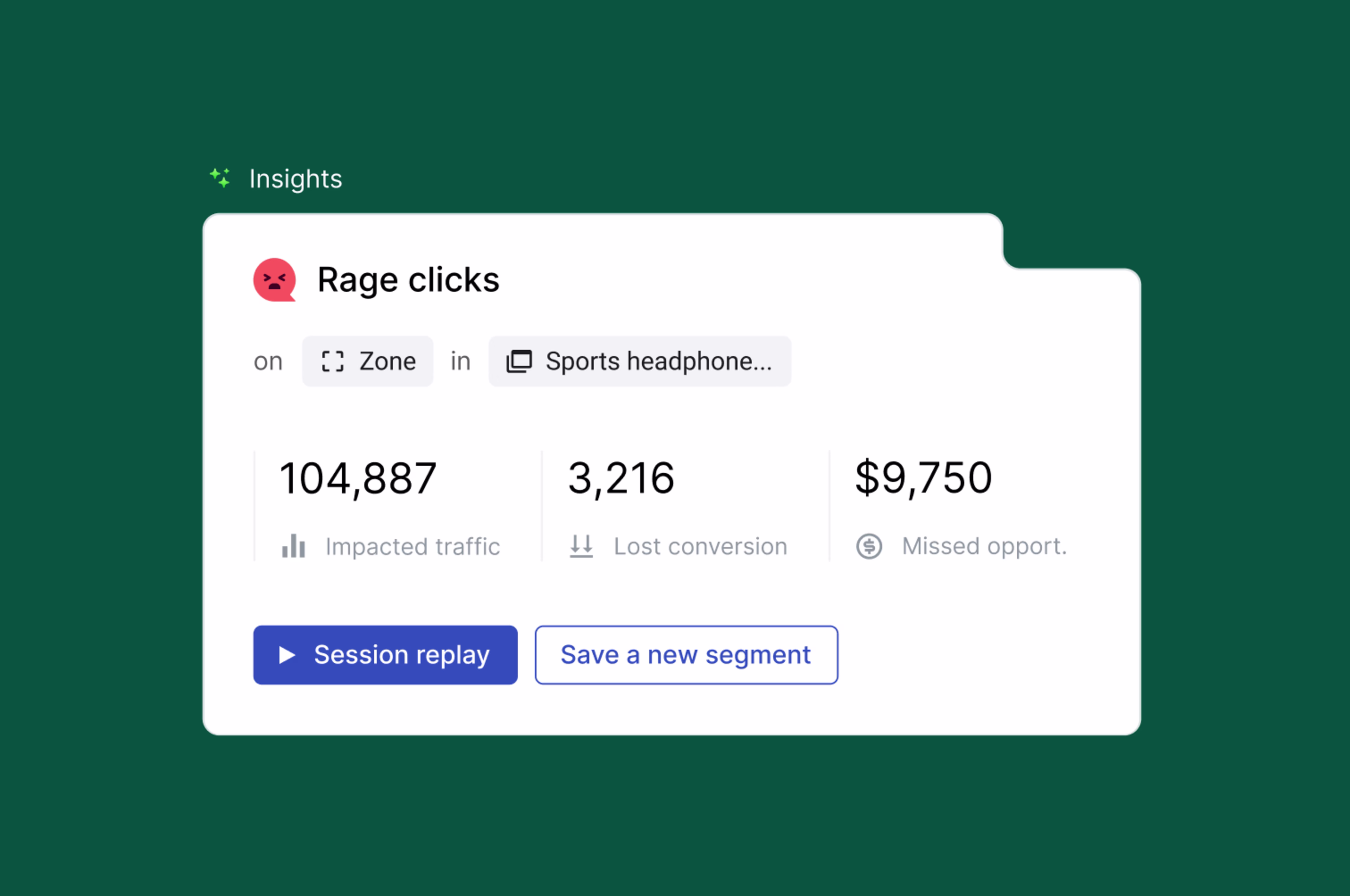
Contentsquare helps you track rage click data, and visualize how it evolves over time
If you had to sift through and compile several different data points, the increase in rage clicks would be much harder to spot. The longer it takes to identify a problem, the longer your customers go without a solution—and the more business you could lose.
2. Make product planning more efficient
Product planning is essential for any team wanting to improve their product and create better outcomes for their customers and business. But to streamline product planning, you need to have access to reliable data.
Trend reporting provides valuable insights and information that help you
Get a clear understanding of what’s working well and what’s not, so you can focus on parts of your product that need improvement
Reduce the risk of making decisions based on assumptions or personal bias and get you crystal clear on your product goals
Prioritize your efforts and focus your resources on areas that have the greatest impact at any given time
This way, you can make informed product decisions.
3. See A/B testing results quickly
Experimentation is a great way to learn more about your customers and improve your product, and A/B testing is one of its most popular methods. A/B testing is all about comparing different data points, and trend reporting is ideal for clearly presenting and understanding your results.
When you compare raw numbers, either on their own or presented in a spreadsheet, it can be hard to see how significant they are. Visualizing your A/B test results in a trend report helps bring your data to life, making it easier to understand the differences in your metrics and preventing you from jumping to false conclusions.
4. Keep user needs at the center of your goals
The customer is critical to the success of any project, and to meet (or even exceed) their expectations, you need to know them inside out.
Trend reporting deepens your knowledge of what your users like and dislike about your product or website. It shows the impact that even seemingly insignificant changes can have on user behavior. The more you understand your customers, the easier it is to keep them at the heart of every decision.
How to create a trend report in 6 steps
Luckily, there’s no right or wrong way to build a trend report. A basic process consists of 6 simple steps.
1. Choose your metrics
It’s not necessarily helpful to create a trend report for every single metric you have. Start small, and think of a metric that ties to a specific business decision or goal. Consider:
Have you made any changes to your website or product? Even small things can radically change the user experience. Actions like clicks (or rage clicks) and metrics like time on page can give you a good idea of how your customers respond.
What goals did you set at your last meeting? Perhaps your team wants to get more newsletter sign-ups or increase traffic to your app. Think about whether these metrics might lend themselves well to a trend report.
2. Decide on a timeframe
Choosing the right timeframe for your data can make or break the effectiveness of your report. To get it right, it’s important to consider the purpose and context of your trend report.
Answer these questions before you start:
What’s the most relevant timeline? For example, if you want to plot metrics tied to a new feature, do you want to include data from the beta version or the full launch?
Do you need to compare your metrics to a prior period? If so, does it make more sense to look at the last month, six months, or year?
What data is available? Without the right data, your trend report will be less accurate, weakening any conclusions you and your team draw.
3. Gather your data
How easy it is to collect the data you need for your trend report depends on what systems you already have in place and the metrics you choose (see Step 1).
If you’re in doubt about which tools to choose, Contentsquare is an all-in-one experience intelligence platform. It has everything you need, whether you’re looking to analyze:
Traffic-related metrics (number of visitors, time on page, new vs returning users)
Clicks or specific events (a demo booking or users scrolling to the end of the page)
User journey data (where users typically bounce, which of your digital surfaces they interact with)
Error occurrences (which pages an error occurred on, how often users experienced it)
Contentsquare lets you create an unlimited number of custom dashboards, to report on whichever data points you need for your trend report
4. Pick a format
Next, you need to decide how to present the data in your trend report. Different charts and graphs are suited to different types of data.
For example, while pie charts are great for showing how different metrics relate to one another, line charts are best for showing changes in data over time.
Ask yourself the following questions when choosing how to display your data:
What type of data are you collecting? Is it numerical, like the number of clicks or a conversion rate? Or is it categorial, like a user demographic or type of business?
Who’s your intended audience? Is it your own team, who’ll already be familiar with the metrics, or other colleagues or stakeholders who may need a more concise and visual breakdown?
How complex is it? With your trend report, you don’t just want to supply the data, but also make sure you present it in a way that’s easy to understand.
Does it allow for easy comparison between data points? When there’s not a huge difference in your numbers, it may not be as easy to visualize with certain types of graphs. If that’s the case, a line chart should be a safe bet.
💡 Pro tip: depending on what your trend report discusses, it can be hard to think about how you’d turn your numbers into data visualizations. Contentsquare offers tools to turn various business-critical metrics into intuitive illustrations, for example:
Customer journey data → Journeys: turn your customer journey data into a sunburst-shaped chart that reveals at a glance which pages users pass through on their path to conversion, and where they usually drop off.
Error rate over time → Error analysis: view a line graph of your important error metrics, and customize it to display whichever segment you’re reporting on. For example, you can check how many desktop users experienced an error on your homepage this week compared to average.
Conversion rate per page element → Heatmaps: create a zoning heatmap to see which page elements are responsible for your conversions or revenue.
Form completion data → Form analysis: understand which fields of your form users fill out, and which they decide to ignore. If form completion is directly tied to your conversion metrics, this helps you understand which fields need optimizing.
![[Visual] product-Form-analysis-showing-how-many-people-started-failed-submitted](http://images.ctfassets.net/gwbpo1m641r7/2LDJFuGjhhgbRUrc3NoaXN/84162c8336bd13fef1e664d04f50adc7/product-Form-analysis-showing-how-many-people-started-failed-submitted-en-1.webp?w=3840&q=100&fit=fill&fm=avif)
Contentsquare helps you visualize data that would otherwise be hard to describe
5. Identify your key results and actions
Once your trend report is complete, it’s time to find the main takeaways you’ll share with your team. These can be improvements to your metrics or issues your trend report has unearthed that’ll set your project back (like decreased use of a new product feature or increased frustration score on your website’s landing page).
Not everyone will have time to comb through your report in detail, so summarizing the key results is a great way to quickly get your team on the same page.
Take the example of an increase in frustration score on your landing page. Lay out exactly when the frustration score started increasing, and by how much. Then, think about the next steps you need to take to improve your user experience and send those numbers back down. For example, tools like session replays or surveys could be a great first step to finding out exactly where users are experiencing friction.
![[Visual] Contentsquare-session-replay](http://images.ctfassets.net/gwbpo1m641r7/2HPGznwqP1cobKSLM0Q3xN/ededb09ac46e5310e98524b2e12b97d3/Contentsquare-session-replay.png?w=3840&q=100&fit=fill&fm=avif)
Use Contentsquare to watch session replays—video-style recordings of users’ journeys as they move through your site—to understand their moments of frustration
6. Share your report where everyone will see it
Lastly, decide on a channel or space to share your finished trend report. Keeping all relevant stakeholders in the loop is an important part of team collaboration, ensuring everyone has the information they need to do their job effectively. The best place to do this will depend on a few factors, including:
Who needs to see the report? Where do they usually share information? Think about whether your trend report is only relevant to your team, or if other teams could benefit from your findings, too.
How sensitive is the information? Is the report something everyone in your organization could see, or do you need to restrict access to it?
Where does most of your communication happen? For example, some companies favor Slack, while others prefer email. Meet your teammates wherever they are.
💡 Pro tip: do you want to keep on top of your numbers between reports? If you’ve based your report on a Contentsquare dashboard, sign up to receive alerts via email or Slack whenever something unusual happens to your metrics.
Effectively track and compare your projects over time with trend reporting
Whether you use trend reports alone or alongside other types of performance reports, they’re a valuable tool for any company with a product or website.
It’s not always easy to know what types of reports to use (or even when to use them). But now you have all you need to introduce trends to your reporting repertoire. With this information in hand, you can improve your team collaboration, create better user experiences, and learn even more about your customers.
FAQs about trend reporting
A trend report is a report that visualizes a metric over time, usually as a chart or graph. Businesses use it to identify changes and patterns in customer or user behavior.
![[Visual] Contentsquare's Content Team](http://images.ctfassets.net/gwbpo1m641r7/3IVEUbRzFIoC9mf5EJ2qHY/f25ccd2131dfd63f5c63b5b92cc4ba20/Copy_of_Copy_of_BLOG-icp-8117438.jpeg?w=1920&q=100&fit=fill&fm=avif)