![[Stock] Man on laptop and tablet from above](http://images.ctfassets.net/gwbpo1m641r7/4mksg6vIOAFHEGsPB7eAZN/4e9862dc2438c13ccdf490785cd1c264/customer-experience-insights-man-computer-digital-1.jpg?w=3840&q=100&fit=fill&fm=avif)
You can play detective all you like to understand why traffic dropped, conversion dipped, or churn spiked. But without the proper methods to uncover the real reason behind metric changes, your diagnosis will likely be inaccurate or formed a little too late.
That’s why agile and effective digital teams use diagnostic analytics techniques, which help them find underlying causes promptly and accurately.
Even better, you don’t have to be a data expert—or detective—to use them. Once you notice your numbers are off, you can drill down into and segment your data, pinpoint the exact triggers, and even perform AI-assisted diagnostics immediately.
In this guide, you’ll explore these techniques, including tools for carrying them out. It’s time you gain faster, evidence-based insights to optimize user experiences (UX) and prioritize the changes that matter most.
Key insights
Combining quantitative techniques, such as drill-down and segmentation, with qualitative methods like behavioral analysis lets you see users’ journeys from different angles, so you don’t miss hidden conversion drivers and blockers
All-in-one experience intelligence platforms like Contentsquare bring your core metrics into one place to ensure correct, actionable insights and timely decisions
Automated, visual, and AI-assisted diagnostics have replaced manual and traditional approaches, allowing for quick identification of root causes behind digital experience issues
7 primary diagnostic analytics techniques for digital teams
These data analytics-backed, practical techniques will help you diagnose problems across your app or website. Discover the key methods that best support your digital teams.
1. Drill-down analysis and segmentation
Say you see a sharp drop in your total product signups. That number doesn’t tell you much, so you go on to view signups by source and find that signups from paid ads are lowest, down by -40%. This movement from high-level to more detailed information is called drill-down analysis.
But, knowing paid-ad users convert the least, still isn’t enough to take action—the insight lacks context. This is where segmentation, which divides your users into groups based on shared behaviors or characteristics, comes in to enhance your analysis.
Segmentation lets you drill down into your paid-ad user base to identify common behaviors so you can take more informed action. For example, if signups from a product campaign fell month-on-month, consider whether your ad or ad group targeted people outside your ideal customer profile (ICP).
The above scenario is just one way to use drill-down analysis and segmentation. You could also go back to your high-level data and drill down another way (Ex: by device or funnel stage). This layered exploration brings a deeper understanding of your data, enabling you to
Prioritize actionable insights
Make informed decisions
Spot recurring patterns (for strategic planning)
👉 Inside Contentsquare: use a template or start from scratch to build a dashboard that displays key metrics from relevant data sources. Once it’s up, you can create custom segments to learn how users with similar attributes behave on your site or app.
![[Visual] create segments in dashboards](http://images.ctfassets.net/gwbpo1m641r7/4vUy7X1bWBBIo0p33eTdrL/334952d40822d7bc00d571f42230b1af/create_segments_in_dashboards.png?w=3840&q=100&fit=fill&fm=avif)
Set up and track key segments in Contentsquare’s dashboard
2. Journey analysis
Journey analysis helps surface UX issues causing users to stumble, take unwanted paths, or leave a site prematurely.
Finding and fixing friction points fast is crucial, and this diagnostic analytics technique lets you uncover problems you wouldn’t spot through metrics alone.
Instead of segments, you could drill down into specific journeys across your app or site. Start by tracking how users from different entry points—such as the homepage, a landing page, or a blog post—progress through the journey. Then, identify which pathways perform well and which need optimization.
For example, you might discover that those who enter via the pricing page drop off before reaching checkout. Or those who find your blog read several posts, and then leave without moving on to the product pages. These insights prompt you to investigate what’s tripping users up.
🚀 Take it to the next level: combine quantitative and qualitative data analysis to build a complete picture of your site or app UX.
Get an interactive visual overview of user flows with Contentsquare’s Journey Analysis capability, flagging those that fail to convert. Or use Funnel Analysis to break down the steps users take, plus conversion, drop-off, and time to conversion numbers.
Then, jump straight to the related session replay to see for yourself why they get stuck and make evidence-based improvements.
When it’s just numbers on a screen, it can be really hard to digest the information. You can feel like the one processing stuff and having to manually get from point A to point B, and that can take a long time. In contrast, because Contentsquare insights are visual, we can spend less time analyzing and more time thinking about what we can do about certain issues.
![[visual] Contentsquare Funnel setup](http://images.ctfassets.net/gwbpo1m641r7/5EX1R2zY8dxcIJvHEYEe8m/b31846b2b709fad619d81fe04bcadbd4/funnels.png?w=3840&q=100&fit=fill&fm=avif)
Find out the exact step where your UX breaks down by performing funnel analysis
3. Behavior analysis
You’ve probably already examined how customers interact with your site or app, including sessions and clicks. If so, you’ve done behavior analysis.
However, when applied to diagnostic analytics, this technique dives deeper to explain what sustains or drives engagement across your digital properties. It reveals underlying patterns behind users’ behavior, removing guesswork and enabling you to make better, data-driven decisions.
Let’s say your product’s churn rate suddenly rose after a new feature launch and your goal is to understand whether the feature caused the churn or coincided with it. Here’s what you can do:
Create a segment of churned users to isolate those most affected by the change
Use heatmaps to visualize where churned users clicked, scrolled, or dropped off
Follow it up with related session replays to uncover friction, confusion, or frustration in the new feature, such as rage-clicking on a button, abandoning the process midway, or circling back to the previous page
Better yet, ask Sense, Contentsquare’s AI, to summarize the replays and flag likely causes
![[Visual] Session replays AI summaries](http://images.ctfassets.net/gwbpo1m641r7/513RGRBy7acZFtxrrMg1cE/7f6851e3d8f3c4ca804c3e8cde0f847a/Session_replays_summaries.png?w=3840&q=100&fit=fill&fm=avif)
Fast-track diagnostics and improvements using AI insights
Real-world success story: how Diptyque unblocked conversions with visual diagnostics
When luxury fragrance brand Diptyque noticed a drop in checkout conversions, its digital performance team turned to Contentsquare’s Journey Analysis, Heatmaps, and Session Replay visualizations to uncover the root cause: a confusing login interface that led users to drop off.
By reworking the checkout experience, the team achieved a -31% decrease in exit rate for new users and a +9% increase in mobile conversions on the page.
4. Correlation analysis
Correlation measures the strength of relationships between variables. When 2 variables are moving in the same direction, it’s called a ‘positive correlation’ and when they move in opposite directions, it’s called a ‘negative correlation’.
Here are 3 simple examples that illustrate different types of correlation between an event and a metric:
Positive correlation: when ad spend increases and signups also improve, the 2 variables move in the same direction
Negative correlation: when ad spend increases but signups decrease, the 2 variables move in opposite directions
No strong correlation: when signups remain unchanged despite an increase in ad spend, the variables are not closely linked
This analysis works well when multiple factors could be influencing performance, such as page speed, paid ads, content quality, or user demographics. Understanding the relationship between key variables helps you see what’s driving better performance. For instance, if you know that signups rise whenever ad spend increases, you can justify investing in more paid campaigns.
Don’t forget to back up your findings with data. Use zoning analysis to show where users engage (or don’t engage) after landing from your ad, and decide to update or keep the page’s copy in question.
![[Visual] zoning analysis](http://images.ctfassets.net/gwbpo1m641r7/1hHsnASr4FOYc5G28JEkHU/2416b0ee43f929889779f3221e2e0868/zoning_analysis.avif?w=3840&q=100&fit=fill&fm=avif)
View top-clicked elements on your site’s pages with zoning analysis
In cases where a third variable creates a false correlation, advanced techniques such as regression analysis can help.
5. Regression analysis
Regression analysis goes beyond correlation by quantifying how each factor contributes to performance. This analysis helps you understand why performance changes by showing which variable has the greater impact. That way, you can prioritize accordingly during optimization.
For example, regression analysis might reveal that every additional second of page load time leads to a -5% drop in conversions, while a $1,000 increase in ad spend boosts conversions by +2%. In this case, improving page speed first would give you a higher return on effort.
💡Pro tip: don’t have the time and capacity to build custom regression models? Use Contentsquare’s Impact Quantification capability to gain quick insight into the impact of errors and issues on conversions, subscriptions, and revenue.
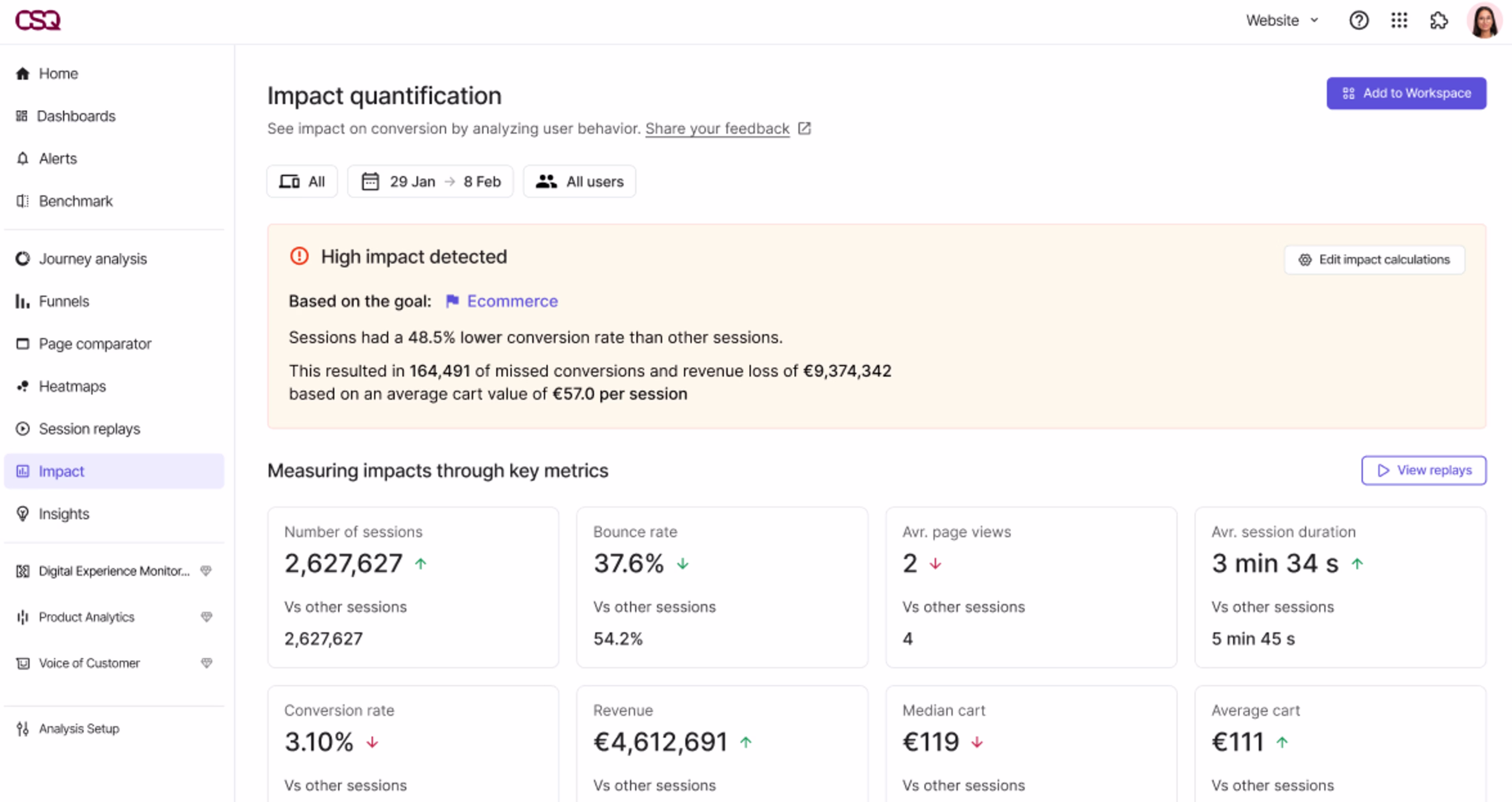
Instantly measure impact and effectively prioritize issues with Impact Quantification
6. Root cause analysis (RCA)
At its core, RCA identifies why something happened, not just what happened.
Traditional methods include the ‘5 whys’, where you repeatedly ask why a problem occurred until you uncover its source, and the ‘Fishbone (Ishikawa) diagram‘, where you generate as many possible causes as you can and sort them into useful categories. These work best when cross-functional teams sit down together, compare notes, and discuss every possible angle, a luxury in today’s fast-moving business landscape.
Realistically, you gain more of an edge by turning to diagnostic analytics tools that help you detect anomalies, surface hidden correlations, and connect issues to business impact in real time.
Imagine a sudden drop in conversions after a site redesign. A traditional RCA might involve a step-by-step review of the design, analytics, and release notes to find what went wrong. A digital RCA, however, quickly shows that most drop-offs occur on mobile during form submission, pointing to a broken field or layout issue.
When decisions are time-sensitive and the data is too complex to untangle, Sense can help.
Instead of manually comparing qual vs quantitative data, you can turn to Sense’s automated and AI-assisted diagnostics to optimize UX efficiently.
✨ Teamwork makes the dream work: to uncover root causes effectively together, give every team access to the same data, eliminating data silos. With Contentsquare’s Data Connect capability, your experience, performance, and error data flow directly into your warehouse.
And, there’s no need to worry about data processing. Cross-functional teams can explore Contentsquare insights wherever they already work, including analytics dashboards, business intelligence (BI) tools, and enterprise resource planning (ERP) and customer relationship management (CRM) platforms.
7. Anomaly detection
Anomaly detection enables you to catch and explain unusual patterns in your data. This signals that something went wrong, such as a sudden spike in bounce rates. Upon digging, you pinpoint that it happened when the development team deployed a new code, which then broke a page.
To ensure you don’t miss any high-impact issues, take advantage of Contentsquare’s Error Analysis capability. It comes with real-time alerts on error spikes, which can be sent to Slack. You can read AI-powered summaries to quickly understand each issue, focus on which has the biggest impact, and even review the technical details in Session Replay before sending a fix request to your devs.
![[Visual] error analysis](http://images.ctfassets.net/gwbpo1m641r7/2RHGIcGhjdzYE7tMVVWzzg/2bc7b35d22f6b8a0806a09a23f6f7c71/error_analysis.avif?w=3840&q=100&fit=fill&fm=avif)
Get faster, accurate, and evidence-based insights
To make the most of your optimization efforts, you need a prompt and accurate diagnosis of issues on your site or app. By combining diagnostic analytics techniques, you’ll get faster insights into your users’ digital journeys and ensure you’re fixing root causes instead of treating symptoms—solidifying the link between effort and revenue.
FAQs about diagnostic analytics techniques
There are 6 primary techniques you can use to optimize user experiences and prioritize changes that matter most. Combine them to gain faster, evidence-based insights:
Drill-down analysis and segmentation
Journey analysis
Correlation analysis
Regression analysis
Root cause analysis (RCA)
![[Visual] Contentsquare's Content Team](http://images.ctfassets.net/gwbpo1m641r7/3IVEUbRzFIoC9mf5EJ2qHY/f25ccd2131dfd63f5c63b5b92cc4ba20/Copy_of_Copy_of_BLOG-icp-8117438.jpeg?w=1920&q=100&fit=fill&fm=avif)