A/B testing is a time-tested strategy for experimenting with different ideas to optimize your website for business, making it more effective at encouraging users to take valuable conversion actions.
When A/B test results are positive, it’s a rock-solid sign that the change you have in mind will inspire more customers to do business with you—whether you’re testing product videos on your ecommerce site or a new subscription banner for your online magazine.
But make one (or more) of the most common A/B testing mistakes, and you get unreliable data that pushes your strategy in the wrong direction.
Here are 10 mistakes to avoid if you want to run the kind of A/B test that produces squeaky-clean data—and leads you to make informed product decisions.
They’re divided into three categories
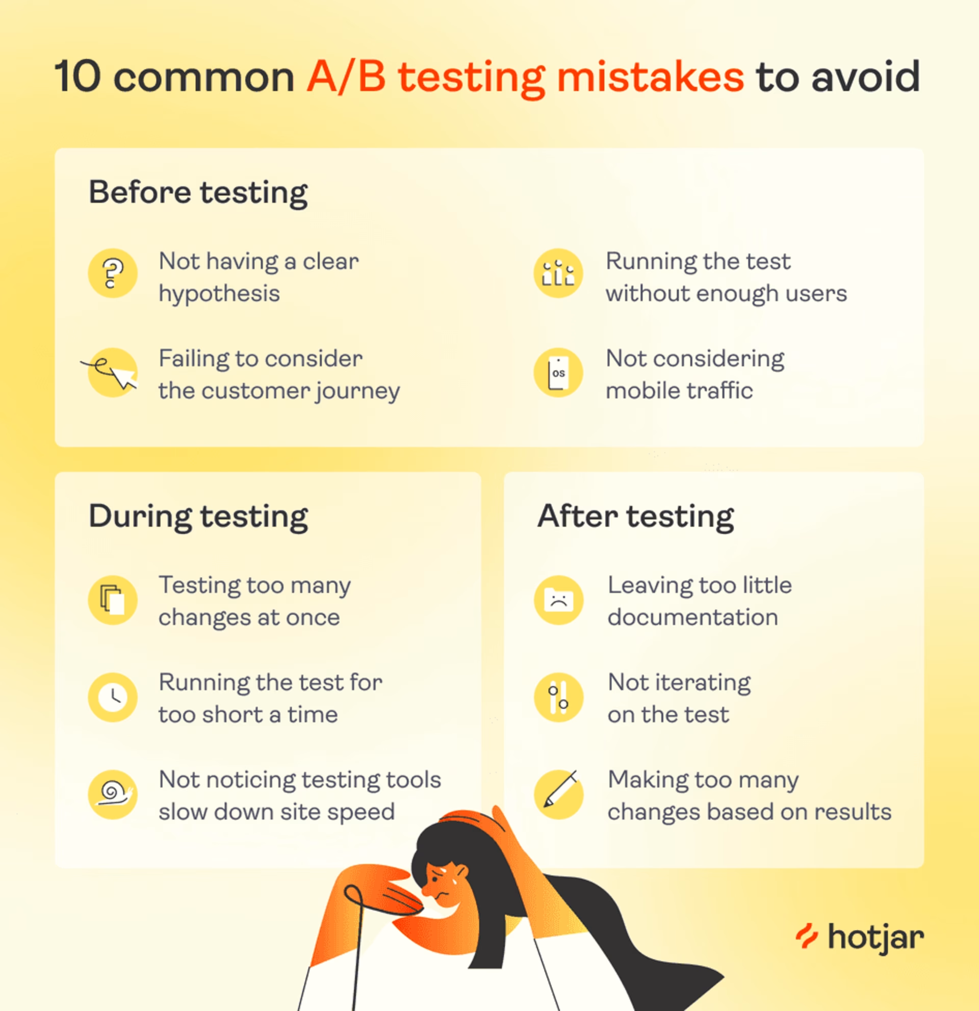
Pre-testing mistakes
In A/B testing, also known as split testing, you present two variations of a web page to users at random. One of them is the standard version (control), and the other is the new version (variant) of that page you hope might encourage more users to take the action you want them to.
A successful, error-free A/B test begins in the planning phase, with a thoughtful consideration of your hypothesis and test conditions. Here are some common A/B testing pitfalls teams make before they’ve even hit ‘run’ on their experiments—and how to avoid them.
1. Not having a clear hypothesis
It’s easy to start an experiment because you’ve just got a vibe that a specific change might be a good idea in some way. However, an A/B test can only answer a closed-ended question, so you need to pin your hypothesis down.
If you run a test without a clear hypothesis statement, you might get distracted by interesting but inconsequential metrics. For example, perhaps you end up focusing on the fact that users spent more time on the page instead of the metric you actually care about.
How to fix it: to produce useful split testing results, you need to specify which metric(s) you hope to increase and why the change you’re proposing could increase it—i.e. you need to create a working hypothesis.
Form your hypothesis as an if-then statement. “I hypothesize that if [we make the Add to cart button clearer] then [more users will convert].
There are 3 things you need to do when formulating a hypothesis.
Step 1. Dig into web analytics data to observe what your users are doing on the path to conversion. For example: “95% of our customers who start checking out bounce before they enter their card details.”
💡Pro tip: experience intelligence platforms like Contentsquare provide valuable extra detail here.
View your Product Analytics dashboard for important metrics like bounce rate, average session duration, and top pages. And understand the why behind those metrics by watching replays or viewing heatmaps of the pages you’re trying to optimize.
Step 2. Speculate on what prevents users from converting—your best guess, based on the information available
“I speculate that users aren’t converting because they don’t trust our creaky old site with their card details.”
Step 3. Formulate a hypothesis on a change that might encourage users to convert. This should be a statement that clearly sets out your A/B test. You can use the 'if-then' format.
“I hypothesize that if we add a ‘secure payment’ icon to the checkout page, then more users will convert.”
Investigate customer behavior → form a strong hypothesis → increase adoption
Session Replay allows you to watch renditions of where your customers move and click, so you can understand why they don't take the actions you expect.
For the online banner-making tool, Bannersnack, this feature provided evidence for several strong hypotheses.
For example, after introducing a timeline view of their product, web analytics alerted the Bannersnack team that not many of their long-term customers were trying out this new feature.
When they watched a few session replays of user behavior, the team realized users completely ignored the ‘show timeline’ button, which was far less visible than their designers had thought.
Their hypothesis? “If we make the ‘show timeline’ button bigger, more users will try it out.”
The Bannersnack team then used an A/B test to see whether their hypothesis was correct. It was—and this low-effort change increased feature adoption by 12%.
![[Visual] Session Replay - What is CSQ?](http://images.ctfassets.net/gwbpo1m641r7/3XsaMYdpHjNeBE8x4r219k/eb9e7ae1ae4a0f3c0eedb754b9d23853/Session_Replay.png?w=3840&q=100&fit=fill&fm=avif)
Session Replay lets you understand how real users move through your site
2. Failing to consider the customer journey
Make sure you’re A/B testing something that has the potential to move your metrics:
Test important pages, like your product, checkout, or registration pages, that are high in traffic and connected to your sales funnel
Don’t run A/B tests on inconsequential pages without much traffic—like your about us page, for example, or else you won’t be able to make impactful changes with the results
One way to check you’ve chosen an important page is to review your customer journey map—the steps that lead up to a customer doing business with you, such as users:
Clicking an advert
Reviewing a product page
Reading shipping information
This stops you from investing too much effort into optimizing a page that customers only see once they’ve already made a conversion decision—or when they’re not even close to making one.
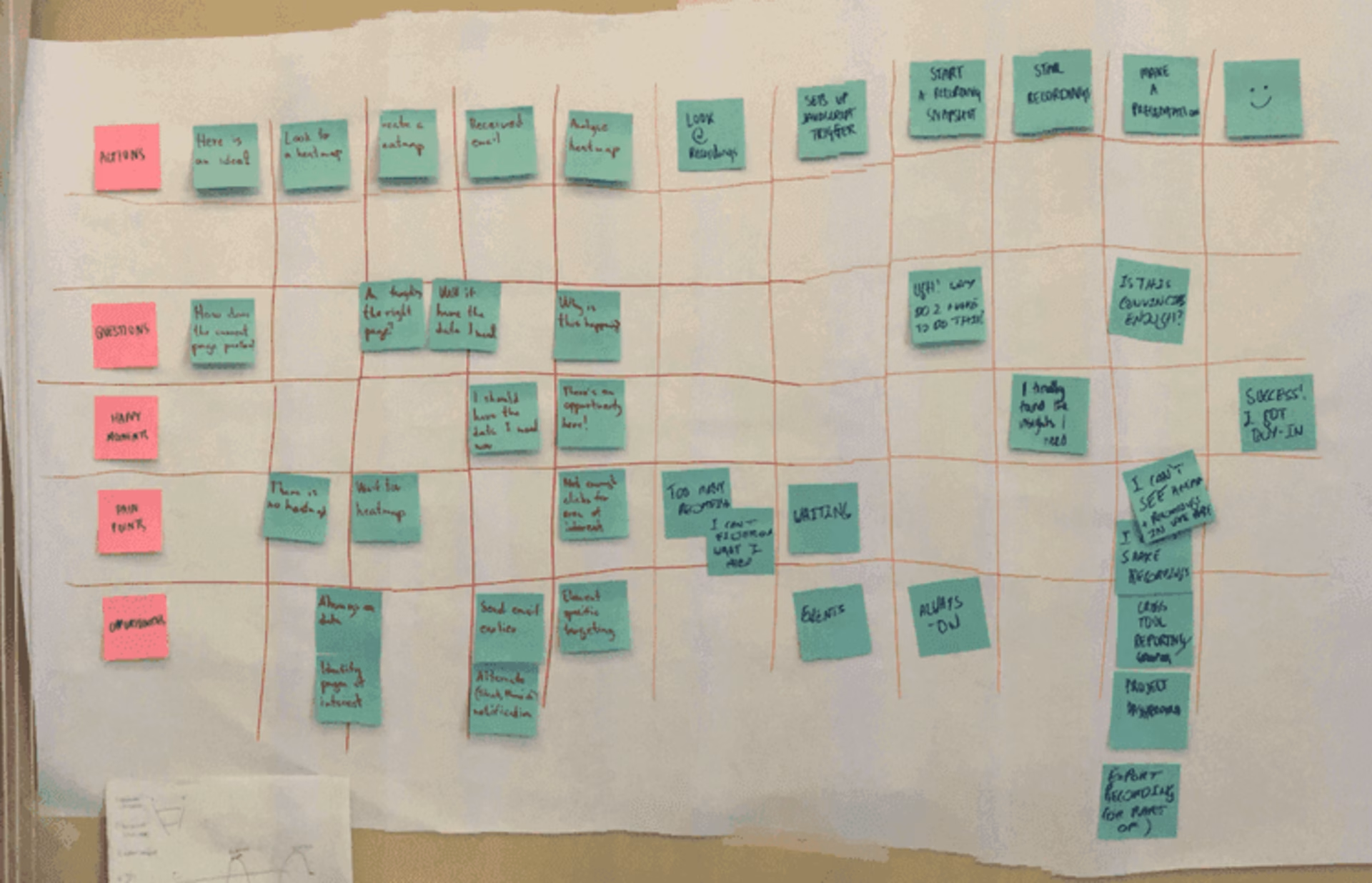
A (charmingly low-tech) customer journey map
How to fix it: formulate hypotheses with your customer journey map in mind. Whichever page you’re planning to A/B test, ask yourself
What decisions has the user already taken at this point?
Is there a chance they’re not even on the path to conversion yet?
💡Pro tip: sometimes, customers don't convert because of a problem existing one step before you assume it does.
For example, when Gavin, Managing Director of the lead generation agency Yatter, reviewed the website of a customer who sold stem cell therapy—a very expensive and high-stakes product—he noticed they had plenty of traffic, but most prospects were dropping off at checkout.
While watching session replays, Gavin noticed users spent a long time reading the product information. He realized the conversion problem wasn’t with the checkout page itself—it was that customers didn’t feel convinced enough by the information on the product page.
So he added some case studies and an explanatory video, and conversions increased by 10%.
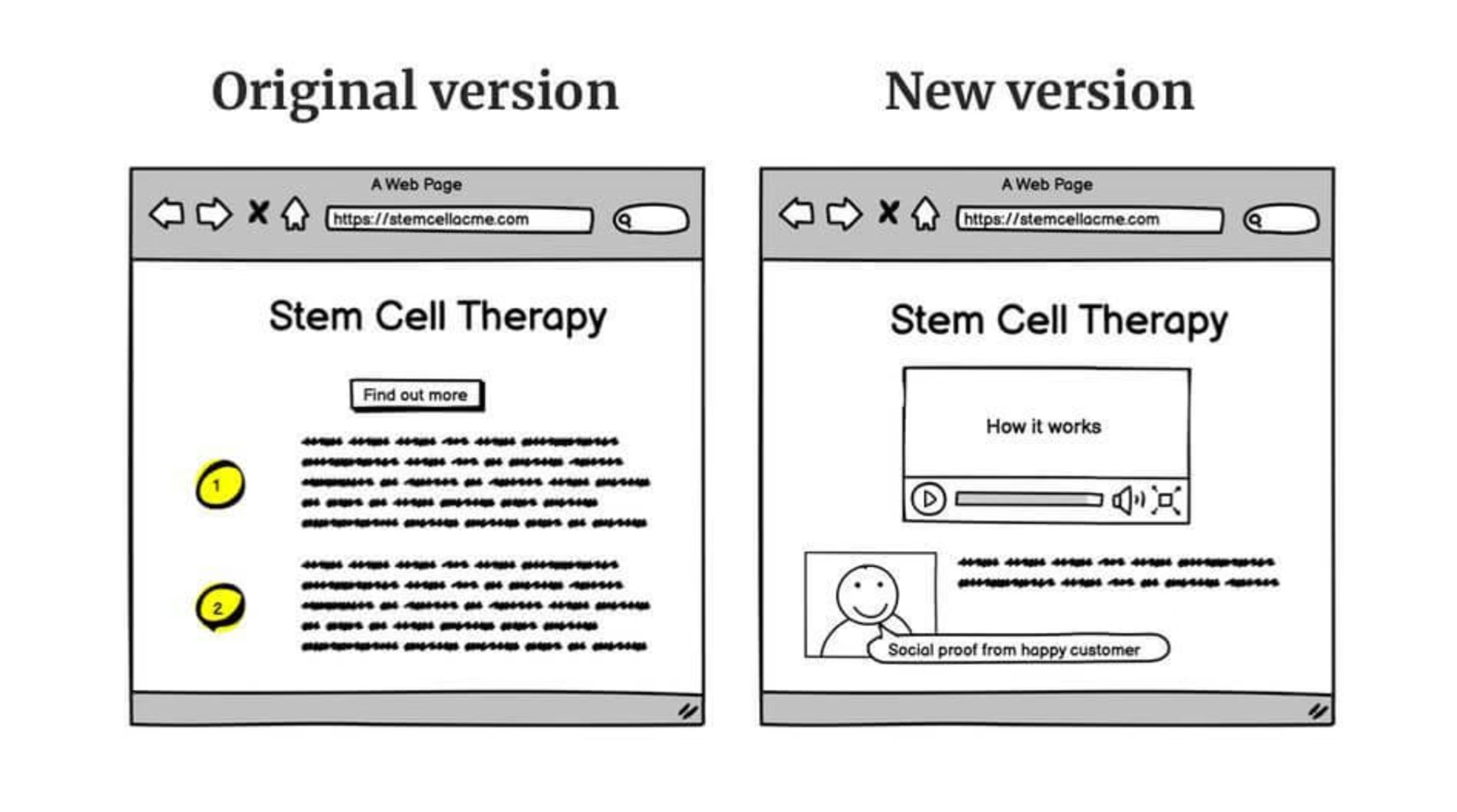
The old Yatter site versus the new and improved version
3. Running a test before you’ve got enough users
A/B testing gets so much hype from product management and marketing media that it’s tempting to consider it the best-in-class solution for all digital businesses. In reality, that’s not the case.
Unless your page has significant weekly traffic, your A/B test will struggle to achieve statistically significant results. It’s industry standard to consider 95% probability ‘statistically significant’, which means that if you ran the experiment 20 times, you’d likely get the same results 19 times.
Many A/B testing tools will automatically send a notification when your test reaches this threshold.
How to fix it: investigate whether you have enough traffic and conversions to run a statistically significant test by using a sample size calculator like this one from Neil Patel or this one from CXL.
If you don’t have enough traffic, remember: A/B testing isn’t the be-all and end-all of conversion rate optimization (CRO).
Directly ask your customers what they want to see with a survey instead, or try using a scroll heatmap to see how far down your page customers typically get.
4. Not considering mobile traffic
It’s easy to prioritize the desktop version of your site. But this is a massive oversight because mobile users are responsible for over 60% of all web traffic in 2024.
The mobile blindspot is behind two big A/B testing mistakes:
Some teams don’t dig into analytics data for the mobile version of their sites when coming up with hypotheses. So, even if they run dozens of A/B tests, they’re only optimizing 40% of the user experience.
Some teams will A/B test a design tweak or new feature idea and—in the rush to put something out—not check how it appears on mobile. This leads to a situation where a user-centric, well-considered hypothesis for the desktop version of your site produces inexplicably poor results from an A/B test. It seems like the idea wasn’t a hit when, really, it might have just looked bad on iOS.
How to fix it: remind your team to spend time with the mobile version of your site. Here’s how:
When you set up an A/B test, investigate how it looks and feels on mobile before you hit ‘run’. Many testing platforms offer simple tools for this. For example, when you’re about to launch an A/B test in Optimizely, there’s a ‘Preview’ tool that allows you to see how your changes will appear on other devices.
When you’re looking at site data to form hypotheses, filter your data by device. Many user insights platforms like Contentsquare allow you to segment your data in this way. Similarly, you can filter replays and heatmaps to watch how smartphone users navigate the mobile version of your site.
For example, in the heatmap below, you see readers trying to click on the ‘Homepage design’ and ‘Responsive web design’ bullet points. This could mean you need to incorporate jump links more into your content strategy to give readers what they want faster.

A Hotjar, part of the Contentsquare group, heatmap of where users click on mobile when reading a guide on web design examples
Mid-testing mistakes
Getting your test off to a strong, error-free start is important, but there are still several common pitfalls to avoid whilst it’s up and running.
5. Testing too many hypotheses at once
Testing multiple page elements at once may seem like an obvious way to save time and achieve a high-converting page ASAP—but it can be more trouble than it’s worth.
Here’s what ‘too many hypotheses’ looks like: say you’re aiming to increase sales to your online store. You decide to run an A/B test on a product page, where the ‘A’ version is the option you currently use, and the ‘B’ variant includes:
An offer banner
A bigger ‘Buy now’ button
Extra product information
You’ll never know which tweak was responsible for the results, so you waste time and resources implementing changes without evidence they’re going to increase conversions.

There can be pressure to optimize your site quickly—especially at startups—but useful A/B test results require patience
How to fix it: take your A/B tests one at a time, so you can understand key learnings from each one, and move forward methodically. But A/B testing isn’t the only way to validate that users will like your changes—and it’s certainly not the fastest.
Here’s what else you can do
If you’ve got plenty of traffic and you’re certain you want to test more than one element at a time—perhaps you’ve got a big design relaunch and need to make sure everything’s in order—then try multivariate testing. This is when your website traffic is split into smaller segments: so instead of A/B testing, it might be A/B/C/D testing.
If you’ve got less traffic, ask customers to rate your radical changes using a good old-fashioned user survey
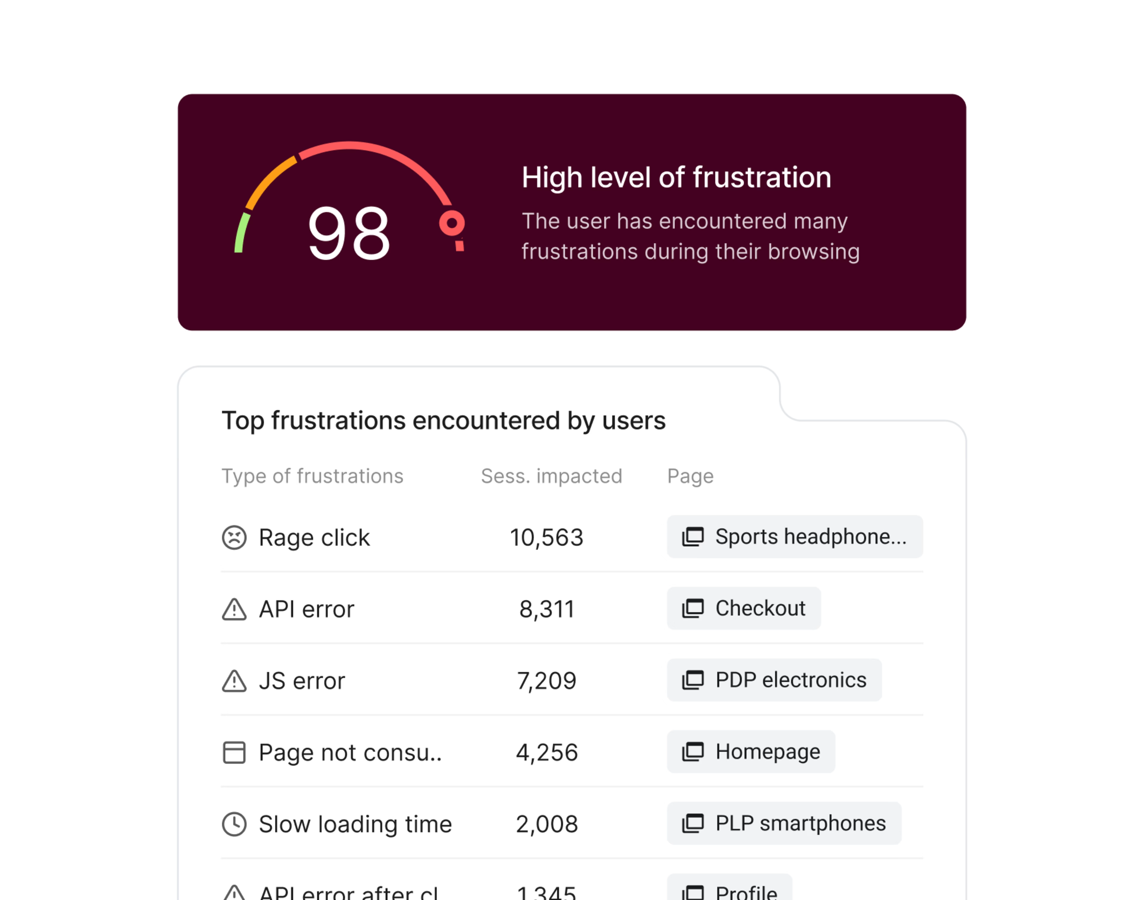
Easily launch and monitor a Net Promoter® Score survey on your site with Contentsquare
6. Running the test for too short a time
Just like running an A/B test on too few users, cutting your test duration short can lead to unrepresentative results. Once again, you need to achieve statistical significance—at least a 95% chance that these results weren’t random.
It’s often tempting to stop an A/B test that shows initial signs of success, especially if you were very confident about your initial hypothesis. But remember: without statistical significance, you’re gambling.The more data you collect, the more accurate your results will be.
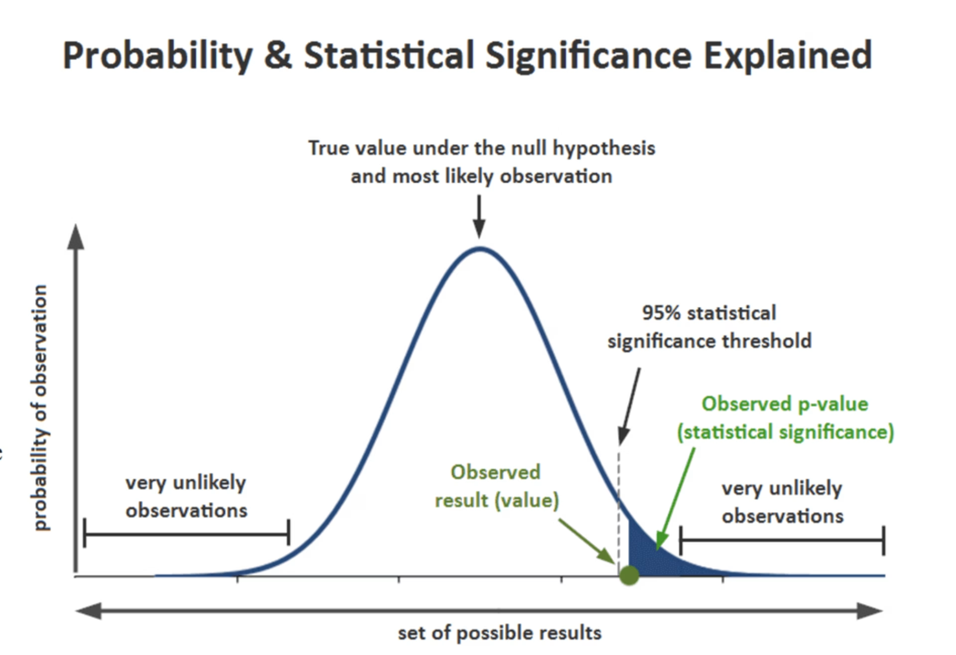
A visual explanation of statistical significance. (Source)
How to fix it: stay disciplined and don’t switch off an A/B test before it’s reached that magic number: 95% significance. Most A/B testing applications will declare a winner at this point automatically.
However, an even surer threshold is to wait until you’ve hit your pre-calculated minimum sample size, as mentioned in the third point.
7. Not noticing your testing tool slows down site speed
Some A/B testing tools might slow your site down by up to a second. After all, splitting your user base between two different versions of your site creates an extra step in the page-loading process. What’s more, 40% of users abandon a site that takes more than 3 seconds to load, so this can seriously hurt your metrics.
If your site slows down, your conversion rate will probably go down, and your bounce rate will go up.
The good news: this is a short-term problem since your site will speed up again once you finish your A/B test and switch the tool off. The danger lies in not realizing what’s going on.
How to fix it: do an A/A test before your A/B test. Run your testing software in the background of your page without an experiment. Many common testing tools, including Optimizely, support this practice.
An A/A test lets you
See if your A/B testing tool slows down your page or has any negative effects on the metric you’re hoping to test
Verify the tool has been set up correctly since the results of your A/A test should show a tie
Factor a reduction in site speed into your results if you need to, or—if you’re planning on A/B testing often—find another tool
Post-testing mistakes
Even once you’ve carefully planned and conducted your A/B tests, there’s still a chance of making mistakes. Here are some errors to avoid when turning your freshly acquired data into action.
8. Leaving too little documentation
Between waiting for statistical significance and only being allowed to change one thing at a time, A/B tests are pretty high maintenance—so it’s important to squeeze as much learning out of each one as possible.
Thorough documentation helps you
Learn which ideas work
Maximize resources
Inform future product strategies
How to fix it: create a template for how you document internal A/B tests and ensure everyone sticks to it. It should include
The analytics data that inspired your hypothesis
Your assumptions about why this data looks the way it does
Your hypothesis, formed as a clear statement
The metrics you decided to measure
Your test results, including a discussion and a list of further actions
Your A/B test document should be a simple one-page report. Once you’ve written up your test, share the report with the rest of your company for feedback.
9. Not iterating on the test
When an A/B test proves your hypothesis wrong, it’s easy to write your report, shrug it off, and move on to a completely different idea—especially if you’ve waited a couple of weeks for this hypothesis to fail and are just over it. However, this approach leaves no space to fully digest your learnings.
How to fix it:
If you have a hypothesis grounded in data about a customer pain point and an A/B test proves it false, try coming up with a different option. The issue you identified still exists—you just didn’t hit the solution the first time around.
Consider an iteration if your hypothesis proves successful. Now that you’ve found something that works, can you double down on your win? Say, for example, you tested adding a carousel of pictures to your product page, and it led to a statistically significant uptick in conversions. Why stop there? Your next move could be A/B testing a product video.
Unsure why your hypothesis sunk? Ask your users!
When you formulate a hypothesis based on solid data, it can be disheartening if an A/B test proves it wrong. However, this is an invitation to dig deeper. Use an on-page survey to ask users about their behavior.
For example, say you’re trying to increase membership sales on a website that helps you find a roommate in a city. Data shows that many users drop off during registration. Your hypothesis is that users are put off by needing to buy a month’s membership, when finding a roomie sometimes only takes a week. So, you decide to A/B test weekly membership. However: the results show there’s no improvement in conversions.
Instead of abandoning your idea, you set up an exit-intent survey on your registration page. It asks users why they’ve decided not to buy a membership. As it turns out, many users say they’re annoyed that they had to set up a profile before buying a membership.
If this is the case, your next iteration of the A/B test could focus on reducing friction in the signup process, rather than reducing the price or duration of the membership.
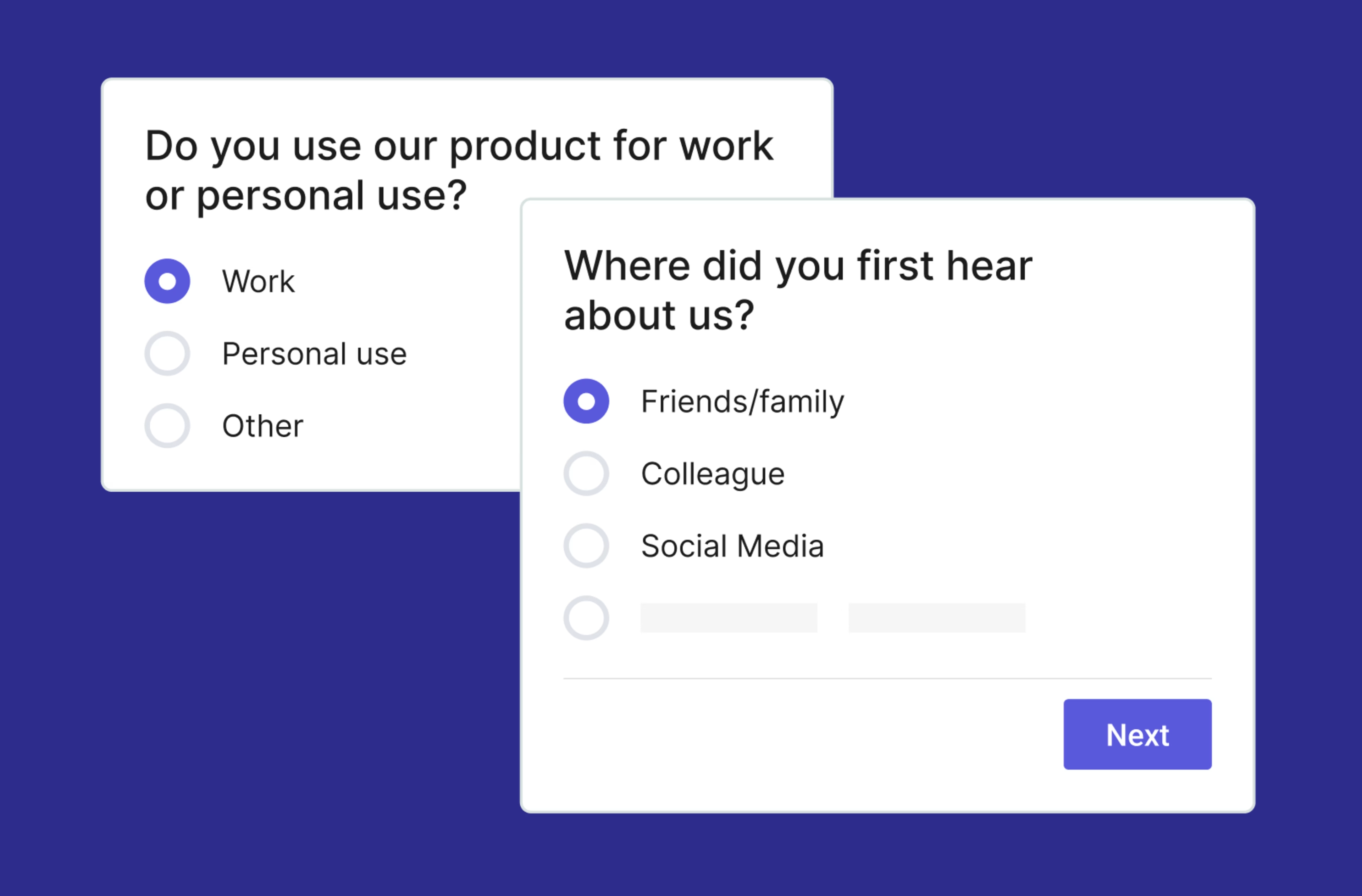
You can trigger Contentsquare surveys to appear when users on your site take a particular action—like navigating away from checkout
10. Making too many changes based on your results
If you’re trying to win your team over to an idea for a new feature or a design change, convincing A/B test results are highly persuasive. However, people feel so much more confident in their product decisions when there’s data involved that it can be tempting to overestimate your experiment’s implications.
For example, say you’re trying to grow your mailing list sign-ups. In an A/B test, you learn that adding a sign-up pop-up to your 'about us' page increases this metric. So, based on that data, you add a pop-up to every page of your site. Perhaps the trend continues, and you get more sign-ups—or, perhaps your bounce rate goes through the roof because users casually browsing your blog are annoyed by seeing a pop-up after every article they click on.
How to fix it: go slow and steady when making changes based on your data. Remember that an A/B test only answers a narrow question and that site-wide changes require care and caution.
Accurate test results lead to successful growth strategies
A/B tests are worth the patience—the results help ensure that every change you make is likely to boost your bottom line. However, A/B testing isn’t the only tool in the trunk.
Digital experience insights tools—like heatmaps, session replays, and surveys—are powerful for identifying which changes encourage your users to convert, and where your hypotheses went wrong (or right!). Watch a handful of replays of users clicking around your checkout page, and you’ll soon notice which areas need improvement.
The most efficient way to optimize your site is to use these strategies hand-in-hand: enrich your understanding of A/B test results with digital experience insights, and use these insights to come up with great hypotheses for A/B tests.
FAQs about A/B testing mistakes
A/B testing is a popular strategy for making small changes to your product, so you can steadily increase your conversions, but it does have some limitations
It takes a long time: you can only test one hypothesis per experiment, and depending on the size of your audience, your test may need to run for up to eight weeks. If you’re trying to polish every individual element of a page using A/B tests, it’ll be a project spanning months or years.
It might not work on low-traffic sites: unless there’s a significant stream of visitors to your site, your A/B tests will struggle to reach statistical significance. Any data you gather could be put down to chance.
It’s not suitable to test big changes: A/B testing can only answer a ‘this vs that’ question: it’s helpful for understanding whether a small copy or design tweak can improve your conversions, but doesn’t offer detailed enough results to help you make large and important changes.
It can’t tell you the ‘why’ behind the numbers: even when the ‘B’ version of your A/B test performs best, you can’t be 100% certain that the assumption in your hypothesis was correct. The modified version of your site could outperform the original for a reason you haven’t considered.
You can overcome many of the limitations of A/B testing by combining it with qualitative information about how your customers behave on your site.

![[Visual] Contentsquare's Content Team](http://images.ctfassets.net/gwbpo1m641r7/3IVEUbRzFIoC9mf5EJ2qHY/f25ccd2131dfd63f5c63b5b92cc4ba20/Copy_of_Copy_of_BLOG-icp-8117438.jpeg?w=1920&q=100&fit=fill&fm=avif)