The company
Wolverine Worldwide is a leading global marketer of branded footwear and apparel with a mission to empower, engage, and inspire its consumers every step of the way.
Over the years, Wolverine Worldwide has amassed an impressive portfolio of owned and licensed brands, such as Merrell, Saucony, and Sweaty Betty. Their products are carried by leading retailers across approximately 170 countries and territories.

The challenge
Before using Contentsquare, Louise Zanier, former Director of Ecommerce at Wolverine Worldwide, and her team had very little visibility into how their customers were using their site. They needed a solution that would help them better understand their customer behavior and journeys. With Contentsquare’s Experience Intelligence platform at hand, the team had access to more insights on their customers than ever before.
“It was actually overwhelming when we suddenly had all this data to use," Louise says. “We didn’t know where to start, or we’d flip between the modules learning different things, but not quite putting anything into practice.”
With a variety of new customer experience analytics insights now available to them, the team decided to start by setting up automated alerts on various error pages.
Louise says turning on Contentsquare's AI, Sense, was a great starting point for getting to know the platform. She explains, “Suddenly, we understood exactly how you take an insight, make a change based on that learning, and then measure the impact.”
Louise and her team didn’t realize quite how useful and impactful Contentsquare AI would prove to be—or how quickly!
“One morning, we woke up to a notification about an increased number of sessions to the Merrell UK error page,” Louise shares. “Prompted by that alert, we used the segment module to create a unique segment of users who viewed the error page, allowing us to dive deeper into the problem.”

The solution
By creating a unique segment within Contentsquare’s Journey Analysis capability, Louise and her team noticed a large number of customers who landed on their error page also left the site.
“We saw that 40% of customers who landed on the error page exited the site,” says Louise. “This showed that not only were there an increased amount of users landing on the error page, but we were also losing a huge amount of them from the site completely.”
Through this analysis, Louise and her team found that most of the users landing on the Merrell 404 error page were trying to reach products that were out of stock.
To provide a quick fix for users and reduce their bounce rate, the team set up a redirect to newer shoe models or another related product listing page (PLP).
However, Louise still needed to find a long-term solution for all the other instances where customers would encounter an error page. “We needed a way to encourage customers to continue their journey,” she says.
Redesigning the 404 page
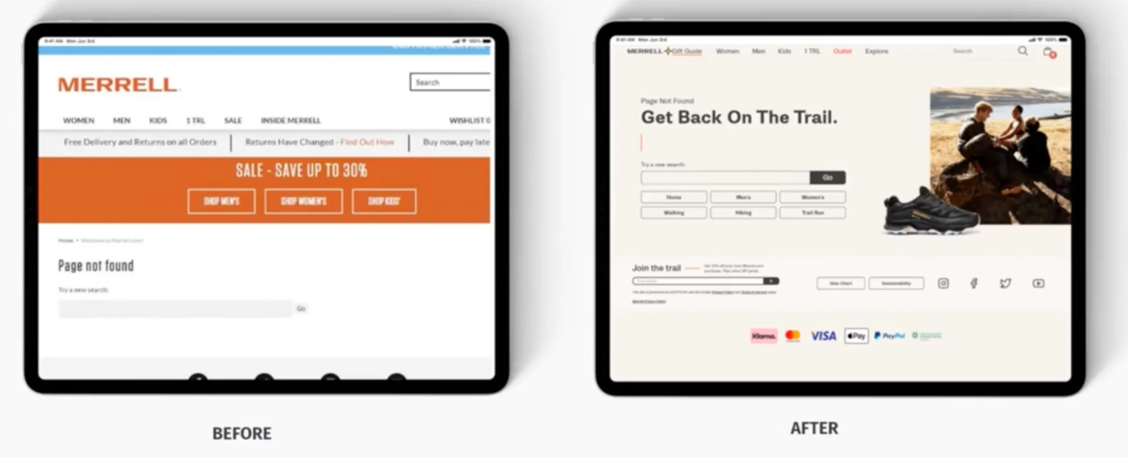
After deep-diving into the Merrell 404 error page, Louise and her team noticed that the customer experience didn’t match their brand, nor the other experiences across the site. They decided that a redesign of the original error page would be the right solution.
Louise says, “The first thing that stood out: if this was a user’s first experience with our brand, then no wonder they were leaving us. There was zero brand personality. And other than the search box, we weren’t giving them any other reason to stay.”
With a few simple changes thanks to these insights, they were able to make data-driven decisions to improve the performance of the page.
Louise explains they got insights by “looking at the journey of the customer that did stay on site after viewing an error page and combining that with some of the most visited pages.”
Armed with these customer experience insights, Louise and her team made the following changes to the page:
Selected 6 simple quick links to add to the page
Incorporated their brand tone of voice by adding a heading, inviting users to 'Get back on the trail'
Revamped the overall design of the page

The Merrell 404 page before (left) and after (right) optimization
The results
Based on these changes, Merrell UK saw significant improvements to the performance of the page. Louise explains, “We saw a -32% drop in exit rate and a -22% drop in bounce rate, saving us a projected lost revenue of just over £10,000 in revenue per annum.”
The team took all these learnings and applied them across every error page across all of their sites, resulting in a far greater impact across the entire Wolverine Worldwide group.

We were able to roll out this approach across all 3 of our brands: Cap, Merell, and Saucony, which spans across 38 regional sites meaning that the impact from that one alert was far greater than the numbers above.

What's next
Of course, the team didn’t stop at error pages. They continued learning from the original 404 error page use case and decided to use the same approach on their no result pages.
Using Contentsquare, the team was able to surface revenue-costing errors they wouldn’t have prioritized otherwise.
“It’s unlikely that a redesign of the error page was going to be high on our to-do list without this alert,” says Louise. “Everyone wants to focus on the big campaigns, but this really showed us that investing time on simple changes can make a big difference.”

