The company
Leeds Building Society (LBS) is a U.K. financial institution, helping over 800,000 members save and buy homes.
The challenge
When reviewing site performance, the digital team noticed their conversion rate was low compared to some of their competitors.
They decided to analyze user behavior and see if users were following the sales path as it was designed.
The solution
Using Contentsquare's Journey Analysis capability, they discovered users were moving from product pages to product homepages and back again—looping between the 2 before exiting the website.
The team hypothesized this behavior was caused by users trying to compare products. They decided to look deeper at the journeys of a specific segment: users arriving from comparator sites. They found many in this segment of users were leaving the website right after landing on a product page.
The team knew they needed to remove distractions in the acquisitions journey and provide a better approach to legal requirements vs. visitor experience in order to improve overall conversion.
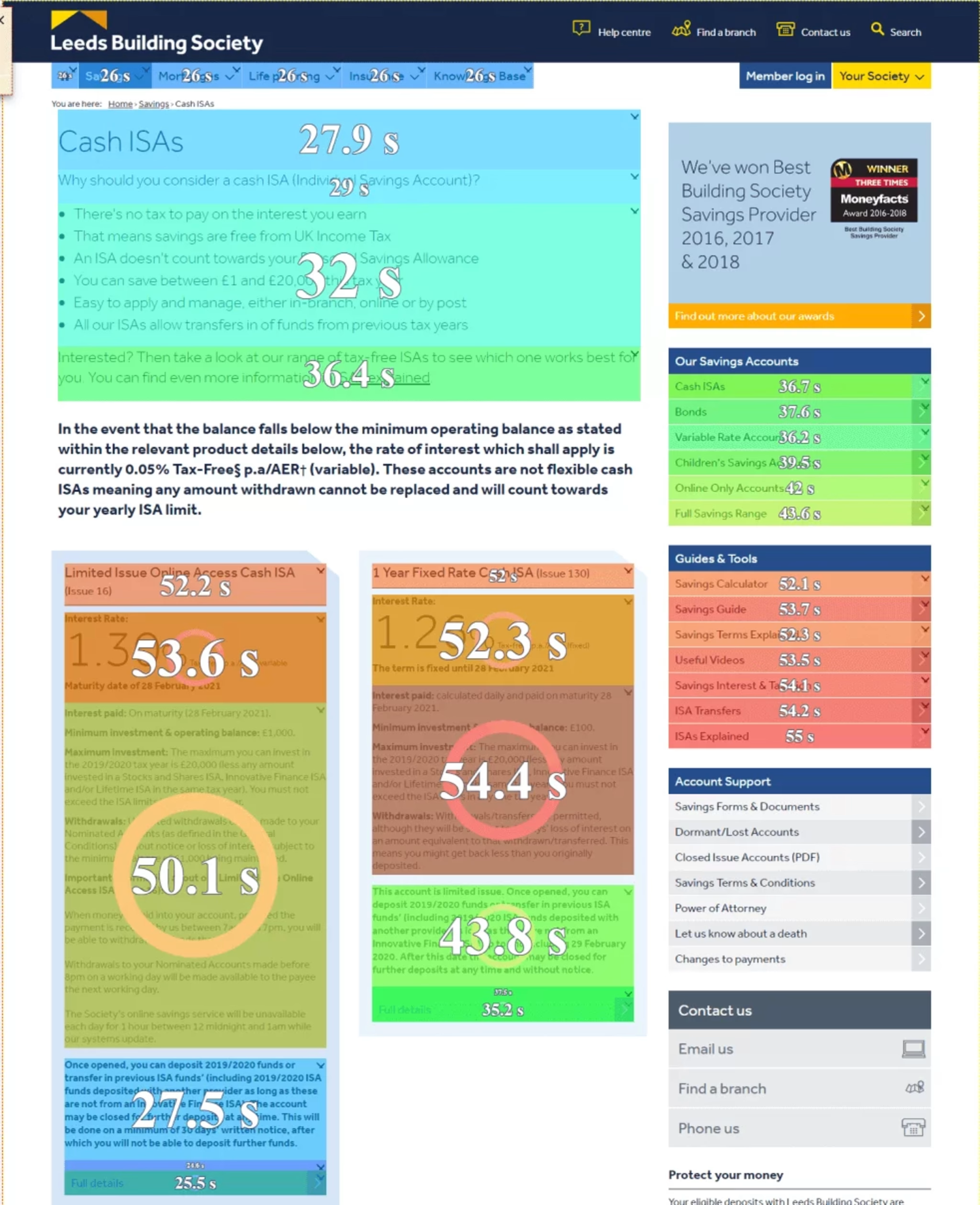
Using the exposure time metric in Contentsquare's Heatmaps capability, they identified which areas of the product page were interacted with the most, and which were causing frustration. They noticed users were spending a long time reading product pages, which were typically long and text-heavy.

Heatmap analysis on Leeds Building Society Cash ISAs page showing exposure time
The team presented this analysis back to their legal department, who were hesitant about simplifying the legal information on the product pages. But, by clearly showing the lack of user engagement on the page, the team was able to convince the department that the product pages needed restructuring.
As a result, the digital team
Redesigned their product homepages
Redesigned their product pages
Introduced a comparison tool

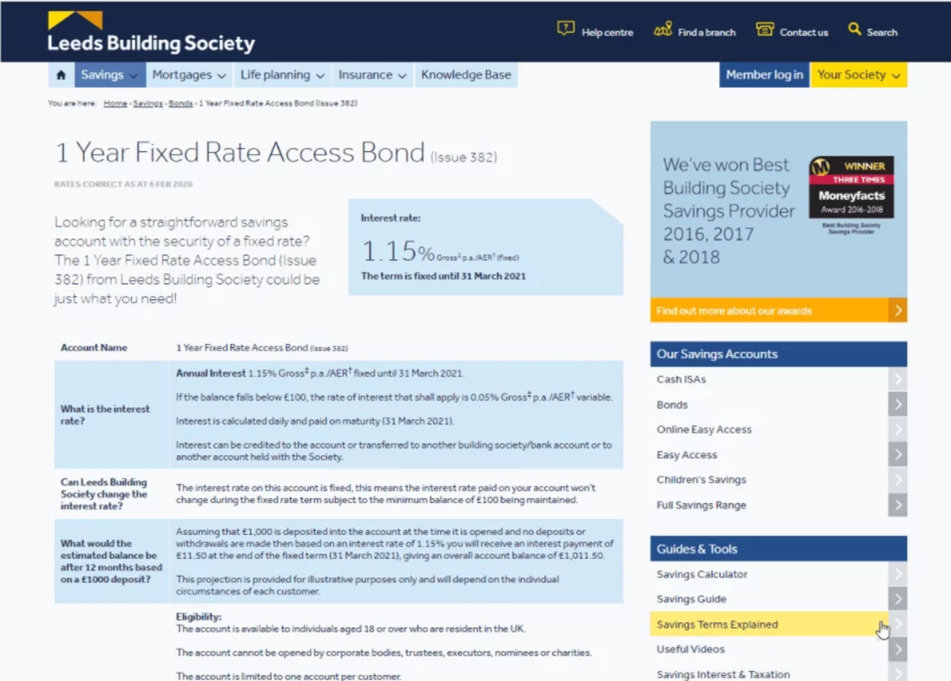
Leads Building Society's product page before redesign

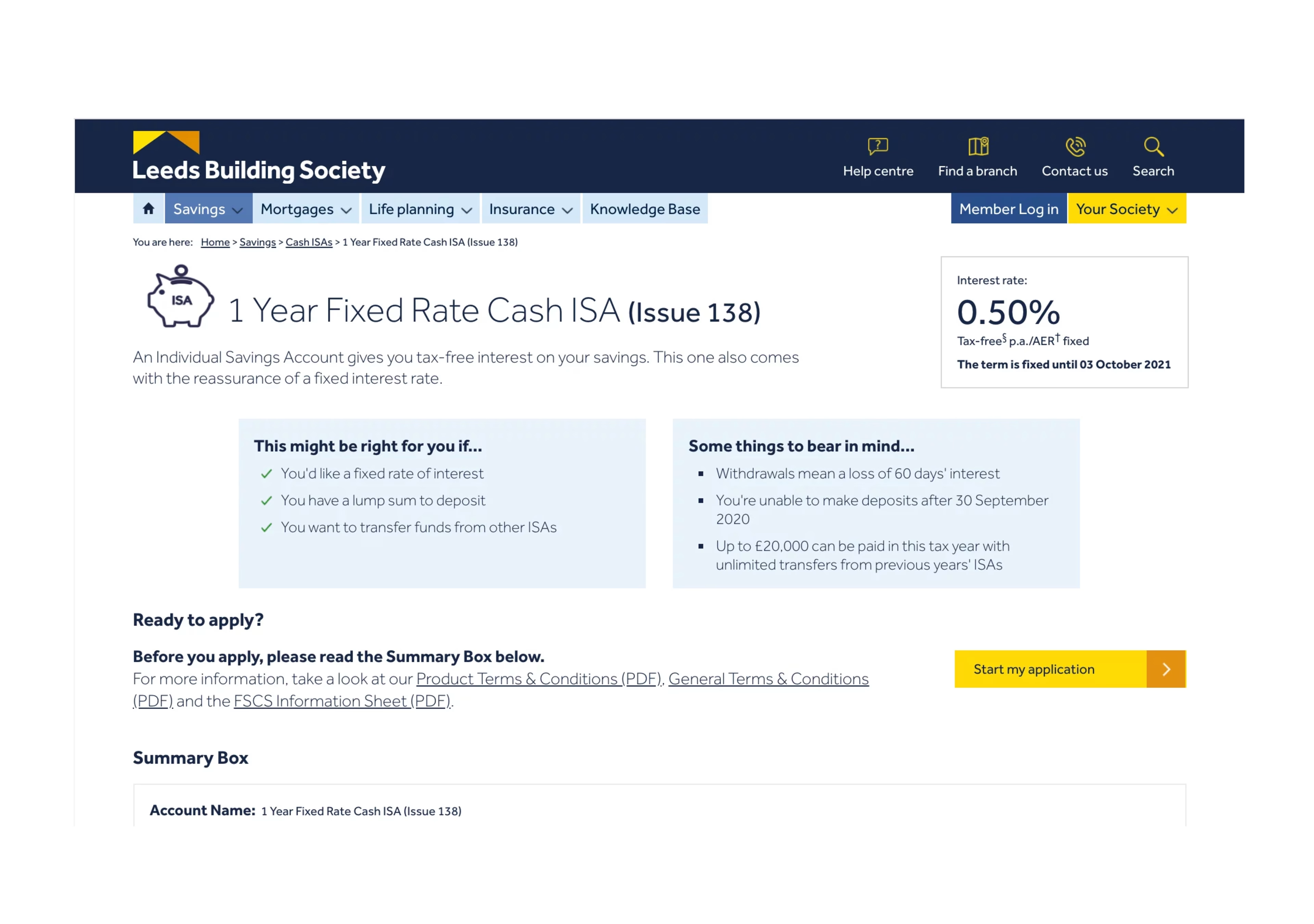
Leads Building Society's product page after redesign
The results
The changes led the average conversion rate of product pages to increase by +40% and for some product pages, that conversion rate increased by +80%.

As a UX designer, Contentsquare is one of the most important tools I have to make design decisions. I base much of my design work on the data I get from Contentsquare and then also use it to test whether my pages are doing what I thought they would. I use Contentsquare every day and I’d be lost without it. Also, the support we get as a client is amazing.

