The company
John Lewis & Partners is a British department store chain. Before joining the company as App Experience Design Manager, Antonio Arevalo was already an experienced user of Contentsquare’s experience intelligence platform—and a passionate advocate for user experience (UX) analytics.
From day one at John Lewis, Antonio made it his mission to spread platform adoption as widely and deeply as possible, knowing it would lead to many significant UX improvements.
Key metrics
+27.3% increase in engagement on campaign banners
4x more traffic to the John Lewis app from email
4x increase in Contentsquare users from 50 to 200 in 18 months
The challenge
Antonio’s ultimate goal was to foster a data-driven culture within the business, a culture in which teams can make better decisions with confidence, improve John Lewis’ digital experience, and drive better results for the business.
First, he had to get everybody on the same page, working with the same data—on the same platform.
But he had to start small—and began by onboarding the business’s UX design community.
The company’s designers had found the tool used prior to Contentsquare difficult to use, which made them the perfect team to start with. Antonio knew if he could get them to start using Contentsquare, benefiting from it and singing its praises, this would help build company-wide confidence in the platform.

Prior to Contentsquare, we were using a different tool at John Lewis and our designers struggled to adopt that tool. The main difference that Contentsquare brought was how easy it was to access insights and get people to the point where they're actually unlocking a lot of insights very, very quickly. That speed to insight comes easily as you upskill.

The solution
To optimize the use of Contentsquare across John Lewis, Antonio created a rigorous adoption and upskilling program.
Finding internal champions and helping them become super users was a key step in the program. Antonio called these champions ‘CS Ninjas’. They’re able to use the platform autonomously to unlock insights and to provide support to other users within the business, helping them leverage insights better.
This “creates the right conditions so that team members can have a ripple effect—that’s key,” says Antonio.
He also ran platform boot camps to incentivize learning and build user confidence. To qualify for John Lewis’ boot camp, users had to first pass key Contentsquare certification courses or reach other specific usage milestones.
Having successfully widened and deepened the use of our platform—from 50 to 200 users in just 18 months—John Lewis has made some impressive improvements to its digital journeys. Here are 3 great examples.
1. Generating 4x more traffic to the John Lewis app via email
Wanting to increase the number of customers who left reviews on the John Lewis app, Antonio used Contentsquare's Journey Analysis capability to understand the user journeys of customers who left a review. He then dug deeper to see which entry points to the app saw the highest review completion rate.
Antonio found that customers asked to write reviews via email had the highest completion rate of all channels. However, emails took customers to the web browser, not to the app.
The app experience team decided to link customers to the app via emails, hypothesizing this small change would drive more traffic and increase review conversions in the app.
Sure enough, the 'Write a Review' call to action drove 4x more traffic to the app than before, and up to 60% of all customer app reviews are now generated via the email channel.

John Lewis and Partners customer review journey from email to app
2. Driving a +27% increase in campaign banner engagement
Having launched one of John Lewis’ biggest members’ week campaigns, Senior Product Designer Shai Mistry set out to measure the impact of banners placed across the website.
He used Contentsquare's Heatmaps capability to understand user engagement and the platform's Impact Quantification capability to measure revenue contribution of users who interacted with campaign banners.
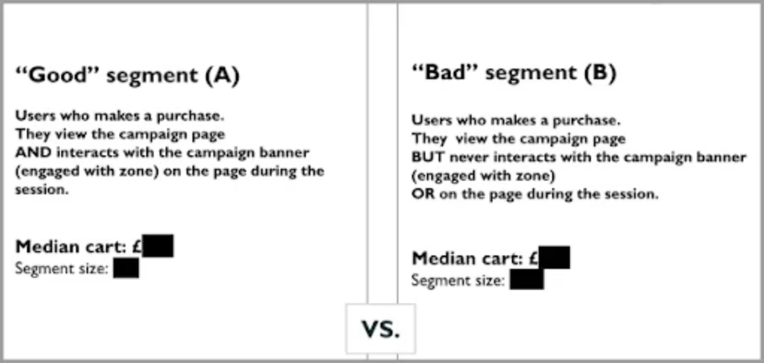
To pull off the latter, Shai compared 2 segments: customers who interacted with the banners and purchased in the same session vs. customers who didn’t interact with the campaign banners.
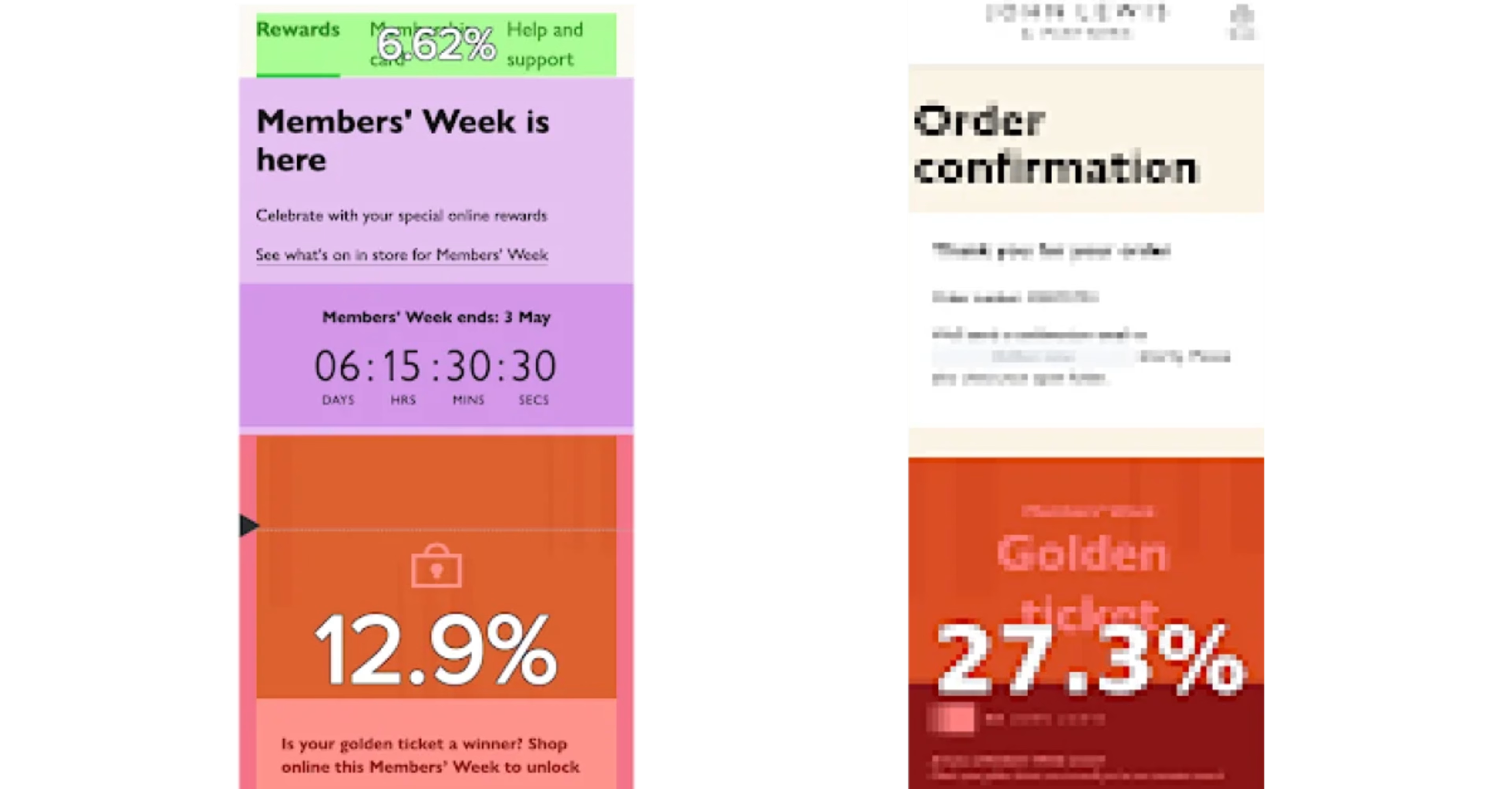
Heatmaps showed that overall engagement with the campaign and its touchpoints was higher than expected.

Heatmap analysis on John Lewis’s biggest members’ week campaign
The analysis showed campaign banners drove up to 4x higher engagement (between 12.9% and 27.3%) than they had targeted (7%). What’s more, customers who engaged with the campaign also had significantly higher average order value (AOV), revealing a potential revenue loss if the campaign banners weren’t shown to users.
Shai Mistry was able to use these insights to communicate campaign results effectively to stakeholders and make the case for placing more banners in other areas of the site.

The good segment (on the left) and bad segment (on the right) with the impact on potential revenue loss identified via Impact Quantification.

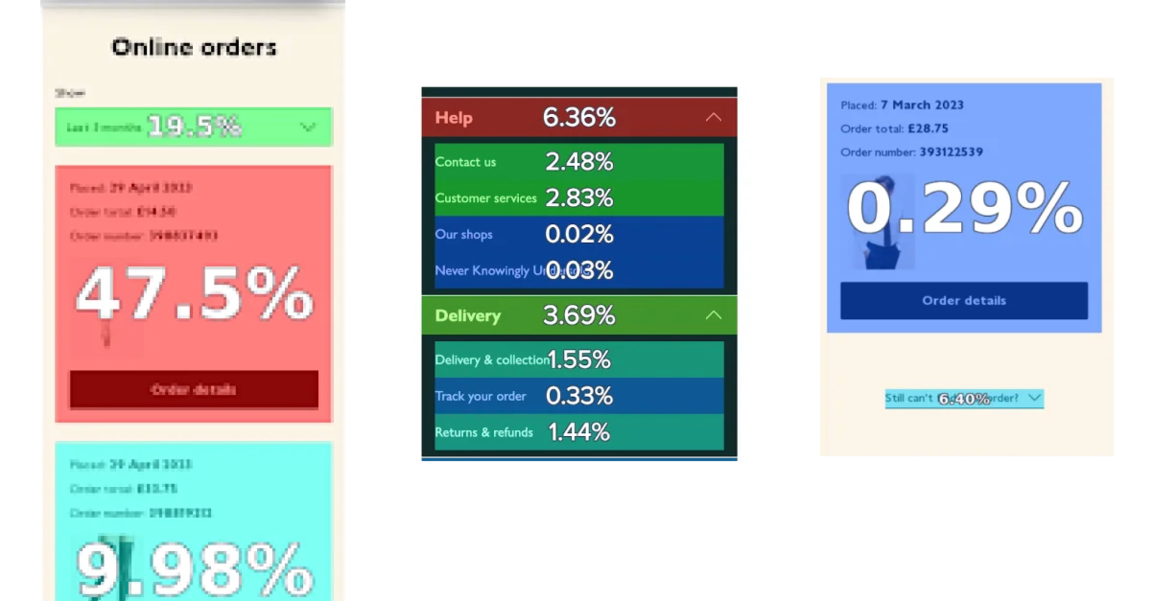
Tap recurrence in Heatmaps on the order details section (on the left), click rate on the ‘help’ and ‘delivery’ links (in the middle) and the ‘can’t find the order they’re looking for’ link (on the right).
3. Improving the post-purchase experience on app and web
Sophie Skinner, former UX Designer at John Lewis, used our platform to investigate possible ways to improve the post-purchase experience in both the app and on the website.
Using Heatmaps to understand the tap rate and tap recurrence for different delivery types, Sophie discovered that 60% of interactions on the 'Order Details' page were on recent orders.
Customers repeatedly clicked on calls-to-action (CTAs), such as 'Help and Delivery', with 6.4% of customers clicking on 'Can’t Find My Order'. All of this suggested that customers were struggling to find what they were looking for.
“All of Sophie's work really helped the team focus on how they can help our customers find what they're looking for during post-purchase missions,” Antonio explains.
The results
As a result of using Contentsquare, John Lewis has significantly increased its speed to insight. The UX design team specifically has used Contentsquare data to create and prove significant customer experience improvements, leading to
4x increase in Contentsquare platform users from 50 to 200 in just 18 months
4x more traffic to the John Lewis app from email
+60% of app reviews now generated via the email channel
+27.3% increase in engagement on campaign banners, 4x higher than the target

By upskilling our designers in Contentsquare, we gave them the confidence to get the most out of the platform, and this has unlocked the opportunity to democratize data across the organization, making it more accessible and actionable for everybody.


