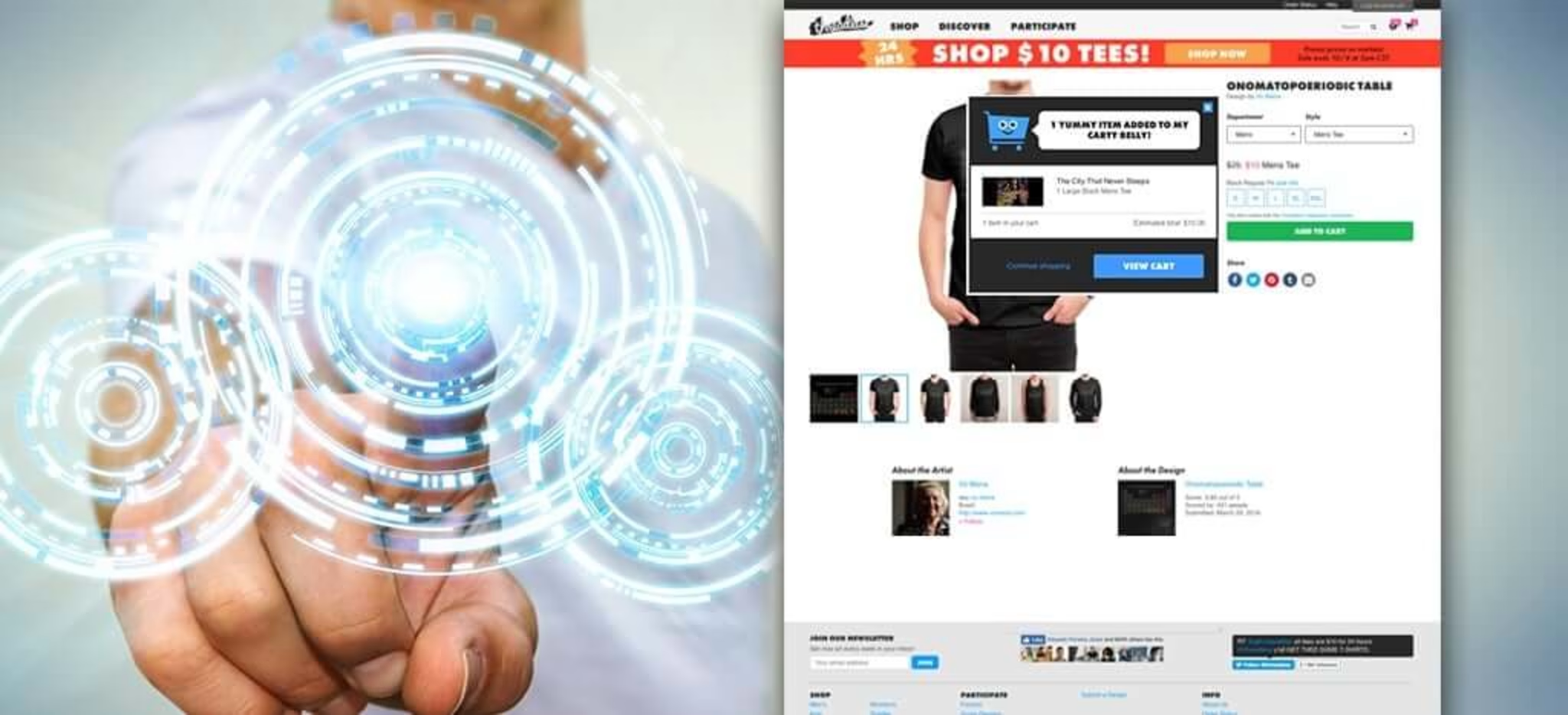
In the UX Spotlight series, I post weekly on UX features that impressed me online, and are great examples and inspiration for anyone looking to enhance their digital user experience.
Checkout is the moment of truth for eCommerce sites. Your customer journey has brought shoppers this far – can it bring them all the way to conversion?
MORE THAN HALF OF SHOPPERS ARE INTERESTED ENOUGH TO PUT AN ITEM ON THEIR CART, BUT THEN SOMETHING STOPS THEM FROM TAKING THAT ITEM HOME.
Statistics vary, but overall it seems the shopping cart abandonment rate is about 60%. More than half of shoppers are interested enough to put an item in their cart, but then something stops them from taking that item home. One of the most direct ways online stores can boost their bottom line is by improving their checkout process and getting interested customers to convert.
This week I look at several different companies improving their checkout process in three key ways: Fun, efficiency, and added value.
1) Fun
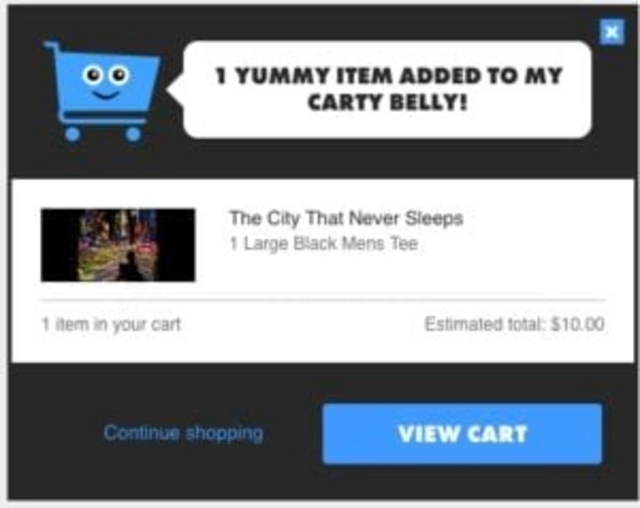
You know when waiters say “good choice” when you choose your lunch, and it affirms you and heightens your anticipation for your meal at the same time? Buying online should offer shoppers similar feedback when they pick out an item.
Threadless, a trendy t-shirt company that sells customer-designed, customer chosen apparel, is a great example of this tactic applied to eCommerce. When you add a shirt to your cart on Threadless, your cart thanks you in a quirky way.
The cart even winks or licks its lips!
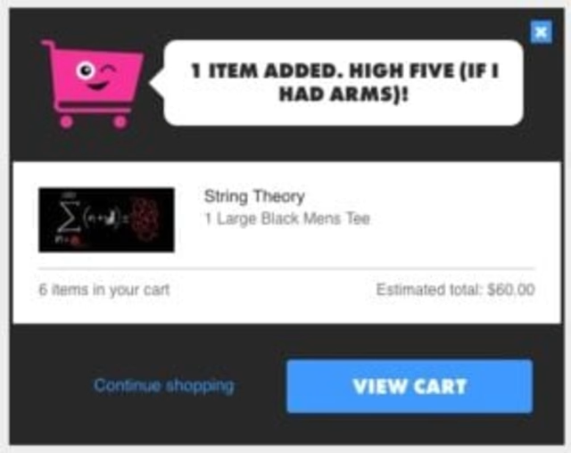
It’s unique touches like these that make shopping memorable. And with a quirky product line like Threadless’s, it only makes sense. Every step in a digital experience should fit the tone of the brand, so even an add-to-cart popup should be part of the immersive customer journey. Besides, this kind of immediate feedback encourages customers to continue, because their actions produce an instant reaction, and they’ll want to see what happens next.
2) Efficient
In a survey of why customers abandoned their carts, 23% of them said it was because they were forced to create a customer account, and they preferred to jump ship than to go through account creation.1
A guest checkout option is imperative in today’s eCommerce environment, especially because 60% of shoppers are now browsing on mobile, and creating an account is beyond cumbersome with your thumbs on a touch screen. By forcing customers to register, you are pushing them away.
Many sites offer two options when entering checkout: to proceed as a guest, or to login to an existing account.
Threadless nails it again, with the rising trend of defaulting to guest checkout while giving the option to login:
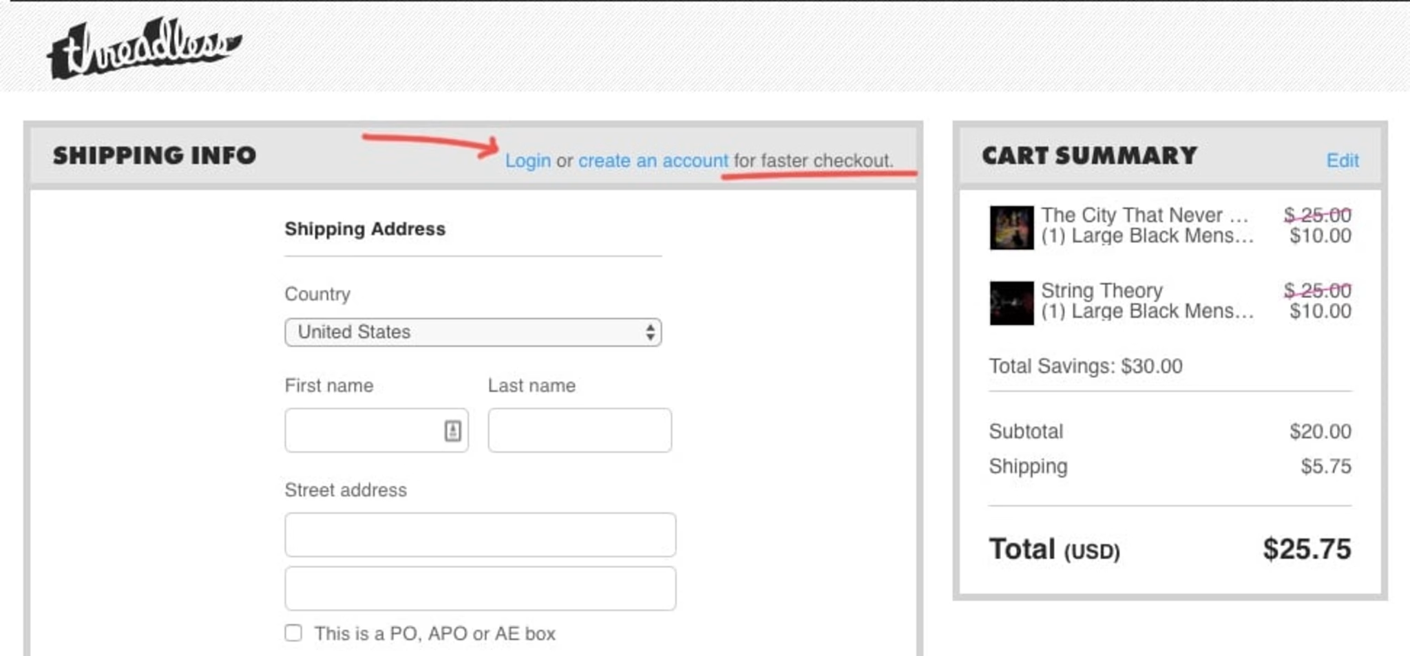
Threadless’s entire checkout process is condensed onto just one screen, making the light at the end of the tunnel seem much closer and more attainable. If the checkout process is a sprint, then each step is a hurdle. Removing the login/guest choice and going straight to data entry is removing a hurdle and bringing your sprinting shopper one step closer to conversion.
Another brand pioneering simplicity and efficiency in customer journeys is eyewear retailer Warby Parker. When it comes to filling out that data, Warby Parker’s approach is notable due to its highly responsive auto-fill option, which can guess a complete address after just a few characters.

3) Added value
But check-outs can offer more than simply speed and convenience. In fact, British appliance retailer AO.com offers additional value during their checkout, helping shoppers achieve a more streamlined customer journey while potentially increasing their cart value.
For starters, when viewing the cart, AO offers checkboxes for additional features that could help that customer. When I tried to check out with a smart TV, for example, AO asked if I also wanted help with installation or old appliance removal, and made it easy for me to accept that assistance:
Offering extra services makes shoppers feel like everything is taken care of, and there’s nothing else to worry about.
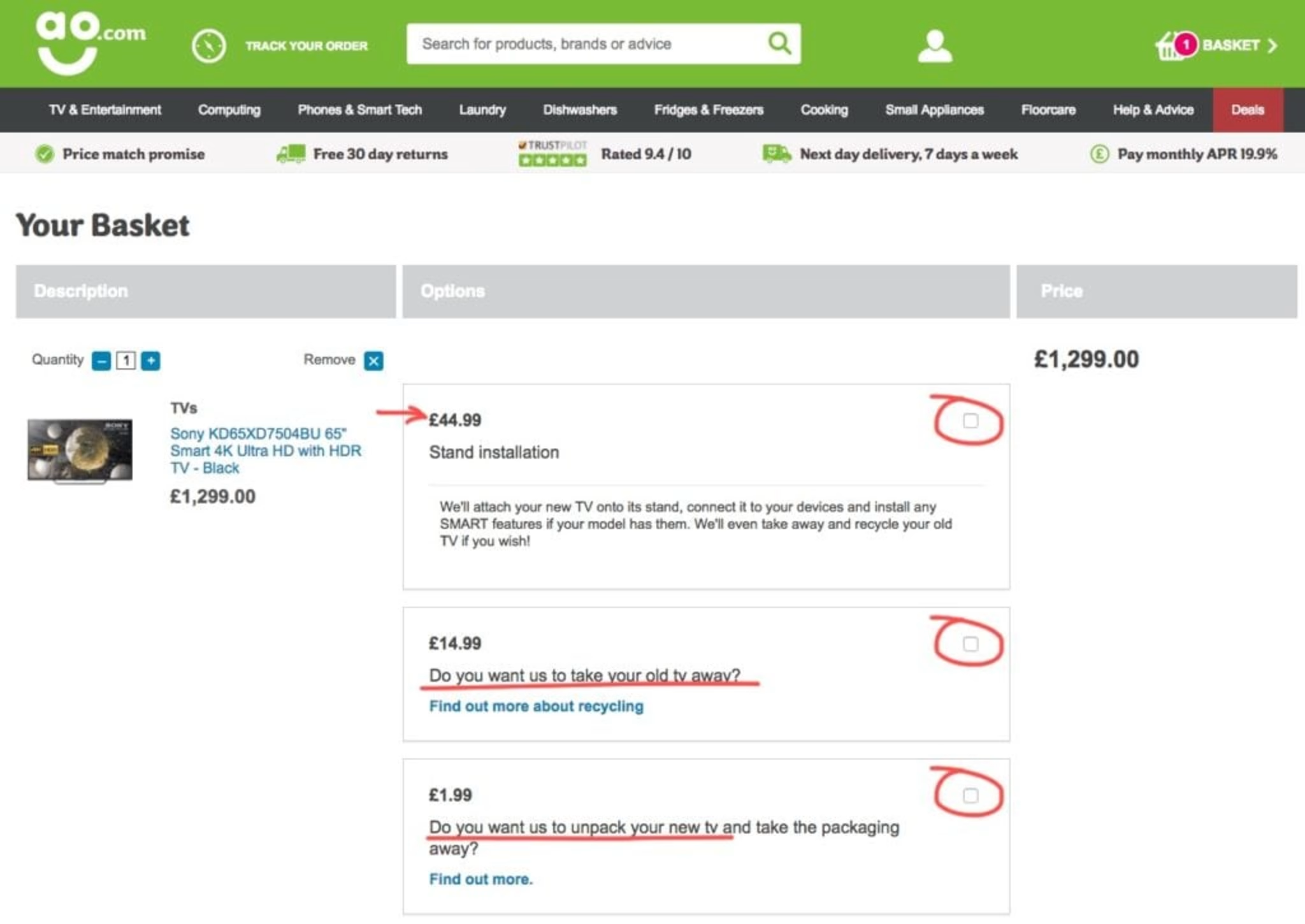
OFFERING EXTRA SERVICES MAKES SHOPPERS FEEL LIKE EVERYTHINGIS TAKEN CARE OF, AND THERE’S NOTHING ELSE TO WORRY ABOUT.
This not only upsells, it also eases any concerns a customer might have about all the nitty-gritty details that might go with a major purchase like home electronics. Offering extra services makes shoppers feel like everything is taken care of, and there’s nothing else to worry about. Furthermore, AO uses friendly, accessible language throughout their checkout process. Instead of technical legalese, they speak to the shopper like a salesperson would in the store, which is exactly the role of a good digital experience.
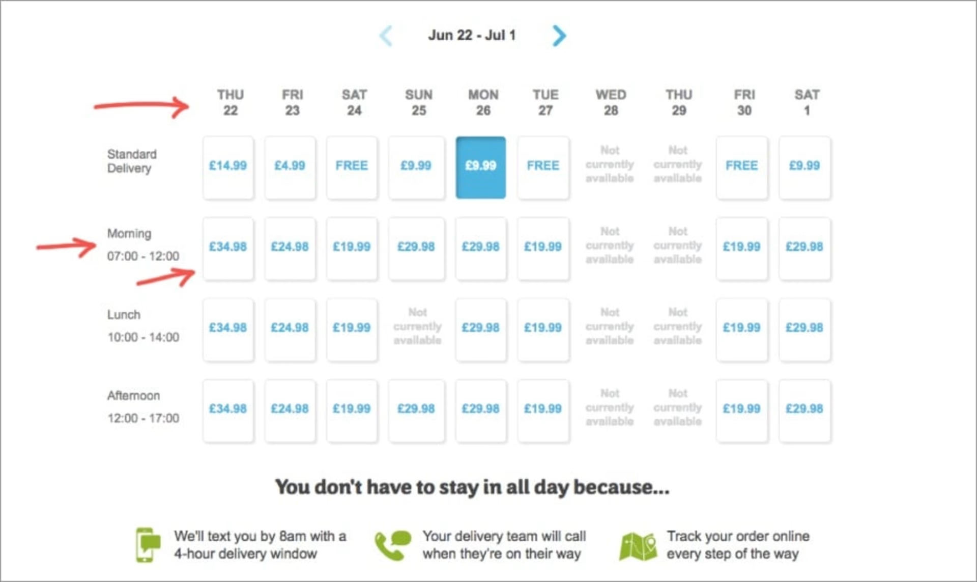
AO also goes above and beyond when it comes to shipping, which is key, because unexpected shipping costs are another notorious checkout obstacle. They allow customers to choose a delivery date and time, transparently showing the prices for each.
AO also enables online order tracking to calm impatient purchasers while their item is on the way.
The Impact:
The proof is in the purchases. Case study after case study illustrates how streamlining the checkout process increases conversion.
For example, in an A/B test, Electronic Path Software found that its conversions increased by 21% when it shifted from a multi-step to single page checkout process.2
Similarly, a Strangeloop test found that conversions declined by 60% when a page loaded 2 seconds slower. Speed is king when it comes to checkouts!3
And ASOS increased their conversions by 50% when they stopped forcing customers to register before they could complete their order.4
It’s clear that taking a few small steps towards a more helpful and less strenuous checkout process could mean major benefits when it comes to conversion.
The Takeaway:
What’s important to note about each of these examples is that they cater to the needs of their particular audience. By and large, shoppers on Threadless might be looking for a fun and simple shopping experience. Those looking for new glasses on Warby Parker are looking for function combined with design flare in both their eye-wear and their customer experience. And customers making a major appliance purchase on AO want to know they have all their bases covered when it comes to their major purchase, and that receiving it won’t be a hassle. Who is your customer? What are they looking for as they check out?
As web analytics become more sophisticated, we have the ability to understand that even the same customer might have different needs on different visits. The next step in the evolution of a superior checkout experience will cater the process further, to meet customers’ particular needs at the time of their purchase, and make conversion the obvious and simple choice!
Resources:
1 – https://www.clickz.com/checkout-best-practice-101-guest-checkout/98289/
2 – https://blog.lemonstand.com/9-case-studies-for-optimising-your-checkout-conversion-rate/
3 – https://blog.lemonstand.com/9-case-studies-for-optimising-your-checkout-conversion-rate/
4 – https://blog.lemonstand.com/9-case-studies-for-optimising-your-checkout-conversion-rate/
Pola is ContentSquare’s Director of Content. A storyteller at heart, she is fascinated by how the right content has the power to connect people to people, ideas and brands.
