In the UX Spotlight series, I post weekly on UX features that impressed me online, and are great examples and inspiration for anyone looking to enhance their digital user experience.
It used to be that technology was considered superior based on its level of “responsiveness.” But these days, it’s not enough to be responsive – you’ve got to be preemptive when it comes to your customers’ needs and their next moves. Staying one step ahead of your shoppers and providing the answers before they ask the questions is like taking them by the hand and leading them straight to conversion. This is especially true in competitive markets in which the best price is often the deciding factor for when shoppers will choose one retailer over another.
IT’S NOT ENOUGH TO BE RESPONSIVE – YOU’VE GOT TO BE PREEMPTIVE WHEN IT COMES TO YOUR CUSTOMERS’ NEEDS AND THEIR NEXT MOVES.
This week, we highlight the clever little ways online retailers Curry’s and AO.com anticipate the needs and actions of their customers and take preemptive measures to keep them satisfied and on-site.
The Impact:
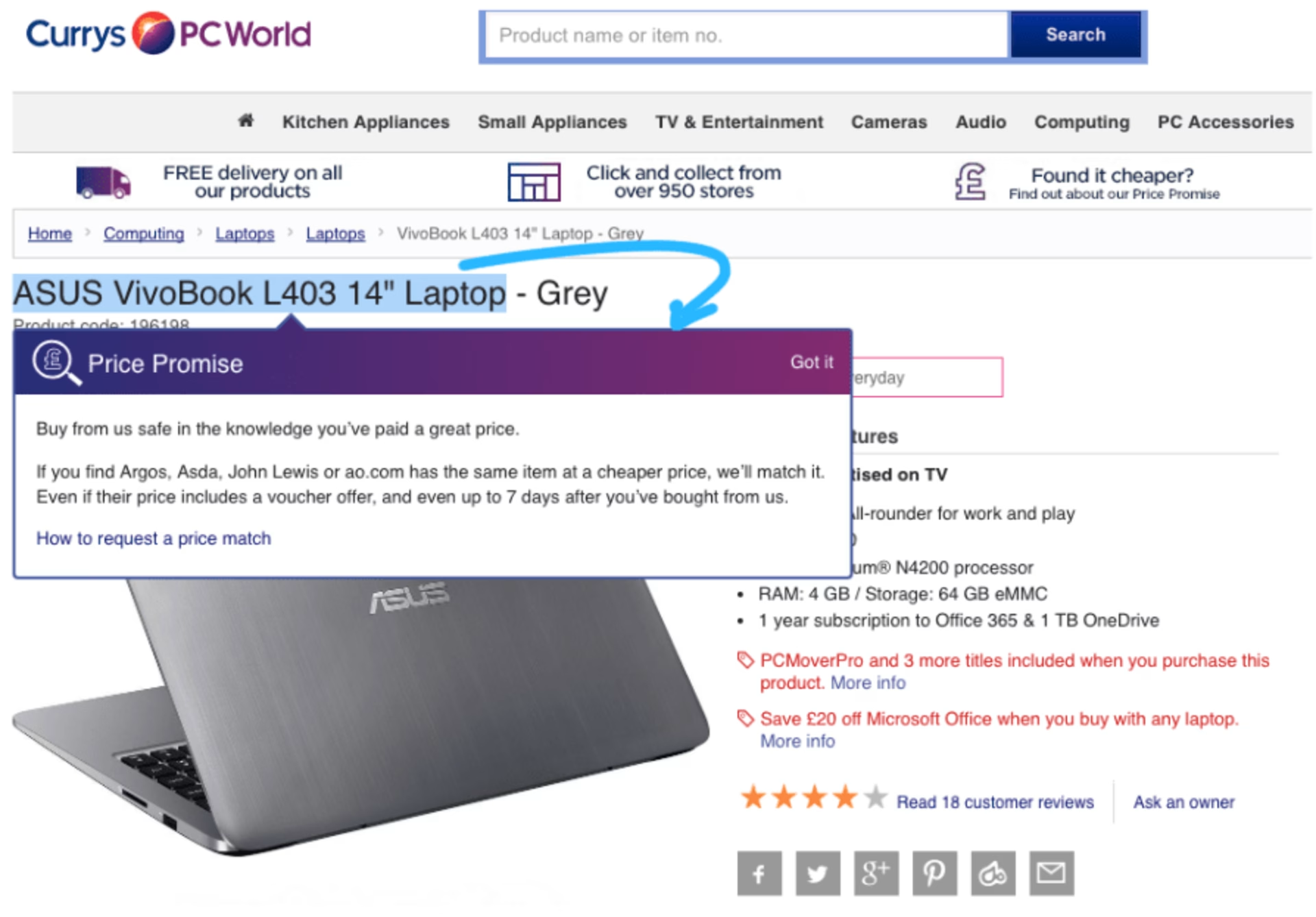
British electronics superstore Curry’s knows that people looking for new major electronics like computers or appliances are usually hunting for the best deal. If a customer is on a Curry’s product page and highlights and copies text like the product name or model number in order to search for pricing elsewhere, a purple box pops up informing the shopper that Curry’s offers price matching and providing them with the link to their price matching procedures. They even mention specific competitors they suspect customers will turn to next.

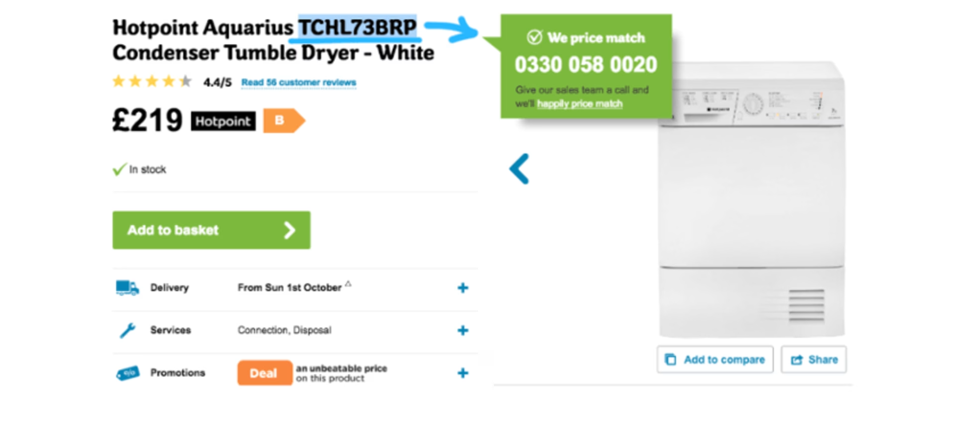
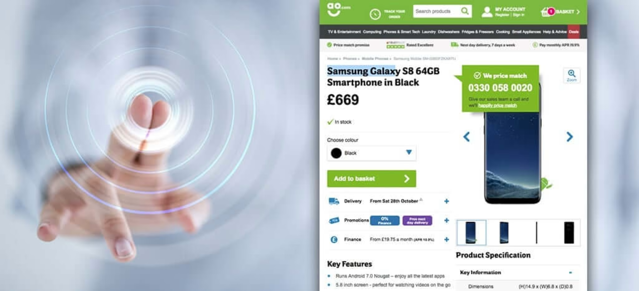
Interestingly, AO.com, one of the competitors Curry’s lists in their popup, has a similar feature. AO is known for interesting UX features, as we’ve discussed in the past. In AO’s case, merely highlighting a model number (no copying required) prompts a green popup with a number to call and a link to their price matching policy.

The Takeaway:
Both Curry’s and AO demonstrate ways in which you can anticipate possible reasons a customer might exit your website and beckon them back in before they stray. They know that price comparison is a major factor in their industry, and aim to head customers off at that pass. The price comparison popups will either convince customers that they must be getting the best deal since the store features competitive pricing, or remind them to come back to that retailer if they happen to find a better price. This is win-win for the retailers. But more than that, the fact that Curry’s and AO read a model # highlight and understand what that means in terms of customer intention demonstrates an intuitive, and oddly charming, familiarity with their customers’ needs that is winsome to say the least.
What are your customers’ pain points? (Hint: Unexpected shipping costs lead to 28% cart abandonment, so transparency is a good place to start your UX tune ups!) Next gen analytics can show you exactly what’s holding them back or prompting their exits from your site. Once you know where they get caught up, you can plot your own guerilla digital experience “wow’ moment!
Pola is ContentSquare’s Director of Content. A storyteller at heart, she is fascinated by how the right content has the power to connect people to people, ideas and brands.
