Whether you’re exploring custom chatbots, browsing third parties, or looking to improve your own chatbot design, it’s good to know what kinds of UX requirements you need beforehand.
Exploring chat options can be daunting but here are some UX considerations for when refreshing or building your chatbot design.
How to nail your chatbot design
Be conscious of the size and placement of chat sticky elements
We don’t typically recommend using sticky chat elements, but if this is a must for your company, these elements should take up a minimal amount of space and appear unintrusive.
The chatbot design should also be adjusted for mobile as the smaller screen can lead to sticky chat elements covering key page information or actions. Nothing is more frustrating for a user than being unable to interact with the page because the sticky chat element is blocking their view and they don’t know how to access the page behind it. Check your pages on different devices to see what your sticky chat element may be covering.

The sticky chat element on desktop remains minimal and unobtrusive in the bottom right corner.

On mobile, the sticky chat element is adjusted to show only the icon rather than the icon and copy. This small size helps to decrease the likelihood of it covering key page information.
Keep the chat feature accessible without relying on a sticky chat element
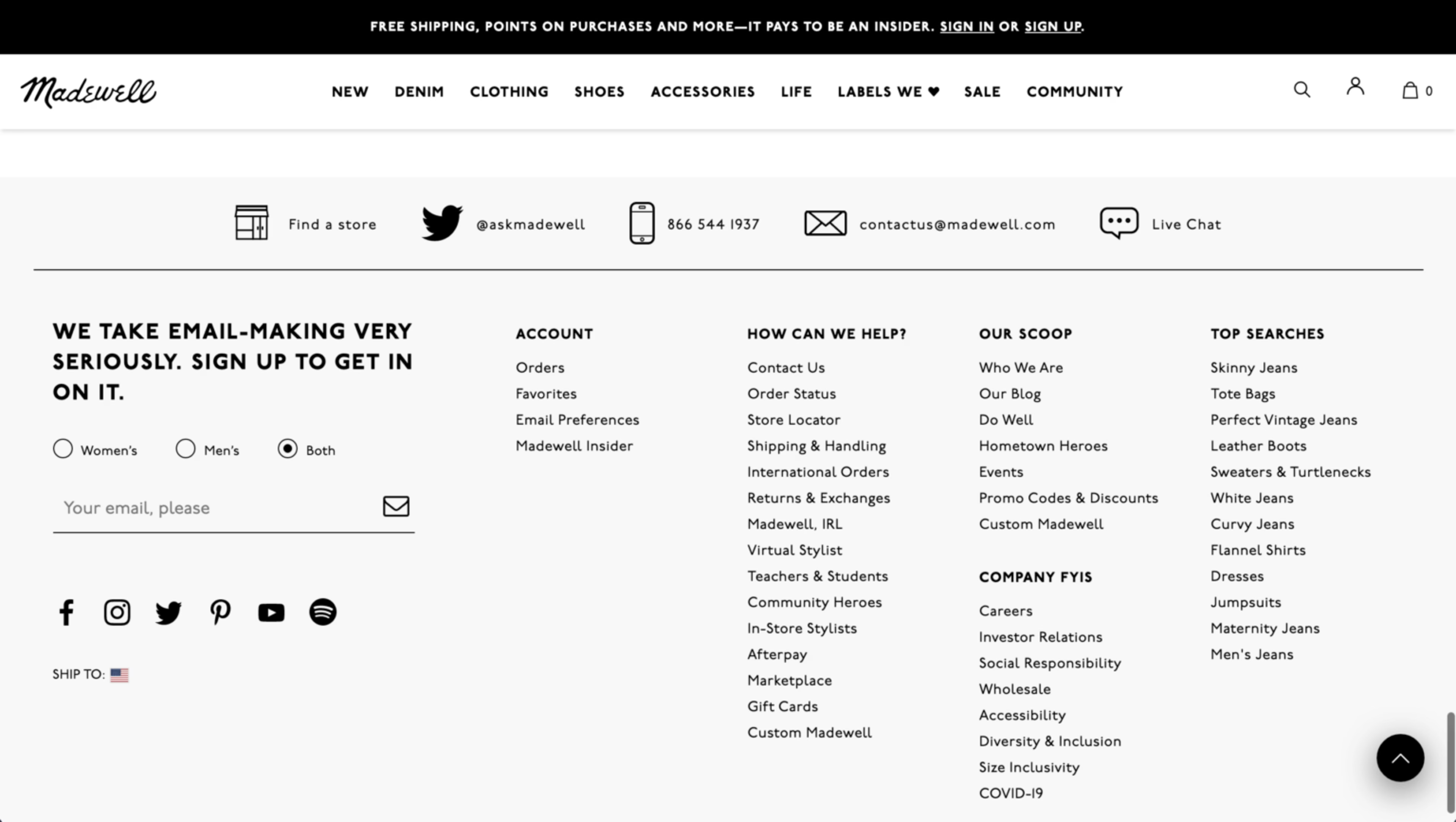
Regardless of whether you use sticky chat elements or not, keeping static links to the chat on relevant pages – as well as in the footer and navigation – makes it easy for users to find and use this feature themselves.
Intersperse static links at the end of FAQ or policy content in case the user needs more information.. Place live chat links in the footer on desktop and in hamburger menus on mobile sites too, as this is where most users will look for it if a sticky option is unavailable.

Various forms of support including a static link to live chat can be found at the top of the footer.
Avoid non-user initiation of chat dialogs
Users typically express the most frustration when unwanted pop-ups, overlays, or dialogs appear uninitiated, leading to disruption of the experience. The same goes for chat dialogs and prompts. So a key thing to keep in mind for your chatbot design is allowing users to initiate the chat themselves when they are ready for help.
If prompting the chat is a must for your team, then avoid initiating chat dialogs in the middle of the screen, and allow the user to interact with the page behind the overlay. Keep the dismissal button of the chat dialog easy to see and tap, keeping the tappable/clickable area reasonably visible.

On desktop, a very minimal chat prompt is visible next to the main sticky chat button. However, it disappears as the user scrolls down the page to avoid disrupting the experience.
Encourage users to search for information with an FAQ or navigational assistant prior to using live support
Encourage users to engage with an assistant to help with common issues without having to wait for a live representative. Only when users indicate they need more help, should you connect them directly to a live representative. Of course, virtual call center software helps complete fewer tasks manually, but make sure you don’t lose the human touch.
This helps reduce the number of call center requests, as well as providing immediate relief to users with simple-to-fix issues. And remember, make it clear to the user when they are interacting with an assistant versus live support.

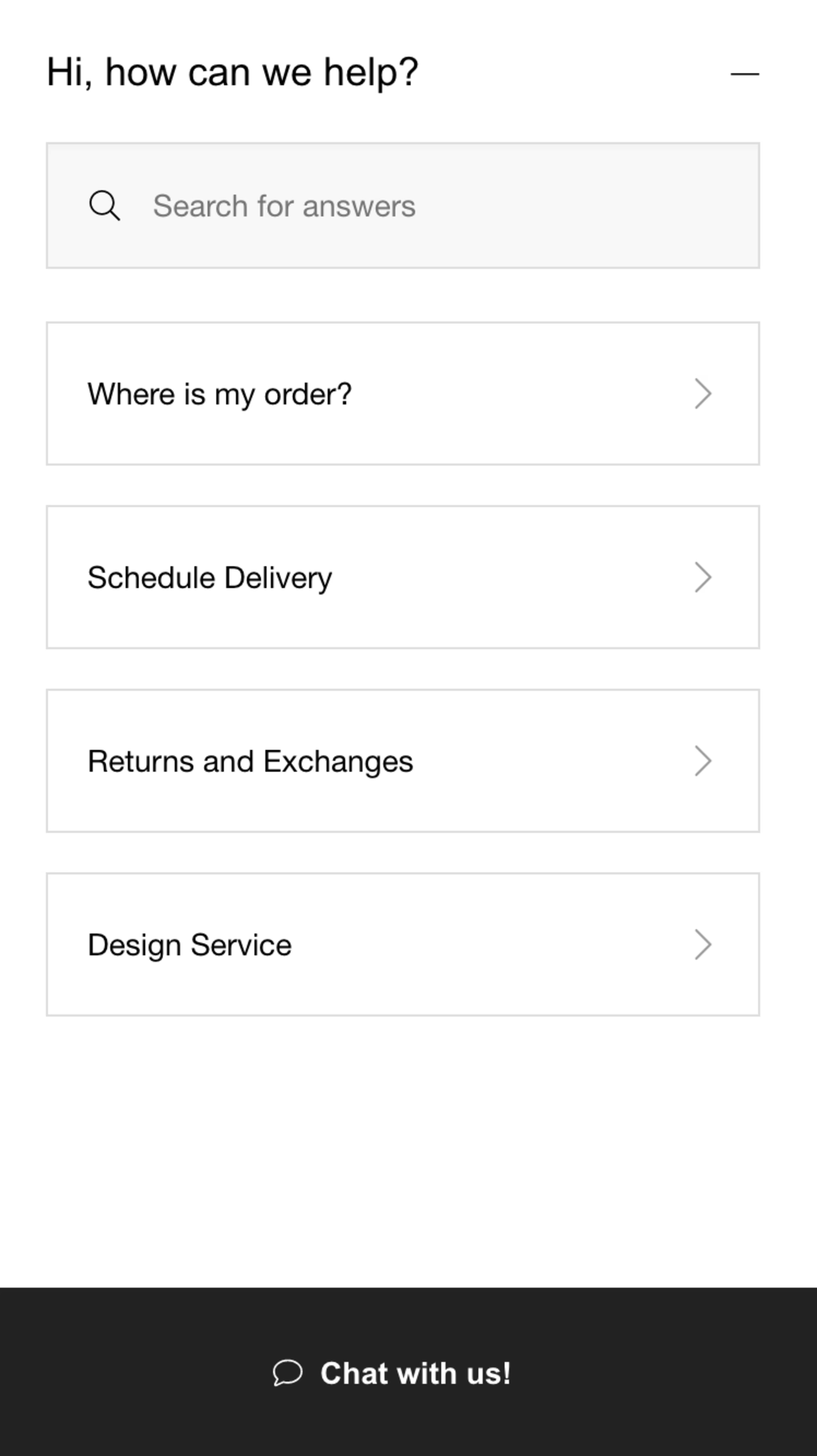
The same is seen on mobile; the chat dialog takes up the full screen so that it is easy to interact with.
Be clear about how the user should engage with the chatbot, and adjust messaging for offline hours
When initiated, provide immediate instructions on how to use the chat. Another great way to improve your chatbot design is by providing the user with pre-determined suggestions, topics, or common issues to narrow down the problem and speed up the support process.
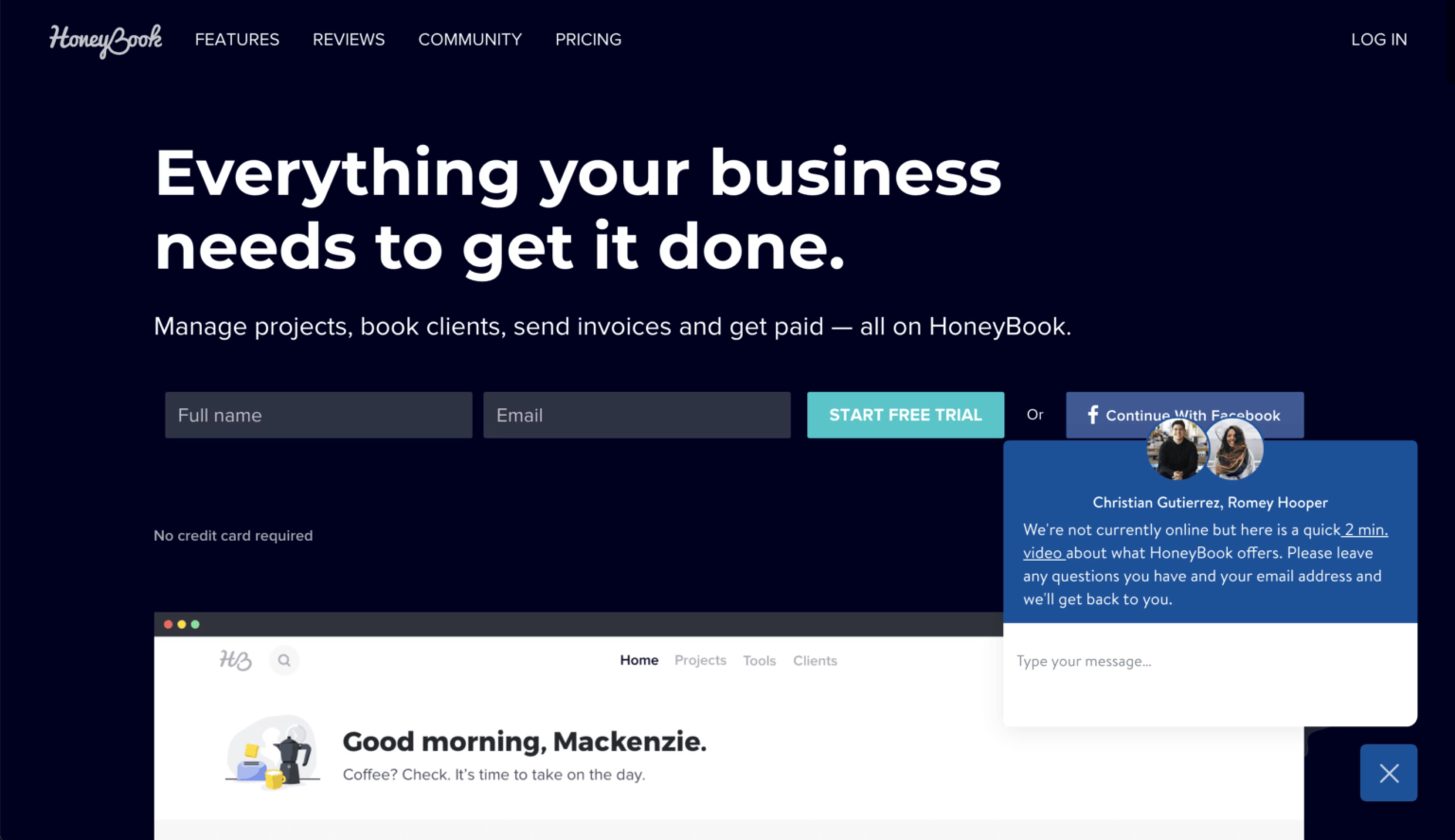
During offline hours, allow the user to ‘leave a message,’ instead. Prompt them to leave their name, email, and describe the issue so they feel satisfied their issue will be dealt with once support comes back online.


When the chat is operating during offline hours, the user is encouraged to watch a helpful video on the product or leave any questions and their email address so the team can get back to the user the next business day.
Assisted and live chat can be complicated as there will always be a varied range of issues the users can bring up. However consistent and well-guided interactions help to create a smooth experience for users who are already frustrated.
Discover Botnation’s chatbot design templates.
Remove customer friction with Contentsquare
Find out why your customers behave the way they do with our industry-leading customer experience analytics platform. Use our Session Replay feature to understand why customers may not be interacting with your chatbot design, or discover your most profitable digital paths with in-depth Sunburst visualizations, covering data from 100% of your customer journeys.
Michelle is a UX/UI Designer who loves finding design solutions that marry both business and user needs. When she’s not designing, you can find her pursuing yet another new hobby, visiting a museum, or laughing a little too loudly somewhere in the distance.
