![[Visual] [Guide] [Website problems] UX](http://images.ctfassets.net/gwbpo1m641r7/6sCdr7tgpmKWNqCOBJzZ9b/8454190a5a225d760e2cdca047e573fe/pexels-god-picture-369194295-28917763.jpg?w=3840&q=100&fit=fill&fm=avif)
Crafting a user experience (UX) that feels effortless and intuitive is the dream—a website that not only looks great but keeps visitors engaged all the way to conversion. But even the best designs can hide sneaky UX pitfalls that cause users to bounce before they’ve even scrolled down your homepage.
In this article, we explore 7 common UX website problems and how to prevent and fix them. By the end, you’ll have the tools to build and maintain a website that’s not just functional but a joy to use, keeping your customers coming back for more.
7 common UX website problems to avoid
Poor UX design makes it hard for users to accomplish what they arrived on your website to do—whether that's buying a specific product, signing up for a free trial, or subscribing to your email list. Even if they ultimately achieve their goal, your target audience may feel frustrated or confused, and hesitant to return.
On the flip side, good UX design puts the user and their needs front and center. This calls for an empathetic approach rooted in data. When you rely on hunches and your own assumptions, users won't get what they need—and may decide to look for it on a competitor’s site instead.
Let’s look at 7 common UX problems on your website (and how to solve them) to create happier users and more conversions.
1. Cluttered or complicated UI
A muddy user interface (UI) design, filled with too many buttons, containers, and links, creates unnecessary friction. When it’s unclear what step visitors should take next, they may become frustrated with the experience and leave.
Instead, you want to make your website as easy as possible for your visitors to navigate by minimizing the visual clutter and the number of clicks they need to convert.
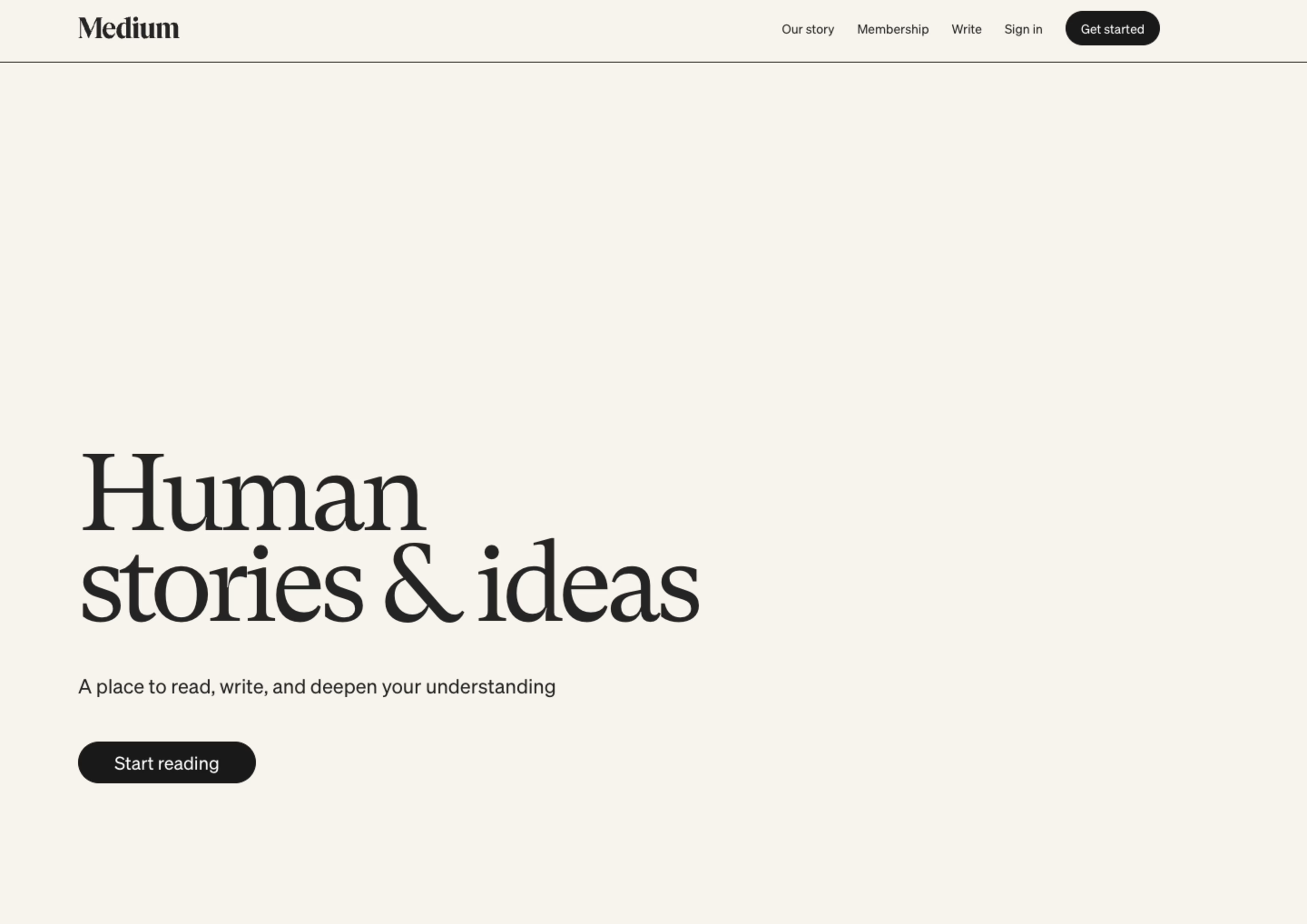
Medium knows that visitors want to explore articles. Above the fold, they offer plenty of negative space and two simple ways to get started: click a button or go straight to the top six trending pieces
Every element distracts from all other elements. Less is more.
Try these 3 tips to create a clean UI and exceptional UX:
Map the customer journey: creating a customer journey map lets you see each touchpoint a customer has with your business and your site, helping you empathize with the user. Then, you can streamline the UX to meet user needs and provide the fastest and easiest route to conversion.
Include white space: providing enough white space, also known as ‘negative’ space, offers a resting point for visitors’ eyes, bringing some calm and clarity to the UX. It also lets other important elements, like a key call to action, pop on the page.
Use icons: while text and photos add information and interest to your site, simple icons serve the same purpose with less visual distraction for your users. You can use classic icons, like a magnifying glass for a search bar, or get a little more creative. (If you choose to go the latter route, watch session replays to ensure users recognize these symbols and understand what they should do next.)
💡 Pro tip: use Contentsquare’s Session Replay tool to observe how users engage with your custom icons. Pinpoint moments of confusion or hesitation to ensure your creative designs are user-friendly and guide visitors seamlessly through their journey.
![[Visual] Experience Analytics - AB Test Session Replay](http://images.ctfassets.net/gwbpo1m641r7/6B0G5JrPHs7GYx3UTU4sm9/dd0a6aa32cad72ad6a6b087dcd21e816/Experience_Analytics_-_AB_Test.png?w=1920&q=100&fit=fill&fm=avif)
Contentsquare’s Session Replay tool lets you see how users respond to your website design
2. Problematic pop-ups
Ah, the pop-up. We’ve all experienced an email capture form blocking our view just as we settle in to use a website. Pop-ups can become an unwelcome game of Whac-A-Mole for your site visitors as they quickly try to ‘x’ out of them—or bounce altogether.
But pop-ups also increase conversions. According to Optimonk, the conversion rate for pop-ups in 2025 was 11.09%, and the top 10% of forms converted at 42.35%. So, what can you do to leverage the effectiveness of pop-ups while dodging poor website UX?
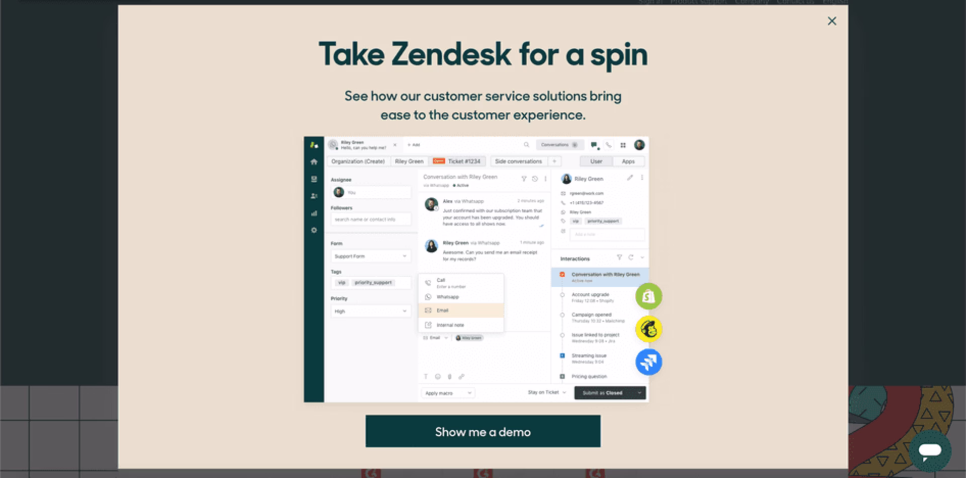
Zendesk waits to display a pop-up until the user moves their cursor to ‘x’ out of the page. The large pop-up features expansive white space to further improve the experience
Here are 3 ways to solve pop-up problems:
Use segmentation: separate users into groups with similar behavioral, demographic, psychographic, or geographic characteristics, and present them with the most relevant and satisfying pop-up offers. For example, you could give users free shipping to their country or a special deal on a product they were shopping for.
Remember that timing is everything: if a form pops up too early, you may disrupt the user experience. Check your average session duration metric in your analytics dashboard (like Contentsquare), and plan your pop-up accordingly. Halfway through the average visit often works well.
Stick to exit-intent pop-ups: one way to avoid annoying visitors with your pop-ups is to save them for the end of their visit—a last-ditch effort to capture that lead or make that sale. If users are leaving anyway, there’s nothing left to lose.
💡 Pro tip: use Contentsquare's Surveys tool to launch an exit-intent survey and ask your website visitors what stopped them from converting—was the page layout confusing, the call-to-action unclear, or key information missing?
Their answers help you pinpoint where to improve your site and keep future visitors from bouncing.
![[Visual] Churn survey CSQ](http://images.ctfassets.net/gwbpo1m641r7/16cklE1JBmOUwKxy5zTEqr/c91a8086524022499570708d450187d7/unnamed__40_.png?w=1080&q=100&fit=fill&fm=avif)
Discover why visitors leave—ask about design, navigation, or missing information with a Contentsquare exit-intent survey
3. Too much content
You’ve heard the saying that ‘content is king.’ Done well, the text on your site meets visitors’ needs by engaging or informing them. But you can have too much of a good thing: large blocks of text create visual clutter—a frustrating and overwhelming wall between where users are and where they want to go.
Imagine you have an ecommerce website selling jewelry. Your prospective customer heads to the About page to learn more about the business and gauge whether it’s trustworthy. As they attempt to scroll down the page, they’re met with a long-winded bio of the company founder. The stretch of small, uniform font fatigues the shopper, so they stop reading long before they’ve determined whether the company’s the right fit and drop off your website.

Allbirds uses large, bold font on product pages to draw the reader’s gaze to a simple table with key information. Other details are hidden in an accordion to avoid overwhelming the shopper
Here are 3 ways to cut back on content while still getting your message across:
Keep content relevant with user input: there’s so much you want to tell your visitor, but they may not want—or need—to hear it. Install a feedback widget on any web page to give users the opportunity to rate their experience and leave comments.
Break up text into shorter sentences and paragraphs: long passages are visually daunting to website visitors, especially if they’re on their mobiles. For example, keep your product descriptions on the shorter side for both human readability and search engine optimization (SEO)—and strive for paragraphs of no more than two or three sentences each.
Utilize clever formatting: most visitors don’t read every word. Instead, they scan the page for important information. Use special formatting, like headers, bold font, and underlining, to make key ideas stand out. Note: this special treatment isn’t just for homepages; it also helps draw readers’ eyes to relevant information on product pages.
💡 Pro tip: use heatmaps to find and fix underperforming content.
Chris Marsh and Laura Algo, conversion rate optimization (CRO) specialists at Dash of CX, suggest browsing through scroll heatmaps, which show the scroll depth percentage at the beginning and end of each section on the page. They say a 5% to 15% drop-off is typical for each section, and to be on the lookout for anything higher.
“If the drop-off in one section is large—say, above 25%—the section is performing poorly,” note Chris and Laura. “Think about whether the section should be removed, or how to make it more engaging or shorter.”
For example, say you have a website selling accounting software. Scroll maps show that 70% of users scroll to the plan comparison table on your homepage, but only 40% scroll past that point. This 30% exit rate shows that the content doesn’t resonate with visitors, perhaps because it’s too confusing or lists an overwhelming number of features.

Use Contentsquare Heatmaps to refine your layout—streamline content, emphasize important points, and keep the flow intuitive to encourage deeper exploration
4. Overlooking accessibility
By elevating the user experience for all users, especially those who have accessibility issues, anyone visiting your site can easily get information or take action. Following the Web Content Accessibility Guidelines (WCAG) helps you adjust site elements to make that happen.
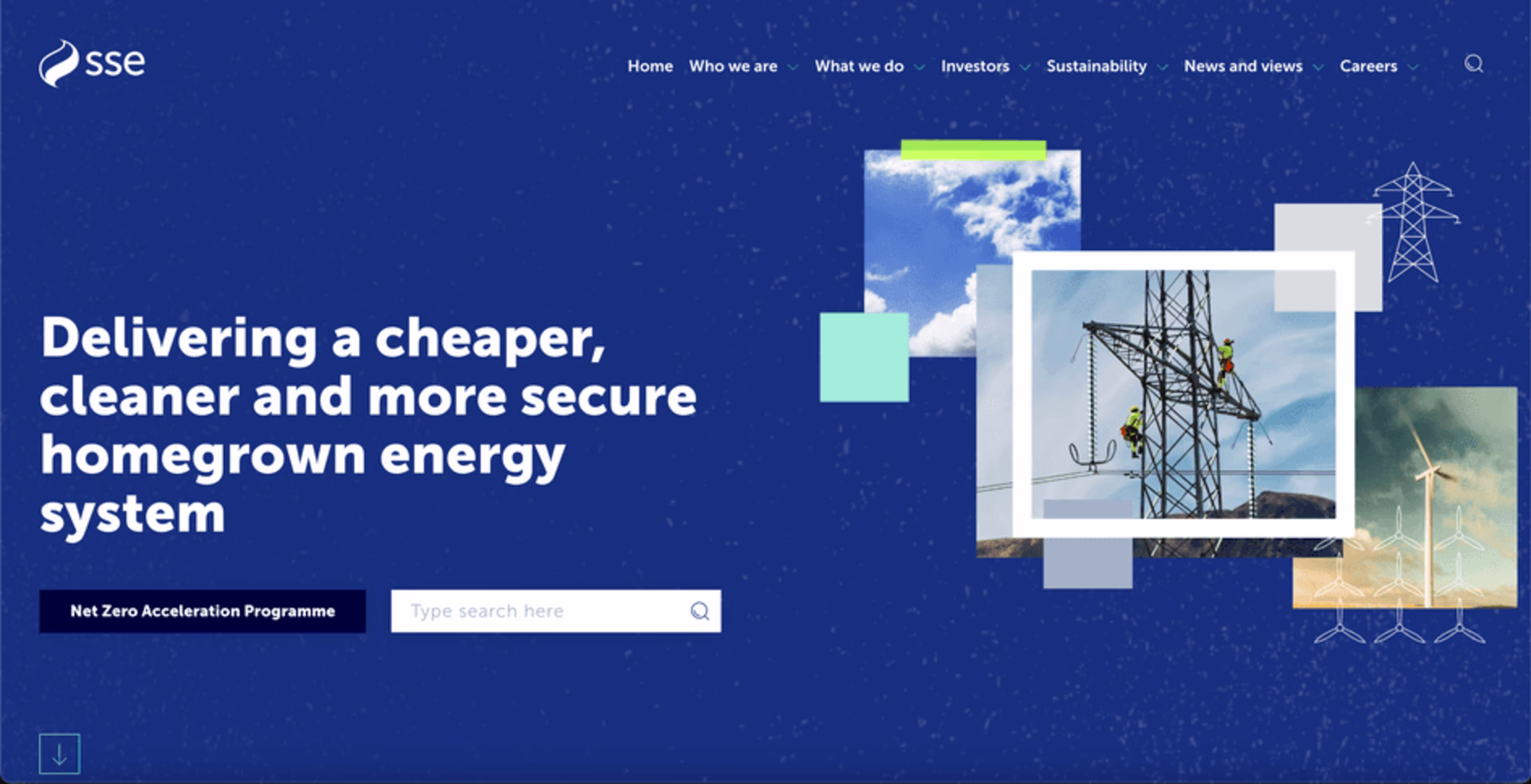
SSE Energy uses large, high-contrast fonts for visitors with vision impairment. The company also provides useful alt-text for images and keyboard controls to access content—and they offer a SignVideo service for customers who use British Sign Language (BSL)
Here are 3 ways to make your website more accessible for your visitors:
Consider color contrast: creating enough of a difference between the text and the background helps improve readability on your website for users with visual trouble. Current WCAG 2 standards suggest you strive for a contrast ratio of at least 4.5:1.
Provide useful alt text: when uploading images to your website, add alt text, or words that describe the image and its purpose. Don’t skip this step, as alt text helps visitors who use screen readers fully experience your site.
Ensure all content is accessible by keyboard: users who can’t use a mouse or trackpad should still be able to use the tab, arrow, and enter keys. (Watch replays to see whether users navigate by keyboard or mouse, and take special note of any rage clicks—these repeated clicks often point to a UX issue.)
💡Pro tip: leverage Contentsquare’s Session Replay tool to uncover hidden accessibility hurdles—every rage click or navigation struggle tells a story about how to improve your site for all users.
You can segment sessions specifically for users who rage-clicked and sort by frustration score to quickly spot and address any UX issues.
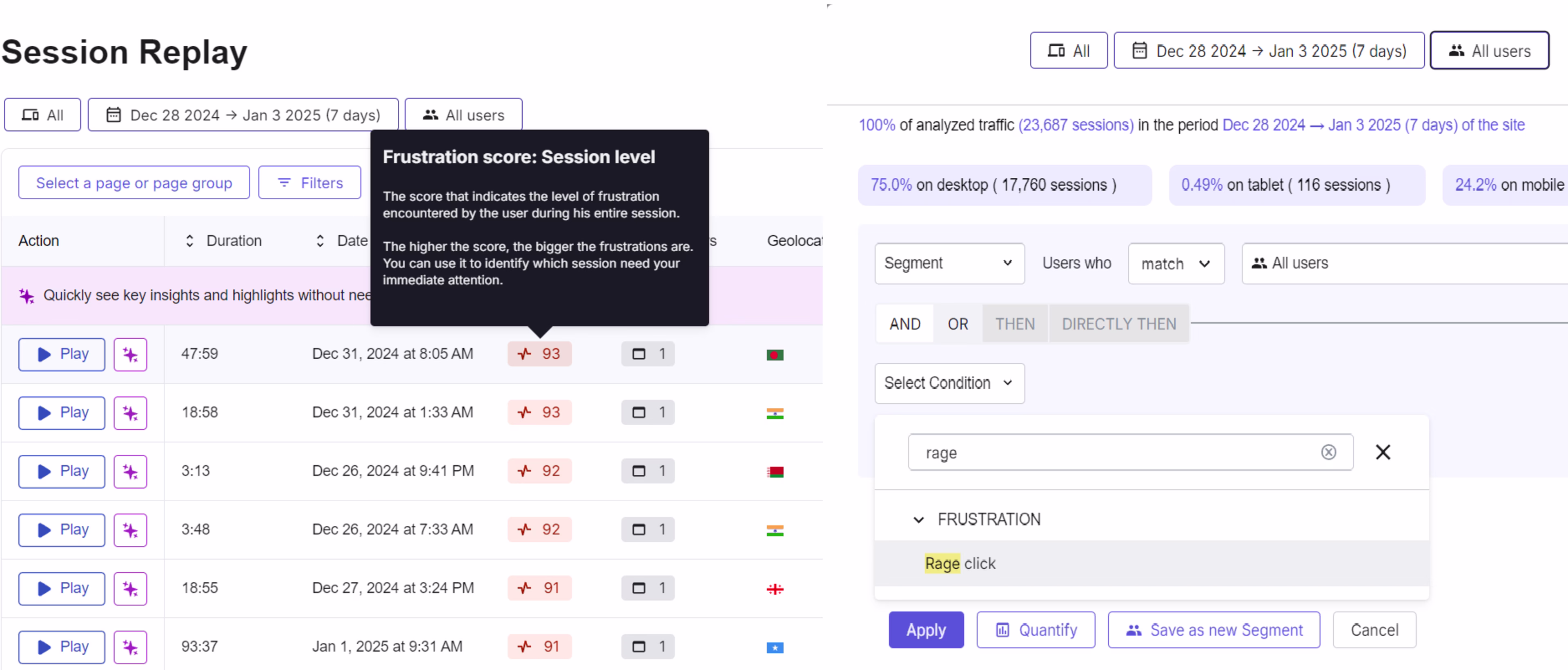
Contentsquare’s Session Replay tool to identify and fix accessibility issues by spotting rage clicks and user frustration
5. Lack of responsiveness
With worldwide active smartphone subscriptions at 7.2 billion and climbing, more people than ever surf the web on the go. If your website lags or loses functionality on mobile or tablet, users will bounce.
By ensuring your site is mobile-friendly, you improve your reach and create a better user experience.
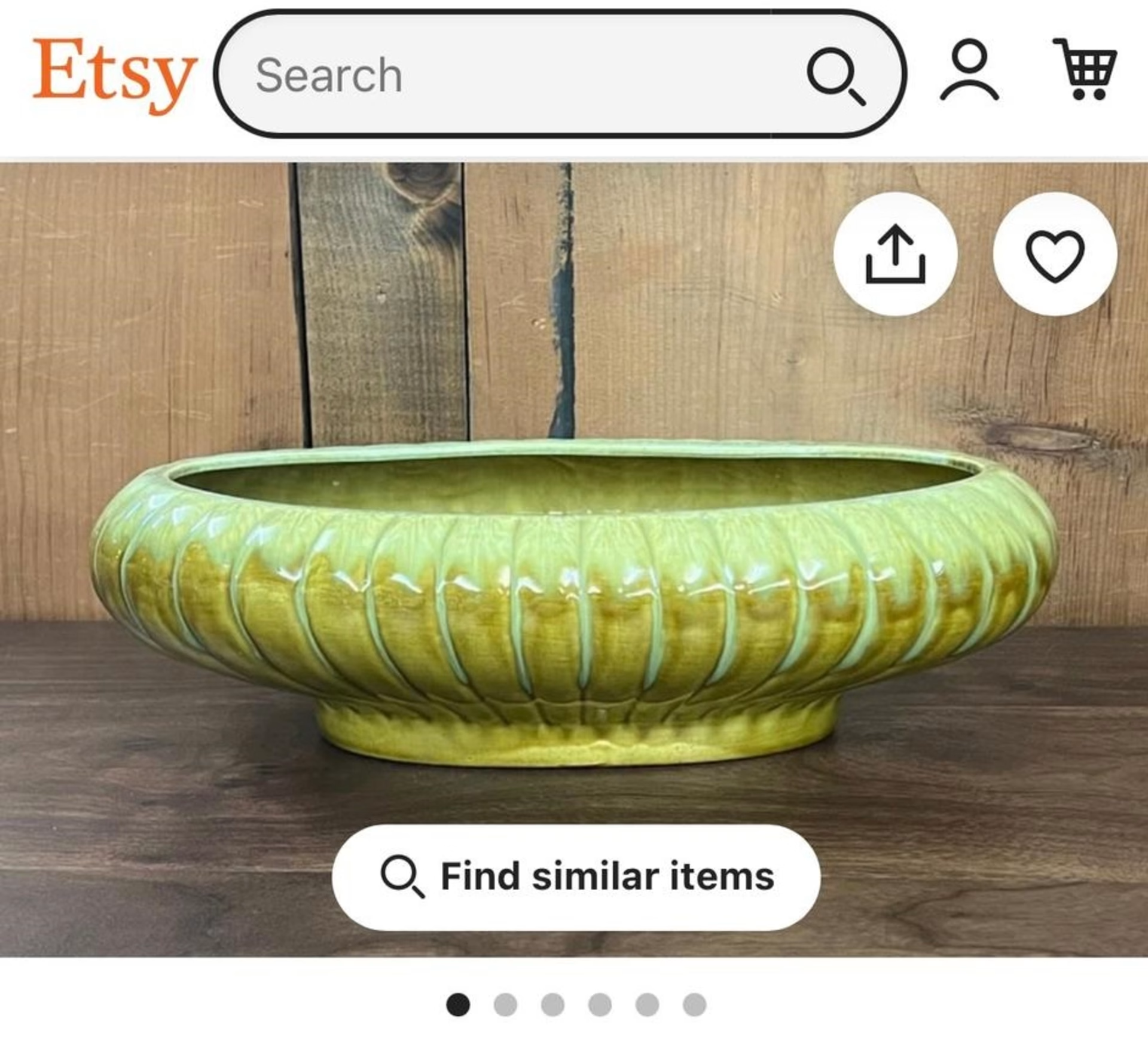
Etsy streamlines its mobile UI for its visitors. Familiar icons reduce clutter and make room for essential information—and two search options—above the fold
Here are 3 ways to enhance your website’s UX on mobile:
Use Google’s mobile-friendly tool: check that your site works for users on mobile devices by entering your URL into Google’s Mobile-Friendly Test. It’s free and provides a good starting point for further investigation.
Test, test, test: before your site goes live, test for bugs on multiple devices. Then, continue to check for responsiveness periodically, or at least whenever your website analytics show a higher bounce rate or lower mobile conversions.
Ask real users what they think: want to find out what people really think of your mobile menu or search function? Leverage user interview tools and user tests to recruit, interview and hear from real users about their experience.
💡Pro tip: use Contentsquare’s Interviews and User Tests tools to go beyond surface-level feedback and really dig into what your users think.
If their words and actions don’t quite match, don’t be afraid to dive deeper during the interview—ask, “Why?” or “Can you walk me through your thought process?” These moments of curiosity often lead to surprising insights and help you fine-tune your mobile layout or search function into something users genuinely love.
Contentsquare’s User Tests and Interviews tools give your users a voice to help you perfect the user experience
User feedback is a goldmine. Utilize user feedback to form your website copy, find and tackle the biggest points of friction, and understand what your audience values most. This takes out the guesswork. It helps you set your biases aside, and focus on what’s really important.
6. Conflicting CTAs
Visitors come to your site with a range of motivations and interests, so it can be tempting to include a variety of calls-to-action (CTAs) for them.
But when faced with conflicting CTAs like ‘Save now,’ ‘Buy again,’ and ‘Try delivery’ all above the fold, users might feel confused and bounce.
The CTA button, a seemingly simple UI element, affects the UX right at the point of conversion—so it’s crucial to get right.
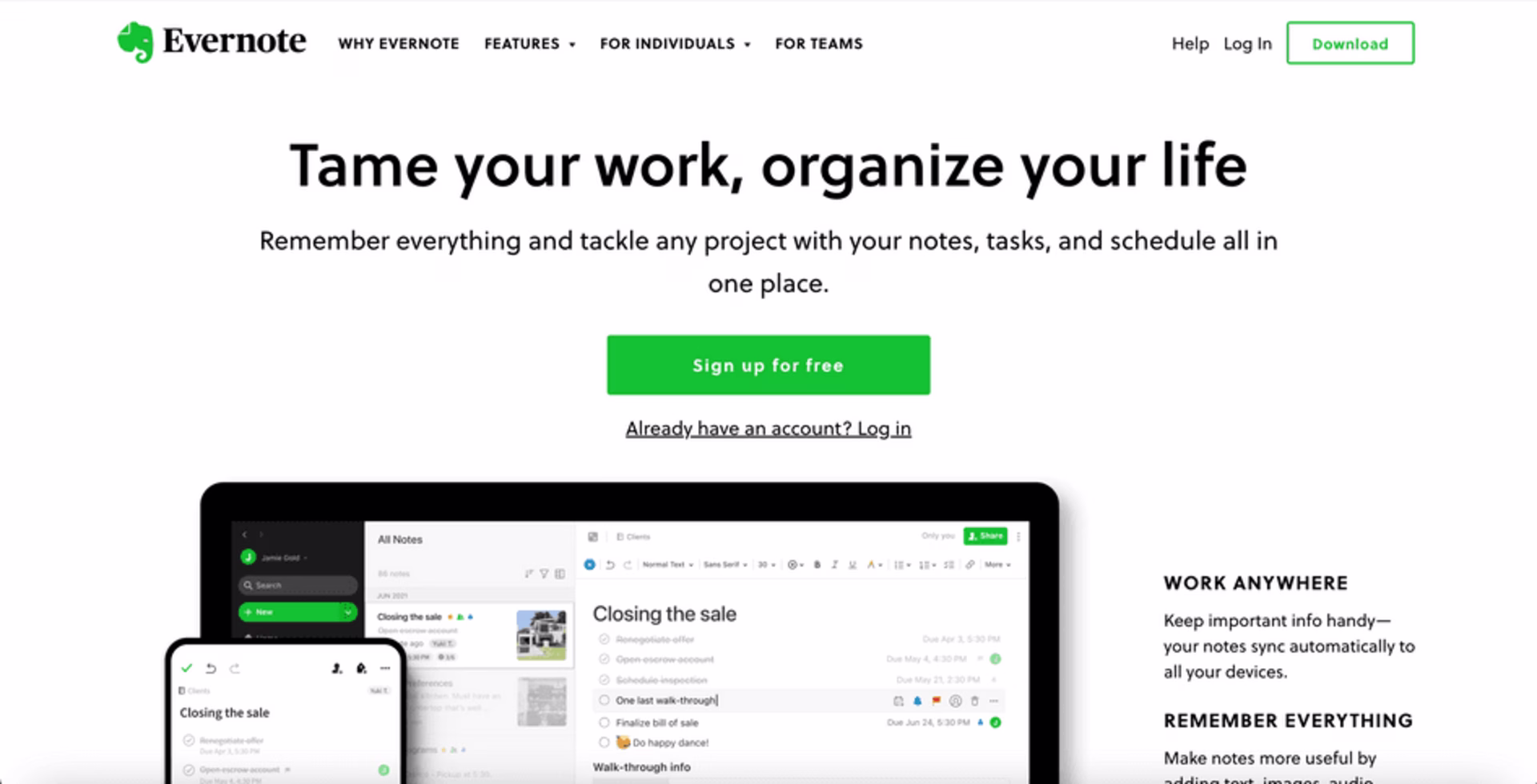
Evernote uses visual hierarchy to make clear the desired action they want visitors to take. A large, bright green CTA button prompts people to ‘sign up for free’
Try these 3 tips for more effective CTAs:
Know your purpose—and your users: create detailed customer profiles by collecting data about your users, their pain points, and their goals. Then, create a user flow that guides them to a relevant CTA on each page of your site.
Use a clear visual hierarchy: elements like formatting, color, and size help create a visual hierarchy that lets you direct your visitor’s attention in a specific order. If you can’t avoid having more than one clickable CTA button in a given area, emphasize the most important one by giving it a color that contrasts with the surrounding area.
Run A/B tests: the placement, color, and size of your CTA button all impact your UX and conversion rate. Conduct A/B testing with heatmaps, where you change one element at a time—like switching the color from black to lime green—to see how it affects conversions.
💡 Pro tip: use Contentsquare’s Heatmaps to supercharge your A/B tests.
Analyze where users click and scroll for each variation, and let the visual data guide you in choosing the most engaging CTA placement, size, or color. Every tweak you test gets you closer to a layout that converts.
![[Blog ] Predictive personalization - Comparator IMAGE](http://images.ctfassets.net/gwbpo1m641r7/ANj20vBXBWxkCHWIvAE7w/9a33e43b8b285fdc49f14b7c4d11a979/Side-by-side_analysis.png?w=3840&q=100&fit=fill&fm=avif)
Visualize user engagement with Contentsquare Heatmaps to find the winning CTA design
7. Unintuitive fields
Visitors come to your site to complete tasks, but encountering confusing or unintuitive form fields can slow them down and even cause frustration.
Fields like date pickers, dropdowns, and vague labels can make users feel stuck, leading to cart abandonment and lost conversions.
Form fields, often overlooked, play a major role in guiding users through the process—so it’s essential to get them right.
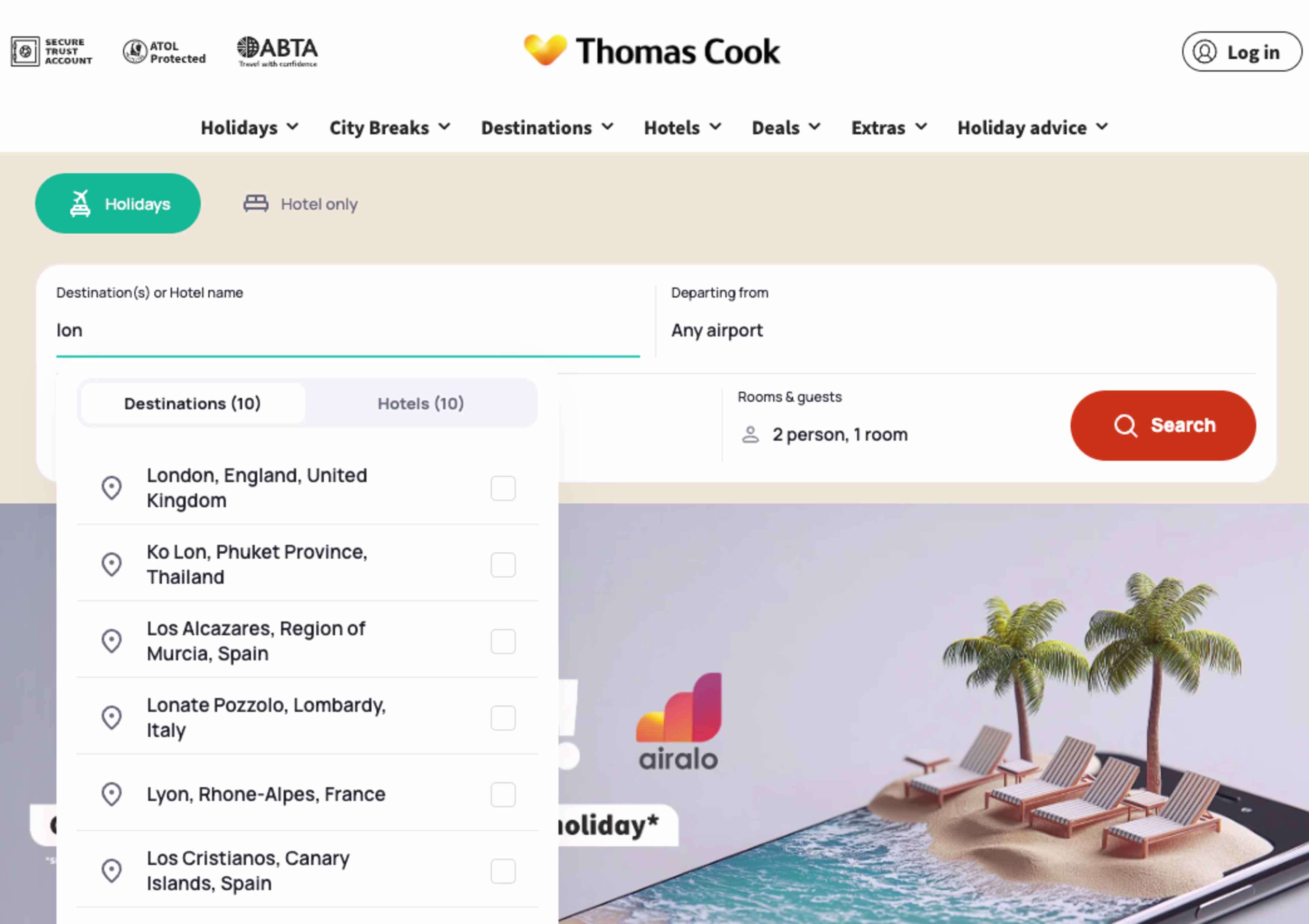
Thomas Cook’s smart use of dropdown menus and autocomplete search features streamlines the user experience, making it easier for travelers to find what they need
Here are 3 ways to make your form fields more intuitive:
Make labels clear and concise: avoid vague labels and provide context. For example, instead of just “Date,” use “Select your date of birth” to ensure users know exactly what’s required. Clear, informative labels make it easier for users to navigate the form.
Simplify dropdowns: dropdown menus can create friction, especially when they’re long and confusing. Replace them with auto-suggest text fields where users can type in their response. This speeds up the process and reduces user frustration.
Use input masks: for fields like phone numbers or credit card info, use input masks that automatically format users' entries as they type. This ensures consistency and reduces errors—helping users complete forms faster and with fewer mistakes.
💡Pro tip: leverage Contentsquare’s Form Analysis tool to pinpoint exactly where users are dropping off or struggling with your forms. Track completion rates, analyze heatmaps for pain points, and watch session replays to see real-time user behavior.
Understanding these key moments of friction helps refine your form design and overall UX, and boost form completion rates.
![[Visual] Heatmap form analysis](http://images.ctfassets.net/gwbpo1m641r7/6gtNUWaHlsNDLydFaYZ6XZ/1fab0b0060a2cf9d7f1400724f0bb226/Heatmap-form-analysis.png?w=3840&q=100&fit=fill&fm=avif)
Use Contentsquare’s Form Analysis tool to design a more intuitive, user-friendly form experience
Get customer-centric to avoid poor UX design
A visually appealing website is just one small part of creating customer delight. To give your target audience an effortless and engaging experience, you need to deliver UX-friendly design that considers their goals and journey—and ultimately gives them what they need.
Collect behavioral data and feedback to prevent, find, and eliminate common UX website problems so they don't negatively impact your business. Going the extra mile is the only way to provide an optimal experience for the people who matter most: your users.
FAQs about UX website problems
Poor UX design can lead to low conversion rates and poor user satisfaction scores—decreasing the likelihood that users will return to your site. By contrast, improving your UX design helps you convert and retain happy customers.