
Le heatmap sono un modo efficace per capire cosa fanno gli utenti sulle pagine del tuo sito web: dove cliccano, fino a che punto scorrono, cosa guardano e cosa ignorano.
Nei capitoli di questa guida, puoi trovare un'introduzione ai diversi tipi di heatmap e capire come crearle e come analizzarle. Mettiamo inoltre a tua disposizione diversi casi di studio reali ed esempi pratici per constatare con i tuoi occhi il valore e l'utilità delle heatmap, quando si vuole migliorare e far crescere un sito web.
Che cos'è una heatmap?
Una heatmap è una rappresentazione grafica di dati in cui i valori sono rappresentati cromaticamente per visualizzare informazioni complesse in modo che siano facilmente intuibili.
Le heatmap di prodotti e siti web visualizzano gli elementi più popolari (con colori caldi) e meno popolari (colori freddi) dei contenuti del sito usando una scala cromatica che va dal rosso al blu. Ecco un esempio:
![[Visual] heatmaps](http://images.ctfassets.net/gwbpo1m641r7/5hwt0WRr4YKlzCv7iRkddx/982f2fb4949bffc26a1f03a43aea1bc8/image2__1_.jpg?w=946&q=85&fit=scale&fm=avif)
I dati a sinistra sono gli stessi di quelli a destra, ma una delle due rappresentazione è molto più facile da capire
Le heatmap sono essenziali per rilevare cosa funziona e cosa no in un sito web o in una pagina e quali parti ed elementi di una pagina vengono usati dagli utenti.
Sperimentando con il posizionamento di vari pulsanti ed elementi sul sito web, le heatmap ti permettono di valutare la performance del prodotto e di aumentare l'user engagement e la fidelizzazione, dando priorità alle attività che portano a un incremento di valore per il cliente.
Si ritiene che la pratica attualmente definita "heatmap" abbia avuto origine nel XIX secolo, quando si usava la sfumatura a mano in scala di grigi per rappresentare visivamente i modelli numerici in matrici e tabelle.
![[Visual] An early heatmap](http://images.ctfassets.net/gwbpo1m641r7/4TCCWONUFbaqBtYzcqentt/d74eb7127e176fdf7ae42489f0e9b947/image1__1_.jpg?w=750&q=85&fit=scale&fm=avif)
Una prima heatmap che mostra la densità della popolazione nei quartieri parigini del XIX secolo
Il termine "heatmap" è stato registrato come marchio per la prima volta all'inizio degli anni '90, quando Cormac Kinney, designer di software, creò uno strumento per visualizzare graficamente e in tempo reale le informazioni del mercato finanziario.
Ai nostri giorni, le heatmap possono ancora essere create manualmente, usando fogli di calcolo Excel o con strumenti di experience intelligence come Contentsquare.
Come funzionano le heatmap?
Heatmaps di Contentsquare funziona creando una copia del codice HTML della pagina, per poi classificare ogni elemento in base al suo tag, agli elementi genitori e agli ID o alle classi, se pertinenti. Quando i visitatori visualizzano la pagina, Contentsquare raccoglie il comportamento d'uso e mappa tutti gli elementi con cui gli utenti interagiscono nel report della heatmap principale.
Perché si usano le heatmap?
Lo scopo principale delle heatmap è quello di visualizzare il comportamento degli utenti di un sito web. Osservando una rappresentazione complessiva di tutte le interazioni degli utenti su una pagina web, diventa più facile individuare problemi e opportunità di miglioramento.
Le heatmap sono anche un ottimo primo passo per ulteriori ricerche sul comportamento degli utenti, come la visualizzazione di riproduzioni delle sessioni e la raccolta di feedback con sondaggi.
Come usare le heatmap per migliorare il proprio prodotto?
Le heatmap offrono ai team di prodotto, ai marketer, ai digital e data analyst, ai designer di user experience (UX), agli specialisti dei social e a chiunque altro si prenda la briga di vendere qualcosa online, un'approfondita rappresentazione grafica del comportamento degli utenti sul sito, aiutandoli a scoprire perché non passano all'adozione del prodotto, non usano i pulsanti CTA (call to action) o non si convertono.
Mettendo insieme tutte le metriche comportamentali che riguardano gli utenti, le heatmap facilitano l'analisi dei dati, combinando quelli quantitativi e quelli qualitativi e offrono un modo istantaneo per visualizzare il modo in cui il pubblico di riferimento interagisce con un sito web o una pagina di prodotto: cosa cliccano, come scorrono o cosa ignorano. Questo consente di identificare i trend e ottimizzare il prodotto e il sito per aumentare il coinvolgimento degli utenti, le conversioni (CRO) e le vendite.
![[Visual] Scroll and Move maps](http://images.ctfassets.net/gwbpo1m641r7/7llXfT80AtnEeTXVKjhTF/0f2fec8f66f0c7ebec100c142505cbb5/Comparison.png?w=1280&q=85&fit=scale&fm=avif)
Una heatmap di scorrimento (a sinistra) e una heatmap di movimento (a destra)
Le heatmap di solito permettono di vedere anche la parte visibile media, ovvero quella porzione della pagina che gli utenti vedono sullo schermo senza scorrere quando aprono la pagina in questione.
Quali sono i vantaggi dell'uso delle heatmap sul proprio sito web?
Le heatmap aiutano i product manager e i gestori di siti web a capire come le persone interagiscono con le pagine del sito per trovare risposte alle loro domande e ai principali obiettivi aziendali, come "Perché gli utenti non si convertono?" o "Come posso fare in modo che un maggior numero di visitatori compia una specifica azione?"
Ecco cosa è possibile determinare a proposito degli utenti, grazie all'uso delle heatmap:
Se raggiungono i contenuti più importanti o se non li notano
Se trovano e usano i link, i pulsanti, gli opt-in et le CTA
Se si fanno distrarre da elementi non cliccabili
Se riscontrano problemi di navigazione sui vari dispositivi
Grazie alle rappresentazioni grafiche, le heatmap aiutano a prendere decisioni consapevoli e basate sui dati per fare test A/B, aggiornamenti o (ri)progettare il sito web. Sono utili anche su una scala aziendale più ampia: le heatmap permettono di mostrare ai team e agli stakeholder cosa sta accadendo e di ottenere più facilmente la loro approvazione quando sono necessarie modifiche: è difficile discutere con una heatmap!
Heatmaps di Contentsquare raccoglie dati in maniera costante, consentendo di filtrarli e di creare heatmap speciali in base alle caratteristiche dell'utente, come il ruolo o la posizione lavorativa, la data di creazione dell'account, se stanno usando o meno una versione di prova del prodotto e tanto altro ancora, così da poter ottenere rapidamente insights specifici in maniera mirata.
I team di prodotto possono ad esempio sfruttare le heatmap per stabilire la priorità sulle correzioni di bug o per verificare in che modo gli utenti interagiscono con una nuova funzionalità.
I designer di UX e di UI possono usare le heatmap per valutare il grado di apprezzamento o il rifiuto del design di una pagina e implementare modifiche che rendano la navigazione del sito più intuitiva per gli utenti.
Quali sono le diverse tipologie di heatmap?
Heatmap è un termine che rimanda a una macrocategoria che comprende diversi strumenti di heatmapping:
Heatmap di scorrimento
Heatmap dei clic
Heatmap di movimento
Heatmap delle aree di coinvolgimento
Heatmap per PC, tablet e dispositivi mobili
Conoscere la differenza è utile, in quanto ogni tipologia di heatmap aiuta a esaminare un aspetto leggermente diverso delle performance di un sito web e di un prodotto.
1. Heatmap di scorrimento
Le heatmap di scorrimento mostrano la percentuale esatta di utenti che scorrono fino a un determinato punto della pagina: più l'area è rossa, maggiore è il numero di visitatori che la visualizzano.
![[Visual] Scroll map](http://images.ctfassets.net/gwbpo1m641r7/59VVM5aFLi9Er63MbUs07u/7d14276947fe5c0bc8269b2871f3454b/Scroll_map.png?w=1280&q=85&fit=scale&fm=avif)
Un esempio di heatmap di scorrimento
2. Heatmap dei clic
Le heatmap dei clic mostrano una visualizzazione complessiva dei punti in cui i visitatori fanno clic con il mouse su un PC o fanno tap su dispositivi mobili (in questo caso sono anche dette heatmap dei tap). La mappa è codificata cromaticamente per mostrare gli elementi che sono stati maggiormente cliccati o su cui si è fatto più spesso tap (in rosso, arancione e giallo).
![[Visual] Click map](http://images.ctfassets.net/gwbpo1m641r7/5vdtmuljb4KurJazBEKcGr/98486f5a2f0d8bed8f1833deedf4b2bf/Click_map.png?w=1280&q=85&fit=scale&fm=avif)
Un esempio di heatmap dei clic
3. Heatmap di movimento
Le heatmap di movimento monitorano i punti in cui gli utenti su PC muovono il cursore del mouse durante la navigazione su una pagina. I punti visualizzati con colori caldi in una heatmap di movimento rappresentano i punti in cui gli utenti hanno spostato il cursore su una pagina e le ricerche suggeriscono una correlazione tra il punto in cui gli utenti guardano e il punto in cui si trova il mouse, il che significa che una heatmap di movimento può indicare dove gli utenti probabilmente guardano durante la navigazione sulla pagina.
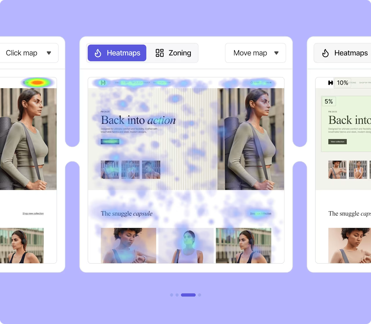
Un esempio di heatmap di movimento
4. Aree di coinvolgimento
Le aree di coinvolgimento combinano i dati sull'interazione provenienti dalle heatmap dei clic, quelle di scorrimento e quelle di movimento in un'unica e semplice rappresentazione grafica.
È un strumento potente per visualizzare i dati, che consente di analizzare le pagine in pochi secondi, così da ottenere una visione d'insieme dell'user engagement nei confronti del prodotto.
![[Visual] Zoning and Heatmaps](http://images.ctfassets.net/gwbpo1m641r7/1fY6bBg1dnmmchw0aGq0u7/fbbc1440b4715d35ffdbf3b048eafd18/Zoning.png?w=1280&q=85&fit=scale&fm=avif)
Le aree di coinvolgimento aiutano a scoprire insights inediti, come le immagini che non ricevono clic, ma che nel complesso convincono gli utenti
5. Heatmap per PC, tablet e dispositivi mobili
![[Visual] Click map](http://images.ctfassets.net/gwbpo1m641r7/1oAZUOxd5cXHEGZRB70Fyc/2b3fabe6ac4202c782fd656040e78315/Mobile_maps.png?w=1280&q=85&fit=scale&fm=avif)
Una heatmap dei clic su PC (a sinistra) e su dispositivo mobile (a destra)
Le heatmap per PC, tablet e dispositivi mobili permettono di mettere a confronto la performance del sito su vari dispositivi. Ad esempio, del contenuto situato in primo piano su una pagina visualizzata su un computer potrebbe trovarsi molto più in basso su un telefono: bisogna quindi verificare se l'interazione si differenzia a seconda del dispositivo e in che modo.
Come creare una heatmap di un sito web
Per creare una heatmap di un sito web è possibile usare uno strumento gratuito oppure un software come Contentsquare.
Richiedi una demo per provare Contentsquare e ti aiuteremo a impostarlo in maniera gratuita.
Tutto pronto per creare una heatmap e migliorare l'esperienza sul tuo sito web?
Le heatmap sono facili da creare e da capire e consentono di scoprire insights concreti per migliorare l'user journey e le pagine di prodotto, così da aumentare la fidelizzazione e le iscrizioni al sito web!
Domande frequenti sulle heatmap
Creating heatmaps with Contentsquare is designed to be straightforward and typically involves just a few clicks. Contentsquare acts as a sophisticated heat mapping tool that overlays real user activity directly onto a screenshot of your actual page, which makes it much easier than struggling with fussy spreadsheets.
Here’s how you can create a website heatmap using Contentsquare:
Step 1: Access the Heatmaps or Zoning Analysis module. If you are using the Free or Growth plans, you will navigate into "Heatmaps" and select "New Heatmap." If you are a Pro or Enterprise user, you will head into "Zoning Analysis" and click "Select a page or page group".
Step 2: Specify the page(s). You will define the page(s) you want to create heatmaps for by listing the URL. If you are on the Enterprise or Pro plan, you can also select page groups.
Step 3: Contentsquare collects the data. Your heatmap will be available to view once Contentsquare has collected enough data.
Step 4: Explore engagement zones (Pro & Enterprise plans). For a comprehensive view of aggregated data points from click, move, and scroll heatmaps, all in a single view, you can select "Zoning" from the dropdown. This feature helps you quickly spot which elements of your page users engage with most and identify those that don’t get the attention they deserve.
Step 5: Filter your data for deeper insights. You can get a lot more value from your heatmap by filtering the session data to only show a relevant time period or specific user cohort. For instance, you can filter by "Rage click" to see where visitors click in frustration, by "New users" to see how first-time visitors behave, or by "Browser" or "Operating system" to troubleshoot tech-specific issues. You can even set up user attributes to filter heatmaps by custom metrics such as 'users who signed up in the last 30 days' or 'customers who spent more than $200'.