
ヒートマップは、ユーザーがあなたのウェブサイトのページで何をするのか、どこをクリックするのか、どこまでスクロールするのか、何を見たり無視したりするのかを理解するための強力な方法です。
このガイドの各章では、様々な種類のヒートマップの紹介と 作成方法そして 分析方法を紹介しています。また、実際のケーススタディや実践的な ユースケースを通して、ヒートマップがあなたのウェブサイトを改善し、ビジネス成長させる上で、どれほど価値があり役に立つものなのか、ご自身の目でお確かめください。
ヒートマップとは何か?
ヒートマップとは、複雑な情報を素早く理解できるように色分けして表示する、データのグラフ表現です。
プロダクトやウェブサイトのヒートマップは、赤から青までの色を使って、コンテンツの最も人気のある要素(暖色)と人気のない要素(感触)を視覚化します。 例:
![[Visual] heatmaps](http://images.ctfassets.net/gwbpo1m641r7/5hwt0WRr4YKlzCv7iRkddx/982f2fb4949bffc26a1f03a43aea1bc8/image2__1_.jpg?w=1920&q=100&fit=fill&fm=avif)
左のデータは右のデータを示していますが、一方の方がはるかに理解しやすいですよね?
ヒートマップは、ウェブサイトやページで何が有効か無効か、ユーザーがページのどの部分や要素に関与しているかを検出するのに不可欠です。
ヒートマップは、ウェブサイト上で特定のボタンや要素をどのように配置するかを実験することで、プロダクトのパフォーマンスを評価し、ユーザーのエンゲージメントとリテンションを高めることができます。
現在ヒートマップと呼ばれている手法は、19世紀に始まったと考えられており、手作業でグレースケールの網掛けを行い、行列や表の数値データのパターンを視覚的に表現します。
![[Visual] An early heatmap](http://images.ctfassets.net/gwbpo1m641r7/4TCCWONUFbaqBtYzcqentt/d74eb7127e176fdf7ae42489f0e9b947/image1__1_.jpg?w=1920&q=100&fit=fill&fm=avif)
19世紀パリ地区の人口密度を示す初期のヒートマップ
ヒートマップという言葉が初めて商標登録されたのは1990年代初頭のことで、ソフトウェア・デザイナーのCormac Kinneyが、リアルタイムの金融市場情報をグラフとして見やすく表示するツールを作ったのがきっかけでした。
CXをさせる協力な機能であるヒートマップを作成するには、手作業、エクセルのスプレッドシート、あるいはContentsquareのようなエクスペリエンス・インテリジェンス・ツールを使う方法があります。
ヒートマップはどのように機能するのか?
Contentsquareヒートマップは、ページのHTMLコードのコピーを作成し、タグ、親要素、関連するIDまたはクラスによって各要素を分類します。 訪問者がページを閲覧すると、Contentsquareは彼らの行動を収集し、ユーザーが反応したすべての要素をマスターヒートマップレポートに記録します。
なぜ人々はヒートマップを使うのか?
ヒートマップの主な目的は、ウェブサイトのユーザー行動を可視化することです。ウェブページ上のすべてのユーザーインタラクションの集計を見ることで、問題や改善の機会を見つけやすくなります。
ヒートマップは、さらなるユーザー行動分析の第一歩としても有効です。例えば、セッションリプレイを確認したり、アンケートでフィードバックを収集したりすることができます。
ヒートマップを使ってプロダクトを改善するには?
ヒートマップは、プロダクトチーム、マーケティング担当者、デジタルアナリスト、データアナリスト、ユーザーエクスペリエンス(UX)デザイナー、ソーシャルメディア・スペシャリスト、などオンラインで何かを販売するすべての人に役立ちます。そして、サイト上での人々の行動を深く理解し、ユーザーがプロダクトを使用しない理由、CTAボタンを押さない理由、コンバージョンしない理由を発見しましょう。
ユーザー行動の指標を集約することで、ヒートマップはデータ分析を促進し、定量データと定性データを組み合わせたスナップショットの理解を提供します。 これにより、ターゲットユーザーがWebサイトやプロダクトページでどのように操作するのか—クリック、スクロール、無視する要素—を把握し、トレンドを特定してプロダクトやサイトを最適化することで、ユーザーエンゲージメントやコンバージョン(CRO)などビジネス成果の向上につなげることができます。
![[Visual] Scroll and Move maps](http://images.ctfassets.net/gwbpo1m641r7/7llXfT80AtnEeTXVKjhTF/0f2fec8f66f0c7ebec100c142505cbb5/Comparison.png?w=3840&q=100&fit=fill&fm=avif)
スクロールマップ(左)とムーブマップ(右)
ヒートマップは通常、平均フォールド率も表示します。 フォールド率とは、人々がページにランディングしてすぐに、スクロールせずに画面に表示される部分です。
ウェブサイトにヒートマップを使用するメリットはなんですか?
ヒートマップは、プロダクトマネージャーやウェブサイトのオーナーが、人々がどのようにウェブサイトページ上を行動しているかを理解し、「なぜユーザーはコンバージョンしないのか」「どうすればより多くの訪問者に行動を起こしてもらえるのか」といった重要なビジネス上の疑問や目標に対する答えを見つけるのに役立ちます。
ヒートマップを使用することで、ユーザーが以下のような状況にあるかどうかを判断することができます。
重要なコンテンツに到達するか、辿り着けていないか
分かりやすいページを構成し、ページのメインリンク、ボタン、オプトイン、CTAのストレス無い利用を促す
クリックできない要素に気を取られる
デバイス間での問題の発生
ヒートマップは視覚的なツールとして、ABテストの実施、サイトの更新や再設計において、データに基づいた意思決定を支援します。さらに、ビジネス全体の視点でも有用です。ヒートマップを活用すれば、チームメンバーやステークホルダーに実際のユーザー行動を示し、変更の必要性についての理解と合意を得やすくなります。ヒートマップの示す数字に裏付けられたデータには、誰も反論しにくいものです!
Contentsquareのヒートマップツールは、ユーザーデータを継続的に収集し、フィルタリングできる機能を備えています。例えば、ユーザーの役職やタイトル、アカウント作成日、プロダクトのトライアル版を使用しているかどうかなどの属性に基づいて、特定のヒートマップを作成できます。これにより、ターゲットに応じたインサイトを素早く見つけることが可能になります。
例えば、プロダクトチームは、バグ修正の優先順位を決めたり、ユーザーが新機能をどのように操作するかをテストするためにヒートマップを使用するかもしれません。
一方、UXデザイナーやUIデザイナーは、ヒートマップを使ってページデザインの人気・不人気を測定し、顧客がウェブサイトを迷いなく操作するための変更を実施します。
ヒートマップにはどのような種類がありますか?
ヒートマップとは、さまざまなヒートマップツールの総称です:
スクロールマップ
マップをクリック
マップを動かす
エンゲージメント・ゾーン・マップ
デスクトップ、タブレット、モバイルのヒートマップ
違いを理解することは重要です。なぜなら、各ヒートマップは、Webサイトやプロダクトのパフォーマンスに関する異なる側面を分析するのに役立つからです。
1.スクロールマップ
スクロールマップは、ページ上の任意のポイントにスクロールダウンした人の正確な割合を示します:エリアが赤くなるほど、より多くの訪問者がそれを見ています。
![[Visual] Scroll map](http://images.ctfassets.net/gwbpo1m641r7/59VVM5aFLi9Er63MbUs07u/7d14276947fe5c0bc8269b2871f3454b/Scroll_map.png?w=3840&q=100&fit=fill&fm=avif)
スクロールマップの例
2.マップをクリック
クリックマップは、訪問者がデスクトップデバイスでマウスをクリックし、モバイルデバイスで指をタップした場所の集計を表示します(この場合、タッチまたはタップヒートマップと呼ばれます)。 マップは色分けされ、最もクリックやタップされた要素が暖色で表示されます(赤、オレンジ、黄色)。
![[Visual] Click map](http://images.ctfassets.net/gwbpo1m641r7/5vdtmuljb4KurJazBEKcGr/98486f5a2f0d8bed8f1833deedf4b2bf/Click_map.png?w=3840&q=100&fit=fill&fm=avif)
クリックマップの例
3.地図を動かす
ムーブマップは、デスクトップユーザーがページを操作する際のマウスの動きを追跡します。ムーブマップのホットスポットは、ユーザーがページ上でカーソルを移動させた箇所を示しており、リサーチによると、視線の動きとマウスの動きには相関関係があるとされています。つまり、ムーブマップを活用することで、ユーザーがページ上のどこを見ている可能性があるかを把握する手がかりになります。
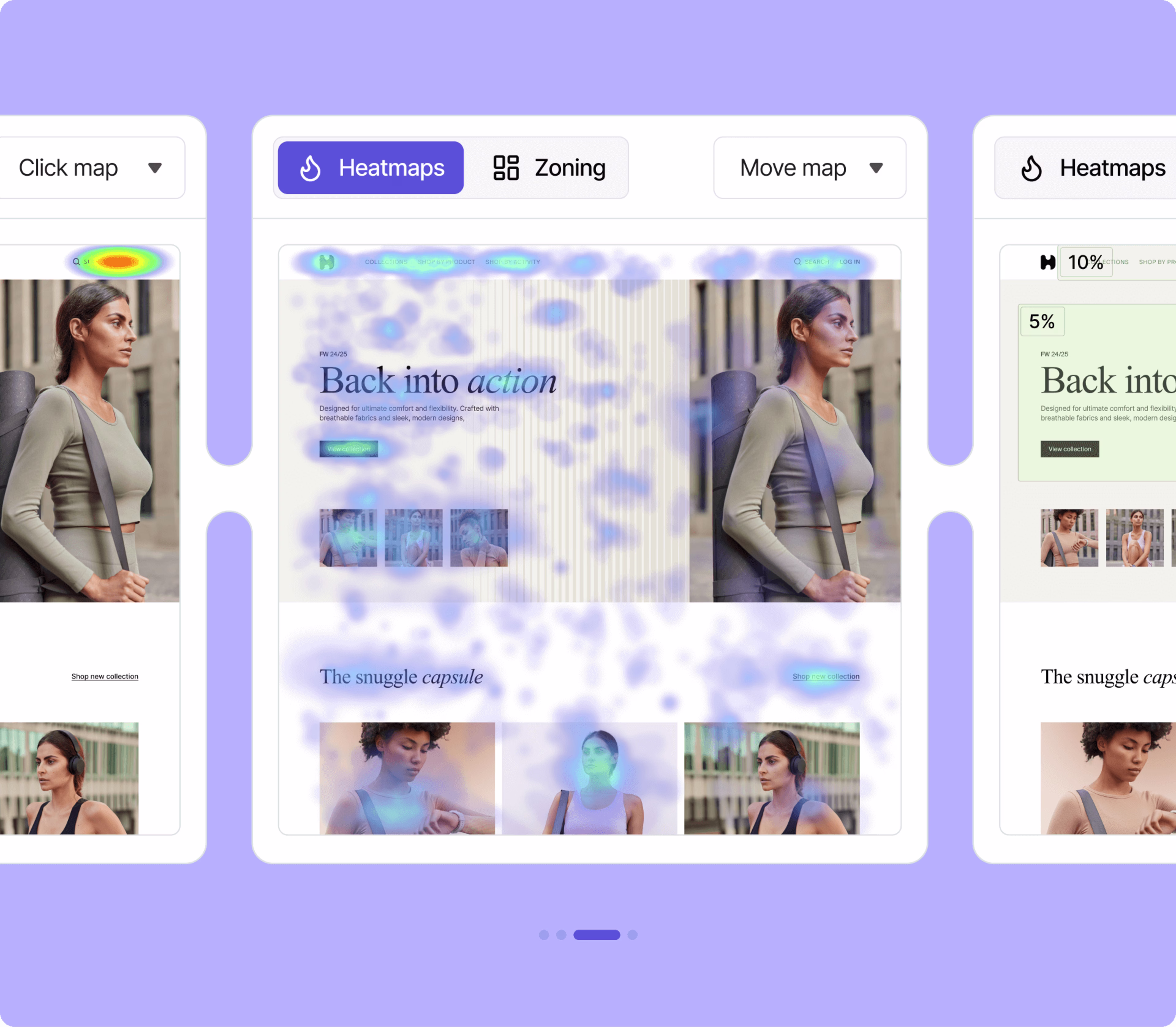
ムーブマップの例
4.エンゲージメント・ゾーン
エンゲージメントゾーンは、クリック、スクロール、ムーブヒートマップのインタラクションデータを統合し、シンプルなビューで表示する機能です。
強力なデータ可視化ツールで、数秒でページを分析できるため、プロダクトに対するユーザーのエンゲージメントを総合的に把握することができます。
![[Visual] Zoning and Heatmaps](http://images.ctfassets.net/gwbpo1m641r7/1fY6bBg1dnmmchw0aGq0u7/fbbc1440b4715d35ffdbf3b048eafd18/Zoning.png?w=3840&q=100&fit=fill&fm=avif)
エンゲージメントゾーンは、クリックされないがユーザーを魅了する画像など、新たなインサイトを発見するのに役立ちます。
5.デスクトップ、タブレット、モバイルのヒートマップ
![[Visual] Click map](http://images.ctfassets.net/gwbpo1m641r7/1oAZUOxd5cXHEGZRB70Fyc/2b3fabe6ac4202c782fd656040e78315/Mobile_maps.png?w=3840&q=100&fit=fill&fm=avif)
デスクトップ(左)とモバイル(右)のクリックマップ
デスクトップ、タブレット、モバイルのヒートマップは、異なるデバイスでのウェブサイトのパフォーマンスを比較するのに役立ちます。例えば、デスクトップページでは目立つコンテンツが、スマホではかなり下の方に位置している可能性があります。
ウェブサイトのヒートマップの作り方
無料のヒートマップツールやContentsquareのようなソフトウェアを使って を使ってウェブサイトのヒートマップを作成することができます。
デモのリクエストContentsquareのデモをご覧ください。
ヒートマップを作成し、ウェブサイトのデジタル体験を向上させる準備はできていますか?
ヒートマップは簡単に作成・理解することができ、ユーザージャーニーや商品ページの改善に役立つ実用的なインサイトを発見し、ウェブサイトでのリテンションやサインアップを増やすことができるツールです!
ヒートマップに関するFAQ
Contentsquareでのヒートマップ作成は、シンプルで直感的な操作を前提に設計されており、通常わずか数クリックで完了します。Contentsquareは高度なヒートマップツールとして機能し、実際のページのスクリーンショット上に実ユーザーの行動を直接重ね合わせて表示します。これにより、面倒なスプレッドシートとの格闘から解放されます。
Contentsquareを使用したウェブサイトヒートマップの作成方法は以下の通りです:
ステップ1: ヒートマップまたはゾーニング分析モジュールにアクセス FreeまたはGrowthプランをご利用の場合は、「ヒートマップ」に移動して「新規ヒートマップ」を選択します。ProまたはEnterpriseユーザーの場合は、「ゾーニング分析」に移動して「ページまたはページグループを洗濯」をクリックします。
ステップ2:ページを指定 ヒートマップを作成したいページのURLを入力して定義します。EnterpriseまたはProプランをご利用の場合は、ページグループも選択できます。
ステップ3:Contentsquareがデータを収集 Contentsquareが十分なデータを収集すると、ヒートマップが表示可能になります。
ステップ4:エンゲージメントゾーンを確認(Pro & Enterpriseプラン) クリック、ムーブ、スクロールヒートマップから集計されたデータポイントを単一のビューで包括的に確認するには、ドロップダウンから「ゾーニング」を選択します。この機能により、ページ上でユーザーが最も関与している要素や、十分な注目を集めていない要素を素早く特定できます。
ステップ5:データをフィルタリングしてより深いインサイトを取得 セッションデータを特定の期間や特定のユーザーコホートのみに絞り込むことで、ヒートマップからより多くの価値を引き出せます。 たとえば、「レイジクリック」でフィルタリングすると訪問者がイライラしてクリックしている箇所を確認でき、「新規ユーザー」では初回訪問者の行動を、「ブラウザ」や「オペレーションシステム」では技術的な問題のトラブルシューティングが可能です。さらに、ユーザー属性を設定することで、「過去30日間にサインアップしたユーザー」や「200ドル以上購入した顧客」など、カスタム指標でヒートマップをフィルタリングすることもできます。

![[Visual] Contentsquare's Content Team](http://images.ctfassets.net/gwbpo1m641r7/3IVEUbRzFIoC9mf5EJ2qHY/f25ccd2131dfd63f5c63b5b92cc4ba20/Copy_of_Copy_of_BLOG-icp-8117438.jpeg?w=1920&q=100&fit=fill&fm=avif)