The company
AVON is a legacy beauty brand with an enviable reputation built in part by a vast community of representatives. The company has invested heavily in digital transformation in order to bring a seamless customer experience to its hyper-connected audience.
Key metrics
+44% increase in exposure rate
+24% increase in click rate
+35% increase in revenue
The challenge
When Avon's Website Optimization Analyst Rachel Bronstein analyzed their makeup category page using Contentsquare's Experience Analytics, she found that their product carousel had a low exposure rate (60%) on desktop—meaning that 40% of customers were not even seeing it.
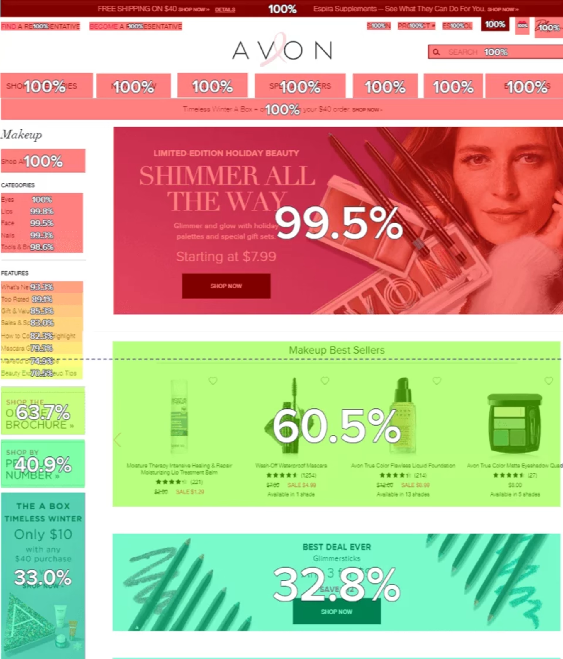
Initial exposure rate analysis of the makeup category page
Visitors were viewing the banner image at the top of the page but were not scrolling down to the product carousel, which was located beneath the fold.
At the same time, the attractiveness rate of the area was high—users exposed to the carousel were likely to click on it. Even better news, the conversion per click showed that a high percentage of visitors who did click on the carousel went on to make a purchase.
The solution
The team decided to run an A/B test on the page to determine whether reducing the height of the banner and bringing the product carousel higher up on the page would translate into a healthier exposure rate, more engagement, and an improved conversion rate.
It wasn’t the first time that the team had considered making the banner smaller, but they had lacked the data to back up such a decision. The team was also concerned about devaluing the banner image so it was important to test before rolling out any changes.
During the test, the team analyzed exposure, clicks, scroll, bounce, and exit rates as well as time spent. They also took into account conversion metrics.

Contentsquare answers the question of “how” and “why” and this is extremely valuable to our team with regard to our A/B tests and site analyses. Perhaps one of the biggest benefits is the visual representation of behavior that Contentsquare provides. Our entire team (creative, marketing, merchandising etc.) is now familiar with unique behavioral metrics such as click rate, exposure rate, and scroll rate. We can sit in a room, take a look at the results and come up with a plan of action. We ran our test for two weeks, analyzed the results immediately thereafter and put a plan in motion on the day the results were presented. Contentsquare has empowered our team to make data-driven decisions quickly.
The results
Running a test with a shorter banner resulted in a +44% increase in the exposure rate (from 57% in the control to 82% in the variant).
The team also noticed a +24% increase in click rate and overall revenue attributed to the section increased by +35%.
In fact, the variant segment also drove revenue +6% higher than the control group. At the same time, bounce and exit rates went down, and visitors ended up spending 5 seconds longer on the page.
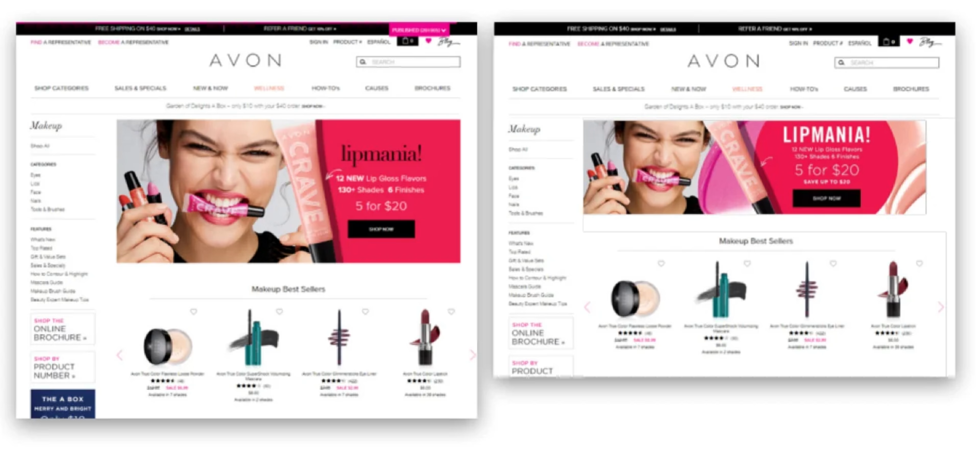
The original layout of AVON's makeup category page (left), and the variant layout with a smaller banner image (right).
