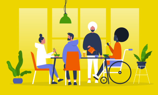
Why Inclusive Design Should Be at the Heart of Your UX Strategy


According to the CDC, 1 in 4 U.S. Adults, or 61 million Americans, have a disability that impacts major life activities. That is a pretty large chunk of the population that most likely do not have representation on the digital teams creating user experiences.
If you have been reading articles or blogs on UX recently, then you have probably read or scanned at least a couple about inclusive design. There is an excellent reason for this, one that entails more active reading instead of scanning. It’s fortunate that there are now an assortment of articles praising the benefits of inclusive design, because everyone should read at least one.
Designing for everyone doesn’t just help the people you are designing for, it has a beneficial impact on the product as well. So even if inclusivity isn’t your main goal, then sit down, relax, and let’s go over why designing for accessibility and improving your website’s performance are deeply entwined.
AN INTRODUCTION TO INCLUSIVE DESIGN
First things first, let’s define inclusive design. The Inclusive Design Research Centre at OCAD University defines it as such: “design that considers the full range of human diversity with respect to ability, language, culture, gender, age, and other forms of human difference”. So basically it means designing something that is accessible to everyone. Pretty simple.
Now let’s define disability to get a full understanding of the elements involved. The World Health Organization pre-2001 followed a pretty narrow medical interpretation of disability, updating their definition in 2001 to, “a complex phenomenon, reflecting the interaction between features of a person’s body and features of the society in which he or she lives.”
The CEO of Microsoft, Satya Nadella, recently predicted that inclusive design going mainstream will be a dominant trend for 2019 and beyond. He mentioned the growing awareness of accessibility and how important it is to keep designing for disabilities at the forefront of your design strategy. Making it possible for the millions living with disabilities to fully participate in our societies and our economies. “We used to call it assistive technologies and it used to be a checklist of things you did after the product was built,” he said. He pointed out that now it’s “about taking this to way upstream into the design process, where you start up front by thinking about inclusive design.” If the CEO of one of the largest companies in the world is advocating for the importance of inclusive design and how it can benefit everyone, it might be time to listen.
INCLUSIVITY IN THE PHYSICAL SPACES
By now we have all run into books, podcasts, and blogs decrying the inaccessibility of doors to anyone who doesn’t have a hand free. So why is the door knob design still so heavily used? Custom, convention, established practice, force of habit, whatever reason floats your boat. We ARE creatures of habit, and once we design something that works for a large chunk of the population, it sticks. It tends to take a long time to upgrade a mechanism so prevalent in society when a better alternative is finally discovered that works better for the public as a whole. It’s time to start designing with everyone in mind from the beginning. Inclusive design if you will.
Imagine this. You have been seated in front of a pristine white porcelain plate with a single cherry tomato left in the middle. You are given a single fork. Your dominant arm is in a sling after a freak accident involving pizza and a table too far from your couch. How well do you think this is going to go? Even with two working hands, a slippery whole tomato on a plate with dressing can be a battle of wills.

Now imagine that this place is near a VA hospital, so they receive a lot of veteran patrons who have lost limbs. They are able to provide one-handed dining aids. Do you feel that relief? How that potential embarrassing struggle with the tomato is no longer a concern? All because of a design created with inclusivity in mind.
This also happens to be an example of functional limitation. With the human lifespan growing to numbers not previously seen in history, everyone at some point is likely going to experience disability in some way. Whether it’s breaking an arm for a few months, or losing hearing with age.
Disability is essentially context-dependent. It can be a permanent state of being, such as being born deaf. It can also be a temporary position like suffering from an ear infection. Or it can be situational, such as attending a loud concert where hearing anything but the music is nearly impossible. Sometimes designs that were initially prescribed for the specific needs of a specific group end up benefiting many others when least expected.
Let’s take a look a real world example of a design intended to benefit a specific subsect, but ended up assisting everyone. Have you ever traveled down a sidewalk while pushing a baby carriage and ended up stymied by a high curb? What about while pulling a heavy suitcase on wheels? Why isn’t there a curb cut here, you’ve probably asked yourself.
Today, curb cuts are almost everywhere and a convenience that most of us just walk by on a daily basis without noticing. Yet only 50 years ago, these mini ramps were few and far between. Curbs were designed with typical bipedal people in mind. If your mode of transportation involved wheels, like a wheelchair, than your area of convenient mobility has shrunk to one square block.

Only after a movement in Berkeley started by students with disabilities who called themselves the “Rolling Quads” did the issue of high curbs and wheelchair-bound people come to the forefront of neglected disability rights. There is a truly amazing 99% Invisible podcast episode that goes into the history of this movement in detail. It is definitely worth a listen.
What started out as an edge case design transformed into an unintended benefit for everyone. If it isn’t obvious from context, edge case design is the practice of making products accessible to people who fall outside the bell curve of user majority. The people that fall at the edges, if you will.
The advent of closed captioning is an excellent example of technology being leveraged for inclusivity. Julia Child’s television show French Chef was actually the first on TV to be broadcast with captioning. The TV station tasked with bringing Chef Child’s show to the small screen was WGBH, a public broadcasting station out of Boston. Due to the ‘public’ denomination their essential goal was to increase access to the content they were producing.
In strolled the idea of helping the viewers who were hard of hearing or deaf by adding captioning. In 1972 the written words made their debut alongside Julia as she endeavored to teach Americans how to cook. They received A LOT of positive feedback. There were a few hiccups that needed to be ironed out, but in the end it proved to be a success. Now anyone with a hearing disability, or those watching a late-night TV show next to a sleeping partner or enjoying a subtitled foreign film, can enjoy the benefits of captions.
TAKING A TOUR IN ANOTHER PERSON’S SHOES
Can we talk about the New York subway system for a moment? It’s a source of pride for many New Yorkers to be able to tell you which lines to take to get the fastest and most reliable route. This has taken many of them years of haphazard study and constant use to accrue the knowledge necessary.
Now bring a tourist in. Already at a disadvantage due to a lack of knowledge, they often fall victim to irritation from locals, as they loiter in the wrong place trying to read a subway map. Now let’s say that tourist is visually impaired. And in the Times Square Station. There is just no coming back from that.
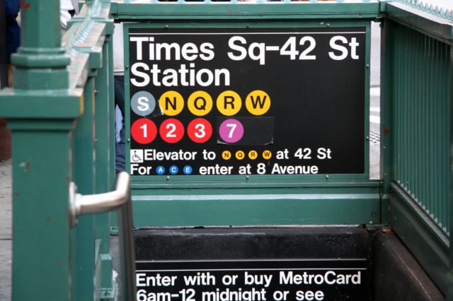
It is not designed following the concept of usability. Trying to navigate the underground catacomb with very little signage, and no clear path to freedom or your destination, makes traversing the enormous station a nightmare for the uninitiated. The subway system was not exactly built with user experience in mind. It is practically impossible to navigate for a person with little to no experience with this kind of public transportation system, let alone for those unable to see the map.
Let’s take it to the other coast by way of the Golden Gate Bridge. San Francisco is not a city known for its efficient public transportation. Instead of a large underground system, it relies on a mixture of a few subway lines, trolleys, and a large fleet of buses. The trolleys may be world-famous, but their reach is limited and relegated to mainly tourist use. The subway is also limited in scope and the buses are notoriously unreliable.
After living there for six years, I can confidently say that there is no comparison when it comes to New York’s MTA in terms of reach and consistency, but that is not the comparison being made here. There is one SF bus driver in particular that is going to be mentioned from one remarkable trip that stands out in my mind.
Most of the drivers call out the current stop when they arrive and announce the final destination as they welcome new riders aboard. This aforementioned operator treated his job a little differently. He not only announced every stop, but gave a continuous tour of the route as the bus was in motion.
The peculiarity of the event caught the attention of the normally apathetic commuters. You could see other public transportation riders slowly remove their ear buds to find out what was going on. I almost never take off my headphones when traveling on public transportation, but followed suit when it was clear something unusual was going on. I’m so glad I did.
In between jokes and restaurant recommendations, this man was giving a full on tour to the entire bus full of people, most of whom were just on their daily commute. It turned out that there was a visually impaired traveler at the front of the bus who had requested that the driver let the person know when they had reached their destination. Instead, the driver decided to give the passenger a little overview of the entire section of the city as it passed through the window.
His running commentary provided an in-depth knowledge of the route and the city as a whole: where to get the best coffee, how to reach other parts of the city from particular stops, which direction to walk in if you wanted to hit historical landmarks, delivered with a little bit a humor. The entire bus was smiling by the time they disembarked. It was not a normal bus ride, to say the least.
That ride was undoubtedly remembered by every passenger that day. It provided a service that the majority of those people didn’t even know they needed. I even got a coffee at one of the recommended cafes. It was a pretty decent cup of joe.
Originally a benefit freely given to the person who requested simple assistance, it had became an eye-opening experience for all. I never got the name of the driver and have never experienced a ride quite like that again, but three years later it still sticks out in my mind. That is saying something.
So what do these transportation examples have to do with inclusive design? Good question. Obviously every bus, train, or trolley cannot provide this kind of service on every ride. But it’s not out of the question that the experience could be amended to be better for people with disabilities, and it isn’t out of the question it could benefit everyone.
TAKING IT BACK TO DIGITAL DESIGN
Let’s move out of the physical world and back into digital experience, where accessibility is just as important. Let’s take the example of someone who is colorblind browsing an eCommerce site. They have decided on something to purchase but can’t find the checkout button. It happens to be on the side of page, but the customer can’t see it because it is low contrast and blends into the background. The shopper gets so frustrated that they decide to abandon the purchase and move on. Not ideal right?
Now say a woman is on the identical site on her mobile phone while in a rush. She wants to make the purchase quickly and easily, but can’t find the checkout button while on the move so she puts the shopping on the back burner, never to return.

Making that button more prominent and ensuring a high contrast could have helped both of those potential consumers. As Rory Sutherland, the Vice Chairman of Oglivy, said, “things designed specifically for people with disabilities often end up being valuable to many more people than originally planned.”
When we talk about inclusivity, we are not exclusively referring to the inclusion of people with physical disabilities. There are MANY other differences to keep in mind, such as people who suffer from cognitive disorders like anxiety or depression. If your site has a lengthy sign-up process or a complicated form with unclear labels, people suffering from these disorders are not likely to take the time to stay and work it out. Simplifying the process and providing a clear and easy path makes it more accessible and feasible, not just for people struggling with these disorders, but for anyone in a position where their full attention is not on the task at hand.
IN SUMMARY
Stop thinking of people with disabilities as a niche group that can be relegated to an afterthought. Design for your future selves, the ones who will continually put on and take off glasses in order to get the best view of the menu, the ones who will turn the volume up all the way only to still be unable to differentiate between the background noise and the phone, the ones who will ask their grandchildren to show how to use the new Hologram feature because the small buttons are too hard to press for your shaking fingers.
As disability rights lawyer, Elise Roy, recently said, “when we design for disability first, you often stumble upon solutions that are better than those when we design for the norm.” If we design products with inclusivity in mind, they could last well into the future.