
Take a product tour
Get to grips with Contentsquare fundamentals with this 6 minute product tour.

Listen the article in audio format:
The topic of sticky headers and sticky menu navigation is muddled in controversy. Some people claim that they drag a person’s attention away from what they should be focusing on, while others believe they’re an essential part of the structure of modern websites. In fact, as in many conversion funnel optimization cases, there is truth in both ideas.
| In this post, we’ll discuss:
– What is a Sticky Menu? |
Here’s your guide to sticky menus and how to figure out if a sticky navbar is right for your digital website experience:
A sticky menu is a fixed navigation menu on a webpage that remains visible and in the same position as the user scrolls down and moves about a site. Persistent navigation bars – or “sticky headers” – are now a web design standard.
Here are three examples of sticky navigation bars to demonstrate how different sites and brands interpret this website feature.
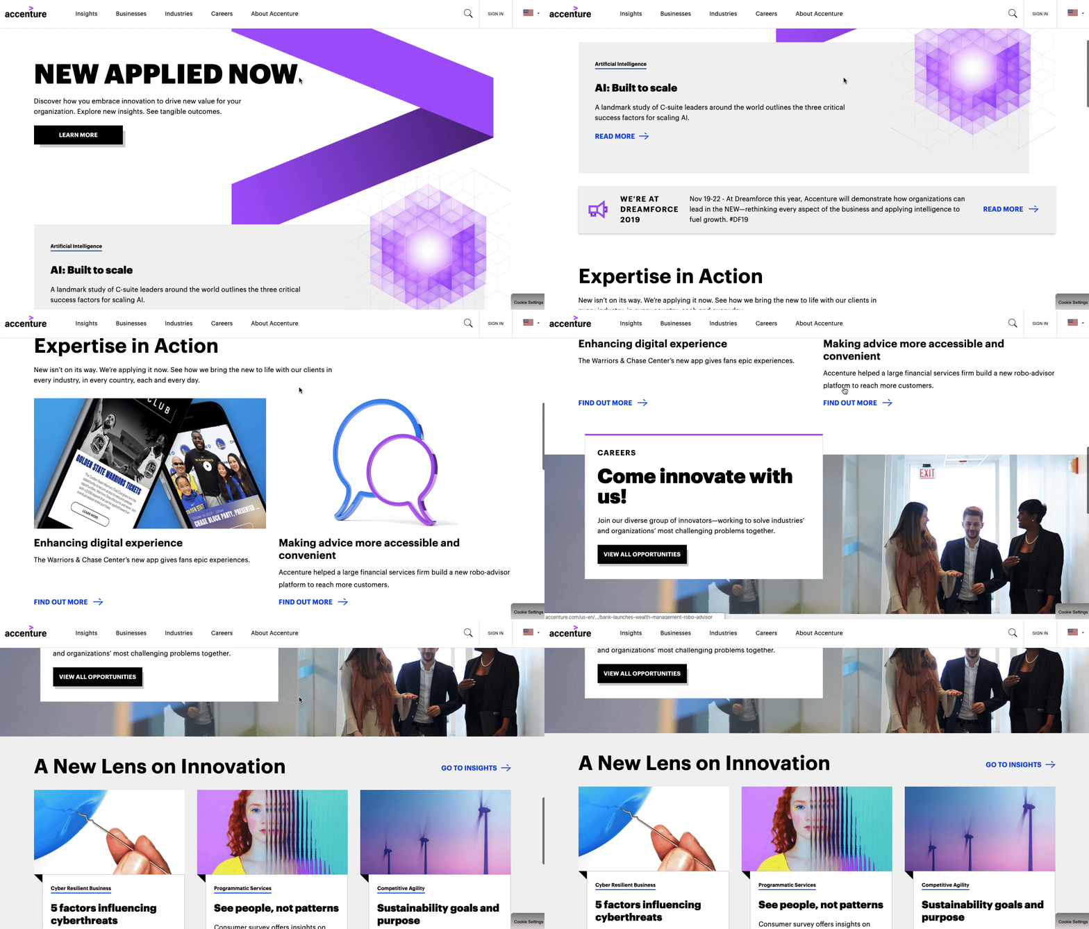
Global consulting firm Accenture’s website features a sticky header that is fixed to the top of a user’s browser so they can still see it even as they scroll down the page.
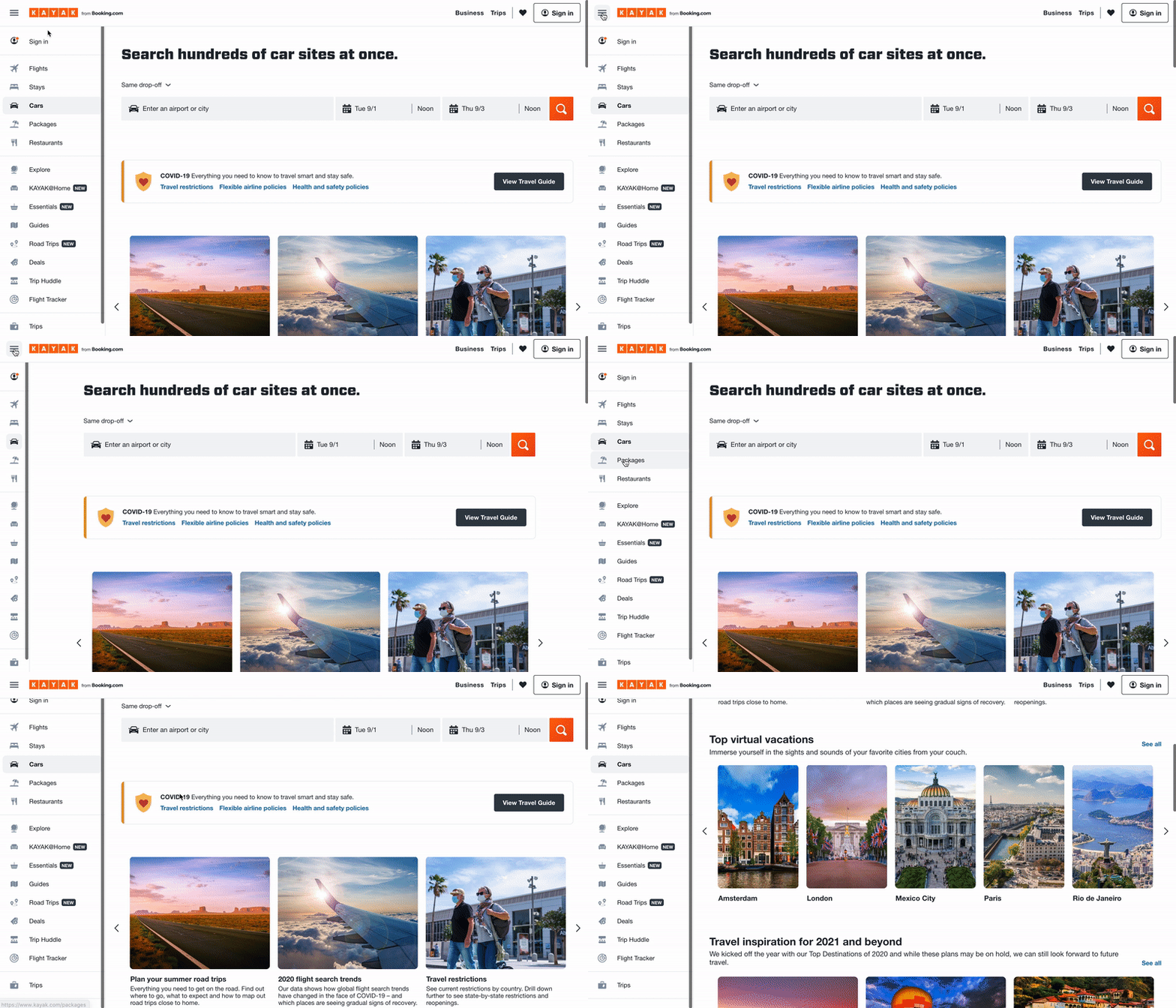
On travel booking site Kayak’s homepage, users can quickly jump to whatever travel needs they’re looking for – flights, hotels, car rentals, vacation packages, etc – via the stick navbar on the left side of the page.
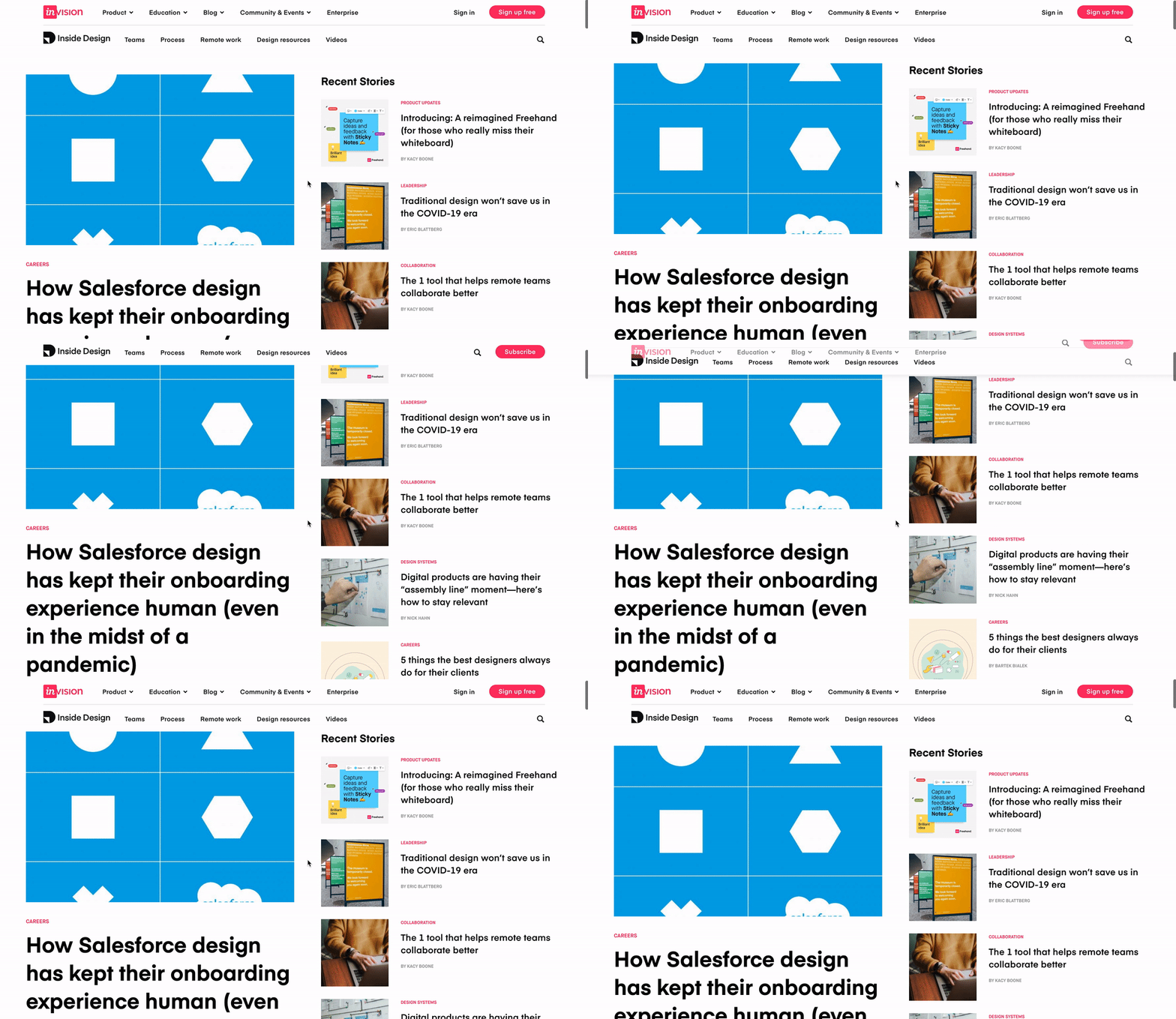
Digital product design platform InVision’s blog features a right-aligned fixed navigation bar. Using this sticky menu, blog visitors can find related blog posts and easily binge InVision’s content.
We know that users generally favor sticky navigation, but how does your brand use sticky navbars to its full potential?
Using insights gleaned from Contentsquare‘s in-page behavioral analytics platform, we’ve drawn some unique conclusions about how people interact with and digitally experience websites of all shapes and sizes. Here are the three golden rules we’ve discovered work best for sticky navigation:
Sticky navigation works best with retail, eCommerce, and other types of “actionable” sites where the designer intends for a user to take a specific action, such as a click to purchase a product. In those cases, sticky menus have been shown to significantly improve customer experience, by keeping users well-oriented and giving them more control over their journey through your site.
In one example from a well-known retail site (sorry – we can’t release the name), after the brand introduced a sticky navigation bar, its visitors began to scroll further on the page and pay more attention to the individual products on the pages. As a result, the company experienced a major reduction in bounce rate, and conversions increased from 30% to 33%, a +10% increase in conversion rate.
That may not sound like much, but a 10% increase in conversions can make a huge difference. And if you’re a leading retailer with annual revenues of, say $100 million, we can make a quick calculation to see how much that’s worth to your business:
Every brand can benefit from having friendly and intuitive navigation, especially on pages with lots of content that require visitors to scroll. Clear on-page navigation helps visitors make a smooth journey through the content on the page in a manageable way. While “back to top” links can help achieve a similar goal, sticky navigation is a quicker, easier way to let visitors jump to a new page on your site and continue their experience.
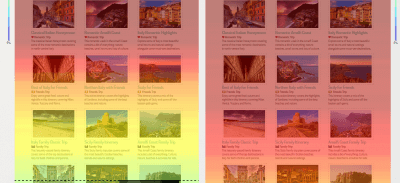
Below, we see part of a long, content-heavy page from a travel website. The left-hand side of the image shows a Contentsquare mouse-scroll heat map that was generated before the site implemented sticky navigation. The heatmap of the right-hand of the image shows how much further people scroll down once the site implemented sticky navigation. The results speak for themselves!
Alongside other interactive navigation techniques, the effectiveness of the sticky element was found to improve the performance in basic selection tasks of older adults and to provide similar benefits (although smaller) to younger users.
So, why do older adults and younger users respond better to sticky navigation? It’s because of the relatively lower confidence levels of older adults and much younger users on the web and their subsequent need for additional support, which sticky navigation provides. Older adults and young users respond well to the confidence that sticky navigation menus instill.
Here’s a deeper explanation as to why this is the case:
This is where the psychology of web design and user experience comes into play. Sticky menu elements increase visitors’ confidence as they scroll up and down a page, giving them a sense of control while interacting with a website. They know what their options are and have no reason to feel uneasy because everything they might need is right in front of them.
A 2020 Contentsquare and CommerceNEXT survey of 1,000 online shoppers revealed customers list the ease of finding what they’re looking for as the third most important factor when picking where to online shop, following price and deals/promotions. Thirty-eight percent of customers also said when a website is easy to navigate, they are more likely to shop there again in the future.
People like feeling in control. Imagine a situation where you are unaware of what is happening around you. Very quickly, the “stress” button is switched on and you try to do everything you can to regain control. You can achieve this by ‘sticking’ to something or somewhere that’s familiar, adopting an old pattern of behavior, or relying on someone you trust.
The same logic can be applied to web navigation and the digital experience. Visitors can feel lost trying to find their way through very long webpages. In most cases, this feeling will trigger stress that will cause them to leave the site, or bounce. This is exactly the purpose of sticky navigation: to help people explore a webpage in a comfortable and controlled manner.
Take a product tour Get to grips with Contentsquare fundamentals with this 6 minute product tour.
A study performed by The Journal of the Acoustical Society of America exposed two groups of participants to a loud, extremely unpleasant noise. Participants in Group A were told they could stop the noise by pressing a button, but were urged not to do so unless absolutely necessary. On the other hand, participants in Group B had no control over the noise.
The results were eye-opening. None of the participants who had a control button actually pressed it. But performance on subsequent problem-solving tasks was significantly worse in Group B who had no access to a “stop button.”
That feeling of being unable to control a situation has dramatic effects on the human psyche.
Translated into the web optimization world: even if people do not take advantage of sticky navigation features, just knowing that the options are always there will improve the digital customer experience. That’s true even at a subconscious level!
Sold on the benefits of sticky navigation? If you’re going to implement a sticky navbar on your site, ensure you make the most of it by following these best practices:
Don’t fall for what may seem like a simple implementation. When you need your site to look good and work well in multiple browsers and on different devices, iFrames are not your friend (not to mention the security and SEO issues…).
If you like simplicity and speed, this is how you want to code your sticky navigation. Pay attention to position, margin-top, and z-index.
If you’re going to have a permanent menu, you should keep it as simple as possible so it still provides your users the safety net they need, without being overly distracting. Try hiding the search input field in favor of just the magnifying glass icon.
Perhaps some of your users know their way around your site and don’t need to see sticky navigation. You could make your menus collapsible to give them the option! No one solution works for every case so be flexible. This can be especially helpful on mobile devices, as they have smaller screens and you’ll want to maximize your use of the device’s limited real estate.
Remember that what works well for another brand might not be a perfect fit for your customers. Test different sticky headers to make data-driven decisions about what your visitors prefer and cater your digital experience to their needs. Click here to get a Contentsquare demo and learn how a digital experience analytics platform can help you test sticky menus and other site optimization projects with powerful A/B testing tools, zone-based heatmaps, customer journey tools, and more. Moreover, make sure to get a web hosting for WordPress for more security and better visitor experience.

