Conversions rarely occur on a whim; usually, there is a layered process behind eCommerce purchases. Known as the conversion funnel — or the sales funnel — this model shows the conduit between the least aware prospects to those who are most aware of your company’s products and services. Those with the most knowledge of your offerings are usually the most interested and motivated to convert.
Brands have to be both wary and strategic in the ways they set up conversions, and that is where the concept of the conversion funnel comes in handy. While no one can truly “set up” conversions, you can set the scene and command all the workings that bring visitors closer to converting thanks to conversion funnel optimization.
As UX-perts, we like to blare the horns on the importance of UX, so it should come as no surprise that a good user experience plays an important role in conversion rate optimization. Let’s take a look at how you can optimize your conversion rate by way of working in a good UX to the different stages of conversion funnel optimization. Here are some of the topics we will discuss:
- What is a conversion funnel?
- What is conversion funnel optimization in marketing?
- What does good conversion funnel optimization look like?
- The different stages of the conversion funnel
- How to optimize these stages to drive consumers down the funnel
What is a conversion funnel?
Before we jump into how to optimize your conversion funnel, we need to briefly review what a conversion funnel is.
The conversion funnel denotes a process in which brands work to turn potential customers into converting customers.
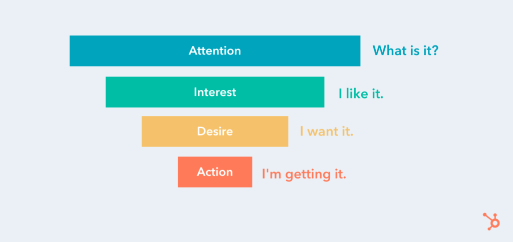
It is comprised of several stages, with each one indicating your customers’ level of brand awareness, interest, and willingness to buy — along with the gradual steps and undertakings you can take to lead users further down. Here’s a quick breakdown of the different stages and what they mean:
- Attention/Awareness: At this stage, your users become aware they have a problem and first discover your brand. This might be through word of mouth, a google search, a blog post, a display ad, an email – you name it!
- Interest: Now, your users are more interested in what you have to say. Share how can your brand help them solve their problem?.
- Desire: This is where you need to turn on the charm and sell your visitors the benefits of your products and services. You want to drive home how your company is different (and better) than your competitors, pushing your users further down the funnel.
- Action: Your users have all the information they need and are ready to pull the trigger, whether they’re checking out to buy a shirt in their cart, applying for a loan, signing a contract, or taking whatever action your company defines as a conversion.
Source: HubSpot
What is Conversion Funnel Optimization in Marketing?
While the stages in each conversion funnel may differ from brand to brand, each shares the ultimate goal of “pushing” site users down to the very last step, which, evidently, represents conversions.
Through this structure, brands can group their potential customers into easy-to-understand categories, thereby dictating several efforts they can maneuver to encourage prospects further down the funnel.
There are various marketing tactics to drive customers down the conversion funnel; they can be deployed through more than one stage. Let’s dig deeper.
What is Good UX in Conversion Funnel Optimization?
Now that you know what a conversion funnel is, the next thing to cover is how to apply good UX practices that relate to each stage in the conversion funnel. The following spells out the ways brands can enhance their UX per each stage of the conversion funnel to optimize it and garner greater conversions.
Stage 1: Awareness
Sitting atop the conversion funnel as the entry point, the awareness stage is the stage with the least… awareness of your brand or offering(s). It’s also the stage with mounting awareness, as potential clients become cognizant of your business and click onto your website, the act which carries with it the possibility to spawn possible interest.
But that requires capturing new customers. You should approach your awareness stage with the mentality of casting a wide net. You want to attract as many people as you can, so you have a higher chance of moving people further down the funnel.
We’re not saying adopt a “spray and pray” method, you still need to be strategic and methodical so you can securely create a heightened awareness of what your brand does – and attract the right kind of customers. Getting tons of traffic on your site or clicks on your ads can be exciting at first, but if these are unqualified visits, they won’t do you much good.
Here are a few ways to educating potential customers on your brand and make it easier for new users to find you:
- PPC ads
- Social media campaigns
- SEO
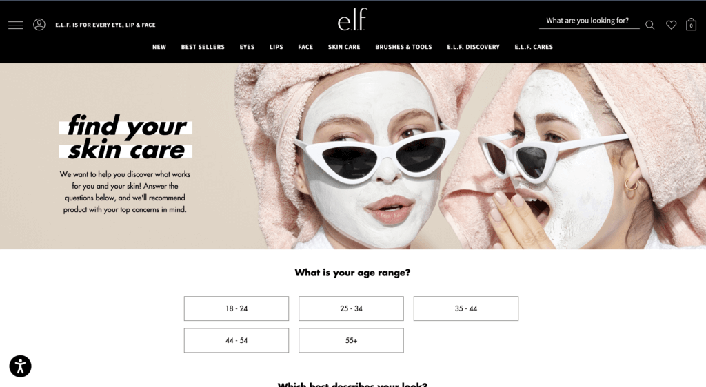
Take e.l.f Cosmetics, for example. To educate potential customers, e.l.f. Cosmetics allows anyone to take their skincare quiz which not only provides awareness to what types of skincare products they offer but also how their products can help alleviate a consumer’s pain points. Whether a potential customer wants to treat acne, dry skin, or improve fine lines, e.l.f. has products that cater to their every need.

Source: e.l.f. Cosmetics website
You have to keep your target audience in mind and create your campaigns accordingly. But once you’ve brought new people onto your site, the UX must be optimized, or at least suitable to pique interest within visitors (lead them to step 2), or — even better — make them convert on the spot.
UX Best Practices at The Awareness Phase
There is a slew of general ways to improve upon the user experience. But often in the awareness stage, users usually arrive at your site via a landing page.
The UX has to be top tier on this page. Keep the copy and imagery relevant to the conversion goal, while making it clear what your brand does. The latter is more important since you’re introducing new prospects to your company. The copy and other contents on landing pages should be to the point, so steer clear of wasting users’ time. In short, don’t overload it.
Most importantly, construct the landing page so that it is relevant to the message that led visitors to click on it in the first place.
Stage 2: Interest
Next, we reach the stage of interest. Now that prospective customers know your company exists, they have to frequent your website; simply knowing about your offering(s) does not ensure they’ll return to your site or engage with your content.
Content is key in this step, as it can foster relationships and maintain interest within your prospects. There’s a twofold approach for conversion funnel optimization: the first is the nature of the content and the second concerns the UX, or the feelings and attitudes users develop over their experience.
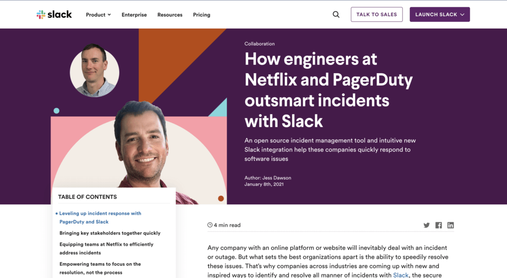
The first element deals with the core of the content — the content type, its subject matter, how it can help with your prospects’ problems, its visual identity, etc. You would need to establish a blog with relevant posts to your industry or niche. Take Slack for example, since the pandemic Slack has upped its content production, providing guides, interviews, etc to teach business leaders and employees alike how to adapt to the “new normal” with Slack.

Source: Slack
Other useful content for stimulating user interest are:
- Guides
- Videos
- Interviews
- A resources page to keep everything together in one place
- And more! The sky is the limit – get creative and see what content works for your audience.
You would have to make sure these align with the needs/interests of your vertical as well as making your content stand out and offer something different. Videos and other content, for example, should not focus on the product alone, but offer something of value — whether that’s inspirational content, news related to your niche or something else.
UX Best Practices for The Interest Phase
As for the attitudes toward the content, i.e. the UX, consider the amount of content on your page; is it slowing down your site? If so, reduce it so that you never have issues with loading speeds.
Make sure everything can be easily seen and accessed. This will encourage further browsing. For example, if you have an in-page element that requires scrolling, the width of it, at the very least, needs to be wide enough so all the content can be easily read.
You should limit scrollable in-page content to one type of scrolling function (either by length or width, never both.) This is generally length, as this is easier to look through. Use carousels, in-page recommendations, and links to other pages to incite browsing.
In fact, when it comes to the UX in general, be sure to keep it continually optimized so that all content elements are easy to understand and seamless. The best way to gauge customer understanding and frustration is of course to measure interactions with each element.
Stage 3: Desire
Once you’ve developed some level of interest, you need to propel prospects towards the lower half of the conversion funnel, which starts with desire. Representing a heightened interest, desire attracts users to your actual offering aside from your content alone.
At this stage, you should make your product or service, as the stage suggests, desirable. It’s also where you have to distinguish your offering from that of your competitors, specifically, by positioning your company as the better option.
This can be done by:
- Employing more targeted social ads that lead to pages with CTAs
- Highlighting how your product can alleviate specific problems
- Offering sales/promotions
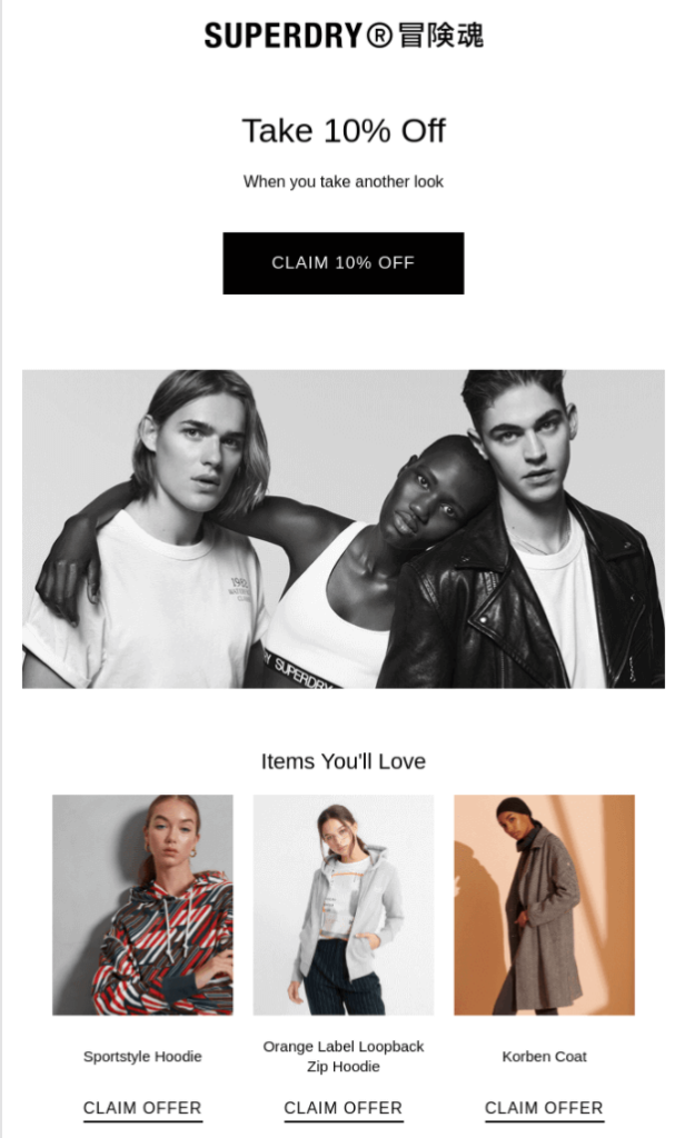
For example, Superdry entices their customers through a series of emails providing special discounts, promotions, etc. to showcase the value of their products.

Source: Superdry
The users with the highest level of interest will sign up for a newsletter or other form of email communication. This is vital, as it enables you to see exactly who your most interested prospects are and market to them directly.
UX Best Practices at The Desire Phase
For the Desire stage, your best bet is to arrange a drip campaign, or an automated email campaign, which can be set off by different triggers and sent at strategic periods. For example, when someone signs up or makes a purchase, you can then sent prewritten emails during key periods, such as sales, new blog posts, company news, etc.
Also, although they’re prewritten content, assure that emails are personalized with the prospects’ names or their company names. Emails that appear auto-generated, or lack a human touch, yield a poor UX.
As you may have gathered, content is as weighty a component at this stage as in others. You need to eliminate any traces of a poor UX, such as an image that appears clickable, but doesn’t actually take users to a landing page, enlarging the image instead, a common UX problem. Nothing spoils a customer journey like obstacles in the digital experience — another reason to measure user behavior.
Stage 4: Action
Last, but certainly not least, we’ve reached the final stage: action. This is the most targeted stage of the conversion funnel for obvious reasons. After pumping out UX-optimized content and building a relationship with potential customers, only a small portion of them will make it to this stage.
Most will hang in the balance of desire and action, toggling between the two until they make the decision to either buy or bounce. This is where your UX can make or break you.
UX Best Practices at The Action Phase
First, you need to ensure that the navigation of your product pages are neatly organized so that products are easy to find. Don’t succumb to the UX sin of overstuffing your navigation. Finding your product/service should be a seamless experience.
As for the product pages, each must have selection tools that make it easier for customers to filter out products by way of their particular needs. (Think of common product organization types like size, color, price, etc.)
Additionally, all aspects of this experience must promote purchases, from the ability to zoom in, to quick load times of the actual product pages (when clicked on from a multi-product page), to the product image quality.
Any element can be off-putting at this stage, including non-design bits like pricing, so make sure your UX is superb and built around actual customer intelligence.
UX Insights Throughout the Conversion Funnel Optimization Process
Measuring the success of your marketing efforts does not end while you embark on optimizing the conversion funnel. In fact, you should not approach the conversion funnel as a standalone marketing tactic to reel in more conversions.
This is because not all user experience exists in such a linear way. As such, it may ring true for some users but not all. Particularly, the customer decision journey can be seen as a contrast to the funnel. This can be observed by viewing user paths and segmenting your users to narrow behavior-based categories.
By tackling a specific segment, you can customize the UX to that segment, to assure an optimized journey that reduces exists and bounces. For example, pure player brands understand that their content will not be consumed by a general audience. Only specific segments will visit their sites and social channels. As such, they create content that aligns with the interests of their segmented users.
The Call to Action: 5 Tips To Increase Your Conversion RateYou’ve got months of careful planning under your belt, a fail-proof business plan, an enviable communications strategy, and you’re finally ready to launch your product or service.
Your homepage is the gateway to your brand. You’ve carefully crafted the content on your landing pages to showcase your unique offering.
But let’s be honest — how much thought have you really put into your CTAs?
Calls To Action, or CTAs, have the heavy task of turning your visitors into prospects.
Their design, location and messaging can’t be an afterthought — they must meet the needs and expectations of your visitors at the opportune moment.
In this post we will look at what makes a good CTA, and how to achieve effective affordance when designing one.
We will reveal the secrets behind the perfect CTA to help you drive a higher click rate and ultimately, more conversions.
What is a Call to Action or CTA?
A Call to Action (CTA), also known as a call-to-action button, is a clickable element designed to encourage users to perform an action.
Oftentimes, this button sends the visitor to a page where they are able to complete a purchase or subscribe to a service.
The Call to Action is generally considered the second step of your Inbound Marketing strategy, preceding the moment of purchase.
Its main objective is therefore conversion or transformation: that of your visitors into leads. Implementing efficient CTAs is crucial to the performance of your website.
The CTA can take many forms — it could be a button, a banner with an image, or a simple text link.
It redirects visitors to a landing page or pop-up window in order to:
- Sign up to a site
- Download a report
- Make a purchase
- Subscribe to a newsletter
- Request a demo
- Etc…
Given this, it’s crucial you send visitors to a relevant landing page to avoid any visitor frustration. But we’ll talk about that in another post.
The Call to Action Button: a Question of Affordance
It’s immediately obvious your CTA button is a button. Or is it?
An effective CTA is recognizable instantly and its function is immediately understood.
Affordance is defined as “the property or feature of an object which presents a prompt on what can be done with this object” — in other words, the possible actions suggested by an object or element’s characteristics.
In short: visitors should be able to immediately identify CTAs from their design. Not only is a good CTA instantly recognizable; it also stands out from the rest of the page. When in doubt, remember that a button must match the idea a visitor has of what a button looks like!
It doesn’t matter how beautiful your design is, if an element that is meant to be clickable doesn’t look clickable, your visitors will be left scratching their heads (at best) or leaving your platform altogether.
This is even truer on mobile, where affordance is the only indicator of active in-page elements. Remember: you can’t hover on a smartphone! In fact, the only way to measure the performance of a CTA on mobile is to track clicks.
CTAs and Mobile UX
As discussed above, while the appearance of a CTA is a key factor that influences desktop performance, it’s even more important on mobile.
Digital behavior is heavily influenced by context, and visitors browse differently on their office desktop than on their mobile, especially while they’re on the go.
Browsing while waiting for the subway, walking down the street or perusing items in a store comes with its own set of challenges, and the absence of a mouse or touchpad may result in less tap accuracy.
A survey of 1,333 people carried out by researcher and consultant Steven Hoober revealed that 49% of users hold their smartphone in one hand (the right hand in 67% of cases).
This statistic has given rise to the concept of the Thumb Zone, which sheds light on the importance of the size of devices and site elements and of how this impacts usability.
To get advice on how to design the perfect CTA, we quizzed some of our UX-perts across our offices in Paris, New York, London and Munich. Here are their 5 top tips for creating an irresistible CTA.
1. Make Sure Your CTA is Visible
Because it’s good to start with the basics, a good CTA needs to be visible. This means:
- It must always be above the fold, particularly if it’s an add-to-cart CTA.
- You must use colors that contrast with the rest of the page.
- There needs to be enough empty space around the button to suggest interactivity.
- If there is more than one button on the page, increase the size of your main CTA and go for a bolder color so that it can stand out.
Make sure you position your CTAs where users expect to find them (add-to-cart buttons, for example, are often located in the top right corner of the page). If visitors can’t see your CTAs, then you’re bound to miss out on sales.
Here are some common types of CTA buttons:
- Sharp-cornered button
- Rounded-corner button
- Gradient background button
- Ghost button
Dropbox uses a simple design with a lot of space, in keeping with the minimalist look of their homepage. The simple design means their blue Call To Action really stands out on the page, and since the CTA button is the same color as the Dropbox logo, there’s no misinterpreting the message on the button.
2. Create an Easily Identifiable CTA
While a CTA has to be visible, it also needs to look like a CTA (see the section on affordance). A heatmap tool will help you see if your CTA is doing its job — ie. whether customers are actually clicking on it.
An identifiable CTA has:
- A shape that suggests its function: heart or thumbs up for a like, a cart icon for add-to-cart…
- A color and design that reflects the brand’s aesthetic and the colors on the page
- A hover feature on desktop
Another example of a viable CTA is the “Remember Everything” button on the Evernote website. It clearly communicates the value of signing up, and the green of the main button both reflects the brand’s palette and stands out on the page.
3. Communicate a Clear Message
The text on your button, if there is any, must be crystal clear.
The wording should be:
- Straight-to-the-point: the text should explain the exact function of the button (Order, Confirm, Remove…)
- Impactful: if possible, the button should point out the value for the user (Download the guide for free, Get one month free…)
- Coherent: it needs to clearly show where users will land next
It’s also smart to:
- Create a sense of urgency, highlighting time-limited offers, limited stock, etc…
There’s nothing like a timer to make a user want to sign up. Visitors who spend some time on the Aquaspresso homepage are welcomed by a pop-up CTA, which advertises a limited-time offer and displays a two-minute timer.
4. Use an Accessible CTA
By now you know that a high-performing CTA is an easy-to-click CTA.
A study by the Massachusetts Institute of Technology Touch Lab found that the average width of a finger is between 10 and 14mm, and the average fingertip is between 8 and 10mm wide.
It follows that any clickable element should be at least 10mm by 10mm. Yes, UX is an extremely precise discipline.
Barkbox provides another great example of the ideal CTA, and the two CTAs on their homepage demonstrate how well the brand knows its audience.
There are many consumers who visit the site are interested in signing up to the service themselves but there are also others looking to give a Barkbox subscription as a gift.
To make their customers’ lives easier, the company has chosen to display two CTAs on the homepage: “Choose Your Barkbox” and “Give a Gift”.
5. A CTA Should be Reassuring
Finally, make sure your CTA is reassuring to your client or prospect. Clicks should trigger a confirmation, which could be visual or audible. The absence of a confirmation could leave the user thinking that their action was not confirmed, causing them to repeat the action needlessly.
Enabling a confirmation feature limits unnecessary interactions and, as a result, user frustration.
You can also reassure visitors by clearly communicating that an action can be reversed at any time. Netflix, for example, allows visitors to cancel anytime, once they have signed up — a reassurance feature that had a positive impact on conversions.
You are now equipped will all the knowledge you need to create irresistible CTAs on your web, mobile site or app. Don’t forget that a big part of creating an effective CTA is “>understanding the intent and browsing context of your customers, and fine-tuning the design accordingly.
Remember to use CTAs sparingly — too many CTAs kill the CTA.
And, some parting words of wisdom: test, test, test!
Whether you are making changes to the size, color, shape or location of your CTA, A/B testing and granular analysis of customer behavior will help you make the right decisions.
