Mother’s Day is right around the corner (May 12th, 2019) and many brands are making the most of the gift-giving occasion, giving special campaigns pride of place on their homepage and across their website.
But how do Mother’s Day campaigns impact conversions? Are visitors clicking on these special promotions? In short, is producing all this Mother’s Day-related content really worth it?
We analyzed 53 million visitor sessions on fashion, luxury, beauty, technology and jewelry sites to see how digital consumers browse for gifts during the Mother’s Day shopping season.
We paid particular consideration to elements like homepage carousels and category pages to paint a clear picture of how Mother’s Day campaigns contribute to traffic, conversions and other KPIs.
Mother’s Day Campaigns Defined
What exactly constitutes a Mother’s Day campaign? We’re glad you asked. For the purpose of our research, it is defined as a specific site element (think slideshows, sliders, etc.) or landing pages that highlight Mother’s Day and lead visitors to a product list page with specialized gifts for the holiday.
Here are 4 findings we’ve culled from our arsenal of original data in the retail space during the Mother’s Day shopping season.

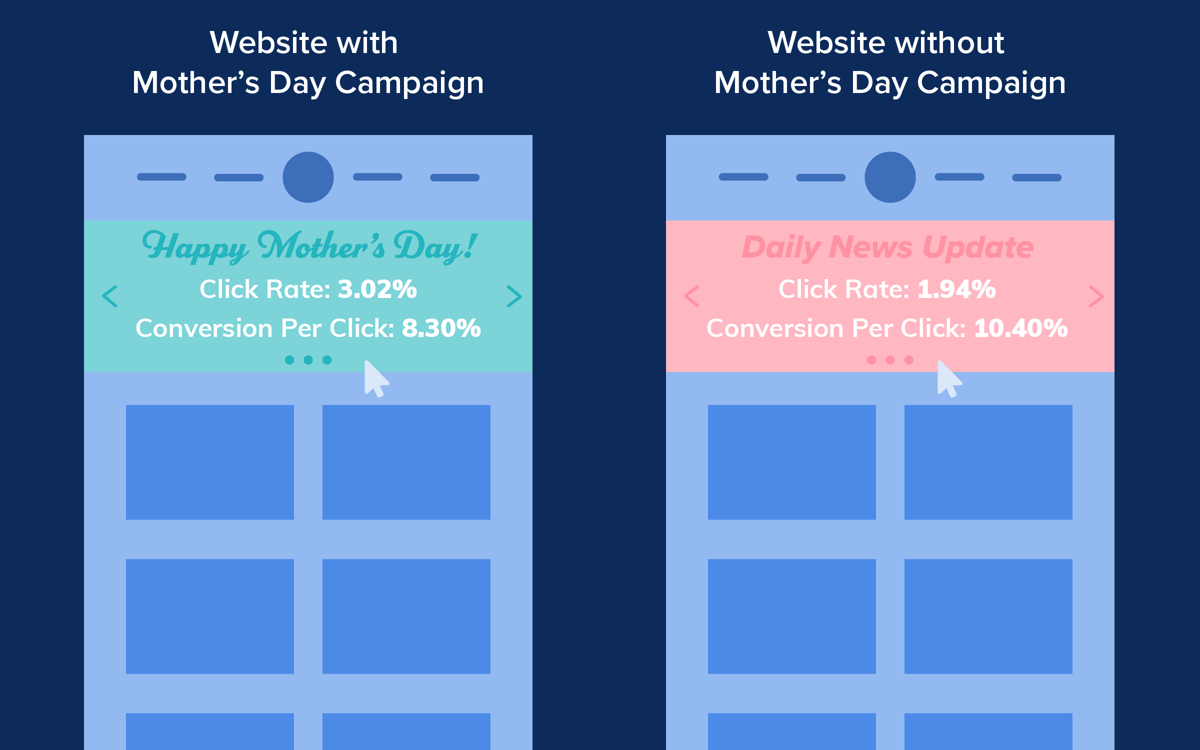
An example of a Mother’s Day campaign from Avon, wherein clicking on the slideshow leads visitors to a product list page.
Websites with Mother’s Day Campaigns Convert Better
Conversions. The raison dêtre of any brand, digital or otherwise. Our data shows that brands that implement Mother’s Day campaigns yield higher conversion rates and generate more revenue than brands that don’t.
In the lead-up to the special day, brands advertising Mother’s Day gifts saw a 211% boost to conversions. This increase in sales also hiked up the revenue for these brands by 22%. Meanwhile, the average visitor shopping cart was 1.28% higher for those browsing sites that made a special effort for Mother’s Day.
So far, so good. So how do you get visitors to consume and act on all this specially-created content?
Mother’s Day Campaign Carousel: Higher Click Rates, Lower Conversions Per Click
We looked at how visitors were interacting with homepage carousels to see whether giving this prime website real estate a Mother’s Day makeover was a winning strategy for brands. With a 3.02% click rate, Mother’s Day banner images drive higher interaction than other carousel images at a 1.94% click rate — that’s 54.87% more clicks for Mother’s Day content.
While Mother’s Day carousel images may reel in interest and curiosity among site visitors, they do not always drive more sales. With a 10.4% conversion rate per click, non-Mother’s Day banner images have a bigger impact on conversions than Mother’s Day banners, which carry an 8.3% conversion rate per click.
So with visitors clicking on Mother’s Day carousels, but not necessarily converting, what kind of data do you need to look at next?
Mother’s Day Product Category Pages Get Less Traffic But Driver Higher Carts
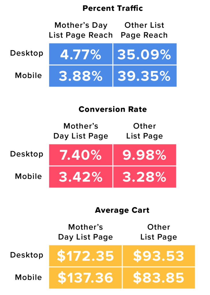
Next, we peered at the pages where conversions occur: product list pages. A comparison of Mother’s Day product list pages with regular category pages reveals that consumers are more likely to reach the latter. Regular product list pages get 7 times the traffic of Mother’s Day product list pages on desktop and 10 times the traffic on mobile.
But while Mother’s Day list pages may get fewer views, visitors who browse these pages have deeper pockets than regular shoppers, resulting in higher than average carts for these pages. Average carts for shoppers who reached the Mother’s Day category page on desktop were 84.28% higher than those who didn’t, while average carts on mobile increased by 63.82%.
Additionally, higher carts have reached higher conversions — on mobile at least. Mobile visitors who reach the Mother’s Day product list pages are 4.2% more likely to convert than those who reach the regular category pages. However, desktop conversions on other list pages beat out Mother’s Day list page conversions by over 20%.
Gift recommendations and products in packages generally make for a good strategy to increase average cart increases for Mother’s Day.
Mother’s Day Campaigns Have Higher Page Attractiveness
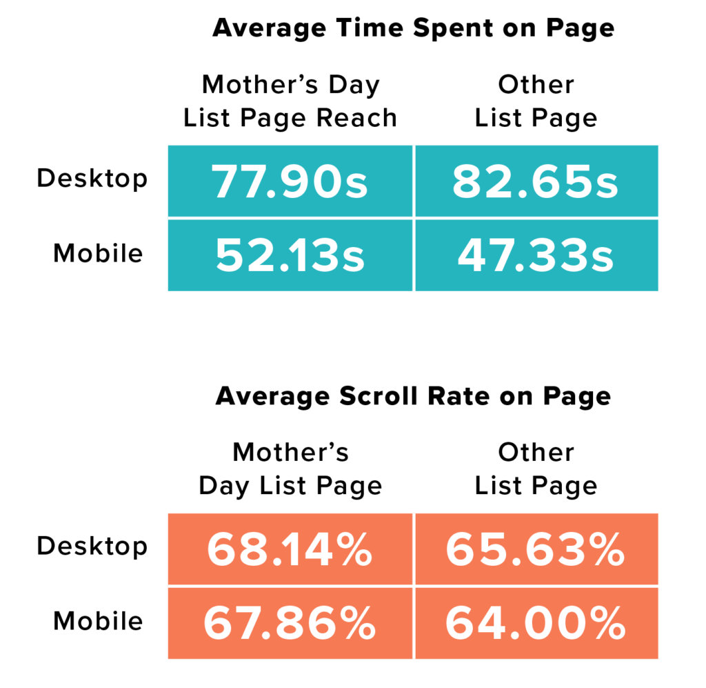
Overall, visitors displayed higher engagement with Mother’s Day content than with non-holiday content, and were more likely to click, hover and scroll on these pages. The scroll rate alone was 6% higher on mobile and 4% higher on desktop.
In fact, the overall activity rate for Mother’s Day category pages was 12% higher than on regular category pages, showing that inspirational content does have the ability to captivate visitors’ attention.
The only KPI these pages did not outperform their non-holiday counterparts on was the average time spent on page on desktop, with visitors spending 6% less time on them. Mobile visitors, however, were willing to spend 9% more time browsing gifts for their mothers than other items.
Pro Tip: Make The Most of Higher-Than-Average Carts With Gift Sets
According to the National Retail Federation (NRF), the world’s leading retail association, which hosted its Big Show in 2019 that Contentsquare took part in, US customers are predicted to spend $25 billion on Mother’s Day in 2019. In short, Mother’s Day campaigns are not to be missed.
Per our research, brands featuring dedicated Mother’s Day campaigns fared better than those without them in several regards: increasing conversions, driving more revenue and recording higher-than-average carts. Revenue alone was 1.95% higher in April for sites with Mother’s Day promotions, presenting a retail opportunity to uplift conversions through new campaigns.
An increase in scroll and activity rates shows that consumers are willing to engage with Mother’s Day campaigns, and brands should see the holiday as an opportunity to highlight unknown products and push inspirational content.
Mother’s Day shoppers have twice the average cart of those browsing regular category pages and are clearly willing to spend money on their moms. This audience will gladly splurge on a gift set so make sure you have those options available.
How UX Analytics Can Help You Understand Your Consumers’ Decision JourneyUX analytics can help you see how your website is being accessed and used. But did you know you can take this to the next level by extracting behavioral data on your site visitors, such that displays the consumer decision journey? This kind of insight reveals why and how users are interacting with your website.
Customer journey maps help you amass a comprehensive snapshot of all the pages your customers visit on your website during each stay.
Along with customer journey mapping, there is a slew of other UX analytics data that showcases a more granular view of visitors’ site meanderings. This type of data has a twofold capacity: understanding your customers’ mindset as they navigate your site, and digging into what drives (or stalls) the consumer decision journey.
Customer Journey Analysis: Your Customers’ Page by Page Motions
Customer journey analysis aggregates user interactions on your site to help you understand the many paths visitors take through your platform. Mapping out the steps visitors take on your website can help you understand user intent and locate stumbling blocks along the customer decision journey.
You may, for example, notice a spike in one of your site pages. Viewing the traffic on these pages alone won’t reveal much about why or how your users have landed there. That’s where customer journey analysis is useful: it shows all the pages your consumers have gone through before reaching a particular page, or, as most business owners would prefer, before they covert. It’s also useful for revealing where visitors get lost, abandon their journey or bounce.
Accessing this start-to-finish view of journeys allows you to drill down into the navigation patterns of your most valuable behavioral segments for a more granular understanding of what is preventing them from reaching their goal(s).
You may notice some visitors go back and forth multiple times between the category and product page before exiting your site — are they happily window-shopping or are they stuck in a loop, unable to find what they are looking for?
The answer is in the consumer’s decision journey — visitors are communicating their frustrations and delight with the user experience through each of their interactions. Being able to measure engagement (but also revenue metrics) on each in-page element of your site is the next step to removing the roadblocks to conversion.

Behavioral Insights From Granular Data: Your Visitors’ In-Page Experience
While customer journey analysis provides an overview, a first look with a high-level vantage point at how visitors peruse your site pages, it’s important to follow it up with an in-depth, in-page analysis. The following section highlights just a few of the metrics that can add a layer of insight to your understanding of your consumer decision journeys and help you derive a deep-read of your customers’ UX on your website. These bits of behavioral analytics will help drive your understanding of your customer’s decision journey into much further detail.
Engagement Rate
If your content is engaging, there’s a good chance it’s having a positive impact on your consumers’ decision journey. So how do you go about measuring a concept as subjective as engagement? We dot it by combining two other behavior KPIs.
Since clicks are often representative of interest, at least some degree of it, we base the engagement levels off of them. While hovers may also indicate interest among users, they can also point to confusion and even hesitation among site users.
That’s why to measure the engagement rate, we calculate how many visitors clicked on a zone after hovering over it. Specifically, this is reflected as a percentage of visitors who clicked after hovering. Before your customers convert, or if they choose to leave without converting, this KPI divulges which elements are intuitive and which aren’t, which essentially shows you how such elements contribute to your customers’ decision journey.
Click Rate
Piggybacking off of the importance of clicks, click rate delves even further into analyzing how clicks contribute to consumer decision-making. The click rate observes how many clicks occurred in relation to page views, since viewing a page alone does not guarantee engagement.
The click rate is a calculation of the number of page views where a zone was clicked divided by the total number of page views. This metric allows you to determine how many site visitors clicked at least once on a zone (or in-page element) for each page view.
This is relevant to understanding customers’ decision journey since not all page views will lead to clicks and not all zones will receive clicks either.
Understanding how many times visitors clicked at least once on a zone during a page view helps you understand which zones are most engaging to customers. This conveys how these zones and their usage contribute to navigation and bring visitors closer to meeting their goals.

Hesitation Time
Understanding where users hesitate on your website can convey either interest or confusion and is measured as the time elapsed between the last hover and the first click on a zone. While some site elements allow you to infer your visitors’ sentiments when they hesitate, others might require some more digging.
Perhaps the copy isn’t clear, maybe an element’s clickability is murky. In either case, you should survey hesitation time in order to understand if your content is easily understood.
This metric is ideal for interpreting whether images are being consumed properly. For example, if a text-heavy visual has a high hesitation rate, it could simply be a sign that the content is being consumed as intended. On the other hand, a visual with little copy and a high hesitation rate could convey confusion and present an argument for optimizing the UX of this area.
Conversion Rate Per Click
Clicks are demonstrative of some level of interest, but wouldn’t it be great to know if clicking on a zone impacts your behavior and conversion goals? Well, there’s a certain UX metric that can measure just that: conversion rate per click. This metric is determined by the number of users who clicked on a zone and completed the behavior, divided by the number of users who clicked on the zone.
This is especially useful when analyzing a category page, in that it shows which zones are helping customers achieve the goal of reaching a product page. After all, they need to be on a product page to view your products and most importantly, buy them. When users are on a product page, this metric helps you analyze which zones are helping customers accomplish the goal of adding to their cart.
In these respects, this metric gauges the performance of zones according to your business objectives. It helps you see the strengths and weakness of your content and pinpoints the role of the zones on a page in propelling your visitors’ decisions.
Understanding Your Customers’ Decision Journey
When analyzing visitor journeys on your site, it can be tricky to understand why your site users behave the way they do. Digital behavior insights can help you visualize the frustrations and impediments along the decision journey, helping you see which elements of your platforms are intuitive or obtuse, clickable or not, conducive conversions or off-putting.
Key to improving the experience for customers is first and foremost understanding what it is they are trying to achieve on your site. With a bird’s eye view of their navigation and an elemental analysis of each touchpoint, you can optimize the decision process and maximize conversions.
The UX Faceoff in UK EnergyIn 2013, six companies serviced 99% of all UK energy customers. By 2016, that number dropped to just 85%. Last year nearly 1 in 5 customers were using an independent energy supplier.
The dominance of the “Big 6” is evidently waning. What can established brands do to fight back?
What Happened?
First, consumer engagement increased. Research from Ofgem shows the rise in the number of consumers switching, changing their tariff or comparing their supplier in the last 12 months.
A recent report from KPMG indicated that nearly 70% of switchers in 2016 were moving from large to small suppliers.
This represents a big risk for incumbent energy brands. Challenger brands able to effectively activate the remaining portion of this largely dormant audience will be highly disruptive and may well steal significant market share.
Experience is the New Battleground
Energy brands should look to more developed retail markets like fashion and luxury if they are to stay ahead of the curve. Don’t forget: energy consumers are retail consumers too, and their service expectations are already set by the likes of Amazon and Google.
- Customers who had an unpleasant experience on your site are 88% less likely to return.
- 50% of consumers are likely to switch brands if a company doesn’t anticipate their needs.
Ten years ago, the expectation of switching costs, complex tariffs and intolerance to risk made customers reluctant to change suppliers, even if they were offered a better deal elsewhere.
This has changed. Today’s customers are educated, deal-savvy and more than happy to switch providers. Brands offering attractive switching bonuses, referral rewards, and seamless energy management pose a tempting offer for the vast swaths of consumers who still can’t name their current energy provider.
Your UX Ages Fast
Businesses that aren’t constantly looking for new ways to optimize, streamline and remove friction are already losing the battle for customers.
According to a recent report, the three key reasons for switching energy providers were:
- Lower price
- Better customer service
- Differentiated product
Brands must ensure their service offering is fully aligned with customer needs if they are to provide a superior customer experience. But often the first hurdle to overcome is understanding how your customers operate:
“To ensure your interface caters to customer needs you’ve got to know what those customer needs are! For OVO, that comes from a few different areas: the explicit feedback customers provide over the phone (observing the common topics that customers call up about), in-app feedback, alongside behavioral data that shows how users are engaging with our interfaces.
We see more than ¾ of our customers check their account online. That ability to give customers instant access and data is important to keep them engaged with their energy usage, and ultimately their energy supplier.”
– Bobby Chucas, Ex-Product Manager, OVO Energy
We analyzed 12 million sessions across 5 energy brands to understand why visitors come to Energy sites, identify key differences between incumbents and challenges, and provide UX recommendations to brands looking to optimize for key user intents.
Key Customer Journeys in Energy
- Account management – 63%
- Read editorial content – 4%
- Explore new offers – 7%
- Subscription forms – 11%
- Contact pages – 10%
Incumbents Vs Challenger Brands
INCUMBENTS
- 5x more visits to contact details
- 4x more visits to information pages
- 9x more visits to editorial content pages
CHALLENGERS
- 85% more visits to the ‘subscribe’ section
- 43% more visits to offer pages
- 2x more visits to quote pages
The data suggests incumbents are more likely to attract customers looking to get in touch to solve issues, find out about their current tariff, and read editorial content.
Conversely, challengers will attract those looking to switch, subscribe to new content, find out about new offers and compare energy prices.
For more insight into the importance of UX optimization in energy, download the free report Why UK Energy Suppliers Need to Join The UX Revolution
How to Enhance User Flow with UX AnalysisUX analysis is methodically different from brand to brand, as each has its own set of KPIs and priorities.
User flow comes into play where UX analysis is concerned, as it is a fundamental part of UX, fulfilling a pivotal role in maintaining the sales funnel and, for this reason, conversions.
Also known as visitor flow or customer journey, the user flow denotes the path that a typical user on a website takes to complete a task, including all the steps along the way.
Mapping out visitor journeys and examining all the finer points of the user flow, such as what your visitors are doing on each page they visit, will inform you on how to improve your UX. To do so, you’ll need to begin with enhancing your user flow.
UX Analysis for Improving User Flow
Here are the steps you’ll need to take to tweak user flow with a UX analysis.
1. A Visual, High-Level View of User Flow
The first step in examining user flow is to access a high-level visualization of it. Much like a birds’ eye view, such a perspective displays all the steps of the user flow in one clear illustration of the pages viewed within the customer journey.
Where visitors land, which task(s) they complete and at what stage they do it unveils what they have been attempting or seeking from your website. Alternatively, the regions in a website in which users couldn’t complete an action reveal their struggles.
Visualizing where visitors enter your site, where they head to next and ultimately how they exit helps add a layer of behavioral understanding to customer segments.
Clarity and accessibility are key in this step, so make sure you use an analytics tool that can clearly lay out an analysis of your visitors’ journeys.
2. Observe & Simplify the Number of Steps
Secondly, you’ll need to scope out the number of steps in the user flows. This is important, as it shows the complexity your visitors undergo to complete each action. It allows you to surmise if you should increase or lessen the number of steps in these users’ journeys.
Identify friction points in the customer decision journey, including looping behavior and premature exits. Contemplate whether your visitors’ need to fill out a certain form field or enter a particular landing page to lead them to conversions or other actions. If not, cut these steps out! Less is more often times.

3. A Deeper, Page-by-Page Read in Your UX Analysis
Next, you’ll have to heed the happenings, aka individual visitor behaviors on each page of their user flows. This will help paint a clear picture of how your users’ traverse your site.
Analyzing visitor paths through your site can immediately flag pages with issues — be that an error message or a UX obstacle. For example, what is causing visitors to exit after adding to cart?
Once you’ve found these problems or points of friction, you can begin to conceive some optimization endeavors.
Besides conversions, you should decide on the metric(s) you seek to make the most strides on in your user flows. Perhaps you want to see a larger click recurrence or a smaller hesitation time. When you zero in a few KPIs or metrics, you’ll be able to tackle user flow optimization in a more precise and conscientious way. This will allow your team to implement a more granular approach to improving each step in the digital visitor journey.
4. Implement A/B Tests
Then, consider how you can improve the user flow by implementing A/B tests. A/B testing is a strategy in which two versions of a website or app are tested against each other on their performance. This will help answer questions about why the setup or features in one page are more effective than another, allowing you to make informed optimization decisions
Finally, after you’ve delved into your UX analysis, you can make changes to your UX accordingly, which will directly influence user flows. Perhaps they’ll improve user flows, making them easier for users to achieve their tasks without issues. There is also the possibility that these changes will have little effect on these flows.
What’s certain is that a granular, behavioral analysis provides a much more lucid picture of how your visitors interact with your content. Although traditional analytics are certainly part of the makeup of this picture, they do not present a comprehensive user flow.
Accessing the user flow requires sifting from an overview to granular data, from viewing journeys to in-page steps, and zooming in on the obstacles.
Culling this data will allow you to make fact-based decisions, instead of those based on intuition.

More Tips on User Flow & UX Analysis
The number of steps a user must take to complete a task often corresponds with their satisfaction over the quality of the digital experience. A good experience is unlikely to have points of friction in which visitors find themselves burdened in the steps towards completing an action.
However, there are instances in which shorter journeys are not the UX target; there will be instances where you want to drive longer sessions and deeper engagement.
An in-depth level of data can help you answer whether a short site duration is telling of a good or bad UX. You have to inquire if a short site navigation is due to visitors having completed their goals or if they struggle with the experience.
An exhaustive UX analysis will shine light on these questions. And since seamlessness is a cornerstone of a good UX, an exhaustive analysis of customer journeys goes hand in hand with digital customer satisfaction.
Optimizing Mobile Experiences: Interview With Bobby Chucas of Babylon HealthSummary
With over 2.5 million users, Babylon utilizes 21-century tech and a robust mobile strategy to fulfill their mission: to place an accessible and affordable health service in the hands of every person on the planet. From tackling challenges of form completion to designing a purposeful and compelling mobile platform, Babylon draws on behavioural insights to create a seamless experience. We sat down with Bobby Chucas, Senior Product Manager, to uncover how to optimise for a mobile-first world.
Intro
At the heart of every great mobile experience is a team that understands its users’ needs. Since 2013, Babylon has worked with partners like the English National Health Service, Samsung, and Tencent to revolutionize the GP experience. Named one of Europe’s hottest startups by Wired in 2016 and the Mobile App of the Year at the UK IT Industry Awards 2015, Babylon takes the mobile approach to democratizing healthcare.
A pioneer in health informatics, Babylon uses artificial intelligence to place accessible healthcare in the palm of your hand. However, it’s Babylon’s robust mobile strategy that places the user at the center of attention. From tackling challenges of form completion to designing a purposeful and compelling mobile platform, Babylon draws behavioral insights from its 2.5 million user base to create a seamless experience.
We sat down with Bobby Chucas, Senior Product Manager, to uncover how to optimise for a mobile-first world.
What’s your biggest challenge when it comes to optimizing your mobile experience?
You’d think mobile experience would be an easy thing to get right, given how much less space you’ve got to work with! However, mobile’s more complicated than being just about screen size, and is as much about understanding your users’ context and intent – given that mobile users could be literally anywhere when interacting with you – when they’re interacting with your product as it is about design. The biggest challenge we have is that what we’re offering requires focus and time: my product is a free, quick health assessment available through an app that gives you a detailed view of your risks of high profile diseases. This assessment is up to 15 minutes long, and many of the questions are quite specific, ranging from family history of certain diseases through to questions around sexual health and drug taking. We’d obviously love our users to get as much value out of the product as possible, so one of our biggest challenges is ensuring that users understand that the assessment takes time and focus, but that the payoff in terms of the insight you receive from the product is well worth the effort.
What can mobile commerce sites learn from Babylon, and vice versa?
Babylon isn’t really presented as a commerce app – while there are services users can pay for to get tests, insights, appointments etc., that’s not the focus, and that’s not what we’re trying to prioritise. Often our users come to us when they’re experiencing symptoms that they’re worried about, and of course our priority is to provide a seamless experience that gets them the information and support they need. By focusing on the needs of the user, we hope to build trust and reassure the user that Babylon is a service they can rely on. It’s difficult to translate this across to pure commerce, but focusing on the user’s immediate needs and priorities is hugely important for us.
That said, many commerce sites have very well structured conversion funnels, and I’m sure there are many insights we can take from those kinds of experiences to better convey what kind of offerings we provide to our users of our private service.

What’s the most surprising behaviour you’ve seen from mobile app visitors?
The most surprising behaviour we’ve seen is that we’re getting around 75% of our users to complete the assessment. Most equivalent assessments see conversion rates in the low single figures, so the fact we’re getting that rate is really valuable. We tested out a number of different ways of framing the assessment, in terms of conveying the value of the insights to users before they started, and we also experimented with the format – we provide a conversational chatbot experience rather than a standard form to fill in, which helps to engage users. It will be interesting to see how this evolves as we increase the range of diseases we provide, as they will be accompanied with more questions, and so we’ll need to decide whether users are still happy to take the assessment all in one go, or whether breaking it out more clearly would make sense.
What are the most important factors in an optimal mobile experience?
In general, people hate it when their screen gets too busy. The experience when you tap on a link to a site, which then fills the screen with multiple prompts for GDPR, cookie consent etc., is frankly awful. Whilst some of that is of course required by regulation, some sites can be tempted to grab the user’s attention by fitting as much information above the fold as possible, in the hope that one of the many items catches their eye. While in some situations this may work, most research shows that the far more compelling experience is a more sleek, refined, experience based around a single intent or purpose. Not only does that provide a clear purpose to the content you’re presenting, it also provides you with a clear metric of success that you can use to research and test how to add incremental value to your product.
What are the common mistakes most brands make when it comes to mobile strategy?
Criticising businesses for not being “mobile-first” has become a bit of a trope over the past few years, but it’s certainly true that it’s very difficult to get right. Often teams can evangelise enthusiastically about mobile, but when it comes to their development process they still build their desktop screens first, then essentially condense them for mobile. It’s not as simple as tweaking the design, and is much more dependent on research into understanding why the user’s interacting with you, and what they’re trying to do. By understanding that and ensuring that you’re expediting that as much as possible, you’ll keep their attention and stop them getting frustrated and resorting to searching elsewhere.
We’re potentially seeing a similar type of trend now with voice interaction – as smart home devices like Alexa and Google Home become more commonplace, more products will become available through the voice medium, and I’d happily bet that many of them will take the same approach and try to shoehorn their existing offering into a voice experience, rather than reconsider it from the bottom up. The first few products to get that experience right will create an incredible opportunity and reach for themselves.

When it comes to delivering a positive UX, the approaches are vast and possibly endless, considering the wide range of verticals and their emerging niches. While you always want to make sure your digital experience falls in line with the expectations of your industry, there are certain general ways to create a positive digital experience for your users.
Each of these generalities encompasses specific actions you can take to deliver the best experiences for your users. Once you’ve taken these actions, you can master the essence behind these tips. As a side note, none of these are “generalities,” per se; we back up our tips with data. Check them out and start a UX strategy that ensures digital happiness now!
Reduce Points of Friction
In the sense of content, friction can be defined as any website element or quality that sets off irritation, frustration, hesitation or any negative feeling within visitors. In turn, these points of friction drive your customers to exit or bounce, with the possibility of never returning to your website again — something you ought to avoid at all costs. You have to identify these points of friction first before you modify your site content accordingly.
So, where are said points of friction found on your website? Believe it or not, but not all of them are based solely off of the design. Some of them stem from outside factors — they’re still a part of the UX but originate elsewhere — think prices. Here’s a roundup of several points of friction:
- Poor search bar experience, i.e., a search bar with irrelevant results, or no results due to minor spelling errors (The search bar has a 76% higher click-through rate than a menu, per our grocery report)
- Glitched fields & CTAs
- Botched cart experience
- Sign-up requirements at checkout
- Long landing pages (shorter landing pages have 13% higher conversion rates)
- Unforeseen fees (handling/processing, delivery fees, etc)
- Form fields
- Promotions that are no longer available but are still live
- Seemingly clickable elements that aren’t clickable & non-clickable that appear clickable
- No confirmations of a successful/unsuccessful action
These points of friction are undoubtedly noteworthy, but to truly get a sense of whether or not any of these are afflicting your users, your only recourse is to analyze their behavior and measure the experience. Smart analytics allow you to extract users’ hesitations and other points of friction at a particular space or element on your site. Once you’re armed with this knowledge, you can make discerning choices on the changes you need to make to your UX.
A few pointers to put an end to friction:
- Keep your messaging transparent (eliminate hidden costs, display reassurance elements when relevant, make sure sales have specific dates, etc).
- Make sure that all form fields are intuitive and error-free.
- Streamline checkouts.
- Make it easy to navigate between pages and remove unnecessary back-and-forths.
- Design ergonomically, as it will affect page speed.
- And make sure all site elements function properly.
- Assure vital site actions (purchases, signups, email entries) have confirmations for site visitors)
Optimize Your Content for an Omnichannel Experience
In 2019 and let’s be honest, for the past decade, users have branched out of browsing the web on desktop solely, and even mainly. Most brands cultivate their strategy on a mobile-first foundation. That’s because a wide swath of verticals including travel, gaming, retail, apparel and others have seen higher traffic rates across 2018 alone, according to our yearly roundup of mobile data.
But it’s not just mobile that’s left the fringes of the digital space; tablet has also made its presence mainstream and has had a steady growing use worldwide. Brands would be wise to pay attention to the growing use of tablet, as it beat out mobile conversion rates in 2018 in the games and media, groceries, pharmaceutical and cosmetics sectors.
Mobile currently wields a chunky 70% of the time people spend on digital media. But despite its large share of traffic, mobile is beset by a conversion gap across the cosmetics, luxury, retail, gaming and other verticals.
An omnichannel experience doesn’t merely refer to the presence and usage of different device types, as it deals with frequent crossovers. For example, a visitor may commence their digital journey on mobile but can end it on desktop or even by way of going to a store (and vice versa). The task at hand is to create experiences that are both tailored for and consistently positive at every touchpoint.
A few pointers on optimizing your UX for an omnichannel experience:
- Ensure that all your data and main content are consistent across touchpoints.
- Create channel-specific capabilities that set you apart from other brands in your vertical
- Integrate a back-end between all channels for seamless transitions
Enhance Your Site with Productive Features
What would the UX be if not for the different forms of content that comprise a website? But such features do not merely serve an aesthetic purpose. They can be the determiner or the last stand between a user and a conversion.
This is because conversions are in large part dependent upon visitors’ feelings of satisfaction by their experience on your website/ app — something we like to refer to as digital happiness. All the content on your website plays a role in fulfilling a visitor’s objective — whether this objective is to renew a standing order, check out your store hours, or browse for garments. Keeping your customers digitally happy is the best way to ensure customer loyalty and site returns.
That is not to say you should lust after trendy features — if you do, you’re a UX sinner. Study your customer journeys instead to create a more personalized experience for them.
Additionally, perfecting your site with efficient features also means giving your current site features a facelift. For example, if you have too many form fields, consider downsizing. If a clickable element on your mobile site is too small, you should enlarge it.
When on the hunt for new creative ways to engage with your site visitors, consider doing your own due diligence on UX elements. You can’t observe these on your own site, as you haven’t implemented them yet, so it would be vital to learn how they’re faring. Also, you should iterate on the features that have already been used if they have positive interactions that can be proven with data.
A few pointers on optimizing your UX by adding productive features:
- Personalize your content by adding recommendations based off of user behaviors.
- Incorporate white space throughout your site. It increases user comprehension by 20%.
- Don’t inundate users with content or information that is irrelevant to conversion or site-staying goals.
An Optimal Digital Experience

Not every site visitor will undergo a positive UX. They are bound to run into points of friction, website malfunctions and journeys not optimized for an omnichannel experience. It’s important to have the right data on hand, the kind that gives you the full picture of visitor behavior, where they’re hesitating and whether they experience digital happiness. Analytics are your best friend — so keep that friendship alive!
We’re Getting Ready for Adobe Summit 2019, Where Experience Meets ExpertiseWe’re heading back to Adobe Summit for a second consecutive year, and we’ve got something extra special up our sleeves for this year’s digital experience conference.
We’ve designed an interactive booth experience that will have attendees sleuthing for clues on our wall of UX insights and cracking the code to our secret Show Me The Money Room.
We’ll also be taking the stage with some of the foremost brands in fashion and luxury, who will be sharing their tips on enhancing the digital experience to keep customers digitally happy.
A three-day extravaganza centered on experience building and the convergence of data with design, Adobe Summit is an unmissable event in the digital marketing calendar.
Set to take place on March 26-28th, in Vegas, the three-day conference will also feature our very own Chief Strategy and Partnership Officer Jean-Marc Bellaiche, who will be in conversation with some of our partner brands, including fashion giant Ralph Lauren.

Contentsquare to Double Down on Digital Experience and High Conversions
Our March 26 session on “Breaking Down Data Silos For Better Digital ROI” will look at the benefits of fostering a data culture, and empowering digital teams with unique visitor engagement metrics.
The session will touch upon smart analytics and customer-centric attribution: how they can be used to elevate the digital customer experience and propel higher conversions.
Jean-Marc will be joined on stage by heavy hitters of the fashion, luxury and retail industries, who also happen to be our partners: Ralph Lauren, Sam Edelman and MatchesFashion.
We’ll also discuss how these top brands utilized our predictive insights and unique metrics to boost their own customer engagement across touchpoints. Session attendees will be able to learn how digital teams were able to expedite reactivity, become more agile and build an impactful optimization strategy.
Essentially, we’ll be covering how these top brands shifted their culture from that of instinct to one of insight, which has, in turn, increased their digital ROI.
Surviving the Digital Jungle — Highlights from the 2018 Adobe Summit
Given that this year will see our second session and booth at the Adobe Summit, we have a lot to measure up to. During the 2018 Summit, we partnered with luxury jewelry brand Tiffany & Co. and financial services giant Goldman Sachs.
But we haven’t merely headed to these types of conferences to take part in a talk. Being that we are experience-oriented where digital is concerned, we also bring our experience-centric vantage to events.
For last year’s booth, we built an entire digital jungle and invited attendees to find their way out of an ominous digital landscape using only flashlights. In our session, we discussed how to survive the dominance of eCommerce giants like Amazon and thrive in the era of digital transformation.
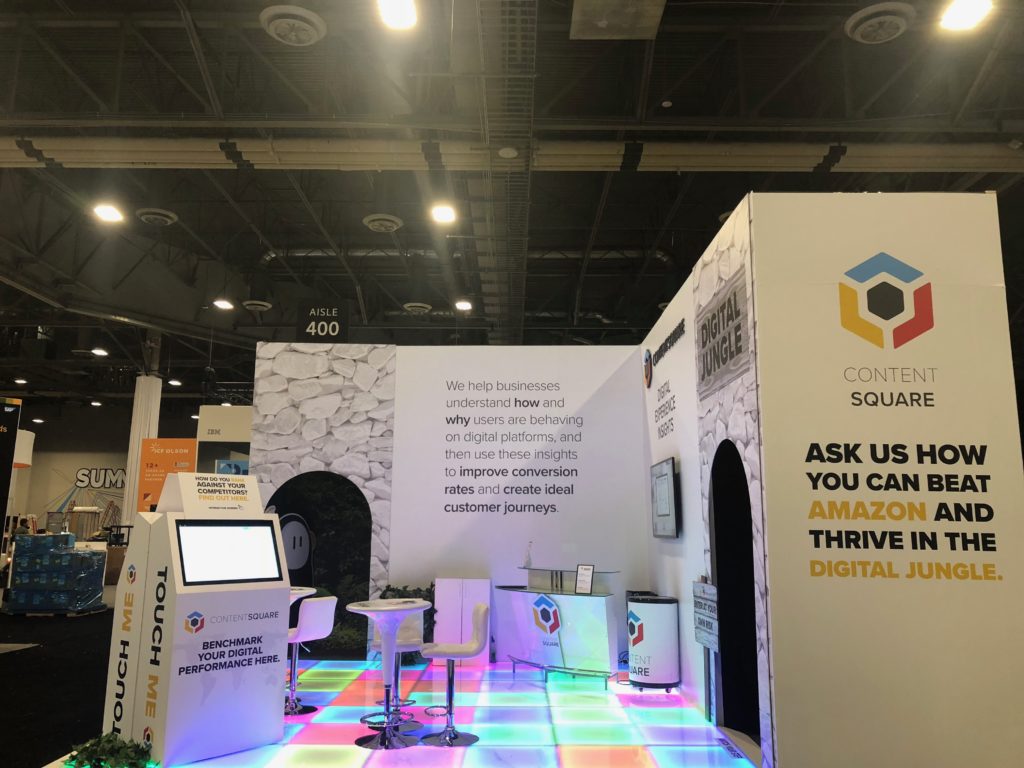
We’re UX-perts both in the digital and physical realms.
Come See Us at the 2019 Adobe Summit
This year, instead of challenging attendees to escape the digital jungle, we’ll be encouraging them to crack the code to unlock the door to our secret Show Me The Money room.
We don’t play games when it comes to digital experience, but we do when it comes to conference booths. And even though we like to say that data beats opinion, this year we’ll have booth visitors guessing for prizes.
If you’re curious, stop by booth #223 from March 26th-28th, and our team will be happy to answer any and all of your digital experience questions. See you there!

When taking on Conversion Rate Optimization (CRO), the primary concern for digital marketers is unsurprisingly the user experience. UX is a catch-all phrase for a visitor’s experience journeying a website, the feelings they undergo and the content of the website itself. Consequently, there are a variety of methods to improve it.
While having CRO on the mind is important, it is also critical to consider user behaviors, including the negative ones. As business owners or marketers, we often have to contend with a rather challenging digital reality, that of bounces and exits. While the definitions of these negative metrics sound similar, they bear a crucial difference.
Delineating site leaves, the bounce rate is far more detrimental to your UX than an exit, and its respective exit rate. That’s because the bounce rate refers to visitors who leave a site after visiting only one page, while the exit rate refers to the visitors leaving after their last pageview, at the end of a journey which may include any number of pages. This article will show you how to both improve your UX and reduce your bounce rate in 5 ways.
1. Measure Conversion Rate and User Experience
It has been said that if you aren’t measuring, then you aren’t marketing. Consequently, particularly in UX and the subdiscipline of conversion rate optimization (CRO), measuring comes first. It is crucial to know how your website is faring and conversion rate is one of the foremost KPIs to keep track of. You’ll also need to understand the state of your conversion rate before moving forward with any changes to your UX.
Measuring the conversion rate is done via the following calculation: divide the total number of conversions by the total number of site visitors and multiply the result by 100%.
This is the formula for conversion rate:
Conversion rate = (conversions / total visitors) * 100%
For example, if there were 8,055 visitors on your site which yielded 1,003 conversions, the conversion rate is 12.45%.
There is no single method to quantify the UX, since it encompasses both the feelings of the users visiting the site and the content of the site itself. There are many factors to work out, as the UX cannot be defined by a single metric, unlike the bounce rate or CRO.
You can parse through the UX through a variety of means. This is where unique, AI-powered analytics come in, as they point to a much more granular understanding of your visitors’ behaviors. You can get a deeper understanding of the digital happiness that your users experience, by way of a read on their emotions. This can be achieved through an overview of their patterns of behavior, one that takes into account visitor objectives, or intent, context and more.
There’s a lot to sort through when evaluating digital happiness, but these factors contribute to your UX, and as pointed out, UX goes a long way towards both reducing bounce rates and optimizing the conversion rate. Here are some of the metrics to work out in your user experience:
- Hesitation Time: The average gone-by time between the last mouse movement and the first click on an element of your site, or zone. This metric shows if the content is quickly understood or if visitors hesitate before they click.
- Engagement: Expressed as a percentage, it shows the visitors who clicked on something after hovering over it. This metric reveals how intuitive an element is, i.e. its ability to demonstrate how it should be used through its design.
- Click Rate: The number of pageviews where a zone was clicked divided by the total number of pageviews. This metric allows you to identify how many visitors clicked at least once on a zone per each pageview.
- Conversion Rate Per Click: The percentage of the number of buyers who clicked a zone divided by the number of users who clicked on it. This metric shows you if clicking on a zone impacts purchasing behavior.
- Attractiveness Rate: The percentage of visitors who clicked on a zone after they have been exposed to it. This metric clarifies the attractiveness of an element.
2. Improve UX Design

The design of the UX is essential to the success of digital journeys. You won’t be able to improve the user experience without addressing and mending the design. What makes up the UX, if not the copy and design?
For a long time, UX design has been a guesswork game, with analytics solutions having provided some answers but not all. Today, next-gen solutions can produce a much more in-depth reading of consumer behavior. These will empower you to make wiser, more UX- savvy designs, so that your site visitors get the most optimal user experience. But the UX design should not be entirely dictated by designers.
As aforesaid, marketing teams reflect a diversity of roles and responsibilities, and the UX design can benefit from a variety of team members’ input on improving the UX. Thus, data democratization is paramount, as it denotes data accessibility: the ability of data to be accessible, and understandability, which denotes the ability to be understood and leveraged by non-data analysts. When behavioral analytics meet data democratization, your UX design will become virtually foolproof and indestructible, creating a space for digital happiness.
Additionally, with access to highly visual, easy-to-read data, UX designers don’t have to wait for analysts to provide them with answers before they get to work. This allows them to streamline their projects and helps focus continuous optimizations.
3. Optimize Website Speed
Website speed paints a picture of the faculty of your UX, and as such, has the ability to yield a good or at least an average, conversion rate. Your website’s load speed is important since it’s one of your visitors’ first impressions of your site. Website speed is especially crucial on mobile, which has surpassed desktop in traffic. And there’s plenty of judgment as far as that is concerned for an on-the-go audience.
There are a number of ways to optimize your website speed for both the desktop and mobile versions. First, evaluate your current website load time, a quick task away, since there are several free sources performing a website speed test on your site, such as GTmetrix and Uptrends.
Next, you’ll have to deduce what is slowing your website down, before you can compile a list of solutions. Website speed can slacken from a variety of issues. These include image difficulties, such as too many images per page, large image sizes and the src tag when using images in HTML.
There are other contributing issues, most of which are technical in nature, such as a high server response time, a lack of browser caching, issues with coding languages and disregarding compression.
Once you find what’s bogging down your website’s speed, you can then employ several methods to remedy it. You can try several workarounds; it’s most appropriate to do what corresponds with your particular issues.
These techniques include: changing your website host, tinkering with your images (such as with their size, src tag, etc.), minimizing the amount of JavaScript and CSS files, minifying your plugins, detecting 404 errors and reducing file sizes via compression.
4. Work on Your Funnel Conversion
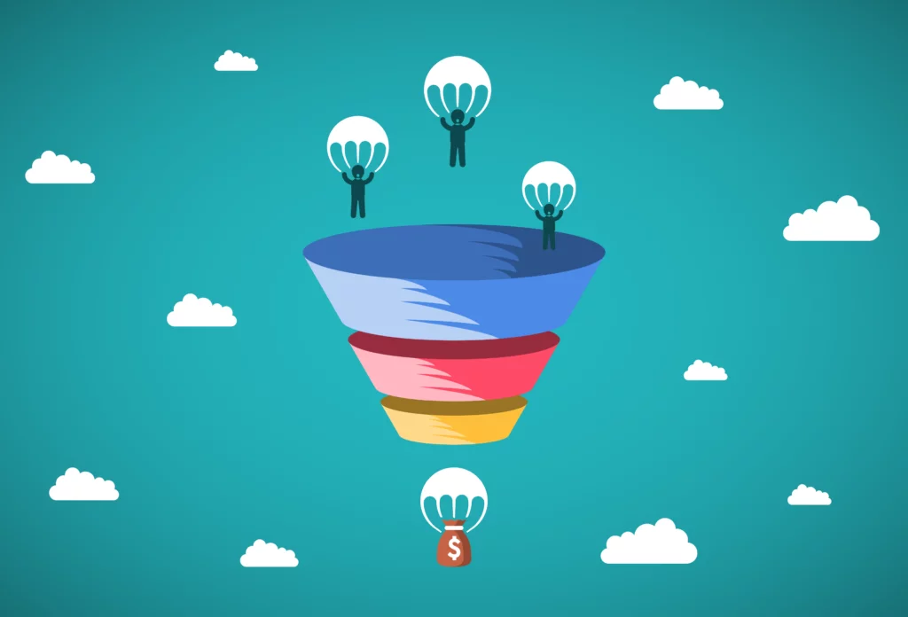
This primarily deals with sales. A sales funnel is a visualization displaying an assessment of where your site visitors are in their customer journey and conversion process. Specifically, a sales funnel is a model, one that is aptly shaped like a funnel, with the widest area at the top, representing all levels of visitor/customer engagements and narrow at the bottom, which displays the most engaged users, or those most likely to convert.
The below image shows the sales funnel, which can be thought of as a chart that sums up your prospects’ sales process. Each stage can be used to improve the overall funnel conversion, i.e., the totality of the process that gives way to a conversion. By working through each stage in a step-by-step manner, you can effectively augment your funnel conversion.
First, start with the awareness stage at the top. This entails building your brand awareness and digital footprint. You can do this via blogging, social media campaigns, PPC and SEO campaigns and traditional PR work.
Next, you must tackle the consideration stage, where brand awareness exists. To do this, take the lead magnet approach, in which you propose solving your leads’ problems if they give you their email address in turn. This will push these leads further down the funnel. The lead magnet involves using landing pages, CTAs and contact forms for content engagement.
For example, in the case of a contact form, it would be beneficial to be able to know exactly which form field is causing user abandonment of the form. Some form fields aren’t clear to users and others just don’t work because of a technical malfunction. Knowledge is power and with the knowledge of these obstacles, you can make precise optimizations.
Then, ease your leads further through the rest of the steps by way of educating them. This can be done through the application of emails, drip marketing (emails you send over time that have long been previously written), integrations of your CRM for re-targeting, offering promotions to incentivize conversions, monitoring your social media campaigns, performing A/B tests and finally, asking converting users (customers in e-commerce) to refer a friend or anyone that may benefit from your offering.
Throughout your sales funnel optimization efforts, you should analyze your visitor journeys to make sure the path to the objective is clear and intuitive. And of course, the final steps of conversion must be streamlined and pain-free for your visitors so don’t neglect to locate and fix obstacles at checkout.
5. Improve Your CTA Button
At last, we arrive at the point of conversion in the UX: the terse but mighty CTA button. The CTA button is the last portal to converting, the threshold between your ultimate goal and user hesitation. So it goes without saying that your CTA button must be optimal.
Fortunately, the CTA button requires little on both the copy and design fronts. First, you should come up with a call-out that is not only attention-grabbing but clear and easy to understand. This is usually no more than a few words that denote a command.
Regarding the design quality, you should make your button big enough to be easily seen without the need for much scrolling down after a user views the content above it. Ideally, the button should be big and bold enough to be impossible for your users to overlook.
While generating a productive CTA button isn’t difficult, the button itself is only as good as the content before it. If the content on your landing page is too long, profuse with jargon or exhibiting poor design elements, your prospective visitors and leads will leave before they even finish reading, watching or scrolling through your content.
However, even if your visitors do reach the CTA button, this does not guarantee conversions. Sometimes, the CTA button itself is out of order. There are several signs to take into consideration of a non-working CTA button.
For example, pay attention to clicks and hovers. Is there a high hover rate but little to no clicks? That’s a UX red flag. Are your users clicking on a non-clickable element? This indicates a faulty CTA design, in that the users think a non-CTA element might be the CTA button. Before answering these questions, you’ll need to be equipped with these particular types of analytics.
Thus, captivating visuals and persuasive copywriting go hand in hand on your landing pages, or wherever else you place a CTA. But a truly functioning and conversion-yielding CTA requires knowledge about how users are interacting with it, which only certain analytics can provide.
In Conclusion
Per this reading, you have probably concluded that improving the user experience and reducing bounce rates is not a lone endeavor by any stretch. Instead, it is made up of a series of processes that involve conducting measurements, applying UX design best practices, improving sales funnel conversion, executing an adequate CTA and quickening the speed of your website.
These processes and solutions will not be the same for businesses and websites industry-wide, or even necessary for all, as the UX differs across businesses and their respective digital assets. Thus, the conversion rate also varies from site to site. The good news is that if your CRO efforts stem from a granular analysis of how consumers are navigating your site, you’ll be able to optimize from a knowledgeable place, and enjoy data-driven results in no time.