Comparing Products: Design Practices to Help Your Users Avoid Fragmented Comparison Users aren’t always intent on purchasing. They may need to conduct extensive research first, meaning they’ll often visit a site multiple times, compare ui/ux and delay their purchase until they’re confident they’re making the right product choice.
Comparing services and products can be time-consuming, especially when you’re flipping back and forth between pages, websites, and information. This is especially harder on mobile, which helps explain why most industries have higher traffic from mobile yet a higher conversion on desktop.
Here are some guidelines that can be applied to pages that use a comparison matrix.
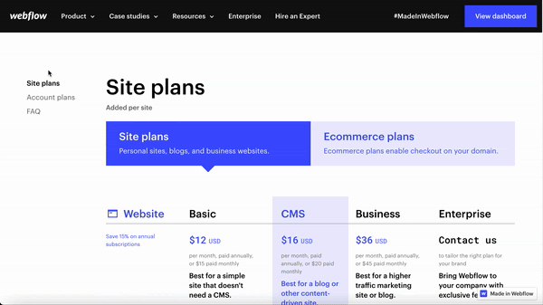
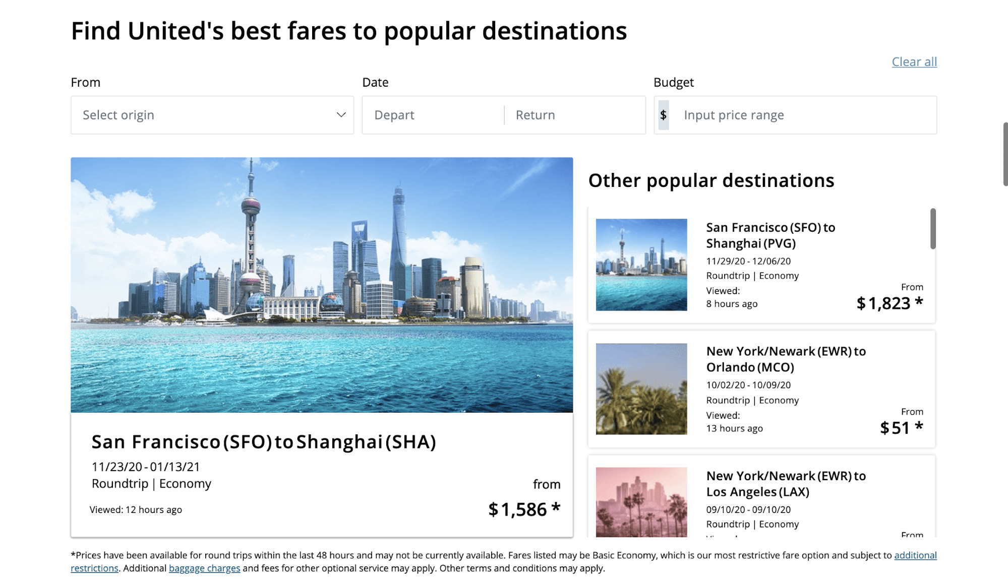
Keep product names, links, and purchase CTAs accessible at all times
Because most comparison tables can’t be viewed fully on desktop or mobile screens, it’s important to keep the most important information and actions fixed to the top of the matrix, such as linked product titles, prices, and purchase CTAs. As users scroll down, these elements should remain viewable to help encourage conversions.
Lengthy comparison tables can frustrate users who are only looking for a general overview of each product. So consider collapsing part of the table with an accordion to ’Show more’ based on user preference. This allows those who want a top-level comparison to see more content below the comparison matrix, and not get stuck in the finer details.
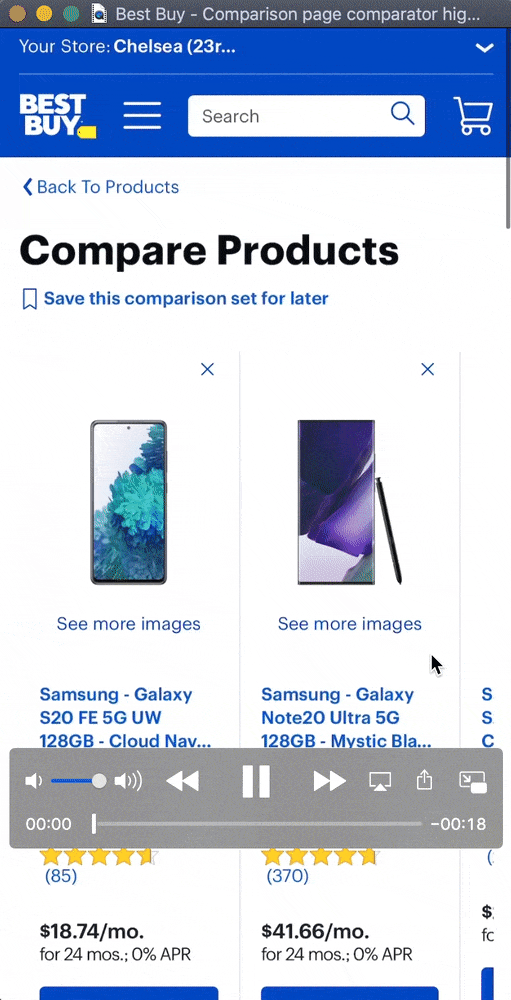
Product titles remain at the top of the page as users scroll the listed features, with the option to change the model of the product they’re comparing. Users can also interact within the table to see different visual specifications specific to each model, allowing the user to see the wider range of possibilities when choosing a product.
Once users add products to the comparison tool, the product names and conversion CTAs remain sticky at the top of the page.
Comparing products: Help users easily identify key differences
It’s unlikely your users will read every detail, so it’s imperative the design allows them to easily skim the differences. This helps them decide quickly which product is most appropriate for them.
3 top tips for your comparison matrix
- Use white space or hyphens to imply a lack of features, and check marks to indicate the existence of a feature.
- If you include descriptions of features, use short and succinct phrases. Lengthy descriptions will hinder your user as well as clutter the matrix.
- Avoid using text in every row or column; this defeats the purpose of the user being able to compare products easily.

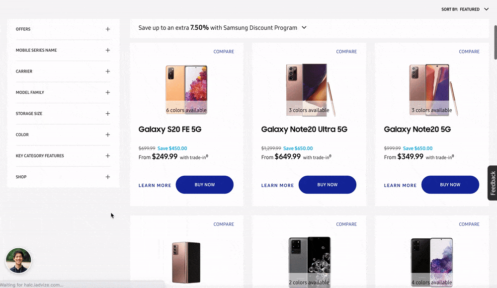
The key differences are easily seen with the use of white space. There is no attempt to fill every row with information, which allows the user to see clearly which plan has the most features. Text is only used when the products all contain the same features and they are clarified further to delineate the differences.
The comparison tool takes advantage of the horizontal scroll on mobile to allow users to compare many products at once. Users can also toggle the table view to highlight the key differences, making it easier to spot which features are differentiated by product. In addition, the user is provided a preview of the main features, with an option to expand the rest of the details. The comparison tool even compares reviews and ratings from customers.
Comparing products: Answer common questions as users browse the product comparison
Though highly informative, the comparison matrix is unlikely to answer all your users’ questions. They may have common questions about your line of products or pricing that isn’t necessarily a highlighted feature. They may also need clarification on specific features that the table doesn’t provide.
It’s important to answer common questions here, as the comparison page is a key conversion point of the journey. Make sure to check which types of product pages are more likely to lead to conversion using Page Comparator within the Contentsquare platform. Then understand whether navigation away from the page is likely to lead to an exit using our Journey Analysis feature.
In this case, tooltips within the matrix or a condensed section of FAQs below the matrix are both extremely effective methods of answering common questions. Rather than rely on graphic icons to delineate tooltips, consider using text to phrase common questions as the tooltip itself. Tooltips phrased as common questions are more relatable and easier to spot than a smaller graphic icon.
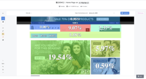
Comparing products: Use a soft offer close to the main CTA
Providing a soft offer can be the golden ticket when encouraging users to try the product without a full commitment. Promoting free trials or offering a free consultation close to the main CTA can be an effective way to reach prospective clients.
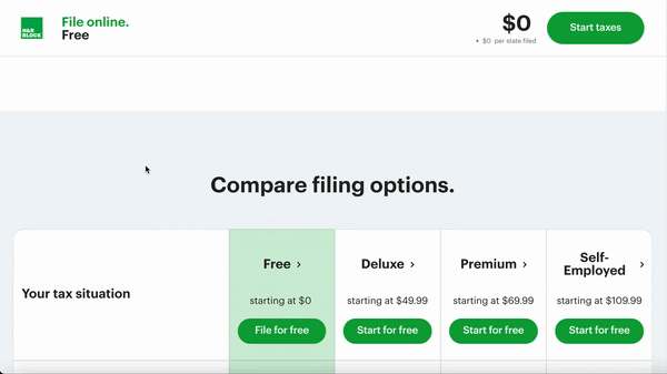
The product CTAs and titles remain sticky at the top of the matrix, with an emphasis on starting a trial.
The CTAs focus on trying a free trial, but offer a text link for users that are ready for more commitment.
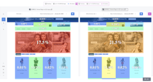
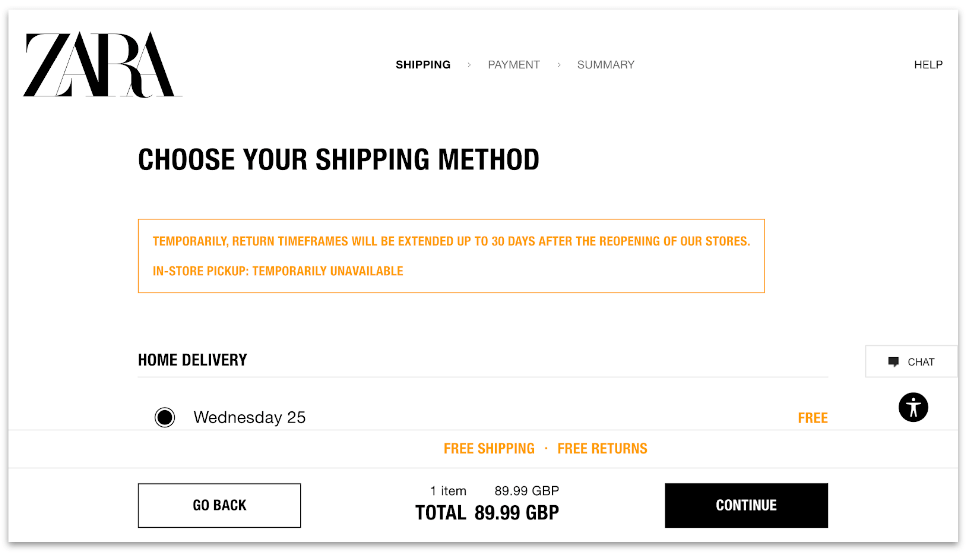
Be transparent about pricing prior to checkout
Lastly, because many products have various pricing methods and commitments – annual versus monthly, for example – it’s important the user understands exactly what they’re signing up for.
Allow users to toggle different views of the comparison matrix that adjust the pricing to their specifications. Clearly state whether users are expected to make annual commitments, and whether plans or products can be canceled at any time.
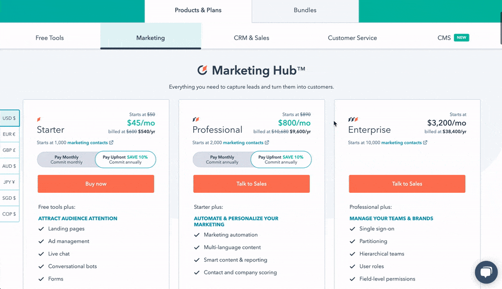
Users can easily toggle the different pricing options; the price adjusts based on the selected method.
Remove customer friction with Contentsquare
Find out why your customers behave the way they do with our industry-leading customer experience analytics platform. Use our Session Replay feature to understand why customers aren’t interacting with your chatbot design, or discover your most profitable digital paths with in-depth Sunburst visualizations, covering data from 100% of your customer journeys.
Interested to learn more? Book a demo with us today.
The Digital Happiness Index: Quantifying Your Customer Experience Although conversions are the desired outcome of a good customer experience, they are not the end-all be-all for brands. A happy customer may make a one-time purchase, but more importantly, a happy customer will return to do business with your company time and time again.
But, how exactly do you define something as elusive as customer happiness? How do you understand the nuances of customer frustration and pinpoint what exactly fosters engagement? And, how do you turn all of this data and intelligence into an effective retention strategy that drives greater customer lifetime value (CLV)?
There are plenty of systems designed to measure user experience; these primarily deal with the pages users visit on your site, conversions, and the oft-cited biggest UX failure: bounces.
But, unfortunately, basic user experience metrics won’t give you enough insight into the nuances of users’ digital happiness. Sure, studying on-page experience, bounce rate, time on page, and other CX metrics are important, but they only give you a one-dimensional view of your customer experience. They fail to give you rich insights into customer sentiment. Fortunately, there is a metric that does exactly that: the Digital Happiness Index.
Calculated from several other behavioral metrics and consolidated into one mega metric, the Digital Happiness Index (DHI) is a unique measure of visitor satisfaction, providing an objective view of whether or not your overall experience is hitting the right notes.
In this article we’ll look at:
- What Is Digital Happiness And How Can You Achieve It?
- What is The Current State of Digital Happiness?
- Calculating the DHI: the 5 Dimensions of Digital Experience
- Making Sense of the Digital Happiness Index
What Is Digital Happiness And How Can You Achieve It?
Before we delve directly into the DHI, let’s start by focusing on digital happiness. A rather simple concept, it denotes the convenience, satisfaction, and even the pleasure of interacting with a website or online interface, such as a search engine results page (SERP).
As a feeling, it is incidentally difficult to pin down, even in the digital realm. But by using Contentsquare’s DHI metric, you can determine how happy your site visitors are, based on their experience with your site or app.
The first of its kind, the DHI combines KPIs from 5 key pillars that contribute to overall customer satisfaction:
- Flawless: Are customers enjoying a smooth experience free of technical performance issues?
- Engaged: Are customers engaging with and satisfied with the content?
- Sticky: Are visitors loyal, returning to the site frequently?
- Intuitive: Does the navigation make it easy for visitors to enjoy a complete experience?
- Empowered: How easy is it for customers to find the products and services right for them?
Is your site’s navigation seamless and friction-free? Is your content proving effective in helping visitors reach their goals? Are visitors coming back to your site? Are they exiting early or completing their journeys? And finally, are they finding what they’re looking for — be that information or products?
By quantifying these various strands of experience, and combining metrics into one score, the DHI provides brands with an objective grasp of whether or not visitors are enjoying a positive experience.
What is The Current State of Digital Happiness?
To better understand the current state of digital happiness in the world, we recently surveyed over 500 marketers and 4,000 shoppers from around the globe in our new Digital Happiness Pulse survey. Here are some of the shocking findings the survey revealed:
1. Most Marketers Can’t Measure Digital Happiness
- 77% of marketers say their brands don’t think about customer happiness as a key concern
- 84% of marketers can’t currently track the moods and mindsets of digital customers
- 76% of marketers can’t accurately measure whether digital customers are happy
If brands are going to understand and improve the happiness of their digital customers, they need to focus on using the right metrics, getting access to the right customer data, and the right technology to make the first two possible.
2. Why Today’s Customers Are Unhappy Online
- 49% of online shoppers feel unhappy when a site uses pop-ups and adverts
- 42% of online shoppers feel unhappy when they can’t find what they’re looking for
- 48% of online shoppers feel unhappy when a site or app crashes during checkout
When asked if they feel happy when shopping online, only 15% of consumers said yes. Considering that a quarter (25%) of customers feel nervous about shopping in-store since COVID-19, now is the time for brands to get serious about making online experiences just as good as — or better than — those in-store.
Every brand’s goal should be to create digital experiences that ensure customers leave your app, site, or online store happier than when they arrived. This doesn’t mean losing focus on retention, market share or brand awareness, but rather thinking about those objectives in the context of satisfying customers and building experiences they’ll love.
Calculating The DHI: The 5 Dimensions of Digital Experience
Using behavioral data from our tool, the DHI separates the data into 5 dimensions to filter the numbers into intelligible concepts behind visitors’ digital happiness. Our clients get a comparison to industry standards, and every score represents an aggregate of every session on the website.
As we mentioned earlier, the DHI has 5 components or 5 dimensions that make up its final score, a number out of 100. To calculate a site’s DHI, we take the average of the 5 scores of each dimension. To come up with this rating, we consider the following five dimensions: flawless, engaged, sticky, intuitive, and empowered.
Each of these 5 individual scores is determined by its own calculations, based on metrics like time spent on site, time spent engaging with pages/elements, bounce rates, and more.
It also takes into account if users have reached their destinations and the way they’ve done so. It captures whether users ran into UX issues like non-intuitive navigation — clicks on non-clickable content, misleading clicks, etc.
Making Sense of the Digital Happiness Index
Innovations in SaaS and marketing have led to more avant-garde methods of measuring digital customer experience and benchmarking customer satisfaction.
Although the complex, 5-tier system of our mega metric is supplemental, it is very much in line with our granular approach to behavioral analytics.
The fact that the 5 dimensions deal with different occurrences in the UX means the DHI is casting as wide a net as possible to capture your customer’s mindset. Based on this score, you can shine light on areas of friction and other obstacles in the customer decision journey.
Customers today will not hesitate to review a poor UX or give one star for a session that doesn’t meet their expectations. But they are also giving you continuous feedback on your site or app through their interactions — with every tap, click, scroll or hover, they are voicing their feelings about your CX.
Here at Contentsquare, we give brands the tools to capture this on-page feedback so you can hear and understand what your customers feel and want.
Happiness of any kind is difficult to pin down to a numerical format. But, by combining the 5 pillars of the UX, you will come as close as possible to determining how digitally happy your visitors are with your content.
Conversion Funnel Optimization: How a Good UX Plays a Role Conversions rarely occur on a whim; usually, there is a layered process behind eCommerce purchases. Known as the conversion funnel — or the sales funnel — this model shows the conduit between the least aware prospects to those who are most aware of your company’s products and services. Those with the most knowledge of your offerings are usually the most interested and motivated to convert.
Brands have to be both wary and strategic in the ways they set up conversions, and that is where the concept of the conversion funnel comes in handy. While no one can truly “set up” conversions, you can set the scene and command all the workings that bring visitors closer to converting thanks to conversion funnel optimization.
As UX-perts, we like to blare the horns on the importance of UX, so it should come as no surprise that a good user experience plays an important role in conversion rate optimization. Let’s take a look at how you can optimize your conversion rate by way of working in a good UX to the different stages of conversion funnel optimization. Here are some of the topics we will discuss:
- What is a conversion funnel?
- What is conversion funnel optimization in marketing?
- What does good conversion funnel optimization look like?
- The different stages of the conversion funnel
- How to optimize these stages to drive consumers down the funnel
What is a conversion funnel?
Before we jump into how to optimize your conversion funnel, we need to briefly review what a conversion funnel is.
The conversion funnel denotes a process in which brands work to turn potential customers into converting customers.
It is comprised of several stages, with each one indicating your customers’ level of brand awareness, interest, and willingness to buy — along with the gradual steps and undertakings you can take to lead users further down. Here’s a quick breakdown of the different stages and what they mean:
- Attention/Awareness: At this stage, your users become aware they have a problem and first discover your brand. This might be through word of mouth, a google search, a blog post, a display ad, an email – you name it!
- Interest: Now, your users are more interested in what you have to say. Share how can your brand help them solve their problem?.
- Desire: This is where you need to turn on the charm and sell your visitors the benefits of your products and services. You want to drive home how your company is different (and better) than your competitors, pushing your users further down the funnel.
- Action: Your users have all the information they need and are ready to pull the trigger, whether they’re checking out to buy a shirt in their cart, applying for a loan, signing a contract, or taking whatever action your company defines as a conversion.
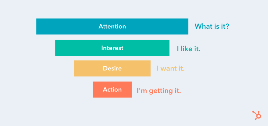
Source: HubSpot
What is Conversion Funnel Optimization in Marketing?
While the stages in each conversion funnel may differ from brand to brand, each shares the ultimate goal of “pushing” site users down to the very last step, which, evidently, represents conversions.
Through this structure, brands can group their potential customers into easy-to-understand categories, thereby dictating several efforts they can maneuver to encourage prospects further down the funnel.
There are various marketing tactics to drive customers down the conversion funnel; they can be deployed through more than one stage. Let’s dig deeper.
What is Good UX in Conversion Funnel Optimization?
Now that you know what a conversion funnel is, the next thing to cover is how to apply good UX practices that relate to each stage in the conversion funnel. The following spells out the ways brands can enhance their UX per each stage of the conversion funnel to optimize it and garner greater conversions.
Stage 1: Awareness
Sitting atop the conversion funnel as the entry point, the awareness stage is the stage with the least… awareness of your brand or offering(s). It’s also the stage with mounting awareness, as potential clients become cognizant of your business and click onto your website, the act which carries with it the possibility to spawn possible interest.
But that requires capturing new customers. You should approach your awareness stage with the mentality of casting a wide net. You want to attract as many people as you can, so you have a higher chance of moving people further down the funnel.
We’re not saying adopt a “spray and pray” method, you still need to be strategic and methodical so you can securely create a heightened awareness of what your brand does – and attract the right kind of customers. Getting tons of traffic on your site or clicks on your ads can be exciting at first, but if these are unqualified visits, they won’t do you much good.
Here are a few ways to educating potential customers on your brand and make it easier for new users to find you:
- PPC ads
- Social media campaigns
- SEO
Take e.l.f Cosmetics, for example. To educate potential customers, e.l.f. Cosmetics allows anyone to take their skincare quiz which not only provides awareness to what types of skincare products they offer but also how their products can help alleviate a consumer’s pain points. Whether a potential customer wants to treat acne, dry skin, or improve fine lines, e.l.f. has products that cater to their every need.
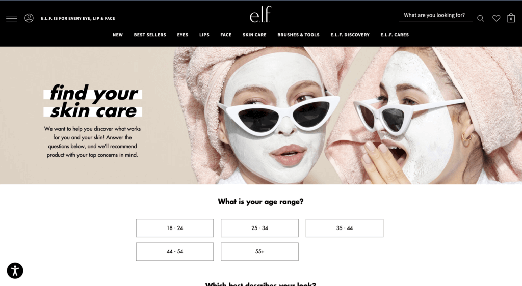
Source: e.l.f. Cosmetics website
You have to keep your target audience in mind and create your campaigns accordingly. But once you’ve brought new people onto your site, the UX must be optimized, or at least suitable to pique interest within visitors (lead them to step 2), or — even better — make them convert on the spot.
UX Best Practices at The Awareness Phase
There is a slew of general ways to improve upon the user experience. But often in the awareness stage, users usually arrive at your site via a landing page.
The UX has to be top tier on this page. Keep the copy and imagery relevant to the conversion goal, while making it clear what your brand does. The latter is more important since you’re introducing new prospects to your company. The copy and other contents on landing pages should be to the point, so steer clear of wasting users’ time. In short, don’t overload it.
Most importantly, construct the landing page so that it is relevant to the message that led visitors to click on it in the first place.
Stage 2: Interest
Next, we reach the stage of interest. Now that prospective customers know your company exists, they have to frequent your website; simply knowing about your offering(s) does not ensure they’ll return to your site or engage with your content.
Content is key in this step, as it can foster relationships and maintain interest within your prospects. There’s a twofold approach for conversion funnel optimization: the first is the nature of the content and the second concerns the UX, or the feelings and attitudes users develop over their experience.
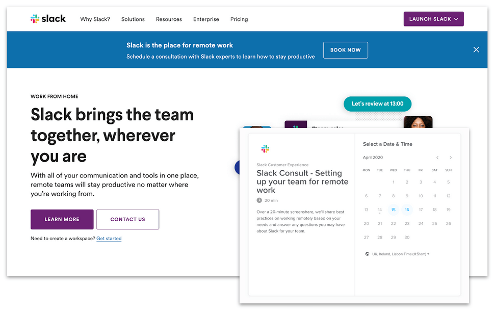
The first element deals with the core of the content — the content type, its subject matter, how it can help with your prospects’ problems, its visual identity, etc. You would need to establish a blog with relevant posts to your industry or niche. Take Slack for example, since the pandemic Slack has upped its content production, providing guides, interviews, etc to teach business leaders and employees alike how to adapt to the “new normal” with Slack.
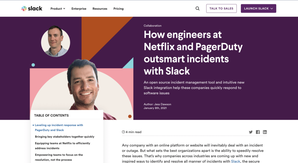
Source: Slack
Other useful content for stimulating user interest are:
- Guides
- Videos
- Interviews
- A resources page to keep everything together in one place
- And more! The sky is the limit – get creative and see what content works for your audience.
You would have to make sure these align with the needs/interests of your vertical as well as making your content stand out and offer something different. Videos and other content, for example, should not focus on the product alone, but offer something of value — whether that’s inspirational content, news related to your niche or something else.
UX Best Practices for The Interest Phase
As for the attitudes toward the content, i.e. the UX, consider the amount of content on your page; is it slowing down your site? If so, reduce it so that you never have issues with loading speeds.
Make sure everything can be easily seen and accessed. This will encourage further browsing. For example, if you have an in-page element that requires scrolling, the width of it, at the very least, needs to be wide enough so all the content can be easily read.
You should limit scrollable in-page content to one type of scrolling function (either by length or width, never both.) This is generally length, as this is easier to look through. Use carousels, in-page recommendations, and links to other pages to incite browsing.
In fact, when it comes to the UX in general, be sure to keep it continually optimized so that all content elements are easy to understand and seamless. The best way to gauge customer understanding and frustration is of course to measure interactions with each element.
Stage 3: Desire
Once you’ve developed some level of interest, you need to propel prospects towards the lower half of the conversion funnel, which starts with desire. Representing a heightened interest, desire attracts users to your actual offering aside from your content alone.
At this stage, you should make your product or service, as the stage suggests, desirable. It’s also where you have to distinguish your offering from that of your competitors, specifically, by positioning your company as the better option.
This can be done by:
- Employing more targeted social ads that lead to pages with CTAs
- Highlighting how your product can alleviate specific problems
- Offering sales/promotions
For example, Superdry entices their customers through a series of emails providing special discounts, promotions, etc. to showcase the value of their products.

Source: Superdry
The users with the highest level of interest will sign up for a newsletter or other form of email communication. This is vital, as it enables you to see exactly who your most interested prospects are and market to them directly.
UX Best Practices at The Desire Phase
For the Desire stage, your best bet is to arrange a drip campaign, or an automated email campaign, which can be set off by different triggers and sent at strategic periods. For example, when someone signs up or makes a purchase, you can then sent prewritten emails during key periods, such as sales, new blog posts, company news, etc.
Also, although they’re prewritten content, assure that emails are personalized with the prospects’ names or their company names. Emails that appear auto-generated, or lack a human touch, yield a poor UX.
As you may have gathered, content is as weighty a component at this stage as in others. You need to eliminate any traces of a poor UX, such as an image that appears clickable, but doesn’t actually take users to a landing page, enlarging the image instead, a common UX problem. Nothing spoils a customer journey like obstacles in the digital experience — another reason to measure user behavior.
Stage 4: Action
Last, but certainly not least, we’ve reached the final stage: action. This is the most targeted stage of the conversion funnel for obvious reasons. After pumping out UX-optimized content and building a relationship with potential customers, only a small portion of them will make it to this stage.
Most will hang in the balance of desire and action, toggling between the two until they make the decision to either buy or bounce. This is where your UX can make or break you.
UX Best Practices at The Action Phase
First, you need to ensure that the navigation of your product pages are neatly organized so that products are easy to find. Don’t succumb to the UX sin of overstuffing your navigation. Finding your product/service should be a seamless experience.
As for the product pages, each must have selection tools that make it easier for customers to filter out products by way of their particular needs. (Think of common product organization types like size, color, price, etc.)
Additionally, all aspects of this experience must promote purchases, from the ability to zoom in, to quick load times of the actual product pages (when clicked on from a multi-product page), to the product image quality.
Any element can be off-putting at this stage, including non-design bits like pricing, so make sure your UX is superb and built around actual customer intelligence.
UX Insights Throughout the Conversion Funnel Optimization Process
Measuring the success of your marketing efforts does not end while you embark on optimizing the conversion funnel. In fact, you should not approach the conversion funnel as a standalone marketing tactic to reel in more conversions.
This is because not all user experience exists in such a linear way. As such, it may ring true for some users but not all. Particularly, the customer decision journey can be seen as a contrast to the funnel. This can be observed by viewing user paths and segmenting your users to narrow behavior-based categories.
By tackling a specific segment, you can customize the UX to that segment, to assure an optimized journey that reduces exists and bounces. For example, pure player brands understand that their content will not be consumed by a general audience. Only specific segments will visit their sites and social channels. As such, they create content that aligns with the interests of their segmented users.
4 UX Best Practices to Optimize Travel Deals Ahead of The Holidays
Revolutionizing UX Analytics From The Inside: 9 Things I Learned As A Product Manager One year into my Product Manager journey at Contentsquare, I wanted to reflect on what I have learned, and how the past twelve months have shaped my approach to solution-finding.
I started my journey as a project management intern for VP of product to whom I mentioned in the first interview that I wanted to become a product manager. Back then, I had no idea what it really meant to be a “PM” — I was simply curious and wanted to talk to all these people.
At Contentsquare, product managers sit between the customer (internal & external) and R&D team. With the former, we detect the WHAT: what is needed to help our customer better understand the end user experience. With the latter, we decide on and execute the HOW: how to respond to those needs in an efficient and elegant way.
Product managers are the go-to persons for any question related to their scope — ie. the part of the solution they are responsible for developing. Therefore, the job includes building the long-term vision and strategy as well as the day-to-day execution on a very granular level. It’s a challenging and fulfilling role that I am truly proud of and can’t stop talking about.
So, without further ado, here are the 9 key things I learned as a product manager:
1. Always put the customer first
Being loyal to your customer/user starts with knowing who they are. Before building a feature, ask yourself: who are you building this for? What challenges are they facing? Talk to them, read their feedback and support tickets, collect the data — these investments are worth the time and effort since they decrease your chances of going down the wrong path right from the beginning.
Being loyal to your customer also means refusing to compromise on their experiences. Sometimes, cutting scope, downgrading the design, or opting for a less expensive technical solution would shorten the go-to-market timeframe. But ultimately, all of these “savings” risk compromising the end users’ experience. When cost-cutting or time-saving decisions are made, the only party not included in the discussion is generally the user. And as a product manager, it is almost a question of professional integrity to protect their interests and advocate for them.
2. Listening is more important than talking
Being a very talkative person, this one was a big challenge for me! Being too self expressive prevents you from hearing what others really think — be it colleagues, business partners or customers. Sometimes, silence can be excruciating in user interviews, and in the past I have felt obliged to give guidance or end my supposedly ‘open-ended’ questions with a list of options. I later realized that doing things this way would prevent me from knowing what the user would have said if it hadn’t been for my prompting. That’s when I realized how important it is to shut up and listen.
3. Prioritizing means saying no
As a product manager, I am constantly facing the question of prioritization. It can be as big as a quarterly roll-out roadmap, or as small as one improvement ticket over another in the backlog. Before entering the PM zone, I always felt like I was able to juggle many tasks at the same time. It might mean pulling an all nighter or skipping dinner, but I always made it.
This is not the case in product management: we are a team with clear objectives, but also constraints, and trying to do everything is a surefire way to not do anything well. Being able to say no to projects/ideas after weighing them up is key — so is listing the pros and cons of such decisions, and keeping a clear record of why you chose not do something in the end. It is very interesting to look back at decisions and a great resource when you are challenged on a past decision.
4. Curiosity over pride
One time, we found a bug after release, and my instinct was to roll back. People on different teams ended up disagreeing with each other about whether to “roll back or hotfix.” I remember that our head of product Luis came in, sat down at the computer, and started to look into the problem. He seemed fascinated and started asking questions, testing different scenarios. People quickly gathered around him to discuss possible root causes and solutions to fix the issue. It looked like a treat or brain teaser for Luis, while I experienced it as a difficult situation for me. Before he walked in, we were all getting carried away in discussion, justifying our own decision making rather than understanding and fixing the problem.
Being curious is something we often forget about after a when we’re working on a project. But it’s important to stay curious, because not only does curiosity lead you to the answer faster, it also makes work more fun. This also applies to talking to users: be humble and curious, ask tons of seemingly dumb questions, and remember, you are not in a user interview to impress anyone — put curiosity before pride.
5. Don’t be afraid to ask WHY
We’ve all been told by people. “I want this button to be blue.” With so many tasks on my to-do list, I have been tempted to just open the feedback box and mechanically note down “5 users asked for the button to be blue.” But why? Why do they want it to be blue? People are very good at telling others what to do, but are quite shy when it comes to sharing what they really want — perhaps from fear of getting it wrong?
I personally would say, “I need a hammer and nails,” instead of “I need to hang a picture frame.” The wonder of product management is that by asking the right question, we can actually identify what the user really needs, and suggest alternative solutions (in this example, Blu-Tack!).
6. Not everything has to be perfect
Launching a product is a process of coming up with hypothesis, testing, and improving. That’s what prototypes and minimum viable products are there for. There are so many books/videos about lean product management, but the biggest barrier to really using that technique turned out to be my own mindset, I was and still am scared of failing. I am afraid of wasting engineer’s time, a designer’s time and companies’ revenue opportunities. I am still trying to accept the fact that “not everything has to be perfect.” I think a common goal for anyone working on a product team is to find the sweet spot between “continuous discovery” and being “comfortably confident” about a decision.
7. Control your emotions
As a product manager it is inevitable to have heated debates with people. We’ve all heard people raise their voices in meetings. But I feel pretty lucky because every ‘heated discussion’ I’ve witnessed happened because the person cared deeply about the topic, and felt strongly about advocating for the best possible outcome for the end user. A reminder for myself and for you: don’t let emotions get in the way, don’t let them be a distraction — use your emotions wisely. Sometimes we are actually all agreeing with each other, we just have different ways of saying it.
8. Data, data, data
One of our mantras is “without data, it is just another opinion”. As a product manager, I couldn’t agree more — getting data on your users is the way to measure whether or not your solution is successful. It’s also by far the most representative and efficient way to get to know your users. Be obsessed with data, there is no such thing as too much knowledge.
9. Adapt to your audience
I am a passionate person, and I talk fast! I was once in a room presenting our future projects to R&D managers, and all these brilliant people looked somehow lost by the time I finished my 40 minute long, nonstop monologue. It wasn’t their fault. They were given no context, no introduction, but just a slew of information. Later, during a training on public speaking organized by the company, the coach recorded and replayed our speech. Mine was extremely fast. I’ve since learned to hold my horses, be generous with context and adjust my rhythm to not lose my audience. And it’s worked!
Voilà! The 9 things I learned at Contentsquare after one year and half as a product manager. There is such a long list of people to thank for this training: product peers, R&D friends, our awesome client facing team members. It’s a fascinating field and a stimulating work environment — I’m excited to keep on learning as I continue on this journey.
Impact of Coronavirus on eCommerce: Online Engagement Still High As Many Sectors Record small decline of Traffic and Transactions (Update 15) To provide understanding during this uncertain time, we are monitoring the impact of coronavirus on online consumer behaviors. See the latest data on our Covid-19 eCommerce Impact data hub.
Our team has been computing billions of user sessions over the past 16 weeks to share insights into how the unfolding Coronavirus crisis is impacting consumer behaviors across industries. Every week we look at traffic, transactions, and engagement data and compare the numbers with averages from the period immediately preceding the beginning of social distancing and quarantine in the West (or, the first 6 weeks of the year, which we call the reference period).
Here are some of the insights we surfaced this week:
Traffic And Transactions Go a bit Down But Online Engagement Remains Strong
After a stable first week of June, eCommerce traffic and transactions dropped slightly this past week, with -4% fewer visits and a -3% decrease in transactions from the previous week. As stores reopen their doors to customers around the globe, digital customer engagement appears to be slowing down. Despite this, online consumer activity is still much, much higher than before the onset of the crisis, prompting many businesses to invest heavily in their digital operations.
The greatest increase in the volume of digital transactions is observed in the UK, where businesses are bringing in on average +67% more online sales than pre-Covid. In the US, this figure is +27%.
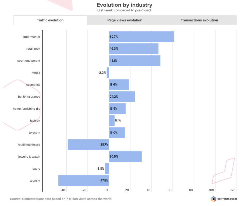
According to our latest data pull for the week ending 6/14, brands across industries are seeing on average +10% more digital traffic than they were back in January, and +33% more online transactions. Some industries — for example, sporting goods retailers or online supermarkets — are even seeing double the amount of transactions they are used to seeing. Other industries, such as travel, are of course dealing with the negative business impact of the pandemic, although recent weeks show positive — if slow — signs of recovery.
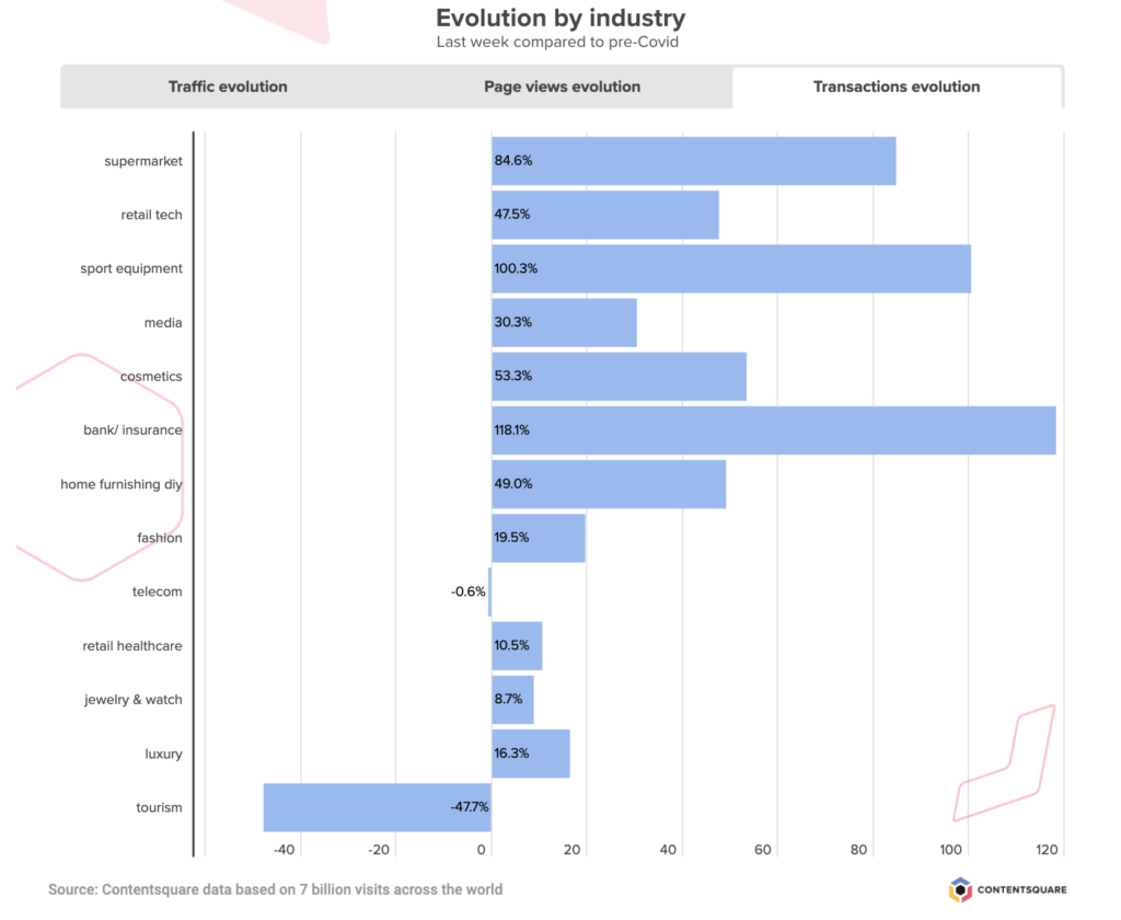
Online Grocery Sector Slows Down But Remains Stable in US
After an initial surge which saw regular volumes of traffic increase x3, the grocery industry continues to experience a slow but steady traffic decrease across the board (-10% drop this past week), although the breakdown by country tells different stories of consumer reliance on online grocery shopping.
The UK shows a pretty vertiginous drop since peak traffic at the end of March (from +440% down to +220% pre-Covid traffic levels), while the US has seen stable levels of digital engagement since the first week of April. Overall, traffic to grocery sites is still +61% higher than pre-crisis and the volume of transactions is +85% higher.
Consumer Electronics Sector Sees Slight Drop in Traffic And Sales last week
On the heels of two weeks of quick growth (traffic + transactions), consumer electronics retailers experienced a bit of a slowdown this past week, with traffic declining by -6% this past week and sales going down by -11%. Still, the sector as a whole is recording +46% more traffic than before the start of the pandemic, and +47% more transactions.
In the US, consumer engagement in this sector has been steadily going down since late April, with surges in the UK and France majorly impacting growth.
Tourism Still On The Up And Healthcare Retail Sees Gains Too
After taking the biggest hit of all industries, the travel and tourism sector continues to see its customers’ digital activity climb, with +7% more traffic this past week compared to the last, and +11% more transactions. These recent increases mean the industry as a whole is now closer to half its pre-Covid traffic and transactions levels — although it is important to note that our reference period, in January, would have different averages than during peak season.
While traffic has remained steady in the US since end of April, transactions have been steadily climbing for the past 7 weeks, reflecting greater consumer confidence when it comes to booking travel. Sites selling camping trips continue to see the greatest increases across all sub-sectors — both in traffic and conversions.
Meanwhile, last week was a strong week for Healthcare retailers, with +22% more traffic to these platforms and an impressive +68% increase in transactions.
Have you registered for Summer Camp yet? We’ve put together a six-part series for adventurous experience-builders looking to capitalize on the summer months to fast-track their digital transformation. Join us for six campfire sessions with digital leaders from Tile and other leading brands, to explore common digital challenges and how best to tackle them (A/B Testing merit badge, anyone?).
ECommerce: Nurturing Customer Trust in 2020
Introducing the New Zoning Analysis: Our Signature Feature is now More Powerful and Easier to Use than Ever After months of hard work and dedication, our Product team is ready to unveil our new Zoning Analysis with a more complete experience than ever.
So how did Zoning Analysis become Contentsquare’s most-loved feature? The answer is simple. In essence, you get intuitive and flexible visualizations that tell you why visitors engage, hesitate or get frustrated by overlaying key UX metrics directly onto your website.
With these clear business and engagement metrics, it has never been easier to understand and explain differences in customer behavior. With a clear view of what site visitors find engaging and helpful, versus what might be considered obstacles along the user journey, teams can quantify their content decisions at a glance, and easily get rid of friction. This granular read of visitor behavior also grants brands a way to attribute revenue to their content and UX investments.
What makes all this so practical is that Contentsquare’s single tag captures every single customer interaction, including every click, scroll, hover and swipe. The platform automatically captures behaviors on dynamic content and historical versions of your site, enabling you to jump straight to your analysis.
In a world where every business is striving to exceed the latest standards of speed, ease-of-use and seamlessness, we believe digital CX stakeholders should also enjoy an optimized user experience. That’s why we’ve now made your favorite power tool for in-page analytics even smarter and easier to use.
Say Hi to Our New Zoning
Having worked closely with our customers on a solution that provides answers to real-life use cases, we’ve completely revamped our Zoning Analysis so teams can answer questions faster and even more efficiently.
The new Zoning Analysis is even more tailored to our operational goals: fast and easy to use.
Agathe Orsoni, Digital Marketing Manager at Petit Bateau
We made Zoning Analysis inside the platform as quick and easy to use as CS Live, our nifty browser extension. With our Live Zoning, your website becomes your dashboard. Simply browse your site including dynamic content and drop-down menus, overlay metrics in one click and answer questions on the spot.

Need to dig deeper into the data? Take snapshots to save them into Contentsquare, analyze any element of interest or track its progress regularly.
Comparison Made Easy
Let’s say you recently launched a new campaign and want to analyze the performance of your hero banner before and after adding a new promotional offer. Or, you just performed an A/B test and want to compare different A/B test elements side by side. By comparing the two, you immediately see why one version performs better and can take actions based on your visitors’ preferences.
Spot a win or a decision you want to celebrate? Simply export your analysis as a PDF to share with key collaborators, whenever you need.
“The intuitive new Zoning allows us to make more detailed analyses especially on CRO / AB Testing subjects where all test variations have to be studied. The new side-by-side functionality allows us to compare the data of each test variation more easily and to learn the best lessons.”
Hazel Dinler, CRO Analyst at Sephora
Ease of use and speed to insights are the key pillars of our new Zoning Analysis. At Contentsquare, we believe in making decisions based on data, not opinion. And we think this level of customer intelligence should be accessible to all. Zoning Analysis was designed to be used by everyone — its highly visual metrics can be leveraged by anyone, not just analysts, and allows everyone on the team to pursue shared goals autonomously.
If you want to learn more about our new, improved Zoning Analysis or if you’d like to see it in action, we’ll be happy to give you a tour!


 These are just a few examples of some of the measures implemented overnight by brands across the globe. And as businesses set together the new standards of customer-centricity, it will be interesting to see which of these services and changes are here to stay.
In uncertain times, a lack of clarity in the visitor journey and insufficient guarantees are a surefire way to lose customers.
These are just a few examples of some of the measures implemented overnight by brands across the globe. And as businesses set together the new standards of customer-centricity, it will be interesting to see which of these services and changes are here to stay.
In uncertain times, a lack of clarity in the visitor journey and insufficient guarantees are a surefire way to lose customers.