Take a product tour
Get to grips with Contentsquare fundamentals with this 6 minute product tour.
Upselling and cross-selling can be a challenge to implement in any industry. A poorly-time distraction can frustrate users, or worse, cause them to leave your site. At the same, cross-selling, when done right, can prove to be an effective way to increase revenue and sales. In fact, product recommendations drive 10-30% of eCommerce site revenue, according to Forrester research analyst Sucharita Kodali. But, you can’t push just any product at any point in the buyer’s journey. In order to really drive value for your customers, you need to be mindful about what you suggest and about your upsell UX.
There’s no doubt that companies should take advantage of upsell and cross-sell opportunities to surface relevant, popular products to customers and drive sales. After all, pushing a product at the right time can help increase the average order value at checkout. The tricky part, however, is executing these recommendations in a seamless, unobtrusive way.
To help you perfect your eCommerce upsell UX and cross-sell strategy, we’ve put together some best-in-class examples that show how you can incorporate upsells and cross-sells within your existing site design.
Placing product recommendations within the cart or add to bag confirmation allows users to make quick decisions about adding products they may have missed during their browsing session, while catching their attention before the end of their purchase journey
Recommendations should stand out from the cart in their own container and design. This helps users quickly distinguish between areas of the cart page, while still capturing their attention.
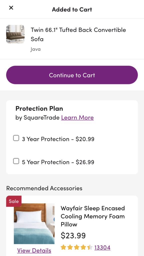
Once a user adds an item to their bag on home goods company Wayfair’s site, they receive recommendations within the same modal for relevant warranties and accessories. Users can choose to add items, continue to the cart, or exit out of the modal to return to their browsing experience.
Adding cross-sell recommendations directly to the cart without having to navigate away from the browsing experience allows for a hassle-free experience. Make sure to have just enough key details to empower your users to make an informed decision, such as the product title, an image thumbnail (if applicable), and the price. Have the cart update seamlessly and automatically if a user decides to add one or more of these items to their cart, and check for long page reloads when users use this feature to minimize frustration.
When creating your upsell UX, consider providing a tooltip or a quickview for users that require more information about the product before adding.
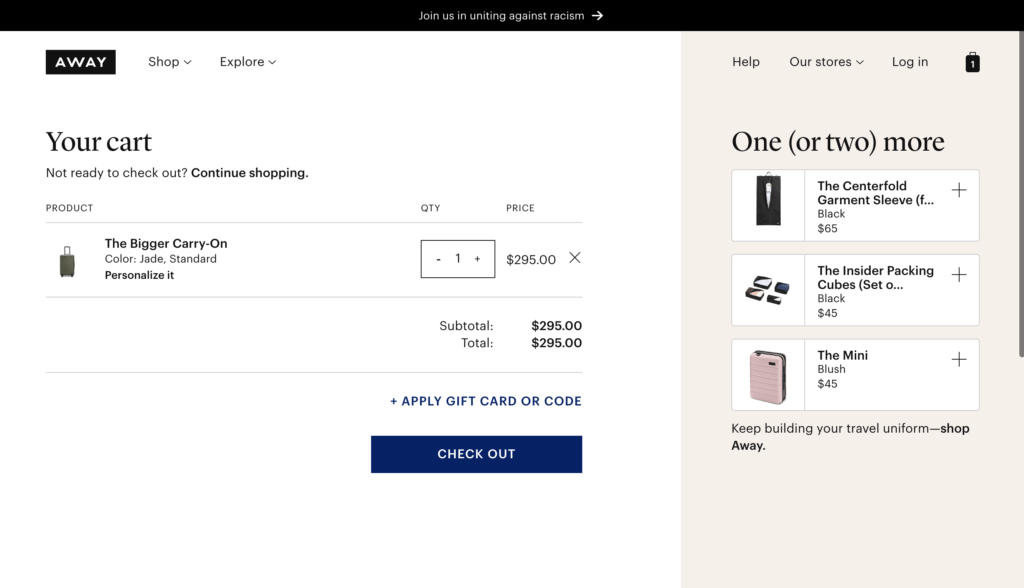
On luggage and travel accessories company Away’s site, add-ons are displayed on the right-hand side of a users cart using a panel with a different background color to help set it apart from the rest of the cart. Users can click on the plus icon to add these items directly to their cart.
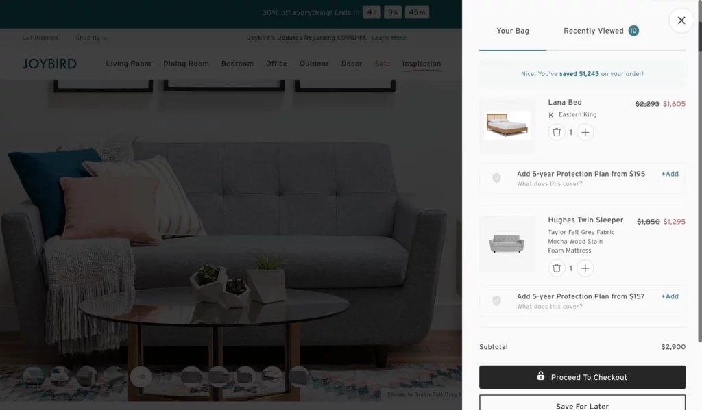
On furniture retailer Joybird’s site, the company’s upsell UX offers users optional add-ons for eligible products wIthin the cart preview. From this view, users can directly add these warranties and protection plans to their cart.
Your recommendations should be straightforward and fairly intuitive to your users. You don’t want to surface a product that seems completely unrelated to their interests or needs. Items should be of lower cart value, or at least a necessary addition to the item that was added. That way, your users can quickly perceive the value of these additional items, decide whether the item is right for, and seamlessly add it to their cart.
Any item you recommend should fit into one of these three categories:
So, how can you ensure the value and convenience of these items are communicated clearly to your customers? The secret lies in optimizing both your user interface (UI) and using easy-to-understand copy. Here’s how to improve your upsell UX using these two factors:
Recommendations should make sense to the user based on their relation to other items in the cart. For example, are they normally bought together out of necessity? Or, are you surfacing this recommendation because most users bought these items together? Indenting cross-sell recommendations within the same listing and using the right language can be a subtle, but effective way to indicate direct relation to the cart item.
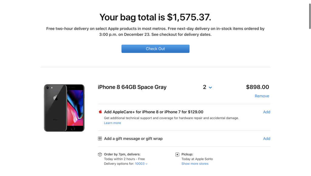
Apple’s upsell UX recommends add-ons and protection plans in the same container as the cart item. Users can use a simple ‘Add’ link to automatically add the coverage to their cart within the cart page, so they never have to leave the page and their checkout flow is not disrupted.
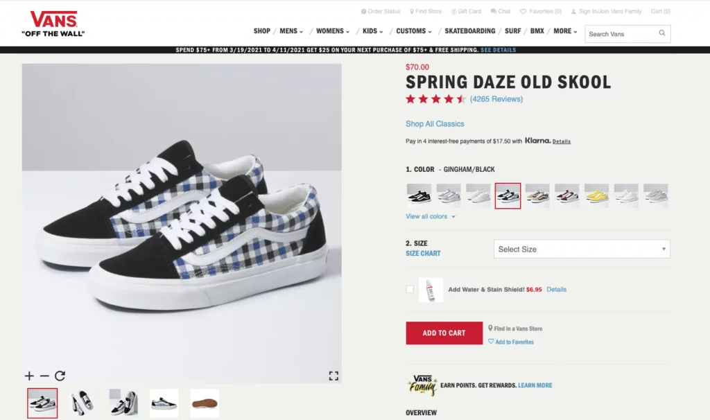
Another way to suggest related products to customers is on a product display page. Shoe company Vans offers its popular Water & Stain Shield product on the PDP for its shoes. Customers who are buying a new pair of Vans will probably want them to stay in good condition for as long as possible. So, they can easily add the spray to their cart and help protect their new shoes from stains and moisture.
Despite the difficulty of incorporating recommendations without being intrusive, cross-sell and upsell product recommendations can ultimately be very beneficial for users. It’s a great way to surface relevant products that a customer may have missed during their browsing journey. For you, it’s an opportunity to drive more sales, but also to increase the discoverability of your products and help your customers find what they need more easily and efficiently.
It can be an effective way to maximize their experience without the difficulty and time-consuming activity of looking for specific items that pair well together with the product they already plan on purchasing. At the end of the day, cross-sells should be considered as a seamless part of the experience rather than an afterthought to the design.
The Digital Happiness Index: Quantifying Your Customer ExperienceAlthough conversions are the desired outcome of a good customer experience, they are not the end-all be-all for brands. A happy customer may make a one-time purchase, but more importantly, a happy customer will return to do business with your company time and time again.
But, how exactly do you define something as elusive as customer happiness? How do you understand the nuances of customer frustration and pinpoint what exactly fosters engagement? And, how do you turn all of this data and intelligence into an effective retention strategy that drives greater customer lifetime value (CLV)?
There are plenty of systems designed to measure user experience; these primarily deal with the pages users visit on your site, conversions, and the oft-cited biggest UX failure: bounces.
But, unfortunately, basic user experience metrics won’t give you enough insight into the nuances of users’ digital happiness. Sure, studying on-page experience, bounce rate, time on page, and other CX metrics are important, but they only give you a one-dimensional view of your customer experience. They fail to give you rich insights into customer sentiment. Fortunately, there is a metric that does exactly that: the Digital Happiness Index.
Calculated from several other behavioral metrics and consolidated into one mega metric, the Digital Happiness Index (DHI) is a unique measure of visitor satisfaction, providing an objective view of whether or not your overall experience is hitting the right notes.
In this article we’ll look at:
Before we delve directly into the DHI, let’s start by focusing on digital happiness. A rather simple concept, it denotes the convenience, satisfaction, and even the pleasure of interacting with a website or online interface, such as a search engine results page (SERP).
As a feeling, it is incidentally difficult to pin down, even in the digital realm. But by using Contentsquare’s DHI metric, you can determine how happy your site visitors are, based on their experience with your site or app.
The first of its kind, the DHI combines KPIs from 5 key pillars that contribute to overall customer satisfaction:
Is your site’s navigation seamless and friction-free? Is your content proving effective in helping visitors reach their goals? Are visitors coming back to your site? Are they exiting early or completing their journeys? And finally, are they finding what they’re looking for — be that information or products?
By quantifying these various strands of experience, and combining metrics into one score, the DHI provides brands with an objective grasp of whether or not visitors are enjoying a positive experience.
To better understand the current state of digital happiness in the world, we recently surveyed over 500 marketers and 4,000 shoppers from around the globe in our new Digital Happiness Pulse survey. Here are some of the shocking findings the survey revealed:
If brands are going to understand and improve the happiness of their digital customers, they need to focus on using the right metrics, getting access to the right customer data, and the right technology to make the first two possible.
When asked if they feel happy when shopping online, only 15% of consumers said yes. Considering that a quarter (25%) of customers feel nervous about shopping in-store since COVID-19, now is the time for brands to get serious about making online experiences just as good as — or better than — those in-store.
Every brand’s goal should be to create digital experiences that ensure customers leave your app, site, or online store happier than when they arrived. This doesn’t mean losing focus on retention, market share or brand awareness, but rather thinking about those objectives in the context of satisfying customers and building experiences they’ll love.
Using behavioral data from our tool, the DHI separates the data into 5 dimensions to filter the numbers into intelligible concepts behind visitors’ digital happiness. Our clients get a comparison to industry standards, and every score represents an aggregate of every session on the website.
As we mentioned earlier, the DHI has 5 components or 5 dimensions that make up its final score, a number out of 100. To calculate a site’s DHI, we take the average of the 5 scores of each dimension. To come up with this rating, we consider the following five dimensions: flawless, engaged, sticky, intuitive, and empowered.
Each of these 5 individual scores is determined by its own calculations, based on metrics like time spent on site, time spent engaging with pages/elements, bounce rates, and more.
It also takes into account if users have reached their destinations and the way they’ve done so. It captures whether users ran into UX issues like non-intuitive navigation — clicks on non-clickable content, misleading clicks, etc.
Making Sense of the Digital Happiness Index
Innovations in SaaS and marketing have led to more avant-garde methods of measuring digital customer experience and benchmarking customer satisfaction.
Although the complex, 5-tier system of our mega metric is supplemental, it is very much in line with our granular approach to behavioral analytics.
The fact that the 5 dimensions deal with different occurrences in the UX means the DHI is casting as wide a net as possible to capture your customer’s mindset. Based on this score, you can shine light on areas of friction and other obstacles in the customer decision journey.
Customers today will not hesitate to review a poor UX or give one star for a session that doesn’t meet their expectations. But they are also giving you continuous feedback on your site or app through their interactions — with every tap, click, scroll or hover, they are voicing their feelings about your CX.
Here at Contentsquare, we give brands the tools to capture this on-page feedback so you can hear and understand what your customers feel and want.
Happiness of any kind is difficult to pin down to a numerical format. But, by combining the 5 pillars of the UX, you will come as close as possible to determining how digitally happy your visitors are with your content.
Conversion Funnel Optimization: How a Good UX Plays a Role
Conversions rarely occur on a whim; usually, there is a layered process behind eCommerce purchases. Known as the conversion funnel — or the sales funnel — this model shows the conduit between the least aware prospects to those who are most aware of your company’s products and services. Those with the most knowledge of your offerings are usually the most interested and motivated to convert.
Brands have to be both wary and strategic in the ways they set up conversions, and that is where the concept of the conversion funnel comes in handy. While no one can truly “set up” conversions, you can set the scene and command all the workings that bring visitors closer to converting thanks to conversion funnel optimization.
As UX-perts, we like to blare the horns on the importance of UX, so it should come as no surprise that a good user experience plays an important role in conversion rate optimization. Let’s take a look at how you can optimize your conversion rate by way of working in a good UX to the different stages of conversion funnel optimization. Here are some of the topics we will discuss:
Before we jump into how to optimize your conversion funnel, we need to briefly review what a conversion funnel is.
The conversion funnel denotes a process in which brands work to turn potential customers into converting customers.
It is comprised of several stages, with each one indicating your customers’ level of brand awareness, interest, and willingness to buy — along with the gradual steps and undertakings you can take to lead users further down. Here’s a quick breakdown of the different stages and what they mean:
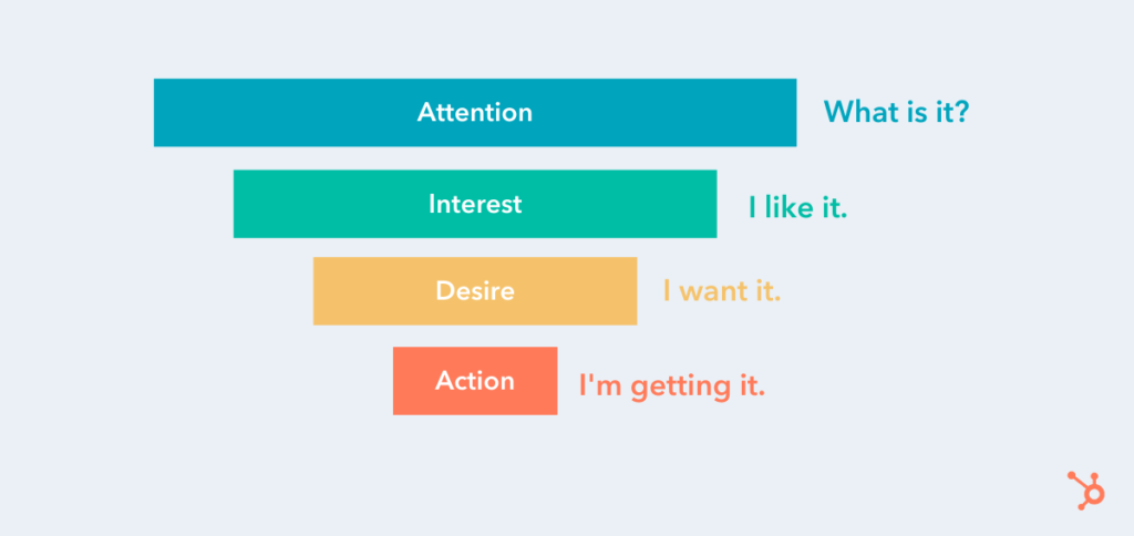
Source: HubSpot
While the stages in each conversion funnel may differ from brand to brand, each shares the ultimate goal of “pushing” site users down to the very last step, which, evidently, represents conversions.
Through this structure, brands can group their potential customers into easy-to-understand categories, thereby dictating several efforts they can maneuver to encourage prospects further down the funnel.
There are various marketing tactics to drive customers down the conversion funnel; they can be deployed through more than one stage. Let’s dig deeper.
Now that you know what a conversion funnel is, the next thing to cover is how to apply good UX practices that relate to each stage in the conversion funnel. The following spells out the ways brands can enhance their UX per each stage of the conversion funnel to optimize it and garner greater conversions.
Sitting atop the conversion funnel as the entry point, the awareness stage is the stage with the least… awareness of your brand or offering(s). It’s also the stage with mounting awareness, as potential clients become cognizant of your business and click onto your website, the act which carries with it the possibility to spawn possible interest.
But that requires capturing new customers. You should approach your awareness stage with the mentality of casting a wide net. You want to attract as many people as you can, so you have a higher chance of moving people further down the funnel.
We’re not saying adopt a “spray and pray” method, you still need to be strategic and methodical so you can securely create a heightened awareness of what your brand does – and attract the right kind of customers. Getting tons of traffic on your site or clicks on your ads can be exciting at first, but if these are unqualified visits, they won’t do you much good.
Here are a few ways to educating potential customers on your brand and make it easier for new users to find you:
Take e.l.f Cosmetics, for example. To educate potential customers, e.l.f. Cosmetics allows anyone to take their skincare quiz which not only provides awareness to what types of skincare products they offer but also how their products can help alleviate a consumer’s pain points. Whether a potential customer wants to treat acne, dry skin, or improve fine lines, e.l.f. has products that cater to their every need.
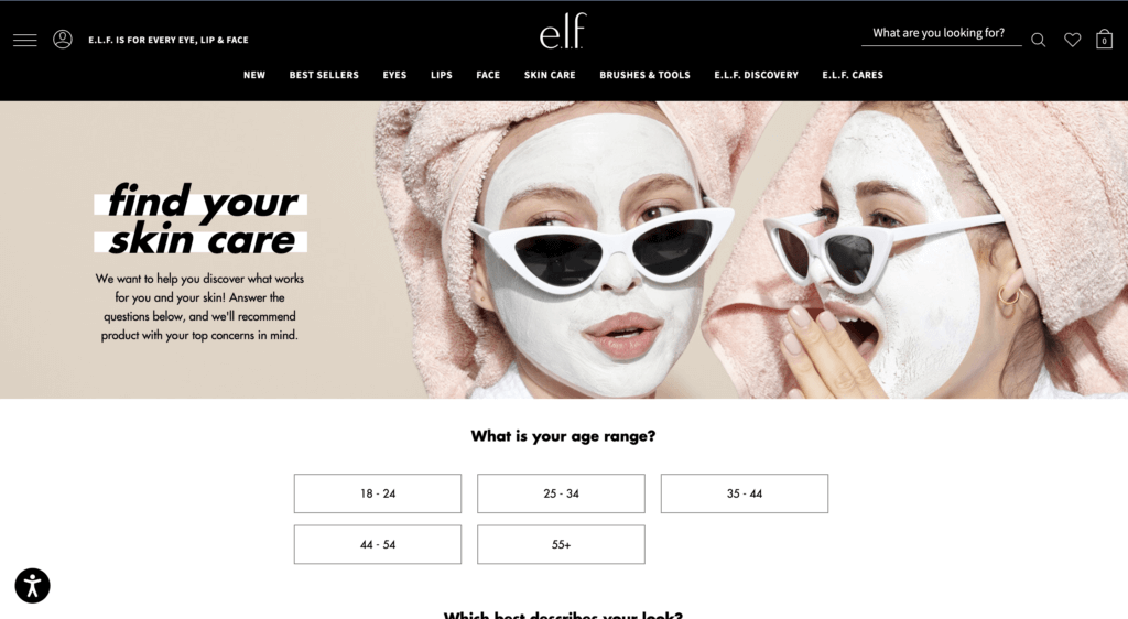
Source: e.l.f. Cosmetics website
You have to keep your target audience in mind and create your campaigns accordingly. But once you’ve brought new people onto your site, the UX must be optimized, or at least suitable to pique interest within visitors (lead them to step 2), or — even better — make them convert on the spot.
There is a slew of general ways to improve upon the user experience. But often in the awareness stage, users usually arrive at your site via a landing page.
The UX has to be top tier on this page. Keep the copy and imagery relevant to the conversion goal, while making it clear what your brand does. The latter is more important since you’re introducing new prospects to your company. The copy and other contents on landing pages should be to the point, so steer clear of wasting users’ time. In short, don’t overload it.
Most importantly, construct the landing page so that it is relevant to the message that led visitors to click on it in the first place.
Next, we reach the stage of interest. Now that prospective customers know your company exists, they have to frequent your website; simply knowing about your offering(s) does not ensure they’ll return to your site or engage with your content.
Content is key in this step, as it can foster relationships and maintain interest within your prospects. There’s a twofold approach for conversion funnel optimization: the first is the nature of the content and the second concerns the UX, or the feelings and attitudes users develop over their experience.
The first element deals with the core of the content — the content type, its subject matter, how it can help with your prospects’ problems, its visual identity, etc. You would need to establish a blog with relevant posts to your industry or niche. Take Slack for example, since the pandemic Slack has upped its content production, providing guides, interviews, etc to teach business leaders and employees alike how to adapt to the “new normal” with Slack.
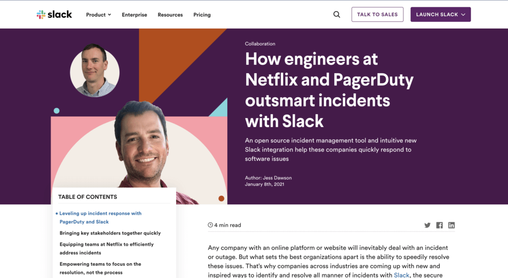
Source: Slack
Other useful content for stimulating user interest are:
You would have to make sure these align with the needs/interests of your vertical as well as making your content stand out and offer something different. Videos and other content, for example, should not focus on the product alone, but offer something of value — whether that’s inspirational content, news related to your niche or something else.
As for the attitudes toward the content, i.e. the UX, consider the amount of content on your page; is it slowing down your site? If so, reduce it so that you never have issues with loading speeds.
Make sure everything can be easily seen and accessed. This will encourage further browsing. For example, if you have an in-page element that requires scrolling, the width of it, at the very least, needs to be wide enough so all the content can be easily read.
You should limit scrollable in-page content to one type of scrolling function (either by length or width, never both.) This is generally length, as this is easier to look through. Use carousels, in-page recommendations, and links to other pages to incite browsing.
In fact, when it comes to the UX in general, be sure to keep it continually optimized so that all content elements are easy to understand and seamless. The best way to gauge customer understanding and frustration is of course to measure interactions with each element.
Once you’ve developed some level of interest, you need to propel prospects towards the lower half of the conversion funnel, which starts with desire. Representing a heightened interest, desire attracts users to your actual offering aside from your content alone.
At this stage, you should make your product or service, as the stage suggests, desirable. It’s also where you have to distinguish your offering from that of your competitors, specifically, by positioning your company as the better option.
This can be done by:
For example, Superdry entices their customers through a series of emails providing special discounts, promotions, etc. to showcase the value of their products.
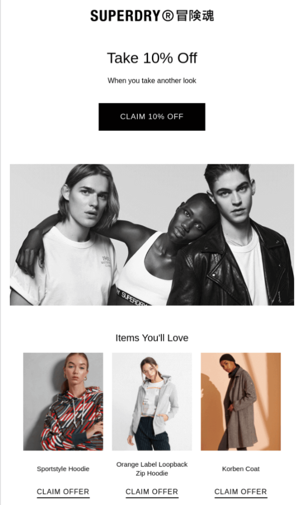
Source: Superdry
The users with the highest level of interest will sign up for a newsletter or other form of email communication. This is vital, as it enables you to see exactly who your most interested prospects are and market to them directly.
For the Desire stage, your best bet is to arrange a drip campaign, or an automated email campaign, which can be set off by different triggers and sent at strategic periods. For example, when someone signs up or makes a purchase, you can then sent prewritten emails during key periods, such as sales, new blog posts, company news, etc.
Also, although they’re prewritten content, assure that emails are personalized with the prospects’ names or their company names. Emails that appear auto-generated, or lack a human touch, yield a poor UX.
As you may have gathered, content is as weighty a component at this stage as in others. You need to eliminate any traces of a poor UX, such as an image that appears clickable, but doesn’t actually take users to a landing page, enlarging the image instead, a common UX problem. Nothing spoils a customer journey like obstacles in the digital experience — another reason to measure user behavior.
Last, but certainly not least, we’ve reached the final stage: action. This is the most targeted stage of the conversion funnel for obvious reasons. After pumping out UX-optimized content and building a relationship with potential customers, only a small portion of them will make it to this stage.
Most will hang in the balance of desire and action, toggling between the two until they make the decision to either buy or bounce. This is where your UX can make or break you.
First, you need to ensure that the navigation of your product pages are neatly organized so that products are easy to find. Don’t succumb to the UX sin of overstuffing your navigation. Finding your product/service should be a seamless experience.
As for the product pages, each must have selection tools that make it easier for customers to filter out products by way of their particular needs. (Think of common product organization types like size, color, price, etc.)
Additionally, all aspects of this experience must promote purchases, from the ability to zoom in, to quick load times of the actual product pages (when clicked on from a multi-product page), to the product image quality.
Any element can be off-putting at this stage, including non-design bits like pricing, so make sure your UX is superb and built around actual customer intelligence.
Measuring the success of your marketing efforts does not end while you embark on optimizing the conversion funnel. In fact, you should not approach the conversion funnel as a standalone marketing tactic to reel in more conversions.
This is because not all user experience exists in such a linear way. As such, it may ring true for some users but not all. Particularly, the customer decision journey can be seen as a contrast to the funnel. This can be observed by viewing user paths and segmenting your users to narrow behavior-based categories.
By tackling a specific segment, you can customize the UX to that segment, to assure an optimized journey that reduces exists and bounces. For example, pure player brands understand that their content will not be consumed by a general audience. Only specific segments will visit their sites and social channels. As such, they create content that aligns with the interests of their segmented users.
Driving Personalization through Marketing and A/B TestingThis article was written by our partner REO, as part of our series highlighting direct insights from our large ecosystem of partners.
In 2019, for the first time ever, digital ad spend represented more than 50% of total global marketing spend. Whilst the UK was considerably ahead of this trend (63.8% of UK’s total ad spend was attributed to digital in 2018, 66.4% in 2019), the US has now joined the group with online ad spend going from 48.6% in 2018 to 54.2% in 2019. With eMarketer forecasting a 17.6% year-on-year growth (to $333.25M) in worldwide digital marketing spend, the need to ensure each of your marketing channels is delivering the best possible ROI has never been higher.
Within the conversion rate optimization (CRO) space, most brands conduct A/B testing without fully considering which marketing channel or source their customers have come from. Customers are typically bucketed into various user segments based on their purchase history, onsite behavior, geographic and demographic data. However, users within the same audience segment can often demonstrate varying behavioral attributes when navigating through the purchase funnel, across countless online and offline touchpoints.
If a user arrives on your website via paid search, you already know what they searched for and which ad they clicked on; however, users who click on the same ad, but searched for different terms/items, will often experience the same customer journey. For instance, if a customer has searched for “luxury men’s white shirt” – not only do you know the item they are looking for, you also know they are looking at the higher end of the market.
A/B Testing the landing page a user is taken to is quite common, but you can go a step further and explore how to change the experience for the customer based on their search criteria.
A potential testing idea could involve pre-sorting these shirts by highest price first, and on the Product Listing Page (PLP), displaying all the available men’s white shirts. This can develop into personalization if the user has visited the site previously, within the cookie period; e.g. by storing size data within the cookie, you could pre-select the shirt size which the user filtered by on their previous visit.
Reducing the number of clicks and filters it takes a user to find their item can only have a positive impact on conversion rate, especially on mobile. So, by showing a customer the items they’re looking for, sorted by their desired price point and filtered by their size, you will make the purchase journey more tailored to that specific customer.
Understanding a visitor’s context (location, date and time of day, device, internet connection, etc) as well as their intent (are they here to complete a quick purchase, to research and compare products, to seek inspiration, to test a coupon, etc) add an invaluable layer of behavioral understanding to your analysis, and will allow you to execute a more impactful form of personalization.
By applying this testing method to the affiliate channel, you can optimize the largest click and revenue drivers; namely voucher and cashback websites. After all, you can already assume that users coming from these two affiliate types are both online-savvy and price-sensitive.
Voucher and discount websites should have a conversion rate of at least 20-25% on mature affiliate programs – so any of these affiliates who have a conversion rate lower than that, represents an opportunity for incremental revenue. For cashback sites, expect this figure to be upwards of 40%.
A test idea for these two affiliate types could be to re-enforce the discount or cashback offer listed on the affiliates’ website. For instance, if the deal was “Save £15 when you spend over £100” – you could use a “loading bar” at the top of the page which gradually fills up as you add items to your basket, until the user hits the spend threshold to activate the discount.
For cashback sites, you could test a cashback calculator onsite, which automatically calculates the amount of cashback the user will earn if they purchase everything currently in their basket. This type of gamification can be incredibly effective in increasing the number of units per sale and, in turn, the average order value.
“Content is King” – we’ve all heard it before, but how can you be smarter in how you serve it? Content, and specifically dynamic content, is another channel where source-based A/B testing can improve engagement, click-through-rates and leads/ sales. If you know the article or blog post a user has come from, you can use this insight to serve them relevant and dynamic content, making their customer journey more seamless and less detached across the two sites.
User journey analysis shows that visits to content sites usually happen in the “Discovery Phase” of the sales funnel – including on product review sites, influencer social posts, news/magazine sites and blogs. Such content is informative and persuasive; perfect to push the user towards the bottom of the funnel.
Some of the more content-heavy merchants, such as insurance brands or high-end technology retailers, will have an eclectic and extensive array of content across their website, making navigation more muddled. A solution? Reducing the amount of content on-site and instead, storing the less frequently visited content pages elsewhere, to then be served dynamically.
For example, if a user looking to buy insurance is reading up on excess and the impacts it has on a claim and future premiums, the existing content about excess could be tweaked accordingly – which could be as simple as changing the title of an article, calling out the keywords or changing the order of the content on that page.
Again, a granular analysis of how customers are interacting with individual elements of content will help paint the complete picture of engagement. Measuring clicks alone will only tell one part of the customer behavior story: tracking metrics such as exposure, attractiveness and conversion rate per click (to name a few) will give a more complete view of how content is contributing to (or stalling) the user journey.
As the capabilities of A/B testing and personalization platforms continue to evolve, the way you test and analyze a customer journey should follow suit. One of the major challenges of channel/source-specific testing can be a lack of traffic volume. If you have insufficient traffic, it will take a while before a test reaches significance. For example, the 5th highest paid search term, or 4th largest voucher site probably won’t have the volume to justify running an A/B Test on.
Contact us! REO is a digital experience agency. We are an eclectic mix of bright and creative thinkers, embracing the best of research, strategy, design and experimentation to solve our clients’ toughest challenges. We work across a variety of sectors, with companies such as Amazon, M&S, Tesco and Samsung.
Also invaluable to our company is our scope of partners, including Contentsquare, which allows our customers to capture the nuances of their end users’ behavior for even more sophisticated segmentation and ultimately, deeper personalization.
Whatever the challenge may be, REO applies design thinking to identify and deliver big growth opportunities.
Hero image: Adobe Stock, via blankstock
Driving Innovation: How Brooks Bell is Helping Brands Achieve Experimentation ExcellenceFounded in 2003, Brooks Bell is a consulting firm focused on building world-class experimentation programs for enterprise brands.
Working out of our headquarters in Raleigh, NC, we’ve spent the last 16 years helping companies better leverage their data, technology, and workforce to learn about their customers and deliver a smarter and more profitable online experience.
Our team is 43-strong and made up of creative thinkers, data scientists, developers and strategists. Everyone—from our operations team to our senior leadership—has a genuine appreciation for the art and science of optimization and a deep understanding of the challenges of experimentation at top-tier companies.
Our client roster consists of many large enterprises and recognizable brands that have trusted our team to assess their experimentation maturity and consult on multi-year “test and learn” roadmaps to achieve true customer-centricity.
Most of our engagements begin with a maturity assessment to benchmark and measure the growth of an experimentation program. This comprehensive, data-driven review scores your program against our proprietary framework consisting of six main categories: culture, team, technology, process, strategy and performance. The results of this assessment are used to create an actionable roadmap to get your program to the next level. What that roadmap looks like and the scope of our services depends on where your program lies on the maturity spectrum.
For clients that are very early in their experimentation journey, we offer a “we do, they watch” type of partnership. In this, our team comes in and fully manages a client’s experimentation program: learning their business and customers, organizing data, building a strategy, launching tests and analyzing and reporting the results. This partnership model is most effective for programs that need to prove the value of testing before going all in.
For clients that are a little further along, we take a more collaborative approach focused on educating what is needed to build a high-functioning program In this type of partnership, our team works alongside theirs. As we run end-to-end tests, we teach the team our methodologies, practices and frameworks. Through this model, we’re able to build the foundational knowledge and practices to set the experimentation program up for scale.
Finally, as the experimentation practice becomes more mature, we transition our services to be less tactical and more strategic. We’ve helped many clients bring their experimentation efforts fully in-house through building training and on-boarding programs, aligning the experimentation process across teams, establishing an Experimentation Center of Excellence, and offering strategic advice in response to new trends, technologies and business challenges.
Critical is putting it lightly.
In order to compete in today’s market, companies need to have a scientifically sound method in place to learn about customers, to change and to innovate—all while limiting risk, streamlining operations and reducing costs. Experimentation offers the best way to accomplish all of that.
That means, for us, our value is not simply in running tests and helping our clients make more money—though that is definitely a major outcome of our efforts (and one that we’re very proud of). Rather, our work is about empowering our clients with the data, skills, processes and technology to use testing to glean powerful customer insights AND operationalize those insights across your entire organization.
Our Maturity Assessment is really only the tip of the iceberg here. Over the last 16 years, we’ve built and honed many frameworks, training programs, practices and even proprietary technology to help our clients elevate their testing and personalization strategies.
For instance, after witnessing some very messy brainstorming sessions, we developed our ideation methodology, which provides a guided approach to developing and prioritizing test ideas in a large, cross-functional group.
Our Insights framework offers a method for connecting your experiment results to bigger picture customer theories and insights.
And finally, we built Illuminate™, our testing and insight management software, to help program managers store, share and learn from their A/B test results. Fun fact: Illuminate was originally built as an internal tool to help us keep track of our client’s tests. In 2018, after many years of tweaking, testing, gathering feedback (and some rave reviews from our clients), we decided to make it available to the public.
These are just a few examples of how we provide value to clients. I should also add that we host Click Summit, an annual conference where digital leaders gather to swap ideas and share tips on testing, personalization, analytics, and digital transformation.
Click Summit trades in all the typical things you’d find at a tech conference: sales pitches, powerpoint presentations and fireside “chats” held in giant auditoriums. Instead, the agenda is built around a series of small-group (15 people) conversations, each focused on a specific topic.
With attendance is limited to just 100 digital leaders, it’s a unique opportunity to tackle your biggest challenges by talking it out with people who have been there before.
We love partnering with companies and tech providers (like Contentsquare!) who share our vision of helping our clients find the people within their data and seek to make every day better through optimization.
There are tons of ways in which we can translate Contentsquare’s excellent user experience analytics into optimization opportunities.
Here are a few off the top of my head:
When Brooks Bell was founded back in 2003, testing was in its infancy. Now, it’s rare that we come across a client that hasn’t run at least a few tests. This is exciting! It means we get to focus on working even closer with our clients and making a bigger impact.
I’m talking more than just conversion increases and revenue lift. The task before us no longer ends at proving the value of experimentation. We’re now in the business of generating insights. By helping companies learn about their customers and fostering experimentation at a cultural level, our clients will be equipped to deliver the best digital experience for their customers.
Investing in experimentation requires taking both a short and long-term view. We look forward to celebrating the day-to-day wins with our community, while also staying focused on the vision of building customer-centric, digitally-forward and insights-driven organizations.
How to Identify and Fix a Broken UX with User Behavior Analytics
Some website users undergo a bad UX, which leads them to exit — or worse — bounce from a website, possibly to never again return. Understanding what causes premature site exits is key to improving the customer experience (CX), and delivering journeys that help customers meet their wide-ranging digital expectations.
Making use of data for a UX analysis is the most practical approach to scrutinizing customer journeys, including high-level views that locate friction points and counter-intuitive navigation patterns. Once you’ve identified your problematic pages through a high-level view of user behavior, you can make more fine-tuned changes by assessing individual pages and elements.
Achieving a fulfilling digital experience is attainable, but you have to identify what constitutes a broken UX in the first place, and establish the visitor segments that come across one. Once you have this insight on hand, you can prioritize optimization efforts to improve your digital experience and make your visitors crave more.
We quizzed Ying Yang, our Lead Product Experience Manager, to get her thoughts on where to start. “The first thing you must look at when identifying a poor UX is the customer journey,” she said. “You should be able to break it apart page by page to see exactly how users traverse your site during each session.”
A well-built customer journey analysis tool will show you each step a customer takes during their time spent on a site, help uncover what they are trying to do, and how they went about doing it. You ought to be able to detect where the first UX friction lies on a high level; to find this, you have to pinpoint where users are bouncing or leaving the site, and what led to this outcome.
“You need to identify the last page that a segment of users stayed on during their journey before leaving your site. It is this page in which their UX was disrupted,” explained Ying.
“However, in longer customer journeys, note that a page from which a user has left the site may not signify a bad experience. Instead, the user may simply feel that their stay on the site is complete, and requires no further browsing.”
As such, observe the pages that contain bounces initially, as there is some shortage of retaining the visitors’ interest. Furthermore, since a bounce is more caustic than a regular site leave, it requires immediate attention. (Bounces reveal a non-existent journey, or one of one step/page visit).
Now that you’ve found the page with the UX culprit of bouncing or exiting, let’s delve further.

Entering step two of making corrections, you will need to work out the cause behind particular site exits or other behaviors indicative of frustration or unmet needs. In order to spot individual obstacles in the customer journey, you’ll need to analyze specific elements within a page.
Through this approach, you’ll be able to catch the exact cause of friction (whether it’s a CTA, image, product description, form field, etc), as opposed to guessing what regions and elements of a page led users to leave.
So what do you do when analyzing a particular page element? You take a hyper-focused turn in your UX analysis. “This is a more granular step,” says Ying. “As such, you’ll want to look at a robust batch of behavior and revenue metrics. These present a deeper dive of your UX to follow up the customer journey analysis.”
Here are just a few of the metrics you can appraise for a granular UX performance check:
Hover Rate: The percentage of pageviews in which visitors hovered over the zone at least once, determining which zones are consumed the most. This helps you rank zones and assess if they are consulted properly, by weighing in factors like averages of other zones and the page length.
Click Recurrence: represents the average number of times a zone was clicked when engaged with during a pageview. This exposes either engagement or frustration. For example, a high click recurrence on a carousel is good news, as it shows a high engagement with an element offering many clickable areas.
It can also point to frustration. For example, if users click on the same element multiple times — such as an image or link, it means the element is drawing up errors; it’s either unclickable or not performing its function correctly.
Conversion Rate Per Click: Applying only to clickable zone, this metric relays if clicking on a zone impacts the user’s behavior or conversion goal.This helps you determine which elements contribute to or deter from conversions. A conversion can be any behavior you set.
Exposure Rate: identifies how far down a page a user scrolls; it’s accounted for when at least half of a zone is viewed. This helps you understand how much users scroll, allowing you to make empirical sizing adjustments.
Attractiveness Rate: Relays the percentage of visitors who clicked on a zone after having been exposed to it. This informs you on optimizing the placement of content on your page. For example, if more users click below the fold, you should move that content further up for more of them to see it quicker. A high rate proves the high performing attractiveness of an element.
After you analyzed the elements of your page with granular behavior metrics, you’ll need to analyze further, by conducting comparisons. This will help you determine what comprises an underperforming UX more clearly. To do this, you would need to compare a good behavior with a bad behavior.
Comparing the experience of visitors who accomplished the goal of a page with those who didn’t, will further confirm what needs fixing. You can carry out a zoning analysis on these two segments as well as make comparisons on each metric.
This allows you to catch where non-converting visitors tend to hover and where they are more inactive. But most importantly, it allows you to weigh this data against the users who did convert/ achieve what they came to your site to do.
“For example, you can build a segment for the users who saw a 404 error page and compare it with the ones who had the same issue across different journeys or those who didn’t run into it,” explained Ying. “Additionally, you can create a segment around users who clicked on a CTA, deepening their journey against a segment of users who didn’t, or worse, ended their journey on that page.”
One of the attributes of a broken UX is content that doesn’t engage users or is not seen, thus prompting visitors to exit the site. Pages that require too much scrolling, for example, may yield low engagement or little to no views.
For example, a particularly wide banner that takes up much of the screen may be obscuring other content that’s crucial to generating revenue. Some users may not even be aware of the content below the fold.
“Most high-performing content should have real estate above the fold,” Ying advises. “Does your business have a major campaign or sub campaign running? Post more than one type of content about it above the fold. These can exist as tiles, a carousel or both.”
This source of friction is especially damaging to mobile UX, which has a much smaller screen size than desktop. As such, some functionalities aren’t well suited to be crammed in. “Big banners, images and accordions (vertical menus) push everything down below the fold, so don’t overuse them. You will probably need to scale back on some of these elements to avoid a UX that has turned sour.”
Another example of poor content occurs when banner usage is slight and/or doesn’t achieve the goal of a page. For example, a banner can send users to a PDP (product details page) that cuts off their browsing journey.
“PDPs, in general, have high bounce rates, as in the case of our retail clients, so you need to be careful what products you send users to, should your banner send them to a PDP (or even a product landing page). Landing on a PDP is especially detrimental to the user experience when the real goal was to send users to a PLP (product landing page), which shows several product options as opposed to a PDP.”

Adobe Stock, via studiostok
Now you know how to move the needle from a high-level UX analysis to a granular level to spot what caused your customers to struggle or give up with your site. After you identify what leads to bad digital experiences, you are all set to start optimizing. Customer experience analytics are your best friend when it comes to augmenting your content ideation strategy.
Since it allows you to meticulously identify digital experience issues, it fastracks you to brainstorming sessions to rectify the issues in a data-backed way. Some things will be clearer than others. For example, if you find 404 errors and other dead-end pages, the quick fix is the get rid of them, or replace them with the proper pages.
“For example, if an item is no longer in stock, or no longer being digitally offered, make sure it doesn’t yield the 404 error. But if it’s a product users can purchase, or if a page offers any other type of conversion (signing up for content, etc.), make sure your page is functional and devoid of any confusing elements,” said Ying.”
Hero image via Adobe Stock, by Marvi7
4 Tips for Maximizing Engagement & ROI on 2019 Holiday Gift GuidesWondering how best to set up your digital gift guides in time for the holidays? Follow these four tips to make sure your website is making the most out of its “featured gift” products, and is helping users navigate through the 2019 holiday season chaos with much-needed ease.
Steer clear of what we in UI call the “false bottom” — the illusion that a page has ended when it hasn’t. This UX misstep could stop your visitors from scrolling further down the page, and may restrict their exposure to content. Instead, let your visitors know there is more to see — the more categories they see, the more likely they are to find the one that is relevant to them.
Check which categories have the highest purchase conversion or conversion rate per click and prioritize these. It is possible that some categories drive higher engagement, but record lower conversions. This points to frustration and confusion, intel you can use to optimize a particular site element.
Your gift guide categories should be as specific as possible. It is harder for users to narrow down a large product catalog on a product landing page (PLP), than to click into a category that already has a narrower scope.
It should be clear before users choose a gift guide that they will find on the gift guide list page. Is the category based on price, interests, demographic information..? Find out what’s most important to your visitors, and wherever you can, personalize suggestions based on these needs.
Also keep in mind that in gift guides, users are likely to be shopping for somebody else, so recommending repeat purchases based on past sales isn’t always relevant.
The more difficult your filter and sort function are to use, the more frustrated users will become when trying to find the most appropriate product on a gift guide list page. Avoid adding frustration to the already overwhelming task of sifting through hundreds or thousands of products.
Displaying shortcuts to other gift categories on the list page can help reduce navigation friction. Visitors shouldn’t have to go back to the homepage, main gift guide page, or use the global navigation to quickly access other gift options.
Here are some great examples of online gift guides:
J.Crew

On the homepage, the gift guide category features an eye-catching GIF that plays automatically. On the gift guide list page, there is a category dropdown that helps users jump to different gift categories. Users can also easily narrow down listings using categorization buttons like “Best Selling” and “Gifts under $25
Madewell

In this example, at least 3 categories are visible on the homepage without the need for scrolling. Once the user clicks to the gift guide list page, they can also use a category dropdown to jump to more specific gift guide categories.
Macy’s

Gift guide categories are specific and speak to users’ personalities. Above these categories, there are also categories based on price.
Hero Image via Adobe Slack, by Nnudoo
Boo! 5 Examples of Scary UX to Avoid on Halloween — and AlwaysHalloween is creeping in on us as the October days tail off. But that doesn’t mean your user experience (UX) should be frightening. While frights are fun for haunted houses and other ghoulish festivities, they shouldn’t trickle into your customer experience.
Alas, as our clients can attest, bad UX has reared its head like a zombie rearing out of a tomb many a time.
Scary. We know. That’s why we’ve compiled a horrifying list of poor UX design examples and ghastly digital experiences, right before Halloween, so you don’t scare off your potential customers.
Even your most loyal customers will be put off by a bad digital experience. Sometimes, this bad UX arises out of something seemingly minor — a missing image, unclear text, an element located a little further down the fold… That’s what makes bad design particularly scary, in that what seems trivial and inconsequential gives rise to dire consequences.
But fear not! Our 5 scary examples of poor user experiences include very specific cases of how simple elements can go awry. Let’s see what scariness our clients underwent. (SPOILER ALERT: although these real-life UX horror stories seem grim, they all have a happy, data-driven ending).
Clicks are great, right? So naturally, a hearty dosage of clicks should be a good thing, shouldn’t it? At face value, it may seem so, as when a zone or an element on a webpage receives a lot of clicks, it signifies ample interaction.
But as our client learned the hard way, click activity, or the study thereof, is not enough when UX is concerned. Studying clicks is crucial, don’t get us wrong. But it offers only a faint glimpse of the overall portrait of your UX.
Our client, a purveyor of men’s fashions, had recently developed a new mega menu. So when it recorded high click activity on the menu, this appeared to be nothing but positive. But it was bearing something sinister; the client noticed a major discrepancy on their site regarding attitudes towards clicks: when clicks increased, sales slumped.
How was this possible? A UX analysis of in-page behavior presented some incongruity between the mega menu and search/category filters. While menu interactions were high, filter usage was stagnant. With unused filters, shoppers weren’t seeing all the products relevant to them, so sales took a tumble. It’s the stuff of nightmares.
Every mega menu — filled with panels, categories and text — ought to be complemented by visual elements. It would thereby seem natural to include sliders to accompany a mega menu, especially on the homepage, where such elements typically exist.
In the case of our beauty client, this placement wound up being a design fright, much to the detriment of their customers’ user experience, as the customers bounced.
Featuring a wealth of merchandise pushes, the homepage is the gateway to pique product awareness and interest for our client. But it was beset with high bounce rates. With a seemingly healthy swath of products on the homepage, the client was bewildered by what the UX culprit could be.
When analyzing the homepage, with special attention to the mega menu and sliders, the client found that the sliders were generating little to no engagement. Instead, these sliders overwhelmed the mega menu, leading many to bounce before engaging with either of these elements. Spooky.

A store locator is a handy UI feature for click-and-mortar brands, especially those seeking to uplift web-to-store visits. After all, netizens won’t visit a physical store if they don’t know where it is.
Instead of looking to Google, visitors ought to trust your brand enough to know that any useful location info exists on your own website. So when our client, a luxury click-and-mortar brand discovered high exits on their store locator, they were beside themselves.
Through granular analytics, they learned that for many site users, the store locator was the main reason behind their visit. Its button, however, had a ghastly label, one with even ghastlier results. It read “product search,” which befuddled users.
To the client, it appeared to be a nifty feature, an add-on to a traditional locator functionality. But it produced high hovers and low clicks, turning users away from the store locator, and as such, from completing their objective of a store visit. This worsened sales for items only available in-store. Creepers.
Conversions. Every brand wants them, but few products or even brands at large can trigger them. As such, users who reach the checkout — the final phase of both the customer journey and the sales funnel — signify a UX victory in itself.
Unfortunately, our retail apparel client was racked by bad UX on this holy grail of pages. Our VoC integration had gotten word of users’ ghostly experience when they reached the client’s checkout page. In fact, a whopping 1,500 customers were afflicted by the ghostly checkout, leading them to complain via the call center, and as our UX analysis showed, leave the site.
When we say ghostly, we mean it. Behavioral analysis caught wind of the sudden onslaught of blank screens when users reached the checkout page. This, in turn, led users on the cusp of converting to abandon the checkout and the site, which reduced revenue for the clients. Yikes!
The above examples elucidated how site content led to a bad UX, with scary repercussions ensuing from each such case. But sometimes it’s the missing content that creates scary UX chaos.
In the case of our hospitality client, a missing image made all the difference for the conversion rates on their property pages.
During a granular UX analysis, the client discovered high click rates on the links to property pages, i.e., pages with hotel offerings. The problem was, despite the clear interest in these hotel pages, users would abandon the site after landing on them.
This caused conversion rates to plummet and an addled brand, as it was unsure of the culprit behind the bad UX, since the images were crystal clear and the deals were showing.
A deeper UX analysis — one on journey analysis, revealed a major gap in the UX of these product pages. Visitors were looking for rooms that included a complimentary breakfast, commonplace in European hospitality, but were struggling to find this information. A simple image notifying free breakfast, even an icon of food would have prevented the loss of this conversion stream. The horror!
Any brand can fall prey to scary bad UX. But bad UX need not uphold its reign of terror on your website; there is a solution.
This mighty antidote is granular user experience analytics, the kind of data that can back up the hidden trappings of customer frustration and its digital origins. Whether on its own or paired with VoC, granular data gives you indispensable knowledge on your UX.
The metrics and other capabilities (heatmaps with metric overlays, customer journey analysis) of these analytics do not merely point out the scary monsters causing a bad UX. They also deduce the changes and additions your website needs to rectify the issues caused by the poor UX and improve your sales figures.
In short, a unique set of UX analytics combat these UX monsters so they can never rear their ugly heads again. Not even on Halloween.