Take a product tour
Get to grips with Contentsquare fundamentals with this 6 minute product tour.
Listen the article in audio format:
The topic of sticky headers and sticky menu navigation is muddled in controversy. Some people claim that they drag a person’s attention away from what they should be focusing on, while others believe they’re an essential part of the structure of modern websites. In fact, as in many conversion funnel optimization cases, there is truth in both ideas.
| In this post, we’ll discuss:
– What is a Sticky Menu? |
Here’s your guide to sticky menus and how to figure out if a sticky navbar is right for your digital website experience:
A sticky menu is a fixed navigation menu on a webpage that remains visible and in the same position as the user scrolls down and moves about a site. Persistent navigation bars – or “sticky headers” – are now a web design standard.
Here are three examples of sticky navigation bars to demonstrate how different sites and brands interpret this website feature.
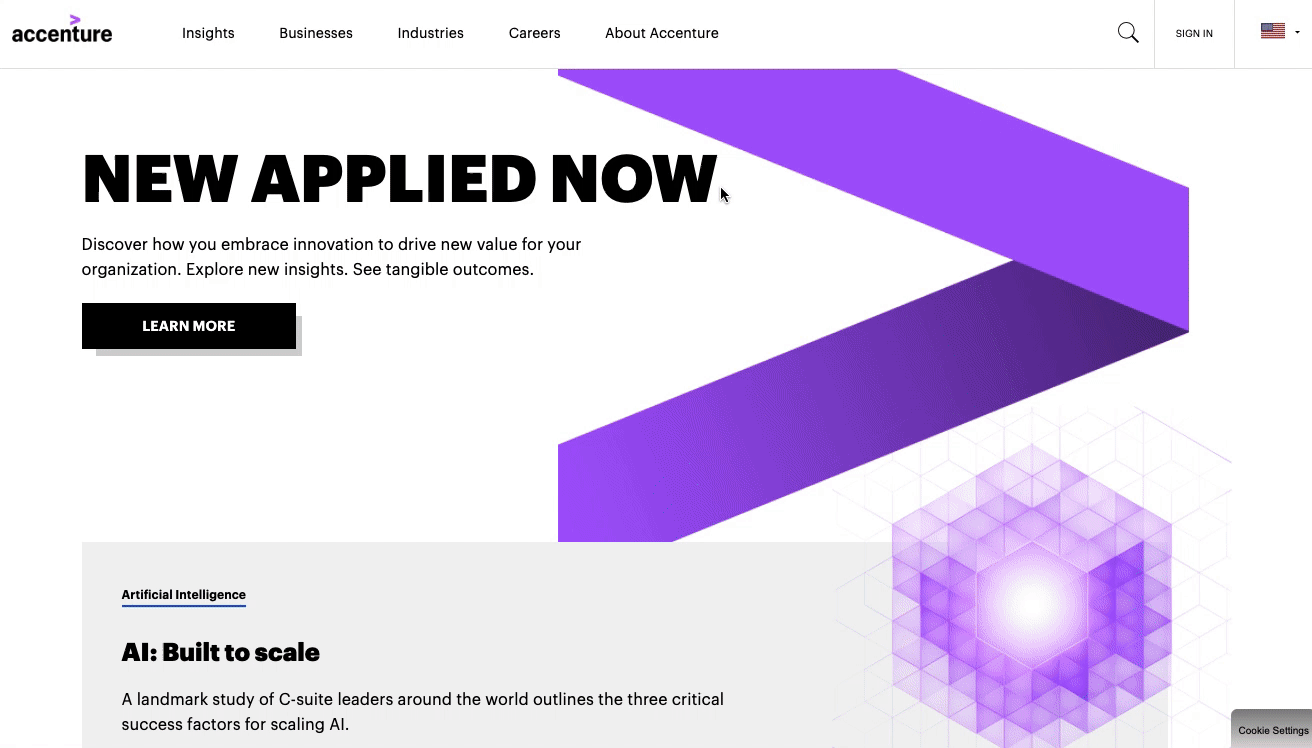
Global consulting firm Accenture’s website features a sticky header that is fixed to the top of a user’s browser so they can still see it even as they scroll down the page.
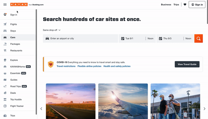
On travel booking site Kayak’s homepage, users can quickly jump to whatever travel needs they’re looking for – flights, hotels, car rentals, vacation packages, etc – via the stick navbar on the left side of the page.
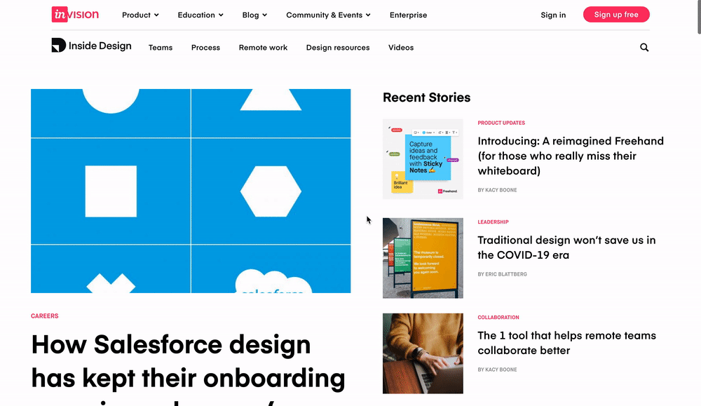
Digital product design platform InVision’s blog features a right-aligned fixed navigation bar. Using this sticky menu, blog visitors can find related blog posts and easily binge InVision’s content.
We know that users generally favor sticky navigation, but how does your brand use sticky navbars to its full potential?
Using insights gleaned from Contentsquare‘s in-page behavioral analytics platform, we’ve drawn some unique conclusions about how people interact with and digitally experience websites of all shapes and sizes. Here are the three golden rules we’ve discovered work best for sticky navigation:
Sticky navigation works best with retail, eCommerce, and other types of “actionable” sites where the designer intends for a user to take a specific action, such as a click to purchase a product. In those cases, sticky menus have been shown to significantly improve customer experience, by keeping users well-oriented and giving them more control over their journey through your site.
In one example from a well-known retail site (sorry – we can’t release the name), after the brand introduced a sticky navigation bar, its visitors began to scroll further on the page and pay more attention to the individual products on the pages. As a result, the company experienced a major reduction in bounce rate, and conversions increased from 30% to 33%, a +10% increase in conversion rate.
That may not sound like much, but a 10% increase in conversions can make a huge difference. And if you’re a leading retailer with annual revenues of, say $100 million, we can make a quick calculation to see how much that’s worth to your business:
Every brand can benefit from having friendly and intuitive navigation, especially on pages with lots of content that require visitors to scroll. Clear on-page navigation helps visitors make a smooth journey through the content on the page in a manageable way. While “back to top” links can help achieve a similar goal, sticky navigation is a quicker, easier way to let visitors jump to a new page on your site and continue their experience.
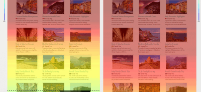
Below, we see part of a long, content-heavy page from a travel website. The left-hand side of the image shows a Contentsquare mouse-scroll heat map that was generated before the site implemented sticky navigation. The heatmap of the right-hand of the image shows how much further people scroll down once the site implemented sticky navigation. The results speak for themselves!
Alongside other interactive navigation techniques, the effectiveness of the sticky element was found to improve the performance in basic selection tasks of older adults and to provide similar benefits (although smaller) to younger users.
So, why do older adults and younger users respond better to sticky navigation? It’s because of the relatively lower confidence levels of older adults and much younger users on the web and their subsequent need for additional support, which sticky navigation provides. Older adults and young users respond well to the confidence that sticky navigation menus instill.
Here’s a deeper explanation as to why this is the case:
This is where the psychology of web design and user experience comes into play. Sticky menu elements increase visitors’ confidence as they scroll up and down a page, giving them a sense of control while interacting with a website. They know what their options are and have no reason to feel uneasy because everything they might need is right in front of them.
A 2020 Contentsquare and CommerceNEXT survey of 1,000 online shoppers revealed customers list the ease of finding what they’re looking for as the third most important factor when picking where to online shop, following price and deals/promotions. Thirty-eight percent of customers also said when a website is easy to navigate, they are more likely to shop there again in the future.
People like feeling in control. Imagine a situation where you are unaware of what is happening around you. Very quickly, the “stress” button is switched on and you try to do everything you can to regain control. You can achieve this by ‘sticking’ to something or somewhere that’s familiar, adopting an old pattern of behavior, or relying on someone you trust.
The same logic can be applied to web navigation and the digital experience. Visitors can feel lost trying to find their way through very long webpages. In most cases, this feeling will trigger stress that will cause them to leave the site, or bounce. This is exactly the purpose of sticky navigation: to help people explore a webpage in a comfortable and controlled manner.
Take a product tour Get to grips with Contentsquare fundamentals with this 6 minute product tour.
Take tour
A study performed by The Journal of the Acoustical Society of America exposed two groups of participants to a loud, extremely unpleasant noise. Participants in Group A were told they could stop the noise by pressing a button, but were urged not to do so unless absolutely necessary. On the other hand, participants in Group B had no control over the noise.
The results were eye-opening. None of the participants who had a control button actually pressed it. But performance on subsequent problem-solving tasks was significantly worse in Group B who had no access to a “stop button.”
That feeling of being unable to control a situation has dramatic effects on the human psyche.
Translated into the web optimization world: even if people do not take advantage of sticky navigation features, just knowing that the options are always there will improve the digital customer experience. That’s true even at a subconscious level!
Sold on the benefits of sticky navigation? If you’re going to implement a sticky navbar on your site, ensure you make the most of it by following these best practices:
Don’t fall for what may seem like a simple implementation. When you need your site to look good and work well in multiple browsers and on different devices, iFrames are not your friend (not to mention the security and SEO issues…).
If you like simplicity and speed, this is how you want to code your sticky navigation. Pay attention to position, margin-top, and z-index.
If you’re going to have a permanent menu, you should keep it as simple as possible so it still provides your users the safety net they need, without being overly distracting. Try hiding the search input field in favor of just the magnifying glass icon.
Perhaps some of your users know their way around your site and don’t need to see sticky navigation. You could make your menus collapsible to give them the option! No one solution works for every case so be flexible. This can be especially helpful on mobile devices, as they have smaller screens and you’ll want to maximize your use of the device’s limited real estate.
Remember that what works well for another brand might not be a perfect fit for your customers. Test different sticky headers to make data-driven decisions about what your visitors prefer and cater your digital experience to their needs. Click here to get a Contentsquare demo and learn how a digital experience analytics platform can help you test sticky menus and other site optimization projects with powerful A/B testing tools, zone-based heatmaps, customer journey tools, and more. Moreover, make sure to get a web hosting for WordPress for more security and better visitor experience.
The 3 Most Common UX Mistakes Every Company Should AvoidTo keep up with changing user behaviors and needs, brands have had to pivot and adapt quickly in the past year. While the pandemic pushed many existing digital customers to increase the frequency of their online shopping, it also pushed many new users to convert online for the first time. In order to maintain this surge of new and existing customers, companies have to build an intuitively designed website that helps their customers quickly and easily find what they are looking for. Unfortunately, common user experience (UX) mistakes could be holding you back.
At Contentsquare, we have over 700+ clients across multiple industries and have seen our fair share of exceptional UX design. On the flip side, we’ve also seen a handful of common UX mistakes brands make that can greatly affect the digital customer experience and hurt their on-page performance metrics.
The good news? These common UX mistakes are easy opportunities to improve your website or app and give your customers a better online experience.
Here are the three most common UX mistakes we see brands make and how to easily fix them:
A “false bottom” occurs when it seems like a page has reached its logical end. For example, a content block may end perfectly at the bottom of the screen, thus creating an illusion that there is no other content on the page. This increases the likelihood that a user will not scroll down the rest of the page, which can cause them to miss out on engaging and relevant content. Users rely on the page design to understand whether there is additional, relevant content, both vertically and horizontally on the page. Even small cues, like an arrow, can signal there’s more content to be seen and encourage them to continue scrolling.
This can happen often when a hero image or an eye-catching, full-width video is meant to engage users without any indication of important content below the fold. Distinct borders or expansive white spaces between content may also create this illusion throughout the page.
Because of this, we frequently see low exposure rates on content below the fold but have a higher likelihood of interaction or even conversion. Through heatmapping, Contentsquare data reveals that 69% of all website content goes unseen by visitors.

Charity Water uses a smaller homepage hero image so the next section of the page is clearly visible, encouraging visitors to continue to scroll down the page.
Avoid accidentally creating a “false bottom” by providing visual signifiers that indicate users can swipe or slide horizontally, or partially bleed content off the screen. Use strong headlines and section headers to separate content, and be mindful of the content flow of your page.
AirBnB’s mobile homepage has carousels that use the illusion of continuity to entice users to scroll and to encourage discoverability.
When the main navigation is not sticky to the page (on both desktop and mobile), it can be difficult for users to navigate to other areas of the site. Users can also experience difficulty when browsing lengthy content or list pages where the navigation can only be reached by excessive scrolling. This experience is exacerbated on mobile due to its limited content view.
Although there should be plenty of alternate navigation on the page that is relevant to the content, the main navigation is a universal indicator for navigation that users are already familiar with. This is also a good tool to browse areas of the site that are not accessible directly from the page they are currently on.
By making the main navigation “sticky” so it’s permanently on users’ screens even as they scroll down a page, you may see increased click rates, engagement rates, and faster time before first clicks on your content.
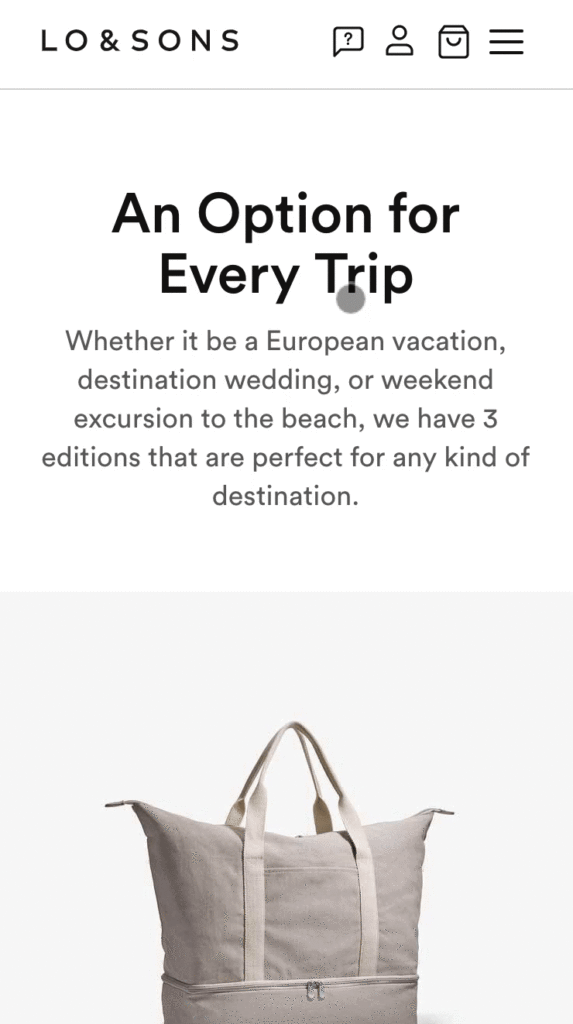
The navigation bar on Lo & Son’s remains sticky as users scroll, making it easy to navigate to other areas of the site regardless of where the user is on the page.
A common UX mistake we often encounter at Contentsquare is when content is either difficult to read or difficult to understand. While typically you want on-page text to be as succinct as possible, that’s not always possible, especially when you have to meet legal or SEO requirements. You can, however, ensure it’s readable and legible.
To improve legibility, always make sure that your fonts are 14px or above, with a contrast ratio of 4.5:1 (minimum) for normal text and 3:1 for larger text. Users can have difficulty reading text that is smaller, or with low contrast. Note that these ratios are the standard for legibility for an audience with healthy, normal vision and does not only include those with disabilities. For a more inclusive and accessible design, W3C’s level AAA success criterion requires a 7:1 contrast for normal text and 4.5:1 for large text to allow users with low vision who do not use assistive technology to clearly see the text.
Try to keep your text on plain surfaces. If text is placed on busy images or backgrounds, it can be difficult to read. If you do overlay it on an image, ensure that it’s on an uncluttered area of the image with high contrast. That may require additional collaboration before new creative work is planned.
For any “fine print” text, consider using a pop-up with a text link or tooltip to share necessary information with your users while avoiding clutter on the page. Choose your typefaces carefully, as certain typefaces require larger sizing and can contribute to decreased legibility.
To improve readability, use simple and short sentences that any reading level can understand. Get to know your audience well. What industry jargon are they familiar with? What will they likely not know? Make sure to be clear, to-the-point, and conversational, while providing clear tooltips that can answer common questions. It is also helpful to break up lengthy content into frequent, short paragraphs. Or, you can use images and diagrams to lighten the cognitive load of maintaining attention to large amounts of text.
Although there are many more UX issues that can be addressed, these are three great opportunities for improvement that can help improve any website and any page’s content.
Digital Predictions: Recipes for Conversion Health in 2020You’ve spent the last few weeks making merry with friends and family, and it’s likely you overindulged. Today, you don’t want to look at another cookie, and you’ve swapped the booze for green juice. You’ve resolved to fill the next decade with yoga and maybe even meditation.
But what are you going to do to improve your digital strategy in 2020? How are you going to go about building a healthier, nourishing, more blissful experience for your customers?
Here is our roundup of 7 trends we think should guide your digital resolutions this year.
The numbers have been out for a while: the gulf between businesses’ perception of their own customer satisfaction versus the consumer’s reality is widening. On the other hand, brands that are synonymous with excellent Customer Experience (CX) are reaping outsized benefits. According to a Forrester report, insight-driven companies are growing 7-10x faster than the average enterprise.
The key to a great CX lies with… your customers. The new standards of experience demand greater, smarter customer proximity — one that hinges on a true understanding of what your audience expects and how it wants to connect with you in 2020 and beyond. If you choose not to go all-in on creating an unexpectedly great experience this year, you do so at your own peril.
Knowing how your brand stacks up to customer expectations — and how many different factors from price, to app ease of use, to customer support — contribute to the experience is still a challenge. This is the year many digital professionals will rebel and demand meaningful analytics that are easy-to-consume. Many brands are finding themselves constrained by old metrics, which can tell you how many people visited your site, and how many converted, but don’t offer many clues as to why they left without buying, or if a purchase was in fact the primary goal of their visit.
When it comes to understanding customers, metrics such as content attractiveness and engagement, friction scores and even an objective measure of consumers’ Digital Happiness paints the story between the clicks. You’ll see more CX Index and e-NPS type metrics coming out from agencies, consulting firms and analytics players this year to help meet the demand.
Having access to a system of insights that can capture the nuances and fluctuations of customer behavior, and translate these into actions is how you turn customer intelligence into intelligent CX.
Digital teams understand that getting as many people as possible through the door is no longer a viable business strategy. It’s simply too expensive and it is not in fact, a customer-centric approach. Why invite someone in unless you can actually deliver value to them? More brands are shifting their focus to analyzing what happens once customers are on their site in order to better understand who they should be marketing to in the first place, and how.
Think about it — not everyone will want to convert on your site (maybe they’re here to check out in-store availability, use the store locator, etc), and those who do will have a specific customer agenda (they might want to see if a coupon works, to check out fast on their smartphone, etc). The key is to understand: 1) what are your high-value segments, 2) how they like to browse.
By analyzing and understanding the journeys and behavior of customers who are already on your site or app, you can surface intelligence about what they’re trying to do, and in turn, use this intelligence to target specific segments with highly relevant experiences. Don’t forget: the best remedy for churn is a relevant customer experience.
Which brings us to content (…don’t all roads lead to content?).
Businesses invest a ton of time and resources into creating content that communicates the brand’s offering and helps customers connect with their values. But how do you measure the impact of content decisions? How do you know what content to display for which audience? How do you maximize your creative investments and merchandising strategy?
Well, it goes back to those smarter metrics. Your customers are giving you real-time feedback on your content with every swipe, tap, scroll, click, etc — each element of your site is either a relevant step in the journey, a distraction, or worse, an obstacle. Customer journey insights are finally becoming operational at scale. And, advanced AI-driven analytics will help translate this customer feedback into actions your team can take to improve the experience and your bottom line. Don’t be left behind.
Brands in 2020 are going to become better at combining their personalization efforts with their customers’ privacy concerns. Why? Because consumers today want more of both. High profile data breaches and an overload of personalized marketing that isn’t in fact that relevant have made consumers wary of oversharing in the digital world.
But is it really possible to personalize without personal info? We think it is. The beauty of behavioral data is that it delivers on both these demands: privacy and personalization.
Because one consumer does not equate one way to browse a website. And just because a brand knows your name, birthday, address and a few of your interests, doesn’t mean they know what drives you crazy when you’re trying to refill a standing cat food order on your mobile. By analyzing and aggregating the behavior of specific customer segments (based on their context and intent) digital teams can unlock a much deeper, truer type of personalization than that made possible by demographic data.
And if you are going to collect data, the key is to use it well. Be transparent and clear about any request for personal information — customers are often willing to give information that is genuinely going to add value for them.
Marketplaces don’t afford brands the same level of control over the end-to-end customer experience as direct-to-consumer (D2C) marketing. By entrusting others to promote and sell their products or services, businesses are not only settling for lower margins; they’re essentially giving away crucial customer intelligence they could be using to elevate and personalize the brand experience.
And when you’re competing on experience, as brands are today, owning the relationship with your customers so you can better meet their needs and expectations — and strengthen your community at the same time — is crucial.
This isn’t an entirely new phenomenon, and it’s not only reserved for new, agile startup companies. Leading brands like GoPro have shifted their strategy, and are putting more emphasis on owning the end to end experience, and cultivating a meaningful, enduring relationships with their customers on their digital properties.
According to the CDC, one in 4 U.S. adults has a disability that impacts major life activities. So if your website and app are not accessible to everyone, that’s 61 million people (in America only) you’re not including in your CX decisions.
The good news is when you design for disability first, you often come up with solutions that are more advanced and smarter than if you hadn’t. Brands everywhere are putting innovation at the service of inclusivity, and are leveraging new technology to future-proof the CX, improve accessibility, and ensure customer-centricity is not just for some, but for everyone.
We’re heading into a new decade of innovation, digital creativity and intelligent technology. Your best strategists in 2020 and beyond will be your own customers. The key will be to tune into their expectations and align your experience strategy with their goals.
It’s time to get a new yoga mat, and a new solution to translate customer behavior into profitable CX actions. As you navigate your favorite sites to find the first, think of the dozens of micro-decisions you take as a consumer: click on this image over that one, filter by size, give up halfway through a scroll, login as guest, etc.
We help brands make the journey to digital wellness more seamless and satisfying. The rest is up to you.
Hero Image via Shutterstock, by Boiarkina Marina
What Not to Do on the Homepage: UX Advice for Fashion RetailThe homepage is often a key webpage for direct and organic search channels for players in the retail fashion industry. In addition to being a crucial step in the browsing process for users, it’s also an opportunity for businesses to introduce and showcase their brand identity through editorials and fashion trends.
However, according to the data we collected in Q1 of 2019, fashion retail homepage bounce rates were as high as 40% across all devices. Users also still spend an average session time of 7min on desktop and 3min 41s on mobile. (Remember, Contentsquare measures bounce rate as having only seen the single page and leaving the site).
It can be difficult to know what kinds of design iterations will help prevent users from exiting without having viewed at least a few product pages. It’s also impossible to create the perfect homepage, but we have some great tips to follow if you’re looking to improve the design of your fashion eCommerce homepage.
Although images and photography are crucial for communicating brand identity and editorial content, make sure you choose images that are text-friendly. Place text over emptier areas of the image, change the image, or place text on an overlay. Always use white text unless brand guidelines say otherwise. Users tend to skip over text that is too long, too small, or just difficult to read. Keep in mind: any information must be easy to digest at a fast pace, especially for mobile users.
If you’re showcasing your Fall/Winter looks, consider using a static banner —a prominent, single banner on the page that does not have rotating content, one that allows other content to be seen above the fold. We often find the exposure rate — how far down the page visitors scroll — drops drastically below the fold line.
A hero image that spans the full length of the page could mislead users into thinking there is no other content. Because the average length of mobile pages is around 3,400px, we need to encourage users as much as possible to scroll past the fold line.
If you’re showcasing new collections or promoting sitewide discounts, avoid automatically rotating slides within the carousel. Instead, use static carousels that do not include more than three slides to allow users an opportunity to digest both the image and information in each slide. Users should be able to use arrows to easily move from one slide to another.
Although there is a big debate in the design world over whether carousels are effective, we see much less exposure and engagement on the second and third slides. Automating carousels can rob users of control over the experience and as a result, they are more likely to ignore it if the slide moves too quickly for them to read.
 Instead, make sure they are clearly above the fold line; try placing them on an uncluttered area of the image. You want to encourage users to immediately begin browsing, whether it leads them to a category page or list page for product catalogs that are currently being prioritized.
Try placing a horizontal category slider at the top of the page and evaluate whether that improves your users’ browsing process.
Showcase editorial content that is space-conscious and easy to interact with
Make sure that any editorial images on the homepage lead the users to specific categories, seasonal collections, or product pages. Giving them a purpose beyond aesthetics encourages users to explore beyond just the homepage and can help increase session time.
Here is a great example from Ralph Lauren:

The above image on the left showcases the bag as both aesthetic and functional, enticing users with beautiful photography, while leading them to the product page. The text is succinct, easy-to-read, and placed on an uncluttered area of the image.
The carousel placed on the right provides even more options for the user to view additional products for the upcoming season. Both the image and carousel do not extend past the screen, making it easy to view. Part of the content of the next section is viewable, avoiding the false bottom and encouraging users to scroll further.
Making design iterations to your site never ends. As user behaviors continue to evolve faster than ever, it’s important to continuously evaluate and reassess the performance of individual elements on your pages. It’s important to make design changes based on the needs of your user base, not the general users of the industry.
Don’t forget to regularly check on other players in your industry for inspiration, as there is much to learn from the digital experiences and websites you enjoy. But remember, just because a competitor does it, doesn’t mean they are improving the experience of their users. So be inspired, yes, but consult your own customer data before implementing changes.
Hero Image Via: Rawpixel.com, Adobe Stock
What is most helpful to know when trying to understand how visitors navigate a site?What is most helpful to know when trying to understand how visitors navigate a site?
You’ve decided to take your UX into your own hands and finally revamp it, so that your site visitors navigate and leave your site digitally happy. You’ve made the right choice and we’re happy you’re here. Improving your user experience is inextricably tied to improving your customer experience.
An adequate CX underpins conversion benchmarks across all the industries we’ve surveyed. So if you’ve been maintaining a site for some time, these are 5 simple steps you can take to improve your UX.
Studying how customers navigate your site is the first step towards improving your UX. After all, who else determines the user experience if not, well… the users? Start with the basics, such as how your users are reaching your website. Is it from typing out a URL? If so, note that these visitors are most likely familiar with your service, or, at the very least, your website. Consider the landing pages users entered through as well. It could mean your SEO or paid social campaign is working out.
If you ask yourself “what is most helpful to know when trying to understand how visitors navigate a site?” here are other basic analytics to keep watch on are bounces, exists, click through rates and conversions. While very basic, these are the building blocks of how well your UX is performing. But to truly get a sense of what exactly your visitors do on your website, and what they are trying to achieve, you’ll need a behavioral analytics platform, or a UX analytics platform. This kind of platform scopes out customers’ every behavior, including all mouse movements, hovers, scrolls, hesitations, and more.
Once you’ve reaped this information, you can start making informed decisions on how to fix issues, remove obstacles along the customer journey, and ultimately improve the digital experience.

Not all UX issues are mission critical. Once you’ve parsed through your behavioral data, you’ll find that some pages outperform others in conversions and time on site. So what exactly is responsible for better page performance? It could be that all on-page elements are working properly together, or that the page loads smoothly. It is also possible that you’re highlighting a special deal or limited promotion, leading users to convert.
Once you’ve analyzed your UX from the point of view of your customers, i.e., through behavioral analytics, you’ll be able to pinpoint why certain pages yield good results and why others don’t. If a user journey points to friction within a page, i.e., one that has a form field difficult to get past, or one with too much content, work on correcting the issues on that page. While technical difficulties point to a design or development issue, there may also be problems in the copy that drive lead users away.
However, the reverse can be done for pages that lead to positive experiences. You can repurpose content themes across your web and mobile sites. Additionally, you should make sure the positive technical aspects of these pages (fast loading times, obvious clickable elements) are replicated. Perhaps the design or the position of your call to action has a high click-through rate and drives conversions. You can mimic this across other pages and CTA configurations.
“What is most helpful to know when trying to understand how visitors navigate a site?” > definetly here we are talking about navigation. Navigation refers to the map and directions of a website. Navigation constitutes the areas which help users move, or navigate, from page to page in their customer journeys (also known as user flows). An optimized user experience should include easy site navigation tools, the ones that guide your visitors to what they’re looking for, or where they need to arrive at.
The most common type of navigation is the menu bar. Usually, it’s composed of parent and child categories as a means of organizing the main contents of a website. While this is the standard on most websites, brands with a large swath of offerings may be at a disadvantage. You don’t want to clutter your navigation; if you do, you’re a UX sinner of the gluttonous kind.
If such is the case, you should use mega menus. These are expandable menus that display more categories and subcategories in a two-dimensional dropdown setup.
Other navigation elements that help guide your visitors include:
When you ask yourself “what is most helpful to know when trying to understand how visitors navigate a site?” you also think of every actions the user are taking on your website. How many times have we done something that we wish we could undo, or have opted for something which we later want to reverse? This is very much a part of user behavior online. Users may decide they want to buy something and change their minds in a few minutes or even seconds.
Where UX is concerned, you should design—or redesign—your site so that all actions visitors perform can be reversible. This includes non-buying actions. How annoying is it when you sign up for something you don’t need, only to have no option of immediately opting out? No one wants to go through their emails and fish out the fine text that says “unsubscribe.” Thus, make this action reversible on-site.
Another way to optimize this is to be reversible-proof, that is, to provide a clear expectation of what a visitor will get before they convert or take any other action. To do this, you can include a preview mode, showing your users exactly what will happen when they complete their action.
It’s been said that multitasking is a myth, but in reality, most people are rapidly switching between tasks. That’s why you can’t allow your visitors to get distracted. Don’t inundate them with miscellaneous content, all on one page. Also, steer clear of fatiguing them with different tasks.
Even if it’s two calls-to-action, users will give one CTA more attention than the other. At worst, they won’t be able to pay enough attention to either and will likely leave the page or not convert.
Consequently, your content should point to one task for your users to complete; this is especially true for landing pages. If you have several CTAs you’d like your users to complete, just set up multiple ad campaigns for multiple landing pages, with each that focusing on its own respective task.
We hope that our assembly of five simple steps helps guide you as you improve your UX. But these aren’t the only ways/factors that can improve your digital experience. UX is a complex concept, one that takes into account all the user emotions and impressions they experience as part of their journey on a website.
If your site’s UX is unclear or frustrating to users, it can cut their visits short, increasing your bounce rates and hurting your brand in the process. So make sure you’re always paying attention to it and optimizing to drive conversions, boost digital ROI, and build your brand.
3 Tips for Creating a Positive Digital Experience for Your UsersWhen it comes to delivering a positive UX, the approaches are vast and possibly endless, considering the wide range of verticals and their emerging niches. While you always want to make sure your digital experience falls in line with the expectations of your industry, there are certain general ways to create a positive digital experience for your users.
Each of these generalities encompasses specific actions you can take to deliver the best experiences for your users. Once you’ve taken these actions, you can master the essence behind these tips. As a side note, none of these are “generalities,” per se; we back up our tips with data. Check them out and start a UX strategy that ensures digital happiness now!
In the sense of content, friction can be defined as any website element or quality that sets off irritation, frustration, hesitation or any negative feeling within visitors. In turn, these points of friction drive your customers to exit or bounce, with the possibility of never returning to your website again — something you ought to avoid at all costs. You have to identify these points of friction first before you modify your site content accordingly.
So, where are said points of friction found on your website? Believe it or not, but not all of them are based solely off of the design. Some of them stem from outside factors — they’re still a part of the UX but originate elsewhere — think prices. Here’s a roundup of several points of friction:
These points of friction are undoubtedly noteworthy, but to truly get a sense of whether or not any of these are afflicting your users, your only recourse is to analyze their behavior and measure the experience. Smart analytics allow you to extract users’ hesitations and other points of friction at a particular space or element on your site. Once you’re armed with this knowledge, you can make discerning choices on the changes you need to make to your UX.
A few pointers to put an end to friction:

In 2019 and let’s be honest, for the past decade, users have branched out of browsing the web on desktop solely, and even mainly. Most brands cultivate their strategy on a mobile-first foundation. That’s because a wide swath of verticals including travel, gaming, retail, apparel and others have seen higher traffic rates across 2018 alone, according to our yearly roundup of mobile data.
But it’s not just mobile that’s left the fringes of the digital space; tablet has also made its presence mainstream and has had a steady growing use worldwide. Brands would be wise to pay attention to the growing use of tablet, as it beat out mobile conversion rates in 2018 in the games and media, groceries, pharmaceutical and cosmetics sectors.
Mobile currently wields a chunky 70% of the time people spend on digital media. But despite its large share of traffic, mobile is beset by a conversion gap across the cosmetics, luxury, retail, gaming and other verticals.
An omnichannel experience doesn’t merely refer to the presence and usage of different device types, as it deals with frequent crossovers. For example, a visitor may commence their digital journey on mobile but can end it on desktop or even by way of going to a store (and vice versa). The task at hand is to create experiences that are both tailored for and consistently positive at every touchpoint.
A few pointers on optimizing your UX for an omnichannel experience:
What would the UX be if not for the different forms of content that comprise a website? But such features do not merely serve an aesthetic purpose. They can be the determiner or the last stand between a user and a conversion.
This is because conversions are in large part dependent upon visitors’ feelings of satisfaction by their experience on your website/ app — something we like to refer to as digital happiness. All the content on your website plays a role in fulfilling a visitor’s objective — whether this objective is to renew a standing order, check out your store hours, or browse for garments. Keeping your customers digitally happy is the best way to ensure customer loyalty and site returns.
That is not to say you should lust after trendy features — if you do, you’re a UX sinner. Study your customer journeys instead to create a more personalized experience for them.
Additionally, perfecting your site with efficient features also means giving your current site features a facelift. For example, if you have too many form fields, consider downsizing. If a clickable element on your mobile site is too small, you should enlarge it.
When on the hunt for new creative ways to engage with your site visitors, consider doing your own due diligence on UX elements. You can’t observe these on your own site, as you haven’t implemented them yet, so it would be vital to learn how they’re faring. Also, you should iterate on the features that have already been used if they have positive interactions that can be proven with data.
A few pointers on optimizing your UX by adding productive features:

Not every site visitor will undergo a positive UX. They are bound to run into points of friction, website malfunctions and journeys not optimized for an omnichannel experience. It’s important to have the right data on hand, the kind that gives you the full picture of visitor behavior, where they’re hesitating and whether they experience digital happiness. Analytics are your best friend — so keep that friendship alive!