UX Spotlight: Visualizing shopping progress – Leading customers through the browsing jungle In the UX Spotlight series, I post weekly on UX features that impressed me online, and are great examples and inspiration for anyone looking to enhance their digital user experience.
Shopping fatigue. We’ve all had it, whether scrounging through bargain basement bins, hitting one more main street shop or clicking on page 17 of blue sweater search results, seemingly endless choices can be a tiring prospect even as it is a freeing one.
As increasingly savvy online shoppers’ tastes evolve, eCommerce merchants must expand their selections to meet every need. How can they also keep customers focused and help them not feel overwhelmed by the sea of options?
This week, I spotlight Ann Taylor for their simple but seamless, genius solution!
The UX element:
Once a category is selected on the Ann Taylor homepage and a customer is browsing products, a meter appears on the right side of the screen with a number of total items available for those search or category parameters and a circle shaded in with the portion of those items already viewed.
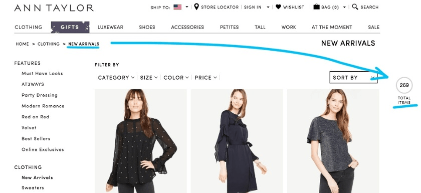
As a customer scrolls through the items, the circle fills more, easily giving customers a frame of reference for how many of the available products they’ve already seen.

The Impact:
Ann Taylor enables endless scroll while still giving customers a sense of their progress through the items. This knowledge also gives shoppers the feeling that they’re in control of their experience, rather than just blindly trying to get to the end.
Most commonly, online clothing retailers offer multiple pages of results (sometimes dozens or more), which users must load individually when they work through a page. This requires multiple reloads of the screen and can frustrate users, especially when they are on mobile, or when it is easy to forget what page they are on – and sadly, many retailers do not make a customer’s current page clear at all!
The Takeaway:
With endless scroll, new items load as soon as all the current items are viewed, and with a decent internet connection this can be seamless indeed. The dark side of the endless scroll is that typically, customers lose all sense of how far along they are in the search results. Sometimes, customers are even left wondering if their search could go on forever, or how many hours they’d have to keep going to see all the options. A progress indicator like this allows shoppers to enjoy the benefits of endless scroll while still safe in the knowledge that it will not, in fact, be endless. Customers are now in control of their own shopping experience, rather than feeling that they are being led along indefinitely.
SINCE JANUARY 2017, MOBILE TRAFFIC TO ECOMMERCE SITES HAS INCREASEDBY 11%,BUT SALES FROM MOBILE HAVE ONLY SEEN A 3% BOOST.
This could be especially important for mobile users, who already make up 50% of US digital commerce revenues, and who are twice as likely to scroll down an entire page than desktop users. Give these scrollers a road map! Since January 2017, mobile traffic to eCommerce sites has increased by 11%, but sales from mobile have only seen a 3% boost. This means there is enormous opportunity here to tap into this traffic by perfecting the mobile customer journey with UX elements that empower mobile shoppers to be more productive.
For many shoppers, there is a desire to see all the possibilities before honing in on a few promising finalists. Such a progress bar can ease shoppers like this through the customer journey by letting them know how far along they are, helping them rest at ease knowing that they’ve done a thorough survey of their choices first.
Besides, everybody loves that feeling of competitive achievement when you finish a progress bar, right? Give your shoppers a pat on the back for seeing all there is to see!
It’s amazing how something so small can have such an important impact on your customer journey. Have you found other ways of setting up signposts for your shoppers?
I am always on the lookout for UX innovation. If you come across a digital experience that stands out, please send it over to pola.zen@contentsquare.com
UX Spotlight: Proactive Price matching – Winning a customer is about staying a few steps in front of the competition In the UX Spotlight series, I post weekly on UX features that impressed me online, and are great examples and inspiration for anyone looking to enhance their digital user experience.
It used to be that technology was considered superior based on its level of “responsiveness.” But these days, it’s not enough to be responsive – you’ve got to be preemptive when it comes to your customers’ needs and their next moves. Staying one step ahead of your shoppers and providing the answers before they ask the questions is like taking them by the hand and leading them straight to conversion. This is especially true in competitive markets in which the best price is often the deciding factor for when shoppers will choose one retailer over another.
IT’S NOT ENOUGH TO BE RESPONSIVE – YOU’VE GOT TO BE PREEMPTIVE WHEN IT COMES TO YOUR CUSTOMERS’ NEEDS AND THEIR NEXT MOVES.
This week, we highlight the clever little ways online retailers Curry’s and AO.com anticipate the needs and actions of their customers and take preemptive measures to keep them satisfied and on-site.
The Impact:
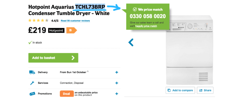
British electronics superstore Curry’s knows that people looking for new major electronics like computers or appliances are usually hunting for the best deal. If a customer is on a Curry’s product page and highlights and copies text like the product name or model number in order to search for pricing elsewhere, a purple box pops up informing the shopper that Curry’s offers price matching and providing them with the link to their price matching procedures. They even mention specific competitors they suspect customers will turn to next.

Interestingly, AO.com, one of the competitors Curry’s lists in their popup, has a similar feature. AO is known for interesting UX features, as we’ve discussed in the past. In AO’s case, merely highlighting a model number (no copying required) prompts a green popup with a number to call and a link to their price matching policy.
The Takeaway:
Both Curry’s and AO demonstrate ways in which you can anticipate possible reasons a customer might exit your website and beckon them back in before they stray. They know that price comparison is a major factor in their industry, and aim to head customers off at that pass. The price comparison popups will either convince customers that they must be getting the best deal since the store features competitive pricing, or remind them to come back to that retailer if they happen to find a better price. This is win-win for the retailers. But more than that, the fact that Curry’s and AO read a model # highlight and understand what that means in terms of customer intention demonstrates an intuitive, and oddly charming, familiarity with their customers’ needs that is winsome to say the least.
What are your customers’ pain points? (Hint: Unexpected shipping costs lead to 28% cart abandonment, so transparency is a good place to start your UX tune ups!) Next gen analytics can show you exactly what’s holding them back or prompting their exits from your site. Once you know where they get caught up, you can plot your own guerilla digital experience “wow’ moment!
I am always on the lookout for UX innovation. If you come across a digital experience that stands out, please send it over to pola.zen@contentsquare.com
UX Spotlight: Superior Checkout Experience – Conversion or bust In the UX Spotlight series, I post weekly on UX features that impressed me online, and are great examples and inspiration for anyone looking to enhance their digital user experience.
Checkout is the moment of truth for eCommerce sites. Your customer journey has brought shoppers this far – can it bring them all the way to conversion?
MORE THAN HALF OF SHOPPERS ARE INTERESTED ENOUGH TO PUT AN ITEM ON THEIR CART, BUT THEN SOMETHING STOPS THEM FROM TAKING THAT ITEM HOME.
Statistics vary, but overall it seems the shopping cart abandonment rate is about 60%. More than half of shoppers are interested enough to put an item in their cart, but then something stops them from taking that item home. One of the most direct ways online stores can boost their bottom line is by improving their checkout process and getting interested customers to convert.
This week I look at several different companies improving their checkout process in three key ways: Fun, efficiency, and added value.
1) Fun

You know when waiters say “good choice” when you choose your lunch, and it affirms you and heightens your anticipation for your meal at the same time? Buying online should offer shoppers similar feedback when they pick out an item.
Threadless, a trendy t-shirt company that sells customer-designed, customer chosen apparel, is a great example of this tactic applied to eCommerce. When you add a shirt to your cart on Threadless, your cart thanks you in a quirky way.
The cart even winks or licks its lips!

It’s unique touches like these that make shopping memorable. And with a quirky product line like Threadless’s, it only makes sense. Every step in a digital experience should fit the tone of the brand, so even an add-to-cart popup should be part of the immersive customer journey. Besides, this kind of immediate feedback encourages customers to continue, because their actions produce an instant reaction, and they’ll want to see what happens next.
2) Efficient
In a survey of why customers abandoned their carts, 23% of them said it was because they were forced to create a customer account, and they preferred to jump ship than to go through account creation.1
A guest checkout option is imperative in today’s eCommerce environment, especially because 60% of shoppers are now browsing on mobile, and creating an account is beyond cumbersome with your thumbs on a touch screen. By forcing customers to register, you are pushing them away.
Many sites offer two options when entering checkout: to proceed as a guest, or to login to an existing account.
Threadless nails it again, with the rising trend of defaulting to guest checkout while giving the option to login:

Threadless’s entire checkout process is condensed onto just one screen, making the light at the end of the tunnel seem much closer and more attainable. If the checkout process is a sprint, then each step is a hurdle. Removing the login/guest choice and going straight to data entry is removing a hurdle and bringing your sprinting shopper one step closer to conversion.
Another brand pioneering simplicity and efficiency in customer journeys is eyewear retailer Warby Parker. When it comes to filling out that data, Warby Parker’s approach is notable due to its highly responsive auto-fill option, which can guess a complete address after just a few characters.

3) Added value
But check-outs can offer more than simply speed and convenience. In fact, British appliance retailer AO.com offers additional value during their checkout, helping shoppers achieve a more streamlined customer journey while potentially increasing their cart value.
For starters, when viewing the cart, AO offers checkboxes for additional features that could help that customer. When I tried to check out with a smart TV, for example, AO asked if I also wanted help with installation or old appliance removal, and made it easy for me to accept that assistance:
Offering extra services makes shoppers feel like everything is taken care of, and there’s nothing else to worry about.
OFFERING EXTRA SERVICES MAKES SHOPPERS FEEL LIKE EVERYTHINGIS TAKEN CARE OF, AND THERE’S NOTHING ELSE TO WORRY ABOUT.
This not only upsells, it also eases any concerns a customer might have about all the nitty-gritty details that might go with a major purchase like home electronics. Offering extra services makes shoppers feel like everything is taken care of, and there’s nothing else to worry about. Furthermore, AO uses friendly, accessible language throughout their checkout process. Instead of technical legalese, they speak to the shopper like a salesperson would in the store, which is exactly the role of a good digital experience.
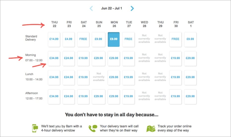
AO also goes above and beyond when it comes to shipping, which is key, because unexpected shipping costs are another notorious checkout obstacle. They allow customers to choose a delivery date and time, transparently showing the prices for each.
AO also enables online order tracking to calm impatient purchasers while their item is on the way.
The Impact:
The proof is in the purchases. Case study after case study illustrates how streamlining the checkout process increases conversion.
For example, in an A/B test, Electronic Path Software found that its conversions increased by 21% when it shifted from a multi-step to single page checkout process.2
Similarly, a Strangeloop test found that conversions declined by 60% when a page loaded 2 seconds slower. Speed is king when it comes to checkouts!3
And ASOS increased their conversions by 50% when they stopped forcing customers to register before they could complete their order.4
It’s clear that taking a few small steps towards a more helpful and less strenuous checkout process could mean major benefits when it comes to conversion.
The Takeaway:
What’s important to note about each of these examples is that they cater to the needs of their particular audience. By and large, shoppers on Threadless might be looking for a fun and simple shopping experience. Those looking for new glasses on Warby Parker are looking for function combined with design flare in both their eye-wear and their customer experience. And customers making a major appliance purchase on AO want to know they have all their bases covered when it comes to their major purchase, and that receiving it won’t be a hassle. Who is your customer? What are they looking for as they check out?
As web analytics become more sophisticated, we have the ability to understand that even the same customer might have different needs on different visits. The next step in the evolution of a superior checkout experience will cater the process further, to meet customers’ particular needs at the time of their purchase, and make conversion the obvious and simple choice!
I am always on the lookout for UX innovation. If you come across a digital experience that stands out, please send it over to pola.zen@contentsquare.com
Resources:
1 – https://www.clickz.com/checkout-best-practice-101-guest-checkout/98289/
2 – https://blog.lemonstand.com/9-case-studies-for-optimising-your-checkout-conversion-rate/
3 – https://blog.lemonstand.com/9-case-studies-for-optimising-your-checkout-conversion-rate/
4 – https://blog.lemonstand.com/9-case-studies-for-optimising-your-checkout-conversion-rate/
UX Spotlight: Product Discovery Quizzes – Dermalogica and Clinique Personalize the Search (and Conversion) Process – tr In the UX Spotlight series, I post weekly on UX features that impressed me online, and are great examples and inspiration for anyone looking to enhance their digital user experience.
Today’s online shoppers have more choice than ever, which means that there is truly something for everyone, but it also means customers are sometimes overwhelmed by choice paralysis.
Back in the brick-and-mortar days, in-person salespeople would help shoppers out by asking the right questions to get to the bottom of what a shopper truly needed and which products would best suit them. Online, with too many options and no personal guidance, the customer journey can slow down significantly – or come to a complete halt.
IT IS IMPERATIVE THAT DIGITAL EXPERIENCES STEP UP AND SERVE AS THE FRIENDLY, EXPERT SALES PERSON THROUGH EASY-TO-NAVIGATE, INFORMATIVE GUIDANCE FOR SHOPPERS.
That’s why it’s so imperative that digital experiences step up and serve as the friendly, expert sales person through easy-to-navigate, informative guidance for shoppers. One great approach to this process is product discovery quizzes.
This week I highlight Dermalogica and Clinique, two skin care companies who both nail the product discovery quiz in different ways.
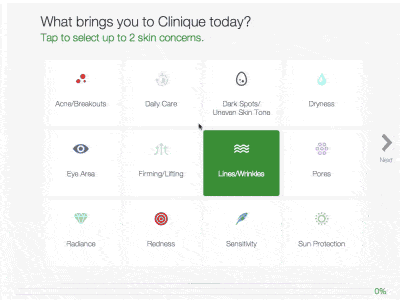
The UX Element: Both Dermalogica and Clinique offer interactive quizzes to help customers pinpoint the right products for their skincare needs.
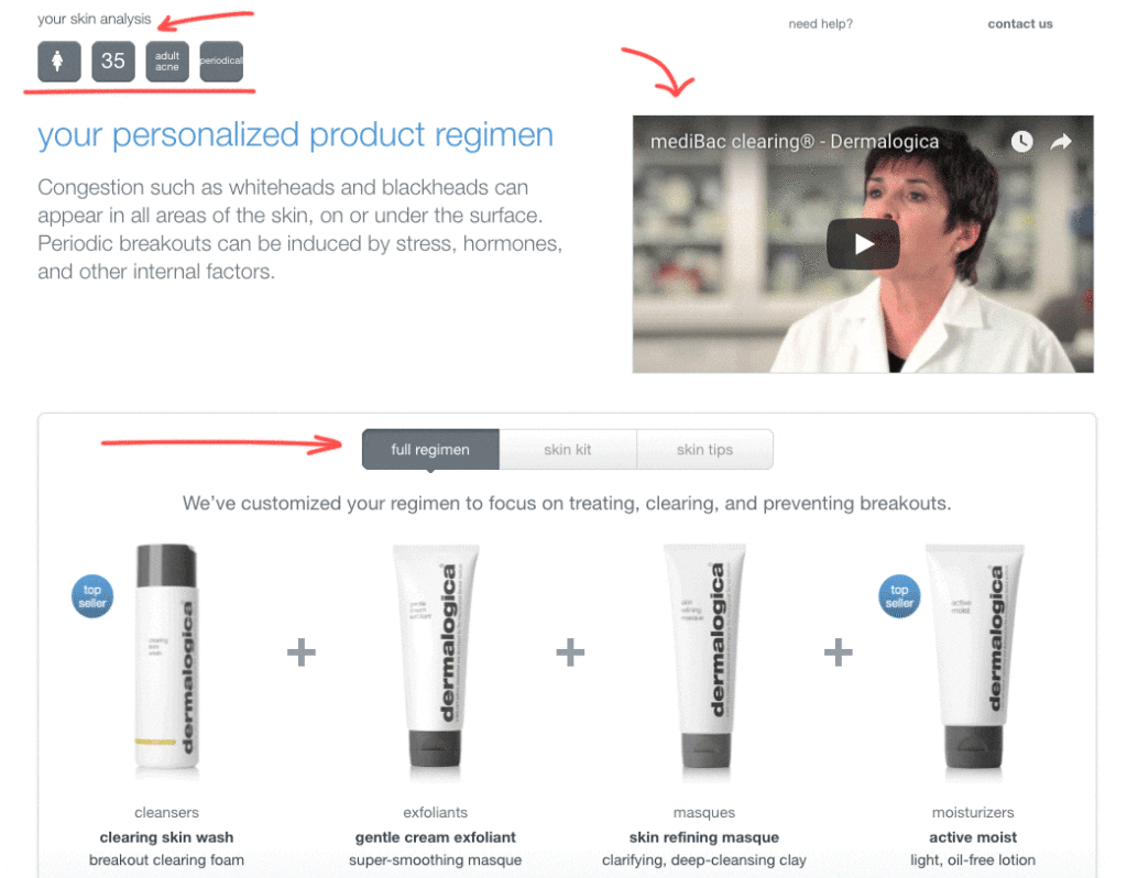
Dermalogica offers a short, quick, streamlined survey to narrow down the body of products that may suit a shopper. In their “speed mapping skin analysis,” which is easily found on their homepage, customers answer 4-6 questions about their age and skin concerns, and Dermalogica offers a “skin analysis,” including a video about the body of products that best suits the shopper, and different skin regimens and products that match the customer’s answers.
Clinique offers a longer, more in-depth quiz, with a variety of different questions and answer mechanisms, such as slide bars and color gradients, which keep the survey engaging and fun. From the homepage, shoppers can click “skincare” and then “customized solutions for every skin.”
Several questions later, Clinique offers a specific set of products that address a pinpointed problem.
The Impact: In the Dermalogica quiz, customers are quickly directed to the right product category for them. In less than one minute, customers can go from not even knowing where to click, to honing in on a personalized category page.
IN LESS THAN ONE MINUTE, CUSTOMERS CAN GO FROM NOT EVEN KNOWING WHERE TO CLICK, TO HONING IN ON A PERSONALIZED CATEGORY PAGE.
In the Clinique quiz, customers take their time answering progressively personalized questions, resulting in a small number of very precise products being offered to them based on their answers. With a little more time investment, customers have their shopping baskets offered up on a silver platter. They just have to add to cart.
Both quizzes offer their results in bundles, which is a great opportunity for brands to upsell. Now that customers are invested in their needs and had those needs verified and validated, it’s the perfect time to offer them the complete solution to their quest.
The Takeaway: First, let’s talk about the fact that people love online quizzes. Even those consumers who come to an eCommerce site purely to browse can be drawn in by the lure of getting to be a little introspective and find out something new about themselves. Being asked questions about yourself is fun, especially aspects of yourself you might not normally think about, which both of these quizzes tap into.
WE AUTOMATICALLY PLACE HIGHER VALUE ON ITEMS IN OUR POSSESSION, OR ITEMS WE DON’T OWN YET BUT WE ASSUME WILL IMPROVE OUR LIVES IF WE DID.
Second, individuals love things that they own or that are assigned to them. We automatically place higher value on items in our possession, or items we don’t own yet but we assume will improve our lives if we did. By designating these items as specifically selected for a customer based on their unique traits or feelings, the items are instantly more valuable in the eyes of the consumer.
Although both of these examples are for skincare, this strategy could be adopted for nearly any field, from travel sites looking to help customers find the right destinations to car dealerships looking to suggest the perfect vehicle for a unique consumer – and help them schedule a test drive for it.
It’s important, of course, that any quiz mechanism is optimized for mobile. With 60% of visitors to eCommerce sites on mobile these days, any process that could speed and simplify the customer journey is a great boon for mobile users, and should be designed with them in mind.
This is the job that salespeople used to do, smiling at a customer across the department store makeup counter and making it easy, pleasant, and even fun for shoppers to narrow their search and hone in on the right product for them. Now, through tools like product discovery quizzes, UX can carry that torch.
I am always on the lookout for UX innovation. If you come across a digital experience that stands out, please send it over to pola.zen@contentsquare.com
UX Spotlight: Custom product creators – New Balance gives customers the sneakers of their dream
In the UX Spotlight series, I post weekly on UX features that impressed me online, and are great examples and inspiration for anyone looking to enhance their digital user experience.
When it comes to sportswear, customers can be very picky. And so they should be – they’re depending on their gear to keep them safe, comfortable, and performing at their best ability. For these reasons, people tend to stick with an athletic brand once they’ve found one that suits them. Which means that customers are hard won, but worth the battle.
With similar brands competing fiercely for customer conversion and loyalty, it’s imperative that sportswear retailers use every tool in their arsenal to set themselves apart. User Experience is one major way that brands can differentiate themselves from competing brands.
WHEN CUSTOMERS TAKE PART IN BUILDING SOMETHING, AND INVEST TIME AND EFFORT, THEY FEEL MORE CONNECTED TO THE PRODUCT.
This week I highlight New Balance’s product customization feature. In this section of the NB website, shoppers can design their own sneakers from scratch, choosing everything from the shape of the shoe to decorative detailing. This feature gives customers a sense of pride and ownership regarding the product they designed. When customers take part in building something, and invest time and effort, they feel more connected to the product. They feel that it has more value and is more desirable than anything out there that’s pre-made.
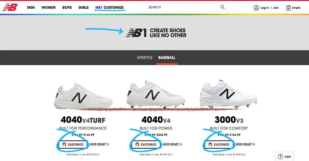
The UX Element: On the New Balance homepage, selecting NB1 Customize from the top menu gives a preview of the different kinds of shoes that can be designed. Once the desired cut is selected, the customer is directed to a full suite of customization tools right in the website interface, with minimal load times and an impressive range of choices to create a unique pair of running shoes that exactly fit the shopper’s preferences and that no one else out there owns.
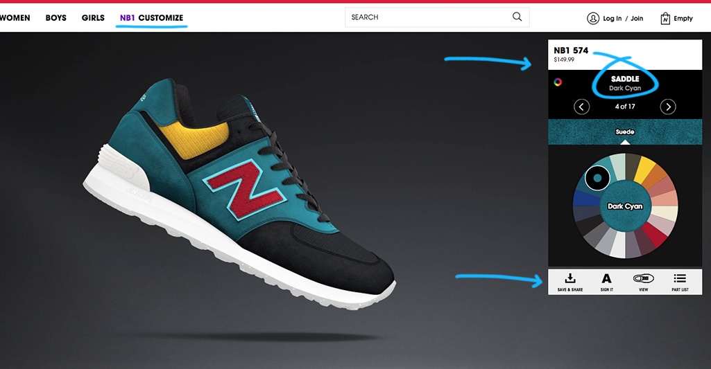
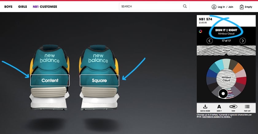
Customers can change almost every aspect of the shoe, from the laces to the color of the mesh to the lining. Each change is reflected in the price in the upper left, so shoppers can balance their budget with the features they desire. There was even an option to add a signature or personal slogan to the back of the shoes.
When a customer has optimized their design, they can select their size and check out immediately – their customized shoes will be shipped right to their door.
The Impact: When it comes to practical items like sportswear, customers generally fit into two groups: Those who know exactly what they want, and those who are overwhelmed by choice. Group A enters their shopping experience with a clear idea in their head of what they want, and spend their time online looking for the product that most matches their vision in terms of functionality and design. Group B has no idea what they want, and the number of options and their specificity intimidates and discourages them.
A customization tool like this one suits both groups. For Group A, it eliminates the need to comparison shop, because the exact design a customer wants can be achieved and ordered with just a few clicks. For group B, customizing frees them from having to choose from existing items and gives them the power to be creative. Through the customization process, these shoppers can discover new features they love and get attached to. In both cases, such a tool increases time on site and user engagement with the site, encouraging extended shopping even in those customers who came to the site out of curiosity without a clear goal.
The Takeaway: As generations become more demanding, brands will need to offer highly customized products and personalized user experiences. Generation Z, for example, particularly craves creative, unique interactions in their shopping experiences, which a custom product creator provides in spades. This incoming shopping generation visits 62% more pages than their predecessors per shopping session and bounce 51% less, which demonstrates how they are eager to interact with e-retailers in more depth.
When implementing such a tool, it’s important to track track the customer journey and steps they find fun and engaging vs. frustrating. It would also be useful to track checkout ratios with different features that customers interact with, . Experience tells us your customers will be willing to pay a much higher price for a customized product than they would for one off the shelf.
I am always on the lookout for UX innovation. If you come across a digital experience that stands out, please send it over to pola.zen@contentsquare.com
UX Spotlight: Hotels.com creates a sense of urgency by heightening friendly customer competition
In the UX Spotlight series, I post weekly on UX features that impressed me online, and are great examples and inspiration for anyone looking to enhance their digital user experience.
For booking/travel sites like car rentals or flights, it can be difficult to set your brand apart from the others. Many offer the exact same services at similar or identical price points, and do not own the products or properties themselves, so the only way to set their site apart is through a superior and unique user experience.
This week I highlight the way hotels.com creates a strong sense of urgency by pitting customers against one another in competition for a limited supply of rooms. This friendly race to the finish line (or booking confirmation) creates a powerful fear of loss and coinciding conversion lift.
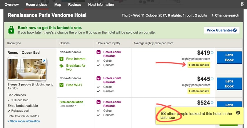
The UX Element: Once a date and location are input, the category page has multiple pieces of messaging that subtly (and not-so-subtly) create a sense of urgency. First, there’s a banner at the top of the page that informs shopper that 30% of the city’s (in this case, Paris) hotels are booked for the chosen dates. Next, a popup in the lower right tells the customer that there are 347 other people browsing Paris hotels at that very same moment, which leverages both natural envy for what others have and fear-of-loss to light a fire under shoppers. Finally, individual property listings boldly display the limited number of rooms left.
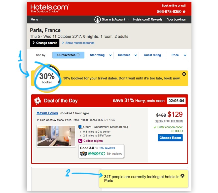
The Impact: The evolution of internet shopping has hurt sense of urgency overall, because shoppers can’t physically see that inventory is running low, nor can they see other customers in the store walking around with an item that suddenly seems desirable due to its popularity. Thus shoppers often dawdle, comparison-shopping or delaying booking for extended periods because they feel they have all the time in the world. Hotels.com creates urgency online by pulling back the curtain and showing who else is in the store. The race begins in the first phase of a search, and increases in intensity as shoppers get closer to product pages. This both makes products more compelling because others are interested in them, and gives customers a reason to book quickly and with their service: if they don’t, the deal could be gone. 88 prospective buyers with only 1 room at the lowest price is a stressful situation for a shopper, but an advantageous one for a seller. It creates an intense sense that if the customer doesn’t book at that moment, 88 other people are ready and willing to do so, and that if they wait and return later, the room they wanted will no longer be available.
There could even be a multiplier effect when it comes to customers looking to book high-end properties. A ContentSquare focus group of luxury brand shoppers found that 13% of luxury customers had in-depth shopping experiences on their first visit, visiting 6 or more product pages, compared to only 5% of non-luxury shoppers. Furthermore, high-end shoppers are more likely to convert on their first visit then conventional customers. Tapping into this “compulsive” tendency of luxury shoppers by fanning their sense of urgency to book an exclusive and sought-after property could have explosive sales results.
TAPPING INTO THIS “COMPULSIVE” TENDENCY OF LUXURY SHOPPERS BY FANNING THEIR SENSE OF URGENCY TO BOOK AN EXCLUSIVE AND SOUGHT-AFTER PROPERTY COULD HAVE EXPLOSIVE SALES RESULTS.
The Takeaway: UX opens many doors to differentiating your brand. Where you might not be able to change a product or price, you can always optimize the way you present the transaction to achieve a powerful effect. By carefully tracking your customer journey, you can see exactly which types of messaging shorten the time between entering a site and check-out or increase conversion overall. You can also see if showing a lower number of other shoppers for a less popular destination has an effect opposite of the one desired. It could be that selective and personalized application of tools like these is a superior strategy.
I am always on the lookout for UX innovation. If you come across a digital experience that stands out, please send it over to pola.zen@contentsquare.com
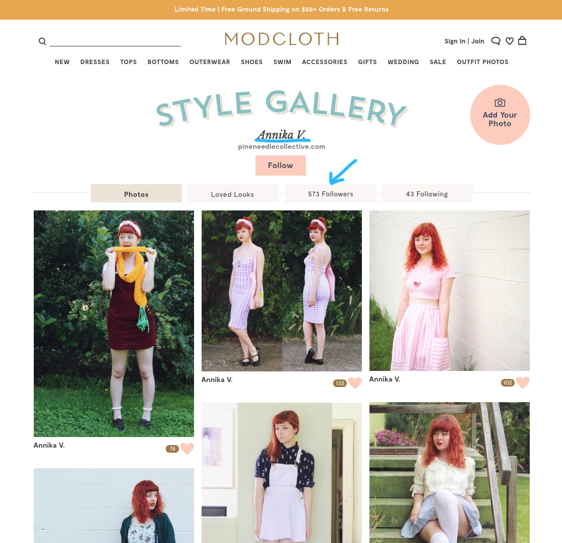
UX Spotlight: ModCloth Cultivates a Shopping Community with Clever Use of Generated Content (UGS) In the UX Spotlight series, I post weekly on UX features that impressed me online, and are great examples and inspiration for anyone looking to enhance their digital user experience.
One of the biggest barriers to purchasing clothing online is the inability for shoppers to try items on before purchase. ECommerce stores are constantly innovating to overcome this obstacle, and one of the best strategies also happens to involve sourcing free content.
This week’s UX highlight is ModCloth’s expert use of User Generated Content (UGC) to increase conversion rates and to build an actively engaged community of shoppers. By displaying customer photos on product pages, ModCloth eases customer concerns about a product, increases the chances a customer will be happy with their purchase, and encourages customer engagement.
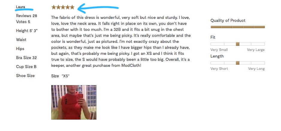
The UX Element: ModCloth product pages feature an “Explore & Shop Outfit photos” gallery below the main professional product photos. This gallery is entirely made up of customer photos submitted as part of voluntary reviews. These photos also appear within customer reviews at the bottom of product pages:
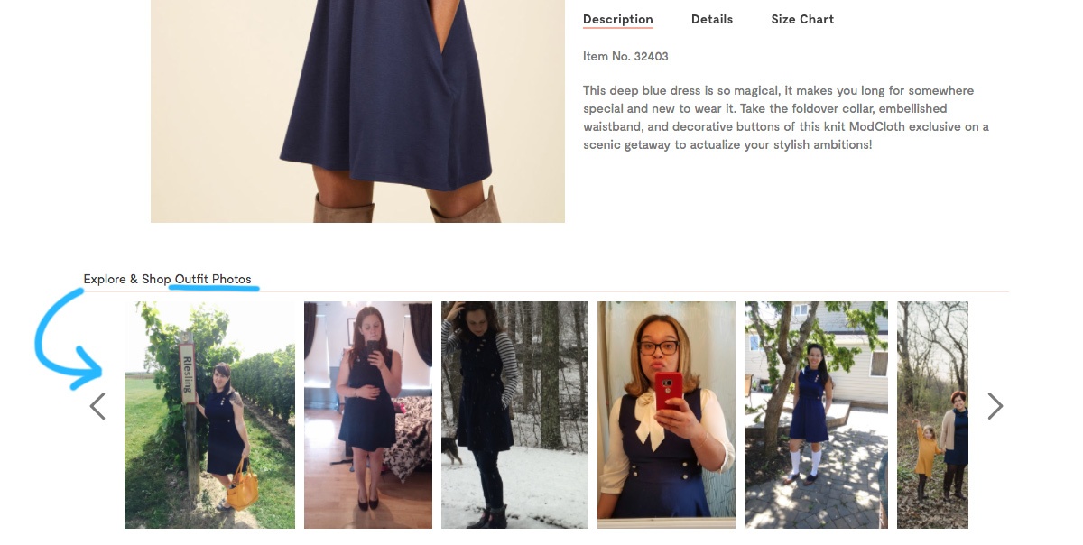
The review template prompts customers to fill in sizing details along with their critique of specific attributes of a product such as length and quality. The combination of stats plus photos enables potential buyers to very accurately evaluate how an item would fit or suit them, by finding a reviewer of a similar size, skin tone, or style and seeing how they liked the product and looked in it.
The Gallery:
Furthermore, if you click on a reviewer you find interesting and relate to in terms of sizing and style, you can view a gallery of the products they’ve tried out:
The Impact: Easing a customer’s mind at checkout is more important than ever, as more and more eCommerce sales come from mobile, and mobile users take 69% more time to complete checkout than desktop users due to lack of purchasing confidence. This layered use of UGC has a tremendous impact.
First, the ability for users to see how a product fits a real person just like them removes the risk that they will frustratingly buy a product that doesn’t fit, and I’m sure lowers return rates.
Next, user profiles with their favorite items create amazing customer engagement, loyalty, and eventually brand ambassadors as users post their looks on social media with links to their profile. Spotlighting star shoppers also encourages new customers to get involved and post their own photos and reviews.
Finally, these brand ambassadors upsell for brands by pairing different items and accessorizing with other brand products.
BY DISPLAYING CUSTOMER PHOTOS ON PRODUCT PAGES, MODCLOTH EASES CUSTOMER CONCERNS ABOUT A PRODUCT, INCREASES THE CHANCES A CUSTOMER WILL BE HAPPY WITH THEIR PURCHASE.
The Takeaway: UGC is powerful because it’s an authentic, word-of-mouth voice, which today’s (and tomorrow’s) shoppers crave. Customer satisfaction with a product is based on how closely a purchase met their expectations, and offering a wide array of UGC posted by a range of people with different traits and interests accurately shapes shopper product expectations while generating excitement and engagement around a brand.
To execute this approach you’ll need to have a system in place to inspire UGC, from getting the ball rolling with social media contests to targeted post-purchase e-mails with review requests. You’ll want to track the ratio between time spent browsing UGC galleries and conversion rates to see how adding user photos really impacts your bottom line. You should also analyze the correlation between users who upload UGC and their rates of repeating as customers. This approach can both sway new shoppers and increase brand loyalty among your existing fan base.
I am always on the lookout for UX innovation. If you come across a digital experience that stands out, please send it over to pola.zen@contentsquare.com
The 4 Best Online Back-To-School Campaigns Countless eCommerce merchants spent the entire year preparing and testing iterations of back-to-school campaigns, with the most innovative and attention-grabbing campaigns raking in lucrative returns.
Now that everyone is back in school and the campaign craze is finally over, we would like to share our favorite 2017 campaigns. These are the ones we found most creative, inspiring, and that really maximized the power of digital experiences. Kudos to these companies who, in a nutshell, completely nailed it. And here they are!
#1) King of Convenience: Staples
Staples has been in the back-to-school game for decades, and has adapted to the digital world thoughtfully. One reason Staples has managed to remain competitive as commerce shifts away from brick and mortar stores is its foundational ability to recognize not only its consumers’ pain points, but also the pain points of the industry at large.
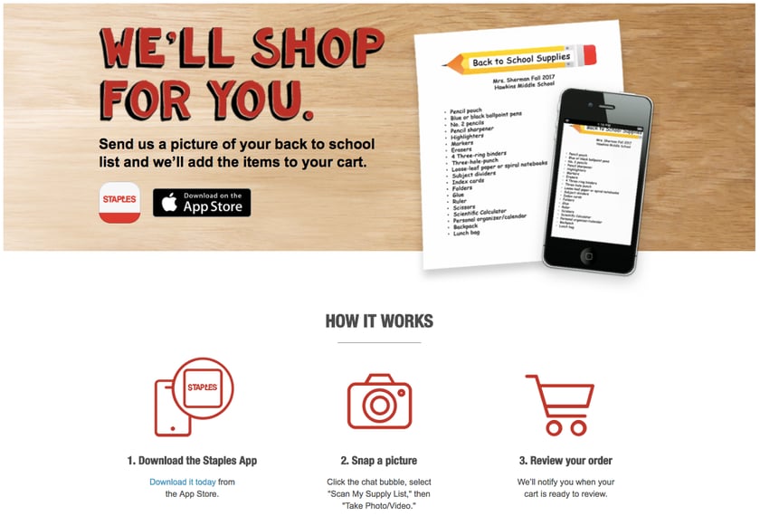
Customers can snap a picture of their back-to-school list, upload it to the Staples app, and Staples automatically adds each item to a shopping cart for customers to review and check out.
Why it works: The biggest pain of back-to-school season? Having to navigate Labor Day Weekend parking lots, track down every picky item on your child’s school supplies list, and wait in line to check out. With their new “We’ll shop for you” campaign, Staples eliminates each and every one of those pain points. Staples sets itself apart with this complete solution to back-to-school anxiety, and at the same time, gets its app installed on phones galore, giving them a leg up in the competition for that customer’s future purchases, as well.
#2) Class Clown: Best Buy
Electronics giant Best Buy made a notable contribution to the back-to-school rush in recent years with their coordinated commercial and mobile campaign featuring comedic actor Adam Devine.
Best Buy has always made an effort to humanize and insert humor into the electronics industry, and its back-to-school campaigns were no different. By creating a short series of videos titled “How to College with Adam Devine,” Best Buy was able to make a lasting impression on high school seniors, college students, and general fans of funny short videos.
https://youtu.be/EiFg7Vc08vk
These videos aimed at helping new college students navigate a new world of first-time experiences and awkward situations with comic levity, while simultaneously introducing relevant Best Buy products.
Some credit is due to Best Buy’s selection of Adam Devine for this particular role. As one of the stars of Workaholics, a Comedy Central show about three college friends entering the workforce, Devine was able to bridge the gap between Best Buy and a new generation of college students.
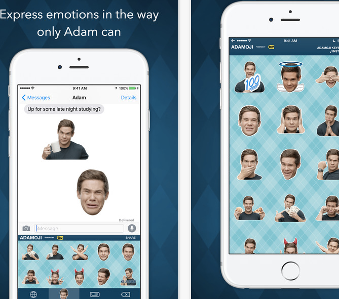
Best Buy carried the campaign into their mobile experience. The introduction of “Adamojis,” exclusive emojis containing Adam Devine’s expressions and funny faces, made it easier for a young audience to associate Best Buy with a hip celebrity. Best Buy’s release of an emoji app also showed an intimate understanding of their target audience.
Why it works: Best Buy’s campaigns were an effective way to build their brand with a new generation of college students. With an omnichannel approach utilizing YouTube, mobile apps, and in-store locations, Best Buy was able to cover a lot more ground with a single initiative.
#3) Advertising through Advice: Walmart
Any good marketer knows that quality content is a great vehicle to introduce products to customers who are otherwise allergic to advertising. Shoppers these days are so inundated by ads that they are likely to ignore obvious marketing. It’s up to innovative advertising teams to use more subtle methods to induce product discovery.
“Subtle” and “Walmart” don’t usually appear in the same sentence, which is why Walmart’s series of back-to-school advice columns are so clever. Pieces like “Girls’ back-to-school outfits for a whole week,” bento box lunch ideas, and a backpack buying guide provide nuggets of useful info for parents while recommending specific Walmart products.
Why it works: Brands like Walmart, which focus on high volume and low prices, can face the problem of customers feeling overwhelmed by choice and fatigued by shopping. Especially online, when the options are seemingly endless, Walmart needs to help customers visualize how items will fit into their daily lives and meet their needs. Giving customers tips for the busy back-to-school season, and explaining how specific items can make the transition easier and fun, is a great way to cut through the consumer fog and connect shoppers with products.
#4) Bundling Boss: Bed Bath & Beyond
When it comes to stocking a dorm room, there’s never been a better time for bundling. First time college students and their parents can only guess at what a modern college freshman needs at their new home away from home, and retailers have the opportunity to help them think of all of the essentials and each of the extras that will make sure they’re at their best and comfortable in their new space.
Bed Bath & Beyond featured a selection of well thought out and creative bundles they call “starter packs,” with the funny and relatable slogan: “When you just can’t even, we can help.”
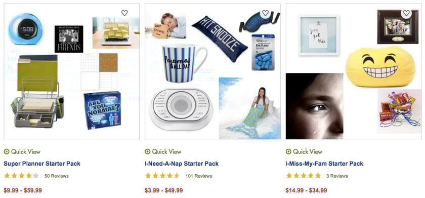
Some favorites include the “anti-freshman 15” which features dumbbells, a mini juicer, and other wellness items, and the “I-miss-my-fam” which includes picture frames, sweets, and other comfort items.
Why it works: The campaign is eye catching and tugs at the heartstrings with its clever nod to how overwhelming and emotional it can be to move away from home (and to move your children away from home), and funny and comforting with its product titling and selection. It cleverly communicates, “When you feel homesick, you’ll need these items,” and “When you have a hard time focusing, you’ll need these items,” which illustrates how their products can help specific states of mind – which at the end of the day is what every shopper truly wants, to feel better and to feel happy. Bundles are the perfect way to deliver products to consumers who don’t know yet what they’ll need in order to feel good in a new situation, like a new school setting.
In Conclusion
The best back-to-school digital campaigns shoot for extremely effective targeting that brings visitors to a clear communication of the specific value of their products, while seamlessly introducing them to their shopping experience.
Savvy merchants understand their audiences and are willing to go outside the boundaries of traditional marketing and get a little creative. A successful back-to-school campaign directly addresses customer’s needs while tapping into the excitement and high emotions of the season of transitions.