With the majority of searches now taking place on mobile, it’s never been more important to ensure your brand’s mobile offering is up to scratch.
At Contentsquare, our mobile app analytics can help you get the most comprehensive insight into your mobile app experience, fuelling your digital teams with everything they need to improve customer journeys across all mobile devices.
Now, let’s take a look at some of the most common mobile filtering pitfalls and show you how to fix them…
“How can I help you?” These five words go a long way to making a customer in a brick-and-mortar clothing store feel more at ease when faced with the sensory overload of multiple racks of apparel and thousands of items to choose from. This assistance in guiding the customer to find exactly what they want is the real-world equivalent of filtering on eCommerce websites.
In the digital world, especially mobile, too many choices make it difficult for people to reach decisions. Often, mobile online shoppers just abandon their search if they can’t quickly and easily find products that grab their interest. Effective filtering narrows down the overwhelming choices. It’s a critical on-site feature for customers who need help coping with information overload and can increase the likelihood of them finding the product they want or need.
According to Contentsquare data, filter use is associated with a 35% increase in click-through rate on products.
According to Contentsquare data, filter use is associated with a 35% increase in click-through rate on products. Moreover, filters were found as helpful for diverse types of visitors: those who are goal-oriented and know exactly what they, as well those who are just browsing.
While filters are effective in helping customers cope with information overload, they are rarely used on mobile sites: as little as 2% and up to 10% of mobile online shoppers use filter menus, compared to 38% of desktop and tablet users.
Only 2 to 10% of mobile online shoppers use filter menus, compared to 38% of desktop and tablet users.
The low usage rate is not for lack of motivation – we found that every second customer that interacted with a filtering menu abandoned the process without filtering. By observing the behavior of filtering ‘abandoners’ we uncovered several common usability issues that block customers from effectively using filters.
Most filter usability issues stem from companies not building mobile responsive filters. As a result, customers are forced to use filtering menus designed for spacious desktop screens, now crammed onto their small mobile screen. In the mobile-first age, responsive sites warrant filters that are designed specifically for the mobile context. Otherwise, customers are likely to abandon a process that could otherwise speed up and ease their shopping experience. Here are five main problems with mobile filtering today:
1. Long and cumbersome mobile filtering menus
On a desktop computer, the vertical bar filtering menus usually appear on the left side of the product listing page, allowing customers to see most or all of the filtering options, even if the menu is long. On most responsive mobile commerce sites, the filtering menu is not exposed by default, rather, it appears as an expandable drop-down menu. Since all filtering options can’t be shown on the screen at once, customers need to scroll up and down or expand sections to explore the full range of options.
In most cases, the font size is small and limits legibility, particularly if there is glare. This experience puts a strain on customers’ short-term memory as they’ll need to remember which filters are out of sight and mentally compare them to the filters they are looking at. In cases of filtering menus with tons of options, the cognitive load often becomes too high, causing customers to abandon the process.
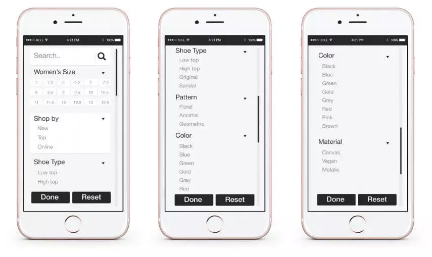
When opened, filter menus are much longer than mobile screens. Customers must scroll repeatedly to see all options.
2. Difficulty in applying multiple filters
Our research shows that visitors who apply two or more filters are more likely to continue to a product details page. However, only 2% of customers that used filters on mobile applied two or more filters. Many mobile sites lack clear visual cues indicating that multiple filters may be applied. Even when such cues exist, desktop-designed menus on mobile are often too small, which can lead to accidental taps on the wrong elements. As a result, customers may find themselves on a page they were not interested in. We also see frequent zooming and tilting behavior, which often results in misaligned page borders and misplaced elements.
Another common issue that limits multiple filter application is when pages reload after each filter is applied. This interrupts the user experience, especially when page reload times are slow. Even if the customer applied one filter, they are not likely to repeat the process if it takes too long.
3. Important filters not easily found
Filters differ in their effectiveness. For instance, we found that customers who filtered by ‘Color’ were 50% more likely to find a product. However, customers often do not reach useful filters because they are hidden at the bottom of a long menu. Filters at the top of the menu are the most used ones, but frequently they are neither the most relevant nor effective options for customers. This can cause a customer who was on the right path to finding a product to be hindered by the low discoverability of important filters.
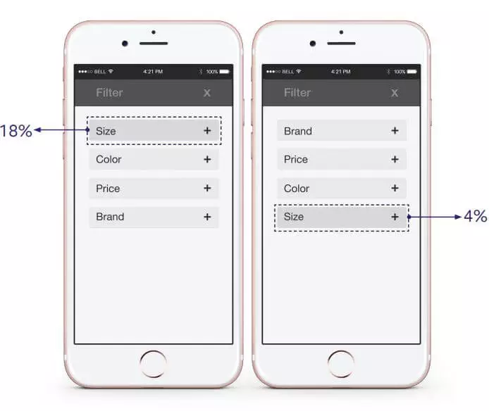
Put conversion-increasing filters like size at the top of the list, where visitors are more likely to use them.
4. Lack of feedback
Many mobile filter result pages don’t indicate which filters have been applied. While some customers may return to the filtering menu to check the filters they applied, most do not realize that they are looking at filtered results. If they can’t find the product they want, they may conclude it’s not available and leave the site.
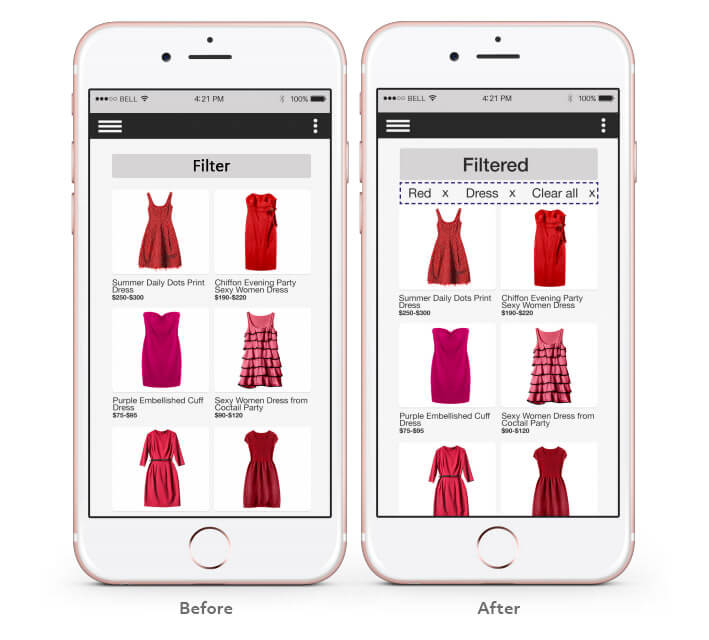
Visitors can easily lose track of which filters they’ve applied, and erroneously conclude that your site does not have the products they want. Clearly indicate which filters are active and make it simple to change or remove them.
5. Difficult to adjust filters
Often, customers only notice that additional filters will yield more relevant options after they scroll through a filtered product list page. For example, on a department store site, a customer may choose “leather” within the “purse” category – and only after scrolling three or four times, realize that also filtering on a specific style will better focus the results to only show the style of bags she likes. Or maybe she wants to apply a different filter altogether. On most mobile sites, customers seeking to add or adjust a filter must scroll all the way to the top of the page. On top of being a time-consuming and irritating task, customers might get distracted along the way and abandon mid-scroll.

Make the filter menu sticky, so it is easily available whenever visitors choose to filter.
Solving Mobile Filtering Problems
The main takeaway is that filtering menus designed for desktops can create a sub-par customer experience on mobile. As a result, a tool that is very effective in helping customers find what they want goes massively under-used. Here’s a brief look at some quick-wins you can take to solve your mobile filtering problems and better serve your customers:
1. Opt for overlay functionality over a drop-down menu.
One quick way of solving many of the usability issues outlined above is to implement an overlay functionality instead of a drop-down menu. An overlay takes up less space, allowing important elements to be larger (e.g., font, check-boxes, etc.). This can reduce users clicking on and applying the wrong filters and allow them to narrow down their search results quicker and easier than before.
2. Move popular filter options to the top of the list.
You want to give your most-used and effective filters prime real estate on your mobile filtering menu. Using an experience analytics platform, like Contentsquare, identify and evaluate which filter categories are most helpful for your customers. Then, list them at the top of your menu so they’re easier to find and use. Be sure to also remove under-performing options.
3. Allow users to see what filters have already been applied.
Within an overlay, it is also easy to see which filters were applied, review them, and then hit ‘Done’ to apply all at once. This functionality also solves the issues of slow re-loads after each filter application. After filtering, the applied filters should appear at the top of the page, so customers can easily see what they selected and quickly and easily remove any filters they don’t want to include in that search anymore.
4. Make filtering menus sticky.
Lastly, making the filtering menu sticky would help customers to access it at any point in their journey. This can save them the hassle of scrolling to the top of the page to double-check what they’re filtering by or to add or remove any other filters.
To maximize the potential of mobile eCommerce sites, equip your customers with a mobile filtering solution that is effective, efficient, and satisfying. After all, filters are the online proxy of a helpful sales associate and play a key role in giving your customers an exceptional digital experience.

According to Pew Research Center, 81% of Americans today own a smartphone, and mobile dependence is also on the rise.
Emarketer predicts that by 2021, “mCommerce will account for 72.9% of the ecommerce market.”
Like many other digital teams around the world, you may be scratching your head, wondering what you need to do to shrink the mobile gap for your business to see healthier conversion rates among your smartphone shoppers.
But instead of focusing exclusively at conversions, brands should take a closer look at their user journeys to gain an in-depth understanding of their customers’ behaviors.
Accessing this level of insight implies having the right tools and methodology, and in some cases, trading in basic or incomplete methods for next-gen solutions.
In this guide, we’ll explore why mobile conversions are having such a hard time catching up to desktop, and what metrics you can use in 2019 to make sense of (and correct) this discrepancy.
As ever, we’ll save the best for last with some concrete tips on how you can optimize your mobile or app experience today.
Let’s dive in!
Mobile Conversions vs. Desktop Conversions: What Gives?
Widespread mobile adoption means consumers now have the world at their fingertips. And yet, 37% of mobile sessions last less than one minute!
Evolving usage and the transformation of devices themselves have widened the gulf between desktop and mobile behavior.
Even more so than on desktop, mobile browsing requires an intuitive, seamless navigation, fast loading times and a streamlined customer journey.
And yet many sites and apps are not conceived to meet the needs of this particular audience, which is often impulsive, impatient, and easily distracted.
The numbers speak for themselves.
Our study of 300 million mobile sessions shows that:
- Smartphone sessions are 1.5 times shorter than sessions on any other device (37% of these sessions last less than a minute!)
- Mobile visitors spend 21% less time on the first page they land on.
- A mobile visitor has a 50% chance of bouncing after 5 seconds.
Hence the need to put aside preconceived ideas and to ask the right questions:
- In what context are users browsing on mobile? At the office, during their lunch break? Waiting for the bus on their morning commute? Inside a mall?
- What is your customers’ intent? Are they hoping to buy or simply looking for information? Are they trying to locate the nearest branch of your store? Are they seeking out customer reviews?
Customer Experience in 2019: The Era of “Micro-Moments”
What if the objective of a browsing session was not, in fact, a purchase?
You heard right. There are as many mobile browsing objectives as there are situations, or “micro-moments.”
And yet it is possible to group these micro-moments into phases, each presenting their own set of challenges for brands:
- I am discovering a product/service: can I get easy access to the information I need from the site?
- I am heading to a store to make up my mind: how am I advised and encouraged online to continue my journey offline?
- I’ve made my decision but I’m still missing some information: how does the site help solve my issues? Does it anticipate my questions?
- I’m completing my purchase on mobile: is the checkout optimized for my immediate context/circumstances?
Giving each of these situations proper consideration goes against some of the preconceived ideas of eCommerce such as: every visit should lead to a conversion. This is simply not the case.
What if the information or free services featured on your site also needed optimizing? Not to encourage an immediate conversion, but to generate long term value.
If you ignore these micro-moments and focus all your efforts on those visitors who have already decided to complete their purchase online, you risk missing out on many conversion opportunities in the long haul.
The Right Metrics for the Right Conclusions
We now know that the user journey on mobile is peppered with micro-moments that should be considered individually.
But how do you shine a spotlight on these moments, which may vary greatly depending on your vertical, your positioning and your offering?
A traditional site analysis, bolstered with A/B tests based on practical use cases (or sometimes even on intuition) may at first glance appear to be the perfect answer.
And while many businesses have relied on the numbers provided by these analyses for years, teams now have access to much more sophisticated UX analysis tools to understand the behavior and goals of their digital audience.
Basic metrics such as conversion rate, bounce rate, session duration and number of pageviews remain critical to understand user journeys.
But why stop there?
In the following paragraphs, we’ll look at four new metrics that can help teams better understand the nuances of customer behavior.
Click recurrence:
Click recurrence is the number of times a user clicks on a specific in-page element.
This metric is incredibly useful because it sheds light on user frustration, due to:
- Bugs and glitches
- A confusing CTA
- An unclear design that led the user to believe an element was clickable when it wasn’t
Activity rate:
The activity rate, a metric that measures the time spent interacting with specific in-page elements, is less frequently leveraged.
And yet it’s much more useful to understand how long visitors spent trying to achieve a specific task than the time if took them to exit your site…
Many businesses routinely monitor how long visitors stay on the pages of their site. This metric is useful to determine how helpful these pages are for visitors trying to fulfill a particular objective.
Engagement rate:
The engagement rate measures the percentage of visitors who clicked after having hovered over a zone.
By analyzing the engagement rate on a CTA, you can understand the impact of each and every one of your changes (wording, positioning, etc) on conversions and other behaviors.
In short — a goldmine!
Time before first click:
The time between the moment when the visitor lands on a page and clicks on an element is an extremely important value.
That’s when your visitor will form an impression, absorb the information you have provided and make a decision about their next action.
Time before first click can convey a lot of information about how a visitor feels about your site.
For example, a short time before first click can indicate that visitors are distracted by certain elements or are being encouraged down the wrong path.
A long time before first click could indicate that the forms or features on a page are too complex to navigate, and are obstacles in the customer journey.
How to Optimize the Mobile Experience to Increase Conversions?
Are you not convinced of the effectiveness of your landing pages? Now would be the time to take a closer look.
Our research shows that visitors who start their navigation on a product page spend less time on-site than those starting their journey on any other category of page.
Presenting the right content at the most opportune moment is key if you want to enjoy a healthy conversion rate.
The first thing to do is to make sure the content of your landing page is relevant to the message in your acquisition source (SEO, SEA, social, etc).
Here are some other good practices you can follow to maximize engagement on your landing pages.
Homepage
Challenge: is it easy for visitors to find what they are looking for?
Solutions :
- Simple and clear CTAs
- Crystal clear brand/product positioning
- Clear displays of the site’s main categories
- Reduction or riddance of moving slideshows,
- Fewer or no popups
Navigation
Challenge: is it easy for users to browse what interests them?
Solutions:
- Easy access to cart
- CTAs above the fold,
- Product availability (online and offline),
- Dynamic/accordion menus.
Conversions
Challenge: is the checkout process seamless?
Solutions for an improved cart:
- Make it easy for users to edit carts
- Allow users to remove items easily
- Suggest other relevant products after add-to-cart
Solutions for checkout:
- Offer secure payment options
- Enable guest checkout option
- Allow users to log in through social/email
- Include multiple payment options (Apple Pay, Google Pay…)
- Clearly label CTAs
- Enable “click and reserve” and “wish list” features
- Leverage mobile payment solutions
While our recommendations focus on specific use cases, an effective mobile optimization strategy requires continuous monitoring of all aspects of the customer experience.
Any improvements to the mobile experience need to keep up with the pace of usage, and with the real-time needs and expectations of your smartphone audience.
To help teams gain a complete understanding of their customers, and to pinpoint the obstacles or frustrations along the user journey, we’ve developed a unique set of metrics that measure customer engagement and interactions at every step of the journey.
Equipped with this level of customer intelligence, teams have everything they need to make winning CX decisions and remove friction from their mobile site and app.
If you’d like to know more about your customers, or if you want to see where they struggle on your site, give us a call and we’ll be happy to show you.
3 Digital Consumer Behaviors Shaping Mobile UXWe’re living in the age of the mobile-first approach to user experience (UX). As the digital backdrop transforms and advances to meet consumers’ needs, the mobile landscape naturally evolves along with it. But mobile usage is experienced differently than desktop and tablet, so it comes with its own set of UX challenges that ultimately shape its approach to design and overall environment.
The consumer behaviors discrete to mobile have shaped how mobile UX is set up, and yet the underwhelming rate of smartphone conversions suggests there is more to be done. In the following post, we look at three behaviors that are impacting best practices for mobile UX.
Forget Heatmaps: Designing for Thumbzones
Mobile UX is molded by the size of people’s thumbs, as most clicks, scrolls and swipes on mobile are done using the thumb. Whether mobile usage is executed with one hand, two hands or in a cradled position (two-hand support of the phone), the thumb is very much involved, as the strongest and foremost finger.
Here are some of the consumer behaviors associated with smartphone usage:
One-handed – 49%
Cradled – 36%
Two-handed – 15%
Most Common Usage for One-Handed Cases: Right thumb on the screen – 67%
Left thumb on the screen – 33%
Common cradling behavior: Thumb on the screen – 72%
Finger on the screen – 28%
Clearly, thumbs are the victor. Now, let’s look at the thumb zone as a model of mobile consumer behavior. Essentially, a thumb zone is a kind of blueprint that shows the difficulty of navigating a smartphone based on the area of a screen. As you can see in the diagram below, the outer and top areas of a phone screen incur the most difficulty for users to reach/ navigate. The middle areas of the screen are the easiest for users to navigate for both left and right-handed users. The upper middle of the screen gets less and less accessible on larger screens, so the ease of use also lessens.
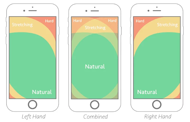
Courtesy of SmartInsights.com
Designing your mobile site and app elements in a way that aligns with the above thumb zones is crucial when optimizing the UX on mobile. Placing site elements in accordance with thumb zones will assure that visitors do not come upon any difficulties when navigating your mobile experience.
Additionally, you should subscribe to standard size recommendations for mobile touch targets. According to the World Wide Web Consortium, the standard sizes for an optimal mobile UX are: 9mm or 34px, and the advised smallest target size is 7mm or 26px. The experience bloggers at UXbooth suggest elements should have no more than 2mm or 8px in space between them, As people with big thumbs and fingers use mobile as well, these standards are sure to shift so that accessibility can reach these users.
Secondary Content: Approaching Mobile Footers
Mobile footers are native to the mobile web, but are less present in mobile apps, as some brands have found a reason to remove them altogether. For example, this is evidenced by the Chinese retail platform AliExpress, which had reaped a 104% increase in conversions after implementing a footer-free web app.
In that incidence, the footers were declined as they did not keep up with user expectations. Mobile users can be short on time and much like other device consumers, only want to see relevant content. Footers display the same content on every page, regardless if the page relates to the footer content or not. This does not pose a UX problem on desktop, since desktop screens are far larger and there is no clamoring for space for viewing and load speed.
So, on mobile footers sometimes get compressed into long pieces of content that require scrolling and take up far too much room. And if they don’t provide relevant content to the site visitor, footer frustration can take hold. Brands like Jackthreads.com have also removed footers from their mobile site, attenuating the effect of the corresponding user behavior. In this way, the line between the mobile web and mobile apps is blurring, if not downright shrinking.
But mobile footers can also improve the experience for visitors — for example, by answering your digital customers’ need for information (terms and conditions, site map, etc). Conversion Sciences has discovered that sticky footers have increased conversions across their numerous client bases. As such, footer usage is a two-way street.
Brands can reach the insights of whether a footer is helping or hurting the experience by analyzing customer behavior to determine whether the footer is serving a purpose or not. After all, without data, it’s nothing more than an opinion.
Tackling the Gap in Mobile Conversions: Constant Mobile Optimizations
Mobile conversions have been lagging significantly behind desktop and tablet conversions, ever since the inception of mobile commerce. Even after the iPhone and smartphone boom in the late 2000s, mobile conversions have been low. They have not made enough strides to compete with desktop to this day — at least where purchases are concerned.
Besides the virtual halving of the conversion rates, what this statistic says about mobile conversion is that over a whopping 80% of mobile users do not complete their purchase.
And yet the high traffic on mobile suggests that there is a desire to shop on mobile. One of the main ways to optimize mobile for conversions is by reducing hesitation and difficulty of use. Non-buyers on mobile who reached the checkout had a 33% higher activity rate (the time spent on a page and interactions on it) than buyers, which could point to an interest in the offerings, but also to hesitation and difficulty.
As such, your content should guide your users. This can be done with progressive disclosure, a UX technique in which page content only relays the necessary information for task completion. This is why mobile typically uses more pages than desktop for the same user path.
Additionally, guiding site visitors can take the form of connecting them with the correct category of product/service, such as a size guide to direct people to the right clothing selection. Ease of use is important, so your content should be optimized like so.
Much like digital, mobile experience is highly visual, so optimizations on this front have also been rising. Because UX is more visual and less text heavy (especially when you take screen size into account), it is necessary to design visuals that are suited to be clearly perceptible (fine details and all)
Images must appear large enough in order for their details to be in clear view. Additionally, providing a 360° view of a product is key, so that potential customers won’t be at a loss of what the item truly looks like.
Pay Attention to Mobile Consumer Behaviors
Mobile usage has had a sharp worldwide upsurge, leaping from 50% in 2016 to 78.2% in late 2018. With the climb of mobile use and the mobile-first milieu of most brands, mobile is a critical medium to earn customers. Any optimization efforts need to start with a clear understanding of mobile consumers’ needs and expectations.
How visitors interact with your mobile site or app holds important clues to what they are trying to achieve, and what is causing friction along the way. Traditional analytics can provide a partial reading of this behavior (page traffic, conversions, etc) but a granular analysis of digital content adapted to the unique behaviors of mobile visitors (taps, swipes and scrolls) will go much deeper and provide a meaningful foundation for successful optimizations.
Optimizing Mobile Experiences: Interview With Bobby Chucas of Babylon HealthSummary
With over 2.5 million users, Babylon utilizes 21-century tech and a robust mobile strategy to fulfill their mission: to place an accessible and affordable health service in the hands of every person on the planet. From tackling challenges of form completion to designing a purposeful and compelling mobile platform, Babylon draws on behavioural insights to create a seamless experience. We sat down with Bobby Chucas, Senior Product Manager, to uncover how to optimise for a mobile-first world.
Intro
At the heart of every great mobile experience is a team that understands its users’ needs. Since 2013, Babylon has worked with partners like the English National Health Service, Samsung, and Tencent to revolutionize the GP experience. Named one of Europe’s hottest startups by Wired in 2016 and the Mobile App of the Year at the UK IT Industry Awards 2015, Babylon takes the mobile approach to democratizing healthcare.
A pioneer in health informatics, Babylon uses artificial intelligence to place accessible healthcare in the palm of your hand. However, it’s Babylon’s robust mobile strategy that places the user at the center of attention. From tackling challenges of form completion to designing a purposeful and compelling mobile platform, Babylon draws behavioral insights from its 2.5 million user base to create a seamless experience.
We sat down with Bobby Chucas, Senior Product Manager, to uncover how to optimise for a mobile-first world.
What’s your biggest challenge when it comes to optimizing your mobile experience?
You’d think mobile experience would be an easy thing to get right, given how much less space you’ve got to work with! However, mobile’s more complicated than being just about screen size, and is as much about understanding your users’ context and intent – given that mobile users could be literally anywhere when interacting with you – when they’re interacting with your product as it is about design. The biggest challenge we have is that what we’re offering requires focus and time: my product is a free, quick health assessment available through an app that gives you a detailed view of your risks of high profile diseases. This assessment is up to 15 minutes long, and many of the questions are quite specific, ranging from family history of certain diseases through to questions around sexual health and drug taking. We’d obviously love our users to get as much value out of the product as possible, so one of our biggest challenges is ensuring that users understand that the assessment takes time and focus, but that the payoff in terms of the insight you receive from the product is well worth the effort.
What can mobile commerce sites learn from Babylon, and vice versa?
Babylon isn’t really presented as a commerce app – while there are services users can pay for to get tests, insights, appointments etc., that’s not the focus, and that’s not what we’re trying to prioritise. Often our users come to us when they’re experiencing symptoms that they’re worried about, and of course our priority is to provide a seamless experience that gets them the information and support they need. By focusing on the needs of the user, we hope to build trust and reassure the user that Babylon is a service they can rely on. It’s difficult to translate this across to pure commerce, but focusing on the user’s immediate needs and priorities is hugely important for us.
That said, many commerce sites have very well structured conversion funnels, and I’m sure there are many insights we can take from those kinds of experiences to better convey what kind of offerings we provide to our users of our private service.

What’s the most surprising behaviour you’ve seen from mobile app visitors?
The most surprising behaviour we’ve seen is that we’re getting around 75% of our users to complete the assessment. Most equivalent assessments see conversion rates in the low single figures, so the fact we’re getting that rate is really valuable. We tested out a number of different ways of framing the assessment, in terms of conveying the value of the insights to users before they started, and we also experimented with the format – we provide a conversational chatbot experience rather than a standard form to fill in, which helps to engage users. It will be interesting to see how this evolves as we increase the range of diseases we provide, as they will be accompanied with more questions, and so we’ll need to decide whether users are still happy to take the assessment all in one go, or whether breaking it out more clearly would make sense.
What are the most important factors in an optimal mobile experience?
In general, people hate it when their screen gets too busy. The experience when you tap on a link to a site, which then fills the screen with multiple prompts for GDPR, cookie consent etc., is frankly awful. Whilst some of that is of course required by regulation, some sites can be tempted to grab the user’s attention by fitting as much information above the fold as possible, in the hope that one of the many items catches their eye. While in some situations this may work, most research shows that the far more compelling experience is a more sleek, refined, experience based around a single intent or purpose. Not only does that provide a clear purpose to the content you’re presenting, it also provides you with a clear metric of success that you can use to research and test how to add incremental value to your product.
What are the common mistakes most brands make when it comes to mobile strategy?
Criticising businesses for not being “mobile-first” has become a bit of a trope over the past few years, but it’s certainly true that it’s very difficult to get right. Often teams can evangelise enthusiastically about mobile, but when it comes to their development process they still build their desktop screens first, then essentially condense them for mobile. It’s not as simple as tweaking the design, and is much more dependent on research into understanding why the user’s interacting with you, and what they’re trying to do. By understanding that and ensuring that you’re expediting that as much as possible, you’ll keep their attention and stop them getting frustrated and resorting to searching elsewhere.
We’re potentially seeing a similar type of trend now with voice interaction – as smart home devices like Alexa and Google Home become more commonplace, more products will become available through the voice medium, and I’d happily bet that many of them will take the same approach and try to shoehorn their existing offering into a voice experience, rather than reconsider it from the bottom up. The first few products to get that experience right will create an incredible opportunity and reach for themselves.
