Aggregators’ laser focus on digital experience has given them an edge when it comes to online conversion. They leverage data to understand how their users behave and buy online, which enables them to A/B test improvements quickly and efficiently to drive sales.
Identifying purchasing trends allows them to spot up-sell and cross-sell opportunities, react to changing customer expectations, and tailor products to meet user needs. Insurers would do well to imitate. 50% of Online Insurance in Europe is sold via aggregators.
Ecosystems Will Account For 30% Of Global Revenues By 2025
7 of the 10 largest companies by market capitalization are ecosystems – Alibaba, Alphabet, Amazon, Apple, Facebook, Microsoft, and Tencent.
Ecosystems’ one main focus is to have customer-centric digital activity. Their expansion puts insurance brands at risk. Products like Amazon Protect, focused on device insurance, are the first examples of a potentially untapped market for these tech giants.
Insuretech
9 In 10 Insurers Fear Losing Part Of Their Business to Fintechs
Pressure on margins, loss of market share and information security are among the top concerns for insurers, but according to PwC, a large proportion also see opportunity. Many think new technologies can offer reduced costs through automation, improved customer retention and a differentiated service.
Insurers
71% Of Consumers Surveyed Used Some Form Of Digital Research Before Buying Insurance
To compete, insurers must adopt the same customer-first mentality as digital leaders like Amazon. Namely: A relentless focus on finding and eliminating friction, particularly for key journeys like account registration, troubleshooting and account management.
Many companies fail to improve customer journeys because discovering what customers value isn’t easy. Translating that understanding into operational performance improvements is even harder, requiring deep customer insight, robust analytics, and a detailed model of key customer journeys, with ownership across functions and end-to-end management.
Digital channels like web and app offer important opportunities to analyze customer interactions and uncover friction. This data is essential to creating services that don’t just work, but delight customers.

Insurance Trends
Traffic per Device: Traffic shifted from desktop to mobile in 2019 – a 48% increase from 2018.
Number of Pages Seen: Visitors seem to consume more content per page, with an increase in the session time (+35% on desktop) but a decrease in the number of pages viewed on average (-6% on desktop).
Percentage of Content That Is Never Seen: Despite visitors consuming more content per page, the percentage of content that is never seen increased.
Average Page Views For A Lead Generation Visit: Visitors consume lots of content before converting whether this is informational content or the form pages themselves.

The Problem
Insight into customer behavior trends is crucial to building an online experience to rival the Amazons of the world. Yet insurance brands still frequently struggle to understand the “why” behind customer behavior, and many still use tools like Google Analytics to get answers. While these tools effectively answer the “what” – ie. which pages are being viewed and for how long, this information doesn’t help when attempting to understand visitor behavior at scale.
Many rely on session replay tools to try and uncover user experience issues, but few have the time to gain effective insight. Others rely on analysts to answer their on-site questions. This too requires significant time and manual effort, and puts a strain on analyst resources.
The “Tag, Wait and Learn” methodology is outdated. It relies on having to guess where issues might be ahead of time, leaving businesses “not knowing what they don’t know.”
A Solution?
UX Analytics helps organizations make faster, smarter decisions by giving each team the means to answer their own optimization questions. With these tools, they can access aggregated data on visitor behavior; robust enough to underpin data-driven decisions, and presented in a way that even non-analysts can understand. Contentsquare’s platform is purpose-built to be easy to use, accessible to a large number of users, and not to sit siloed within Analytics teams.
According to our Digital Experience Report on insurance Bank of America has 30 people trained on the tool to measure the impact of every experience, and piece of content.

Find out how Contentsquare’s solutions can help insurance brands by accessing “The Digital Experience Report – Insurance” below

When taking on Conversion Rate Optimization (CRO), the primary concern for digital marketers is unsurprisingly the user experience. UX is a catch-all phrase for a visitor’s experience journeying a website, the feelings they undergo and the content of the website itself. Consequently, there are a variety of methods to improve it.
While having CRO on the mind is important, it is also critical to consider user behaviors, including the negative ones. As business owners or marketers, we often have to contend with a rather challenging digital reality, that of bounces and exits. While the definitions of these negative metrics sound similar, they bear a crucial difference.
Delineating site leaves, the bounce rate is far more detrimental to your UX than an exit, and its respective exit rate. That’s because the bounce rate refers to visitors who leave a site after visiting only one page, while the exit rate refers to the visitors leaving after their last pageview, at the end of a journey which may include any number of pages. This article will show you how to both improve your UX and reduce your bounce rate in 5 ways.
1. Measure Conversion Rate and User Experience
It has been said that if you aren’t measuring, then you aren’t marketing. Consequently, particularly in UX and the subdiscipline of conversion rate optimization (CRO), measuring comes first. It is crucial to know how your website is faring and conversion rate is one of the foremost KPIs to keep track of. You’ll also need to understand the state of your conversion rate before moving forward with any changes to your UX.
Measuring the conversion rate is done via the following calculation: divide the total number of conversions by the total number of site visitors and multiply the result by 100%.
This is the formula for conversion rate:
Conversion rate = (conversions / total visitors) * 100%
For example, if there were 8,055 visitors on your site which yielded 1,003 conversions, the conversion rate is 12.45%.
There is no single method to quantify the UX, since it encompasses both the feelings of the users visiting the site and the content of the site itself. There are many factors to work out, as the UX cannot be defined by a single metric, unlike the bounce rate or CRO.
You can parse through the UX through a variety of means. This is where unique, AI-powered analytics come in, as they point to a much more granular understanding of your visitors’ behaviors. You can get a deeper understanding of the digital happiness that your users experience, by way of a read on their emotions. This can be achieved through an overview of their patterns of behavior, one that takes into account visitor objectives, or intent, context and more.
There’s a lot to sort through when evaluating digital happiness, but these factors contribute to your UX, and as pointed out, UX goes a long way towards both reducing bounce rates and optimizing the conversion rate. Here are some of the metrics to work out in your user experience:
- Hesitation Time: The average gone-by time between the last mouse movement and the first click on an element of your site, or zone. This metric shows if the content is quickly understood or if visitors hesitate before they click.
- Engagement: Expressed as a percentage, it shows the visitors who clicked on something after hovering over it. This metric reveals how intuitive an element is, i.e. its ability to demonstrate how it should be used through its design.
- Click Rate: The number of pageviews where a zone was clicked divided by the total number of pageviews. This metric allows you to identify how many visitors clicked at least once on a zone per each pageview.
- Conversion Rate Per Click: The percentage of the number of buyers who clicked a zone divided by the number of users who clicked on it. This metric shows you if clicking on a zone impacts purchasing behavior.
- Attractiveness Rate: The percentage of visitors who clicked on a zone after they have been exposed to it. This metric clarifies the attractiveness of an element.
2. Improve UX Design

The design of the UX is essential to the success of digital journeys. You won’t be able to improve the user experience without addressing and mending the design. What makes up the UX, if not the copy and design?
For a long time, UX design has been a guesswork game, with analytics solutions having provided some answers but not all. Today, next-gen solutions can produce a much more in-depth reading of consumer behavior. These will empower you to make wiser, more UX- savvy designs, so that your site visitors get the most optimal user experience. But the UX design should not be entirely dictated by designers.
As aforesaid, marketing teams reflect a diversity of roles and responsibilities, and the UX design can benefit from a variety of team members’ input on improving the UX. Thus, data democratization is paramount, as it denotes data accessibility: the ability of data to be accessible, and understandability, which denotes the ability to be understood and leveraged by non-data analysts. When behavioral analytics meet data democratization, your UX design will become virtually foolproof and indestructible, creating a space for digital happiness.
Additionally, with access to highly visual, easy-to-read data, UX designers don’t have to wait for analysts to provide them with answers before they get to work. This allows them to streamline their projects and helps focus continuous optimizations.
3. Optimize Website Speed
Website speed paints a picture of the faculty of your UX, and as such, has the ability to yield a good or at least an average, conversion rate. Your website’s load speed is important since it’s one of your visitors’ first impressions of your site. Website speed is especially crucial on mobile, which has surpassed desktop in traffic. And there’s plenty of judgment as far as that is concerned for an on-the-go audience.
There are a number of ways to optimize your website speed for both the desktop and mobile versions. First, evaluate your current website load time, a quick task away, since there are several free sources performing a website speed test on your site, such as GTmetrix and Uptrends.
Next, you’ll have to deduce what is slowing your website down, before you can compile a list of solutions. Website speed can slacken from a variety of issues. These include image difficulties, such as too many images per page, large image sizes and the src tag when using images in HTML.
There are other contributing issues, most of which are technical in nature, such as a high server response time, a lack of browser caching, issues with coding languages and disregarding compression.
Once you find what’s bogging down your website’s speed, you can then employ several methods to remedy it. You can try several workarounds; it’s most appropriate to do what corresponds with your particular issues.
These techniques include: changing your website host, tinkering with your images (such as with their size, src tag, etc.), minimizing the amount of JavaScript and CSS files, minifying your plugins, detecting 404 errors and reducing file sizes via compression.
4. Work on Your Funnel Conversion
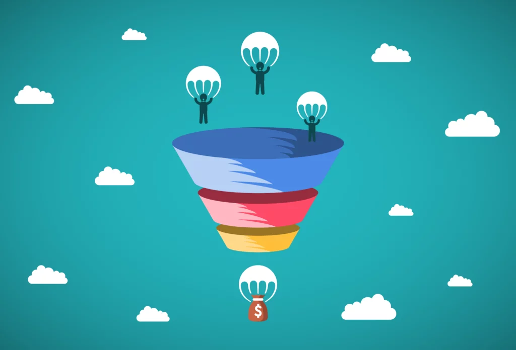
This primarily deals with sales. A sales funnel is a visualization displaying an assessment of where your site visitors are in their customer journey and conversion process. Specifically, a sales funnel is a model, one that is aptly shaped like a funnel, with the widest area at the top, representing all levels of visitor/customer engagements and narrow at the bottom, which displays the most engaged users, or those most likely to convert.
The below image shows the sales funnel, which can be thought of as a chart that sums up your prospects’ sales process. Each stage can be used to improve the overall funnel conversion, i.e., the totality of the process that gives way to a conversion. By working through each stage in a step-by-step manner, you can effectively augment your funnel conversion.
First, start with the awareness stage at the top. This entails building your brand awareness and digital footprint. You can do this via blogging, social media campaigns, PPC and SEO campaigns and traditional PR work.
Next, you must tackle the consideration stage, where brand awareness exists. To do this, take the lead magnet approach, in which you propose solving your leads’ problems if they give you their email address in turn. This will push these leads further down the funnel. The lead magnet involves using landing pages, CTAs and contact forms for content engagement.
For example, in the case of a contact form, it would be beneficial to be able to know exactly which form field is causing user abandonment of the form. Some form fields aren’t clear to users and others just don’t work because of a technical malfunction. Knowledge is power and with the knowledge of these obstacles, you can make precise optimizations.
Then, ease your leads further through the rest of the steps by way of educating them. This can be done through the application of emails, drip marketing (emails you send over time that have long been previously written), integrations of your CRM for re-targeting, offering promotions to incentivize conversions, monitoring your social media campaigns, performing A/B tests and finally, asking converting users (customers in e-commerce) to refer a friend or anyone that may benefit from your offering.
Throughout your sales funnel optimization efforts, you should analyze your visitor journeys to make sure the path to the objective is clear and intuitive. And of course, the final steps of conversion must be streamlined and pain-free for your visitors so don’t neglect to locate and fix obstacles at checkout.
5. Improve Your CTA Button
At last, we arrive at the point of conversion in the UX: the terse but mighty CTA button. The CTA button is the last portal to converting, the threshold between your ultimate goal and user hesitation. So it goes without saying that your CTA button must be optimal.
Fortunately, the CTA button requires little on both the copy and design fronts. First, you should come up with a call-out that is not only attention-grabbing but clear and easy to understand. This is usually no more than a few words that denote a command.
Regarding the design quality, you should make your button big enough to be easily seen without the need for much scrolling down after a user views the content above it. Ideally, the button should be big and bold enough to be impossible for your users to overlook.
While generating a productive CTA button isn’t difficult, the button itself is only as good as the content before it. If the content on your landing page is too long, profuse with jargon or exhibiting poor design elements, your prospective visitors and leads will leave before they even finish reading, watching or scrolling through your content.

However, even if your visitors do reach the CTA button, this does not guarantee conversions. Sometimes, the CTA button itself is out of order. There are several signs to take into consideration of a non-working CTA button.
For example, pay attention to clicks and hovers. Is there a high hover rate but little to no clicks? That’s a UX red flag. Are your users clicking on a non-clickable element? This indicates a faulty CTA design, in that the users think a non-CTA element might be the CTA button. Before answering these questions, you’ll need to be equipped with these particular types of analytics.
Thus, captivating visuals and persuasive copywriting go hand in hand on your landing pages, or wherever else you place a CTA. But a truly functioning and conversion-yielding CTA requires knowledge about how users are interacting with it, which only certain analytics can provide.
In Conclusion
Per this reading, you have probably concluded that improving the user experience and reducing bounce rates is not a lone endeavor by any stretch. Instead, it is made up of a series of processes that involve conducting measurements, applying UX design best practices, improving sales funnel conversion, executing an adequate CTA and quickening the speed of your website.
These processes and solutions will not be the same for businesses and websites industry-wide, or even necessary for all, as the UX differs across businesses and their respective digital assets. Thus, the conversion rate also varies from site to site. The good news is that if your CRO efforts stem from a granular analysis of how consumers are navigating your site, you’ll be able to optimize from a knowledgeable place, and enjoy data-driven results in no time.
Remedies for the 7 Deadly Sins of UX
You’re probably aware of the seven deadly sins thanks to our webinar, which detailed their existence beyond the biblical sphere. The 7 deadly sins have trickled down into the sphere of UX, and from time to time can rear their ugly heads into the UX of even the most astute digital marketers. But they can be prevented, or if committed already, set right. Read more to assure a sin-proof UX so you can avoid UX hell.
Remedies for Lust
Lusting after trendy features? They’re hot, they’re sought after, but how do you know they’re right for your website and target market? You don’t. So don’t allow yourself to be bewitched by these beguiling features.
- Focus on analyzing your own consumer journeys to see which elements have the best user engagement instead of opting for features just because they’re trendy.
- If there is still a feature you want to adopt, research it before its implementation. Essentially, look out for the cold, hard data to show just exactly how such features affect the UX.
- Decide whether the data behind these features justifies putting them into practice. If the data doesn’t point to significantly higher conversions or fewer bounces, quash your lust and don’t use them.
Remedies for Gluttony
Stuffing yourself to get your fill may seem satisfying, but it’s excessive and can become dangerous to your health. The same goes for your UX: oversaturating the navigation bar may be tempting, as you’d want your consumers to see the most of your offerings. But it results in an excess of content that’ll sicken your customers. No one will want to be entangled in the glut.
- Understand how visitors browse your site: find the pages with the most visits and the highest conversions; prioritize these in the navigation.
- Keep the parent pages above the child pages in the dropdown menu, but don’t overwhelm it with too many child categories.
- Survey the digital journeys your customer take and discover where they land first and what pages they’re more inclined to click.
- Get rid of the clutter with a simplified navigation setup.
Remedies for Greed
We all want the best for us; to some, this may mean the more the merrier. Data is precious and we all need it on which to base our UX decisions. While that’s an understandable and even constructive motivation, you should always remember to share your insights.
- Use an easily-comprehensible solution for even the non-analysts to draw conclusions from. Our AI Alerts feature, for example, flags key site anomalies and delivers the insights straight to you.
- Keep other members in the loop as you discover new data. For example, our unique data visualization, paired with alerts and insights is accessible in just a few clicks with CS Live.
- Do not confine the compiled data to either one team member or one team. Remember, intuitive analytics software was meant to be distributed to all on your teams.
- Keep your optimization ideas and efforts in the know across teams, so that everyone has a say, or at least an understanding of how your website is performing.

Remedies for Pride
You’ve got the expertise and knowledge within your discipline and you’re proud of it. After all, it’s what has secured your position in the first place. Naturally, you don’t want to keep this knowledge to yourself. Except, it may mean little when stacked up against data. Thus, no matter how proud you are of your ideas, it’s only the data that’s indisputable to providing a virtuous UX.
- Consult the data that pinpoints the performance of various site elements.
- Gauge how these elements have contributed to your KPIs. Consider if they have hurt or helped them overall.
- Weigh this data against your opinions and make data-backed inferences on how to proceed. If your opinions have been proven to steer the site in a positive direction, incorporate them into the UX, but don’t stop measuring.
Remedies for Sloth
Whether it’s from complacency or out of sheer laziness, you may succumb to to sloth. Sloth is especially conspicuous in websites that sit in stagnation for long periods of time. While you shouldn’t lust after trendy features, your website is a living creature in the digital space and it needs to evolve with the changing times. But if it doesn’t, it’s being slothful.
- Keep your site fresh by adding updates of things that have had proven success, ex: don’t get rid of testimonials and case studies, rather, add new ones to keep your consumers intrigued and in want of more.
- Apply fixes to underperforming elements or pages by applying elements based on data to garner more visits and conversions.
- Excite your customers with new sales and showcasing new products and monitor these new additions to keep improving your UX in a fast and focused way.
Remedies for Wrath
Starting out as user frustration, your UX can quickly spark wrath within your visitors and you, by extension. Aside from the missed conversion opportunities, wrath usually leads consumers away from a website entirely. Our 2018 survey of a wide breadth of industries found that for many industries, over 50% of digital content goes unseen. For example, in the travel industry, 78.99% of the content got no views. To avoid this conundrum and reduce website exits, you’ll need to kick wrath to the curb by providing optimal online experiences.
- Scope out the bad UX by surveying where users are hesitating, bouncing, hovering — or if it’s text, scrolling too fast.
- Identify the pages with the most user frustration (or get notified of KPI deviations) and optimize all areas of poor user engagement.
- Improve site load speeds and other bugs and glitches behind user frustration.
- Remind customers who have abandoned their cart of their pending purchase. Allow the option of checking out as visitors.
Remedies for Envy
You’re doing market research and jump right into competitor analysis. You admire what you find on your competitor’s site, knowing they are viable in your vertical. This leads to desiring what they have, imbued with negative feelings directed towards them. This isn’t healthy for either your psyche or your UX.
- Don’t look at your competitors until you sift through and analyze your own content, including navigation, site hierarchy, CTAs, copy and graphics.
- Run some A/B test and beta versions of your site to see how your visitors interact with it.
- Build your content around the best results from existing user journeys.
- Strive to create digital experiences that set you apart from your competitors.
Don’t Be a UX Sinner!
It’s easy to yield to sin whether via temptation, force of habit or mood. But there are plenty of ways to circumnavigate it. First, you must identify and accept the fact that you have transgressed or are about to in your UX. After all, recognizing the problem is a crucial part of rectifying it. And don’t deny your sin, no matter how trifling it may seem, as it is not harmless and will affect your UX, even if at a slow and steady pace.
But we understand that nobody’s perfect, so even if you do capitulate to a UX sin, the good news is that you can turn to your analytics as your shining light out of the realm of the seven deadly sins of UX.