Listen the article in audio format:
A high bounce rate on your site indicates your landing experience is not meeting your visitor’s expectations. Ideally, you want your site visitors to be captivated by your content the second they land on your site. After all, the more time they spend on your site, the more they can learn about your brand, your products/services, and gather the information they need to feel confident enough to convert.
A high bounce rate can mean a few things:
- Your visitors didn’t find what they were looking for
- Your on-site experience was confusing and visitors didn’t know what to do next
- Your on-page content didn’t address their needs
- There was a website error
- Your page loaded too slowly
Adding insult to injury, high bounce rates are one of the leading indicators used by search engines like Google to score web page performance and user satisfaction. Over time, a high bounce rate negatively impacts search rankings because it indicates poor user experience on the page.
A Contentsquare study comparing the top 10,000 eCommerce sites revealed that smaller players have, on average, a bounce rate 3 times higher than the top performers.
To help you lower your bounce rate and provide a better on-site customer experience, we’ve rounded up some helpful bounce rate definitions, industry benchmarks, and tips. Check them out below:
High bounce rate: first, how do you calculate bounce rate?
Your bounce rate is the percentage of visitors who enter a site and exit without viewing a second page. To calculate bounce rate, divide the total number of one-page visits by the total number of entries to your website.
Also note, bounce rate is a common website performance metric and can be easily found on any website analytics provider, like Google Analytics. Google Analytics makes it easier to view changes in bounce rate over time too, so you can easily track and measure how on-site changes impact your overall customer experience.
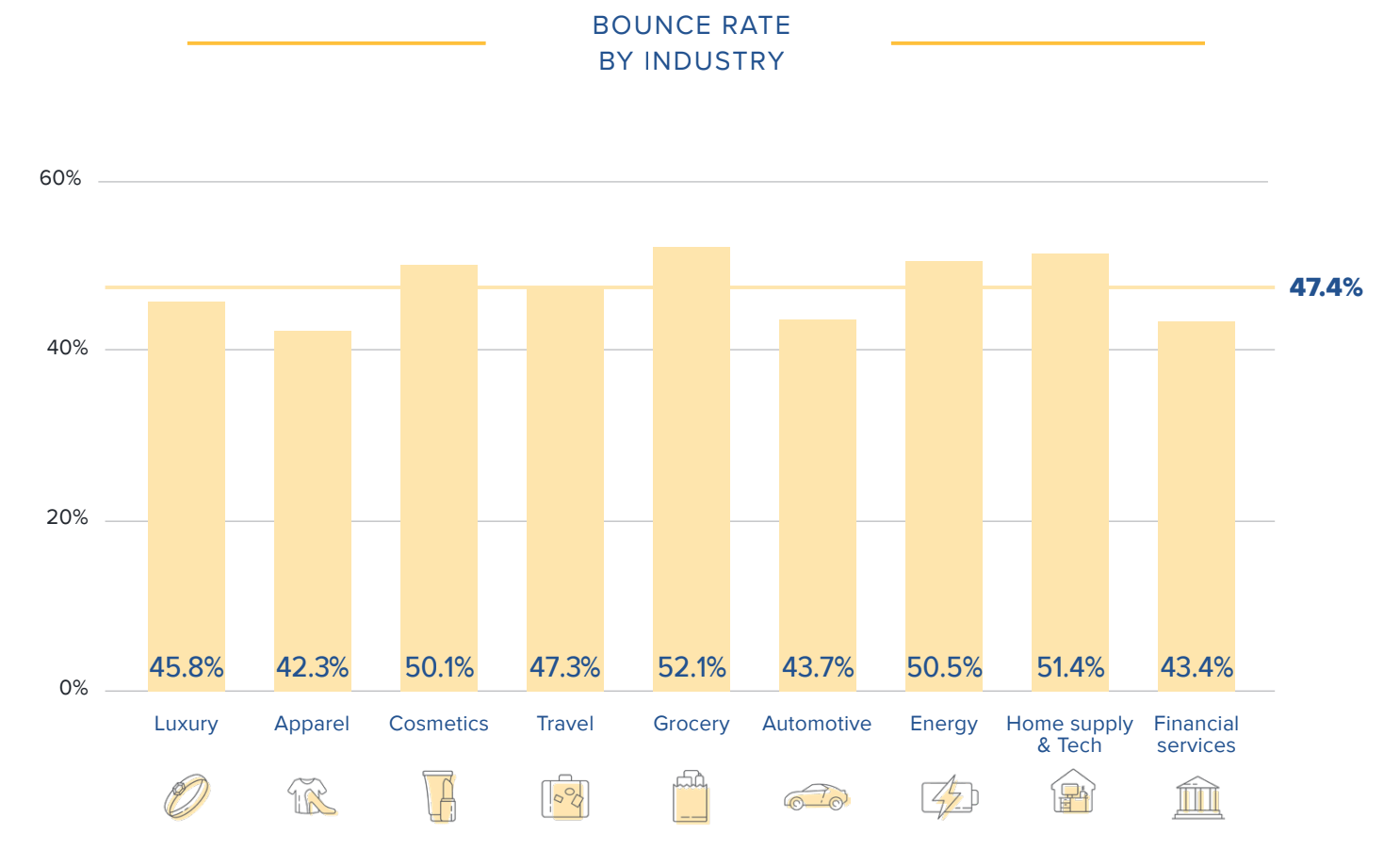
Industry Average Bounce Rate
- Grocery 59.03%
- Fitness 53.30%
- Beauty 53.21%
- Pharmacy 52.04%
- Electronics 51.83%
- Food & Drink 51.71%
- Home Goods 51.57%
- Apparel 49.98%
- Sports 49.80%
The resulting percentage is your bounce rate. Also note, bounce rate is a common website performance metric and can be easily found on any website analytics provider, like Google Analytics. Google Analytics makes it easier to view changes in bounce rate over time too, so you can easily track and measure how on-site changes impact your overall customer experience.
What is an average bounce rate for a site?
Websites vary immensely by function and goals, there is no way to generalize a global bounce rate with an average. It would be best to learn what the average bounce rate of sites that serve the same purpose as yours are, such as looking at an industry as a whole. This is because different types of websites have different purposes and goals, and therefore have different averages of bounce rate. For example, a news website may have a higher bounce rate than an ecommerce site.
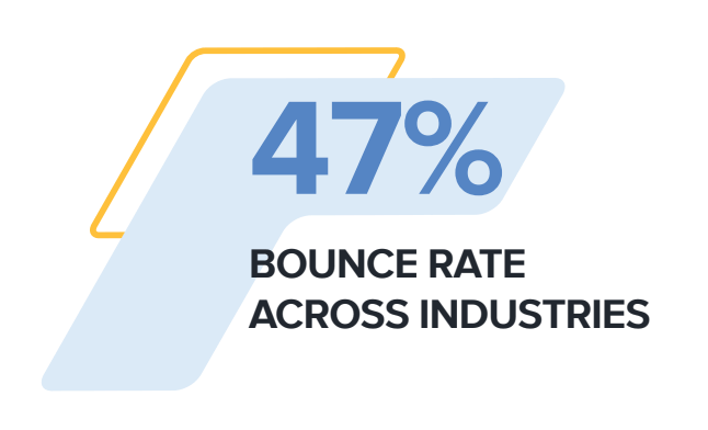
What is the average bounce rate for eCommerce sites?
According to 2020 Contentsquare benchmark data, the average bounce rate for eCommerce sites is 47%.
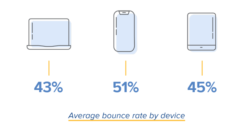
Average bounce rate varies by device too. Across all industries, the average bounce rate is 43% on desktop, 51% on mobile, and 45% on tablet. Mobile’s heightened bounce rate can be attributed to the fact that many websites lack mobile optimized websites. This can be extremely detrimental to brands because if a user discovers your company on mobile and has a poor experience, they might take their business to a competitor with a better mobile experience.
What is the average eCommerce bounce rate by industry?
Average bounce rates vary significantly by industry. Contentsquare’s annual benchmark report looked at the average bounce rate for 9 different industries to find that the grocery industry has the highest bounce rate, while apparel has the lowest. Retail has historically lead the pack in terms of innovative user experience with top-notch product photography, user-generated content, and more to inspire customer confidence, so this comes as no surprise.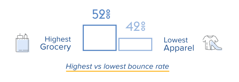
For a full look at bounce rate across all industries, check out the chart below, or read our annual benchmark report for even more insights.
What can you learn from your bounce rate?
Bounce rate can also help determine the quality of your traffic. A high bounce rate coupled with large volumes of single-source traffic could indicate poor referrals. But to determine the quality of your traffic, you need to understand why an entry or landing page is not performing as well as you had hoped.
You can, of course, perform A/B tests that can help you find what does and doesn’t work for your site, but A/B tests can take time and often go off of assumptions. In the meantime, you might be losing potential customers, missing out on revenue, and wasting resources.
With the right experience analytics platform, you can get real-time qualitative insights into your bounce rate, which can help you answer the following important questions:
- Why aren’t visitors engaging with my homepage?
- How do I encourage users to navigate to another page on my site?
- How can I push visitors to move further down the conversion funnel?
To answer these questions, it’s vital that you first determine the type of bounce that your website is experiencing. This is a crucial step on the way to effective website optimization.
What’s the difference between a hard, medium, and soft bounce?
Not all bounces are the same. To help you better understand your visitors’ intent and why your site didn’t meet their expectations at the moment, it’s helpful to break bounces into three different categories: hard bounces, medium bounces, and soft bounces. The easiest way to differentiate between these types of bouncers is to compare visitors’ engagement time. Approaching bounces this way can provide a unique insight into how your visitors truly interact and experience a page, and makes bounce rate not only a qualifying metric but also an actionable one.
Here’s a look at how hard, medium, and soft bounces differ:
1. Hard Bounce
This is when your visitors are probably thinking, “Yep, I’m definitely on the wrong site.”
Hard bounce visitors are those who do not have any interest in your page. How do you know that? Because these visitors land on your entry page and then leave almost immediately. Hard bouncers show minimum engagement; they spend less time scrolling or fewer on-page clicks, indicating that they didn’t waste any time looking or reading to find out more about your offerings. The conclusion can only be that they had no intention of landing on your page in the first place.
Example of a hard bounce: Say a visitor searches “glasses” on Google and lands on your brand’s prescription eyewear website. They quickly realize that your site is selling reading glasses, but not the drinking glasses they were searching for. They hit their browser’s back button and continue on their search.
2. Medium Bounce
Medium bounce visitors show slightly more engagement on the page and they typically stick around for a few seconds. They might not be your ideal target audience, or they might just not have been in the mood to learn more at the moment. They may still have the potential to come back later for further exploration.
Example of a medium bounce: A visitor lands on your blog article and spends a few moments skimming the article before leaving. While your article was helpful, it didn’t quite have the information they needed, so they left in search of another article that could better answer their question.
3. Soft Bounce
Soft bounce visitors are those who typically remain on the entry page longer than just a few seconds. They show plenty of engagement across the web page; scrolling down further, clicking on more items, reading, and viewing additional content. However, although they spent a considerable amount of time on your site, they still left. It may be that they couldn’t find what they were looking for or were nervous about making a commitment.
Example of a soft bounce: A visitor lands on your website because they saw an ad for a shirt they liked. The visitor clicks through the product images, reads a handful of product reviews, looks at a few similar products, but ultimately decides they don’t need the shirt right now and leaves your site.
A soft bounce is often the easiest visitor to reengage. Retargeting ads, abandoned cart reminder emails, or even personalized discounts can be enough to push them to convert.
The Top 6 Reasons Why a Visitor Would Leave Your Site:
1. You’re attracting the wrong traffic
If a majority of your website visitors are bouncing after viewing one page, it could mean that confusing ad copy or more generic keywords in your marketing campaigns and PPC ads are generating the wrong type of visitors to your site. These visitors know immediately know they’re in the wrong place and leave as soon as they arrive on your site. If you have lots of hard bouncers, this could be a likely explanation for it. You can, of course, view bounce rate by acquisition source to determine if users who click your ads have a higher bounce rate than users from other sources.
2. You have a poor or confusing site design
There are a few reasons a user could be having a hard time navigating your website:
- Poor site navigation. If menus and options are unclear and visitors can’t find the product they are looking for, even the most well-intended visitors may leave after a few seconds of struggle.
- Inconsistent messaging. If the messaging on your entry or landing page doesn’t match the creative or live up to the promise of your marketing campaigns and PPC ads, visitors could become frustrated and exit.
- An unappealing site design. If the page layout is uninviting, lacks eye-catching images, or contains confusing information, visitors will quickly lose interest and leave.
3. Your on-site content isn’t relevant
Remember to put yourself in the shoes of your customers and ask yourself what value they want to get from your website. Every piece of content on your site should help them achieve their goals. Whether it’s a video, blog post, search filter, or homepage banner, you need to convey your brand’s value proposition clearly to your audience and help them at every stage of the customer journey.
It is important to note though that Contentsquare data reveals that 69% of all site content goes ‘unseen’ by visitors. Just because a piece of content isn’t performing well doesn’t mean it isn’t providing value to your customers. You might see a surge in interactions if you move it further up the page.
4. Your calls to action are not performing
It could be possible that the calls to action on your homepage don’t sufficiently stand out and are blending in with other on-page elements. Small tweaks like updating the color, image, or typeface could be enough to quickly remedy the situation and increase visitor interactions.
Alternatively, your calls to action might fall below the fold line, and therefore most visitors may simply be unaware they exist.
“Banner blindness” is another possible problem. Banner blindness is when your site has so many ads and calls to action competing for your audience’s attention that your visitors become “blinded” to the ones that they should click on.
And lastly, the messaging on your calls to action may simply not be enticing enough.
5. Your site loads too slow
Slow page load times could make even well-intentioned visitors give up and leave if your site. Google reports that if mobile page load time increases from one second to 10 seconds, the probability of a visitor bouncing increases by 123%. Slow page load times can also hurt your website’s visibility on search engine result pages (SERP). Google considers page speed as a ranking factor, meaning that if your page loads slowly, it will be harder to rank higher on SERPs. Additionally, slow page load times can harm the user experience and lead to fewer conversions and sales.
6. Your site has technical errors
Lastly, users might bounce if they can’t get your site to work due to technical errors. After all, users can’t navigate your site if it never loads. Or, if a page does load, broken links and other on-site issues could frustrate them and push them to take their business elsewhere.
How can I improve my website’s bounce rate?
You have two main tasks now:
- To reduce the number of hard bouncers arriving on your site
- To start converting soft and medium bouncers more effectively
Soft and medium bouncers are interested in the content your website offers. It is therefore important to try and encourage those visitors to stay put. These bouncers are an indication that there is something missing on your entry page. By optimizing your web page(s), you have the potential to convert many of them into customers.
Luckily, an experience analytics platform like Contentsquare makes isolating bounce rate issues easier than ever before.
Our Customer Journey Analysis tool lets you see how visitors progress through your site, page by page, from entry to exit, as well as helps you discover your biggest opportunities and frustrations within minutes.
You can also use Zone-Based Heatmaps to note discrepancies in user behavior. For example, zone-based heatmaps can help you identify strong areas of engagement on a page that don’t necessarily have high usability. It is possible that visitors are focusing on distracting links or visuals instead of where you intended them to look. That can help you identify on-site changes you need to make to increase the visibility of your high-performing page elements.
Lastly, you can use our Session Replay tool to playback individual user sessions. This lets you watch actual customers navigate your website. You can see the pages exactly as your users saw them and follow their journey through your website. This powerful tool can confirm your suspicions and reveal what areas of your experience need to be optimized.
To learn more about how Contentsquare can help you reduce your bounce rate and help you build a better customer experience, schedule a personalized demo.
5 Ways to Improve User Experience and Reduce Bounce RateWhen taking on Conversion Rate Optimization (CRO), the primary concern for digital marketers is unsurprisingly the user experience. UX is a catch-all phrase for a visitor’s experience journeying a website, the feelings they undergo and the content of the website itself. Consequently, there are a variety of methods to improve it.
While having CRO on the mind is important, it is also critical to consider user behaviors, including the negative ones. As business owners or marketers, we often have to contend with a rather challenging digital reality, that of bounces and exits. While the definitions of these negative metrics sound similar, they bear a crucial difference.
Delineating site leaves, the bounce rate is far more detrimental to your UX than an exit, and its respective exit rate. That’s because the bounce rate refers to visitors who leave a site after visiting only one page, while the exit rate refers to the visitors leaving after their last pageview, at the end of a journey which may include any number of pages. This article will show you how to both improve your UX and reduce your bounce rate in 5 ways.
1. Measure Conversion Rate and User Experience
It has been said that if you aren’t measuring, then you aren’t marketing. Consequently, particularly in UX and the subdiscipline of conversion rate optimization (CRO), measuring comes first. It is crucial to know how your website is faring and conversion rate is one of the foremost KPIs to keep track of. You’ll also need to understand the state of your conversion rate before moving forward with any changes to your UX.
Measuring the conversion rate is done via the following calculation: divide the total number of conversions by the total number of site visitors and multiply the result by 100%.
This is the formula for conversion rate:
Conversion rate = (conversions / total visitors) * 100%
For example, if there were 8,055 visitors on your site which yielded 1,003 conversions, the conversion rate is 12.45%.
There is no single method to quantify the UX, since it encompasses both the feelings of the users visiting the site and the content of the site itself. There are many factors to work out, as the UX cannot be defined by a single metric, unlike the bounce rate or CRO.
You can parse through the UX through a variety of means. This is where unique, AI-powered analytics come in, as they point to a much more granular understanding of your visitors’ behaviors. You can get a deeper understanding of the digital happiness that your users experience, by way of a read on their emotions. This can be achieved through an overview of their patterns of behavior, one that takes into account visitor objectives, or intent, context and more.
There’s a lot to sort through when evaluating digital happiness, but these factors contribute to your UX, and as pointed out, UX goes a long way towards both reducing bounce rates and optimizing the conversion rate. Here are some of the metrics to work out in your user experience:
- Hesitation Time: The average gone-by time between the last mouse movement and the first click on an element of your site, or zone. This metric shows if the content is quickly understood or if visitors hesitate before they click.
- Engagement: Expressed as a percentage, it shows the visitors who clicked on something after hovering over it. This metric reveals how intuitive an element is, i.e. its ability to demonstrate how it should be used through its design.
- Click Rate: The number of pageviews where a zone was clicked divided by the total number of pageviews. This metric allows you to identify how many visitors clicked at least once on a zone per each pageview.
- Conversion Rate Per Click: The percentage of the number of buyers who clicked a zone divided by the number of users who clicked on it. This metric shows you if clicking on a zone impacts purchasing behavior.
- Attractiveness Rate: The percentage of visitors who clicked on a zone after they have been exposed to it. This metric clarifies the attractiveness of an element.
2. Improve UX Design

The design of the UX is essential to the success of digital journeys. You won’t be able to improve the user experience without addressing and mending the design. What makes up the UX, if not the copy and design?
For a long time, UX design has been a guesswork game, with analytics solutions having provided some answers but not all. Today, next-gen solutions can produce a much more in-depth reading of consumer behavior. These will empower you to make wiser, more UX- savvy designs, so that your site visitors get the most optimal user experience. But the UX design should not be entirely dictated by designers.
As aforesaid, marketing teams reflect a diversity of roles and responsibilities, and the UX design can benefit from a variety of team members’ input on improving the UX. Thus, data democratization is paramount, as it denotes data accessibility: the ability of data to be accessible, and understandability, which denotes the ability to be understood and leveraged by non-data analysts. When behavioral analytics meet data democratization, your UX design will become virtually foolproof and indestructible, creating a space for digital happiness.
Additionally, with access to highly visual, easy-to-read data, UX designers don’t have to wait for analysts to provide them with answers before they get to work. This allows them to streamline their projects and helps focus continuous optimizations.
3. Optimize Website Speed
Website speed paints a picture of the faculty of your UX, and as such, has the ability to yield a good or at least an average, conversion rate. Your website’s load speed is important since it’s one of your visitors’ first impressions of your site. Website speed is especially crucial on mobile, which has surpassed desktop in traffic. And there’s plenty of judgment as far as that is concerned for an on-the-go audience.
There are a number of ways to optimize your website speed for both the desktop and mobile versions. First, evaluate your current website load time, a quick task away, since there are several free sources performing a website speed test on your site, such as GTmetrix and Uptrends.
Next, you’ll have to deduce what is slowing your website down, before you can compile a list of solutions. Website speed can slacken from a variety of issues. These include image difficulties, such as too many images per page, large image sizes and the src tag when using images in HTML.
There are other contributing issues, most of which are technical in nature, such as a high server response time, a lack of browser caching, issues with coding languages and disregarding compression.
Once you find what’s bogging down your website’s speed, you can then employ several methods to remedy it. You can try several workarounds; it’s most appropriate to do what corresponds with your particular issues.
These techniques include: changing your website host, tinkering with your images (such as with their size, src tag, etc.), minimizing the amount of JavaScript and CSS files, minifying your plugins, detecting 404 errors and reducing file sizes via compression.
4. Work on Your Funnel Conversion
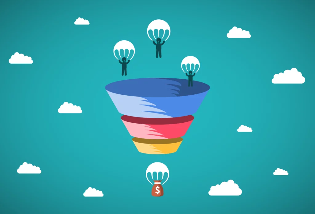
This primarily deals with sales. A sales funnel is a visualization displaying an assessment of where your site visitors are in their customer journey and conversion process. Specifically, a sales funnel is a model, one that is aptly shaped like a funnel, with the widest area at the top, representing all levels of visitor/customer engagements and narrow at the bottom, which displays the most engaged users, or those most likely to convert.
The below image shows the sales funnel, which can be thought of as a chart that sums up your prospects’ sales process. Each stage can be used to improve the overall funnel conversion, i.e., the totality of the process that gives way to a conversion. By working through each stage in a step-by-step manner, you can effectively augment your funnel conversion.
First, start with the awareness stage at the top. This entails building your brand awareness and digital footprint. You can do this via blogging, social media campaigns, PPC and SEO campaigns and traditional PR work.
Next, you must tackle the consideration stage, where brand awareness exists. To do this, take the lead magnet approach, in which you propose solving your leads’ problems if they give you their email address in turn. This will push these leads further down the funnel. The lead magnet involves using landing pages, CTAs and contact forms for content engagement.
For example, in the case of a contact form, it would be beneficial to be able to know exactly which form field is causing user abandonment of the form. Some form fields aren’t clear to users and others just don’t work because of a technical malfunction. Knowledge is power and with the knowledge of these obstacles, you can make precise optimizations.
Then, ease your leads further through the rest of the steps by way of educating them. This can be done through the application of emails, drip marketing (emails you send over time that have long been previously written), integrations of your CRM for re-targeting, offering promotions to incentivize conversions, monitoring your social media campaigns, performing A/B tests and finally, asking converting users (customers in e-commerce) to refer a friend or anyone that may benefit from your offering.
Throughout your sales funnel optimization efforts, you should analyze your visitor journeys to make sure the path to the objective is clear and intuitive. And of course, the final steps of conversion must be streamlined and pain-free for your visitors so don’t neglect to locate and fix obstacles at checkout.
5. Improve Your CTA Button
At last, we arrive at the point of conversion in the UX: the terse but mighty CTA button. The CTA button is the last portal to converting, the threshold between your ultimate goal and user hesitation. So it goes without saying that your CTA button must be optimal.
Fortunately, the CTA button requires little on both the copy and design fronts. First, you should come up with a call-out that is not only attention-grabbing but clear and easy to understand. This is usually no more than a few words that denote a command.
Regarding the design quality, you should make your button big enough to be easily seen without the need for much scrolling down after a user views the content above it. Ideally, the button should be big and bold enough to be impossible for your users to overlook.
While generating a productive CTA button isn’t difficult, the button itself is only as good as the content before it. If the content on your landing page is too long, profuse with jargon or exhibiting poor design elements, your prospective visitors and leads will leave before they even finish reading, watching or scrolling through your content.
However, even if your visitors do reach the CTA button, this does not guarantee conversions. Sometimes, the CTA button itself is out of order. There are several signs to take into consideration of a non-working CTA button.
For example, pay attention to clicks and hovers. Is there a high hover rate but little to no clicks? That’s a UX red flag. Are your users clicking on a non-clickable element? This indicates a faulty CTA design, in that the users think a non-CTA element might be the CTA button. Before answering these questions, you’ll need to be equipped with these particular types of analytics.
Thus, captivating visuals and persuasive copywriting go hand in hand on your landing pages, or wherever else you place a CTA. But a truly functioning and conversion-yielding CTA requires knowledge about how users are interacting with it, which only certain analytics can provide.
In Conclusion
Per this reading, you have probably concluded that improving the user experience and reducing bounce rates is not a lone endeavor by any stretch. Instead, it is made up of a series of processes that involve conducting measurements, applying UX design best practices, improving sales funnel conversion, executing an adequate CTA and quickening the speed of your website.
These processes and solutions will not be the same for businesses and websites industry-wide, or even necessary for all, as the UX differs across businesses and their respective digital assets. Thus, the conversion rate also varies from site to site. The good news is that if your CRO efforts stem from a granular analysis of how consumers are navigating your site, you’ll be able to optimize from a knowledgeable place, and enjoy data-driven results in no time.