
How to improve your homepage
35+ actionable insights for getting the most out of your homepage.
Your offering is clear. Your site is live. Your PR and ad campaigns are in full swing. You’re actively monitoring sales and subscriptions. But you’re not seeing the results you were hoping to see, and conversions are not growing fast enough. Have you considered landing page optimization to increase retention and achieve a healthier conversion rate?
For example, when a visitor clicks one of your ads, are they directed to a page that was built as an extension of that particular ad? That’s the idea behind landing pages. You probably already have some on your website. But are you sure they’re as impactful as they could be?
In the following post, we’ll try to help you master the delicate art of landing page creation and design by answering three key questions:
Let’s get started!
A landing page (or destination page) is a webpage intended to be part of a marketing or ad campaign.
Its purpose is to encourage visitors who click on the link to convert.
It tends to be fairly simple and pragmatic.
Why the no-frills approach? Because the objective here is simply to grab your visitor’s attention and encourage them to take a course of action.
It’s different from traditional pages (like your FAQ pages or homepage) in that it is specially conceived for paid traffic (Google Adwords, Facebook Ads…).
Nonetheless, it can still appear in the organic results generated by search engines, even if it is, first and foremost, commercial.
How to improve your homepage 35+ actionable insights for getting the most out of your homepage.
Download
We won’t keep you waiting any longer. The main objective of launching a landing page is to maximize conversions. While your homepage may be built around the needs and expectations of your largest audience, you can afford to focus your landing pages around a single message.
You might want to build a landing page to:
A landing page is part of a wider communications and marketing campaign designed to maximize its reach and impact.
It’s probably wise to start by analyzing the pages you currently have live.
Landing pages are often associated with search engine or social media advertising campaigns, PR campaigns or events. Their impact often goes hand in hand with a simple design and clear messaging.
By communicating a major piece of information in a relevant format, they minimize the risk of distraction often associated with traditional web pages and encourage a more focused consumption. It is, therefore crucial that your landing pages echo the messaging of the campaigns they are tied to.
Further reading: The Call to Action: 5 Tips to Increase Your Conversion Rate
You now know what a landing page is, and it’s important for you to have them on your site. But there are still some things you need to know before launching the perfect landing page!
So before you put in a request to your marketing and UX teams, make sure to analyze your visitors’ behavior and understand their unique customer journeys on your site.
The very first step is to make sure you have a concrete offering for your visitors, whether that’s a product or service, a white paper or a discount.
The offer needs to be relevant to the needs of your client, wherever they are in the sales funnel. For example, if a customer is in the early stage of the buying phase, you may want to give them information about the various options available to them.
You may also want to wait until your visitor is further down the funnel to promote the actual products or services.
Once you’re clear about what it is you’re offering, it’s time to figure out what the objective of your landing page is going to be. This objective will help you set conversion targets, which in turn will allow for efficient monitoring.
There could be several objectives:
At this stage, you may want to make sure you have a pretty clear idea of the types of campaigns your competitors are already running. This might seem obvious but the whole point of good practices is they’re tried and tested!
So, find out who your competitors are, determine the key to their success and see how you can leverage similar strategies to increase your own conversions.
Knowing your prospects and customers is not optional. The better you understand your visitors, their needs, habits and expectations, the better equipped you will be to respond to these needs in a relevant and impactful way.
This behavioral “mapping” will allow you to find the right words, to choose the best visuals and to create the most appropriate experience for your visitors’ segments.
Where your visitors come from should not be taken lightly. In fact, this factor can even help guide the messaging and design of your landing page.
Indeed, your visitors’ browsing patterns and mindset may vary depending on the acquisition source — whether that’s Google, a Facebook page, an Instagram story or their Twitter feed.
Another obvious reality: the more landing pages you have, the higher the chance of generating leads, since each page can be customized for a specific audience. If this sounds like a lot of work, start with one page per campaign, and then try to add pages for specific segments.
You now have everything you need to create a landing page that answers your visitors’ needs.
But wait, there’s more.
We’ve quizzed our UXperts in London, New-York, Paris and Tel Aviv to get their top tips on the subject of landing pages, and put together a list of 11 must-haves that will help you save time and increase opportunities for conversion.
Let’s jump in.
While all the copy on your landing page is important, an awful lot is riding on the header and subheader.
One way to keep visitors engaged is to be clear and concise. You should be able to capture their attention and share the key product or service message in one sentence (no more than a dozen words).
The header and subheader must reflect the messaging of whatever link your visitors clicked on. Linkedin gets straight to the point with its “Get started with Linkedin ads” landing page.
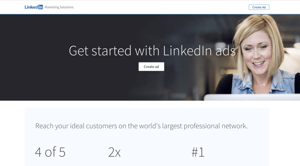
Image source: Linkedin
Does your product have standout qualities? Can it solve several problems?
You should enumerate those succinctly, in bullet points perhaps. Add icons for a visual representation of this added value.
Hootsuite, for example, clearly lists the benefits of its new AI tool.
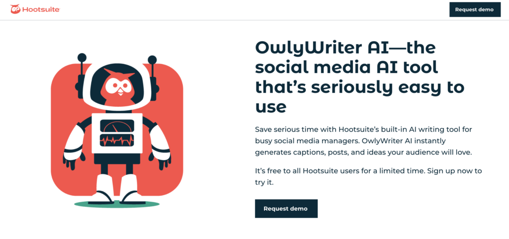
Image source: Hootsuite
“Without a clear Call to Action, you can kiss conversions goodbye.” – Contentsquare’s UX Team.
We won’t go on and on about the perfect CTA here because we already did that in another blog post. 🙂
But if we had to summarize:
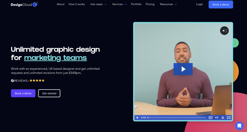
DesignCloud is good at distinguishing between its main CTA (Book a demo) and its secondary CTA (Get started).
Here’s a piece of advice that never gets old.
The search bar, menu, copy, forms — remember, every added in-page element could be a potential source of distraction.
So be ready to kill your darlings, on the one hand, and showcase key elements, on the other.
Appcues does a great job with a clear heading, listing three key benefits and having a clear CTA.
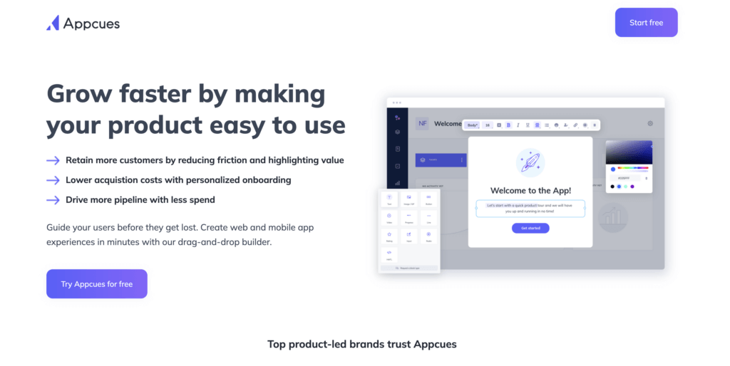
Image source: Appcues
Because an image is worth a thousand words, be picky when it comes to images. Try and stick to a simple and clean design, and don’t be afraid of empty space.
At the same time, don’t forget to optimize images so they don’t negatively affect the performance of your landing page.
Monday.com’s landing page with interactive elements is the perfect example of how you can create a “fun” landing page without necessarily promoting an inherently “fun” product or service.
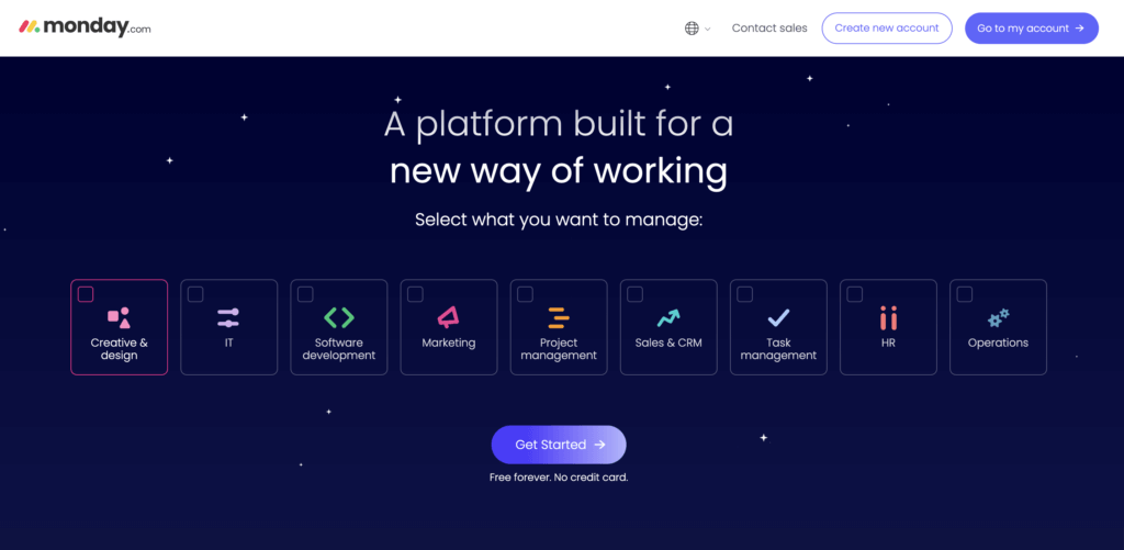
Image source: Monday.com
If you had to choose between reading a paragraph with several sentences or watching a very short video, what would you pick?
It’s likely that, like most consumers, you’d opt for the second.
Video remains one of the most powerful, highest-converting marketing mediums out there. Pinterest Business uses video to contextualize its product or service and to highlight what problems it can solve.

Image source: Pinterest
Unless you’re working in a very niche industry, it’s to be expected that visitors will connect to your site via a variety of devices.
Desktop, mobile, tablet — be sure to anticipate the various devices your visitors may be browsing on and ensure your CTA and header are visible without needing to scroll. Typeform’s landing page does this well, showing all key information above the fold on their mobile site.
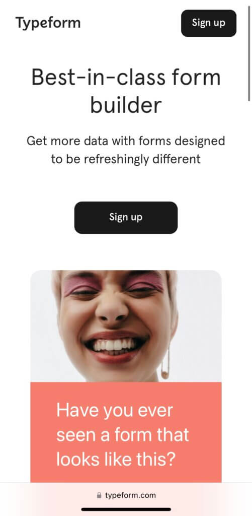
Image source: Typeform
It’s no secret that consumers are often swayed by peer reviews.
Make sure to feature testimonials and leverage social proof to reassure visitors unfamiliar with your product or services or perhaps hesitant to convert.
You can include:
Sustainable personal care brand Wild showcases its Trustpilot reviews above the fold on its new product landing page.
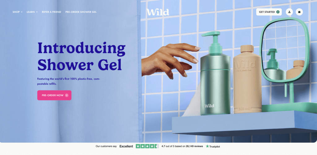
Image source: Wild
Consumers respond well to clear pricing.
If you can, try to display your costs clearly or direct prospects to an understandable rates table. And why not offer a free trial?
Shopify’s landing page is simple and has a clear CTA to signup for a free trial.
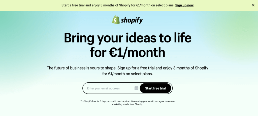
Image source: Shopify
A beautiful landing page is great. A landing page that comes up in search results is even better.
Make sure your content is SEO-friendly, and be mindful of what your potential audience is searching for. Be sure to optimize:
Not only does Semrush provide SEO tools, but its also a good example of how brands can utilize SEO to drive traffic to landing pages.
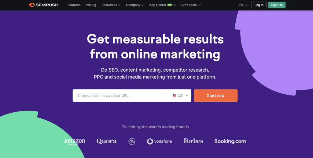
Image source: Semrush
You did it. Your visitor subscribed to your newsletter or completed a purchase. But it’s not over yet.
Don’t forget to always follow up with a “thank you” page after a user makes a conversion — any type of conversion. It’s the opportunity to reassure your customer about their choice and to once again, point out the value.
Use this page to guide your visitor towards the next steps — you could, for example, direct them to useful resources such as blogs, reports, etc.
The Thank You page is also a good opportunity for you to ask consumers to share their experiences on social media.
Source: CXL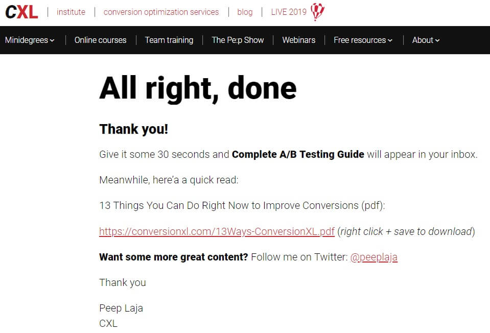
Image Source: CXL.com
While this guide is intended to give you some basic tools and advice to build the strongest possible landing page, it’s important to remember that there are as many approaches to landing page-building as businesses… and customers.
Just like your homepage and your product pages, your landing pages need to be carefully tested to surface any missed opportunity.
Here at Contentsquare, we help brands maximize the impact they’re getting from testing by adding a critical layer of customer behavior understanding to their experiments through A/B testing.
Interested in finding out how you can improve the performance of your landing pages?
We’ll be more than happy to show you how we can help your team deliver the perfect Customer Experience (CX) for every customer, every time.
Get a demo Request a personalized demo with a digital experience expert!
 Get a demo