When it comes to delivering a positive UX, the approaches are vast and possibly endless, considering the wide range of verticals and their emerging niches. While you always want to make sure your digital experience falls in line with the expectations of your industry, there are certain general ways to create a positive digital experience for your users.
Each of these generalities encompasses specific actions you can take to deliver the best experiences for your users. Once you’ve taken these actions, you can master the essence behind these tips. As a side note, none of these are “generalities,” per se; we back up our tips with data. Check them out and start a UX strategy that ensures digital happiness now!
Reduce Points of Friction
In the sense of content, friction can be defined as any website element or quality that sets off irritation, frustration, hesitation or any negative feeling within visitors. In turn, these points of friction drive your customers to exit or bounce, with the possibility of never returning to your website again — something you ought to avoid at all costs. You have to identify these points of friction first before you modify your site content accordingly.
So, where are said points of friction found on your website? Believe it or not, but not all of them are based solely off of the design. Some of them stem from outside factors — they’re still a part of the UX but originate elsewhere — think prices. Here’s a roundup of several points of friction:
- Poor search bar experience, i.e., a search bar with irrelevant results, or no results due to minor spelling errors (The search bar has a 76% higher click-through rate than a menu, per our grocery report)
- Glitched fields & CTAs
- Botched cart experience
- Sign-up requirements at checkout
- Long landing pages (shorter landing pages have 13% higher conversion rates)
- Unforeseen fees (handling/processing, delivery fees, etc)
- Form fields
- Promotions that are no longer available but are still live
- Seemingly clickable elements that aren’t clickable & non-clickable that appear clickable
- No confirmations of a successful/unsuccessful action
These points of friction are undoubtedly noteworthy, but to truly get a sense of whether or not any of these are afflicting your users, your only recourse is to analyze their behavior and measure the experience. Smart analytics allow you to extract users’ hesitations and other points of friction at a particular space or element on your site. Once you’re armed with this knowledge, you can make discerning choices on the changes you need to make to your UX.
A few pointers to put an end to friction:
- Keep your messaging transparent (eliminate hidden costs, display reassurance elements when relevant, make sure sales have specific dates, etc).
- Make sure that all form fields are intuitive and error-free.
- Streamline checkouts.
- Make it easy to navigate between pages and remove unnecessary back-and-forths.
- Design ergonomically, as it will affect page speed.
- And make sure all site elements function properly.
- Assure vital site actions (purchases, signups, email entries) have confirmations for site visitors)
Optimize Your Content for an Omnichannel Experience

In 2019 and let’s be honest, for the past decade, users have branched out of browsing the web on desktop solely, and even mainly. Most brands cultivate their strategy on a mobile-first foundation. That’s because a wide swath of verticals including travel, gaming, retail, apparel and others have seen higher traffic rates across 2018 alone, according to our yearly roundup of mobile data.
But it’s not just mobile that’s left the fringes of the digital space; tablet has also made its presence mainstream and has had a steady growing use worldwide. Brands would be wise to pay attention to the growing use of tablet, as it beat out mobile conversion rates in 2018 in the games and media, groceries, pharmaceutical and cosmetics sectors.
Mobile currently wields a chunky 70% of the time people spend on digital media. But despite its large share of traffic, mobile is beset by a conversion gap across the cosmetics, luxury, retail, gaming and other verticals.
An omnichannel experience doesn’t merely refer to the presence and usage of different device types, as it deals with frequent crossovers. For example, a visitor may commence their digital journey on mobile but can end it on desktop or even by way of going to a store (and vice versa). The task at hand is to create experiences that are both tailored for and consistently positive at every touchpoint.
A few pointers on optimizing your UX for an omnichannel experience:
- Ensure that all your data and main content are consistent across touchpoints.
- Create channel-specific capabilities that set you apart from other brands in your vertical
- Integrate a back-end between all channels for seamless transitions
Enhance Your Site with Productive Features
What would the UX be if not for the different forms of content that comprise a website? But such features do not merely serve an aesthetic purpose. They can be the determiner or the last stand between a user and a conversion.
This is because conversions are in large part dependent upon visitors’ feelings of satisfaction by their experience on your website/ app — something we like to refer to as digital happiness. All the content on your website plays a role in fulfilling a visitor’s objective — whether this objective is to renew a standing order, check out your store hours, or browse for garments. Keeping your customers digitally happy is the best way to ensure customer loyalty and site returns.
That is not to say you should lust after trendy features — if you do, you’re a UX sinner. Study your customer journeys instead to create a more personalized experience for them.
Additionally, perfecting your site with efficient features also means giving your current site features a facelift. For example, if you have too many form fields, consider downsizing. If a clickable element on your mobile site is too small, you should enlarge it.
When on the hunt for new creative ways to engage with your site visitors, consider doing your own due diligence on UX elements. You can’t observe these on your own site, as you haven’t implemented them yet, so it would be vital to learn how they’re faring. Also, you should iterate on the features that have already been used if they have positive interactions that can be proven with data.
A few pointers on optimizing your UX by adding productive features:
- Personalize your content by adding recommendations based off of user behaviors.
- Incorporate white space throughout your site. It increases user comprehension by 20%.
- Don’t inundate users with content or information that is irrelevant to conversion or site-staying goals.
An Optimal Digital Experience

Not every site visitor will undergo a positive UX. They are bound to run into points of friction, website malfunctions and journeys not optimized for an omnichannel experience. It’s important to have the right data on hand, the kind that gives you the full picture of visitor behavior, where they’re hesitating and whether they experience digital happiness. Analytics are your best friend — so keep that friendship alive!
Everything You Were Too Afraid to Ask About Mobile OptimizationInterested in taking your brand’s mobile experience to the next level? We bet you are. Get in touch with us today to find out more about our industry-leading mobile app analytics.
Enjoy the most comprehensive insight into your mobile experiences and give your digital teams the insights they need to improve customer journeys across all mobile devices.
M-commerce is big. And it’s getting bigger.
Using revenue as a metric, m-commerce has already passed web eCommerce. According to Statista, m-commerce will represent 67.2% of all online commerce by the end of 2019 and 72.9% by 2021.
Much of the growth in m-commerce is coming from emerging markets which, due to the proliferation and low cost of mobile devices, tend to be mobile-first economies. These engines of growth are pretty much operating in a post-web world.
Also according to Statista, users spend in the region of just 4 minutes in the average m-commerce app. That’s a reduction from 6 minutes in 2017!
So that’s just 4 minutes to convince the user to make that purchase.
Keep it bitesize
One important aspect of UX design is friction. Friction is anything that prevents the visitor from accomplishing a task in the app. Friction is bad. Friction can lead to app exits, frustration, and a drop in overall conversation rates.
One way to reduce friction is the design principle known as chunking. Chunking was developed by the psychologist George Miller in 1956. It’s the cognitive psychology theory that states the number of objects the average human can process at any one time is 7+ or -2.
App and mobile web designers use Chunking to group together related objects into logical groups. This technique can be used to organize single screens and also to break up complex tasks into sub-tasks, like signup forms and presentations.
Simple, right?
Marketers love to talk about the challenges that mobile presents, but few provide practical, actionable advice, based on real data, that marketers and digital teams can use to improve their mobile user experience.
For our latest report, Everything You Were Too Afraid to Ask About Mobile Optimisation, we analyzed millions of user sessions across mobile and desktop and turned our findings into practical advice on how to create a bigger impact for your business on mobile web and app.
In the report, we cover:
- Mobile myths
- Retention strategies
- Quick tips to boost mobile conversion
- Best practice when designing for mobile
- Building a mobile-first methodology

As the Nordics’ leading eCommerce company in design, furniture and home furnishings, Royal Design continuously strives to create the best online shopping experience for its global customers. The company has recently embarked on a digital reorganization, and has partnered with UX Analytics company, ContentSquare, to ensure every change is a strategic step to meet the dynamic needs and expectations of its online consumers.
Contentsquare Marketing Manager, Camila Florez, sat down with Royal Design Head of eCommerce and Omnichannel, Martin Magnusson, to further discuss the company’s drivers and objectives, and the importance of UX Analytics in its journey.
What do you think sets Royal Design apart from other companies in the same field?
History is definitely a big part of the company. Royal Design has been online since 1999. It has been almost 20 years, which none of our competitors can live up to.
- Half of which are in-stock, which means we can deliver more products to more clients on the same or next day.
- Our price is also one of the best among our chosen competitors.
- Finally, Royal Design is very omnichannel-focused. Although the journey— to connect our 15 physical stores to the online experience— has just started, much more will come!
Describe your target market and the typical customer of Royal Design. What are their online customer journey needs? How does your website address those needs?
Royal design operates on 13 country markets, mainly in the Nordics— Sweden and Norway being our strongest markets.
Since we have more than 80 000 products online, the site structure and navigation are the most important user-needs that we need to address. Our users expect to find what they are looking for quickly; as well as having a fast and easy checkout experience. Accessibility across devices, particularly the shift to mobile, is extremely important too. We need to deliver a solid and speedy user experience.
Unfortunately, our website— which had the same online look and feel for the past 10 years— does not live up to the high expectations of a modern online customer.
“ We realized that the business had outgrown the website, and a big change was needed. “
Hence, we’ve launched a brand new omnichannel platform site. It is a best in breed solution with a great platform that takes care of each part of the application. The front-end application is a custom built react application focused on:
- SEARCH
- STRUCTURE
- SPEED
- CONTENT
- PRICING
Why did Royal Design choose to work with ContentSquare?
Before we launched the redesigned website, we wanted to have a powerful tool to analyze the behavior of the current site to avoid making the same mistakes on the new one.
Martin Magnusson, Head of eCommerce and Omnichannel
We needed to take that deep dive into the customer journeys, understand the pain points and take action which we never fully understood before.
ContentSquare can provide all of these. It is a great tool for several different teams of the organization; such as, Tech, eCommerce, Purchasing and Marketing. It also gives us a better way to understand differences between traffic sources and setting up KPIs.
Questions such as, “Why does social convert better than search?” can now be answered with quantitative data generated through ContentSquare. It gives us more visual details compared to other tools (such as Google Analytics) and provides us the means to build custom site mappings and customer segments.
ContentSquare also helps with managing key partners such as NOSTO.
What was your primary expectation from the ContentSquare tool?
We expected that the ContentSquare tools will help us understand the pain points, visualize the customer journey and compare different user segments and behaviors. We expect it to be a powerful tool that will make us capable of optimizing conversions, understanding our customers, and improving Conversion Rate Optimization (CRO) awareness in the company.
These numbers and insights have never been done in the company before. It’s like a blank page for us so this is a great tool for us to start exploring more.
What was the most urgent need that you wanted ContentSquare to address?
We needed ContentSquare to analyze the current website so as to optimize the new one. It is also necessary to establish this CRO mindset and UX analysis practice throughout the company, not just the eCommerce Team and Developers.
How many people are being trained in the use of UXA and from which teams?
We have about 10-12 employees being trained from the following departments: eCommerce, Marketing and Purchasing. It is crucial for everyone to start having the mindset of how to optimize online sales into each team.
Where do you see Royal Design evolving in the following years? Where do you see the partnership with ContentSquare fit with this evolution?
ContentSquare is very important in all steps. They are crucial to help us understand
- different behaviors on different markets and parts of the world;
- help us become more adaptive.
Personal note
I would like to see more people in Royal Design using the ContentSquare tools— start coming with their own CRO ideas, talking about customer journeys and conversion, etc.
We at Royal Design are really happy about the close partnership with ContentSquare. We really appreciate the proactive approach of the company and our dedicated Customer Success Manager, Lovisa Dahlbacka.
The future
The new website was just launched last October 2018, we will continue growing in our key markets, but also start expanding new markets. The plan is to have dedicated eCommerce resources for every market to ensure better quality, better awareness and better customer experience.
We hope we can offer a great shopping experience on more channels, such as in local apps, in store screens, voice, and so on. Royal Design is also looking into the exciting development of AI and how we can apply it in different parts of the company.
Why Inclusive Design Should Be at the Heart of Your UX StrategyHow many people with severely impaired vision do you have on your design team? What about hearing impaired? How about color blind? Limited motor function? Or maybe someone with a complex neurobehavioral condition? You might see where this is headed.
According to the CDC, 1 in 4 U.S. Adults, or 61 million Americans, have a disability that impacts major life activities. That is a pretty large chunk of the population that most likely do not have representation on the digital teams creating user experiences.
If you have been reading articles or blogs on UX recently, then you have probably read or scanned at least a couple about inclusive design. There is an excellent reason for this, one that entails more active reading instead of scanning. It’s fortunate that there are now an assortment of articles praising the benefits of inclusive design, because everyone should read at least one.
Designing for everyone doesn’t just help the people you are designing for, it has a beneficial impact on the product as well. So even if inclusivity isn’t your main goal, then sit down, relax, and let’s go over why designing for accessibility and improving your website’s performance are deeply entwined.
AN INTRODUCTION TO INCLUSIVE DESIGN
First things first, let’s define inclusive design. The Inclusive Design Research Centre at OCAD University defines it as such: “design that considers the full range of human diversity with respect to ability, language, culture, gender, age, and other forms of human difference”. So basically it means designing something that is accessible to everyone. Pretty simple.

Now let’s define disability to get a full understanding of the elements involved. The World Health Organization pre-2001 followed a pretty narrow medical interpretation of disability, updating their definition in 2001 to, “a complex phenomenon, reflecting the interaction between features of a person’s body and features of the society in which he or she lives.”
The CEO of Microsoft, Satya Nadella, recently predicted that inclusive design going mainstream will be a dominant trend for 2019 and beyond. He mentioned the growing awareness of accessibility and how important it is to keep designing for disabilities at the forefront of your design strategy. Making it possible for the millions living with disabilities to fully participate in our societies and our economies. “We used to call it assistive technologies and it used to be a checklist of things you did after the product was built,” he said. He pointed out that now it’s “about taking this to way upstream into the design process, where you start up front by thinking about inclusive design.” If the CEO of one of the largest companies in the world is advocating for the importance of inclusive design and how it can benefit everyone, it might be time to listen.
INCLUSIVITY IN THE PHYSICAL SPACES
By now we have all run into books, podcasts, and blogs decrying the inaccessibility of doors to anyone who doesn’t have a hand free. So why is the door knob design still so heavily used? Custom, convention, established practice, force of habit, whatever reason floats your boat. We ARE creatures of habit, and once we design something that works for a large chunk of the population, it sticks. It tends to take a long time to upgrade a mechanism so prevalent in society when a better alternative is finally discovered that works better for the public as a whole. It’s time to start designing with everyone in mind from the beginning. Inclusive design if you will.
Imagine this. You have been seated in front of a pristine white porcelain plate with a single cherry tomato left in the middle. You are given a single fork. Your dominant arm is in a sling after a freak accident involving pizza and a table too far from your couch. How well do you think this is going to go? Even with two working hands, a slippery whole tomato on a plate with dressing can be a battle of wills.

Now imagine that this place is near a VA hospital, so they receive a lot of veteran patrons who have lost limbs. They are able to provide one-handed dining aids. Do you feel that relief? How that potential embarrassing struggle with the tomato is no longer a concern? All because of a design created with inclusivity in mind.
This also happens to be an example of functional limitation. With the human lifespan growing to numbers not previously seen in history, everyone at some point is likely going to experience disability in some way. Whether it’s breaking an arm for a few months, or losing hearing with age.
Disability is essentially context-dependent. It can be a permanent state of being, such as being born deaf. It can also be a temporary position like suffering from an ear infection. Or it can be situational, such as attending a loud concert where hearing anything but the music is nearly impossible. Sometimes designs that were initially prescribed for the specific needs of a specific group end up benefiting many others when least expected.
Let’s take a look a real world example of a design intended to benefit a specific subsect, but ended up assisting everyone. Have you ever traveled down a sidewalk while pushing a baby carriage and ended up stymied by a high curb? What about while pulling a heavy suitcase on wheels? Why isn’t there a curb cut here, you’ve probably asked yourself.
Today, curb cuts are almost everywhere and a convenience that most of us just walk by on a daily basis without noticing. Yet only 50 years ago, these mini ramps were few and far between. Curbs were designed with typical bipedal people in mind. If your mode of transportation involved wheels, like a wheelchair, than your area of convenient mobility has shrunk to one square block.

Only after a movement in Berkeley started by students with disabilities who called themselves the “Rolling Quads” did the issue of high curbs and wheelchair-bound people come to the forefront of neglected disability rights. There is a truly amazing 99% Invisible podcast episode that goes into the history of this movement in detail. It is definitely worth a listen.
What started out as an edge case design transformed into an unintended benefit for everyone. If it isn’t obvious from context, edge case design is the practice of making products accessible to people who fall outside the bell curve of user majority. The people that fall at the edges, if you will.
The advent of closed captioning is an excellent example of technology being leveraged for inclusivity. Julia Child’s television show French Chef was actually the first on TV to be broadcast with captioning. The TV station tasked with bringing Chef Child’s show to the small screen was WGBH, a public broadcasting station out of Boston. Due to the ‘public’ denomination their essential goal was to increase access to the content they were producing.
In strolled the idea of helping the viewers who were hard of hearing or deaf by adding captioning. In 1972 the written words made their debut alongside Julia as she endeavored to teach Americans how to cook. They received A LOT of positive feedback. There were a few hiccups that needed to be ironed out, but in the end it proved to be a success. Now anyone with a hearing disability, or those watching a late-night TV show next to a sleeping partner or enjoying a subtitled foreign film, can enjoy the benefits of captions.
TAKING A TOUR IN ANOTHER PERSON’S SHOES
Can we talk about the New York subway system for a moment? It’s a source of pride for many New Yorkers to be able to tell you which lines to take to get the fastest and most reliable route. This has taken many of them years of haphazard study and constant use to accrue the knowledge necessary.
Now bring a tourist in. Already at a disadvantage due to a lack of knowledge, they often fall victim to irritation from locals, as they loiter in the wrong place trying to read a subway map. Now let’s say that tourist is visually impaired. And in the Times Square Station. There is just no coming back from that.
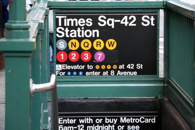
It is not designed following the concept of usability. Trying to navigate the underground catacomb with very little signage, and no clear path to freedom or your destination, makes traversing the enormous station a nightmare for the uninitiated. The subway system was not exactly built with user experience in mind. It is practically impossible to navigate for a person with little to no experience with this kind of public transportation system, let alone for those unable to see the map.
Let’s take it to the other coast by way of the Golden Gate Bridge. San Francisco is not a city known for its efficient public transportation. Instead of a large underground system, it relies on a mixture of a few subway lines, trolleys, and a large fleet of buses. The trolleys may be world-famous, but their reach is limited and relegated to mainly tourist use. The subway is also limited in scope and the buses are notoriously unreliable.
After living there for six years, I can confidently say that there is no comparison when it comes to New York’s MTA in terms of reach and consistency, but that is not the comparison being made here. There is one SF bus driver in particular that is going to be mentioned from one remarkable trip that stands out in my mind.
Most of the drivers call out the current stop when they arrive and announce the final destination as they welcome new riders aboard. This aforementioned operator treated his job a little differently. He not only announced every stop, but gave a continuous tour of the route as the bus was in motion.
The peculiarity of the event caught the attention of the normally apathetic commuters. You could see other public transportation riders slowly remove their ear buds to find out what was going on. I almost never take off my headphones when traveling on public transportation, but followed suit when it was clear something unusual was going on. I’m so glad I did.
In between jokes and restaurant recommendations, this man was giving a full on tour to the entire bus full of people, most of whom were just on their daily commute. It turned out that there was a visually impaired traveler at the front of the bus who had requested that the driver let the person know when they had reached their destination. Instead, the driver decided to give the passenger a little overview of the entire section of the city as it passed through the window.

His running commentary provided an in-depth knowledge of the route and the city as a whole: where to get the best coffee, how to reach other parts of the city from particular stops, which direction to walk in if you wanted to hit historical landmarks, delivered with a little bit a humor. The entire bus was smiling by the time they disembarked. It was not a normal bus ride, to say the least.
That ride was undoubtedly remembered by every passenger that day. It provided a service that the majority of those people didn’t even know they needed. I even got a coffee at one of the recommended cafes. It was a pretty decent cup of joe.
Originally a benefit freely given to the person who requested simple assistance, it had became an eye-opening experience for all. I never got the name of the driver and have never experienced a ride quite like that again, but three years later it still sticks out in my mind. That is saying something.
So what do these transportation examples have to do with inclusive design? Good question. Obviously every bus, train, or trolley cannot provide this kind of service on every ride. But it’s not out of the question that the experience could be amended to be better for people with disabilities, and it isn’t out of the question it could benefit everyone.
TAKING IT BACK TO DIGITAL DESIGN
Let’s move out of the physical world and back into digital experience, where accessibility is just as important. Let’s take the example of someone who is colorblind browsing an eCommerce site. They have decided on something to purchase but can’t find the checkout button. It happens to be on the side of page, but the customer can’t see it because it is low contrast and blends into the background. The shopper gets so frustrated that they decide to abandon the purchase and move on. Not ideal right?
Now say a woman is on the identical site on her mobile phone while in a rush. She wants to make the purchase quickly and easily, but can’t find the checkout button while on the move so she puts the shopping on the back burner, never to return.

Making that button more prominent and ensuring a high contrast could have helped both of those potential consumers. As Rory Sutherland, the Vice Chairman of Oglivy, said, “things designed specifically for people with disabilities often end up being valuable to many more people than originally planned.”
When we talk about inclusivity, we are not exclusively referring to the inclusion of people with physical disabilities. There are MANY other differences to keep in mind, such as people who suffer from cognitive disorders like anxiety or depression. If your site has a lengthy sign-up process or a complicated form with unclear labels, people suffering from these disorders are not likely to take the time to stay and work it out. Simplifying the process and providing a clear and easy path makes it more accessible and feasible, not just for people struggling with these disorders, but for anyone in a position where their full attention is not on the task at hand.
IN SUMMARY
Stop thinking of people with disabilities as a niche group that can be relegated to an afterthought. Design for your future selves, the ones who will continually put on and take off glasses in order to get the best view of the menu, the ones who will turn the volume up all the way only to still be unable to differentiate between the background noise and the phone, the ones who will ask their grandchildren to show how to use the new Hologram feature because the small buttons are too hard to press for your shaking fingers.
As disability rights lawyer, Elise Roy, recently said, “when we design for disability first, you often stumble upon solutions that are better than those when we design for the norm.” If we design products with inclusivity in mind, they could last well into the future.
Jarir Bookstore partners with ContentSquare to optimize its eCommerce platformAs part of its digitalization roadmap, Saudi Arabia’s leading retailer brand Jarir Bookstore will be using the ContentSquare analytics solution to study specific visitor segments and optimize the user experience on their online platforms.
Considered to be one of the largest retailers in the Arab World, Jarir Bookstore has opened more than 47 physical stores in GCC region since the 1970s. Jarir Bookstore offers a unique range of high-quality products ranging from office/school supplies, books, arts and crafts, to electronics and smart devices. Jarir Bookstore has recognized the importance of digitally transforming its offerings and services over the past few years – first by introducing digital books and launching an e-reader app (Jarir Reader) in 2013, followed by the launch of their official eCommerce site in 2016.
Jarir and ContentSquare
Using big data and artificial intelligence, ContentSquare precisely measures the web behavior of online visitors and makes it accessible to Jarir via its digital insights platform. “Through the use of our zoning technology, our solution breaks down each webpage and identifies problem areas. We measure everything from failed clicks to frustration points and hesitation time of online users. From experience, we know that addressing these problem areas leads to higher conversion rates. That’s what ContentSquare is about – offering a full-picture UX Analysis that helps people understand the reasons behind the behavior of online visitors, and why are they converting or not,” explains Disney Yapa, ContentSquare’s Sales Director MENA.
As one of the prominent members of the French tech startup scene, ContentSquare has helped more than 200 clients to optimize their digital channels, including Trolley in the UAE, Clarks, Harvey Nichols, Carrefour, L’Occitane and many others. In 2018, the company received an additional $42M in funding allowing it to invest further in developing its technology and offering its services to new markets – including the Middle East.
Since the partnership was finalized in the first quarter of the year, ContentSquare has worked closely with Jarir’s eCommerce team, training them extensively on the tool’s features.
Q&A: Taking Rum21 to the next UX levelThat’s what ContentSquare is about – offering a full-picture UX Analysis that helps people understand the reasons behind the behavior of online visitors, and why are they converting or not.
Disney Yapa, ContentSquare
“We can’t be inside our customers’ brain, but ContentSquare is as close as we get.”
Andrea Ryberg, Rum21
Rum 21 has gone through a number of changes since its early days. Acquired by furniture e-commerce giant RoyalDesign in 2014, what used to be a family-owned enterprise now has access to large-scale resources. In 2018, it partnered with UX Analytics company ContentSquare to really deep-dive into getting to know their customers and improving their online journey,
ContentSquare Marketing Manager Camila Florez sat down with Rum 21 e-Commerce Manager Andrea Ryberg to discuss these changes and how the site seeks to ‘balance information with inspiration’.
How would you define Rum 21 and how is it different from other companies?
We aspire to be a more personal company that has a high level of trust with customers. Being owned by RoyalDesign, we do have the advantages of having the larger supply chain, the sizeable warehouse, and other resources. But we want our site to feel straightforward and trustworthy. We try to be very transparent and give a full picture of the product and who we are. Furthermore, we believe customer service is one of the main pillars of our business.
Who is the primary customer of Rum21 and how would you distinguish them from Royal Design customers?
With segmentation analysis, we can see that our customer is primarily a woman, relatively young, and we also see that our average order values are higher. We need to dig more into that, but there’s definitely a perceived difference between our two brands and we work on maintaining that. Rum21 is a bit more premium in terms of product offering.
How do you identify these customers and how do you cater to them differently?
We have customers in various stages of the funnel on our site, so we really need to accommodate all types of customers. To do that, we strive to offer a mix of inspiration and information. As we’ve seen with ContentSquare, we have the largest number of visitors coming straight to the product page. These customers generally come from Google or through paid click, indicating they already know what they are looking for and therefore are quite far down in the funnel. So, in that stage, inspiration is still important, but we need to focus on the information part.
On the other hand, if a customer is landing on the homepage and hasn’t fully decided yet what they want, the inspirational part needs to be more emphasized.
So you began using the ContentSquare tool in 2018. How do you find the solution so far and how does it compare to the tools you were using prior?
Well, we know what sells and what doesn’t, and we wanted to know why. We were using Google Analytics for a long time, and we still do, but it’s more useful for looking at traffic and straight sales figures. Yes, you can see the clicks on the pages, or how popular different pages are, but you can’t really see the navigation paths and what the customers look at and for how long. Our marketing department uses it much more than I do now.
The difference is that ContentSquare brings you the behavior part. We can really learn why a customer clicks on something or why they don’t. That was something that I could only make assumptions about before. We can’t be inside our customers’ brain, but the insights we get from ContentSquare are as close as we can get. It’s really been interesting for us.
How do you use or interact with the solution on a regular basis?
It depends on what I’m looking for. Usually, I go on the dashboard and have a quick overview. I also merchandise the site and the homepage, so I love looking at how the different elements on it are performing, that’s really interesting. Also, I look at the Customer Journey Analytics to get a better understanding of the actual customer journey. I use the solution in different ways. Our IT and Content Managers also use it.
How has the tool changed the way you carry out your job?
Well, it’s a lot easier now to understand what must be prioritized, because I can see for example what a certain pain point does to the actual conversion rate. I work a lot with the developers, so this is really handy. Before I would come to them with suggestions or let them know what my personal preferences are. Now I come to them with data, I know that this is what we need to do. This is a massive advantage!
What would you say is the biggest insight that you gained from ContentSquare that you couldn’t have before?
Lots of things, actually. For us, it was good to realize that the locations on the homepage where we put our prime offers weren’t even visible to many of our customers and visitors. Now we changed the whole layout of the homepage and we’re still looking at how that has affected our customers’ behavior.
We also know now that our search function is really one of the most used functions and most clicked elements. We identified that the float time is quite high on the search bar, so we changed and clarified the CTA. We could also see that we had customers starting to type on the search bar, and when the actual search pop up would appear, it covers it. So you couldn’t really see what you were typing. We changed that because obviously, we saw that we lost customers through this frustration point.
We have also identified pain points on our product and cart pages… we have so much work to do still!
How do you see the partnership between ContentSquare and Rum21 moving forward?
I feel from our collaboration that ContentSquare – especially with Lovisa, the Nordics Customer Success Manager with whom we work very closely – encourages and pushes us to examine the elements on our website more in detail. And ContentSquare as a tool always has a new update or feature coming out. I feel like they’re really on their toes when it comes to developing the tool. As for Rum 21, we will never stop evolving either. We always need to adapt to the customer. There are so many new features and technologies that are emerging every day; working with ContentSquare is definitely going to help us to be able to keep up with that. It makes it a lot more effortless to deal with data and analysis. We can get the answers so much quicker. Whether we’re doing a complete redesign work or simply small adjustments, we will always find room for continued growth together.
What are your next steps in terms of optimization?
First of all, we’re going to develop the search function a bit more and make it faster. And we’re looking at that now. It would be interesting to look at the Cart page and follow up on the insights that we have. We discovered for example that we have a lot of exit points in the Cart that we want to keep to a strict minimum.
There are also features in the solution that we haven’t maximized yet, like the AI notifications. I also think there’s room for improvement in terms of having even more of our teams use the tool. For now, people have a lot on their plates, but it would be very helpful to really buckle down and have our Category and Content teams spend more time to gather insights from the tool as well and determine what to do with those insights. Those are the things we are working on.
If there’s one sentence that you would use to describe ContentSquare and the work it has done for Rum21, what would it be?
Well, it would be difficult to put it in just one line. But all we ever strive to do in this business is to understand the customer. We might know what we want to sell, but it’s so important to understand what the customer actually wants and how they want to interact. To sum it up, this is the only solution that primarily gives us that data. We simply couldn’t do that with the tools that we used before ContentSquare.
What Surprised Us Most About Fashion Week 2018: Quick Takeaways On User BehaviorContentSquare data experts analyzed more than 11 million user sessions during the course of a month, across 6 global luxury fashion sites. They examined sessions captured between 09/01 and 09/24 — coinciding with New York, London, and Milan fashion weeks, and the week leading up to the shows.
Here are some of their findings:
1. Homepage traffic increases by almost 20% during fashion week.
Our data analysts found that the number of visitors entering luxury fashion sites through the homepage increased from 26.03% to 31.22% at the start of fashion week. And while the majority of users are still coming in through the digital side door (product pages, category pages, etc), numbers show that many consumers are primed for an introductory brand experience. Also noteworthy was a 42% spike in the number of visitors entering a site through a page dedicated to showcasing inspirational content.
Our analysts also noticed that more than 1 in 2 inspirational pages get updated at the start of September, confirming the expectation that more visitors will be reaching these pages around this time. So, is this seasonal content push working as a strategy to boost consumer loyalty?
2. Users who consumed inspirational content returned to a website on average 233% more times on desktop than the average visitor, and 160% more on mobile.
And it’s not just inspirational content that is getting users coming back for more. Our analysts found that users who viewed ‘new arrivals’ content returned to a site on average 227% more often on desktop and 163% more often on mobile — suggesting the buzz around new collections and campaigns does indeed foster ongoing interest in a brand.
Read the full mini-report to find out what other user behavior trends we learned about when we analyzed millions of fashion lovers’ browsing sessions.
ContentSquare CEO Jonathan Cherki answers burning questions about digital experience and customer journey optimization. Follow this series.
Last week, ContentSquare was at Adobe Summit in Las Vegas, meeting digital leaders and digital experience teams from all over the world. One of the questions I got asked a lot during the event was, “How do I know which type of content to invest in?”
A change to the User Experience (UX) only becomes an improvement once it evidences a positive impact. That’s why having the ability to measure the performance of digital investments is invaluable to brands wishing to see a healthy ROI for their digital assets. Brands need strong data attribution models so they can react fast and confidently to their customers’ needs and usage patterns.
A change to the User Experience (UX) only becomes an improvement once it evidences a positive impact. That’s why having the ability to measure the performance of digital investments is invaluable to brands wishing to see a healthy ROI for their digital assets. Brands need strong data attribution models so they can react fast and confidently to their customers’ needs and usage patterns.
REVEALING HIDDEN DIGITAL EXPERIENCE OPPORTUNITIES
One of the motivators for starting ContentSquare in 2012 was the realization that many companies developing sites had no idea what was happening online. Their website was like a black box that no one could open, full of information about the digital behavior of customers and prospects.
This challenge is one of the things that got me interested in analytics in the first place—making obvious what was hidden until now to help brands distribute time and resources in the most productive way.
In the luxury industry, for example, brands have vast budgets to develop inspirational content with extremely high production values. But how do they know whether this content or campaign is working for them and driving business?
Being able to attribute revenue to content at an elemental level – seeing not just which page, but which individual pieces of in-page content encourage conversion, and which are obstacles in the navigation – is key to identifying where your UX budget is best spent. Whether that’s a menu item, CTA button, thumbnail image, video, etc. – getting an accurate measure of content value allows teams to focus on prioritizing and validating optimizations, and invest in the areas of highest impact.
DEMOCRATIZING THE REVENUE ATTRIBUTION PROCESS
Furthermore, a clear, shareable attribution model has the power to change brands’ digital marketing culture by empowering even non-analysts to measure their contribution to a company’s digital revenue goals. The ability to pinpoint where and why you lost visitors helps you determine where you should invest efforts and resources to get the highest ROI. It’s also more efficient to A/B test when you can tell not just which test but what element, in a variant, led to better results.
A CLEAR, SHAREABLE ATTRIBUTION MODEL HAS THE POWER TO CHANGE BRANDS’ DIGITAL MARKETING CULTURE.
Analytics have come a long way in recent years, and today, marketers know that understanding the expectations and behavior of digital consumers is the backbone of a good online experience. In the same way, understanding the needs and challenges of brands with online assets is vital to developing a good digital insights platform.
Certainly for us, improving our product would not be possible without listening to the people who use it day-to-day. We want the solution to keep growing with your goals, which is why we put brands at the heart of our research and development strategy. When we develop new features and capabilities for our product, it’s in direct response to the feedback and questions of those who want to leverage big data into a better connection with their customers.
So – keep those questions coming—email us at askmeanything@contentsquare.com—keep talking to us, and we will listen and work to solve the issues most important to you.