
How to improve your homepage
35+ actionable insights for getting the most out of your homepage.
At Contentsquare, we envision a world where every digital interaction improves lives.
As we spend more and more time online these days, it’s important to us that the user experience and customer journey are meaningful.
But today, the digital world is plagued by poor experiences. Brands have traditionally been unable to deliver the experiences customers want online because they haven’t been able to easily understand what their customers really want. It’s not just about making sure your customers can find the right product pages or the contact us page — it’s much more nuanced than that. Your customer’s changeable mindset and intent can completely change their behavior online, and most brands can’t tailor the experience needed on demand.
But we do believe that brands have the ability to improve people’s lives. Making the time you spend online more meaningful doesn’t have to be impossible — and so our strategy for achieving our vision has always been to empower brands with unique behavioral insights to create better experiences.
To that end, we took the strategic decision to acquire experience analytics company Clicktale in July 2019. While both Contentsquare and Clicktale are rooted in customer behavioral data and insights, Clicktale’s session replay and heatmaps complement Contentsquare’s page zoning and customer journeys capabilities. Today, just 90 days after that acquisition, we are releasing major new capabilities of the Contentsquare platform, which includes innovation driven by the combined R&D and product team of more than 170 innovators strong.
Now, we can confidently offer the most complete experience analytics platform on the market. None of our competitors can give you the level of insight into your customer behavior we can thanks in part to the fact that our solution analyses 9 trillion digital interactions every day for each of our customers.
Now, the combined product is the only complete system of insight that offers brands the ability to do all of the following:
No other solution can give you a better level of insight to help you understand and create insight-driven innovation.
Improving any kind of digital experience, whether it’s on desktop, mobile or any other channel, starts with collecting the right kind of behavioral data. Customers behave differently depending on the touchpoint you interact with them on, and so it’s important to measure precisely how those customers are using your channels so you can tailor the experience accordingly.
And behaviors won’t necessarily stay the same over time, either, so simply analyzing behavior just once won’t be enough. You need to continuously measure behavior over time so you can tailor your experience to whatever nuanced behavioral changes your customers portray.
But the touchpoints themselves are starting to evolve. In the next three years or so, we’re going to see a shift in the types of interactions between brands and customers. By 2021, experiences will be more conversational, mobile, personalized, social and immersive. All these trends are going to transform the customer touchpoints ecosystem, whether it’s the brand’s own digital channels, physical channels, third-party channels or marketplaces.
If you want to create a great overall experience for your customers, you can’t solely focus on your own digital channels like your desktop and mobile sites. You have to provide a consistent experience across all touchpoints and do the marketing basics (like providing the right product at the right price) well. That’s why our vision for our product is to help you with a significant proportion of those touchpoints — beyond just digital.
Once you’re measuring all your channels though, the key, of course, is to unify all that data and product intuitive visualizations so even the non-digital business units in your organization can understand it and draw insights from it. Only then can we start to realize a vision where digital interactions improve lives — when the whole organization is on board.
Those organizations that lead on digital experience tend to see benefits of 3–5x on measures such as lead generation, conversion, price premiums and loyalty as a result of offering a great experience across the board. And customers are more likely to pay a premium price when they have a great experience versus a poor one.
At Contentsquare, we can help you to compete with the digital leaders, and help you gain an insight into your customers like never before. Request a demo to find out how.
Is Disruption Coming To The Auto Sector? We Quizzed Two Experts For Their ViewpointsThe end of dealerships, online vehicle shopping, pure players, smart cars… Has the auto sector been speeding down the digital transformation highway? We quizzed two digital auto experts to find out how disruptive the auto industry is about to get…
Our first interview is with Jérôme Jean, Digital & Regional Marketing Manager of Toyota in France. Interviewed by David Robin, Associate Director of Colombus Consulting, we learned about the automotive landscape in the digital space.
Colombus Consulting: Let’s dive straight in. What does a successful customer experience (CX) in the auto sector look like?

Jérôme Jean: It’s pretty simple: it’s an experience that is completely linear — from the search engine or website all the way to the dealership visit. These last few years, Toyota has focused heavily on digital to improve the customer journey.
It was crucial for auto manufacturers, whose distribution network has not evolved in 30 years, to become more agile. The aim was to offer a renewed buying experience with a mainly digital pre-sale journey.
We thought about how we positioned our brand and our vehicles at every touchpoint. What experience do we want our customers to have in the dealership? And today we have a new challenge: customers show up very well informed and really challenge our salespeople…
Particularly nowadays, competition is so fierce…
Yes, that’s true of other manufacturers’ eCommerce platforms, but also with pure players who have a radically different approach. There is also one thing no competitor can get around: having actual dealerships so that customers can have a live experience and “feel” the product.
So does that mean the auto sector is moving from hardware to software..?
Yes, absolutely. First of all because you need to add a digital dimension to the dealership experience, which requires having one single database — in our case, Salesforce.
The software is going to continue to evolve fast with smart cars. Tomorrow, diagnosis, preventive interventions, vehicle upgrades — all of those will happen remotely. The auto sector’s approach to marketing will shift increasingly to mobile. We will be able to offer new apps and services to make our customers’ lives easier. Manufacturers will finally connect with their customers on a daily basis.
“The auto sector’s approach to marketing will shift increasingly to mobile.”
Where are we at with online sales today?
The online retail market is gaining traction. All manufacturers, especially in England and Scandinavia, have been testing online sales of new vehicles. 2020 will be a pivotal year with the emergence of online sales platforms. The real question is: what is being sold? Selling new vehicles is the Holy Grail… except that today, the used vehicle market is much more mature. But will it work? I don’t think that online sales will dominate the market or spell the end of dealerships. In my opinion, digital will be one extra sales channel that will hopefully allow us to market to a younger customer base.

Next, our own Geoffrey Vion interviewed Brice Renvoizé, Digital & Experience Manager at SEAT Groupe Volkswagen on marketing, data and CX in the automotive sector.
Contentsquare: How did SEAT restructure to meet the digital challenges of a fast-evolving sector?
Brice Renvoizé: We transformed our digital marketing strategy 2 years ago, with a restructuring of teams based on data and customer experience. Today, our Influence division is responsible for increasing brand awareness and our Digital Customer Experience division is in charge of optimizing the customer journey. The customer journey is changing fast and we’re seeing a decline in dealership visits.

Has this changed your mission at all?
Our objective today is to prove the business value of digital, and to drive more traffic to our dealerships, which is where 100% of our sales still happen. Drive to Store is our main KPI and all our digital innovation takes into account the dealerships as a key part of the buyer journey.
The SEAT ID is an example of how our digital strategy is evolving. This unique client/prospect identifier will remove all barriers between our digital interfaces, dealerships and smart cars. It guarantees a friction-free experience in both the physical and digital world — it’s the ability to keep members in our ecosystem, which includes offering new services.
New services?
Yes, third-party services (music streaming, paying for gas…) are included in a monthly payment thanks to the connectivity revolution in the auto sector.
On the product side, we’ve already disrupted the status quo by launching a “no strings attached” car. A Netflix-type subscription where you can return/exchange your car and change your mileage — all this in an easy way, with no fees. Every last obstacle in the experience has been removed! With this level of service, we’re answering the needs of the new generation, who is more interested in usage than ownership.
Will people be buying their car online anytime soon?
No, not yet. We all still need contact with a product that remains a unique type of purchase. But digital can simplify the process: online deals with financing offers, estimates for a trade-in…
So it’s not the end of dealerships just yet… But how do they connect to digital?
We can remove the barriers between the two. We measure showroom visits that come from mobile traffic. The information shared during the experience on seat.fr. makes it easier for the vendor to understand the client.
The experience both online and offline still needs to improve thanks to considerable personalization. The key to personalization will be customer ID and data.
Can you describe your data strategy?
It helps us save on acquisition and focus instead on conversions. How? By personalizing messages depending on profiles and segments, by way of optimizing touchpoints to increase conversions. Ads we will go even further with the SEAT ID and the smart car. Today, data is used for marketing, tomorrow it will be used for business and service.
Hero image credit: SergeyBitos, Adobe Stock
CX Day 2019: Spreading Digital Happiness In The Age Of ExperienceRemember not so long ago, experts predicted that by 2020, customer experience (CX) would become the main differentiator for brands, outweighing both product and price? Well, we’ve arrived. The world has changed. Customers have changed. Has the way you understand and serve those customers really changed? Have you changed the way you work, how you invest, and how you define great experiences?
According to CapGemini, while three-quarters of businesses today consider themselves to be customer-centric, only 30% of customers agree. So, what gives?
The long and short of it is that delivering on customer expectations is proving harder than expected for brands. And with plummeting tolerance for a poor CX, and consumers less and less willing to give second chances, getting it wrong is a costly affair.
And this isn’t a problem that acquisition alone can fix. First off, it’s more costly to attract new customers than to retain them. Second, it’s not a viable business strategy, because all evidence points to the fact that delivering a spot-on CX gives a business at least 3X the conversion rate and revenue growth over its competitors which provides an advantage no short-term spend or price drop can catch.
So how exactly do you go about tackling the growing CX crisis, and shrink the experience gap for a better, healthier digital future?
Too much of consumers’ online activity ends up unused — sure, this beauty brand knows it’s your birthday, but do they know how annoying it was to click on that lipstick three times and still not land on the product page? Do they know you want to see how it looks on your face with other makeup? Well, they certainly should.
Brands today have access to the tools they need to make every single second of digital activity (or inactivity) meaningful, and leverage this meaning to improve the experience for customers. Think of digital browsing as an insightful type of Voice of the Customer — every scroll, tap, hover and click tells the story of your customers’ intent and challenges, satisfaction and frustration.
This ongoing digital feedback is fuel for insights that generate new opportunities, innovation and competitive advantage.
So if digital customer signals are all there for the understanding, why are so many businesses still only scratching the surface of the possibilities of data? And how can you drive maximum impact from customer data?
If you haven’t already, now is the time to adopt a zero-waste approach to data processing: collect only the data you need, analyze that data to extract relevant insights, and make it easy for everyone on the team to act on every piece of customer intelligence.
Digital leaders who adhere to zero waste push their teams and their vendors to insist on solutions and services that go well beyond the confines of click stream analytics. They ensure transparent data collection and usage practices. They create data-driven cultures and processes, including analytics, as integral parts of business discussions and decisions rather than a separate function.
At Contentsquare, everything we do starts with the data we collect, with the most comprehensive set of meaningful digital signals available. We take this responsibility seriously. We turn the trillions of behaviors into useful and quantifiable recommendations, making it easy for brands to act on those signals and give customers what they are loudly — even silently — asking for.
Digital teams regularly use insights to improve their site and app experience in two ways: to troubleshoot issues (recover from errors fast) and grow through innovation (uncover hidden opportunities).
Brands are always going to have to do all three, but in order to maintain their competitive advantage, they need to be able to tackle each of these strands as part of one holistic approach to experience-building. They need to quantify the strategic and numeric impact of each potential improvement, and prioritize the investments that will add up to the biggest total impact.
Because a reactive experience strategy won’t keep pace with the fluctuating nature of customer behavior, or the fluid essence of experience design. Just like your GPS is constantly learning from historic locations to predict future trajectories, experience builders should leverage behavioral data to anticipate customer mindsets and preferences.
Probably the biggest inhibitor to innovation and impact right now is the inability of teams to act, or act in time, on insights that matter. A lot of customer analyses happen separate from the experience execution owners. The limited access to analytics tools and the lag time inherent in the cycle of question-answer-follow up, question-answer creates lag time and inhibits customer understanding across teams.
One thing we know about the outperformers is that they put the data directly into the hands of those tasked with ideating and executing the changes to the CX. Without widespread access to customer intelligence, there is no scalability and ultimately, no digital transformation.
The ability to understand, and increasingly predict the needs, desires and preferences of digital audiences should belong to everyone who has a stake in CX — from acquisition marketers to content producers to eMerchanders to UX designers to product owners.
Empowering teams around a common language for customer behavior and enabling them to watch firsthand as it evolves, is the only way to guarantee every one of them will be able to design the best possible experiences for your customers.
There are no best practices when it comes to experience — there is only what is best for your brand and for your customers right now. Because just as there isn’t one sole way of being convenient, there is no single gold standard for digital customer experience. What customers seek from you is different than what they seek from another company. You have a unique brand value to offer and your experience should reflect the specific relationship you want to cultivate with your customers.
In addition, the perfect customer experience is not a monolithic thing — the perfect experience is the right experience for a given customer at a given time in a given context.
People deserve experiences that reflect their nuances, that are reliably excellent, and that adapt to their fluid context and needs. They deserve experiences that recognize what they need from your company. If you keep that in mind, your team will be able to design experiences that are innovative rather than copycat and that is how you solve for the customer experience gap.
Turning customer experience into an advantage is now critical for business survival. You can step up and do things differently with the help of teams, partners and technology ready to support you. Together, if we listen to the digital signals our customers are sending and empower everyone to act them, we can close the CX gap, and unleash the potential of experience innovation to set up the digital future we really want.
Where there’s a will, there’s a way!
What Not to Do on the Homepage: UX Advice for Fashion RetailThe homepage is often a key webpage for direct and organic search channels for players in the retail fashion industry. In addition to being a crucial step in the browsing process for users, it’s also an opportunity for businesses to introduce and showcase their brand identity through editorials and fashion trends.
However, according to the data we collected in Q1 of 2019, fashion retail homepage bounce rates were as high as 40% across all devices. Users also still spend an average session time of 7min on desktop and 3min 41s on mobile. (Remember, Contentsquare measures bounce rate as having only seen the single page and leaving the site).
It can be difficult to know what kinds of design iterations will help prevent users from exiting without having viewed at least a few product pages. It’s also impossible to create the perfect homepage, but we have some great tips to follow if you’re looking to improve the design of your fashion eCommerce homepage.
Although images and photography are crucial for communicating brand identity and editorial content, make sure you choose images that are text-friendly. Place text over emptier areas of the image, change the image, or place text on an overlay. Always use white text unless brand guidelines say otherwise. Users tend to skip over text that is too long, too small, or just difficult to read. Keep in mind: any information must be easy to digest at a fast pace, especially for mobile users.
If you’re showcasing your Fall/Winter looks, consider using a static banner —a prominent, single banner on the page that does not have rotating content, one that allows other content to be seen above the fold. We often find the exposure rate — how far down the page visitors scroll — drops drastically below the fold line.
A hero image that spans the full length of the page could mislead users into thinking there is no other content. Because the average length of mobile pages is around 3,400px, we need to encourage users as much as possible to scroll past the fold line.
If you’re showcasing new collections or promoting sitewide discounts, avoid automatically rotating slides within the carousel. Instead, use static carousels that do not include more than three slides to allow users an opportunity to digest both the image and information in each slide. Users should be able to use arrows to easily move from one slide to another.
Although there is a big debate in the design world over whether carousels are effective, we see much less exposure and engagement on the second and third slides. Automating carousels can rob users of control over the experience and as a result, they are more likely to ignore it if the slide moves too quickly for them to read.
 Instead, make sure they are clearly above the fold line; try placing them on an uncluttered area of the image. You want to encourage users to immediately begin browsing, whether it leads them to a category page or list page for product catalogs that are currently being prioritized.
Try placing a horizontal category slider at the top of the page and evaluate whether that improves your users’ browsing process.
Showcase editorial content that is space-conscious and easy to interact with
Make sure that any editorial images on the homepage lead the users to specific categories, seasonal collections, or product pages. Giving them a purpose beyond aesthetics encourages users to explore beyond just the homepage and can help increase session time.
Here is a great example from Ralph Lauren:

The above image on the left showcases the bag as both aesthetic and functional, enticing users with beautiful photography, while leading them to the product page. The text is succinct, easy-to-read, and placed on an uncluttered area of the image.
The carousel placed on the right provides even more options for the user to view additional products for the upcoming season. Both the image and carousel do not extend past the screen, making it easy to view. Part of the content of the next section is viewable, avoiding the false bottom and encouraging users to scroll further.
Making design iterations to your site never ends. As user behaviors continue to evolve faster than ever, it’s important to continuously evaluate and reassess the performance of individual elements on your pages. It’s important to make design changes based on the needs of your user base, not the general users of the industry.
Don’t forget to regularly check on other players in your industry for inspiration, as there is much to learn from the digital experiences and websites you enjoy. But remember, just because a competitor does it, doesn’t mean they are improving the experience of their users. So be inspired, yes, but consult your own customer data before implementing changes.
Hero Image Via: Rawpixel.com, Adobe Stock
Fall/Winter Fashion Campaigns: How Brands Are Capitalizing On High Interest in New CollectionsWith fashion month in full bloom in the world’s four most glamorous cities, retailers and luxury brands are capitalizing on the collective excitement for all things sartorial to showcase their new Fall/Winter looks online. And judging by our findings, consumers are more than ready to give their wardrobes a makeover and explore new styles…
In this article, we examine the effects of Fall/Winter apparel campaigns on digital customer behavior and their impact on revenue.
To paint a clear picture of how US consumers respond to Fall/Winter collections campaigns, we analyzed data from 24 global fashion brands (including luxury and mainstream brands), focusing on their US sites. Our analysis runs through a month and a half worth of data, representing 98 million user sessions, spread out over 510 pages.
As part of our analysis, we compared the performance of Fall/Winter campaigns (or “new collections”) with that of the end-of-Summer 2019 campaigns (or “old collections”).
Let’s learn more.
The happy news for retailers is that the recently-launched Fall/Winter collections reaped larger average carts across all 3 devices. In fact, overall revenue was up 6.74% from the end of the summer campaigns, with the most impressive leap observed on tablet (+6.56%).
Conversion rates, however, did not follow the same upward trend — not on two device types, that is. . Desktop conversions on new fall collections stagnated at 2.19%, signaling no change in the conversion rate between the old and new collections. Tablet conversions lessened by 3%, further handing the victory torch to the end-of-summer collection in terms of conversion rates.
On the contrary, new collections on mobile outperformed old ones, with a 4.43% rise in conversions.
While the mobile conversion rate increase is slight, it nonetheless signals a significant opportunity for retailers, and a clear indication that consumers are willing to shop for new looks on their smartphone. Brands should thus not neglect capitalizing on their mobile UX.
In fact, they should design with a mobile-first approach to digital. Aside from holding stock in revenue, mobile continued its high traffic trend. It was the most-trafficked device in BOTH old and new collections, hovering at around 72%, dwarfing desktop and tablet usage, which came in at 22.5% and 6%, respectively.

Now that we shined light on what is arguably the most important impact of Fashion Week, let’s veer into the beginning of the user journey: how visitors entered the websites we surveyed.
According to our data, paid acquisition campaigns around the new collections paid off (pun intended). Brands primarily relied on paid sources to draw more users into Fall/Winter looks, including paid search campaigns (display ads) and paid social campaigns.
These paid acquisition campaigns resulted in traffic increases across all devices, with a whopping 289% growth in traffic from display ads and a sturdy 178% growth from paid social ads. It seems that if a brand is willing to put money behind ads for Winter/Fall fashions, customers are more than willing to click.
A high-level view of the digital customer behavior on the homepage reveals that, by the time the new collections roll in, visitors are eager to discover new trends and styles.
The new styles drive a peak in customer interactions, with a higher click rate on the homepage slideshow (64% up from clicks on Summer items) and on the product tiles right below (+17%).
There are fewer clicks on the search bar, which figures, as most consumers appear to be in a discovery/inspiration phase, accessing the new styles through the more visual, inspirational elements of the homepage. The click rate on the cart also goes down around the new season launch, corroborating the idea that consumers are primarily window-shopping.
It’s a good time for brands to make sure they’re getting the most ROI from the inspirational elements on the homepage, since the excitement for new season looks translates to heavier engagement with these areas of the site. Optimizing product pages to capitalize on this heightened interest is also key: if visitors are clicking on your Fall sweaters tile, make sure you follow through with a relevant selection of items and an easy path to conversion.

But with all this inspirational and visual content showcasing the season’s must-have items, some brands are running into speed issues.
On desktop, for example, homepage loading times were up 50% after the launch of the Fall/Winter collection — from 2.09 to 3.14 seconds. With a 4% increase on mobile, it seems brands have overall made some effort to keep load times down on smartphones.
It’s a delicate balance to achieve— on the one hand, you want to give consumers all the inspiration they are willing to consume, but not at the cost of stalling the customer journey. Analyzing customer interactions around each element of the page will help teams determine which content is truly driving conversions and which underperforming elements can be optimized, or altogether removed.
Customers shopping for Fall looks seem less inclined to continue their journey offline than those looking for end-of-summer bargains. On mobile, the reach rate on the store locator was down -6% for consumers browsing the Fall/Winter collection. Desktop was hit the hardest with a -14% dip in the store locator reach rate.
It could be that with back-to-school, back-to-work, and general September busy-ness, many shoppers don’t have time to go to the stores. Then again, conversions are down too, so it could be that this is a time for window shopping and eyeing up what’s on offer for the months to come.
The unveiling of Fall/Winter collections is a potent engagement driver, and consumers are not shy about clicking on ads and images to be educated about the new season’s looks. With higher engagement and revenue, these campaigns have plenty of potential.
From post-click optimization to ongoing analysis of your key homepage areas, a granular read of your customers’ experience will uncover any areas of opportunity and help you refine underperforming content.
Remember to reduce your page loading times (long loading times are a major UX offense) and create seamless mobile experiences to reel in the most profit from this short-lived yet critical shopping season.
A guide to landing page optimization
Your offering is clear. Your site is live. Your PR and ad campaigns are in full swing. You’re actively monitoring sales and subscriptions. But you’re not seeing the results you were hoping to see, and conversions are not growing fast enough. Have you considered landing page optimization to increase retention and achieve a healthier conversion rate?
For example, when a visitor clicks one of your ads, are they directed to a page that was built as an extension of that particular ad? That’s the idea behind landing pages. You probably already have some on your website. But are you sure they’re as impactful as they could be?
In the following post, we’ll try to help you master the delicate art of landing page creation and design by answering three key questions:
Let’s get started!
A landing page (or destination page) is a webpage intended to be part of a marketing or ad campaign.
Its purpose is to encourage visitors who click on the link to convert.
It tends to be fairly simple and pragmatic.
Why the no-frills approach? Because the objective here is simply to grab your visitor’s attention and encourage them to take a course of action.
It’s different from traditional pages (like your FAQ pages or homepage) in that it is specially conceived for paid traffic (Google Adwords, Facebook Ads…).
Nonetheless, it can still appear in the organic results generated by search engines, even if it is, first and foremost, commercial.
How to improve your homepage 35+ actionable insights for getting the most out of your homepage.
Download
We won’t keep you waiting any longer. The main objective of launching a landing page is to maximize conversions. While your homepage may be built around the needs and expectations of your largest audience, you can afford to focus your landing pages around a single message.
You might want to build a landing page to:
A landing page is part of a wider communications and marketing campaign designed to maximize its reach and impact.
It’s probably wise to start by analyzing the pages you currently have live.
Landing pages are often associated with search engine or social media advertising campaigns, PR campaigns or events. Their impact often goes hand in hand with a simple design and clear messaging.
By communicating a major piece of information in a relevant format, they minimize the risk of distraction often associated with traditional web pages and encourage a more focused consumption. It is, therefore crucial that your landing pages echo the messaging of the campaigns they are tied to.
Further reading: The Call to Action: 5 Tips to Increase Your Conversion Rate
You now know what a landing page is, and it’s important for you to have them on your site. But there are still some things you need to know before launching the perfect landing page!
So before you put in a request to your marketing and UX teams, make sure to analyze your visitors’ behavior and understand their unique customer journeys on your site.
The very first step is to make sure you have a concrete offering for your visitors, whether that’s a product or service, a white paper or a discount.
The offer needs to be relevant to the needs of your client, wherever they are in the sales funnel. For example, if a customer is in the early stage of the buying phase, you may want to give them information about the various options available to them.
You may also want to wait until your visitor is further down the funnel to promote the actual products or services.
Once you’re clear about what it is you’re offering, it’s time to figure out what the objective of your landing page is going to be. This objective will help you set conversion targets, which in turn will allow for efficient monitoring.
There could be several objectives:
At this stage, you may want to make sure you have a pretty clear idea of the types of campaigns your competitors are already running. This might seem obvious but the whole point of good practices is they’re tried and tested!
So, find out who your competitors are, determine the key to their success and see how you can leverage similar strategies to increase your own conversions.
Knowing your prospects and customers is not optional. The better you understand your visitors, their needs, habits and expectations, the better equipped you will be to respond to these needs in a relevant and impactful way.
This behavioral “mapping” will allow you to find the right words, to choose the best visuals and to create the most appropriate experience for your visitors’ segments.
Where your visitors come from should not be taken lightly. In fact, this factor can even help guide the messaging and design of your landing page.
Indeed, your visitors’ browsing patterns and mindset may vary depending on the acquisition source — whether that’s Google, a Facebook page, an Instagram story or their Twitter feed.
Another obvious reality: the more landing pages you have, the higher the chance of generating leads, since each page can be customized for a specific audience. If this sounds like a lot of work, start with one page per campaign, and then try to add pages for specific segments.
You now have everything you need to create a landing page that answers your visitors’ needs.
But wait, there’s more.
We’ve quizzed our UXperts in London, New-York, Paris and Tel Aviv to get their top tips on the subject of landing pages, and put together a list of 11 must-haves that will help you save time and increase opportunities for conversion.
Let’s jump in.
While all the copy on your landing page is important, an awful lot is riding on the header and subheader.
One way to keep visitors engaged is to be clear and concise. You should be able to capture their attention and share the key product or service message in one sentence (no more than a dozen words).
The header and subheader must reflect the messaging of whatever link your visitors clicked on. Linkedin gets straight to the point with its “Get started with Linkedin ads” landing page.
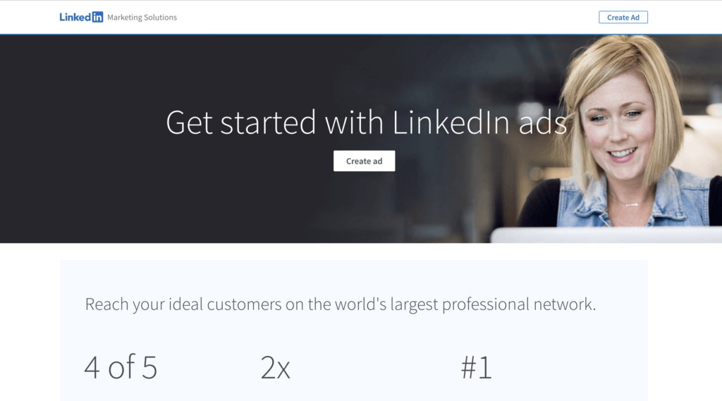
Image source: Linkedin
Does your product have standout qualities? Can it solve several problems?
You should enumerate those succinctly, in bullet points perhaps. Add icons for a visual representation of this added value.
Hootsuite, for example, clearly lists the benefits of its new AI tool.
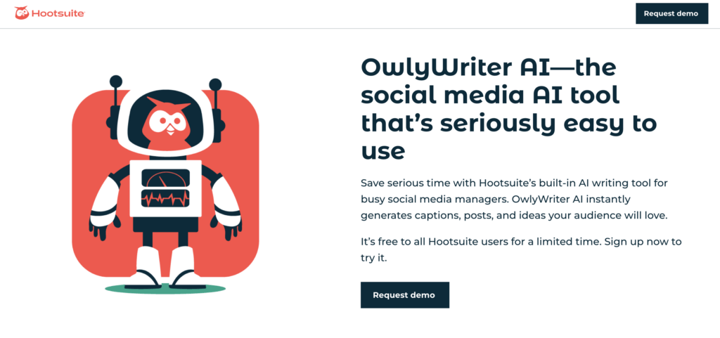
Image source: Hootsuite
“Without a clear Call to Action, you can kiss conversions goodbye.” – Contentsquare’s UX Team.
We won’t go on and on about the perfect CTA here because we already did that in another blog post. 🙂
But if we had to summarize:
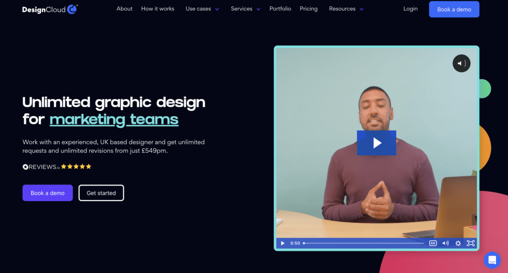
DesignCloud is good at distinguishing between its main CTA (Book a demo) and its secondary CTA (Get started).
Here’s a piece of advice that never gets old.
The search bar, menu, copy, forms — remember, every added in-page element could be a potential source of distraction.
So be ready to kill your darlings, on the one hand, and showcase key elements, on the other.
Appcues does a great job with a clear heading, listing three key benefits and having a clear CTA.
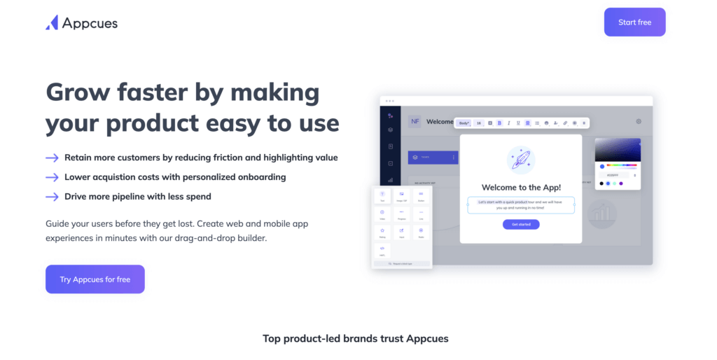
Image source: Appcues
Because an image is worth a thousand words, be picky when it comes to images. Try and stick to a simple and clean design, and don’t be afraid of empty space.
At the same time, don’t forget to optimize images so they don’t negatively affect the performance of your landing page.
Monday.com’s landing page with interactive elements is the perfect example of how you can create a “fun” landing page without necessarily promoting an inherently “fun” product or service.
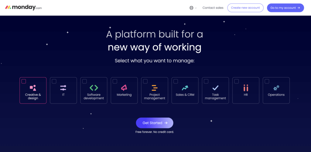
Image source: Monday.com
If you had to choose between reading a paragraph with several sentences or watching a very short video, what would you pick?
It’s likely that, like most consumers, you’d opt for the second.
Video remains one of the most powerful, highest-converting marketing mediums out there. Pinterest Business uses video to contextualize its product or service and to highlight what problems it can solve.

Image source: Pinterest
Unless you’re working in a very niche industry, it’s to be expected that visitors will connect to your site via a variety of devices.
Desktop, mobile, tablet — be sure to anticipate the various devices your visitors may be browsing on and ensure your CTA and header are visible without needing to scroll. Typeform’s landing page does this well, showing all key information above the fold on their mobile site.
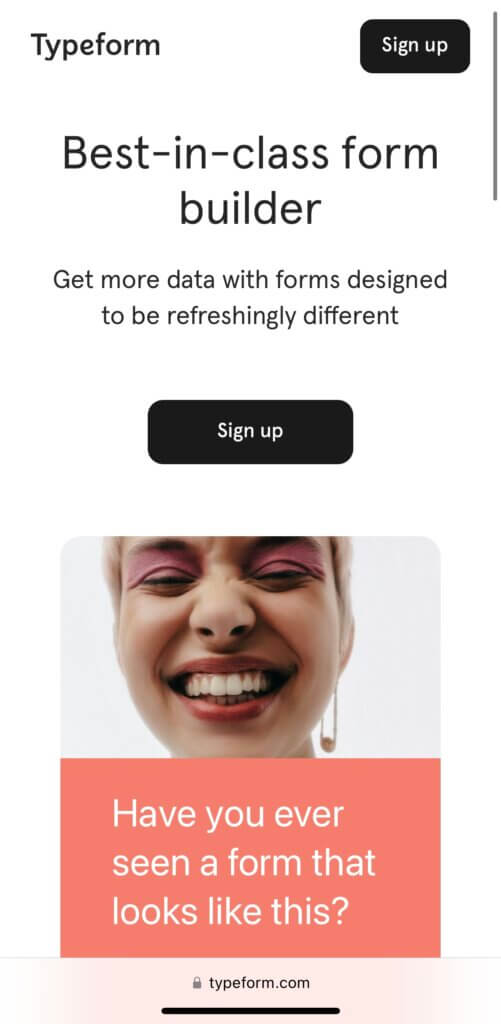
Image source: Typeform
It’s no secret that consumers are often swayed by peer reviews.
Make sure to feature testimonials and leverage social proof to reassure visitors unfamiliar with your product or services or perhaps hesitant to convert.
You can include:
Sustainable personal care brand Wild showcases its Trustpilot reviews above the fold on its new product landing page.
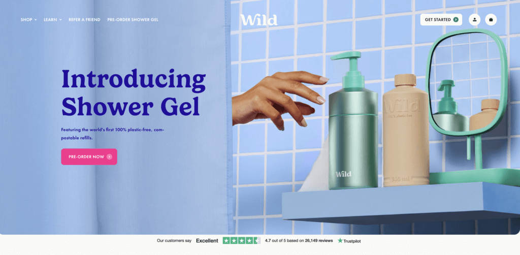
Image source: Wild
Consumers respond well to clear pricing.
If you can, try to display your costs clearly or direct prospects to an understandable rates table. And why not offer a free trial?
Shopify’s landing page is simple and has a clear CTA to signup for a free trial.
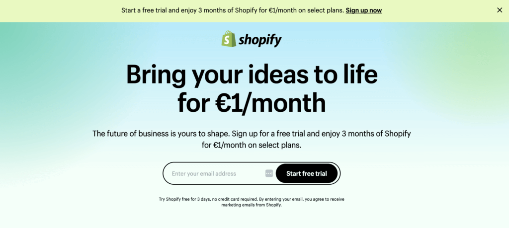
Image source: Shopify
A beautiful landing page is great. A landing page that comes up in search results is even better.
Make sure your content is SEO-friendly, and be mindful of what your potential audience is searching for. Be sure to optimize:
Not only does Semrush provide SEO tools, but its also a good example of how brands can utilize SEO to drive traffic to landing pages.
Image source: Semrush
You did it. Your visitor subscribed to your newsletter or completed a purchase. But it’s not over yet.
Don’t forget to always follow up with a “thank you” page after a user makes a conversion — any type of conversion. It’s the opportunity to reassure your customer about their choice and to once again, point out the value.
Use this page to guide your visitor towards the next steps — you could, for example, direct them to useful resources such as blogs, reports, etc.
The Thank You page is also a good opportunity for you to ask consumers to share their experiences on social media.
Source: CXL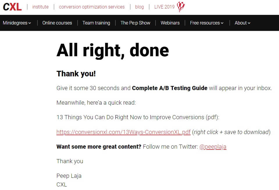
Image Source: CXL.com
While this guide is intended to give you some basic tools and advice to build the strongest possible landing page, it’s important to remember that there are as many approaches to landing page-building as businesses… and customers.
Just like your homepage and your product pages, your landing pages need to be carefully tested to surface any missed opportunity.
Here at Contentsquare, we help brands maximize the impact they’re getting from testing by adding a critical layer of customer behavior understanding to their experiments through A/B testing.
Interested in finding out how you can improve the performance of your landing pages?
We’ll be more than happy to show you how we can help your team deliver the perfect Customer Experience (CX) for every customer, every time.
Get a demo Request a personalized demo with a digital experience expert!
 Get a demo
Marrying Experimentation with User Experience: Opticon19
Customer Experience (CX) school is back in session and what better way to get ready for a new season of A+ experiences than by attending Optimizely’s Opticon19?
Centered on digital experience optimization, the conference will feature experts in the fields of CX experimentation and personalization to help you create standout experiences and steer your business towards digital Nirvana.
Taking place on September 11-13th at the Marriott Marquis hotel in San Francisco, Opticon19 is not to be missed.
We at Contentsquare are quite fond of events — we don’t just boast of experiments, we help create them. So you’re probably wondering why we’re going to this conference, given that we’re fresh off of our Digital Happiness Summer Roadshow, which hit up several states in a multi-day event.
Additionally, you’re probably wondering why we chose to team up with Optimizely, of all the brands hosting regional events surrounding the topic of UX.
Optimizely is one of our premier partners, delivering a world-class experimentation platform that equips digital teams with a scientific approach to optimizing digital experiences.
Our integration with Optimizely adds a critical layer of behavioral understanding to experiments for faster results and a bigger lift in conversions. We tell brands why some tests and personalization campaigns win, and help digital teams fine-tune variations and focus experimentation efforts.
Optimizely seeks to help brands obtain the highest ROI based on its SaaS and so do we. You could say we are a partnership made in heaven and Opticon provides the perfect setting for us to show you this partnership in action.
A three-day event, Opticon19 will kickstart the conference with a day of training on the 11th of September.
The other two days will feature sessions, networking events and a conference party. You will get to hear from some of the best and brightest in the digital space, including leaders from IBM, Salesforce and Mailchimp.
Opticon19 will include an impressive roster of keynote speakers, including actor, investor and entrepreneur Ashton Kutcher, astronaut and engineer Dr. Mae Jemison, Optimizely’s CEO Jay Larson and a host of other digital leaders.
The event will present over 20 sessions across 3 “tracks” — critical areas to learn and optimize for a superb experience that helps raise conversions. The three tracks are those of: culture and growth, strategy and process and platform and technology, each highlighting crucial nuances for your brand to digitally outperform.

Contentsquare is hosting its own cocktail event at the Everdene Bar, a rooftop bar atop the Virgin Hotel in San Francisco.
We won’t be sitting idly at the conference and our experts will be on hand at Booth G11 in the Yerba Buena Ballroom to share tips and best practices on how to power up your experimentation strategy and improve your digital CX.
We’ll be happy to show you how some of our 600+ clients have successfully put our software to use and improved on a number of KPIs and show off the newly instituted benefits from our coalescence with Clicktale.
We’re also going to host our own surrounding event just before the conference, in tandem with our friends at Tealium. Join us for an evening of drinks, fare and networking at the Virgin Hotel’s Everdene Rooftop Bar, which comes with sweeping views of the city.
So swing on over to Opticon19, meet with us at our booth, party with us at Everdene and absorb all the enlightening, up-to-date trends on experimentation and having your brand the upper hand in digital experience.
Cracking the Code of UX in Luxury Retail and Travel: Advice From Three Luxury Influencers
The luxury industry can be a tough puzzle to decode as far as user experience (UX) is concerned. The lavishness of the industry is clearly presented in the messaging of luxury brands. But underneath all that glitz and glamor lies a very serious issue for brands, one that ultimately affects their conversions: user experience on their digital platforms.
You’ve read correctly. Even the top dogs in luxury retail have to contend with UX optimization if they want to forge ahead. They have to engage their site visitors every bit as much as non-high-end industries like grocery, cosmetics, gaming and general fashion.
A lackluster digital experience on a luxury website will be reflected in the key performance indicators of luxury businesses. It will doom a business’s swath of KPIs with underperforming ROI.
So what can luxury brands do to improve their digital experience? We consulted with three influencers in the multi-faceted vertical of luxury to weigh in on how its UX can improve. From what ticks them off, to how brands can perfect their UX, we’ve garnered a bundle of insights from these three content creators in the luxury space.
User experience starts with the preferred mode of entry to a website; in this context it’s the device used. We spoke with three influencers in the luxury space: Patrick Van Negri, a content creator and social media influencer who operates his namesake website, which provides lifestyle content on fashion, travel, fitness and more.
Aftab Pathan is an influencer in the luxury travel space, who documents his traveling adventures on his website Fresh & Fearless. The site offers insight on the places he’s visited with suggestions on the activities and services of his sojourns.
Marie Olin runs Luxury Travel Diva, a website in which she shares her luxury travel adventures and advice on a bevy of worldwide destinations. Her trips span across Asia, Africa, the Middle East and Europe and her posts review exclusive properties, along with covering travel tips for those seeking extraordinary experiences.
In the ongoing digital battle of desktop versus mobile, each of our interviewees gave their own takes, demonstrating that even one’s own preference on device usage isn’t always so clear-cut. Patrick made the case for desktop, because of faster load times, a higher-resolution screen and better control of the experience. However, he admitted that he’s been increasingly shopping on his phone, shining light on the potential of mobile conversions, which are unambiguously low. According to our industry benchmark data, the luxury conversion rate on mobile sits at a meager 0.62%, despite its healthy traffic rate of 66%.
While Aftab generally prefers using his laptop, he admitted that a lot of his shopping was done on-the-go. “I don’t always get time to sit down to shop, so I often find myself scrolling through my favorite fashion apps in preparation for my next travels,” he told us. “Especially as I thrive on looking my best when traveling.”
Marie opts for desktop, proving that this device is still a strong digital contender when it comes to digital shopping, even in a mobile-first world. A computer, she reasoned, allows her to “blow up the photos and see the products more easily.”

Courtesy of Patrick Van Negri
When we asked our three influencers to name some of their pet peeves on luxury sites, their answers pointed mostly to a dissatisfaction with the products themselves; or more to the point, with how they are presented. For Patrick, one cause of annoyance is “making sure the size is correct and how the product feels once you have it in your hands.”
So how can this be rectified through changes to the CX? Brands should offer clear photos of the product in clear lighting, so that once the customer has the product, it doesn’t fall outside their expectations. Making sure you add clear size and size comparator charts will also go a long way to reassuring visitors. And if your brand has a presence in more than one country, consider helping your customers navigate different sizing standards so they can easily find their fit.
One of Marie’s biggest peeves is missing out on a bargain because her size has sold out. Notifying visitors of low stock is a good solution to this problem, as well as providing the option to be notified once a sold-out item is back in stock.
Patrick, like many other shoppers, hates “going back to the post office for a return or exchange.” This is another area where retailers can make a difference: a pain-free return policy is today a key component of a positive experience.
Aftab chimed in with a joke, referring to the obnoxious prices in luxury. But while one of the defining characteristics of luxury is that the prices are as exclusive as the products, it’s interesting to note that some brands are adopting a “pay what you want” strategy on certain products, giving customers greater control of the shopping experience.
In earnestness, he referred to the lack of diversity from certain luxury brands as worrisome. It seems that, when it comes to inclusive marketing and campaign diversity, many luxury companies are lagging behind more mainstream retailers.

Courtesy of Fresh and Fearless

Courtesy of Fresh and Fearless
But while they had great insights to share on the experience gap, our three interviewees also pointed out that some luxury brands are really getting it right. Patrick singled out GQ, Farfetch, Nordstrom, and Dolce & Gabbana. “I love the style inspiration, user experience, and the info I get prior to my purchase,” he said.
That’s why digital teams ought to consider the weight of the content when designing their UX, as it can resonate with users so much so that it leads to a purchase. The purpose of content, after all, is to not only grab attention /entertain but to establish connections that resonate.
It’s not surprising then that brands invest heavily in content to boost ecommerce conversions. But according to our data, 68% of luxury content never gets viewed, putting tremendous pressure on the 32% of content visitors are interacting with.
Aftab credits Mr. Porter as his ultimate luxury app and his partiality for this brand highlights the need for and positive outcomes of a mobile-first approach to UX. “It gives me all the latest luxury fashion essentials right to my phone, without needing to browse through various sites and spend hours finding my size,” Aftab said. “It stands out to me because it provides luxury fashion tailored towards men, and there aren’t many online stores like them, or with an app,” he concluded.
For Marie, a seamless navigation, one that shortens the path to product, takes center stage in her choosing of favorite luxury site, as well as the ease of making returns and quick order reception. “I love net-a-porter.com, she said. “It has some great designers, the site is easy to navigate, orders are sent quickly and no quibble returns. Aesthetically pleasing too!”

Courtesy of Patrick Van Negri
The luxury space is not limited to luxury retail or shopping; plenty of brands render niche offerings that obviously deal with the digital space. Since Aftab and Marie are both laser-focused on the travel niche in the luxury space, we grilled them on this subsector.
We begin with their more high level takes on luxury travel: what the best parts of it are. Aftab praised personalized service and luxurious interiors, doubling down on the former by noting the importance of “attentive service” in one sentence.
And personalization today is an omnichannel affair — consumers want tailored experiences both off and online. Behavioral analytics allow brands to deploy a deeper personalization strategy than ever before, one that takes into account more than just demographic data and enables meaningful experiences tied to context and intent.
Additionally, he raved about “my one true love, branded bathroom amenities. Nothing makes me happier!” Providers in luxury hospitality take note.
Marie also ascribes the scenery as the highlight of luxury travel, along with other particular likings. “My favorite aspects of luxury travel are obviously luxurious surroundings but just as important are the staff,” she said. “Luxury travelers want to have everything running smoothly and have competent and polite staff. A Butler is my favorite treat in a top hotel.”
Zeroing in on the UX of luxury travel itself, Aftab cites the need for wish list function for a smoother, more convenient UX.
“I would like to see more travel sites allowing you to save packages and bookings in the form of a “wish list”, the same way you can on many fashion sites. Sometimes you don’t want to book the flight, hotel or both instantly, and want to revisit it at a later date (and for the same price!)”
Whether it’s to avoid longer bookings or to have easy access for a later session, the use of a wish list is crucial, and as we’ve seen in previous research, the converting power of the wish list is proven.
Marie goes for a more general rule of thumb for luxury sites that look to improve their UX, stating the necessity for user-friendliness. She pointed to the specific examples of attaining this: by providing up-to-date information with appealing and functional (clickable) links.
Luxury travel providers, especially those in hospitality, should also make specific types of hotels or other sojourning options readily visible, perhaps with left-hand navigation categories. This is because finding them can be as struggle for users — inevitably leading to their frustration.
Aftab attests to this: “I’m very specific about the kind of hotels I choose for my travels. Often enough, I find it difficult to find a five-star hotel that fits my “vibe”, which is suitably located, and includes all the amenities/services I require during the dates I want to travel,” he said, following with a jest — “I know, total first world problems!”
Marie’s biggest frustration in booking luxury travel stays is difficulty in navigation, particularly when there’s “too many boxes to tick!” Additionally, a poor UX for her involves the insistence on certain dates of travel. She suggests luxury travel sites show an entire month of prices per one page for both convenience and even affordability. This is so — in her own words — “I can go on the cheapest date! Luxury travelers like a good deal.”

Courtesy of Luxury Fashion Diva

Courtesy of Luxury Fashion Diva
Lastly, we sought out advice from these influencers for luxury retailers in the digital space and content creators alike.
According to Patrick, creativity and originality are at the helm of an optimized user experience. Creators need to be able to find their own voice and style and steer clear of duplicating what other content creators do; if they don’t avoid the latter, it’ll stunt the growth of their brand (whether that’s a business or their own media presence).
“Just like any other content creators, stay authentic because that is the only asset you have. Also, do not try to copy what other influencers are doing. You will look cheap and unoriginal, and your potential to grow is non-existent,” he said.
He closes off with: “Innovate and do not be afraid to try new things and concepts, even if they scare you and the risk is too big. That is the only way to stand out and get ahead of your competition.”
“Don’t ever start content creation for the sake of earning money or getting “famous”, it defeats the objective of being a genuine, and sought-after content creator,” he said. “And when it gets tough, or you lose inspiration, remind yourself why you started. Let your creativity run wild!”
Alongside focusing on community-building and common interests, Aftab also believes in the need to have a unique offering, whether that be in sales or content:
“If I had to share one piece of advice, it would be to be completely true to yourself. It’s easy to get consumed with what other luxury content creators are doing around you, but the main thing is that you create content that fits your brand, aura and truly allows your personality to shine through.”
As they deal with the subject of luxury, Marie suggests that content creators in the luxury space make the content itself luxurious. “Make the content really luxurious, stand out from the ‘ordinary’, be extraordinary.”
Furthermore, she advises on the need to appeal to the target market, meaning those most apt to buy, or at least take interest in the luxury space. “Someone recently commented that my website was luxury and not for ‘ordinary’ people. This made me happy because I aim to target the luxury market!”
Closing off, she proposes that luxury travel sites ought not forget the older travel market. “Remember the older travel market! We are the people with time and money to spend on luxury trips. Older travelers want luxurious Business Class flights, top class accommodation,” she said.