Although conversions are the desired outcome of a good customer experience, they are not the end-all be-all for brands. A happy customer may make a one-time purchase, but more importantly, a happy customer will return to do business with your company time and time again.
But, how exactly do you define something as elusive as customer happiness? How do you understand the nuances of customer frustration and pinpoint what exactly fosters engagement? And, how do you turn all of this data and intelligence into an effective retention strategy that drives greater customer lifetime value (CLV)?
There are plenty of systems designed to measure user experience; these primarily deal with the pages users visit on your site, conversions, and the oft-cited biggest UX failure: bounces.
But, unfortunately, basic user experience metrics won’t give you enough insight into the nuances of users’ digital happiness. Sure, studying on-page experience, bounce rate, time on page, and other CX metrics are important, but they only give you a one-dimensional view of your customer experience. They fail to give you rich insights into customer sentiment. Fortunately, there is a metric that does exactly that: the Digital Happiness Index.
Calculated from several other behavioral metrics and consolidated into one mega metric, the Digital Happiness Index (DHI) is a unique measure of visitor satisfaction, providing an objective view of whether or not your overall experience is hitting the right notes.
In this article we’ll look at:
- What Is Digital Happiness And How Can You Achieve It?
- What is The Current State of Digital Happiness?
- Calculating the DHI: the 5 Dimensions of Digital Experience
- Making Sense of the Digital Happiness Index
What Is Digital Happiness And How Can You Achieve It?
Before we delve directly into the DHI, let’s start by focusing on digital happiness. A rather simple concept, it denotes the convenience, satisfaction, and even the pleasure of interacting with a website or online interface, such as a search engine results page (SERP).
As a feeling, it is incidentally difficult to pin down, even in the digital realm. But by using Contentsquare’s DHI metric, you can determine how happy your site visitors are, based on their experience with your site or app.
The first of its kind, the DHI combines KPIs from 5 key pillars that contribute to overall customer satisfaction:
- Flawless: Are customers enjoying a smooth experience free of technical performance issues?
- Engaged: Are customers engaging with and satisfied with the content?
- Sticky: Are visitors loyal, returning to the site frequently?
- Intuitive: Does the navigation make it easy for visitors to enjoy a complete experience?
- Empowered: How easy is it for customers to find the products and services right for them?
Is your site’s navigation seamless and friction-free? Is your content proving effective in helping visitors reach their goals? Are visitors coming back to your site? Are they exiting early or completing their journeys? And finally, are they finding what they’re looking for — be that information or products?
By quantifying these various strands of experience, and combining metrics into one score, the DHI provides brands with an objective grasp of whether or not visitors are enjoying a positive experience.
What is The Current State of Digital Happiness?
To better understand the current state of digital happiness in the world, we recently surveyed over 500 marketers and 4,000 shoppers from around the globe in our new Digital Happiness Pulse survey. Here are some of the shocking findings the survey revealed:
1. Most Marketers Can’t Measure Digital Happiness
- 77% of marketers say their brands don’t think about customer happiness as a key concern
- 84% of marketers can’t currently track the moods and mindsets of digital customers
- 76% of marketers can’t accurately measure whether digital customers are happy
If brands are going to understand and improve the happiness of their digital customers, they need to focus on using the right metrics, getting access to the right customer data, and the right technology to make the first two possible.
2. Why Today’s Customers Are Unhappy Online
- 49% of online shoppers feel unhappy when a site uses pop-ups and adverts
- 42% of online shoppers feel unhappy when they can’t find what they’re looking for
- 48% of online shoppers feel unhappy when a site or app crashes during checkout
When asked if they feel happy when shopping online, only 15% of consumers said yes. Considering that a quarter (25%) of customers feel nervous about shopping in-store since COVID-19, now is the time for brands to get serious about making online experiences just as good as — or better than — those in-store.
Every brand’s goal should be to create digital experiences that ensure customers leave your app, site, or online store happier than when they arrived. This doesn’t mean losing focus on retention, market share or brand awareness, but rather thinking about those objectives in the context of satisfying customers and building experiences they’ll love.
Calculating The DHI: The 5 Dimensions of Digital Experience
Using behavioral data from our tool, the DHI separates the data into 5 dimensions to filter the numbers into intelligible concepts behind visitors’ digital happiness. Our clients get a comparison to industry standards, and every score represents an aggregate of every session on the website.
As we mentioned earlier, the DHI has 5 components or 5 dimensions that make up its final score, a number out of 100. To calculate a site’s DHI, we take the average of the 5 scores of each dimension. To come up with this rating, we consider the following five dimensions: flawless, engaged, sticky, intuitive, and empowered.
Each of these 5 individual scores is determined by its own calculations, based on metrics like time spent on site, time spent engaging with pages/elements, bounce rates, and more.
It also takes into account if users have reached their destinations and the way they’ve done so. It captures whether users ran into UX issues like non-intuitive navigation — clicks on non-clickable content, misleading clicks, etc.
Making Sense of the Digital Happiness Index
Innovations in SaaS and marketing have led to more avant-garde methods of measuring digital customer experience and benchmarking customer satisfaction.
Although the complex, 5-tier system of our mega metric is supplemental, it is very much in line with our granular approach to behavioral analytics.
The fact that the 5 dimensions deal with different occurrences in the UX means the DHI is casting as wide a net as possible to capture your customer’s mindset. Based on this score, you can shine light on areas of friction and other obstacles in the customer decision journey.
Customers today will not hesitate to review a poor UX or give one star for a session that doesn’t meet their expectations. But they are also giving you continuous feedback on your site or app through their interactions — with every tap, click, scroll or hover, they are voicing their feelings about your CX.
Here at Contentsquare, we give brands the tools to capture this on-page feedback so you can hear and understand what your customers feel and want.
Happiness of any kind is difficult to pin down to a numerical format. But, by combining the 5 pillars of the UX, you will come as close as possible to determining how digitally happy your visitors are with your content.
How Contentsquare is Helping The French Government Fight Covid-19
Since the onset of the pandemic, people have been scrambling to find accurate, reliable sources of information on the virus and how to keep themselves and their loved ones safe. In France, many people turned to the Government Information Service (SIG), or the government agency in charge of official Covid-19 communications, for credible information about the virus.
The SIG’s coronavirus website has been a destination for the latest up-to-date Covid-19 information including how to recognize common symptoms, where to get tested, the latest local infection rates, travel restrictions, and more. These pages allow French users to find the answers to all of their questions related to the virus. Because the organization was putting out such critical and timely information, the SIG wanted to make sure users were able to easily find and access the content they needed to stay informed on how to manage the spread of the virus.
Over the past months, Contentsquare has been partnering with the SIG, giving the agency free access to its experience analytics platform to help government teams optimize the journey for visitors to the Covid-19 site.
“Faced with the impact of Covid-19 on the daily lives of French people, it is essential for the government to offer French people a point of reference and quality,” explained Michaël Nathan, the Managing Director of the Government Information Service (SIG). “These informational pages must be user-friendly and accessible so that everyone can find answers in just a few clicks.”
“Our top priority is eliminating user frustration and misunderstanding for our visitors. We would have failed if a visitor couldn’t find key information to safeguard their health or aid their daily life. That’s why we accepted Contentsquare’s offer to help optimize navigation on the government site,” said Nathan.
Using Contentsquare insights, the agency was able to understand how users were interacting with the site, which in turn allowed them to build a clearer, more fluid navigation. Using behavioral data to inform their daily adjustments and page modifications, they were able to ensure users find answers to their questions in just a few clicks.
“We wanted to feel useful and be part of the outpouring of solidarity that we have seen all over France and around the world,” commented Jonathan Cherki, Founder and CEO of Contentsquare. “Helping the government optimize the design of its Covid-19 information website, seemed liked an obvious move to us, and we hope that it has made everyday life easier for the French people.”
Once quarantine orders had lifted, the SIG broadened their use of the platform to analyze the performance of the whole site (the homepage, research pages, etc.) to identify areas for improvement as part of an upcoming website design overhaul. Now, reliable information is just a click away.
Impact of Coronavirus on eCommerce: Digital Activity Decreases But Pure Play Brands Set To Emerge Stronger (Update 16)
To provide understanding during this uncertain time, we are monitoring the impact of coronavirus on online consumer behaviors. See the latest data on our Covid-19 eCommerce Impact data hub.
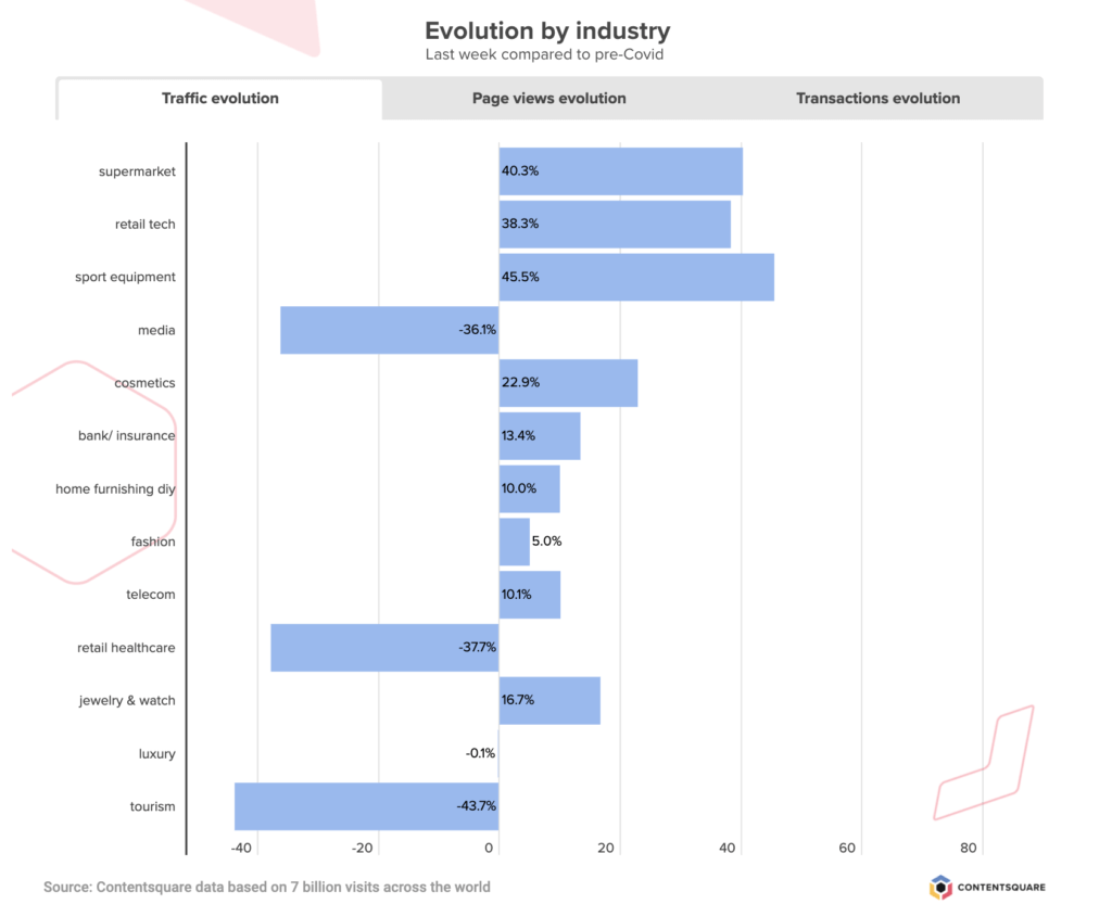
As countries and cities open up again, or move to the next phase of their post-Covid plan, consumers everywhere are reconnecting with what it means to go into a non-essential store to make a purchase. We’ve been paying attention to digital shopping behaviors this past week (and since early March), to understand how the Coronavirus crisis has impacted online activity and businesses across industries.
We’ve analyzed more than 10 billion sessions — monitoring traffic, transactions and customer engagement — to see how the unfolding situation has affected digital business. To understand these changes, we’ve compared data from each week with the period immediately preceding the introduction of social distancing and store closures in the West (or, the first 6 weeks of the year, which we call the reference period).
This is what we observed this past week:
Traffic Goes Down For Fifth Consecutive Week But Transactions Remain Strong
Global digital traffic has been decreasing steadily since mid-May (coinciding with the first wave of store reopenings in Europe), with a new -4% drop in the volume of visits this past week. This puts digital traffic today at +6% pre-Covid levels, although a breakdown by industry shows that some sectors are still seeing up to +45% more visitors than back in February.
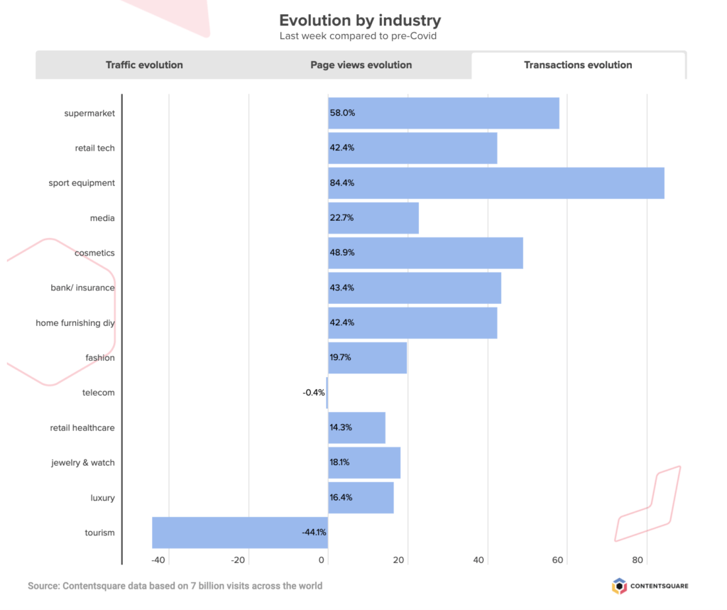
Transactions however have not been dropping at quite the rate of digital traffic, with a -3% drop this past week, that does little to make a dent in the +29% transaction increase recorded since the onset of the crisis.
The UK is responsible for the greatest leap in the volume of digital transactions (+63%), while France and Germany have recorded slightly more conservative increases (+14% and +17% respectively). The US numbers are very aligned with the global average, with +28% more digital sales than before the introduction of quarantine measures.
 Traffic to Fashion Sites Stabilizes As Pure Play Businesses Emerge Stronger
Traffic to apparel sites remained steady this past week after several weeks of dwindling digital activity. Transactions were also stable, following a 40 point drop since late May, and the volume of digital sales today is +20% greater than it was before the crisis started.
We also compared traffic and transactions between click-and-mortar and pure play brands, and found that, since reopening, pure players (with no / limited retail) are experiencing more stability with their digital activity. Brands with physical stores are doing slightly better today than their online-only counterparts, but their volume of transactions has been decreasing steadily since late May, while pure play brands appear to be maintaining the increase in sales week on week. As of now it certainly looks like digital-only brands are emerging stronger from the Coronavirus crisis, particularly when you consider that for these storeless brands, extra traffic and transactions are net gains while for retailers the surge of online business was there to compensate for the drop of retail activity.
Grocery Sector Loses Traffic But Digital Sales Still Strong
Online grocery traffic continues on its downward trend, having steadily decreased since the massive surge in the third week of March and a more discreet peak in early April. This last week brought a -13% drop in the volume of traffic to grocery sites, but despite this latest decrease, the sector is still enjoying +40% more visits than before the first social distancing orders. And while transactions may have dropped -15% this past week, the global volume of online grocery transactions is still +58% higher than before the start of the crisis.
The breakdown by country reveals different dependencies on digital for food and household staples with France almost back at its pre-Covid levels of digital grocery transactions, the US at around +50% more, and the UK in the lead with more than double the number of sales. As other non-essential businesses open their doors, it will be interesting to see how a ‘return to normal’ shopping habits impacts the collective reliance on online grocery stores.
Tourism Sector Still On The Road To Recovery
Traffic and transactions on travel sites went up +7% this past week, marking another week of growth for the sector that has suffered the most since the start of the crisis. This latest positive chapter makes a small impact on the sector’s digital activity, and globally, travel sites are still experiencing -43% less traffic than it was back in February, and are recording -44% fewer transactions.
France is catching up faster than any other country we analyzed, and is today seeing -20% less traffic than it was before the start of lockdown and -25% the number of transactions. The US is the country that has suffered the biggest drop in visitors although interestingly, transactions are picking up faster in the US than in the UK, despite the UK boasting more traffic.
Have you registered for Summer Camp yet? We’ve put together a six-part series for adventurous experience-builders looking to capitalize on the summer months to fast-track their digital transformation. Join us for our next campfire session with Walmart, to explore common digital challenges and how best to tackle them (A/B Testing merit badge, anyone?).
Introducing the New Zoning Analysis: Our Signature Feature is now More Powerful and Easier to Use than Ever
After months of hard work and dedication, our Product team is ready to unveil our new Zoning Analysis with a more complete experience than ever.
So how did Zoning Analysis become Contentsquare’s most-loved feature? The answer is simple. In essence, you get intuitive and flexible visualizations that tell you why visitors engage, hesitate or get frustrated by overlaying key UX metrics directly onto your website.
With these clear business and engagement metrics, it has never been easier to understand and explain differences in customer behavior. With a clear view of what site visitors find engaging and helpful, versus what might be considered obstacles along the user journey, teams can quantify their content decisions at a glance, and easily get rid of friction. This granular read of visitor behavior also grants brands a way to attribute revenue to their content and UX investments.
What makes all this so practical is that Contentsquare’s single tag captures every single customer interaction, including every click, scroll, hover and swipe. The platform automatically captures behaviors on dynamic content and historical versions of your site, enabling you to jump straight to your analysis.
In a world where every business is striving to exceed the latest standards of speed, ease-of-use and seamlessness, we believe digital CX stakeholders should also enjoy an optimized user experience. That’s why we’ve now made your favorite power tool for in-page analytics even smarter and easier to use.
Say Hi to Our New Zoning
Having worked closely with our customers on a solution that provides answers to real-life use cases, we’ve completely revamped our Zoning Analysis so teams can answer questions faster and even more efficiently.
The new Zoning Analysis is even more tailored to our operational goals: fast and easy to use.
Agathe Orsoni, Digital Marketing Manager at Petit Bateau
We made Zoning Analysis inside the platform as quick and easy to use as CS Live, our nifty browser extension. With our Live Zoning, your website becomes your dashboard. Simply browse your site including dynamic content and drop-down menus, overlay metrics in one click and answer questions on the spot.

Need to dig deeper into the data? Take snapshots to save them into Contentsquare, analyze any element of interest or track its progress regularly.
Comparison Made Easy
Let’s say you recently launched a new campaign and want to analyze the performance of your hero banner before and after adding a new promotional offer. Or, you just performed an A/B test and want to compare different A/B test elements side by side. By comparing the two, you immediately see why one version performs better and can take actions based on your visitors’ preferences.
Spot a win or a decision you want to celebrate? Simply export your analysis as a PDF to share with key collaborators, whenever you need.
“The intuitive new Zoning allows us to make more detailed analyses especially on CRO / AB Testing subjects where all test variations have to be studied. The new side-by-side functionality allows us to compare the data of each test variation more easily and to learn the best lessons.”
Hazel Dinler, CRO Analyst at Sephora
Ease of use and speed to insights are the key pillars of our new Zoning Analysis. At Contentsquare, we believe in making decisions based on data, not opinion. And we think this level of customer intelligence should be accessible to all. Zoning Analysis was designed to be used by everyone — its highly visual metrics can be leveraged by anyone, not just analysts, and allows everyone on the team to pursue shared goals autonomously.
If you want to learn more about our new, improved Zoning Analysis or if you’d like to see it in action, we’ll be happy to give you a tour!
NEWS: Contentsquare launches most complete experience analytics platform in industryNEW YORK, Oct. 21, 2019 /PRNewswire/ — Experience analytics leader Contentsquare today launches a major release of the most complete experience analytics platform on the market, helping brands to innovate based on customer behavior across digital channels.
Contentsquare now gives brands the ability to surface and quantify revenue-generating recommendations for experience improvements using artificial intelligence. Contentsquare customers can use these recommendations to immediately troubleshoot issues or innovate new ways to improve the experience. For example, teams can quickly understand the impact of changes to a web site or mobile app by comparing side-by-side the visitor experience over time or across split test versions.
This update to the platform is the work of a combined team of 170 innovators in R&D and product development who came together through the combination of Contentsquare and Clicktale, which was announced in July 2019. The teams have been working closely with customers to prioritize the use cases that drive the most return and upside for digital leaders across industries such as retail, travel, automotive, financial services and telecommunications.
The benefits to Contentsquare’s customers are huge. Armed with quantified alerts, the tool gives resource-stretched digital teams the ability to discover new growth opportunities to increase revenue, (worth up to nine times the revenue opportunity of fixing bugs). It also aligns the whole business around a single version of the truth with regards to digital customer behavior, with intuitive visualizations of macro behavior, and session replays for seeing behavior at the individual session level. As a result, teams can more quickly and confidently prioritize and execute on the experience changes that will mean the most for their business.
")
Feliz Papich, director of product management at Crocs, said: “Contentsquare aids our ability to innovate, giving us more room to do insight-driven experimentation with less risk. With the visualizations, we don’t have to make assumptions about the visitor experience, we can make enhancements based on tangible behavior. Contentsquare makes it easier for us to have the hard discussions about what to prioritize and implement to meet our big growth goals.”
Contentsquare’s new platform, available later this quarter, helps brands capitalize on the fact that consumers who receive a better customer experience spend up to 140% more than when they receive a poor experience (Harvard Business Review). It also helps brands operate more like best-in-class digital businesses, which can have 2-3x the lead generation and sales conversions versus the average according to Contentsquare insights.
Jonathan Cherki, founder and CEO, Contentsquare said: “At Contentsquare, we envision a world where every digital interaction is used to create better experiences and improve the quality of people’s lives. Traditionally, the barrier to turning that vision into a reality is that brands have been in the dark when it comes to understanding specifically how to design the experiences their customers will love and want to use again and again.
“With our technology, though, we are empowering brands with unique behavioral insights to create better experiences — and connecting those improvements more directly to the upside they drive for their business and for their customers.”
There’s a lot to learn from the way site visitors browse and interact with your website. Then there’s customer acquisition marketing, since before users navigate your site, they must be acquired, which is a digital marketing feat on its own. Much of what we cover is UX (user experience) — the environment and associated feelings users undergo on your website and other digital offerings.
But drawing users in is a major step, a push further down the sales funnel, bring them closer to conversion and certainly a crucial to brand awareness. Sometimes it involves perfecting the UX as well, except as an alternative to onsite behaviors, it deals with those on acquisition channels, some of which you can customize, i.e., social media.
As the final installment of our 3-part series covering the UX International Map, this iteration will edify you on what customer acquisition marketing channels look like through a global lens. After all, if you’re going to set up websites for different countries, acquiring the users of these countries and their distinct acquisition manners is key to be mindful of.
Acquisition Channel Methodology
In the past 2 UX map lessons, you’ve read that we parsed through over 35 million visitor sessions in January and February 2019 on 11 luxury websites — that’s 150 million page views and 3 billion clicks.
The 7 countries we focused our analyses on were: the US, UK, France, Germany, Italy, China and Japan.
For each of the 7 countries we surveyed, we analyzed the performance of 12 acquisition channels — both paid and unpaid. For each country we scrutinized, we asked the following questions to get a deep read of how websites were gaining visitors:
- Do consumers prefer free or paid channels?
- How do they arrive at your site?
- Did users do independent research or follow a recommendation?
Free Vs Paid Acquisition Channels
The chief divide of digital acquisition channels is whether they are free or paid. Free acquisition channels, as their name suggests, are outlets that you can leverage for free. They encompass the following:
- Organic search results (SEO)
- Direct traffic
- Referral traffic
- Social media posts (unsponsored)
Paid acquisition channels are cost-based and these costs are not unilateral. In other words, while PPC ads will cost you for each click on the keyword you bid on, affiliate marketing will cost you the amount agreed upon with your affiliate marketer. These channels include:
- Paid Search (SEM/PPC)
- Paid Social (sponsored content)
- Display Ads
- Affiliate Marketing
- Emailing
- Brandzone (Baidu)
- Retargeting
- Influencer marketing
The Global Majority of Online Consumers Prefer Free Acquisition Channels
While it’s patently obvious that brands and marketers prefer to acquire consumers through free means, our analysis has found that even from a consumer standpoint, the preferred method of arriving at a new website is from a free traffic source. With a 61% global average share of traffic from free channels, this is something of a global consensus.
The customer audiences in Japan and Italy are at the higher ends of the free acquisition spectrum, as they reach websites through free channels at the respective rates of 69% and 65% of their total acquisition. The US comes in at third, with 62% of its site visitors springing from free acquisition channels.
France has the lowest share of traffic from free channels, at 55%. Germany and China come in second at the low end of the free channel spectrum with traffic rates of 58% from both countries.

Global visitors mostly arrive at a site via free traffic acquisition, although France drives a large portion of paid traffic.
Acquisition through Consumer Research or Recommendation
Another way to gauge customer preferences and segment behaviors is by analyzing whether visitors land on your site from independent research or by following a product recommendation. It’s crucial to study this, since some consumers arrive at your website through their own due diligence from research, while some need to be marketed to concertedly, i.e., in a direct way, often involving recommendations. (Think targeted ads and sponsored social content).
Here are a few independent research channels:
- Organic search (SEO)
- Paid search
- Direct
Here are a few recommendation research channels:
- Social
- Paid social
- Display
- Affiliate Marketing
- Emailing
- Referral
- Brandzone
- Retargeting
- Influencer Marketing
So which acquisition method, independent research or product recommendation takes the victory among our swath of global consumers? In this type of acquisition square-off, the emerging winner is independent research, which holds the majority across every country we surveyed.
In Italy, 92% of consumers reach a site through their own research, overshadowing the country’s 8% of consumers who reach a site by following a link. China is at the lowest end of the independent research gamut, with 54% of its users reaching websites through their own research, but even this lower rate shows a favorability among consumers to visit a website based on their own findings instead of recommendations made to them.
Japan and the US follow Italy, with a respective 81% and 80% of users landing on a website through independent research.

Independent research drives most global visitors to a site, but has a varying traffic share per country.
Organic Search Traffic Dominates in the US, Italy and Japan
Organic search traffic (SEO) overshadows paid search, affiliate marketing and other acquisition sources in the US, Italy and Japan. This is due to the dominance of free acquisition in these 3 countries, raking in over 40% of user acquisition in these 3 countries, with a massive 70% in Japan.
Traffic from SEO has the highest influence in Japan, with 48% of traffic coming from organic search. Italy ranks in second on SEO acquisition, with 40% of consumers reaching websites this way and the US comes in at third, with 32%.
Reel in Traffic with Display Ads in China
Gaining site in traffic is heavily dependent on display ads, along with the Baidu Brand Zone technology. Procuring 28.2% of all traffic acquisition in China, this channel is a force to be reckoned with in order to increase site visitors. While globally, there is far less dependence on this channel (only 4.1%), in China it is a key player in obtaining traffic. Display ads go in tandem with this channel and also fall within the trend of using visuals to keep users interested.
Email Marketing and Social Reign Supreme in the UK
In the UK, customer acquisition is contingent on social marketing efforts. At 12.4%, social customer engagement spurs twice as much traffic in the UK as it does in any of the other countries surveyed. Aside from social, email campaigns are also drivers of successful traffic, raking in 6.7% on desktop and a heaping 18.4% on mobile. Organic search traffic lags behind in the UK, as far as traffic is concerned, accounting for only 23.1% of traffic, as opposed to the global 31.5% global ranking.
France is All About Paid Tactics
Whether it’s coming from SEM, PPC or paid social, paid tactics are driving up traffic in France. Paid channels account for almost half of all French traffic at 45%. This traffic mainly comes from paid search, which rakes in 29% of the traffic. SEM in France brings in roughly a third more in traffic than in all the other countries we analyzed. A significant part of the traffic in France is wrought by paid social — 8.4%, as opposed to the global average of 4.7%.
German Traffic: Paid Search and Direct
German traffic acquisition is dominated by two sources: paid search and direct traffic. Paid search yields 27.3% of all traffic in the country, while direct traffic is even more powerful in drawing in users, as it’s higher in Germany than any of the other 6 countries at 26.1%. The direct traffic average globally is at 21.9%. High direct traffic visitations suggest that visitors in this country have a vested interest and loyalty in big-name brands.
Optimizing The Landing Page — Whatever The Traffic Channel
Understanding how your site acquires visitors, who might later become customers, is as crucial as studying the UX of your website. After all, no matter how ideal your UX is, it won’t matter if little to no one arrives at your website. As such, acquisition channels provide a kind of hook, line and sinker approach where acquisition is concerned.
Acquisition channels are markedly useful and necessary for drawing in customers, but you must remember their limited scope in your overall digital marketing strategy. As their name suggests, they are good for acquisition but have little to do with retention. These channels may even hurt your UX and thereby conversions if these channels redirect visitors to irrelevant pages.
This is why the landing page is a critical aspect of acquisition — and retention. A landing page that’s relevant and optimized for users will maintain a good UX and digital happiness. So make sure to study the elements of your landings pages and see which ones are detrimental to the customer journey. There’s no point in optimizing acquisition only to lose your customers later on.

Analytics have made a splash in the realm of marketing, to say the least. The need for data is more apparent than ever, as more brands are marketing themselves under the coveted category of “data-driven.” In reality, they are not becoming data-driven fast enough, if at all.
We can vouch for the fact that data trumps intuition, but aside from arming yourself with industry data that relates to your vertical for market research, it’s also vital to compile site data on your own site visitors. That’s where digital experience analytics solution enters the picture, and it does so in a substantial way.
Most web analytics platforms show how a websites is accessed, along with some of the activity that occurs on it. Granular digital experience analytics takes this further, in a concerted effort to measure digital customer experience (CX). As such, it offers acute data sets, visualizations and metrics that evaluate and quantify how visitors interact with the individual elements of your website. But not all user experience analytics solutions provide the same granularity of data.
Most analytics platforms do not take user insights a step further, so they do not give you a more granular performance review of your site or app, meaning that you wouldn’t be able to comprehend how each in-page element is used and how it contributes to a broad set of KPIs.
In short, user experience analytics is a functionality designed to give you insights into visitors’ user experience. It’s incredibly important for both marketers, web developers and designers alike, as it dictates their strategy and implementations. But not all DX platforms offer the same capabilities.
So why exactly does digital experience analytics matter? Let’s find out.
Understanding Your Customers
If you don’t understand your customers, your website will show, leading to reduced activity, heightened bounces and poor conversion rates. Digital experience analytics allows you to segment your audience based on their behavior, and unlock a much deeper understanding of their needs and expectations.
From what visitors are trying to achieve and how they want to go about achieving it, to what causes frustration along their customer journey, analytics gives brands a nuanced read of these occurrences. Pure play brands are masters at leveraging this type of customer intelligence as they hyper-target their offerings to specific segments. With this approach, they are not attempting to be all things to all users, but are tapping into the minds of their most profitable segments, implementing high levels of customization.
Behavioral analytics can highlight visitors’ distinctive behaviors on your website, such as where they are most engaged, where they click and how often, the frequency of their hovers on a particular part of a page, the time they spend per page or element and much more.
We recently helped, travel leader Pierre & Vacances identify customer preferences for targeted optimizations. After analyzing customer behavior on its holiday property search results page, the brand found that site visitors were interacting heavily with the “number of rooms” filter (it had a high click rate and a hearty dose of conversions).
However, this filter was lost among a wealth of other filtering options. Based on this intelligence, the brand placed the filter in the second position on the filter bar, making it easier for users to find it.
The moral of their story is that once you’ve figured out through DX analysis what your users’ precise intentions are, you can then go about improving your digital experience to allow them to seamlessly complete their intended tasks without incurring any frustration.
Additionally, it’s interesting to learn about online behaviors of visitors in different regions of the world. As per our Global UX Map, a comprehensive report on the user behavior of visitors in 7 countries, we’ve found just that.
For example, we learned that visitors China are happy to engage with visuals, with a slideshow click rate of 5.5, so adding product images on your China site makes for a great UX. On the contrary, using a lot of visuals like slideshows is less well-received by visitors in the US and Italy, which have the respective click rates of 1.3 and 2.5 on the slideshow, the lowest of all the surveyed countries.
In both of these cases, DX analytics has the prowess to empower digital teams with localizing knowledge that can assure a positive UX for global users.

Creating Data-Driven CX Decisions
Digital experience analytics matter where website design is concerned, as it dictates what the experience will look like for visitors. If it doesn’t, chances are, your analytics platform isn’t very robust and offers little else aside from a traditional traffic analysis.
A granular user experience analytics space empowers its users to make data-driven CX (customer experience) decisions, and if you couldn’t tell from this blog, CX is not something to ignore. It is critical for the sake of both acquisition and retention, especially the latter, which is important for maintaining a steady revenue stream.
With data providing multiple reference points to optimize your content, you can do so innovatively and confidently. An optimized CX will make it so that you can streamline your customer journeys and remove frustrations, the latter of which impedes conversions. It can also help you detect if there are any errors in the elements that yield conversions themselves, such as CTAs, form fields and buttons that signal making a purchase.
But it doesn’t end with conversion-bound elements. A deep experience analysis can identify a host of other faulty site elements which stir your site visitors into leaving. That’s where a data-driven analysis comes into play, finding pesky problems in the design and structure of your website that can have grim consequences on your CX.
A data-backed CX optimization plan acts as a security net for brands seeking to try new things on their sites. Perhaps there’s a trendy feature you want to try out or a new setup of a crucial site element. Delving into new implementations is a rocky road, but with data on your side, you’ll be informed as to what works and what doesn’t.
Furthermore, making data-driven decisions allows all team members to own business goals, measure the contribution of their revenue and quantify the ROI of the experience.
Making Headway in Conversions
After you’ve done your CX homework, testing what strategies work and keeping close tabs on how your website is used, you check to see the impact. Which ROI is more important than conversions? Most marketers would agree that conversions are of the utmost importance for a business if not one of the most important.
Aside from boosting conversions, digital experience analytics assists in all the steps leading up to conversions, as it visualizes user flows with customer journey mapping. Understanding how users navigate your site is the first marker of what needs to be improved, along with indicating what works and what drives interest among visitors.
As such, granular analytics provides the relevant data and metrics for CRO (conversion rate optimization). Optimizing conversions always starts with measuring the experience on your site and/or app. As for preserving retention, a chief business goal, digital experience insights will assure you know what works and what doesn’t — essentially giving you more knowledge into how to retain conversions by keeping hold of the same site visitors.
Getting The Most Out Of Digital Experience Insights
Digital experience analytics carry weight with the entirety of your user experience, as it can quantify a host of user data: their interactions, hesitations, frustrations, etc. on your website. Because of this, it should be a top-priority implementation into your marketing plans. However, not all user experience platforms have the same built-in capabilities — particularly the actionable, full-picture data of all the goings-on of your website.
For example, not all of such platforms analyze individual site elements and how they fare in traditional metrics, let alone more robust ones. So you should be selective when choosing your experience analytics software. Don’t forget: you ought to aim for retention over acquisition, as once your users visit your site and enjoy what they experience, the likelihood of them returning shoots up.
There’s More to Conversion Rate Optimization
You’re probably aware of the weight that analytics carry in your overall marketing executions. While quantitative analytics solutions give you a good indication of what is happening on your website (conversions, bounces, etc), they don’t present a granular understanding of your customers’ user experience. And when it comes to conversion rate optimization (CRO), the more you know, the better.
Behavioral analytics put forth a deep reading of how visitors interact with individual elements on your web, mobile site and app. By tracking advanced KPIs, behavior-based solutions allow you to discover high points of friction and hesitation, which traditional programs analytics do not offer. They also reveal the areas of your site that contribute to engagement and conversion goals.
Let’s take a gander at the more latent analytics waiting to be used at your disposal for CRO.
Behavioral Analysis to Improve Conversion Rates
In the context of website and mobile analytics, behaviors and their derivative behavioral analysis can be narrowed down to a few quick, yet vital actions that users take on your website.
So what are behaviors in the context of site analytics? A behavior is a navigational action made by a user that gets recorded by a tag. Such an action can be culled and accessed as part of a UX optimization strategy to improve a website’s conversion rate. Behaviors can include page views, clicks and hovers (to name a few) — with each event painting a nuanced picture of how your site is used.
Since 90% of behaviors occur between clicks, a true observation into behavior would require looking at the behaviors beyond clicks alone. These include the behaviors not limited to a single action, such as frustration, hesitation and engagement.
Being able to understand the customer story behind behaviors is key to rolling out the improvements that will have a positive impact on engagement and conversion rate optimization. Clicks, for example, can signify both interest AND frustration — what matters is figuring out which it is.
Behavioral Analysis Starts with Customer Journeys
The first step of a behavioral analysis is to identify where on your site lie the biggest issues and opportunities. This comes from surveying the customer journey. This journey grants a step by step view into how visitors traverse across your website, mobile sites and apps. You can see all the pages users have visited to put together the story behind their digital journey: where they leave and what has led them to conversion. These paths make up the user flow, a crucial aspect of UX that gives you a clear vantage point to the visitor’s intent, which is much-needed to landing conversions.
For example, a site visitor may be on your site for a number of reasons: to window-shop, check out their local store’s opening hours, add a promotional code to a cart to see the price difference, etc.
Customer journeys are visualizations that shine a light on user intent — vital information when you’re trying to develop a customer-centric digital experience. Understanding customer intent will help you optimize your content and know how to best guide visitors down the conversion funnel. It’s also the cornerstone of a satisfying experience, which itself is a guarantee of long-term customer loyalty. If visitors do not convert on their first go, a good UX will spur them to in future visits.
For example, a number of airlines have earned a negative reputation due to their substandard customer experience. But their low prices have gained them the ability to capture a solid customer base. Airlines that offer low prices coupled with good customer experiences (including digital) will undoubtedly give these shoddy airlines a run for their money due to their competitive edge.
Customer journeys present you with a detailed view of where your visitors drop by on your platform, a function that allows you to see where they enter, where they head to next and all the pages in between exits and conversions. Viewing them will help you understand how your site is being used and how to optimize these journeys to ramp up the conversion rate.
For example, if the bounce rate for a landing page is at 60%, a behavioral analysis will provide insight into why visitors are bouncing. This is because it shows you what users do on a page before they bounce, which you ought to look at to make the proper optimizations.
Other issues affecting conversions can manifest as repeated attempts on a payment or login page. This suggests a struggle and thereby, frustration within users. Identifying this is a must in order to improve the conversion rate.
Zone-Based Heatmaps for Better Readings
Now that you’ve identified your most critical opportunities and issues, the next step is to answer why they are happening and how you can improve. That’s where we dovetail customer journey analysis with zone-based heatmaps, as they perfect the heat map with a more granular measure of digital behavior. Traditional heat maps appear as a big blob of colors on a page, showing the areas with the most engagement. They don’t however, give you insight into the performance of each page element.
That’s where zone-based heat maps come to the rescue. Like regular heat maps, zone-based maps are highly visual aides that display the most and least popular places on a site page in different colors. However, they have the added capacity of gauging each site element, so you can understand how visitors interact with each one, and what role they play in the overall customer experience.
To do this, zone-based heat maps are numbers-based, so along with the colors, they display attribution and performance metrics, such as click attribution, time spent on each element, conversion rates, revenue per click, etc.
Having this information on hand can help teams pinpoint precise areas of hesitation and engagement, allowing them to carry out targeted, data-backed optimizations. For example, rethinking the location of an image that visitors find attractive but is hidden beneath the fold can have a positive impact on revenue.
What’s more is that today, teams don’t even need to tag elements manually, thanks to the technology that scans all your site elements with precision, identifying CTAs, photos, text, carousels and other content in the process. This kind of smart technology is far ahead of the kind you’d get with a traditional analytics solution.
Reining in Confusion & Interest by Observing Hesitations
Behavioral analytics has the capacity to determine not just where people visit, but to also reveal what feelings individual elements of content trigger within visitors.
One of the things it can reveal is if and where users are hesitating on your website. You can leverage hesitation time, a metric that relays the average time elapsed from the last hover to the first click on a zone, which shows you whether your content is easily understood, or if it causes users to hesitate. Understanding this gives you a data-backed picture of the content that stalls visitors — crucial knowledge when deciding on where to optimize the UX for better conversions.

Scroll Behavior to Identify Exposure
Scroll behavior is crucial to evaluate in order to optimize conversion rates. A user’s scroll behavior depicts which part of a page garners engagement. When analyzing scrolling behavior, you can surmise that users are scrolling when they read something or are in search of a particular piece of information. In either case, there exists some level of interest in your content.
This behavior allows marketers, along with web designers to comprehend exactly how to tinker with page length, or the length of an in-page element that has a scrolling function. In short, scrolling behavior provides context into the impact of longer content. This is especially important for conversion rate optimization, as many scrollable elements lead to CTAs.
Scrolling behavior can be analyzed by way of exposure time, which you can use to see the elements users are scrolling past, to see if they are missing or ignoring a particular element. Or you can also refer to exposure rate, which reveals how far down users are scrolling on a page on average.
This can help you uncover real gems under the fold — areas of the page where visitors who scrolled far enough stopped to linger and engage with the zone. This insight, combined with the hover to conversion rate, can highlight highpoints of visitor engagement that would benefit from more visibility.
Measuring User Engagement with A Designated Metric
Conversion rate optimization can be bolstered by creating engaging content, but no matter how well you think your content is faring, it has to be measured for its efficacy. Traditional analytics fall short here because it cannot distinguish whether an abundance of clicks conveys positive engagement or frustration. Fortunately, there is a formulaic way to measure user engagement.
With the engagement rate metric, you can determine how intuitive your site elements are, i.e., how well users are able to understand how they work and what they do. The metric is calculated by dividing the number of page views who click on a zone by the number of page views with a hover on the zone. This represents the percentage of visitors who clicked on a zone or element after hovering over it.
Clickable elements, especially those that lead to conversions, should have high engagement rates, as this metric essentially shows if a zone has good affordance in light of clickability. So you should make all the aspects of the zone underscore that it’s clickable. This metric will show you if you need to make any changes to such site elements.
The engagement rate of an element can also be used to guide you where on a page to place an element. For example, elements with high exposure and a low engagement rate show that while visitors see these elements and are hovering over them, they don’t click.
Such a scenario reveals either confusion or a lack of interest in users. Thus, this insight points to the need to clarify these elements, i.e., they should clearly show why users should click on them and what they’ll see when they click.
Performance Targeting by Way of Benchmarking
Performance targeting comes from a kind of competitive analysis, one that brings you a side-by-side comparison of content element performance and the like. Performance targeting provides data and insights on how your website is performing against industry averages, essentially showing you the behavioral standards sector by sector.
Additionally, it scraps the need to scout out analytical sources of industry averages, which are not readily available to the public. Performance targeting puts various benchmarks on display for comparison (such as engagement, conversion and revenue). Additionally, it provides insights into content element performance — average locations and sizes for common site elements like the search bar, menu and homepage hero banner.
Lastly, it shows the typical behavioral standards on websites in a particular industry. This allows you to determine exactly what type of content to target and how to modify for better engagement and CRO.
Summing Up Unique Behavioral Analysis for CRO
Collating analytics should — and usually does — involve examining the most relevant metrics for conversion rate optimization. These bits of data will help you configure the best practices for the UX, as well as weed out the harmful elements of your website. But common behavioral analyses and their corresponding metrics like bounce rate and conversions are not enough, certainly not for conversion rate optimization. To tap into the minds of your site users and potential customers, you need to employ a unique behavioral analytics solution, which provides additional data-based perspectives and a slew of insight that will prove invaluable for conversion rates.