You’ve spent the last few weeks making merry with friends and family, and it’s likely you overindulged. Today, you don’t want to look at another cookie, and you’ve swapped the booze for green juice. You’ve resolved to fill the next decade with yoga and maybe even meditation.
But what are you going to do to improve your digital strategy in 2020? How are you going to go about building a healthier, nourishing, more blissful experience for your customers?
Here is our roundup of 7 trends we think should guide your digital resolutions this year.
1. The experience wars heat up
The numbers have been out for a while: the gulf between businesses’ perception of their own customer satisfaction versus the consumer’s reality is widening. On the other hand, brands that are synonymous with excellent Customer Experience (CX) are reaping outsized benefits. According to a Forrester report, insight-driven companies are growing 7-10x faster than the average enterprise.
The key to a great CX lies with… your customers. The new standards of experience demand greater, smarter customer proximity — one that hinges on a true understanding of what your audience expects and how it wants to connect with you in 2020 and beyond. If you choose not to go all-in on creating an unexpectedly great experience this year, you do so at your own peril.
2. Leaders scramble for new metrics
Knowing how your brand stacks up to customer expectations — and how many different factors from price, to app ease of use, to customer support — contribute to the experience is still a challenge. This is the year many digital professionals will rebel and demand meaningful analytics that are easy-to-consume. Many brands are finding themselves constrained by old metrics, which can tell you how many people visited your site, and how many converted, but don’t offer many clues as to why they left without buying, or if a purchase was in fact the primary goal of their visit.
When it comes to understanding customers, metrics such as content attractiveness and engagement, friction scores and even an objective measure of consumers’ Digital Happiness paints the story between the clicks. You’ll see more CX Index and e-NPS type metrics coming out from agencies, consulting firms and analytics players this year to help meet the demand.
Having access to a system of insights that can capture the nuances and fluctuations of customer behavior, and translate these into actions is how you turn customer intelligence into intelligent CX.
3. More brands flip the acquisition model
Digital teams understand that getting as many people as possible through the door is no longer a viable business strategy. It’s simply too expensive and it is not in fact, a customer-centric approach. Why invite someone in unless you can actually deliver value to them? More brands are shifting their focus to analyzing what happens once customers are on their site in order to better understand who they should be marketing to in the first place, and how.
Think about it — not everyone will want to convert on your site (maybe they’re here to check out in-store availability, use the store locator, etc), and those who do will have a specific customer agenda (they might want to see if a coupon works, to check out fast on their smartphone, etc). The key is to understand: 1) what are your high-value segments, 2) how they like to browse.
By analyzing and understanding the journeys and behavior of customers who are already on your site or app, you can surface intelligence about what they’re trying to do, and in turn, use this intelligence to target specific segments with highly relevant experiences. Don’t forget: the best remedy for churn is a relevant customer experience.
4. Smarter content
Which brings us to content (…don’t all roads lead to content?).
Businesses invest a ton of time and resources into creating content that communicates the brand’s offering and helps customers connect with their values. But how do you measure the impact of content decisions? How do you know what content to display for which audience? How do you maximize your creative investments and merchandising strategy?
Well, it goes back to those smarter metrics. Your customers are giving you real-time feedback on your content with every swipe, tap, scroll, click, etc — each element of your site is either a relevant step in the journey, a distraction, or worse, an obstacle. Customer journey insights are finally becoming operational at scale. And, advanced AI-driven analytics will help translate this customer feedback into actions your team can take to improve the experience and your bottom line. Don’t be left behind.
5. Personalization partners with privacy
Brands in 2020 are going to become better at combining their personalization efforts with their customers’ privacy concerns. Why? Because consumers today want more of both. High profile data breaches and an overload of personalized marketing that isn’t in fact that relevant have made consumers wary of oversharing in the digital world.
But is it really possible to personalize without personal info? We think it is. The beauty of behavioral data is that it delivers on both these demands: privacy and personalization.
Because one consumer does not equate one way to browse a website. And just because a brand knows your name, birthday, address and a few of your interests, doesn’t mean they know what drives you crazy when you’re trying to refill a standing cat food order on your mobile. By analyzing and aggregating the behavior of specific customer segments (based on their context and intent) digital teams can unlock a much deeper, truer type of personalization than that made possible by demographic data.
And if you are going to collect data, the key is to use it well. Be transparent and clear about any request for personal information — customers are often willing to give information that is genuinely going to add value for them.
6. D2C is the new flagship store
Marketplaces don’t afford brands the same level of control over the end-to-end customer experience as direct-to-consumer (D2C) marketing. By entrusting others to promote and sell their products or services, businesses are not only settling for lower margins; they’re essentially giving away crucial customer intelligence they could be using to elevate and personalize the brand experience.
And when you’re competing on experience, as brands are today, owning the relationship with your customers so you can better meet their needs and expectations — and strengthen your community at the same time — is crucial.
This isn’t an entirely new phenomenon, and it’s not only reserved for new, agile startup companies. Leading brands like GoPro have shifted their strategy, and are putting more emphasis on owning the end to end experience, and cultivating a meaningful, enduring relationships with their customers on their digital properties.
7. Inclusivity becomes core to your digital strategy
According to the CDC, one in 4 U.S. adults has a disability that impacts major life activities. So if your website and app are not accessible to everyone, that’s 61 million people (in America only) you’re not including in your CX decisions.
The good news is when you design for disability first, you often come up with solutions that are more advanced and smarter than if you hadn’t. Brands everywhere are putting innovation at the service of inclusivity, and are leveraging new technology to future-proof the CX, improve accessibility, and ensure customer-centricity is not just for some, but for everyone.
Final thoughts
We’re heading into a new decade of innovation, digital creativity and intelligent technology. Your best strategists in 2020 and beyond will be your own customers. The key will be to tune into their expectations and align your experience strategy with their goals.
It’s time to get a new yoga mat, and a new solution to translate customer behavior into profitable CX actions. As you navigate your favorite sites to find the first, think of the dozens of micro-decisions you take as a consumer: click on this image over that one, filter by size, give up halfway through a scroll, login as guest, etc.
We help brands make the journey to digital wellness more seamless and satisfying. The rest is up to you.
Hero Image via Shutterstock, by Boiarkina Marina
3 Travel UX Must-Dos for Your Travel Booking WebsiteTravel UI design can be a hard nut to crack, especially when it comes to conversions. Our recent analysis of 2,100 Million visitor sessions across several verticals found that travel and tourism has one of the lowest mobile conversion rates of all sectors (0.90% average).
Desktop reigns over mobile within this sector on every performance metric, touting higher conversion rates: 2.90% vs 0.90% on mobile, and average cart values $1,860 vs. $1,790 on mobile.
Visitors spend almost double the amount of time on desktop as they do on mobile sites — 6 minutes 4 seconds on average, suggesting a less than optimized experience. The bounce rate appears to confirm this story, with a considerably higher rate of bounces on mobile than on desktop visitors bounce less, bearing a bounce rate of 39.80% (45.70% versus 39.80%).
It is clear that even in this mobile-first age, booking an international flight or a train ticket on your smartphone phone may still be far from being user-friendly, let alone instinctive. Since travelers are largely defined by their mobility, developing headache-free solutions is paramount. Take advantage of the following tips to optimize your site for mobile users.
Make it Easy to Navigate Your Site
Whether you provide a multitude of transportation options or accommodation around the world, it’s imperative to optimize your website or app for booking on-the-go.
The best way to achieve this end is by ensuring your users can easily find what they are looking for on your site or app.
That’s where the navigation menu comes in handy. By providing a clear navigation menu, visitors can quickly navigate the myriad of information and deals you have on offer. The more frustrated visitors become trying to navigate your site, the more likely they will bounce or exit without having converted.
Make sure that the most important parent categories are visible upon reaching the site. Avoid using ambiguous wording for navigation links so that hesitation times remain low, especially for featured content, offers, or features. Don’t leave users guessing what kind of content they’ll be directed to before clicking on something.
In addition to a clean navigation, use category or product pushes throughout the site in relevant areas so users don’t always have to rely on the global navigation (especially if it isn’t sticky to the page.) This can help keep your users engaged even after they’ve found what they’ve been looking for.

An example of good travel UI design: On JetBlue’s homepage, the focus is solely on searching for flights, vacations, hotels, or cars. However, upon opening the menu, users are presented with key categories and CTAs dedicated to booking, managing, or exploring travel options. Categories and subcategories are written in large text and use helpful icons. The contrast in the background of the sub-categories makes it easier to read.
Create Seamless Experiences between Mobile, Web and Mobile Apps.
Many travel apps, especially those for booking transportation and accommodation, require specific functions and features that use the native capabilities of mobile phones.
For example, users are able to add their boarding passes, pull up their tickets or even track their baggage through mobile apps. Are travel brands replicating these essential features for their mobile websites? If not, they’re missing out on key mobile UX improvements. That’s because equipping users with access to the same types of features across platforms is key to providing a seamless travel UX.
Surface Upsells and Cross-Sells When it’s Relevant
Users are easily overwhelmed when presented with too many options to choose from or multiple tasks to complete. Focusing the user on the most important task, such as booking a flight, is much harder when users are bombarded with a variety of extras or promotions they are encouraged to take advantage of.
You wouldn’t put every checkout step on one page; the booking process should take a similar approach. It should be spread out across several steps to make it more easily digestible.
The same goes for any upsells or cross-sells. Options should be progressively surfaced during different stages of the journey and in places where they are most relevant.

When a flight is selected, the users are immediately provided an option to upgrade their seat. It clearly lists the benefits and price to upgrade. Bold colors that pop from the screen are used to indicate these special options.
That Does it for Travel UX
Overall, your travel website should make any booking or research process as easy as possible. With mobile users increasingly on the move, any process should be made simple and easy to understand. That includes reimagining and optimizing crucial features so they take into account the context and goals of distinct audience segments. Learn what works best by studying your users’ behaviors and putting customer intelligence at the heart of your experience decisions.
Boo! 5 Examples of Scary UX to Avoid on Halloween — and AlwaysHalloween is creeping in on us as the October days tail off. But that doesn’t mean your user experience (UX) should be frightening. While frights are fun for haunted houses and other ghoulish festivities, they shouldn’t trickle into your customer experience.
Alas, as our clients can attest, bad UX has reared its head like a zombie rearing out of a tomb many a time.
Scary. We know. That’s why we’ve compiled a horrifying list of poor UX design examples and ghastly digital experiences, right before Halloween, so you don’t scare off your potential customers.
Even your most loyal customers will be put off by a bad digital experience. Sometimes, this bad UX arises out of something seemingly minor — a missing image, unclear text, an element located a little further down the fold… That’s what makes bad design particularly scary, in that what seems trivial and inconsequential gives rise to dire consequences.
But fear not! Our 5 scary examples of poor user experiences include very specific cases of how simple elements can go awry. Let’s see what scariness our clients underwent. (SPOILER ALERT: although these real-life UX horror stories seem grim, they all have a happy, data-driven ending).
Unclear Filters Dampening Sales
Clicks are great, right? So naturally, a hearty dosage of clicks should be a good thing, shouldn’t it? At face value, it may seem so, as when a zone or an element on a webpage receives a lot of clicks, it signifies ample interaction.
But as our client learned the hard way, click activity, or the study thereof, is not enough when UX is concerned. Studying clicks is crucial, don’t get us wrong. But it offers only a faint glimpse of the overall portrait of your UX.
Our client, a purveyor of men’s fashions, had recently developed a new mega menu. So when it recorded high click activity on the menu, this appeared to be nothing but positive. But it was bearing something sinister; the client noticed a major discrepancy on their site regarding attitudes towards clicks: when clicks increased, sales slumped.
How was this possible? A UX analysis of in-page behavior presented some incongruity between the mega menu and search/category filters. While menu interactions were high, filter usage was stagnant. With unused filters, shoppers weren’t seeing all the products relevant to them, so sales took a tumble. It’s the stuff of nightmares.
Frightening Sliders Causing High Homepage Bounce Rate
Every mega menu — filled with panels, categories and text — ought to be complemented by visual elements. It would thereby seem natural to include sliders to accompany a mega menu, especially on the homepage, where such elements typically exist.
In the case of our beauty client, this placement wound up being a design fright, much to the detriment of their customers’ user experience, as the customers bounced.
Featuring a wealth of merchandise pushes, the homepage is the gateway to pique product awareness and interest for our client. But it was beset with high bounce rates. With a seemingly healthy swath of products on the homepage, the client was bewildered by what the UX culprit could be.
When analyzing the homepage, with special attention to the mega menu and sliders, the client found that the sliders were generating little to no engagement. Instead, these sliders overwhelmed the mega menu, leading many to bounce before engaging with either of these elements. Spooky.

Confusing Label on the Store Locator Causing Fewer Web-to-Store Visits
A store locator is a handy UI feature for click-and-mortar brands, especially those seeking to uplift web-to-store visits. After all, netizens won’t visit a physical store if they don’t know where it is.
Instead of looking to Google, visitors ought to trust your brand enough to know that any useful location info exists on your own website. So when our client, a luxury click-and-mortar brand discovered high exits on their store locator, they were beside themselves.
Through granular analytics, they learned that for many site users, the store locator was the main reason behind their visit. Its button, however, had a ghastly label, one with even ghastlier results. It read “product search,” which befuddled users.
To the client, it appeared to be a nifty feature, an add-on to a traditional locator functionality. But it produced high hovers and low clicks, turning users away from the store locator, and as such, from completing their objective of a store visit. This worsened sales for items only available in-store. Creepers.
Disappearing Checkouts Angering Customers and Reducing Revenue
Conversions. Every brand wants them, but few products or even brands at large can trigger them. As such, users who reach the checkout — the final phase of both the customer journey and the sales funnel — signify a UX victory in itself.
Unfortunately, our retail apparel client was racked by bad UX on this holy grail of pages. Our VoC integration had gotten word of users’ ghostly experience when they reached the client’s checkout page. In fact, a whopping 1,500 customers were afflicted by the ghostly checkout, leading them to complain via the call center, and as our UX analysis showed, leave the site.
When we say ghostly, we mean it. Behavioral analysis caught wind of the sudden onslaught of blank screens when users reached the checkout page. This, in turn, led users on the cusp of converting to abandon the checkout and the site, which reduced revenue for the clients. Yikes!
Simple Missing Image Impairing Conversion Rates
The above examples elucidated how site content led to a bad UX, with scary repercussions ensuing from each such case. But sometimes it’s the missing content that creates scary UX chaos.
In the case of our hospitality client, a missing image made all the difference for the conversion rates on their property pages.
During a granular UX analysis, the client discovered high click rates on the links to property pages, i.e., pages with hotel offerings. The problem was, despite the clear interest in these hotel pages, users would abandon the site after landing on them.
This caused conversion rates to plummet and an addled brand, as it was unsure of the culprit behind the bad UX, since the images were crystal clear and the deals were showing.
A deeper UX analysis — one on journey analysis, revealed a major gap in the UX of these product pages. Visitors were looking for rooms that included a complimentary breakfast, commonplace in European hospitality, but were struggling to find this information. A simple image notifying free breakfast, even an icon of food would have prevented the loss of this conversion stream. The horror!
UX Analytics: The Bad UX Buster
Any brand can fall prey to scary bad UX. But bad UX need not uphold its reign of terror on your website; there is a solution.
This mighty antidote is granular user experience analytics, the kind of data that can back up the hidden trappings of customer frustration and its digital origins. Whether on its own or paired with VoC, granular data gives you indispensable knowledge on your UX.
The metrics and other capabilities (heatmaps with metric overlays, customer journey analysis) of these analytics do not merely point out the scary monsters causing a bad UX. They also deduce the changes and additions your website needs to rectify the issues caused by the poor UX and improve your sales figures.
In short, a unique set of UX analytics combat these UX monsters so they can never rear their ugly heads again. Not even on Halloween.
What Not to Do on the Homepage: UX Advice for Fashion Retail
The homepage is often a key webpage for direct and organic search channels for players in the retail fashion industry. In addition to being a crucial step in the browsing process for users, it’s also an opportunity for businesses to introduce and showcase their brand identity through editorials and fashion trends.
However, according to the data we collected in Q1 of 2019, fashion retail homepage bounce rates were as high as 40% across all devices. Users also still spend an average session time of 7min on desktop and 3min 41s on mobile. (Remember, Contentsquare measures bounce rate as having only seen the single page and leaving the site).
It can be difficult to know what kinds of design iterations will help prevent users from exiting without having viewed at least a few product pages. It’s also impossible to create the perfect homepage, but we have some great tips to follow if you’re looking to improve the design of your fashion eCommerce homepage.
Don’t place text on cluttered areas of images
Although images and photography are crucial for communicating brand identity and editorial content, make sure you choose images that are text-friendly. Place text over emptier areas of the image, change the image, or place text on an overlay. Always use white text unless brand guidelines say otherwise. Users tend to skip over text that is too long, too small, or just difficult to read. Keep in mind: any information must be easy to digest at a fast pace, especially for mobile users.
Don’t make the hero image the full length of the page
If you’re showcasing your Fall/Winter looks, consider using a static banner —a prominent, single banner on the page that does not have rotating content, one that allows other content to be seen above the fold. We often find the exposure rate — how far down the page visitors scroll — drops drastically below the fold line.
A hero image that spans the full length of the page could mislead users into thinking there is no other content. Because the average length of mobile pages is around 3,400px, we need to encourage users as much as possible to scroll past the fold line.
Don’t automate carousels
If you’re showcasing new collections or promoting sitewide discounts, avoid automatically rotating slides within the carousel. Instead, use static carousels that do not include more than three slides to allow users an opportunity to digest both the image and information in each slide. Users should be able to use arrows to easily move from one slide to another.
Although there is a big debate in the design world over whether carousels are effective, we see much less exposure and engagement on the second and third slides. Automating carousels can rob users of control over the experience and as a result, they are more likely to ignore it if the slide moves too quickly for them to read.
Don’t hide primary CTAs or category links below the fold
 Instead, make sure they are clearly above the fold line; try placing them on an uncluttered area of the image. You want to encourage users to immediately begin browsing, whether it leads them to a category page or list page for product catalogs that are currently being prioritized.
Try placing a horizontal category slider at the top of the page and evaluate whether that improves your users’ browsing process.
Showcase editorial content that is space-conscious and easy to interact with
Make sure that any editorial images on the homepage lead the users to specific categories, seasonal collections, or product pages. Giving them a purpose beyond aesthetics encourages users to explore beyond just the homepage and can help increase session time.
Here is a great example from Ralph Lauren:

The above image on the left showcases the bag as both aesthetic and functional, enticing users with beautiful photography, while leading them to the product page. The text is succinct, easy-to-read, and placed on an uncluttered area of the image.
The carousel placed on the right provides even more options for the user to view additional products for the upcoming season. Both the image and carousel do not extend past the screen, making it easy to view. Part of the content of the next section is viewable, avoiding the false bottom and encouraging users to scroll further.
Making design iterations to your site never ends. As user behaviors continue to evolve faster than ever, it’s important to continuously evaluate and reassess the performance of individual elements on your pages. It’s important to make design changes based on the needs of your user base, not the general users of the industry.
Don’t forget to regularly check on other players in your industry for inspiration, as there is much to learn from the digital experiences and websites you enjoy. But remember, just because a competitor does it, doesn’t mean they are improving the experience of their users. So be inspired, yes, but consult your own customer data before implementing changes.
Hero Image Via: Rawpixel.com, Adobe Stock
5 Minutes with a UX/UI DesignerHelping brands forge an exceptional user experience (UX) for their customers is at the heart of our mission and product, and it’s impossible to discuss UX without also mentioning user interface (UI).
The main arm behind the production of memorable digital customer experiences, save for web development and programming, UX/UI is a sector in its own right, and deserves a hefty amount of credit.
This is not to undermine the other disciplines that contribute to experience development, such as marketing, merchandising, analytics, etc.
Nonetheless, we’d like to spotlight the UX/UI discipline — and what better way is there to delve into this topic than with the first-hand insights of a UX/UI designer? So I sat down with Fanny Pourcenoux, our very own head of UI design.
And Fanny did not disappoint. I was able to derive heaps of insight into the practice of UX/UI. Aspiring designers ought to take note.
What are some of your go-to UX/UI elements/tricks?
It’s very important to keep in mind that every website is unique, and has a dedicated audience, experience, product range, brand story… Here at Contentsquare we work with international brands in many verticals: retail, luxury, banking, automotive… The goals and challenges are always different and you can’t apply the same UX/UI best practices for all your customers. Based on the global client knowledge we’ve acquired over the past 7 years and our daily handling of our data, my team is able to quickly find and suggest unique & personalized recommendations from Contentsquare insights.

Fanny gives a presentation to the team in Paris.
What are some of the biggest changes you’ve noticed in website design in the past 5 to10 years?
Mobile first is the biggest, of course, from a global perspective, but there are also two other big must-haves.
The first one concerns fast & easy navigation. Visitors are more and more demanding when it comes to having a fluid and intuitive navigation. Today this is perhaps the most important goal for an e-commerce website: to facilitate access to menu/search and cross-category/products navigation.
The second is about immersive experiences. In the same way that brick-and-mortar shops are doing their best to make you live/feel an in-store experience, e-commerce websites are striving to offer an immersive & secure digital experience. Since you are only 1 click away from their competitors, brands have to show you quickly their most popular products, and leverage images and video to show to wear/use them. All this in an environment where your personal & payment data is completely safe (think visible and meaningful reassurance elements). Customer reviews are also a very important decision factor in the buyer journey.
What are the main trends you’re noticing now?
There are you classic trends such as visual signifiers that encourage scrolling, sticky nav or CTAs on mobile, cross-navigation links and blocks…
There are more and more bots, too: to guide you, to assist you with purchases, to answer to your questions… Shorter checkout and forms are also popular. Everyone knows it’s often the most painful part of the purchase journey, and we’ve seen a lot of improvement in form length, social and guest login options, interactive and playful checkout experiences…
What are some of your biggest pet peeves in UX?
Filters! A lot of choices, but a small area to display them. How do you make the best choices to ensure they are easy to use. Cross-selling too —what content to showcase, how does it fit in with the overall goal of the page, where to position it, etc… Each case is different and represents a unique challenge.
How has data transformed the job of a UX/UI designer?
Before using data, UX/UI jobs were only based on UX laws, UI trends and user feedback.
Now it’s so much more powerful!! You can directly access the behavior of thousands of visitors on your website and analyze their behavior patterns in seconds. You can stop relying on intuition to optimize, and instead identify actual pain points to improve and solve. We also have benchmark data for every vertical to be able to compare behavioral data with averages before prioritizing actions.
What advice do you have for aspiring UX/UI designers?
To be passionate about digital. Spend a lot of time every day browsing international sites and apps to prospect/ buy items and services (from a dress to a plane ticket, to booking an appointment with your doctor or hairdresser). Read articles about the latest tech innovations and trends, cultural preferences when it comes to digital, take part in events with other UX and UI designers so you can share knowledge and learn from your peers.
And don’t be afraid to be wrong. You can have good intuition but “without data, it’s just another opinion.” Identifying the best optimization opportunities based on data has to be your daily motivation.
Mastering the UX/UI to Deliver Desirable Digital Experiences
Ease of use, an intuitive navigation and indicators of safe payments are key UX/UI tricks that will elevate your user experience. While some UX/UI best practices are everlasting, or at least seem to be, many emerging and existing ones should be taken with a grain of salt. This is to say that trends change, along with user expectations. But most importantly, the way your own site visitors navigate and interact with your site can change — sometimes suddenly and abnormally. Luckily, you can make timely UX/UI changes with a secure AI-based alerts system in place.
UX Spotlight: Using Videos on Clothing Site’s Product PagesIn the UX Spotlight series, I post weekly on UX features that impressed me online and are great examples and inspiration for anyone looking to enhance their digital user experience.
UX is the new salesperson. Customers can’t feel or try on items before purchasing them online, so it’s up to eCommerce digital platforms to provide a user experience that gives shoppers the same confidence and readiness to buy that an in-store exposure to a product would. We found that there is a 50% chance that mobile users will abandon a site after 5 seconds, so there’s not much time to make a good impression.
With that in mind, I’d like to share the great experience that I had in White House Black Market’s product pages. They have pictures taken from different angles, which has become an industry standard – but they also have videos that really give that in-store feel and create a great experience.
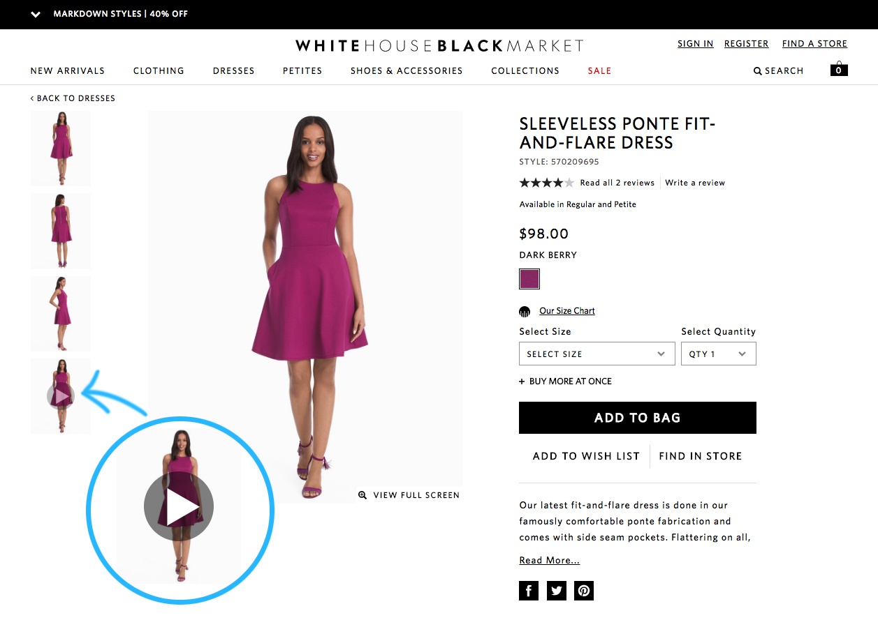
The UX Element: Most WHBM product pages I visited featured short videos of the clothing item in action. Within the product page, below the images, they added a play button. When clicked, an inline video shows models walking and posing in the garments, along with different shoes and accessories. The videos are available on the product pages of popular or new items and directly on some category pages.
The Impact: With online conversion rates so low, brands will try almost anything to improve them. WHBM does an amazing job at this by making it very easy to visualize how an item might look and fit with these videos. I can see the texture and weight of the fabric, how it falls and moves, how it looks in the light, and how it flatters or constrains the body. By making it easy to picture oneself in the dress, they are emulating the store experience and bridging the gap between seeing and buying that other brands may struggle with.
The Takeaway: Video continues to prove it’s value both on a personal level, as a shopper, and on a business level, as a marketer.
There’s no doubt that in time, the video will be present on all pages like fitting rooms are for physical stores now. But you still have a chance to be ahead of the game. ContentSquare data suggests that 48% of users will exit the site from the product page, so you can start by incorporating videos on all of those product pages. You could even take it a step further and offer multiple models so that shoppers can see how an item looks on different body types or with different accessories.
As with any UX element, make sure you are properly tracking all the changes and results so that when your conversion rates start increasing, you will know what to attribute it to and how to continue optimizing your business.
I am always on the lookout for UX innovation. If you come across a digital experience that stands out, please send it over to pola.zen@contentsquare.com