In the weeks leading up to Superbowl, many grocery sites deck their homepage with promotional banners advertising deals on beer, dips, wings, and other culinary highlights from the most popular sporting event in the US.
We took a deep dive into digital consumer behavior on Superbowl-themed category pages, and found that beer drove the highest number of desktop clicks — 70% more clicks than meat and 83% more clicks than produce.
Smartphone shoppers were less enthusiastic about their Superbowl snacks browsing than their desktop counterparts, with only 2% of mobile consumers clicking on beer, and even fewer on meat and produce.
And yet despite the high level of enthusiasm reserved for beer, customers ultimately were 64% more likely to convert on… produce, marking perhaps the stats of a new era of healthy game night snacking?

In spring 2018, six French eCommerce brands launched their own riposte to Black Friday — the one-day retail extravaganza that kicks off the US holiday shopping season. More than 200 brands took part in the first ever Les French Days, a five-day event designed to boost sales during the post-winter/pre-summer sales lull. Building on the success of the first event, retailers decided to repeat the operation this fall, slashing prices on thousands of items between September 28 and October 1.
ContentSquare analyzed 68 million user sessions before and during this latest round of Les French Days, to understand the impact of the event on digital consumer behavior. We also compared these findings to our analysis of 29 million user sessions captured just before and during Black Friday 2017 — a record-breaking day for US eCommerce.
Impact of eCommerce sales events on mobile traffic
The majority of retail traffic during this latest iteration of Les French Days came from mobile, with the device accounting for 48% of all digital traffic from 09/28 to 10/01 — a 6% increase from the period immediately preceding the sales. This pushed desktop into second place, with traffic from the device dropping from 48% to 45%. Tablet traffic remained constant at 6% throughout the event.
While the increase to mobile traffic during Black Friday 2017 was noticeably smaller (only 2.44%), the trend does support the argument that sales campaigns encourage more on-the-go shopping. By streamlining their mobile UX, brands can capitalize on the sense of urgency generated by major seasonal sales campaigns.
Conversion rates spike during Black Friday sales events
Perhaps unsurprisingly, Black Friday and its new French sister event are a tonic for conversion rates. In 2017, Black Friday triggered an impressive 28.57% increase in mobile conversion rates and a 44.44% CVR increase on desktop. Not to be completely outdone, Les French Days led to a 19.15% conversion rate increase on desktop and more timid 6.5% boost to mobile CVR.
Seasonal sales events attract a more committed consumer, with reduced bounce rates observed across all devices. The biggest drop is attributed to Les French Days, which result in 9.56% fewer bounces on desktop.
Les French Days also get the medal for the highest increase in page views, with desktop users viewing on average 16.54% more pages than before the event. Mobile visitors view 12.56% more pages during the same period, proving that consumers on all devices are keen to engage with the new sales content. Black Friday saw its biggest page view increase on mobile, with users viewing 9.37% more pages during the weekend event. In fact, the only decrease observed when it comes to content consumption is a 4.09% drop in the average session time of mobile shoppers browsing les French deals.
Data shows that seasonal sales increase thrifty consumers’ willingness to engage with promotional content while on the go. During the sales periods, retailers have their customers’ attention — analyzing navigation patterns to pinpoint where users hesitate, or abandon their navigation is key to developing successful buyer journeys. Intuitive paths that get customers from point A to B in fewer screens, shorter forms and streamlined checkouts — there is much retailers can do to keep mobile users engaged all the way to conversion.
Look out for our Black Friday coverage!

ContentSquare data experts analyzed more than 11 million user sessions during the course of a month, across 6 global luxury fashion sites. They examined sessions captured between 09/01 and 09/24 — coinciding with New York, London, and Milan fashion weeks, and the week leading up to the shows.
Here are some of their findings:
1. Homepage traffic increases by almost 20% during fashion week.
Our data analysts found that the number of visitors entering luxury fashion sites through the homepage increased from 26.03% to 31.22% at the start of fashion week. And while the majority of users are still coming in through the digital side door (product pages, category pages, etc), numbers show that many consumers are primed for an introductory brand experience. Also noteworthy was a 42% spike in the number of visitors entering a site through a page dedicated to showcasing inspirational content.
Our analysts also noticed that more than 1 in 2 inspirational pages get updated at the start of September, confirming the expectation that more visitors will be reaching these pages around this time. So, is this seasonal content push working as a strategy to boost consumer loyalty?
2. Users who consumed inspirational content returned to a website on average 233% more times on desktop than the average visitor, and 160% more on mobile.
And it’s not just inspirational content that is getting users coming back for more. Our analysts found that users who viewed ‘new arrivals’ content returned to a site on average 227% more often on desktop and 163% more often on mobile — suggesting the buzz around new collections and campaigns does indeed foster ongoing interest in a brand.
Read the full mini-report to find out what other user behavior trends we learned about when we analyzed millions of fashion lovers’ browsing sessions.
Halloween is scary. It brings out the zombies, the monsters and the demons. And horror stories. Oh, the horrible UX horror stories. Dare you read on?
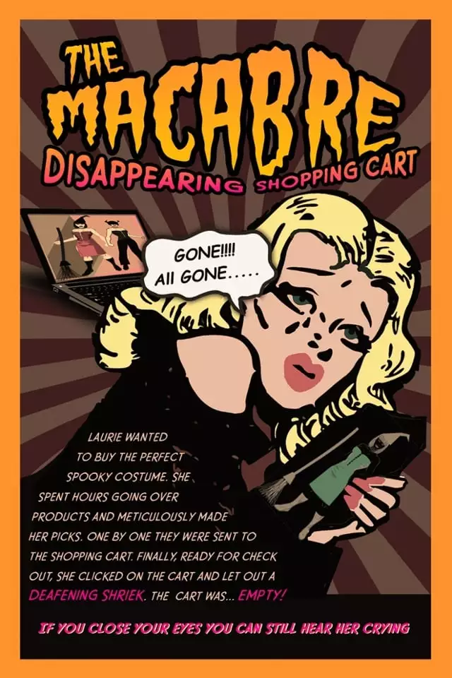
Have you ever taken your time to shop for yourself, select the perfect items, one by one, examining every detail and making sure they are exactly what you want and then… you want to check out… you click on the cart… and it is empty?! THE HORROR! This is Laurie’s story:
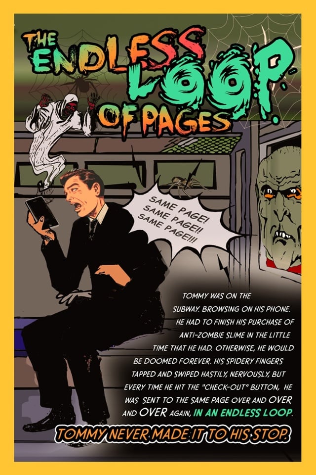
Have you ever been on a mission to find something online, begin your journey and click on the option you want but get an error and get sent to the same page, and try again and again and again and get sent every single time to the same page in an endless vortex you can never get out of? THE HORROR! This is Tommy’s story:
Have you ever created content for a site, worked hard to find the right mix of words, images, rhyme and reason to convey your beautiful thoughts online and published them knowing that with such an amazing effort will come an even more amazing result? And have you then realized that, in fact, no one is reading it, no one is scrolling, no one is clicking and the words are dying a slow and painful death? THE HORROR! This is Linda’s story:

Save Laurie, Lynda and Tommy from these horrors! ContentSquare will give you the digital experience insights you need to understand where people are getting stuck or frustrated, what makes them happy and what makes them howl. No wooden stake, garlic or silver bullets necessary.
Want to see it in action? Watch a video here
UX Spotlight: Product Discovery Quizzes – Dermalogica and Clinique Personalize the Search (and Conversion) Process – trIn the UX Spotlight series, I post weekly on UX features that impressed me online, and are great examples and inspiration for anyone looking to enhance their digital user experience.
Today’s online shoppers have more choice than ever, which means that there is truly something for everyone, but it also means customers are sometimes overwhelmed by choice paralysis.
Back in the brick-and-mortar days, in-person salespeople would help shoppers out by asking the right questions to get to the bottom of what a shopper truly needed and which products would best suit them. Online, with too many options and no personal guidance, the customer journey can slow down significantly – or come to a complete halt.
IT IS IMPERATIVE THAT DIGITAL EXPERIENCES STEP UP AND SERVE AS THE FRIENDLY, EXPERT SALES PERSON THROUGH EASY-TO-NAVIGATE, INFORMATIVE GUIDANCE FOR SHOPPERS.
That’s why it’s so imperative that digital experiences step up and serve as the friendly, expert sales person through easy-to-navigate, informative guidance for shoppers. One great approach to this process is product discovery quizzes.
This week I highlight Dermalogica and Clinique, two skin care companies who both nail the product discovery quiz in different ways.
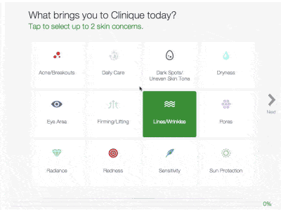
The UX Element: Both Dermalogica and Clinique offer interactive quizzes to help customers pinpoint the right products for their skincare needs.
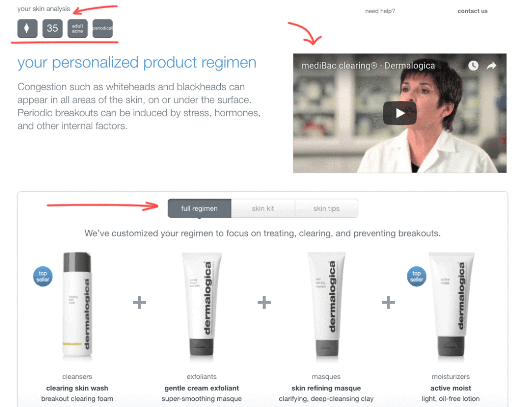
Dermalogica offers a short, quick, streamlined survey to narrow down the body of products that may suit a shopper. In their “speed mapping skin analysis,” which is easily found on their homepage, customers answer 4-6 questions about their age and skin concerns, and Dermalogica offers a “skin analysis,” including a video about the body of products that best suits the shopper, and different skin regimens and products that match the customer’s answers.
Clinique offers a longer, more in-depth quiz, with a variety of different questions and answer mechanisms, such as slide bars and color gradients, which keep the survey engaging and fun. From the homepage, shoppers can click “skincare” and then “customized solutions for every skin.”
Several questions later, Clinique offers a specific set of products that address a pinpointed problem.
The Impact: In the Dermalogica quiz, customers are quickly directed to the right product category for them. In less than one minute, customers can go from not even knowing where to click, to honing in on a personalized category page.
IN LESS THAN ONE MINUTE, CUSTOMERS CAN GO FROM NOT EVEN KNOWING WHERE TO CLICK, TO HONING IN ON A PERSONALIZED CATEGORY PAGE.
In the Clinique quiz, customers take their time answering progressively personalized questions, resulting in a small number of very precise products being offered to them based on their answers. With a little more time investment, customers have their shopping baskets offered up on a silver platter. They just have to add to cart.
Both quizzes offer their results in bundles, which is a great opportunity for brands to upsell. Now that customers are invested in their needs and had those needs verified and validated, it’s the perfect time to offer them the complete solution to their quest.
The Takeaway: First, let’s talk about the fact that people love online quizzes. Even those consumers who come to an eCommerce site purely to browse can be drawn in by the lure of getting to be a little introspective and find out something new about themselves. Being asked questions about yourself is fun, especially aspects of yourself you might not normally think about, which both of these quizzes tap into.
WE AUTOMATICALLY PLACE HIGHER VALUE ON ITEMS IN OUR POSSESSION, OR ITEMS WE DON’T OWN YET BUT WE ASSUME WILL IMPROVE OUR LIVES IF WE DID.
Second, individuals love things that they own or that are assigned to them. We automatically place higher value on items in our possession, or items we don’t own yet but we assume will improve our lives if we did. By designating these items as specifically selected for a customer based on their unique traits or feelings, the items are instantly more valuable in the eyes of the consumer.
Although both of these examples are for skincare, this strategy could be adopted for nearly any field, from travel sites looking to help customers find the right destinations to car dealerships looking to suggest the perfect vehicle for a unique consumer – and help them schedule a test drive for it.
It’s important, of course, that any quiz mechanism is optimized for mobile. With 60% of visitors to eCommerce sites on mobile these days, any process that could speed and simplify the customer journey is a great boon for mobile users, and should be designed with them in mind.
This is the job that salespeople used to do, smiling at a customer across the department store makeup counter and making it easy, pleasant, and even fun for shoppers to narrow their search and hone in on the right product for them. Now, through tools like product discovery quizzes, UX can carry that torch.
I am always on the lookout for UX innovation. If you come across a digital experience that stands out, please send it over to pola.zen@contentsquare.com
The 4 Best Online Back-To-School CampaignsCountless eCommerce merchants spent the entire year preparing and testing iterations of back-to-school campaigns, with the most innovative and attention-grabbing campaigns raking in lucrative returns.
Now that everyone is back in school and the campaign craze is finally over, we would like to share our favorite 2017 campaigns. These are the ones we found most creative, inspiring, and that really maximized the power of digital experiences. Kudos to these companies who, in a nutshell, completely nailed it. And here they are!
#1) King of Convenience: Staples
Staples has been in the back-to-school game for decades, and has adapted to the digital world thoughtfully. One reason Staples has managed to remain competitive as commerce shifts away from brick and mortar stores is its foundational ability to recognize not only its consumers’ pain points, but also the pain points of the industry at large.
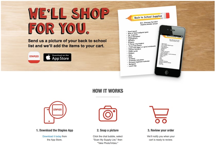
Customers can snap a picture of their back-to-school list, upload it to the Staples app, and Staples automatically adds each item to a shopping cart for customers to review and check out.
Why it works: The biggest pain of back-to-school season? Having to navigate Labor Day Weekend parking lots, track down every picky item on your child’s school supplies list, and wait in line to check out. With their new “We’ll shop for you” campaign, Staples eliminates each and every one of those pain points. Staples sets itself apart with this complete solution to back-to-school anxiety, and at the same time, gets its app installed on phones galore, giving them a leg up in the competition for that customer’s future purchases, as well.
#2) Class Clown: Best Buy
Electronics giant Best Buy made a notable contribution to the back-to-school rush in recent years with their coordinated commercial and mobile campaign featuring comedic actor Adam Devine.
Best Buy has always made an effort to humanize and insert humor into the electronics industry, and its back-to-school campaigns were no different. By creating a short series of videos titled “How to College with Adam Devine,” Best Buy was able to make a lasting impression on high school seniors, college students, and general fans of funny short videos.
https://youtu.be/EiFg7Vc08vk
These videos aimed at helping new college students navigate a new world of first-time experiences and awkward situations with comic levity, while simultaneously introducing relevant Best Buy products.
Some credit is due to Best Buy’s selection of Adam Devine for this particular role. As one of the stars of Workaholics, a Comedy Central show about three college friends entering the workforce, Devine was able to bridge the gap between Best Buy and a new generation of college students.
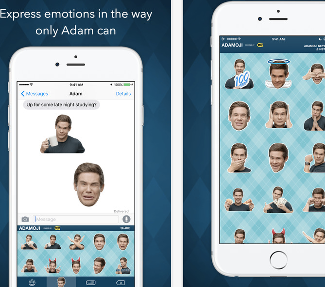
Best Buy carried the campaign into their mobile experience. The introduction of “Adamojis,” exclusive emojis containing Adam Devine’s expressions and funny faces, made it easier for a young audience to associate Best Buy with a hip celebrity. Best Buy’s release of an emoji app also showed an intimate understanding of their target audience.
Why it works: Best Buy’s campaigns were an effective way to build their brand with a new generation of college students. With an omnichannel approach utilizing YouTube, mobile apps, and in-store locations, Best Buy was able to cover a lot more ground with a single initiative.
#3) Advertising through Advice: Walmart
Any good marketer knows that quality content is a great vehicle to introduce products to customers who are otherwise allergic to advertising. Shoppers these days are so inundated by ads that they are likely to ignore obvious marketing. It’s up to innovative advertising teams to use more subtle methods to induce product discovery.
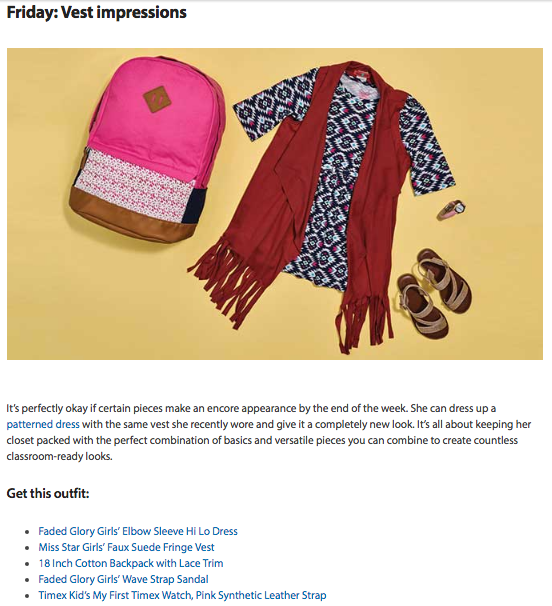
“Subtle” and “Walmart” don’t usually appear in the same sentence, which is why Walmart’s series of back-to-school advice columns are so clever. Pieces like “Girls’ back-to-school outfits for a whole week,” bento box lunch ideas, and a backpack buying guide provide nuggets of useful info for parents while recommending specific Walmart products.
Why it works: Brands like Walmart, which focus on high volume and low prices, can face the problem of customers feeling overwhelmed by choice and fatigued by shopping. Especially online, when the options are seemingly endless, Walmart needs to help customers visualize how items will fit into their daily lives and meet their needs. Giving customers tips for the busy back-to-school season, and explaining how specific items can make the transition easier and fun, is a great way to cut through the consumer fog and connect shoppers with products.
#4) Bundling Boss: Bed Bath & Beyond
When it comes to stocking a dorm room, there’s never been a better time for bundling. First time college students and their parents can only guess at what a modern college freshman needs at their new home away from home, and retailers have the opportunity to help them think of all of the essentials and each of the extras that will make sure they’re at their best and comfortable in their new space.
Bed Bath & Beyond featured a selection of well thought out and creative bundles they call “starter packs,” with the funny and relatable slogan: “When you just can’t even, we can help.”
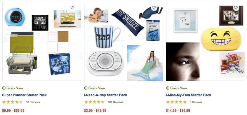
Some favorites include the “anti-freshman 15” which features dumbbells, a mini juicer, and other wellness items, and the “I-miss-my-fam” which includes picture frames, sweets, and other comfort items.
Why it works: The campaign is eye catching and tugs at the heartstrings with its clever nod to how overwhelming and emotional it can be to move away from home (and to move your children away from home), and funny and comforting with its product titling and selection. It cleverly communicates, “When you feel homesick, you’ll need these items,” and “When you have a hard time focusing, you’ll need these items,” which illustrates how their products can help specific states of mind – which at the end of the day is what every shopper truly wants, to feel better and to feel happy. Bundles are the perfect way to deliver products to consumers who don’t know yet what they’ll need in order to feel good in a new situation, like a new school setting.
In Conclusion
The best back-to-school digital campaigns shoot for extremely effective targeting that brings visitors to a clear communication of the specific value of their products, while seamlessly introducing them to their shopping experience.
Savvy merchants understand their audiences and are willing to go outside the boundaries of traditional marketing and get a little creative. A successful back-to-school campaign directly addresses customer’s needs while tapping into the excitement and high emotions of the season of transitions.

For many brands today, keeping up with the fast-moving trajectory of digital retail comes with its fair share of trials and tribulations. Consumers are increasingly aware of what they want, and what they are prepared to put up with to acquire it. And while the ‘nothing ventured, nothing gained’ maxim holds truer than ever, some risks can also lead to losses.
French luxury fashion house Kenzo experienced this firsthand when it recently launched a new checkout page for its online store. The brand, which is the brainchild of Japanese designer Kenzo Takada, came onto the scene in 1970. Over the past five decades, it has asserted itself as a visionary leader in the world of couture, and has earned its place in the canon of fashion history.
Unfortunately, the recent revamp of the site’s checkout page did not translate into improved sales, and in fact, digital teams observed a decrease in the site’s conversion rate. What was it about the new design that was putting customers off? And if the remodel had failed, then what exactly needed to be done to optimize the checkout page?
WITHIN SEVEN DAYS, KENZO SAW A 150% INCREASE TO ITS ONLINE CONVERSION RATE – A FULL 25% UP FROM THE PREVIOUS YEAR.
Understanding customer intent, and tailoring content accordingly is central to providing a satisfactory online user experience. But classic analytics often give only partial insights into user behavior, leaving an awful lot up to guesswork.
Following the drop in online sales, Kenzo was left facing two choices: either return to the original checkout page design, or identify what elements of the new interface were hindering navigation.

The brand decided to adopt the ContentSquare digital experience insights solution to review the purchase funnel, and effectively identify any friction points in the navigation path. The zoning analysis (that shows attribution for every asset on the page) flagged several areas of weakness, including misplaced delivery fields, a convoluted login process, and unclear calls to action — obstacles that were leaving users frustrated, and causing them to drop off.
Thanks to a data-driven assessment of the interface, ecommerce teams were able to focus on fixing proven design flaws with confidence. And this time, the effort paid off. Within seven days, Kenzo saw a 150% increase to its online conversion rate — a full 25% up from the previous year.
To read the full Kenzo case study, click here.