
The Digital Playbook for Automotive Brands
Download now to discover the biggest digital challenges facing automotive brands and how to overcome them.
This article was written by our partner REO, as part of our series highlighting direct insights from our large ecosystem of partners.
In 2019, for the first time ever, digital ad spend represented more than 50% of total global marketing spend. Whilst the UK was considerably ahead of this trend (63.8% of UK’s total ad spend was attributed to digital in 2018, 66.4% in 2019), the US has now joined the group with online ad spend going from 48.6% in 2018 to 54.2% in 2019. With eMarketer forecasting a 17.6% year-on-year growth (to $333.25M) in worldwide digital marketing spend, the need to ensure each of your marketing channels is delivering the best possible ROI has never been higher.
Within the conversion rate optimization (CRO) space, most brands conduct A/B testing without fully considering which marketing channel or source their customers have come from. Customers are typically bucketed into various user segments based on their purchase history, onsite behavior, geographic and demographic data. However, users within the same audience segment can often demonstrate varying behavioral attributes when navigating through the purchase funnel, across countless online and offline touchpoints.
If a user arrives on your website via paid search, you already know what they searched for and which ad they clicked on; however, users who click on the same ad, but searched for different terms/items, will often experience the same customer journey. For instance, if a customer has searched for “luxury men’s white shirt” – not only do you know the item they are looking for, you also know they are looking at the higher end of the market.
A/B Testing the landing page a user is taken to is quite common, but you can go a step further and explore how to change the experience for the customer based on their search criteria.
A potential testing idea could involve pre-sorting these shirts by highest price first, and on the Product Listing Page (PLP), displaying all the available men’s white shirts. This can develop into personalization if the user has visited the site previously, within the cookie period; e.g. by storing size data within the cookie, you could pre-select the shirt size which the user filtered by on their previous visit.
Reducing the number of clicks and filters it takes a user to find their item can only have a positive impact on conversion rate, especially on mobile. So, by showing a customer the items they’re looking for, sorted by their desired price point and filtered by their size, you will make the purchase journey more tailored to that specific customer.
Understanding a visitor’s context (location, date and time of day, device, internet connection, etc) as well as their intent (are they here to complete a quick purchase, to research and compare products, to seek inspiration, to test a coupon, etc) add an invaluable layer of behavioral understanding to your analysis, and will allow you to execute a more impactful form of personalization.
By applying this testing method to the affiliate channel, you can optimize the largest click and revenue drivers; namely voucher and cashback websites. After all, you can already assume that users coming from these two affiliate types are both online-savvy and price-sensitive.
Voucher and discount websites should have a conversion rate of at least 20-25% on mature affiliate programs – so any of these affiliates who have a conversion rate lower than that, represents an opportunity for incremental revenue. For cashback sites, expect this figure to be upwards of 40%.
A test idea for these two affiliate types could be to re-enforce the discount or cashback offer listed on the affiliates’ website. For instance, if the deal was “Save £15 when you spend over £100” – you could use a “loading bar” at the top of the page which gradually fills up as you add items to your basket, until the user hits the spend threshold to activate the discount.
For cashback sites, you could test a cashback calculator onsite, which automatically calculates the amount of cashback the user will earn if they purchase everything currently in their basket. This type of gamification can be incredibly effective in increasing the number of units per sale and, in turn, the average order value.
“Content is King” – we’ve all heard it before, but how can you be smarter in how you serve it? Content, and specifically dynamic content, is another channel where source-based A/B testing can improve engagement, click-through-rates and leads/ sales. If you know the article or blog post a user has come from, you can use this insight to serve them relevant and dynamic content, making their customer journey more seamless and less detached across the two sites.
User journey analysis shows that visits to content sites usually happen in the “Discovery Phase” of the sales funnel – including on product review sites, influencer social posts, news/magazine sites and blogs. Such content is informative and persuasive; perfect to push the user towards the bottom of the funnel.
Some of the more content-heavy merchants, such as insurance brands or high-end technology retailers, will have an eclectic and extensive array of content across their website, making navigation more muddled. A solution? Reducing the amount of content on-site and instead, storing the less frequently visited content pages elsewhere, to then be served dynamically.
For example, if a user looking to buy insurance is reading up on excess and the impacts it has on a claim and future premiums, the existing content about excess could be tweaked accordingly – which could be as simple as changing the title of an article, calling out the keywords or changing the order of the content on that page.
Again, a granular analysis of how customers are interacting with individual elements of content will help paint the complete picture of engagement. Measuring clicks alone will only tell one part of the customer behavior story: tracking metrics such as exposure, attractiveness and conversion rate per click (to name a few) will give a more complete view of how content is contributing to (or stalling) the user journey.
As the capabilities of A/B testing and personalization platforms continue to evolve, the way you test and analyze a customer journey should follow suit. One of the major challenges of channel/source-specific testing can be a lack of traffic volume. If you have insufficient traffic, it will take a while before a test reaches significance. For example, the 5th highest paid search term, or 4th largest voucher site probably won’t have the volume to justify running an A/B Test on.
Contact us! REO is a digital experience agency. We are an eclectic mix of bright and creative thinkers, embracing the best of research, strategy, design and experimentation to solve our clients’ toughest challenges. We work across a variety of sectors, with companies such as Amazon, M&S, Tesco and Samsung.
Also invaluable to our company is our scope of partners, including Contentsquare, which allows our customers to capture the nuances of their end users’ behavior for even more sophisticated segmentation and ultimately, deeper personalization.
Whatever the challenge may be, REO applies design thinking to identify and deliver big growth opportunities.
Hero image: Adobe Stock, via blankstock
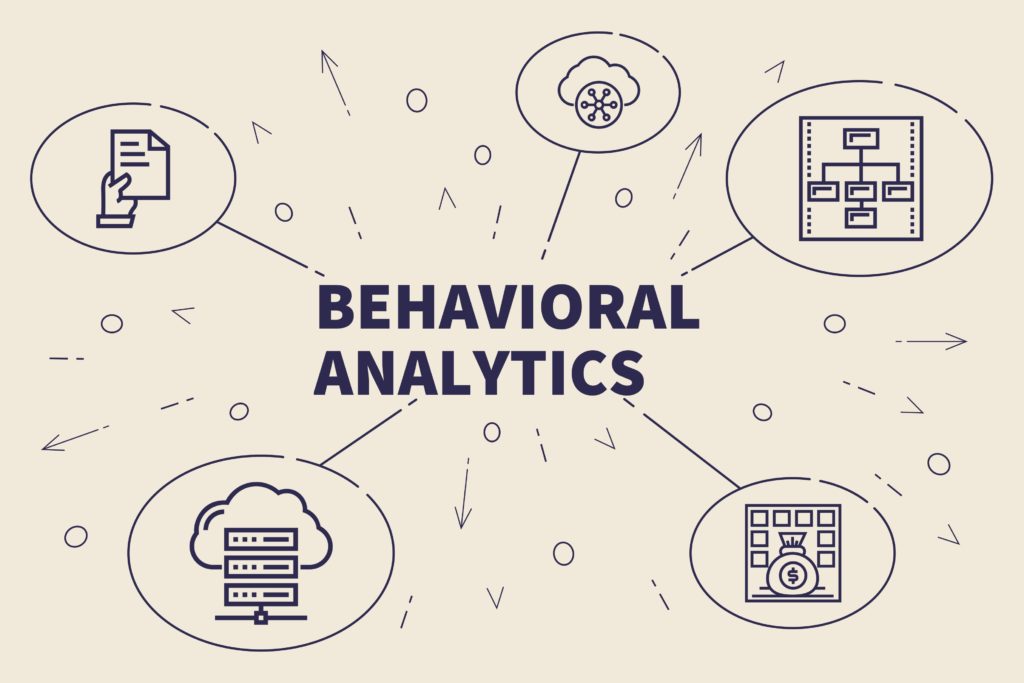
Analyzing Visitor Behavior For Conversion Rate OptimizationYou’re probably aware of the weight that analytics carry in your overall marketing executions. While quantitative analytics solutions give you a good indication of what is happening on your website (conversions, bounces, etc), they don’t present a granular understanding of your customers’ user experience. And when it comes to conversion rate optimization (CRO), the more you know, the better.
Behavioral analytics put forth a deep reading of how visitors interact with individual elements on your web, mobile site and app. By tracking advanced KPIs, behavior-based solutions allow you to discover high points of friction and hesitation, which traditional programs analytics do not offer. They also reveal the areas of your site that contribute to engagement and conversion goals.
Let’s take a gander at the more latent analytics waiting to be used at your disposal for CRO.
In the context of website and mobile analytics, behaviors and their derivative behavioral analysis can be narrowed down to a few quick, yet vital actions that users take on your website.
So what are behaviors in the context of site analytics? A behavior is a navigational action made by a user that gets recorded by a tag. Such an action can be culled and accessed as part of a UX optimization strategy to improve a website’s conversion rate. Behaviors can include page views, clicks and hovers (to name a few) — with each event painting a nuanced picture of how your site is used.
Since 90% of behaviors occur between clicks, a true observation into behavior would require looking at the behaviors beyond clicks alone. These include the behaviors not limited to a single action, such as frustration, hesitation and engagement.
Being able to understand the customer story behind behaviors is key to rolling out the improvements that will have a positive impact on engagement and conversion rate optimization. Clicks, for example, can signify both interest AND frustration — what matters is figuring out which it is.
The first step of a behavioral analysis is to identify where on your site lie the biggest issues and opportunities. This comes from surveying the customer journey. This journey grants a step by step view into how visitors traverse across your website, mobile sites and apps. You can see all the pages users have visited to put together the story behind their digital journey: where they leave and what has led them to conversion. These paths make up the user flow, a crucial aspect of UX that gives you a clear vantage point to the visitor’s intent, which is much-needed to landing conversions.
For example, a site visitor may be on your site for a number of reasons: to window-shop, check out their local store’s opening hours, add a promotional code to a cart to see the price difference, etc.
Customer journeys are visualizations that shine a light on user intent — vital information when you’re trying to develop a customer-centric digital experience. Understanding customer intent will help you optimize your content and know how to best guide visitors down the conversion funnel. It’s also the cornerstone of a satisfying experience, which itself is a guarantee of long-term customer loyalty. If visitors do not convert on their first go, a good UX will spur them to in future visits.
For example, a number of airlines have earned a negative reputation due to their substandard customer experience. But their low prices have gained them the ability to capture a solid customer base. Airlines that offer low prices coupled with good customer experiences (including digital) will undoubtedly give these shoddy airlines a run for their money due to their competitive edge.
Customer journeys present you with a detailed view of where your visitors drop by on your platform, a function that allows you to see where they enter, where they head to next and all the pages in between exits and conversions. Viewing them will help you understand how your site is being used and how to optimize these journeys to ramp up the conversion rate.
For example, if the bounce rate for a landing page is at 60%, a behavioral analysis will provide insight into why visitors are bouncing. This is because it shows you what users do on a page before they bounce, which you ought to look at to make the proper optimizations.
Other issues affecting conversions can manifest as repeated attempts on a payment or login page. This suggests a struggle and thereby, frustration within users. Identifying this is a must in order to improve the conversion rate.
Now that you’ve identified your most critical opportunities and issues, the next step is to answer why they are happening and how you can improve. That’s where we dovetail customer journey analysis with zone-based heatmaps, as they perfect the heat map with a more granular measure of digital behavior. Traditional heat maps appear as a big blob of colors on a page, showing the areas with the most engagement. They don’t however, give you insight into the performance of each page element.
That’s where zone-based heat maps come to the rescue. Like regular heat maps, zone-based maps are highly visual aides that display the most and least popular places on a site page in different colors. However, they have the added capacity of gauging each site element, so you can understand how visitors interact with each one, and what role they play in the overall customer experience.
To do this, zone-based heat maps are numbers-based, so along with the colors, they display attribution and performance metrics, such as click attribution, time spent on each element, conversion rates, revenue per click, etc.
Having this information on hand can help teams pinpoint precise areas of hesitation and engagement, allowing them to carry out targeted, data-backed optimizations. For example, rethinking the location of an image that visitors find attractive but is hidden beneath the fold can have a positive impact on revenue.
What’s more is that today, teams don’t even need to tag elements manually, thanks to the technology that scans all your site elements with precision, identifying CTAs, photos, text, carousels and other content in the process. This kind of smart technology is far ahead of the kind you’d get with a traditional analytics solution.
Behavioral analytics has the capacity to determine not just where people visit, but to also reveal what feelings individual elements of content trigger within visitors.
One of the things it can reveal is if and where users are hesitating on your website. You can leverage hesitation time, a metric that relays the average time elapsed from the last hover to the first click on a zone, which shows you whether your content is easily understood, or if it causes users to hesitate. Understanding this gives you a data-backed picture of the content that stalls visitors — crucial knowledge when deciding on where to optimize the UX for better conversions.

Scroll behavior is crucial to evaluate in order to optimize conversion rates. A user’s scroll behavior depicts which part of a page garners engagement. When analyzing scrolling behavior, you can surmise that users are scrolling when they read something or are in search of a particular piece of information. In either case, there exists some level of interest in your content.
This behavior allows marketers, along with web designers to comprehend exactly how to tinker with page length, or the length of an in-page element that has a scrolling function. In short, scrolling behavior provides context into the impact of longer content. This is especially important for conversion rate optimization, as many scrollable elements lead to CTAs.
Scrolling behavior can be analyzed by way of exposure time, which you can use to see the elements users are scrolling past, to see if they are missing or ignoring a particular element. Or you can also refer to exposure rate, which reveals how far down users are scrolling on a page on average.
This can help you uncover real gems under the fold — areas of the page where visitors who scrolled far enough stopped to linger and engage with the zone. This insight, combined with the hover to conversion rate, can highlight highpoints of visitor engagement that would benefit from more visibility.
Conversion rate optimization can be bolstered by creating engaging content, but no matter how well you think your content is faring, it has to be measured for its efficacy. Traditional analytics fall short here because it cannot distinguish whether an abundance of clicks conveys positive engagement or frustration. Fortunately, there is a formulaic way to measure user engagement.
With the engagement rate metric, you can determine how intuitive your site elements are, i.e., how well users are able to understand how they work and what they do. The metric is calculated by dividing the number of page views who click on a zone by the number of page views with a hover on the zone. This represents the percentage of visitors who clicked on a zone or element after hovering over it.
Clickable elements, especially those that lead to conversions, should have high engagement rates, as this metric essentially shows if a zone has good affordance in light of clickability. So you should make all the aspects of the zone underscore that it’s clickable. This metric will show you if you need to make any changes to such site elements.
The engagement rate of an element can also be used to guide you where on a page to place an element. For example, elements with high exposure and a low engagement rate show that while visitors see these elements and are hovering over them, they don’t click.
Such a scenario reveals either confusion or a lack of interest in users. Thus, this insight points to the need to clarify these elements, i.e., they should clearly show why users should click on them and what they’ll see when they click.
Performance targeting comes from a kind of competitive analysis, one that brings you a side-by-side comparison of content element performance and the like. Performance targeting provides data and insights on how your website is performing against industry averages, essentially showing you the behavioral standards sector by sector.
Additionally, it scraps the need to scout out analytical sources of industry averages, which are not readily available to the public. Performance targeting puts various benchmarks on display for comparison (such as engagement, conversion and revenue). Additionally, it provides insights into content element performance — average locations and sizes for common site elements like the search bar, menu and homepage hero banner.
Lastly, it shows the typical behavioral standards on websites in a particular industry. This allows you to determine exactly what type of content to target and how to modify for better engagement and CRO.
Collating analytics should — and usually does — involve examining the most relevant metrics for conversion rate optimization. These bits of data will help you configure the best practices for the UX, as well as weed out the harmful elements of your website. But common behavioral analyses and their corresponding metrics like bounce rate and conversions are not enough, certainly not for conversion rate optimization. To tap into the minds of your site users and potential customers, you need to employ a unique behavioral analytics solution, which provides additional data-based perspectives and a slew of insight that will prove invaluable for conversion rates.
E-Grocery Is Seeing Considerable Growth, But All Devices Are Not Created EqualWith eCommerce giants such as Amazon and Walmart dominating the eGrocery game, the rules of errand engagement are changing. ContentSquare analyzed more than 92 million sessions spanning a little over three months across grocery stores and other retailers to examine these changes in action.
More and more consumers are integrating digital platforms into their daily routine. The online grocery sector is no exception. In fact, just a one month jump from August to September saw an increase to the average conversion rate of 5.74%, and October is already recording an increase of 3.05% over September. Over the three months analyzed the average conversion rate increased by 9% across desktop, mobile, and tablet. Consumers are proving to be hungry to get grocery shopping done online.
Shoppers are actually spending more time perusing the online supermarket shelves than they are browsing for clothes and accessories, spending an average of 1.3x more time filling their grocery carts on desktop. People aren’t just window shopping either. Grocery conversions proved to be even higher than retail clothes and accessories, beating the popular eCommerce destination by 357% on desktop and 33.9% on mobile.
Even though growth is observed across the board, all devices have not proved to be equal. Conversions on a desktop have outpaced all other retail industries by at least 2x with a rate of 8.86%, while the mobile conversion rate is steadfastly in the middle of the pack, coming in at 1.46%. Tablet CVR also came out on top with a conversion rate average of 6.83%, but with less of a noticeable lead over other online retailers.
This isn’t exactly surprising news, especially considering the amount of time spent browsing on each of these devices. Consumers are spending about twice as long browsing grocery sites on desktop and tablet versus mobile.
Even though the grocery retail sector has seen a precipitous growth on desktop, mobile conversions are still lagging. What works for desktop does not necessarily work for mobile. In order to understand what is hindering mobile conversions the pain points need to be identified. Where are customers dropping off and why?

Efrat David, former CMO at Contentsquare, explains why focusing on improving digital experiences is critical to driving a higher conversion rate in the automotive industry.
A business school professor of mine once referenced “buying a car from a dealership” as one of Americans’ top ten fears. And while the nation’s anxieties have evolved since my MBA years, shopping for a vehicle remains a significant pain for many consumers today.1
The automotive industry has long had an unfortunate reputation in the collective unconscious, what with:
And even if you’re not swayed by pop culture stereotypes of car dealers, the amount of confusing information that gets thrown at you when shopping for a vehicle is overwhelming at the best of times.
Like many parents, I spend a significant amount of time driving my kids from one after-school activity to another. But while I may be a veteran carpooler, a Formula 1 driver I am not.
The Digital Playbook for Automotive Brands Download now to discover the biggest digital challenges facing automotive brands and how to overcome them.
Get my free copy
I’m not particularly interested in acceleration stats, high-fangled engine specs or rustproofing. Nor do I want to spend forever negotiating on special features I don’t need or get into lengthy discussions about warranties.
When it comes to picking out a car, my checklist is fairly simple: I’m looking for good mileage, reliable safety ratings and comfort on the road.
My main priorities: An easy buying experience and simple, fast delivery
So when it was finally time for me to get a new car, I decided to go online in order to bypass those long, confusing showroom conversations I’ve grown to dread. I made a short list of my top three car manufacturers and checked out each of their sites. My main priorities: an easy buying experience and simple, fast delivery.
In the end, my online experience was far from seamless, and I had to request assistance from a customer service representative. I did end up buying a vehicle online, but the process was complex enough that it did make me wonder, “Do car manufacturers actually design their sites with the intention of selling online..?”
Or is it high time that the automotive industry embraced conversion rate optimization?
While buying a car online might seem daunting to a lot of people, more and more big purchases and transactions are shifting to the digital sphere. There is a tremendous opportunity for the automotive industry to build up its digital audience by investing in successful online experiences that remove the friction associated with showroom visits. But creating successful journeys online means more than transposing the dealership sales model to digital platforms.
Creating successful journeys online means more than transposing the dealership model to digital platforms.
Disruptors like Airbnb and Amazon have understood that today’s consumers want seamless digital experiences that strike the right balance of giving you the facts upfront and at the same time not overloading you with information.
A brand like Tesla (I did not buy a Tesla) delivers on these points, keeping the process of buying a vehicle as simple and transparent as possible, with a manageable amount of choice for the consumer. Their car configurator is user-friendly, pre-selecting standard models and clearly labelling the value of each added feature for a quick and painless overview of upgrades.
Understanding what consumers are looking for in a digital experience is the first step towards creating journeys that speak to their expectations and are convenient from start to finish. This becomes particularly important when it comes to major transactions like acquiring a vehicle, which is slightly more involved than many of the “one-click purchases” we complete from day to day.
Developing these seamless journeys means knowing which steps and elements cause users to stall or hesitate, or become frustrated. Thanks to AI, analytics today can pinpoint where these obstacles lie so you can focus on fixing the User Experience (UX) elements that still make consumers reluctant to convert online when it comes to cars.
Automotive brands that harness digital experience analytics to understand site visitor behavior and optimize conversion rates will turn their digital platforms into the ideal showroom, keeping up with the digital appetite of today’s consumers and shift more and more of their vehicle sales to the online space.
Just take a look at French car dealership BYmyCAR, who used Contentsquare to optimize its customer journey, increase inbound leads and exceed its goal of doubling its conversion rate.
To find out more about how the automotive industry can drive better conversion rates through digital experiences and overcome the digital challenges facing the industry, read our automotive playbook.
The Digital Playbook for Automotive Brands Download now to discover the biggest digital challenges facing automotive brands and how to overcome them.
Get my free copy
UX Spotlight: Superior Checkout Experience – Conversion or bust
In the UX Spotlight series, I post weekly on UX features that impressed me online, and are great examples and inspiration for anyone looking to enhance their digital user experience.
Checkout is the moment of truth for eCommerce sites. Your customer journey has brought shoppers this far – can it bring them all the way to conversion?
MORE THAN HALF OF SHOPPERS ARE INTERESTED ENOUGH TO PUT AN ITEM ON THEIR CART, BUT THEN SOMETHING STOPS THEM FROM TAKING THAT ITEM HOME.
Statistics vary, but overall it seems the shopping cart abandonment rate is about 60%. More than half of shoppers are interested enough to put an item in their cart, but then something stops them from taking that item home. One of the most direct ways online stores can boost their bottom line is by improving their checkout process and getting interested customers to convert.
This week I look at several different companies improving their checkout process in three key ways: Fun, efficiency, and added value.

You know when waiters say “good choice” when you choose your lunch, and it affirms you and heightens your anticipation for your meal at the same time? Buying online should offer shoppers similar feedback when they pick out an item.
Threadless, a trendy t-shirt company that sells customer-designed, customer chosen apparel, is a great example of this tactic applied to eCommerce. When you add a shirt to your cart on Threadless, your cart thanks you in a quirky way.
The cart even winks or licks its lips!

It’s unique touches like these that make shopping memorable. And with a quirky product line like Threadless’s, it only makes sense. Every step in a digital experience should fit the tone of the brand, so even an add-to-cart popup should be part of the immersive customer journey. Besides, this kind of immediate feedback encourages customers to continue, because their actions produce an instant reaction, and they’ll want to see what happens next.
In a survey of why customers abandoned their carts, 23% of them said it was because they were forced to create a customer account, and they preferred to jump ship than to go through account creation.1
A guest checkout option is imperative in today’s eCommerce environment, especially because 60% of shoppers are now browsing on mobile, and creating an account is beyond cumbersome with your thumbs on a touch screen. By forcing customers to register, you are pushing them away.
Many sites offer two options when entering checkout: to proceed as a guest, or to login to an existing account.
Threadless nails it again, with the rising trend of defaulting to guest checkout while giving the option to login:

Threadless’s entire checkout process is condensed onto just one screen, making the light at the end of the tunnel seem much closer and more attainable. If the checkout process is a sprint, then each step is a hurdle. Removing the login/guest choice and going straight to data entry is removing a hurdle and bringing your sprinting shopper one step closer to conversion.
Another brand pioneering simplicity and efficiency in customer journeys is eyewear retailer Warby Parker. When it comes to filling out that data, Warby Parker’s approach is notable due to its highly responsive auto-fill option, which can guess a complete address after just a few characters.

But check-outs can offer more than simply speed and convenience. In fact, British appliance retailer AO.com offers additional value during their checkout, helping shoppers achieve a more streamlined customer journey while potentially increasing their cart value.
For starters, when viewing the cart, AO offers checkboxes for additional features that could help that customer. When I tried to check out with a smart TV, for example, AO asked if I also wanted help with installation or old appliance removal, and made it easy for me to accept that assistance:
Offering extra services makes shoppers feel like everything is taken care of, and there’s nothing else to worry about.
OFFERING EXTRA SERVICES MAKES SHOPPERS FEEL LIKE EVERYTHINGIS TAKEN CARE OF, AND THERE’S NOTHING ELSE TO WORRY ABOUT.
This not only upsells, it also eases any concerns a customer might have about all the nitty-gritty details that might go with a major purchase like home electronics. Offering extra services makes shoppers feel like everything is taken care of, and there’s nothing else to worry about. Furthermore, AO uses friendly, accessible language throughout their checkout process. Instead of technical legalese, they speak to the shopper like a salesperson would in the store, which is exactly the role of a good digital experience.
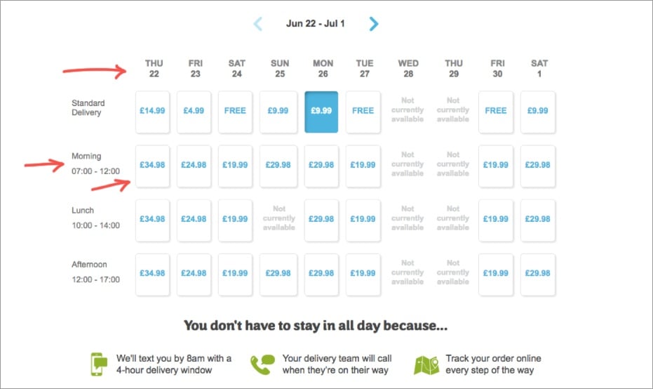
AO also goes above and beyond when it comes to shipping, which is key, because unexpected shipping costs are another notorious checkout obstacle. They allow customers to choose a delivery date and time, transparently showing the prices for each.
AO also enables online order tracking to calm impatient purchasers while their item is on the way.
The proof is in the purchases. Case study after case study illustrates how streamlining the checkout process increases conversion.
For example, in an A/B test, Electronic Path Software found that its conversions increased by 21% when it shifted from a multi-step to single page checkout process.2
Similarly, a Strangeloop test found that conversions declined by 60% when a page loaded 2 seconds slower. Speed is king when it comes to checkouts!3
And ASOS increased their conversions by 50% when they stopped forcing customers to register before they could complete their order.4
It’s clear that taking a few small steps towards a more helpful and less strenuous checkout process could mean major benefits when it comes to conversion.
What’s important to note about each of these examples is that they cater to the needs of their particular audience. By and large, shoppers on Threadless might be looking for a fun and simple shopping experience. Those looking for new glasses on Warby Parker are looking for function combined with design flare in both their eye-wear and their customer experience. And customers making a major appliance purchase on AO want to know they have all their bases covered when it comes to their major purchase, and that receiving it won’t be a hassle. Who is your customer? What are they looking for as they check out?
As web analytics become more sophisticated, we have the ability to understand that even the same customer might have different needs on different visits. The next step in the evolution of a superior checkout experience will cater the process further, to meet customers’ particular needs at the time of their purchase, and make conversion the obvious and simple choice!
I am always on the lookout for UX innovation. If you come across a digital experience that stands out, please send it over to pola.zen@contentsquare.com
1 – https://www.clickz.com/checkout-best-practice-101-guest-checkout/98289/
2 – https://blog.lemonstand.com/9-case-studies-for-optimising-your-checkout-conversion-rate/
3 – https://blog.lemonstand.com/9-case-studies-for-optimising-your-checkout-conversion-rate/
4 – https://blog.lemonstand.com/9-case-studies-for-optimising-your-checkout-conversion-rate/
Buying energy online is still a relatively new concept for many, even as other services — including phone, banking, etc — have made the transition to digital. But in this bright new future where everything is just a click away, the energy sector is next in line for a digital revolution.
That’s why global energy company Gazprom — the world’s largest producer of natural gas — has been preparing to meet the challenges of a digital future head on. Gazprom Energy, which is based in France, specializes in selling natural gas to business professionals. Anne-Laure Daniel, marketing manager for Gazprom Energy, says the B2B energy market is on its way to making the transition.
Of the company’s 1,200 employees, 350 are dedicated to retail, says Édouard Ibled, sales and marketing director for France. And with more and more business happening online, the challenges faced by retail teams are greater than ever.
“We decided to work with ContentSquare for their expertise in the B2C market, but also for their user-based approach, and the very high quality of the feedback and the proposals,” says Julien Tamssom, head of retail at Gazprom Energy.
Thanks to its innovative digital experience insight technology, ContentSquare allows businesses to visualize their clients’ journeys through digital platforms — identifying each page’s strengths, but also flagging any friction points that may cause a prospect to drop off.
WITH CONTENTSQUARE INSIGHTS, OUR DIGITAL TEAMS WERE ABLE TO COME UP WITH A SIMPLIFIED, CLEARER FORM, INCREASING 48% ON THE SITE’S CONVERSION RATE.
An evidence-based interpretation of user flow enables teams to better understand their customers’ needs and expectations. And in this era of digital convenience, meeting those needs and expectations is central to a successful user experience — and by extension, to a healthy conversion rate.
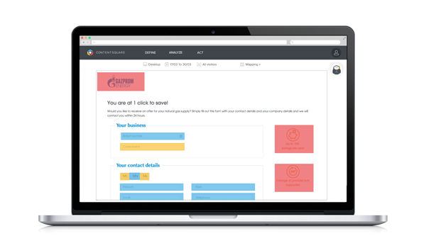
One of the issues highlighted by ContentSquare was the amount of time it took potential Gazprom Energy customers to fill in the inquiry form. With data-backed evidence of this challenge, digital teams were able to confidently address the issue, and come up with a simplified, clearer form. Marketing Manager Anne-Laure Daniel credits this makeover with a whopping 48% increase to the site’s conversion rate.
For Daniel, the implementation of the ContentSquare solution marks a shift “from instinct to data.” This shift has also had a tremendous impact on the company’s large retail team. Indeed, working from the same behavioral data makes for a more cohesive approach to optimization.
To watch the video of Gazprom’s digital transformation, follow this link.
With Back-to-School is just around the corner, retailers and shoppers are running around getting the last items on the list in time to kick-off a new school year. The magic words of this season have been experience, mobile and seamless journey.
Check out our infographic below that highlights the digital behavior of back-to-school shoppers, based on our recently published study.
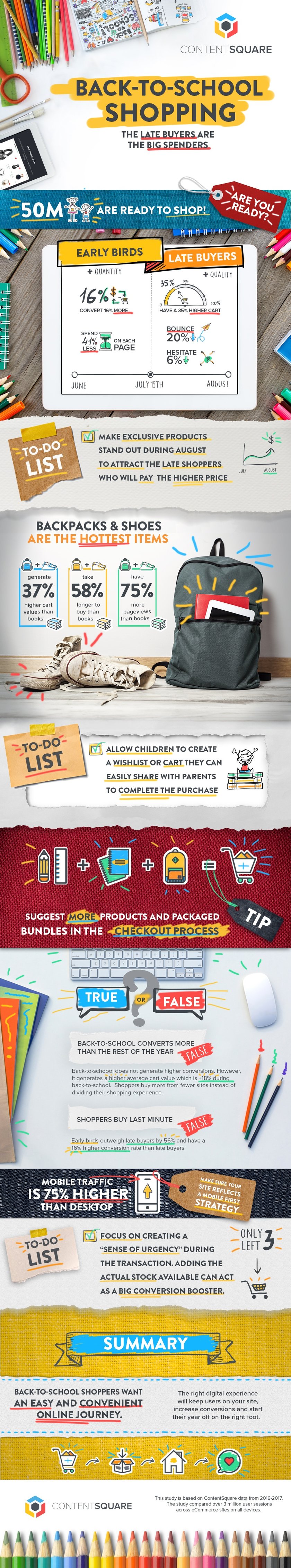
For insights, tips and tricks, read our free study “Back-to-School Shoppers: A Digital Behavior Report”