We’re living in the age of the mobile-first approach to user experience (UX). As the digital backdrop transforms and advances to meet consumers’ needs, the mobile landscape naturally evolves along with it. But mobile usage is experienced differently than desktop and tablet, so it comes with its own set of UX challenges that ultimately shape its approach to design and overall environment.
The consumer behaviors discrete to mobile have shaped how mobile UX is set up, and yet the underwhelming rate of smartphone conversions suggests there is more to be done. In the following post, we look at three behaviors that are impacting best practices for mobile UX.
Forget Heatmaps: Designing for Thumbzones
Mobile UX is molded by the size of people’s thumbs, as most clicks, scrolls and swipes on mobile are done using the thumb. Whether mobile usage is executed with one hand, two hands or in a cradled position (two-hand support of the phone), the thumb is very much involved, as the strongest and foremost finger.
Here are some of the consumer behaviors associated with smartphone usage:
One-handed – 49%
Cradled – 36%
Two-handed – 15%
Most Common Usage for One-Handed Cases: Right thumb on the screen – 67%
Left thumb on the screen – 33%
Common cradling behavior: Thumb on the screen – 72%
Finger on the screen – 28%
Clearly, thumbs are the victor. Now, let’s look at the thumb zone as a model of mobile consumer behavior. Essentially, a thumb zone is a kind of blueprint that shows the difficulty of navigating a smartphone based on the area of a screen. As you can see in the diagram below, the outer and top areas of a phone screen incur the most difficulty for users to reach/ navigate. The middle areas of the screen are the easiest for users to navigate for both left and right-handed users. The upper middle of the screen gets less and less accessible on larger screens, so the ease of use also lessens.
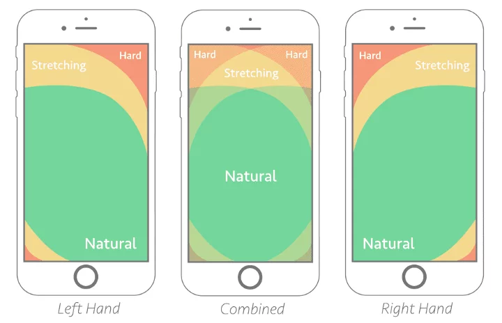
Courtesy of SmartInsights.com
Designing your mobile site and app elements in a way that aligns with the above thumb zones is crucial when optimizing the UX on mobile. Placing site elements in accordance with thumb zones will assure that visitors do not come upon any difficulties when navigating your mobile experience.
Additionally, you should subscribe to standard size recommendations for mobile touch targets. According to the World Wide Web Consortium, the standard sizes for an optimal mobile UX are: 9mm or 34px, and the advised smallest target size is 7mm or 26px. The experience bloggers at UXbooth suggest elements should have no more than 2mm or 8px in space between them, As people with big thumbs and fingers use mobile as well, these standards are sure to shift so that accessibility can reach these users.
Secondary Content: Approaching Mobile Footers
Mobile footers are native to the mobile web, but are less present in mobile apps, as some brands have found a reason to remove them altogether. For example, this is evidenced by the Chinese retail platform AliExpress, which had reaped a 104% increase in conversions after implementing a footer-free web app.
In that incidence, the footers were declined as they did not keep up with user expectations. Mobile users can be short on time and much like other device consumers, only want to see relevant content. Footers display the same content on every page, regardless if the page relates to the footer content or not. This does not pose a UX problem on desktop, since desktop screens are far larger and there is no clamoring for space for viewing and load speed.
So, on mobile footers sometimes get compressed into long pieces of content that require scrolling and take up far too much room. And if they don’t provide relevant content to the site visitor, footer frustration can take hold. Brands like Jackthreads.com have also removed footers from their mobile site, attenuating the effect of the corresponding user behavior. In this way, the line between the mobile web and mobile apps is blurring, if not downright shrinking.
But mobile footers can also improve the experience for visitors — for example, by answering your digital customers’ need for information (terms and conditions, site map, etc). Conversion Sciences has discovered that sticky footers have increased conversions across their numerous client bases. As such, footer usage is a two-way street.
Brands can reach the insights of whether a footer is helping or hurting the experience by analyzing customer behavior to determine whether the footer is serving a purpose or not. After all, without data, it’s nothing more than an opinion.
Tackling the Gap in Mobile Conversions: Constant Mobile Optimizations
Mobile conversions have been lagging significantly behind desktop and tablet conversions, ever since the inception of mobile commerce. Even after the iPhone and smartphone boom in the late 2000s, mobile conversions have been low. They have not made enough strides to compete with desktop to this day — at least where purchases are concerned.
Besides the virtual halving of the conversion rates, what this statistic says about mobile conversion is that over a whopping 80% of mobile users do not complete their purchase.
And yet the high traffic on mobile suggests that there is a desire to shop on mobile. One of the main ways to optimize mobile for conversions is by reducing hesitation and difficulty of use. Non-buyers on mobile who reached the checkout had a 33% higher activity rate (the time spent on a page and interactions on it) than buyers, which could point to an interest in the offerings, but also to hesitation and difficulty.
As such, your content should guide your users. This can be done with progressive disclosure, a UX technique in which page content only relays the necessary information for task completion. This is why mobile typically uses more pages than desktop for the same user path.
Additionally, guiding site visitors can take the form of connecting them with the correct category of product/service, such as a size guide to direct people to the right clothing selection. Ease of use is important, so your content should be optimized like so.
Much like digital, mobile experience is highly visual, so optimizations on this front have also been rising. Because UX is more visual and less text heavy (especially when you take screen size into account), it is necessary to design visuals that are suited to be clearly perceptible (fine details and all)
Images must appear large enough in order for their details to be in clear view. Additionally, providing a 360° view of a product is key, so that potential customers won’t be at a loss of what the item truly looks like.
Pay Attention to Mobile Consumer Behaviors
Mobile usage has had a sharp worldwide upsurge, leaping from 50% in 2016 to 78.2% in late 2018. With the climb of mobile use and the mobile-first milieu of most brands, mobile is a critical medium to earn customers. Any optimization efforts need to start with a clear understanding of mobile consumers’ needs and expectations.
How visitors interact with your mobile site or app holds important clues to what they are trying to achieve, and what is causing friction along the way. Traditional analytics can provide a partial reading of this behavior (page traffic, conversions, etc) but a granular analysis of digital content adapted to the unique behaviors of mobile visitors (taps, swipes and scrolls) will go much deeper and provide a meaningful foundation for successful optimizations.
How Behavior Analytics Can Help You Understand Your CustomersWouldn’t it be nice to gain access to your customer’s every behavior on your website, much like search engines (Google, etc.) extract all the goings-on in your site through their crawling process?
Accessing a deep read of your customer’s digital experience will allow you to know where they’re struggling, as well as where they’re kept engaged and digitally happy.
This is of the essence where user experience (UX) is concerned, enabling brands to create experiences that delight and add value to their customers’ lives. It’s even more crucial when you consider that a visitor who has a bad experience is unlikely to return to a website, much less convert.
Visitors to a site communicate their frustration and satisfaction with every click, hover and tap — tracking these behaviors is the first step towards deciphering the digital conversation to help them achieve their goals.
What is Customer Behavior Analysis?
Customer behavior analysis has a rather self-evident purpose: the methods of analyzing user behaviors of a particular website. It reveals the areas of a site that users engage with, their points of friction and hesitation, and where they show interest or unsurety. It also refers to a slew of other behaviors such as how they click, tap or scroll, empowering you to better understand the impact of your website’s User Experience (UX).
The data and metrics of customer behavior analysis allow brands and marketers to make informed decisions on how to communicate with their audience, along with improving the customer journey on their digital platforms. User behavior analysis pivots you forward in optimizing both the UX of your website, your conversion rates and producing desired customer behaviors (purchases, sign-ups, engagement, etc).
In this way, understanding your customers can spur brand loyalty, in an optimized site, that is. If you understand where users are struggling, you’ll know exactly what to tweak to maintain a healthy brand perception. This keeps visitors engaged with your site and then making their way back to it, the foundation for brand loyalty.
The following is an examination of customer behaviors and their accompanying metrics for a behavioral analysis.
Zooming in on Visiting Manners
We’ll start with the basics; in order to extract insights about visitor behavior, we begin with their visit to your website. Now that they’ve made it to your site, you ought to parse the way they spend their visits and the way they leave, such as through bouncing. This behavior will help you arrive at the elements — whether specific zones or overall design of a page — that need improvement.
Metrics that capture the manners of user visits:
- Visit Time – This metric determines the duration of each session spent on your site. It is a measure of the average time visitors spend from their entry on the site to their exit. It is useful to have, as it can show you how visit duration varies based on unique customer journeys.
- Bounce Rate – The bounce rate shows the stickiness of your website along with the interest users have in the site or offering. The calculation is the ratio between the visitors who entered the site and left it without visiting another page. You should know that if a user scrolls, clicks through images and reads content, but doesn’t make it to a second page, it qualifies as a bounce.

Content Awareness & Views to Establish Your Brand
It is needless to say that if your site visitors don’t see your content, they won’t engage with it, let alone convert. That’s why you need to be kept informed on whether they see certain elements and to know the time they spent viewing them. This behavior is necessary to follow since it shows you how much of your content is known to your users. Before the users engage or hesitate, they come into view with your content, as it enters their consciousness… or not, so you have to measure to be certain.
Metrics that capture points of user awareness:
- Exposure Time – Showing the average time that zone was viewed during a page view, this metric pins down the zones that were viewed the longest. This is important in gauging a visitor’s’ awareness and viewing habits of your content, since it allows you to see which sections they are scrolling past and possibly ignoring.
- Exposure Rate – Identifying how far down a page your visitors are scrolling, this metric tells you how much of your creative content visitors are actually exposed to.
Hesitation: A Behavior Signaling Confusion or Interest in the Content
User hesitation is defined by inactivity while at or around a clickable or interactive element. It reveals your site visitors’ inactivity within areas that would typically require some kind of action. This is also important to record as it shows whether your content is easily understood or leads visitors to pause, or hesitate.
Metrics that capture points of hesitation:
- Hesitation Time – the time elapsed between the last hover and the first click on a zone. This metric helps you understand if your customers are hesitating because they have trouble understanding or accessing your content. However, it may also reveal that they are interested in the content on which they are hesitating.
- Float Time – pointing to the average time spent hovering over an element, this metric also reveals if your users are digesting your content or are confused by it. Since it can represent either interest or confusion, it’s vital to take the type of element being looked at into consideration. Ex: High float times are positive for images viewed, negative when on a CTA.
These metrics should lead you to consider — of the people who hesitate, are they understanding your content? Once you know where your users are hesitating, you can make a move to tackle this hypothetical, from where you can optimize the hesitated elements of your UX.
Engagement: Showing How Well Your Elements Are Understood
Engagement can easily be seen as the opposite of hesitation, as it shows the points in which users are taking action with, or using, site elements. Engagement is a critical behavior to keep track of, as it conveys how intuitive site elements are. When an element is intuitive, it has a high capacity for demonstrating how it should be used by its design alone. For example, a CTA should be easy to see as a clickable element.
Metrics that capture points of engagement:
- Engagement Rate- Relays how intuitive an element is, determined by the number of page views with a click on the zone divided by the number of page views with a hover on the zone. Essentially, it tells you how well your users are engaging with a site element. Getting insight into this behavior allows you to understand if your site elements are doing their job, or at least appear to be. Ex: a clickable element must look clickable, otherwise, no one will engage, i.e., click on it.
- Click Recurrence- Measuring engagement and frustration, this metric shows the average number of times an element was clicked when engaged with during a page view. It’s calculated by the total of clicks on the zone / total number of page views with at least one click on the zone. It allows you to understand if a page element was satisfying or frustrating for your users. It also shows you if users are trying to engage with non- clickable elements. If so, you should change such elements accordingly.

Conversions: A UX Behavior in Itself
The behavior at the very bottom of the sales funnel and every brand’s ultimate goal for their site visitors, conversions need little introduction. These can be segmented as an overall user behavior, one that signifies the highest level of interest with your products.
Metrics that capture points of conversion:
- Conversion rate per click – this metric is able to help you decide if there is an impact on your behavior or conversion goal when a zone gets clicked. As such, it only applies to clickable zones. The calculation is the number of users who click on a zone and accomplished the behavior divided by the number of users who clicked on the zone. You can use this metric to see which zones are helping customers achieve the goal of clicking on a product page. If on a product page, this metric shows which zones help customers add to their carts.
- Conversion rate per hover – similar to the above metric, this one shows you if hovering over a zone impacts the behavior or conversion goal. It’s measured by the number of users who accomplished the behavior and hovered over the zone / number of users who hovered the zone. It helps you decide if hovering over a product’s details result in a high or higher conversion rate.
Customer Behavior Analysis: The First Towards UX Optimization
Site behavior can be measured through a variety of metrics, the more nuanced they are, the more precisely you can understand why your consumers and site visitors behave the way they do. As you can see, each behavior is not only measured by a single metric, in fact there are many more that can be attributed to the broader sense of a behavior. Thus, each behavior is not limited to the metrics laid out in this article. Scoping them out on your website is the first step towards UX optimization, achieving digital happiness for your customers and potential customers and ultimately attaining more conversions.