Take a product tour
Get to grips with Contentsquare fundamentals with this 6 minute product tour.
Whether it’s the holiday season or not, it’s imperative that your promotions and coupon codes work effectively for the user. Promotions and discounts go a long way in encouraging users to buy and makes it crucial to mitigate any confusion or friction. But, having confusing exceptions and bad promo code UX can sometimes do more harm than good.
In a recent survey we did with CommerceNEXT and BizRate Insights, we asked 1,000 online shoppers what they value when shopping online. The top two qualities they valued when picking where to shop online were price and deals and promotion. When we asked what would make them shop with an online brand time and time again, 68% of respondents said good value and price had the most influence over their decision to become a repeat customer.
While price is clearly top of mind for online shoppers, brands need to effectively showcase their sales to attract both new and existing customers. But, when you’re competing on a global scale, you need to ensure you’re highlighting your sales and deals in the right way to catch customers’ attention. Having a strong discount strategy is only half the battle. You also need a strong promo code UX to see positive results.
With over 900 global customers, we’ve put together a list of the best ways we’ve seen brands promote their coupon codes and deals to their customers to help you understand what makes a good promo code UX. Here’s a quick checklist to help you ensure you’ve optimized your coupons codes and promo code UX on your eCommerce site:
Whether you are using an announcement banner across the top of your site or using standalone text on product pages, it’s imperative that your explanation of the deal is not confusing. If users have to use a specific code to redeem the promotion, answer the what, where/how, and why. Simply state what that code is, the benefit of using the code, and how users can redeem it – without any fluff.
If users have to reach a certain threshold for spending, clearly define that threshold and whether it is before or after tax. If certain categories or exclusions apply, make sure the user knows this prior to browsing. Nothing is more frustrating than to find out right before checkout that actually, the products that you are interested in are not valid for promotion.
Have a lot of things to say about the promotion that’s running? Use clear links that open a pop-up rather than a new window that lists additional details about the promotion that can help the user understand what products and services are eligible as part of the deal.
Within the pop-up window, make sure that your design is simple and clean — keep your line heights and text sizes readable, avoiding text that resembles fine print. Keep the message as short as possible and avoid adding fluff. Your users are already spending the time to read additional details, you want to make it as easy and clear as possible for them to understand the details and terms of the offer. That way they can spend more time shopping your site and less time getting caught up in the details of your offer.
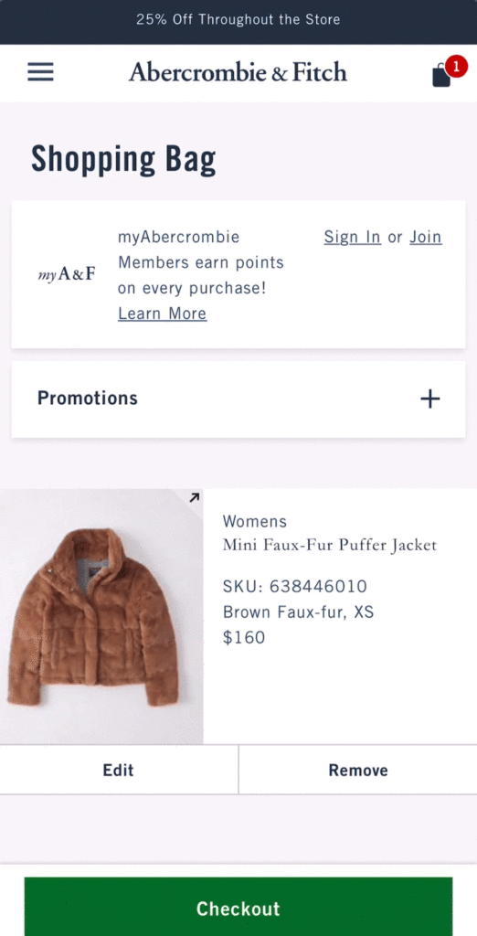
Clothing brand Abercrombie & Fitch uses space on their homepage to clearly outline the parameters of a promotion. The main benefit of the promotion is written right in the title and subtitle. Users are encouraged to use links to navigate to categories. Succinct phrases are used to further clarify any exceptions to the promotion, with a link to view the promotion in detail.
Avoid inundating the homepage with product-specific promotions. Save these for the PLPs and PDPs so that users aren’t overwhelmed with information and discounts are surfaced in a timely manner. Don’t waste precious real estate on your homepage for product-specific promotions, as these deals may be irrelevant to users on the homepage who are not interested in those specific offerings. Save promotions that are site-wide for your announcement banners, as they should reach and apply to a more general audience.
On the other hand, you know a customer viewing that specific product page would be more interested in your deal, so it makes more sense to feature the deal on that PDP or PLP.
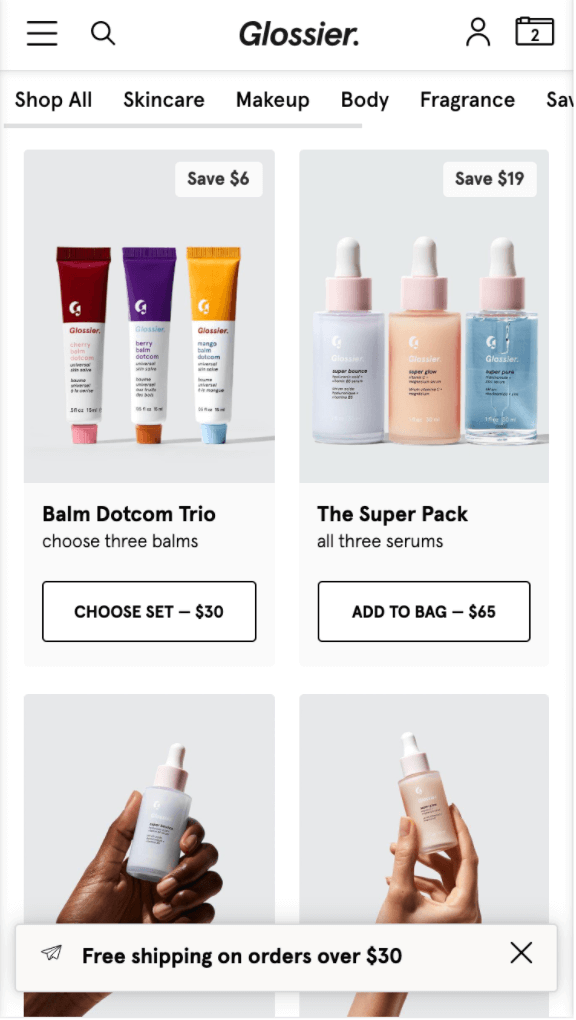
Cosmetics and skincare brand Glossier uses the floating announcement banner at the bottom of their mobile site to push site-wide promotions. However, product-specific discounts and promotions are pushed on the PLP using simple and easy-to-read badges that advertise product-specific discounts. In this example, discounts are focused on product bundles.
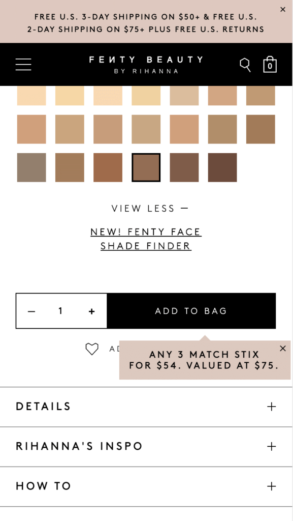
Similar to Glossier, cosmetics brand Fenty Beauty’s announcement banner at the top of the site alludes to a site-wide promotion. It is specific about the spending threshold users must reach in order to receive free shipping. In addition, a small pop-up is used next to the “Add to Bag” CTA on specific PDPs to alert users about product-specific promotions and discounts.
No one wants to have to remember coupon codes or jump from their cart to the homepage to copy and paste a discount code. Make it easy for your customers to see and apply codes with just a click of a button during your checkout process. This helps your users to avoid potential human error, like spelling errors, which can lead to frustration. Helping your user apply codes easily and automatically when promotional requirements have been met is an easy way to earn a brownie point from your user. Plus, it lessens the likelihood of them abandoning their cart to go in search of a coupon code on coupon sites, like RetailMeNot.
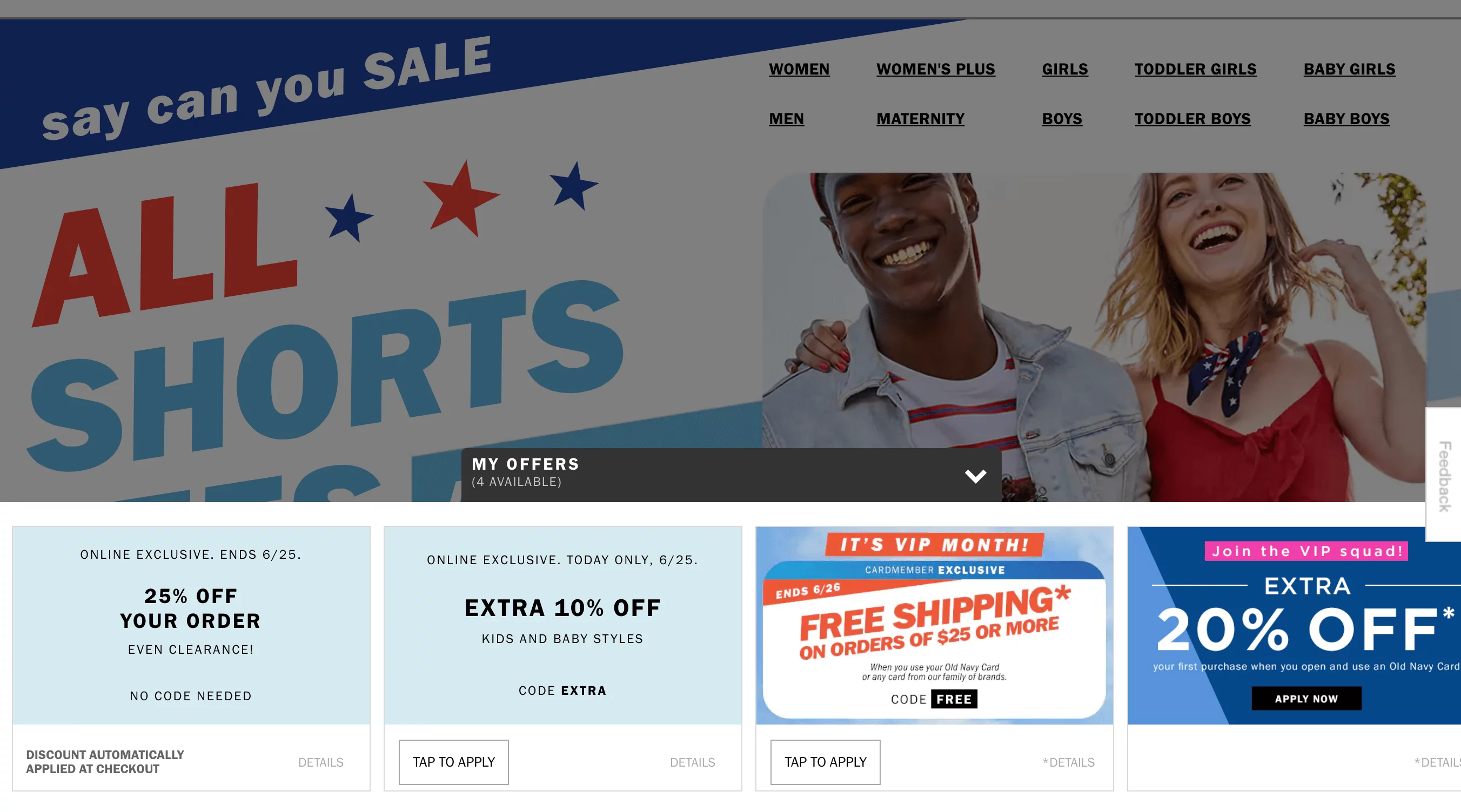
On clothing brand Old Navy’s desktop website, users can expand the available offers section at the bottom of the page and tap to apply a code automatically to their cart. Each offer clearly explains what code is being applied, or whether no code is needed.
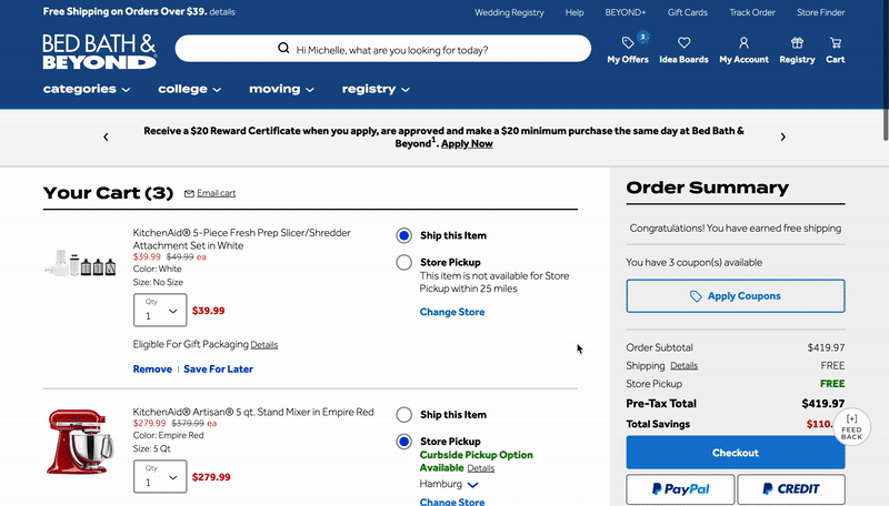
On home goods store Bed, Bath, and Beyond’s desktop website experience, users can see whether there are coupons available to use directly from their cart. Users can simply click ‘Apply Coupons” to surface a pop-over with a list of promotions and browse deals. Each promotion has an “Apply” CTA that automatically applies the coupon to the cart. Users receive confirmation of the application and see the update automatically within the cart (without a page reload).
Overall, the types of promotions you implement for your customers will determine the best way to surface them within the digital experience. No matter what, communicating clearly and doing the work for your customers will improve the browsing and purchasing experience of your site.
The 3 Golden Rules of Sticky Menu NavigationListen the article in audio format:
The topic of sticky headers and sticky menu navigation is muddled in controversy. Some people claim that they drag a person’s attention away from what they should be focusing on, while others believe they’re an essential part of the structure of modern websites. In fact, as in many conversion funnel optimization cases, there is truth in both ideas.
| In this post, we’ll discuss:
– What is a Sticky Menu? |
Here’s your guide to sticky menus and how to figure out if a sticky navbar is right for your digital website experience:
A sticky menu is a fixed navigation menu on a webpage that remains visible and in the same position as the user scrolls down and moves about a site. Persistent navigation bars – or “sticky headers” – are now a web design standard.
Here are three examples of sticky navigation bars to demonstrate how different sites and brands interpret this website feature.
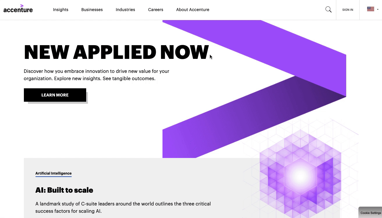
Global consulting firm Accenture’s website features a sticky header that is fixed to the top of a user’s browser so they can still see it even as they scroll down the page.
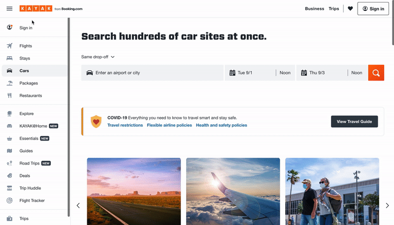
On travel booking site Kayak’s homepage, users can quickly jump to whatever travel needs they’re looking for – flights, hotels, car rentals, vacation packages, etc – via the stick navbar on the left side of the page.
Digital product design platform InVision’s blog features a right-aligned fixed navigation bar. Using this sticky menu, blog visitors can find related blog posts and easily binge InVision’s content.
We know that users generally favor sticky navigation, but how does your brand use sticky navbars to its full potential?
Using insights gleaned from Contentsquare‘s in-page behavioral analytics platform, we’ve drawn some unique conclusions about how people interact with and digitally experience websites of all shapes and sizes. Here are the three golden rules we’ve discovered work best for sticky navigation:
Sticky navigation works best with retail, eCommerce, and other types of “actionable” sites where the designer intends for a user to take a specific action, such as a click to purchase a product. In those cases, sticky menus have been shown to significantly improve customer experience, by keeping users well-oriented and giving them more control over their journey through your site.
In one example from a well-known retail site (sorry – we can’t release the name), after the brand introduced a sticky navigation bar, its visitors began to scroll further on the page and pay more attention to the individual products on the pages. As a result, the company experienced a major reduction in bounce rate, and conversions increased from 30% to 33%, a +10% increase in conversion rate.
That may not sound like much, but a 10% increase in conversions can make a huge difference. And if you’re a leading retailer with annual revenues of, say $100 million, we can make a quick calculation to see how much that’s worth to your business:
Every brand can benefit from having friendly and intuitive navigation, especially on pages with lots of content that require visitors to scroll. Clear on-page navigation helps visitors make a smooth journey through the content on the page in a manageable way. While “back to top” links can help achieve a similar goal, sticky navigation is a quicker, easier way to let visitors jump to a new page on your site and continue their experience.
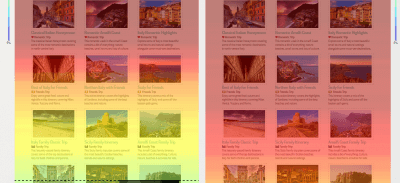
Below, we see part of a long, content-heavy page from a travel website. The left-hand side of the image shows a Contentsquare mouse-scroll heat map that was generated before the site implemented sticky navigation. The heatmap of the right-hand of the image shows how much further people scroll down once the site implemented sticky navigation. The results speak for themselves!
Alongside other interactive navigation techniques, the effectiveness of the sticky element was found to improve the performance in basic selection tasks of older adults and to provide similar benefits (although smaller) to younger users.
So, why do older adults and younger users respond better to sticky navigation? It’s because of the relatively lower confidence levels of older adults and much younger users on the web and their subsequent need for additional support, which sticky navigation provides. Older adults and young users respond well to the confidence that sticky navigation menus instill.
Here’s a deeper explanation as to why this is the case:
This is where the psychology of web design and user experience comes into play. Sticky menu elements increase visitors’ confidence as they scroll up and down a page, giving them a sense of control while interacting with a website. They know what their options are and have no reason to feel uneasy because everything they might need is right in front of them.
A 2020 Contentsquare and CommerceNEXT survey of 1,000 online shoppers revealed customers list the ease of finding what they’re looking for as the third most important factor when picking where to online shop, following price and deals/promotions. Thirty-eight percent of customers also said when a website is easy to navigate, they are more likely to shop there again in the future.
People like feeling in control. Imagine a situation where you are unaware of what is happening around you. Very quickly, the “stress” button is switched on and you try to do everything you can to regain control. You can achieve this by ‘sticking’ to something or somewhere that’s familiar, adopting an old pattern of behavior, or relying on someone you trust.
The same logic can be applied to web navigation and the digital experience. Visitors can feel lost trying to find their way through very long webpages. In most cases, this feeling will trigger stress that will cause them to leave the site, or bounce. This is exactly the purpose of sticky navigation: to help people explore a webpage in a comfortable and controlled manner.
Take a product tour Get to grips with Contentsquare fundamentals with this 6 minute product tour.
Take tour
A study performed by The Journal of the Acoustical Society of America exposed two groups of participants to a loud, extremely unpleasant noise. Participants in Group A were told they could stop the noise by pressing a button, but were urged not to do so unless absolutely necessary. On the other hand, participants in Group B had no control over the noise.
The results were eye-opening. None of the participants who had a control button actually pressed it. But performance on subsequent problem-solving tasks was significantly worse in Group B who had no access to a “stop button.”
That feeling of being unable to control a situation has dramatic effects on the human psyche.
Translated into the web optimization world: even if people do not take advantage of sticky navigation features, just knowing that the options are always there will improve the digital customer experience. That’s true even at a subconscious level!
Sold on the benefits of sticky navigation? If you’re going to implement a sticky navbar on your site, ensure you make the most of it by following these best practices:
Don’t fall for what may seem like a simple implementation. When you need your site to look good and work well in multiple browsers and on different devices, iFrames are not your friend (not to mention the security and SEO issues…).
If you like simplicity and speed, this is how you want to code your sticky navigation. Pay attention to position, margin-top, and z-index.
If you’re going to have a permanent menu, you should keep it as simple as possible so it still provides your users the safety net they need, without being overly distracting. Try hiding the search input field in favor of just the magnifying glass icon.
Perhaps some of your users know their way around your site and don’t need to see sticky navigation. You could make your menus collapsible to give them the option! No one solution works for every case so be flexible. This can be especially helpful on mobile devices, as they have smaller screens and you’ll want to maximize your use of the device’s limited real estate.
Remember that what works well for another brand might not be a perfect fit for your customers. Test different sticky headers to make data-driven decisions about what your visitors prefer and cater your digital experience to their needs. Click here to get a Contentsquare demo and learn how a digital experience analytics platform can help you test sticky menus and other site optimization projects with powerful A/B testing tools, zone-based heatmaps, customer journey tools, and more. Moreover, make sure to get a web hosting for WordPress for more security and better visitor experience.
Digital CX We’re Thankful for: UX Lessons for Thanksgiving & BeyondThanksgiving is right around the corner, and as we near this precious time of family reunions, hearty meals and giving thanks for all of life’s blessings, we thought it would be fitting to call out another source of our gratitude: good digital customer experience (CX).
While gathering data is crucial to building a good UX — and we’re chock full of it — we thought it would be pertinent to get direct feedback from our lovely cadre of UX-perts through a VoC approach.
As such, we surveyed our own team members on some of the best digital experiences they’ve had and they responded with the websites and site features that they’re thankful for.
Let’s read about the kind of user experience that completes our Thanksgiving, and our daily lives.
“I go to TechCrunch a lot. The way the site is designed and presented is easy to digest and view, as opposed to a regular news site. TheAwesomer is also a great site, not great-looking, but it curates cool stuff from across the internet, like news articles, product finds, Kickstarter projects, videos and more. Unlike Reddit, it’s not user submitted, so the quality is better. It’s filled with thumbnails.”
Greg Tessitore, Director of Digital Experience in Marketing
“Target, it’s super convenient and there are two stores that are in my path when heading home from work. ASOS has affordable clothes that are pretty diverse in the section. From beachwear to wedding attire, you can find it on ASOS.Nordstrom Rack has great sales on designer clothes. And when you order online or via the app, they often give you an additional 15% off already discounted items.”
Ebony Hester, Director of Demand Generation
“I’m thankful for Zara, Nordstrom Rack and Amazon, as they make shopping online rather easy, and I don’t feel the necessity to have to go in person to any store if I’m feeling lazy. I know what will fit me the majority of the time and the return policy/process isn’t an inconvenience.”
Ashley Ygarza, Sales Development Representative
“YouTube – I’m thankful for the beauty bloggers’ recommendations!”
Emily Cawse, Strategic Consultant in Global Services
“ESPN, Foot Locker, CNN. For content sites, I like to be able to understand headlines quickly and dive in quick. For retail sites, I want to be able to either locate what I want asap or have appropriate browsing options.”
Joseph Schaefer, SDR Manager
“Twitter. It’s easy to navigate and I love the content.”
Tito Javier, Sales Development Representative
UXPin, an open-source code forum, where you can submit pins — a pivot point/starting point on a development project, that’s in code like CSS or Javascript. Users can get involved in a project and put their own spin on it. I’m subscribed to the newsletter and it’s all in code. It’s basically a digital sandbox that people build stuff in.”
Greg Tessitore
“Freshly.com — used the service and the ability to select meals, edit cart and pause the subscription, which was very intuitive and executable in a click or two.”
Marc Blum, Sales Director
“Birchbox + Careof. Prior to committing to either box, you have to fill out a questionnaire about your concerns and what you would like to implement in your self-care regimen that I truly like. The questions are well thought out and it makes you feel that the items you are getting are truly crafted for you. The packaging as well is very personable and I look forward to receiving them, let it be monthly (Birchbox) or when I finish my current supply (Care/of).”
Ebony Hester
“Curology; it’s easy to get around.”
Ashley Ygarza
“Spotify, because of its seamless experience across all my devices and more music than I could ever listen to!”
Emily Cawse

Adobe Stock, VIa Hurca!
“It seems like Amazon already has an idea of my preferences based on the product suggestions I get recommended to me on the homepage. Sometimes I end up adding unnecessary items simply because it’s within the category that I’m already purchasing and looks kind of cool /have not thought about buying it before. <span
I also enjoy how easy it is to get to their review section and depend on those heavily if I’m buying an unfamiliar product. Sometimes I go on and buy stuff just bc I’m in the mood to shop and they have everything – they make shopping kind of addicting.”
Ashley Ygarza
“Lush — I like the easy navigation and the ability to search box spend. Casper is just a clean layout. I like the social media UGC feed and that the pop up for additional offers is delayed just the right amount that you don’t feel bombarded.”
Ebony Hester
“Apple — you get what you pay for!”
Emily Cawse
“Foot Locker. I like the blend of lifestyle content and product pushes/CTAs.”
Joseph Schaefer
“Godaddy, because of the incredible customer support.”
Avi Mash
“The Digital Panda, a DX agency. They built out cool animated bits on their “what they do” section of their homepage. Instead of having the title of each service and a small paragraph alone, they’re topped with an animation of pandas doing what the services offer — they’re animated descriptions. So I don’t even have to read what they do if I don’t have time; looking at these animations lets me know in a unique way.”
Greg Tessitore
“Wayfair’s app lets you see their furniture in your own space with a 3D camera. It really helped when I redecorated my apartment last year, I had a graph paper floor plan with proper measurements but seeing how the furniture spacing would work in real life was awesome.”
Meredith Golden, Sales Director
“The filtering capability. Being able to drill down into exactly what I’m looking for without having to filter and then do an exhaustive manual search on top of it.”
Joseph Schaefer
“When Google populated my calendar appointments on to Maps.”
Emily Cawse
“Rio2rome.com. I like the functionality and predictability of being able to connect my travel journeys through a variety of transportation options.”
Ebony Hester
“I didn’t know what size bag to get, but the site offered a great comparison guide.”
Marc Blum
“The Delta app is really clean and easy to use.”
Avi Mash
“Paypal and Apple Pay, because of their rapid loads and mobile checkout capabilities.”
Harold Padilla Villa, Product Experience Manager

Adobe Stock, via Estheroon
“I don’t really buy on Black Friday, it’s more of taking advantage of any sale. I’ll be on Wayfair, seeing if any of the couches go down in price. The couch I want is saved in my cart; it would be nice if they sent an email about this if there is a price drop, to show they’re paying attention.”
Greg Tessitore
“Electronics from Best Buy, because of the name recognition and comfort with the brand.”
Joseph Schaefer
“Yes, luggage. Have been on Monos.com a lot and will buy from them. I really like their UX.”
Marc Blum
“Definitely cleaning supplies or certain types of tech gadgets. Most likely Target and Amazon.”
Allison Choi
“A Lumie sunrise alarm clock — I’ll be checking Amazon of course.”
Emily Cawse
“Yes, for Black Friday, looking to purchase a TV and possibly an instapot. I start my Black Friday shopping with a direct mail piece. Target is now taking over as the big gift guide book since the end of Toy R Us. After that I view the website to gather more details about the Black Friday Preview sales. I’m more looking forward to Cyber Monday for flight deals.”
Ebony Hester
“I’ll probably buy some flights.”
Avi Mash