To provide understanding during this uncertain time, we are closely monitoring the impact of coronavirus on digital consumer behaviors. Find all the latest insights on our Covid-19 eCommerce Impact data hub.
As one third of the planet navigates a new reality on lockdown, people everywhere are leaning on digital to fulfill basic needs and obligations such as buying food, educating their children or getting their jobs done. Convenience has been superseded by necessity, and as a society, our reliance on digital has perhaps never been greater.
Our analysts have tracked billions of user sessions since the start of the Coronavirus crisis to bring you week-by-week updates on how consumers across the world and across industries are browsing today. Our study includes more than 5.2 billion sessions and 25 billion page views, captured over the last 13 weeks of 2020, from January 6th 2020 to March 29th 2020. To understand the impact of Covid-19 on global eCommerce, we’ve compared recent weeks to the period immediately preceding the global reporting of the outbreak (or, the first 6 weeks of the year, which we call the reference period).
In last week’s update we highlighted the challenges of the online grocery sector, as traffic surged but supply chain issues prevented some stores from meeting consumer demand for products and delivery slots. We also recorded a significant increase in transactions on sporting goods sites (after an earlier drop in both traffic and sales), reflecting a desire by consumers to stay fit at home. The cosmetics sector was also in recovery, after brands refocused their promotions around hand soap and personal hygiene products. And as people settled into quarantine, streaming and news sites recorded a significant boost in traffic, while retail tech sites saw more transactions on laptop, televisions and gaming consoles.
These are the trends we recorded this week:
Overall: Traffic and Transactions Are Trending Upwards
Global digital traffic was up +7% last week compared to the reference week — an +8% increase from the previous week. Transactions were also up, with a +12% increase from the start of the outbreak (or +9% increase from the previous week).
In fact, all the metrics we have been analyzing week on week recorded a positive difference last week, with a higher number of page views, longer browsing sessions and a higher conversion rate than during the week ending 3/22. This acceleration confirms the pattern of higher engagement observed over the past two weeks, as consumers settle into quarantine and expand their reliance on digital.


Traffic and Transactions Surge in Online Grocery Sector
Traffic to online grocery stores is up +219% since the beginning of the outbreak, shifting the industry from one of convenience to one of necessity. Transactions are also up (+50% compared to the reference week), but the gap between traffic and purchases highlights the challenges faced by the industry, as stores struggle to meet demand and securing a delivery slot becomes a daily challenge for many households.
The big change this week is that in many countries, online supermarkets have improved their supply chain, while at the same time many consumers have lowered their expectations, accepting substitute products and later delivery slots. As a result, transactions which were down the week ending 3/22, were up the week ending 3/29.
In the UK, where many stores have now ironed out some of the issues caused by the previous week’s traffic surge, there was a +220% increase in transactions last week compared to the previous week. Chains like Iceland, for example, are now able to deliver again this week, while last week online delivery slots were reserved to the elderly and most vulnerable.
In France, online grocery stores have come up with innovative ways to cope with the surge in demand, including supermarket chain Carrefour, which is now making consumer queue a few minutes before accessing their e-stores and is also offering “baskets of essentials” — a selection of basic items in categories such as produce, pets, cleaning etc.
Grocery stores have also been focusing on their homepage messaging, and on communicating to their customers how they are responding to their needs. Sainsbury’s, for example, has promised a “price lockdown” for the upcoming weeks and are being transparent about their efforts to prioritize home delivery for those who need it most.


Fashion Makes a Comeback
After weeks of dwindling traffic, the fashion sector recorded a sharp increase in visits last week from the previous week (+31%). Transactions also went up +32% from the previous week, confirming a renewed interest in browsing for apparel among global consumers. This is good news for fashion retailers, and goes some way to compensating for the lag observed over the last few weeks. As we speak, after a significant drop in traffic and sales at the beginning of the crisis — a traditionally slow time of year for apparel brands — the fashion sector is seeing the same level of transactions as before the start of the outbreak.
A deep-dive into the traffic data from individual countries shows that the greatest uptick in interest is in the US, where many fashion players have been pushing strong promotions and heavy discounts. This is good news as it shows some reactivity from consumers and also some optimism as for potential upcoming use of their new Fashion purchases.
Finally, it is worth noting that the retail tech, home/furniture, beauty and retail healthcare sectors continue to do quite well in terms of the volume of transactions, with increases of between +30% to +60% between the week ending 3/29 and our pre-outbreak reference period. This reflects a clear shift in consumer behaviors, with people actively equipping their homes for quarantine (laptops, gaming consoles, TVs, home office, soap, vitamins).
Online banking transactions were also up last week, as consumers moved from branch banking to managing their money online (applying for credit, opening savings accounts, trading, etc).
We will keep monitoring the data over the coming weeks to bring you timely updates on how events are impacting various sectors. In the meantime, our 2020 Digital Experience Benchmark report is available to download and contains key vertical insights for improving the full customer journey.
Photo credit: icarmen13

What 4.4B Sessions Tell Us About the Impact of Coronavirus on Online Behavior (Update 3)
We continue our close monitoring of the impact of Coronavirus on consumer behaviors online — most notably on traffic, conversion and time spent patterns across industries.
We have broadened our approach to include more than 4.4 billion sessions and 21 billion pages views over the last 10 weeks of 2020, from January 6th 2020 to March 15th 2020. To understand the shift in digital consumer trends, we have compared behaviors week by week since the outbreak of the Coronavirus was first reported globally in the news (the week starting Feb 17th) compared to the period immediately before (first 6 weeks of the year: the reference period).
We tracked 20+ industries in our analysis and will present data for 14 of them in this article (please contact us directly for information about your industry). Overall and across industries, we recorded a -3.6% decrease in online traffic last week vs the reference week. Consumers have even further reduced the time they spend online (-11.5%) but appear to be quite determined and to know what they want, as indicated by the +3.3% increase to the conversion rate.
Drilling down into specific industries, we observe major differences and shifts in online behavior.
Traffic analysis shows the dramatic impact by sector
Not all the sectors are equal in the face of this crisis. Some industries are experiencing a significant increase in traffic, while others are seeing a major drop in digital visits. The chart below compares last week’s traffic (March 8-15) with the average of the first six weeks of the year (pre-Covid-19 acceleration in western countries).
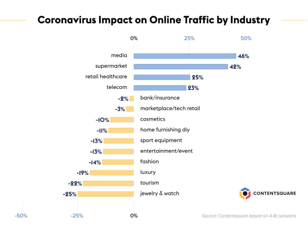
Four sectors recorded a major surge in traffic: Media (+46%), Supermarket (+42%), Retail Healthcare (comprising online pharmacies, vitamin, supplement: +24%) and Telecom (+24%).
This shows two major patterns: people are interested in stocking up on basic items and key necessities to face the crisis (food, health, staying connected during quarantine or WFH), and at the same time people want to be informed and have more time to consume media.
The week by week view of traffic trends shows the Media and Supermarket sectors, which were already up in late February, experienced a strong acceleration last week (respectively +46% and +42% in one week). Conversely, Healthcare experienced a relative drop in traffic last week (-10%) after 2 weeks of increases.

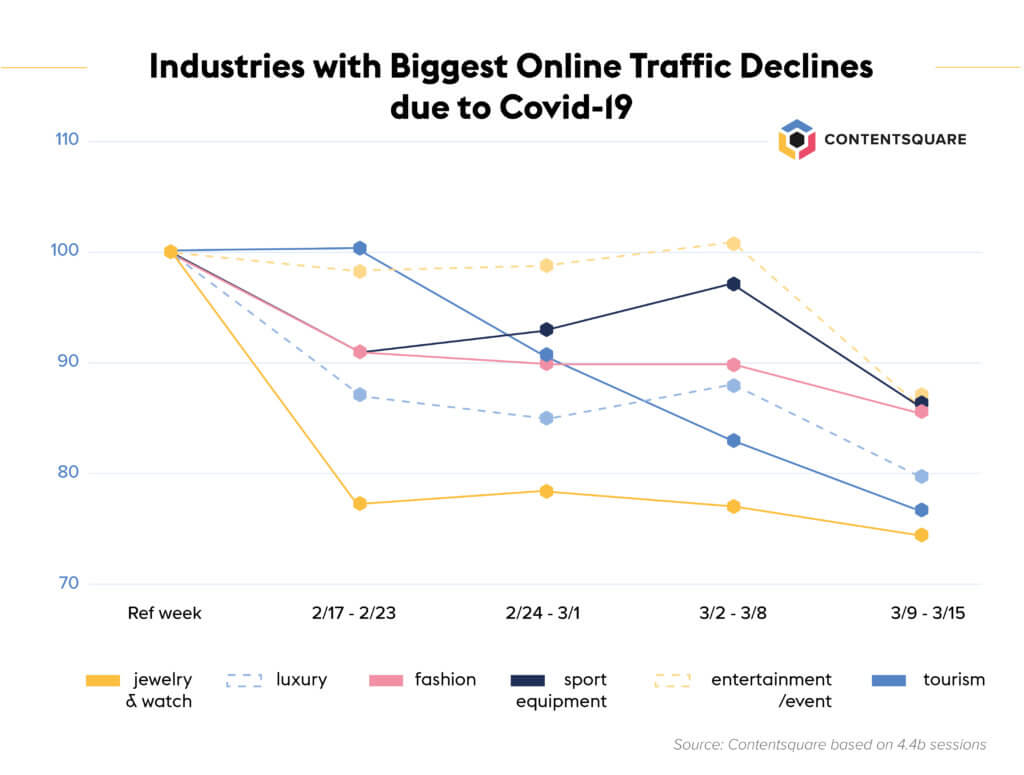
Some sectors are particularly hurt, experiencing significantly fewer visits: Jewelry (-25%), Tourism (-22%), Luxury (-19%), Fashion (-14%) and Events/Theater and Sport equipment brands (both at -13%).
The week-by-week view shows a very strong decline in Tourism and Events in particular.
Transactions follow Maslow’s hierarchy
The change in the number of transactions is directly but not perfectly correlated to the shifts in traffic:
![]()
At the top of the chart, Supermarket is experiencing a boom in transactions (+57%) with a rise of the conversion rate amplifying the super-strong traffic. Retail healthcare businesses are also seeing more transactions.
Two sectors recorded a slight drop of traffic but had higher conversion rates, leading to an increase in the number of transactions: Bank and Insurance (+45% transactions last week vs reference period) and Marketplace/Tech retail (+15%).
At the bottom of the chart, Tourism is hurt the most (-47% transactions last week vs the reference period). Jewelry & Watch, Luxury, Fashion Events and Sport brands are also severely hurt (-15 to -25%) and for the last four the drop in transactions is even stronger than the traffic decline, leading to a significant decrease in the conversion rate.
It is interesting to note that while traffic on Media websites is surging, this does not translate into new subscriptions or purchases. Consumers are consuming more media (news, movies, videos) but within their existing subscriptions.
These purchases clearly correspond to the logic of the Maslow pyramid: in order to satisfy needs at the base of the pyramid, consumers are stocking up mostly on food and health necessities, ensuring they have the basic equipment to stay at home (TV, PCs, headsets, fridges…) and taking care of their finances. At the same time, any purchase that falls into the top tier of the Maslow pyramid of needs, such as non-necessary items and of course, any outdoor activities, are dropping significantly.
Considering very recent trends and looking only at the weeks ending March 15 and 8, we see that the main variations in the volume of transactions are recorded in the Supermarket sector (+33% increase in the number of transactions in one week, in strong acceleration), the Banking/Insurance sector (+26%) and, on the negative side, Tourism (-39% in strong negative inflection).
We estimate the online grocery market to be worth $50B in the Western World, and the increase we measured following the recent acceleration of the Coronavirus is worth $2.5B per month. Conversely, we estimate the tourism market in the West is worth $4T, of which 75% is made from online bookings, so the drop of transactions observed can be quantified as a loss of revenues of $120B per month.
We will keep monitoring the data over the coming weeks to bring you timely updates on how events are impacting various sectors. In the meantime, our 2020 Digital Experience Benchmark report is available to download and contains key verticalized insights on how today’s consumer likes to browse.
Some website users undergo a bad UX, which leads them to exit — or worse — bounce from a website, possibly to never again return. Understanding what causes premature site exits is key to improving the customer experience (CX), and delivering journeys that help customers meet their wide-ranging digital expectations.
Making use of data for a UX analysis is the most practical approach to scrutinizing customer journeys, including high-level views that locate friction points and counter-intuitive navigation patterns. Once you’ve identified your problematic pages through a high-level view of user behavior, you can make more fine-tuned changes by assessing individual pages and elements.
Achieving a fulfilling digital experience is attainable, but you have to identify what constitutes a broken UX in the first place, and establish the visitor segments that come across one. Once you have this insight on hand, you can prioritize optimization efforts to improve your digital experience and make your visitors crave more.
Identifying What’s Amiss in the Customer Journey
We quizzed Ying Yang, our Lead Product Experience Manager, to get her thoughts on where to start. “The first thing you must look at when identifying a poor UX is the customer journey,” she said. “You should be able to break it apart page by page to see exactly how users traverse your site during each session.”
A well-built customer journey analysis tool will show you each step a customer takes during their time spent on a site, help uncover what they are trying to do, and how they went about doing it. You ought to be able to detect where the first UX friction lies on a high level; to find this, you have to pinpoint where users are bouncing or leaving the site, and what led to this outcome.
“You need to identify the last page that a segment of users stayed on during their journey before leaving your site. It is this page in which their UX was disrupted,” explained Ying.
“However, in longer customer journeys, note that a page from which a user has left the site may not signify a bad experience. Instead, the user may simply feel that their stay on the site is complete, and requires no further browsing.”
As such, observe the pages that contain bounces initially, as there is some shortage of retaining the visitors’ interest. Furthermore, since a bounce is more caustic than a regular site leave, it requires immediate attention. (Bounces reveal a non-existent journey, or one of one step/page visit).
Now that you’ve found the page with the UX culprit of bouncing or exiting, let’s delve further.

A Further Analysis of a Crippled UX
Entering step two of making corrections, you will need to work out the cause behind particular site exits or other behaviors indicative of frustration or unmet needs. In order to spot individual obstacles in the customer journey, you’ll need to analyze specific elements within a page.
Through this approach, you’ll be able to catch the exact cause of friction (whether it’s a CTA, image, product description, form field, etc), as opposed to guessing what regions and elements of a page led users to leave.
So what do you do when analyzing a particular page element? You take a hyper-focused turn in your UX analysis. “This is a more granular step,” says Ying. “As such, you’ll want to look at a robust batch of behavior and revenue metrics. These present a deeper dive of your UX to follow up the customer journey analysis.”
Here are just a few of the metrics you can appraise for a granular UX performance check:
Hover Rate: The percentage of pageviews in which visitors hovered over the zone at least once, determining which zones are consumed the most. This helps you rank zones and assess if they are consulted properly, by weighing in factors like averages of other zones and the page length.
Click Recurrence: represents the average number of times a zone was clicked when engaged with during a pageview. This exposes either engagement or frustration. For example, a high click recurrence on a carousel is good news, as it shows a high engagement with an element offering many clickable areas.
It can also point to frustration. For example, if users click on the same element multiple times — such as an image or link, it means the element is drawing up errors; it’s either unclickable or not performing its function correctly.
Conversion Rate Per Click: Applying only to clickable zone, this metric relays if clicking on a zone impacts the user’s behavior or conversion goal.This helps you determine which elements contribute to or deter from conversions. A conversion can be any behavior you set.
Exposure Rate: identifies how far down a page a user scrolls; it’s accounted for when at least half of a zone is viewed. This helps you understand how much users scroll, allowing you to make empirical sizing adjustments.
Attractiveness Rate: Relays the percentage of visitors who clicked on a zone after having been exposed to it. This informs you on optimizing the placement of content on your page. For example, if more users click below the fold, you should move that content further up for more of them to see it quicker. A high rate proves the high performing attractiveness of an element.
Segmenting Your Users for UX Comparisons
After you analyzed the elements of your page with granular behavior metrics, you’ll need to analyze further, by conducting comparisons. This will help you determine what comprises an underperforming UX more clearly. To do this, you would need to compare a good behavior with a bad behavior.
Comparing the experience of visitors who accomplished the goal of a page with those who didn’t, will further confirm what needs fixing. You can carry out a zoning analysis on these two segments as well as make comparisons on each metric.
This allows you to catch where non-converting visitors tend to hover and where they are more inactive. But most importantly, it allows you to weigh this data against the users who did convert/ achieve what they came to your site to do.
“For example, you can build a segment for the users who saw a 404 error page and compare it with the ones who had the same issue across different journeys or those who didn’t run into it,” explained Ying. “Additionally, you can create a segment around users who clicked on a CTA, deepening their journey against a segment of users who didn’t, or worse, ended their journey on that page.”
Main Examples of UX That Cuts the Customer Journey
One of the attributes of a broken UX is content that doesn’t engage users or is not seen, thus prompting visitors to exit the site. Pages that require too much scrolling, for example, may yield low engagement or little to no views.
For example, a particularly wide banner that takes up much of the screen may be obscuring other content that’s crucial to generating revenue. Some users may not even be aware of the content below the fold.
“Most high-performing content should have real estate above the fold,” Ying advises. “Does your business have a major campaign or sub campaign running? Post more than one type of content about it above the fold. These can exist as tiles, a carousel or both.”
This source of friction is especially damaging to mobile UX, which has a much smaller screen size than desktop. As such, some functionalities aren’t well suited to be crammed in. “Big banners, images and accordions (vertical menus) push everything down below the fold, so don’t overuse them. You will probably need to scale back on some of these elements to avoid a UX that has turned sour.”
Another example of poor content occurs when banner usage is slight and/or doesn’t achieve the goal of a page. For example, a banner can send users to a PDP (product details page) that cuts off their browsing journey.
“PDPs, in general, have high bounce rates, as in the case of our retail clients, so you need to be careful what products you send users to, should your banner send them to a PDP (or even a product landing page). Landing on a PDP is especially detrimental to the user experience when the real goal was to send users to a PLP (product landing page), which shows several product options as opposed to a PDP.”

Adobe Stock, via studiostok
Fixing Customer Journeys
Now you know how to move the needle from a high-level UX analysis to a granular level to spot what caused your customers to struggle or give up with your site. After you identify what leads to bad digital experiences, you are all set to start optimizing. Customer experience analytics are your best friend when it comes to augmenting your content ideation strategy.
Since it allows you to meticulously identify digital experience issues, it fastracks you to brainstorming sessions to rectify the issues in a data-backed way. Some things will be clearer than others. For example, if you find 404 errors and other dead-end pages, the quick fix is the get rid of them, or replace them with the proper pages.
“For example, if an item is no longer in stock, or no longer being digitally offered, make sure it doesn’t yield the 404 error. But if it’s a product users can purchase, or if a page offers any other type of conversion (signing up for content, etc.), make sure your page is functional and devoid of any confusing elements,” said Ying.”
Hero image via Adobe Stock, by Marvi7
Mobile Marketing: How To Boost Your Mobile UXAccording to Pew Research Center, 81% of Americans today own a smartphone, and mobile dependence is also on the rise.
Emarketer predicts that by 2021, “mCommerce will account for 72.9% of the ecommerce market.”
Like many other digital teams around the world, you may be scratching your head, wondering what you need to do to shrink the mobile gap for your business to see healthier conversion rates among your smartphone shoppers.
But instead of focusing exclusively at conversions, brands should take a closer look at their user journeys to gain an in-depth understanding of their customers’ behaviors.
Accessing this level of insight implies having the right tools and methodology, and in some cases, trading in basic or incomplete methods for next-gen solutions.
In this guide, we’ll explore why mobile conversions are having such a hard time catching up to desktop, and what metrics you can use in 2019 to make sense of (and correct) this discrepancy.
As ever, we’ll save the best for last with some concrete tips on how you can optimize your mobile or app experience today.
Let’s dive in!
Mobile Conversions vs. Desktop Conversions: What Gives?
Widespread mobile adoption means consumers now have the world at their fingertips. And yet, 37% of mobile sessions last less than one minute!
Evolving usage and the transformation of devices themselves have widened the gulf between desktop and mobile behavior.
Even more so than on desktop, mobile browsing requires an intuitive, seamless navigation, fast loading times and a streamlined customer journey.
And yet many sites and apps are not conceived to meet the needs of this particular audience, which is often impulsive, impatient, and easily distracted.
The numbers speak for themselves.
Our study of 300 million mobile sessions shows that:
- Smartphone sessions are 1.5 times shorter than sessions on any other device (37% of these sessions last less than a minute!)
- Mobile visitors spend 21% less time on the first page they land on.
- A mobile visitor has a 50% chance of bouncing after 5 seconds.
Hence the need to put aside preconceived ideas and to ask the right questions:
- In what context are users browsing on mobile? At the office, during their lunch break? Waiting for the bus on their morning commute? Inside a mall?
- What is your customers’ intent? Are they hoping to buy or simply looking for information? Are they trying to locate the nearest branch of your store? Are they seeking out customer reviews?
Customer Experience in 2019: The Era of “Micro-Moments”
What if the objective of a browsing session was not, in fact, a purchase?
You heard right. There are as many mobile browsing objectives as there are situations, or “micro-moments.”
And yet it is possible to group these micro-moments into phases, each presenting their own set of challenges for brands:
- I am discovering a product/service: can I get easy access to the information I need from the site?
- I am heading to a store to make up my mind: how am I advised and encouraged online to continue my journey offline?
- I’ve made my decision but I’m still missing some information: how does the site help solve my issues? Does it anticipate my questions?
- I’m completing my purchase on mobile: is the checkout optimized for my immediate context/circumstances?
Giving each of these situations proper consideration goes against some of the preconceived ideas of eCommerce such as: every visit should lead to a conversion. This is simply not the case.
What if the information or free services featured on your site also needed optimizing? Not to encourage an immediate conversion, but to generate long term value.
If you ignore these micro-moments and focus all your efforts on those visitors who have already decided to complete their purchase online, you risk missing out on many conversion opportunities in the long haul.
The Right Metrics for the Right Conclusions
We now know that the user journey on mobile is peppered with micro-moments that should be considered individually.
But how do you shine a spotlight on these moments, which may vary greatly depending on your vertical, your positioning and your offering?
A traditional site analysis, bolstered with A/B tests based on practical use cases (or sometimes even on intuition) may at first glance appear to be the perfect answer.
And while many businesses have relied on the numbers provided by these analyses for years, teams now have access to much more sophisticated UX analysis tools to understand the behavior and goals of their digital audience.
Basic metrics such as conversion rate, bounce rate, session duration and number of pageviews remain critical to understand user journeys.
But why stop there?
In the following paragraphs, we’ll look at four new metrics that can help teams better understand the nuances of customer behavior.
Click recurrence:
Click recurrence is the number of times a user clicks on a specific in-page element.
This metric is incredibly useful because it sheds light on user frustration, due to:
- Bugs and glitches
- A confusing CTA
- An unclear design that led the user to believe an element was clickable when it wasn’t
Activity rate:
The activity rate, a metric that measures the time spent interacting with specific in-page elements, is less frequently leveraged.
And yet it’s much more useful to understand how long visitors spent trying to achieve a specific task than the time if took them to exit your site…
Many businesses routinely monitor how long visitors stay on the pages of their site. This metric is useful to determine how helpful these pages are for visitors trying to fulfill a particular objective.
Engagement rate:
The engagement rate measures the percentage of visitors who clicked after having hovered over a zone.
By analyzing the engagement rate on a CTA, you can understand the impact of each and every one of your changes (wording, positioning, etc) on conversions and other behaviors.
In short — a goldmine!
Time before first click:
The time between the moment when the visitor lands on a page and clicks on an element is an extremely important value.
That’s when your visitor will form an impression, absorb the information you have provided and make a decision about their next action.
Time before first click can convey a lot of information about how a visitor feels about your site.
For example, a short time before first click can indicate that visitors are distracted by certain elements or are being encouraged down the wrong path.
A long time before first click could indicate that the forms or features on a page are too complex to navigate, and are obstacles in the customer journey.
How to Optimize the Mobile Experience to Increase Conversions?
Are you not convinced of the effectiveness of your landing pages? Now would be the time to take a closer look.
Our research shows that visitors who start their navigation on a product page spend less time on-site than those starting their journey on any other category of page.
Presenting the right content at the most opportune moment is key if you want to enjoy a healthy conversion rate.
The first thing to do is to make sure the content of your landing page is relevant to the message in your acquisition source (SEO, SEA, social, etc).
Here are some other good practices you can follow to maximize engagement on your landing pages.
Homepage
Challenge: is it easy for visitors to find what they are looking for?
Solutions :
- Simple and clear CTAs
- Crystal clear brand/product positioning
- Clear displays of the site’s main categories
- Reduction or riddance of moving slideshows,
- Fewer or no popups
Navigation
Challenge: is it easy for users to browse what interests them?
Solutions:
- Easy access to cart
- CTAs above the fold,
- Product availability (online and offline),
- Dynamic/accordion menus.
Conversions
Challenge: is the checkout process seamless?
Solutions for an improved cart:
- Make it easy for users to edit carts
- Allow users to remove items easily
- Suggest other relevant products after add-to-cart
Solutions for checkout:
- Offer secure payment options
- Enable guest checkout option
- Allow users to log in through social/email
- Include multiple payment options (Apple Pay, Google Pay…)
- Clearly label CTAs
- Enable “click and reserve” and “wish list” features
- Leverage mobile payment solutions
While our recommendations focus on specific use cases, an effective mobile optimization strategy requires continuous monitoring of all aspects of the customer experience.
Any improvements to the mobile experience need to keep up with the pace of usage, and with the real-time needs and expectations of your smartphone audience.
To help teams gain a complete understanding of their customers, and to pinpoint the obstacles or frustrations along the user journey, we’ve developed a unique set of metrics that measure customer engagement and interactions at every step of the journey.
Equipped with this level of customer intelligence, teams have everything they need to make winning CX decisions and remove friction from their mobile site and app.
If you’d like to know more about your customers, or if you want to see where they struggle on your site, give us a call and we’ll be happy to show you.
Analyzing Visitor Behavior For Conversion Rate OptimizationThere’s More to Conversion Rate Optimization
You’re probably aware of the weight that analytics carry in your overall marketing executions. While quantitative analytics solutions give you a good indication of what is happening on your website (conversions, bounces, etc), they don’t present a granular understanding of your customers’ user experience. And when it comes to conversion rate optimization (CRO), the more you know, the better.
Behavioral analytics put forth a deep reading of how visitors interact with individual elements on your web, mobile site and app. By tracking advanced KPIs, behavior-based solutions allow you to discover high points of friction and hesitation, which traditional programs analytics do not offer. They also reveal the areas of your site that contribute to engagement and conversion goals.
Let’s take a gander at the more latent analytics waiting to be used at your disposal for CRO.
Behavioral Analysis to Improve Conversion Rates
In the context of website and mobile analytics, behaviors and their derivative behavioral analysis can be narrowed down to a few quick, yet vital actions that users take on your website.
So what are behaviors in the context of site analytics? A behavior is a navigational action made by a user that gets recorded by a tag. Such an action can be culled and accessed as part of a UX optimization strategy to improve a website’s conversion rate. Behaviors can include page views, clicks and hovers (to name a few) — with each event painting a nuanced picture of how your site is used.
Since 90% of behaviors occur between clicks, a true observation into behavior would require looking at the behaviors beyond clicks alone. These include the behaviors not limited to a single action, such as frustration, hesitation and engagement.
Being able to understand the customer story behind behaviors is key to rolling out the improvements that will have a positive impact on engagement and conversion rate optimization. Clicks, for example, can signify both interest AND frustration — what matters is figuring out which it is.
Behavioral Analysis Starts with Customer Journeys
The first step of a behavioral analysis is to identify where on your site lie the biggest issues and opportunities. This comes from surveying the customer journey. This journey grants a step by step view into how visitors traverse across your website, mobile sites and apps. You can see all the pages users have visited to put together the story behind their digital journey: where they leave and what has led them to conversion. These paths make up the user flow, a crucial aspect of UX that gives you a clear vantage point to the visitor’s intent, which is much-needed to landing conversions.
For example, a site visitor may be on your site for a number of reasons: to window-shop, check out their local store’s opening hours, add a promotional code to a cart to see the price difference, etc.
Customer journeys are visualizations that shine a light on user intent — vital information when you’re trying to develop a customer-centric digital experience. Understanding customer intent will help you optimize your content and know how to best guide visitors down the conversion funnel. It’s also the cornerstone of a satisfying experience, which itself is a guarantee of long-term customer loyalty. If visitors do not convert on their first go, a good UX will spur them to in future visits.
For example, a number of airlines have earned a negative reputation due to their substandard customer experience. But their low prices have gained them the ability to capture a solid customer base. Airlines that offer low prices coupled with good customer experiences (including digital) will undoubtedly give these shoddy airlines a run for their money due to their competitive edge.
Customer journeys present you with a detailed view of where your visitors drop by on your platform, a function that allows you to see where they enter, where they head to next and all the pages in between exits and conversions. Viewing them will help you understand how your site is being used and how to optimize these journeys to ramp up the conversion rate.
For example, if the bounce rate for a landing page is at 60%, a behavioral analysis will provide insight into why visitors are bouncing. This is because it shows you what users do on a page before they bounce, which you ought to look at to make the proper optimizations.
Other issues affecting conversions can manifest as repeated attempts on a payment or login page. This suggests a struggle and thereby, frustration within users. Identifying this is a must in order to improve the conversion rate.
Zone-Based Heatmaps for Better Readings
Now that you’ve identified your most critical opportunities and issues, the next step is to answer why they are happening and how you can improve. That’s where we dovetail customer journey analysis with zone-based heatmaps, as they perfect the heat map with a more granular measure of digital behavior. Traditional heat maps appear as a big blob of colors on a page, showing the areas with the most engagement. They don’t however, give you insight into the performance of each page element.
That’s where zone-based heat maps come to the rescue. Like regular heat maps, zone-based maps are highly visual aides that display the most and least popular places on a site page in different colors. However, they have the added capacity of gauging each site element, so you can understand how visitors interact with each one, and what role they play in the overall customer experience.
To do this, zone-based heat maps are numbers-based, so along with the colors, they display attribution and performance metrics, such as click attribution, time spent on each element, conversion rates, revenue per click, etc.
Having this information on hand can help teams pinpoint precise areas of hesitation and engagement, allowing them to carry out targeted, data-backed optimizations. For example, rethinking the location of an image that visitors find attractive but is hidden beneath the fold can have a positive impact on revenue.
What’s more is that today, teams don’t even need to tag elements manually, thanks to the technology that scans all your site elements with precision, identifying CTAs, photos, text, carousels and other content in the process. This kind of smart technology is far ahead of the kind you’d get with a traditional analytics solution.
Reining in Confusion & Interest by Observing Hesitations
Behavioral analytics has the capacity to determine not just where people visit, but to also reveal what feelings individual elements of content trigger within visitors.
One of the things it can reveal is if and where users are hesitating on your website. You can leverage hesitation time, a metric that relays the average time elapsed from the last hover to the first click on a zone, which shows you whether your content is easily understood, or if it causes users to hesitate. Understanding this gives you a data-backed picture of the content that stalls visitors — crucial knowledge when deciding on where to optimize the UX for better conversions.

Scroll Behavior to Identify Exposure
Scroll behavior is crucial to evaluate in order to optimize conversion rates. A user’s scroll behavior depicts which part of a page garners engagement. When analyzing scrolling behavior, you can surmise that users are scrolling when they read something or are in search of a particular piece of information. In either case, there exists some level of interest in your content.
This behavior allows marketers, along with web designers to comprehend exactly how to tinker with page length, or the length of an in-page element that has a scrolling function. In short, scrolling behavior provides context into the impact of longer content. This is especially important for conversion rate optimization, as many scrollable elements lead to CTAs.
Scrolling behavior can be analyzed by way of exposure time, which you can use to see the elements users are scrolling past, to see if they are missing or ignoring a particular element. Or you can also refer to exposure rate, which reveals how far down users are scrolling on a page on average.
This can help you uncover real gems under the fold — areas of the page where visitors who scrolled far enough stopped to linger and engage with the zone. This insight, combined with the hover to conversion rate, can highlight highpoints of visitor engagement that would benefit from more visibility.
Measuring User Engagement with A Designated Metric
Conversion rate optimization can be bolstered by creating engaging content, but no matter how well you think your content is faring, it has to be measured for its efficacy. Traditional analytics fall short here because it cannot distinguish whether an abundance of clicks conveys positive engagement or frustration. Fortunately, there is a formulaic way to measure user engagement.
With the engagement rate metric, you can determine how intuitive your site elements are, i.e., how well users are able to understand how they work and what they do. The metric is calculated by dividing the number of page views who click on a zone by the number of page views with a hover on the zone. This represents the percentage of visitors who clicked on a zone or element after hovering over it.
Clickable elements, especially those that lead to conversions, should have high engagement rates, as this metric essentially shows if a zone has good affordance in light of clickability. So you should make all the aspects of the zone underscore that it’s clickable. This metric will show you if you need to make any changes to such site elements.
The engagement rate of an element can also be used to guide you where on a page to place an element. For example, elements with high exposure and a low engagement rate show that while visitors see these elements and are hovering over them, they don’t click.
Such a scenario reveals either confusion or a lack of interest in users. Thus, this insight points to the need to clarify these elements, i.e., they should clearly show why users should click on them and what they’ll see when they click.
Performance Targeting by Way of Benchmarking
Performance targeting comes from a kind of competitive analysis, one that brings you a side-by-side comparison of content element performance and the like. Performance targeting provides data and insights on how your website is performing against industry averages, essentially showing you the behavioral standards sector by sector.
Additionally, it scraps the need to scout out analytical sources of industry averages, which are not readily available to the public. Performance targeting puts various benchmarks on display for comparison (such as engagement, conversion and revenue). Additionally, it provides insights into content element performance — average locations and sizes for common site elements like the search bar, menu and homepage hero banner.
Lastly, it shows the typical behavioral standards on websites in a particular industry. This allows you to determine exactly what type of content to target and how to modify for better engagement and CRO.
Summing Up Unique Behavioral Analysis for CRO
Collating analytics should — and usually does — involve examining the most relevant metrics for conversion rate optimization. These bits of data will help you configure the best practices for the UX, as well as weed out the harmful elements of your website. But common behavioral analyses and their corresponding metrics like bounce rate and conversions are not enough, certainly not for conversion rate optimization. To tap into the minds of your site users and potential customers, you need to employ a unique behavioral analytics solution, which provides additional data-based perspectives and a slew of insight that will prove invaluable for conversion rates.