How to ensure your retail site is accessible to all this sale season


Today’s brands aim to serve the needs of their customers, but many fail to do so because millions of people can’t even access their websites and mobile apps.
Over one billion people, or 15% of the world’s population, are dealing with some form of disability. 1 in 25 people are blind or visually impaired, 1 in 10 people have dyslexia, whilst around 1 in 11 are 65+ today.
If one of your site visitors is visually impaired, deaf or hard of hearing, or has a physical disability, they might find it challenging or even impossible to use and navigate your website.
With over 70% of digital content deemed inaccessible, including 80% of new sites and ⅔ of eCommerce sites, it’s evident that we’ve still got a long way to go. As the holiday season is fast approaching, will some of our users be yet again at a disadvantage?
In the UK, £11.75 billion consumer spend could be driven away by inaccessible websites.
By building a more accessible website, you will create a stellar user experience for all your users. This in turn will help your organization better serve your existing customers and can even offer new opportunities to expand your current customer base.
1. Color contrast ratios
One of the biggest UX accessibility issues I typically find on websites is color contrast. This is an often-overlooked web accessibility problem, but also incredibly common.
One in 12 men experience some form of color deficiency and over 217 million people in the world have moderate to severe vision impairment, according to the World Health Organization (WHO). By ensuring your digital elements have proper color contrast, you can ensure anyone with a vision impairment can easily interact with and use your website.
Where designers and brands often go wrong is that we focus on creating things that look good, but forget to think about how our designs could be interpreted by people different than ourselves. While a design might “look good,” how successful can it be if it’s not readable for many users?
People with vision impairments might find it difficult to read text on a background color with poor contrast. So, make sure you have sufficient contrast between text and background and avoid inconsistent backgrounds or banners.
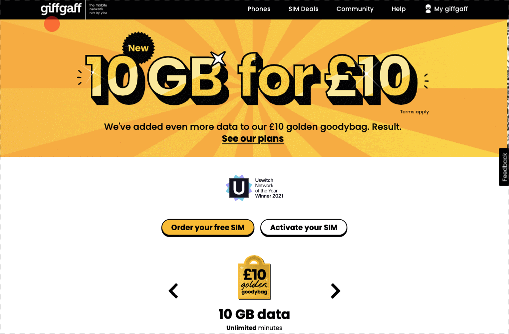
Color contrasting doesn’t have to mean boring black and white only sites. High contrast, yes, but you can still have fun like GiffGaff. Bright, bold banners with nicely contrasted text. It’s using color blocks but still readable and legible.
The contrast ratio is a number between 1 and 21 (where 1 is the same color and 21 is black/white) that determines how easy the contrast between text and its background is to read. You need to be aiming for at least 4.5:1. No ifs no buts.
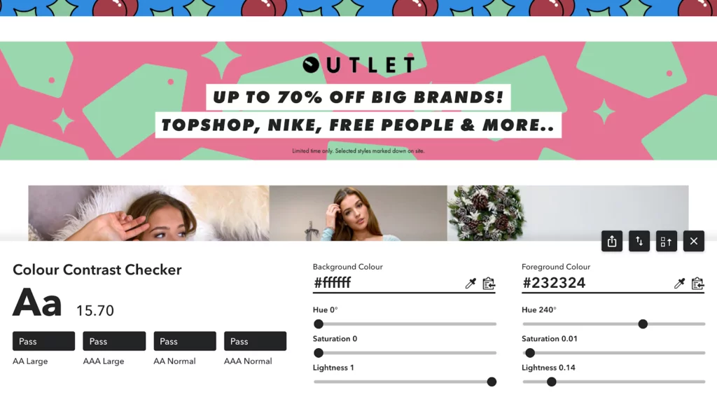
Colour contrasting tools such as Colour Contrast Checker (browser plugin), allows you to quickly check if your color combos are accessible. Simply select background and foreground color to determine whether you’ve passed or not. Remember! 4.5:1 and above.
2. Image alternatives
When it comes to using images and banners on your site, ensure the color contrast is sufficiently sharp. And always give a text alternative to an image or banner, so screen readers know how to share their purpose.
A screen reader detects and interprets elements on your screen, looking at the text, images, and links, and translates them to speech so visually impaired people can consume and interact with content on their phones and/or desktops. By including alt-text, you’re helping many more users using screen readers to seamlessly navigate your site.
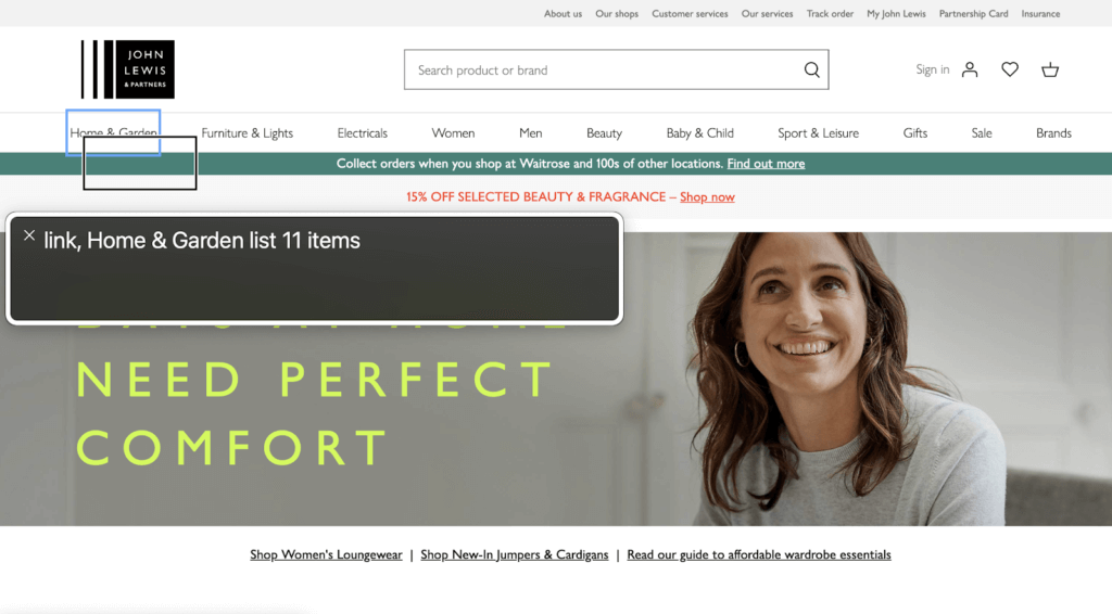
A screen reader should be able to effectively read everything on a web page (left to right). In this example by John Lewis, it’s clearly telling the user they’ve landed on a link > Home & Garden and that it’s within a dropdown “list” with 11 items.
Adding alt-text to your images and banners is a quick fix that takes very little time and effort to include when designing or developing a website, but can have a big impact on the UX accessibility of your site.
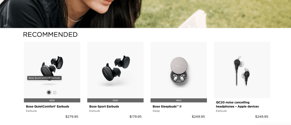
A screen reader should also read out images and banners. In this example from Bose, you can see when hovering over the image “Bose QuietComfort Earbuds”. This is Alt-Text and the screen reader will tell users this when they’re navigating through.
3. Navigation
Imagine for a moment that you land on a site and want to click that rather bright and inviting promotional banner that offers 50% off. For many users, it’s easy to reach by merely using a mouse or trackpad to navigate and click. It takes a matter of seconds to achieve this. But now imagine you’re a user who’s unable to use a mouse or trackpad, who relies solely on their keyboard or voice.
You can use your keyboard alone – without a mouse or trackpad – to navigate the content of the page.
For users using keyboard navigation, they might have to first navigate through the whole top quarter of the site – the navigation section. This typically includes the brand logo, Account, Basket, and then all the menu items for the site. To reach that banner means first tabbing through all those menu list items and in some cases, there could be hundreds. This can be often long and labor-intensive, and depending on the size of the site, could take a minute or more to reach the main content of the site.
One way to avoid any frustration is to implement a ‘Skip to main content’ option. This will appear on the first tab. A user then has the option to either continue navigating through the menu items, or they can just simply ‘Skip to main content’. They’ve reached that bright and inviting banner in a matter of seconds, just as a user would using a mouse or trackpad. It’s as simple as that.
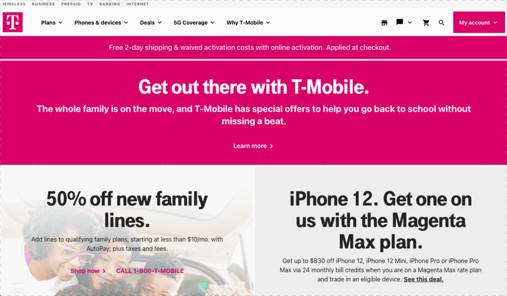
T-Mobile’s definitely going above and beyond. Allowing users to ‘Skip to main content’, ‘Skip to footer’ and also enable their built-in Accessibility and Screen Reader tools. All of this before starting our journey. Wow.
The accessibility mindset
These are just a few ways to help support all your users. This sale season, be better than your competitors. Take the next step and lead the torch in accessibility.
Keep Reading...