Five tips for creating a holiday gift guide that converts

- 1. Avoid creative that takes up most of the screen — especially on mobile!
- 2. Be specific with category and gift guide labels
- 3. Provide a seamless way to navigate to other categories or gift guides from the list page
- 4. Don’t forget to include any seasonal or relevant parameters within your filters
- 5. Be intentional (and creative) with the images and media you use
- And there you have it!
But, with unexpected spikes in discretionary and essential categories, it may be difficult to predict what consumers will be spending their money on this year. It is now more important than ever to closely monitor what categories have been purchased at a steady rate, and what categories are seeing unexpected spikes, especially if you have access to our e-Merchandising platform.
What we do know is that more than 75% of consumers have tried new shopping behaviors, methods, brands, and places over the last year (thanks, pandemic!).
So here are some holiday gift guide UX tips for developers to help you optimize your product categories and gift guides ahead of the peak holiday shopping season.
1. Avoid creative that takes up most of the screen — especially on mobile!
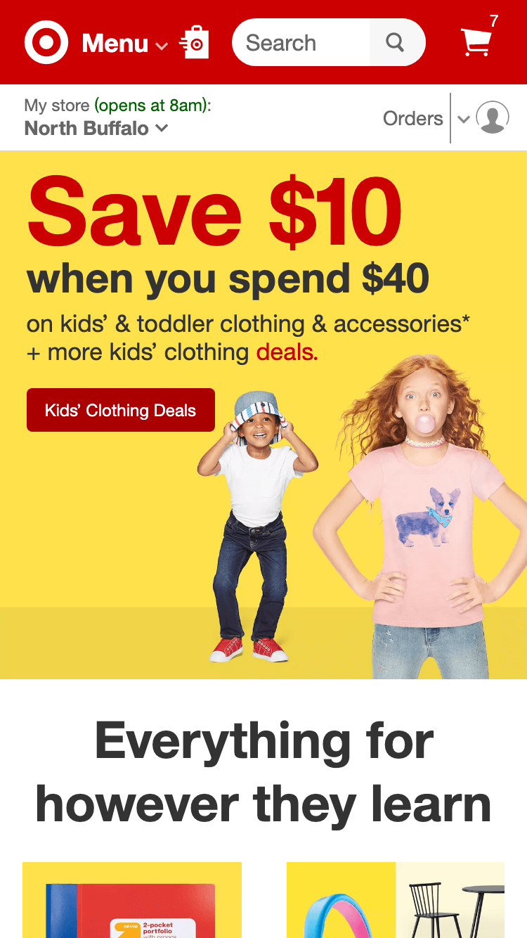
We have seen over and over again that users are not likely to be exposed to content when there is a false bottom. Ensure that the next section is partially visible, and while you don’t have to try to fit all your content at the top, we want to make sure that highly converting content will most likely be seen below the fold.

Target’s banner size lets users see there is more content on the page, encouraging users to continue scrolling.
On this Target landing page, the hero image, while large, still allows for part of the next section to be visible. This avoids the ‘false bottom’ and indicates to users that there is additional content below. This can encourage users to continue scrolling and ensure site content lower on the page is still seen.
2. Be specific with category and gift guide labels
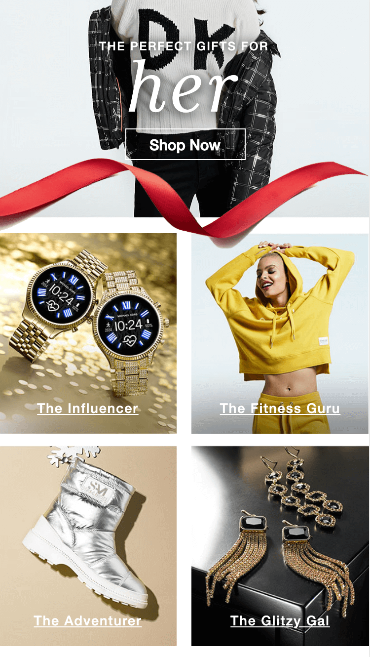
Every time a user clicks on content or a category push on your homepage, they are taking a chance on you. With limited time and pageviews to convince someone they should purchase, all copy and labels should be specific. It is more difficult for users to narrow down a large product listing page than to visit a page with a narrower scope, especially if exposure is low past the fold on listing pages. Opt for more specific category pushes, rather than generic categories that are more difficult for users to anticipate.

A female clothing brand offers highly-specific gift guide landing pages to appeal to specific buyers
Gift guide categories are intentional and speak to users’ personalities. Above these categories, there are also specific guides based on price for swift navigation to what’s most important to users.
3. Provide a seamless way to navigate to other categories or gift guides from the list page
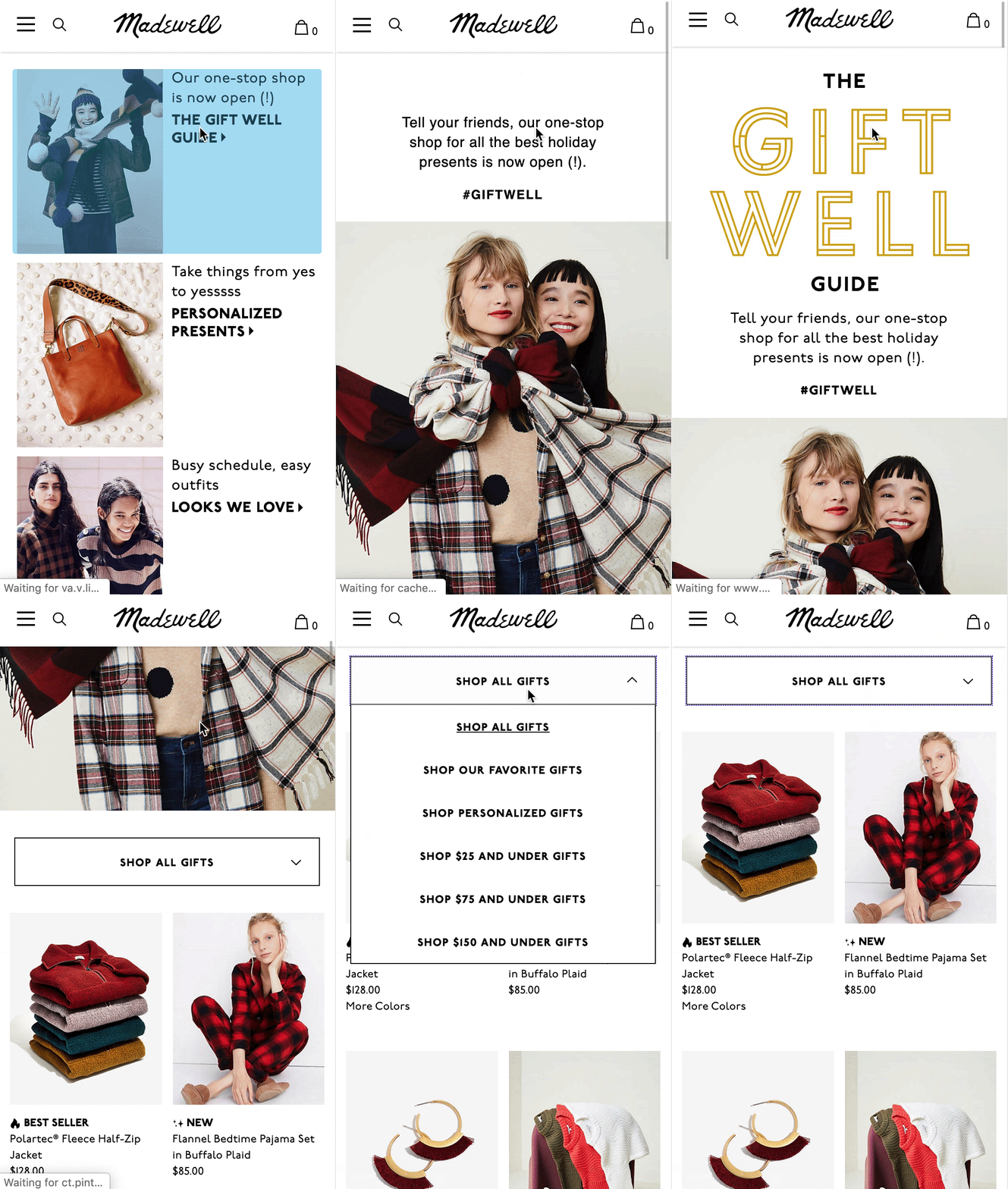
There is no reason a user should have to navigate all the way back to the homepage just to find another category they were interested in. As category pushes tend to perform better than single product pushes on the homepage, you may want to consider providing ways to easily navigate to other closely related categories and gift guides directly from the list page the user is on.

Madewell makes it easy to narrow down search results by price point
At least 3 categories are seen on the Homepage, and do not take the full length of the page. Once the user clicks to the gift guide list page, they can also use a category dropdown to jump to more specific gift guide categories.
4. Don’t forget to include any seasonal or relevant parameters within your filters
In addition to navigating to peak season categories, you can help users by adjusting your filter options to better match shopping behaviors during this time. You don’t want to overwhelm your user with a long product list, but rather encourage your user to utilize the filters effectively. For example, are your consumers concerned with price? Provide parameters that allow them to filter by ‘Gifts under $25,’ Gifts under $50,’ etc. Make sure your filters are clearly visible and easily reachable from anywhere on the page. (Make them sticky!)
5. Be intentional (and creative) with the images and media you use
Choosing images is notoriously difficult, but when the images themselves are cluttered, the page feels cluttered as well. Busy images can be distracting and make the page harder to read, even if the font is legible on the page. Especially if there is text on your images, ensure the images have empty spaces on which the text can be read easily. This is a pro tip for any carousels you may be utilizing. (Don’t forget, you don’t want to auto-rotate your carousels!)
This is also a good time to get creative with your media. More dynamic and interactive media is used to communicate brand or product features, such as auto-playing GIFs, which are quick to load and communicate the type of products being featured, as well as the brand tone.

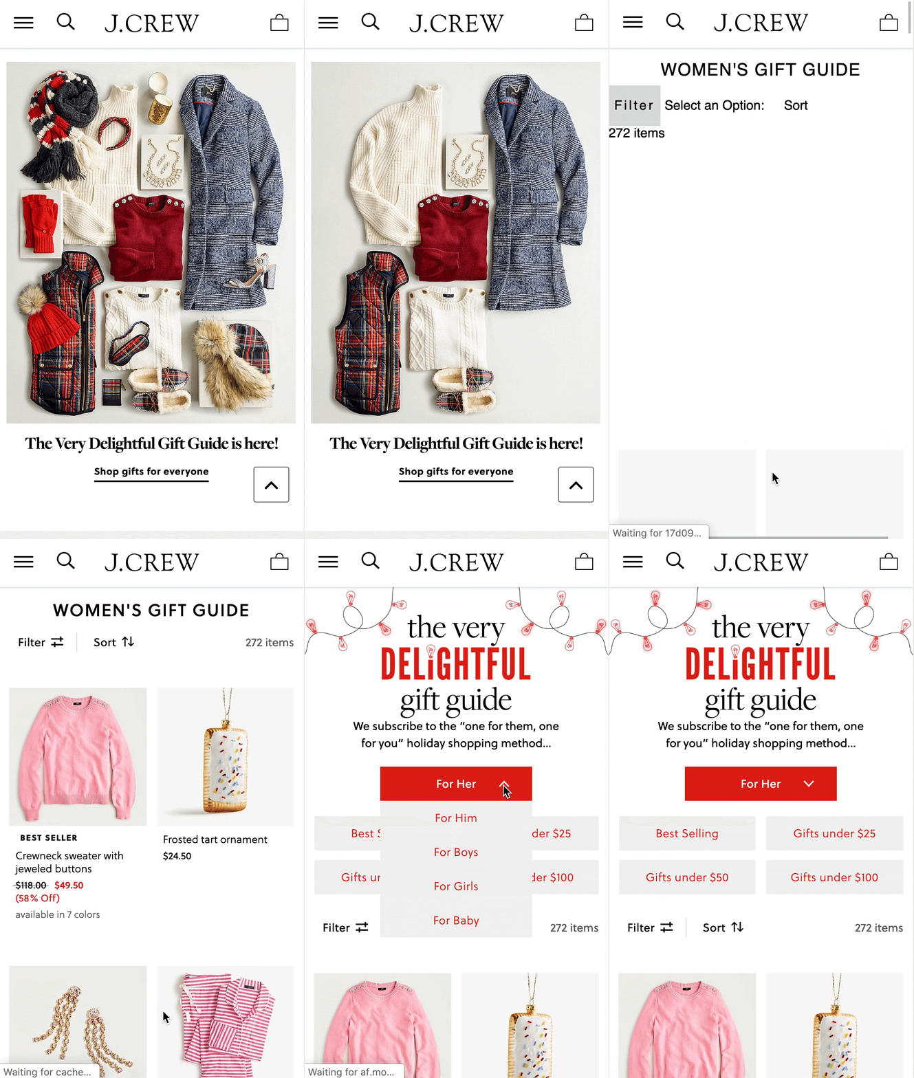
J. Crew’s gift guide features a fun and festive GIF to get visitors in the holiday spirit
On the J. Crew homepage above, the gift guide category uses an engaging GIF that automatically plays. On the gift guide list page, there is a category dropdown that helps users jump to different gift categories. Users can also easily narrow down listings using buttons like ‘Best Selling’ and ‘Gifts under $25.’
Target’s 2019 gift guide takes a fun, interactive approach to connect customers with great gifts for everyone on their list
Gift lists with fun and approachable descriptions mimic the layout of a Pinterest collage, posing product images on a colorful combination of background colors. Each tile lists the price and produces a popover panel that allows the user to navigate to the PDP or view similar gifts.
And there you have it!
Five gift guide UX tips to help you create a memorable and helpful gift guide this holiday season.
Overall, you want to ensure seamless navigation for your users. This may be the first time for many to be shopping all their gifts online, and just like the in-store experience, no one wants to be confused about where to find something they’re looking for. On the plus side, this is an opportunity to guide your customers to great gift ideas and increase your digital sales.


