Quick CX tips to help you add extra love to your digital customer experience before Valentine’s Day.
Budgets are tightening, and teams are forced to do more with less. When your ad budget gets cut, or new team hire is put on hold, you need to focus on your customers’ experience the most. But why?
Because retaining customers you’ve already spent money acquiring and expanding their spending with your brand is more cost-effective than continually trying to acquire new, first-time shoppers.
To retain customers, you need to offer a seamless experience, and to do that, you need to understand your customers’ behaviors, feelings and intents throughout the customer journey. By understanding their goals, frustrations and micro-interactions, you can create a seamless, intuitive experience that delights shoppers and makes them want to keep coming back.
So, to help you sweeten up your customer experience (CX) and give your customers some extra love before Valentine’s day, here are 12 quick things you can do today to give your website a higher return and better experience.
Make it easy for those who forget their logins and passwords
- Explicitly state and display password requirements as users create their account password. The requirements should always be visible to reduce user friction or frustration. For example, next to the password form field, display the criteria in a checklist that updates as they type.

Mailchimp shows when password requirements are fulfilled as the user is typing. (Source: mailchimp.com)
- Allow users to show passwords by providing a button near or within the password form field to unmask the password as they type. This way, they can check their work as they go, reducing cognitive load and catching any mistakes.
- For quick and secure sign-ins on mobile, offer physiological biometric authentication, such as Touch ID, Face ID, or voice recognition. The user can quickly sign in without remembering and entering a password.
Offer chatbots and virtual assistants—subtly
- Allow users to initiate the chat dialog themselves when they are ready for help. Unwanted pop-ups, overlays, or dialogs appearing uninitiated disrupts the user experience and cause frustration. If prompting the chat is a must for your team, keep it to the side of the screen and allow users to interact with the page behind the prompt overlay. Keep the dismissal button clear and clickable at all times.
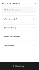
- Encourage users to search for information with an FAQ or navigational assistant before using live support. When users indicate they need more help, you connect them directly to a live representative. This helps reduce the number of call center requests and provides immediate relief to users with simple-to-fix issues. And remember, make it clear to the user when interacting with an assistant versus live support.

Crate & Barrel provides several self-help prompts before sending a customer to live chat. (Source: crateandbarrel.com)
- Be clear about how users should engage with the chatbot immediately, and adjust messaging for offline hours. To speed up the support process, provide users with pre-determined suggestions, topics, or common issues to narrow down the problem. During offline hours, allow the user to ‘leave a message’ instead and prompt them to leave critical information like name, email and a description of the issue. If you can, provide a timeline or window that they’ll receive a response from your support team, so users know when to expect a response.
Be a good host and provide cookie(s) options
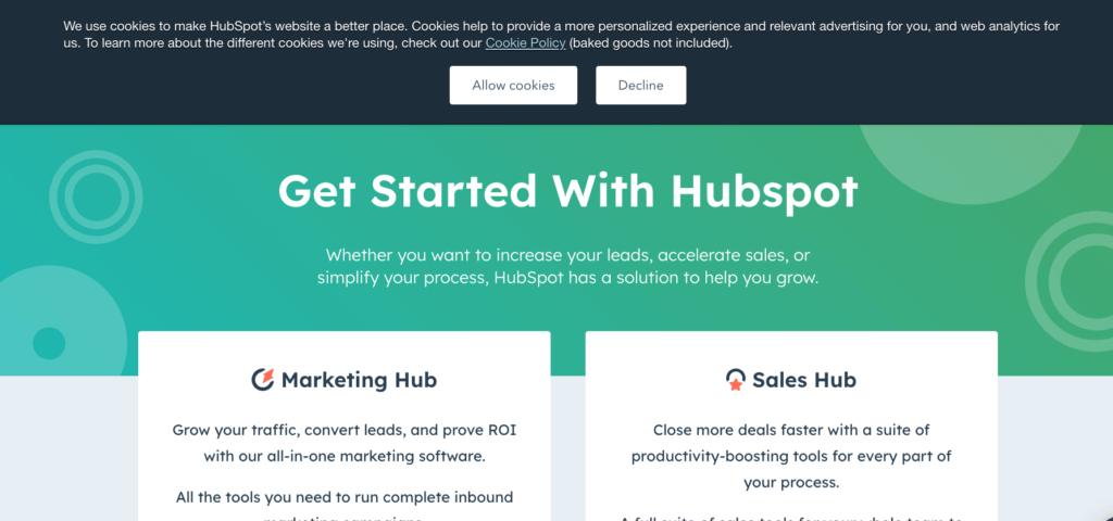
- Clearly explain the purpose of cookies on your site and whether the information will be shared with third-party companies. Provide links to the website’s privacy policy and cookies page within the banner so the user can learn more before making a decision.
- Allow users to accept or reject cookies. If explicitly asking users for cookies consent, provide two clear options to accept or reject. Provide a CTA to reject or decline cookies with an “X.”

HubSpot notifies and lets users accept or reject cookies on their site using a homepage banner. (Source: hubspot.com)
- Allow the user to customize their cookie settings from the banner. Display a button within or near the banner that allows the user to opt in/out of certain cookies on the site. Communicate the different cookie settings by using clear buttons such as toggles, checkboxes, or radio buttons that make it easy for the user to know what they can turn on and off. Also, include an option that allows the user to opt in/out of ALL options at once.
Don’t make visitors search too hard for the search bar
- Ensure that the search function is always easy to find and accessible. Place it within the global navigation and make it sticky to the page as users scroll. Depending on your space, you can opt for a search icon or bar in the menu. However, the user should only click once or twice to enable the keyboard.
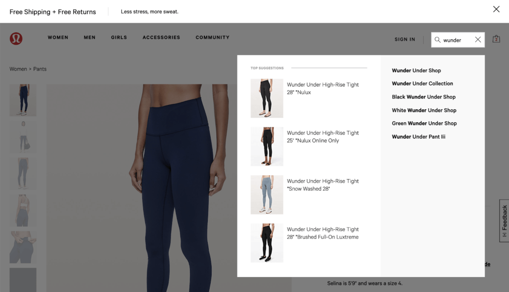
- As users type within the search, enable autofill to make suggestions to search within various categories rather than a site-wide search. Surface recommended categories and subcategories or auto-direct them to the matching list page. This helps avoid producing an overwhelming and irrelevant list of search results. Users may also miss out on beneficial features and functionality using a search results page rather than finding items through the main navigation category.

Lululemon provides suggestions using keywords and provides a dark overlay over the page so visitors can easily focus on the search. (Source: shop.lululemon.com)
- Create a dark overlay when visitors use the search function to help contrast it from the rest of the webpage, which usually has a white background. The contract helps de-clutter the screen and is easier for the eyes to focus on the search suggestions.


