Five ways to optimize your checkout flow and increase conversion


- 1. Allow users to easily edit items and/or fulfillment methods in the cart
- 2. Keep the order summary visible and easily accessible—and validate costs in real-time as users adjust cart items or delivery
- 3. Make relevant coupon codes and promotional information easy to add within the checkout
- 4. Use alternative methods of signing in/allow guest checkout
- 5. Provide immediate, specific, and instructional system feedback on checkout errors (including form fields and promo codes)
The checkout flow should give your user confidence to keep moving through each step. It’s crucial to create a flow that’s relevant, informative, and most importantly, easy to navigate. With that in mind, here are five ways to optimize your checkout flow this upcoming season.
1. Allow users to easily edit items and/or fulfillment methods in the cart
Users tend to change their mind regularly, so make sure changes can be made easily within the cart itself. For each of the items, include features for:
- Product color
- Size
- Quantity
- Save/Favorite
- Pickup/Delivery method
- Removal
Users can interact with these features without having to navigate to the product page (PDP). Additionally, consider showing a quick view modal of the product when users click into each product item. This helps keep users on the cart page and encourages them to continue down the conversion funnel.
**Note: When users make any changes to the cart, avoid refreshing the entire cart page every time, as this can be time-consuming and cause frustration. If possible, try to render only the elements that need to be updated, such as the product pricing and subtotal.
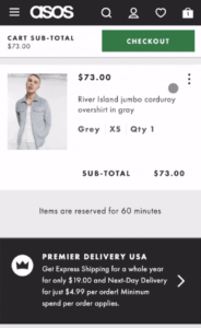
On ASOS’s mobile site, the user can click on the kebab icon on the right side of the cart item to view all edit options.
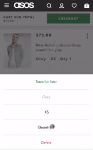
From there, the user can edit the color, size, and quantity of the product, as well as save or remove the item from their cart.

When the user makes any edits in the cart on Everlane’s desktop site, the product price and subtotal update on the page.
2. Keep the order summary visible and easily accessible—and validate costs in real-time as users adjust cart items or delivery
Some users may feel uncertain about their order if they can’t see their order details on the page. Increase the visibility of the order summary, and allow users to access this information easily.
One effective way to practice this on desktop is to have the order summary stick to the side of the page where users can then view it at any time.
For mobile, one effective way is by placing the summary in an accordion at the top. When collapsed, users can view the total number of items in the cart and the total cost. When expanded, users can view the full details of the order. Keeping it as an accordion also reduces the height of the page.
Make sure to update the order summary immediately after any options have been set.
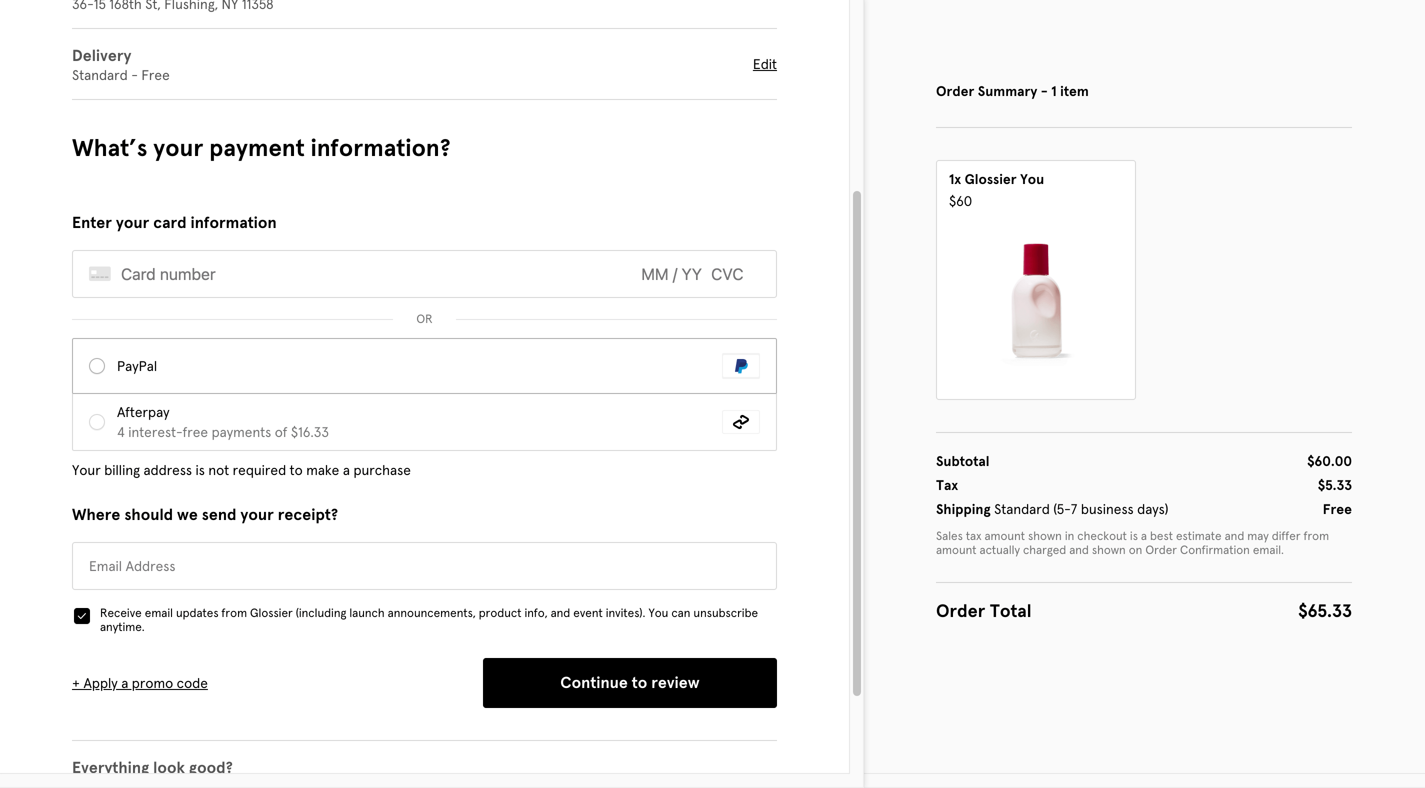
On Glossier’s desktop checkout, the order summary stays constant on the right side of the page while the user is scrolling through the content on the left side.
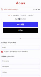
On Dous’s mobile site, the order summary is found as an accordion at the very top of the page.
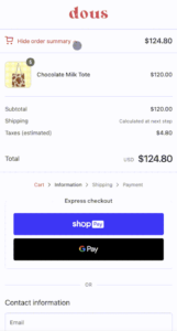
When the user clicks on the accordion, they can view their cart items and a full breakdown of their order.
3. Make relevant coupon codes and promotional information easy to add within the checkout
Users frequently use coupon codes for their purchases, but can be deterred from conversion if they’re difficult to apply. So make sure to keep the promotion code field, along with the promotional codes, visible on the page.
The promotional form field can either be found on the cart page or during checkout, and is oftentimes placed in close proximity to the order summary.
Again, only render elements on the page that need to be updated, and provide feedback immediately.
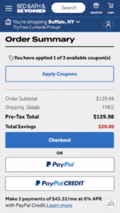
Bed Bath & Beyond’s cart page shows an “Apply Coupons” button at the top of the order summary.
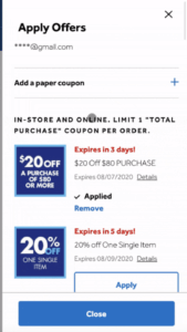
When the user clicks on the button, a pop-over of available coupons appears. The user can go through the list and click on the “Apply” button to quickly apply the coupon to their order.

On Abercrombie & Fitch’s mobile site, a promotions accordion is found at the very top of the page.
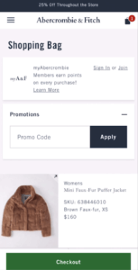
Users can find the promotion code form field within the accordion.
4. Use alternative methods of signing in/allow guest checkout
While signing in or signing up during checkout can unlock benefits, the process of signing in can be a major wall for users. Take the pressure off by remembering their login information or offering alternative methods of verification.
Some popular methods include single sign-on (SSO), 2-Factor authentication (2FA), or one-time passwords (OTP). Implementing these alternative methods can make the checkout process smoother.
Additionally, allow users to proceed to checkout as a guest, and make this option the most prominent on the page.
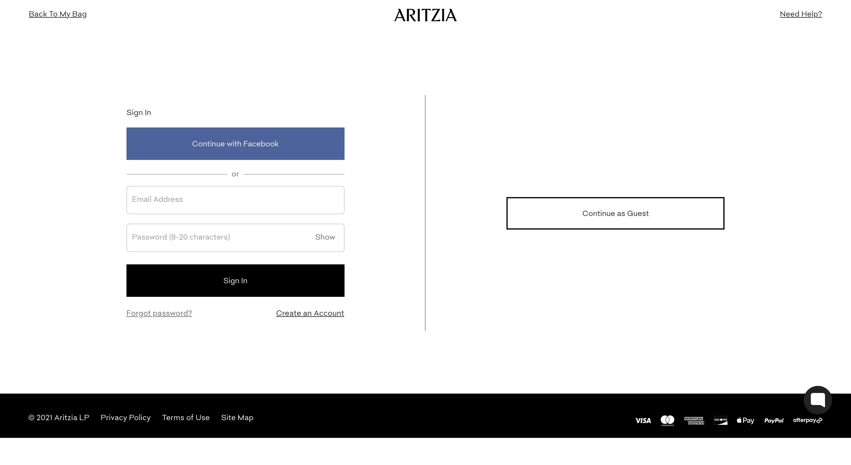
When entering checkout on Aritzia’s site, the user is able to sign in via Facebook, their site account, or as a guest.
5. Provide immediate, specific, and instructional system feedback on checkout errors (including form fields and promo codes)
Providing clear feedback is extremely important for your users, especially when there are errors or missing fields during checkout. Users need to know exactly what and where the problem is, and this feedback needs to be well-visible to the user.
Typically, this is indicated with a bold text message by the field and/or a highlight outlining the field. Sites can also show an error notification within the checkout step or by the CTA.
Keep in mind that the system should only provide error feedback only until after the user has fully input something in the field or submitted it. Showing an error message while the user is still typing or clicking out of the field can be confusing.
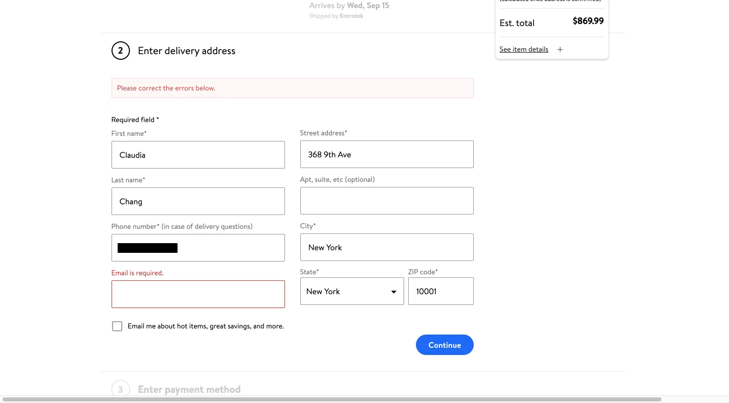
Walmart notifies the user of an error by outlining the missing form field in a bold red and also writing an error message at the top of the checkout step.
Feedback for correct form fields is helpful in letting the user know they’re doing the right thing. One use case for positive feedback is when the system shows the card type after the user inputs their card number. It validates the card information, reaffirming users that they’re on the right track.
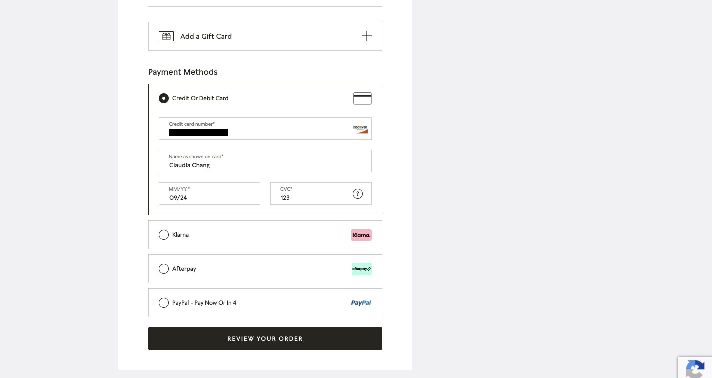
Once the user enters the card number on Pandora’s desktop site, the system displays the user’s card type on the right end of the form field.
Conclusion
In summary, the checkout flow should be optimized to encourage users to keep moving through the conversion funnel by
- Allowing users to make any edits within the cart without requiring them to navigate to the full product page.
- Keeping the order summary and promotional code features visible and well-exposed.
- Creating a frictionless sign-in experience by providing alternative verification methods.
- And finally, always communicating immediate, specific, and instructional feedback to the user as they fill out any form fields.
Keep Reading...