Know what drives engagement and abandonment on your sites and mobile apps.


To make your users more comfortable with the process, you should ensure that their personal information is kept safe and secure, and that it won’t be used for anything other than the intended purpose. Additionally, you should provide an explanation of how their information will be used to give them peace of mind.
So here are some content-oriented tips to ensure the foundation of your lead generation experience is headed in the right direction.
CTAs that lead to the same form or site page should be styled consistently, both in color and copy. Use specific CTA copy to help users understand exactly what to expect. For example, are they being directed to contact someone or to view another informational page? Make sure you clearly tell the user.
Using generic wording too frequently with the same style of CTA can confuse users, leading to a lack of context which doesn’t help instill confidence. On the other hand, CTAs that lead to different types of experience should be differentiated. For example, contacting Sales and Support should be presented differently.
If you have multiple CTAs that lead to different actions or pages, make sure you prioritize them efficiently – especially when placed alongside each other. Use button-styled CTAs for primary actions, and text links or ‘ghost’ CTAs (buttons with no solid fill color) for secondary CTAs. The level or lack of color and size can help determine their priority.
All CTAs in this example labeled ‘Get started’ are styled in the same color and font. The size varies based on its placement.

The primary CTA has a fill color of green and is placed on the left, while the secondary CTA uses a simple border and is placed on the right. A tertiary action is a simple text link at the bottom of the viewport. All CTAs are descriptive of the action that will be triggered.
Know what drives engagement and abandonment on your sites and mobile apps.
I want to start!
If you only offer one CTA, users who are not ready to commit to the ‘ideal’ conversion may not take any action at all. Instead, providing a secondary action that’s informative, valuable, and assists them during the research phase can help nurture them until they’re ready to buy.
You can use Contentsquare’s attractiveness and improve your conversion rate metric by understanding the likelihood of interaction or conversion between primary and secondary CTAs. Does this differ between new and returning users?
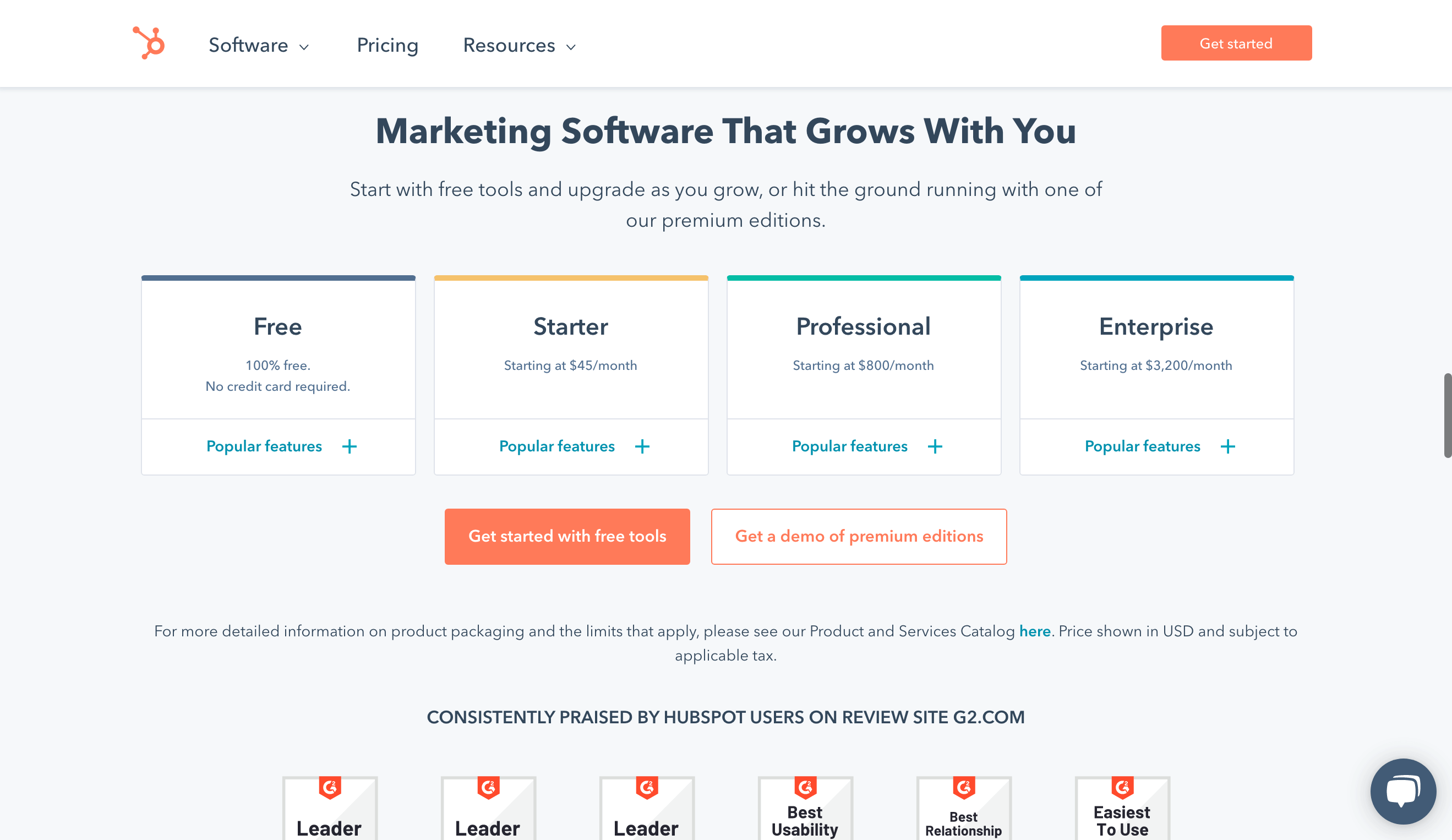
A user is provided with the option to sign up immediately or receive a demo instead, catering to users that are not ready to convert. The softer action does not use a fill color to avoid overpowering the main CTA. Both CTAs use specific copy to let users know exactly what to expect.

The user can watch a demo video of the product if they’re not ready to commit to a trial or purchase.
Users are much more likely to provide contact information in exchange for helpful content. Although not directly related to purchasing or trialing a product, it builds credibility and trust between the audience and brand.
To avoid disrupting the experience, surface a modal rather than directing users to a new page to fill out a form to view content. Depending on the content, avoid asking for too much information as this can be a deterrent for users.
Know what drives engagement and abandonment on your sites and mobile apps.
I want to start!
You can use Contentsquare’s Form Analysis to understand what percentage of users left the form without interacting, or how many fields users filled before submitting to better understand what users are willing to fill out. You can also use Form Analysis to identify which fields are causing users to drop off or are difficult for them to complete.
With this information, you can optimize your forms to ensure users complete them quickly and easily.
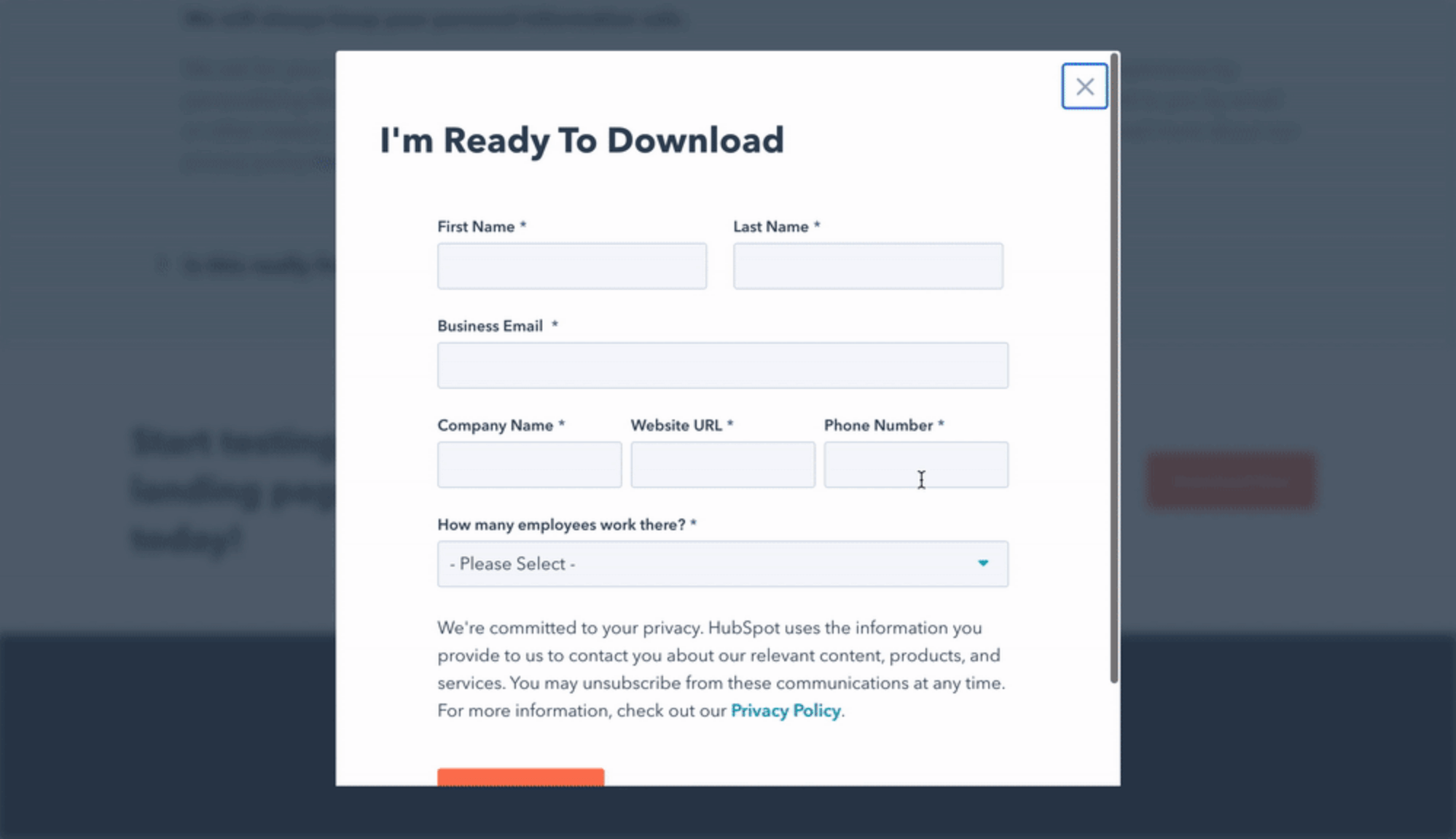
The download form appears in a modal rather than redirecting the user to a new page. It is easily removable and a dark overlay is placed behind to focus the user on the form.
Avoid using purely decorative visuals for the sake of breaking up text. Visuals should be contextual, informative, and aesthetically pleasing. If your product is complicated, visualize the concept in a way that users can quickly understand while skimming the page. Visuals should not be difficult to read or understand. This is an important rule to follow in your B2B lead generation, sales, and other strategies in the future.
If previewing a digital software product, simplify the platform for visuals on the site rather than animate an exact replica, as most users will not be able to understand the level of detail presented. If visuals can be interacted with, this can add a level of engagement you may see users gravitate towards.

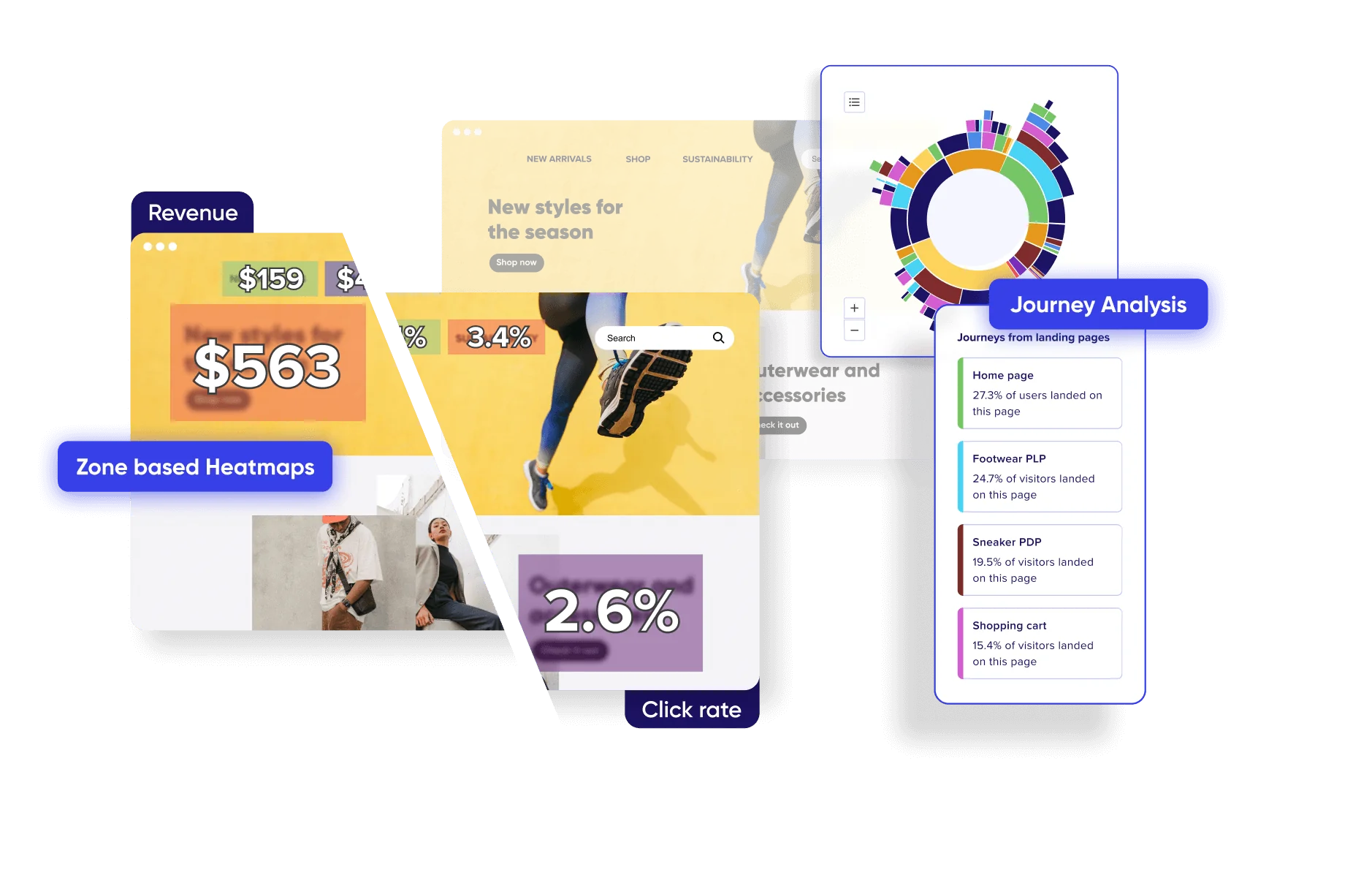
The user is provided a simple and interactive visualization of a concept to more quickly understand how a product works. The user can interact with different tabs that represent different use cases of the product which adds another, more interesting level of engagement.
Know what drives engagement and abandonment on your sites and mobile apps.
I want to start!
Always remember, the user is ultimately looking for helpful information to decide whether your product is right for them. So make sure your site – and specifically your lead generation pages – caters to them. Avoid using lengthy and superficial descriptions and instead answer questions the user is likely to have about your products and services. When information is limited or superficial, users may have trouble finding or understanding how your product is differentiated from your competitors, which might prevent them from becoming leads.
So for lead generation success; keep it clear, consistent, visual, and informative.