Take a product tour
Get to grips with Contentsquare fundamentals with this 6 minute product tour.
As part of its digital brand lift, Avon has been investing heavily in customer-friendly content, equipping teams with the right tools to make insight-led customer experience decisions.
We recently caught up with Rachel Bronstein, Avon’s Website Optimization Analyst, who told us how one A/B test on the product carousel led to a 35% increase in revenue.
Take a product tour Get to grips with Contentsquare fundamentals with this 6 minute product tour.
Take tour
The team at Avon analyzed two category pages — makeup and skincare — to understand desktop customer journeys on these pages: how visitors were reaching the site, where they landed, and what they were doing once they were on the page.
They discovered that the product carousel on this page (which is where the company highlights best-selling products) had a low 60% exposure rate on desktop, meaning 40% of visitors were not even seeing it.
Many customers were seeing the banner image above the fold (what the team at Avon refers to as the A Spot banner) but were not scrolling down to the carousel.
A deeper analysis showed that, despite the low exposure of the product carousel, it had a high attractiveness rate and a healthy conversion per click rate, meaning that those who did scroll down to see it were likely to click and — even better news — to convert.
The team had already considered the potential benefit of shrinking the height of the A Spot banner to bring the carousel up the fold, but there had been insufficient data to back up this decision.
Armed with new customer behavior knowledge, the team decided to test the impact of a banner redesign to see if a permanent design change was the way forward.
A/B testing is a key part of Avon’s continuous digital optimization strategy, and the team comes together every other week to discuss ideas of what tests to run next as part of its customer experience optimization.
The test subject on this occasion was primarily the banner, which the Avon team decided to shrink to determine if doing so would lift the exposure rate. Also part of the test was moving the carousel higher up on the page so that it would be in better view of the visitors.
The area of concern for Avon with cutting down the A Spot banner was that it might devalue this area of the site — the team was concerned that with the product carousel more prominent, consumers might disregard the banner. Running the test was therefore a crucial step to take before executing any changes — even the newly data-backed ones.
During the A/B test, the team at Avon paid special attention to a bounty of specialized metrics: exposure, clicks, scroll, time spent on an element, and bounce and exit rates. Last but certainly not least, the brand studied conversion metrics and compared them against one another in each version of the makeup category product page.
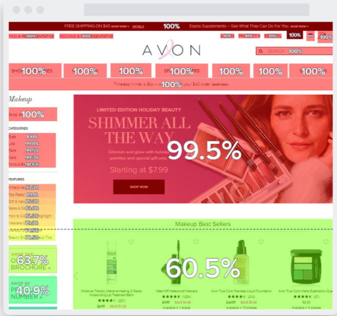
Initial exposure rate analysis of the Makeup category page.
The page with the shorter banner saw positive outcomes across the board. It led to a 44% increase in exposure, which climbed from 57% in the control page to 82% in the variant page. The click rate increased by 24% and the bounce and exit rates dwindled. The team also reported a 5-second increase of time spent on the page.
These uplifts resulted in a 35% increase in overall revenue in the carousel zone. The revenue in the variant page was 6% higher than that of the control page.
The test also disproved Avon’s original misgivings of reducing the banner, in that it did not negatively affect its performance — quite the opposite! Revenue generated by the banner increased by 2% during the test, strengthening the argument to change the standard size of the category page banner.
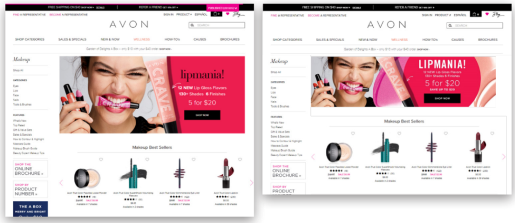
Original layout (left), and the variant layout with a smaller banner image (right).
After this experience, the team decided to use Contentsquare with every test. Today, 20 people across several departments regularly use the solution to underpin UX optimization actions. The tool’s clear visualization means everyone on the team can understand behavior-measuring metrics like exposure rate, and see the impact of changes.
The other main benefit of anchoring the A/B testing strategy to Contentsquare metrics was how quickly the team was able to see uplift. Following the initial batch of insights, the test was up and running within a week, ran for a couple of weeks and results were analyzed in just a few days. Having indisputable results to share with the entire team also secured team-wide buy-in for implementing the winning variant.
Contentsquare answers the question of “how” and “why” and this is extremely valuable to our team with regards to our A/B tests and site analyses. — Rachel Bronstein, Website Optimization Analyst at Avon
“Perhaps one of the biggest benefits is the visual representation of behavior that Contentsquare provides,” said Rachel Bronstein.
“We can sit in a room, take a look at the results and come up with a plan of action. We ran our test for two weeks, analyzed the results immediately thereafter and put a plan in motion on the day the results were presented. Contentsquare has empowered our team to make data-driven decisions quickly,” said Bronstein
The customer experience optimization strategy has proven to be an all in all victorious one for Avon’s engagement and revenue. It could not have happened without the consolidation of critical tools: unique behavioral UX metrics, which picked apart the elements and their performances in the category page, leading the team to understand what was going on UX-wise at a granular level; and the ensuing A/B test, allowing the brand to confidently determine how to best improve the UX.